$30 off During Our Annual Pro Sale. View Details »

Placing the Learner at the Centre of Learning Analytics

Placing the Learner at the Centre of Learning Analytics

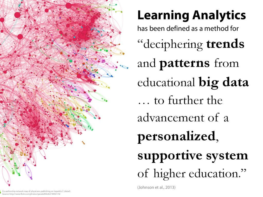
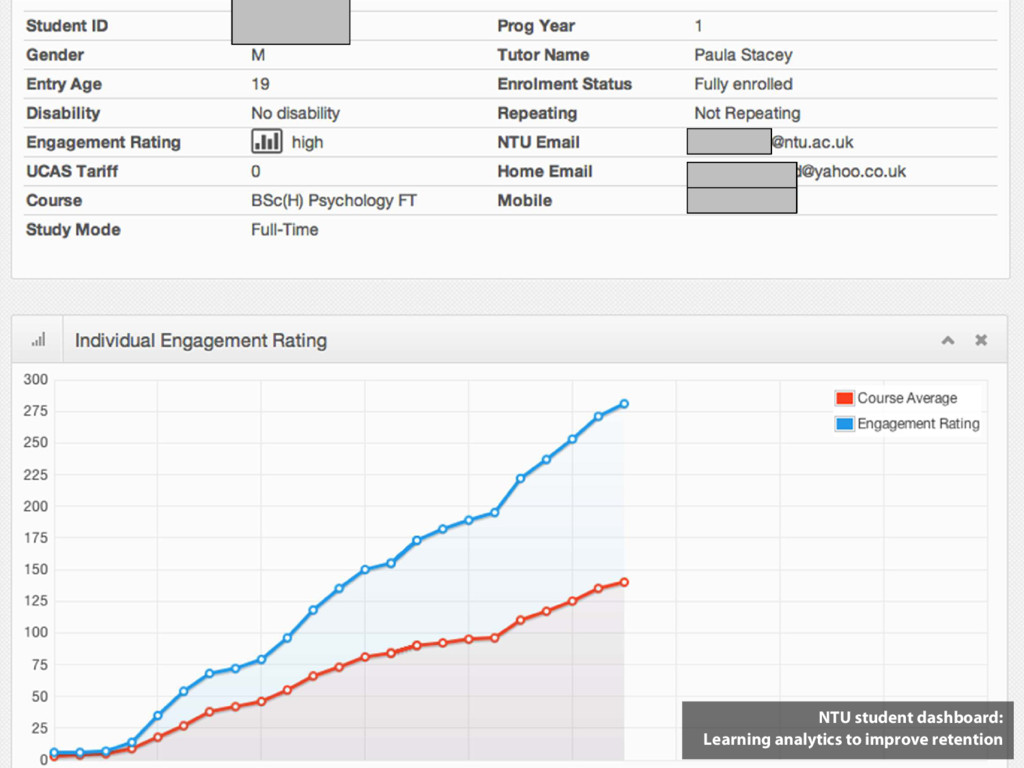
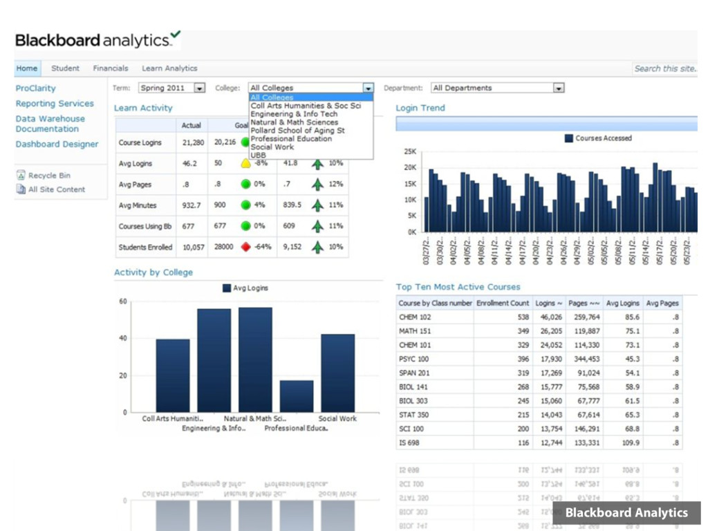
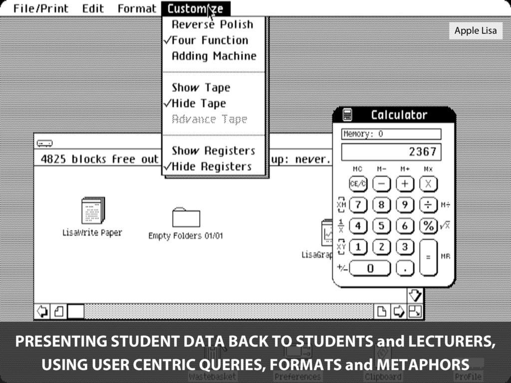
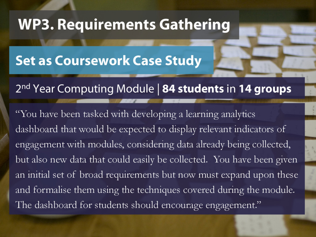
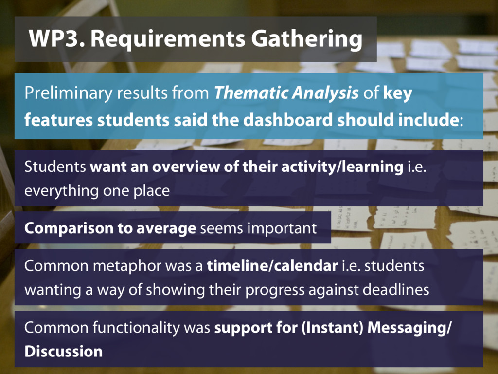
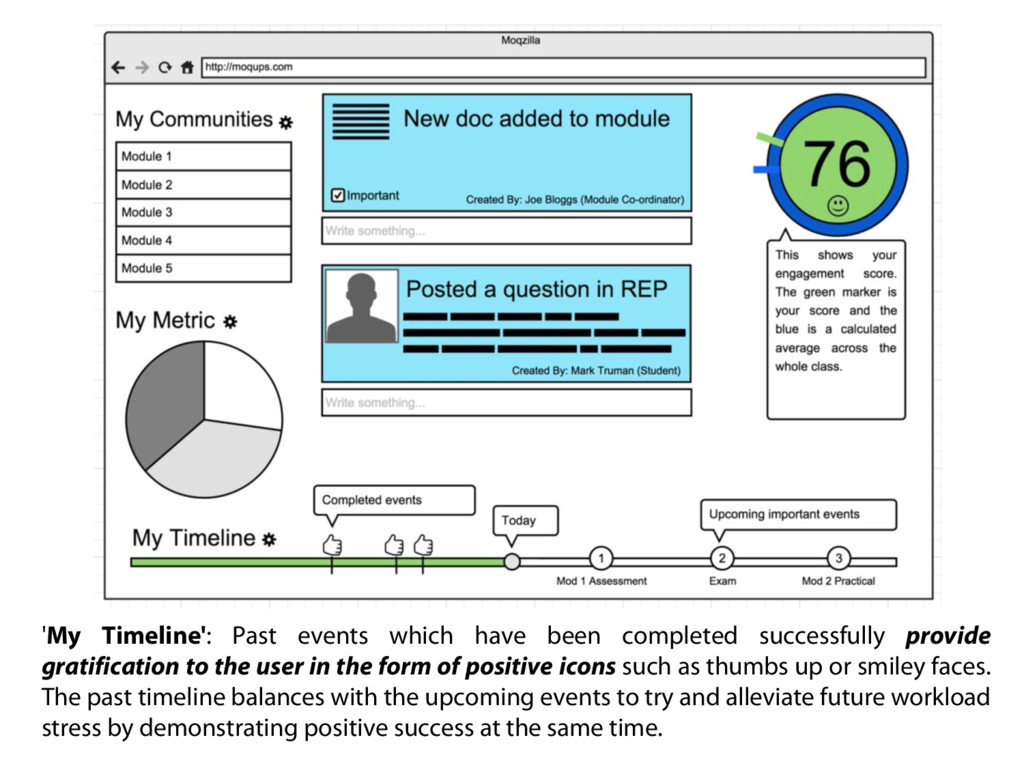
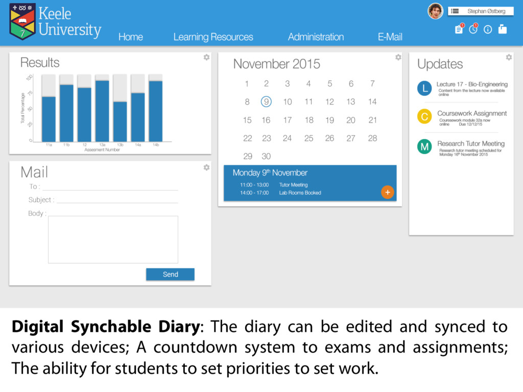
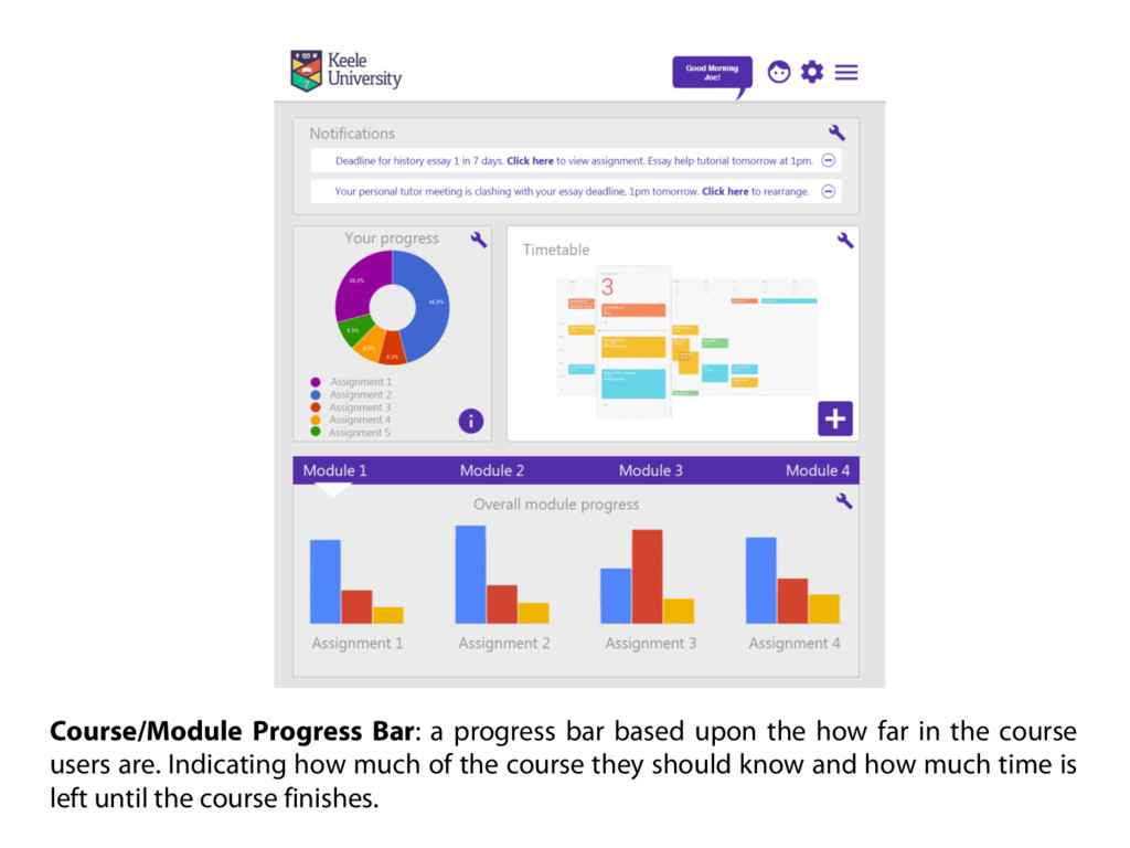
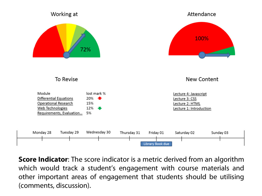
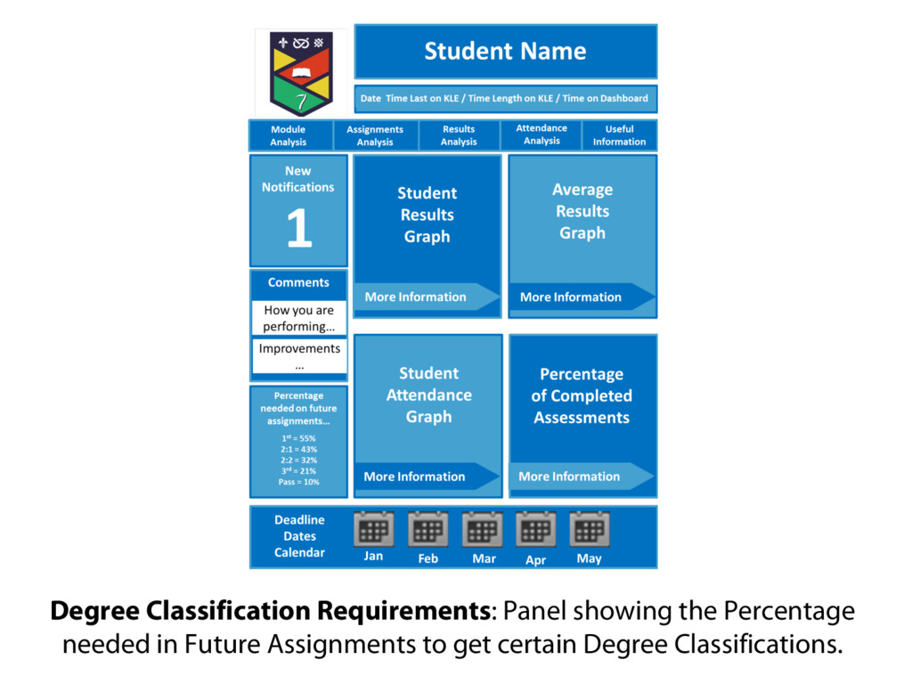
The interaction and interface design of Learning Analytics (LA) systems is often based upon the ability of the developer to extract information from disparate sources and not on the types of data and interpretive needs of the user. Current systems also tend to focus on the educator’s view and very rarely involve students in the development process. We have used a User Centred Design (UCD) approach with a group of 82 second year Computer Science students to design LA interfaces (in the form of Dashboards) that will engage and motivate them as learners and personalise their own learning experience. A preliminary thematic analysis has suggested that their understanding of LA and their requirements for it are often formed by the limitations of the technologies and systems that they currently use within and outside of the University. We have found however that learners want to be able to access an overarching view of their previous, current and future learning activity e.g. in a timeline. We propose that the only way of truly creating a personalised, supportive system of education is to place the learner at the centre, giving them control of their own Learner Analytics.

Presented at #KALTC17 https://www.keele.ac.uk/lpdc/learningteaching/keelelearningandteachingconference/

Ed de Quincey

January 17, 2017
Tweet

More Decks by Ed de Quincey

Other Decks in Education

Transcript

  1. Placing the learner at the centre of
    learning analytics
    Dr Ed de Quincey, Dr Mark Turner, Dr Theo Kyriacou, Dr Nikki Williams
    School of Computing and Mathematics, Keele University Photo by GotCredit
    www.gotcredit.com

    View Slide

  2. TRADITIONALLY A STUDENT’S PROGRESS AND LEVEL OF
    ENGAGEMENT HAS BEEN MEASURED BY ASSESSMENT
    Photo by Alberto G.
    https://www.flickr.com/photos/albertogp123/5843577306

    View Slide

  3. HOW ELSE CAN WE MEASURE ENGAGEMENT
    AND PROGRESS IN REAL-TIME?
    Photos by
    Cropbot https://en.wikipedia.org/wiki/Lecture_hall#/media/File:5th_Floor_Lecture_Hall.jpg
    See-ming Lee https://www.flickr.com/photos/seeminglee/4556156477

    View Slide

  4. Learning Analytics
    has been defined as a method for
    “deciphering trends
    and patterns from
    educational big data
    … to further the
    advancement of a
    personalized,
    supportive system
    of higher education.”
    (Johnson et al., 2013)
    Co-authorship network map of physicians publishing on hepatitis C (detail)
    Source: http://www.flickr.com/photos/speedoflife/8274993170/

    View Slide

  5. NTU student dashboard:
    Learning analytics to improve retention

    View Slide

  6. Blackboard Analytics

    View Slide

  7. View Slide

  8. Apple Lisa
    PRESENTING STUDENT DATA BACK TO STUDENTS and LECTURERS,
    USING USER CENTRIC QUERIES, FORMATS and METAPHORS

    View Slide

  9. View Slide

  10. WP1. KLE Data Review
    A review of activity log data that are
    currently available via the KLE.


    View Slide


  11. View Slide

  12. View Slide

  13. WP1. KLE Data Review


    • Inconsistent formats
    • Reports take a long time to run
    • No way to bulk download all “raw” data
    • Single Course User Participation Report is the most useful
    BUT have to run for each student
    Around 11 “reports” available
    9 Course Reports, a Performance Dashboard and a Retention Centre

    View Slide

  14. Identified and Reviewed 22 Learning Analytics Systems

    View Slide

  15. Review of Existing Systems
    Few systems available for general use

    Primarily targeted at educators. Only 5 of the 22
    systems being designed purely for use by students
    Only 4 of the studies gathered the requirements for
    the systems directly from users
    Currently analysing visualisation techniques used
    and types/sources of data used

    View Slide

  16. View Slide

  17. “Jisc is hosting an event in February where we’ll bring together people
    from universities and colleges across the UK to look at what they
    think can and should be provided to students directly.”
    December, 2014
    “What data and analytics should be presented directly to students? This
    was the subject of a workshop on 27th Feb in Jisc’s London offices,
    attended by staff from across UK higher education. We also had
    with us a couple of students with a keen interest in the
    area … In advance of the meeting members of Jisc’s Student
    App Expert Group had anonymously provided a range
    of potential requirements, which I then grouped and used as the
    basis for the workshop.” March, 2015
    Effective Learning Analytics
    Using data and analytics to support students
    https://analytics.jiscinvolve.org/

    View Slide

  18. “I’m now carrying out
    sessions directly with
    students to find out
    what they would find
    most useful… The
    students were from a variety
    of levels and backgrounds,
    ranging from engineering to
    drama.” April 29, 2015
    Effective Learning Analytics
    Using data and analytics to support students
    https://analytics.jiscinvolve.org/

    View Slide

  19. “A major influence on our thinking is the use of fitness apps such
    as MapMyRide and Google Fit: some of us are already avid users of
    these technologies. To emulate their addictive qualities
    in an app for learning is one of our aims.”
    https://analytics.jiscinvolve.org/wp/2015/08/21/student-app-for-learning-analytics-functionality-and-wireframes/

    View Slide

  20. “About half of the respondents (427/934, 45.7%) had stopped
    using some health apps, primarily due to high data entry
    burden, loss of interest, and hidden costs.”

    View Slide

  21. View Slide

  22. User-Centered Design Process Map
    http://www.usability.gov/how-to-and-tools/resources/ucd-map.html

    View Slide

  23. WP3. Requirements Gathering
    Set as Coursework Case Study
    2nd Year Computing Module | 84 students in 14 groups
    “You have been tasked with developing a learning analytics
    dashboard that would be expected to display relevant indicators of
    engagement with modules, considering data already being collected,
    but also new data that could easily be collected. You have been given
    an initial set of broad requirements but now must expand upon these
    and formalise them using the techniques covered during the module.
    The dashboard for students should encourage engagement.”

    View Slide

  24. WP3. Requirements Gathering
    Preliminary results from Thematic Analysis of key
    features students said the dashboard should include:
    Students want an overview of their activity/learning i.e.
    everything one place
    Comparison to average seems important
    Common metaphor was a timeline/calendar i.e. students
    wanting a way of showing their progress against deadlines
    Common functionality was support for (Instant) Messaging/
    Discussion

    View Slide

  25. 'My Timeline': Past events which have been completed successfully provide
    gratification to the user in the form of positive icons such as thumbs up or smiley faces.
    The past timeline balances with the upcoming events to try and alleviate future workload
    stress by demonstrating positive success at the same time.

    View Slide

  26. Digital Synchable Diary: The diary can be edited and synced to
    various devices; A countdown system to exams and assignments;
    The ability for students to set priorities to set work.

    View Slide

  27. Course/Module Progress Bar: a progress bar based upon the how far in the course
    users are. Indicating how much of the course they should know and how much time is
    left until the course finishes.

    View Slide

  28. Score Indicator: The score indicator is a metric derived from an algorithm
    which would track a student’s engagement with course materials and
    other important areas of engagement that students should be utilising
    (comments, discussion).

    View Slide

  29. Degree Classification Requirements: Panel showing the Percentage
    needed in Future Assignments to get certain Degree Classifications.

    View Slide

  30. Comparison with peers: The chance for the user to see how
    they are comparing with the top 20% of the class and how they
    are doing compared with the average mark.

    View Slide

  31. Goals and Trophies: The student will get a list of goals or tasks
    sent to their dashboard and there they can also add more tasks
    of their own.

    View Slide

  32. News Feed: An aggregated news feed is a pattern followed on many
    major platforms, and provides a intuitive way to group content into a
    digestible stream of information from multiple sources (modules).

    View Slide

  33. Did we find agreement with the 6 Jisc principles?
    • Comparative ✓
    • Social ✓
    • Gamified ✓
    • Private by default (✓)
    • Usable standalone x Seen as part of the VLE
    • Uncluttered (✓) VLE’s have poor usability
    Effective Learning Analytics
    Using data and analytics to support students
    https://analytics.jiscinvolve.org/
    https://analytics.jiscinvolve.org/wp/2015/08/21/student-app-for-learning-analytics-functionality-and-wireframes/

    View Slide

  34. “The average user interface has
    some 40 flaws. Correcting the easiest
    20 of these yields an average
    improvement in usability of 50%.
    The big win, however,
    occurs when usability is
    factored in from the
    beginning. This can yield
    efficiency improvements of
    over 700%.” (Landauer, 1995)
    ©CollegeDegrees360 via Flickr

    View Slide

  35. “The cost of poor usability is
    high. It includes unsatisfied,
    ineffective learners and
    ineffective e-learning
    initiatives. Learners who find an
    e-learning program hard to use
    might:
    • Carry out their task reluctantly
    • Be confused about the learning
    exercise
    • Fail to engage with the e-learning,
    possibly abandon the e-learning
    completely, fail to learn or retain
    knowledge.” (Abedour and Smith, 2006)
    ©CollegeDegrees360 via Flickr

    View Slide

  36. Learning Analytics in the classroom?
    Students in lecture hall ©Jirka Matousek via Flickr

    View Slide

  37. HEFCE Catalyst Grant £99,790 (£49,988 from Catalyst Fund, £49,802 in matched funding from Keele)
    Title: Learner Centred Design for Learning Analytics
    This project aims to avoid the common problem in Learning Analytics (LA) of the technology and data driving the
    user experience, and therefore the ability to interpret and use the information. By sharing the data directly
    with students, using student-centred representations of their learning activity, this project aims to facilitate a
    common understanding of the learning experience between lecturers and students. Expanding on a successful
    teaching innovation project at Keele University interface metaphors for LA will be identified that motivate and
    personalise the learning experience of cohorts with differing levels of technical experience and levels of digital
    literacy. We will then produce appropriate visualisations of student activity based on the data available at Keele
    University and incorporate them into the delivery of relevant modules with the key aims of
    increasing engagement, making the VLE a more active space for learning and teaching and bridging the current
    gap between physical and digital spaces.

    View Slide

  38. Good morning
    class…
    Do you prefer lecturing in the dark?

    View Slide

  39. View Slide