‘designing for mobile’. But it’s not about ‘designing for the desktop’, either. Rather, it’s about adopting a more flexible, device-agnostic approach to designing for the web. » JOHN ALLSOPP “A DAO OF WEB DESIGN”
often desire in the web medium, is simply a function of the limita- tion of the printed page. We should embrace the fact that the web doesn’t have the same constraints, and design for this flexibil- ity. But first, we must “accept the ebb and flow of things.” Now, John was writing during the web’s early years, a period of transition when designers transferred print-centered design principles onto this young, new medium.
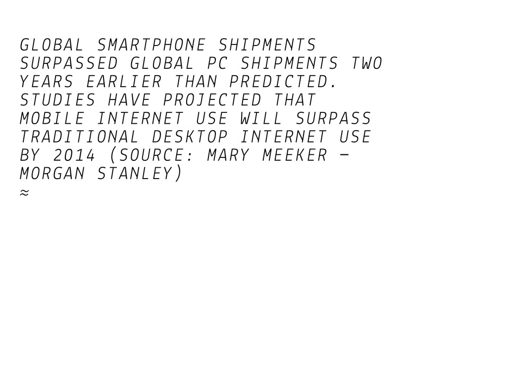
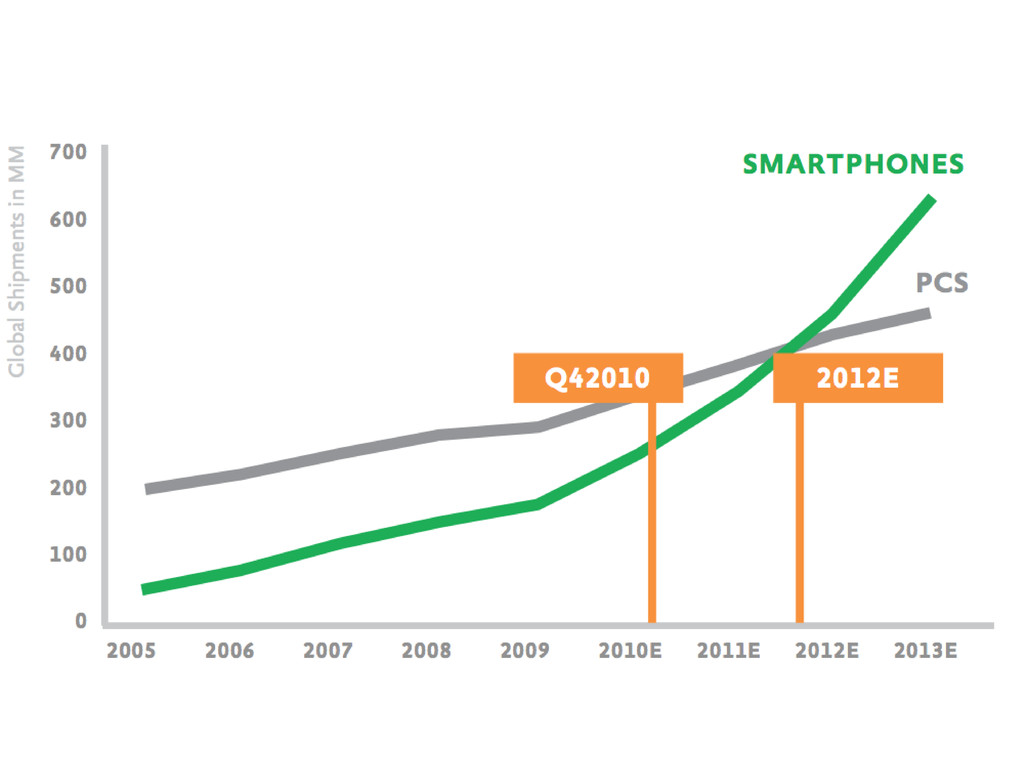
THAN PREDICTED. STUDIES HAVE PROJECTED THAT MOBILE INTERNET USE WILL SURPASS TRADITIONAL DESKTOP INTERNET USE BY 2014 (SOURCE: MARY MEEKER MORGAN STANLEY) ≈
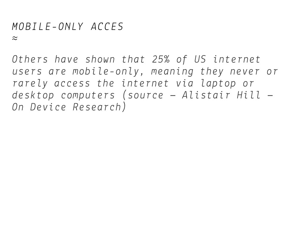
internet users are mobile-only, meaning they never or rarely access the internet via laptop or desktop computers (source – Alistair Hill – On Device Research)
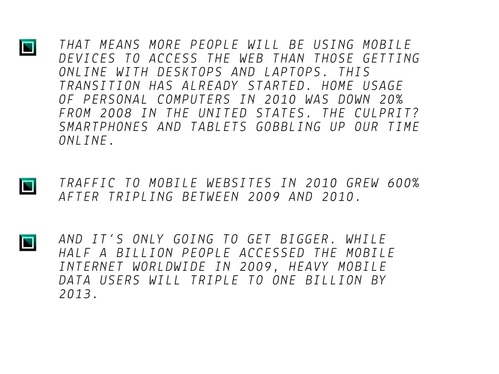
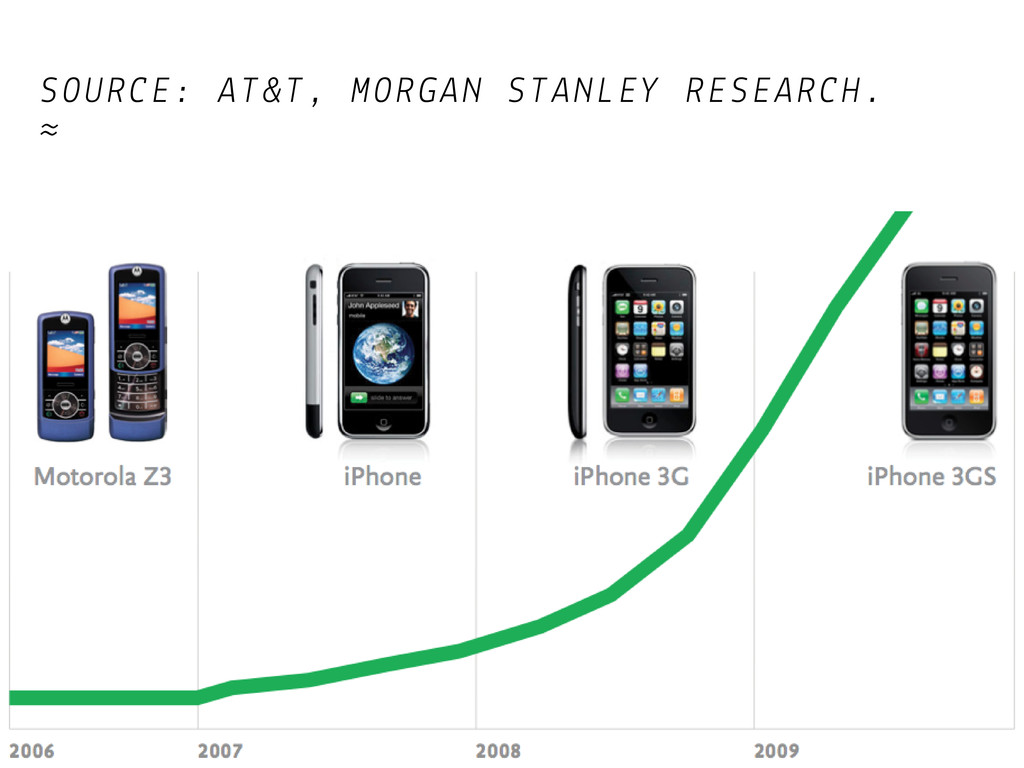
ACCESS THE WEB THAN THOSE GETTING ONLINE WITH DESKTOPS AND LAPTOPS. THIS TRANSITION HAS ALREADY STARTED. HOME USAGE OF PERSONAL COMPUTERS IN 2010 WAS DOWN 20% FROM 2008 IN THE UNITED STATES. THE CULPRIT? SMARTPHONES AND TABLETS GOBBLING UP OUR TIME ONLINE. TRAFFIC TO MOBILE WEBSITES IN 2010 GREW 600% AFTER TRIPLING BETWEEN 2009 AND 2010. AND IT’S ONLY GOING TO GET BIGGER. WHILE HALF A BILLION PEOPLE ACCESSED THE MOBILE INTERNET WORLDWIDE IN 2009, HEAVY MOBILE DATA USERS WILL TRIPLE TO ONE BILLION BY 2013.
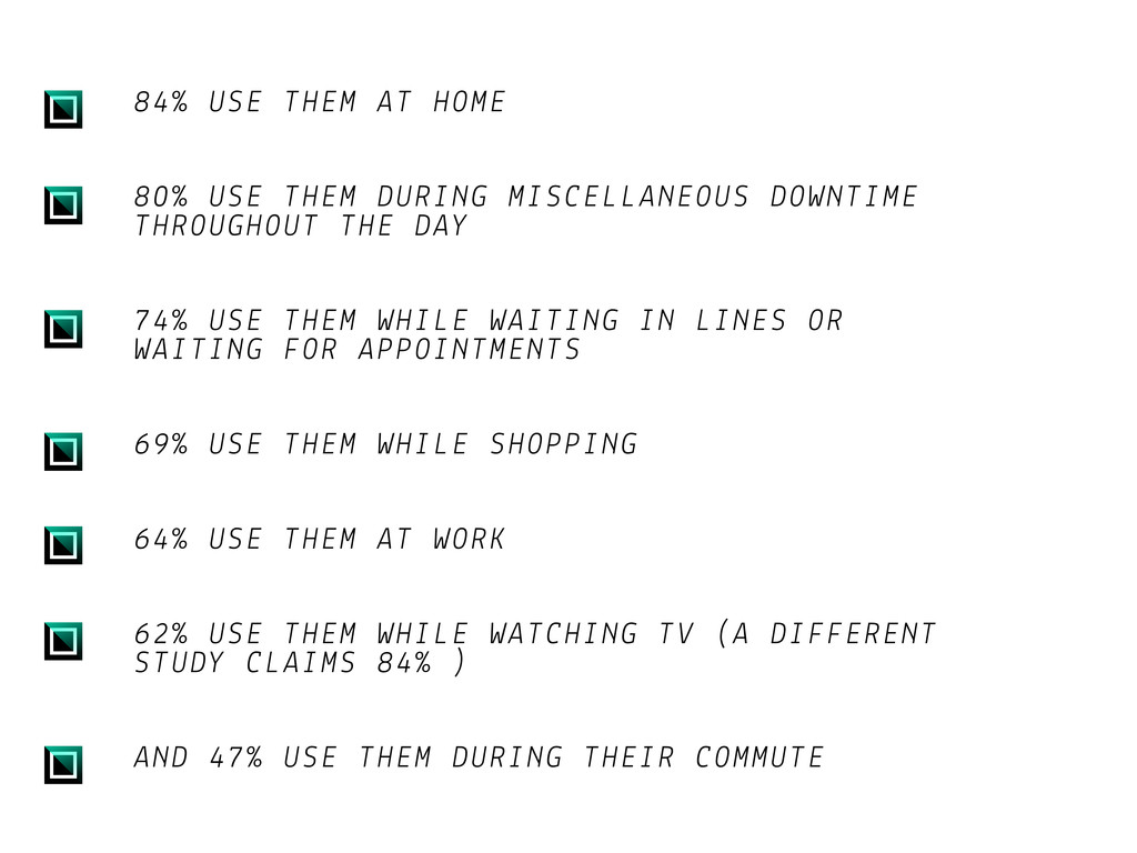
DOWNTIME THROUGHOUT THE DAY 74% USE THEM WHILE WAITING IN LINES OR WAITING FOR APPOINTMENTS 69% USE THEM WHILE SHOPPING 64% USE THEM AT WORK 62% USE THEM WHILE WATCHING TV (A DIFFERENT STUDY CLAIMS 84% ) AND 47% USE THEM DURING THEIR COMMUTE
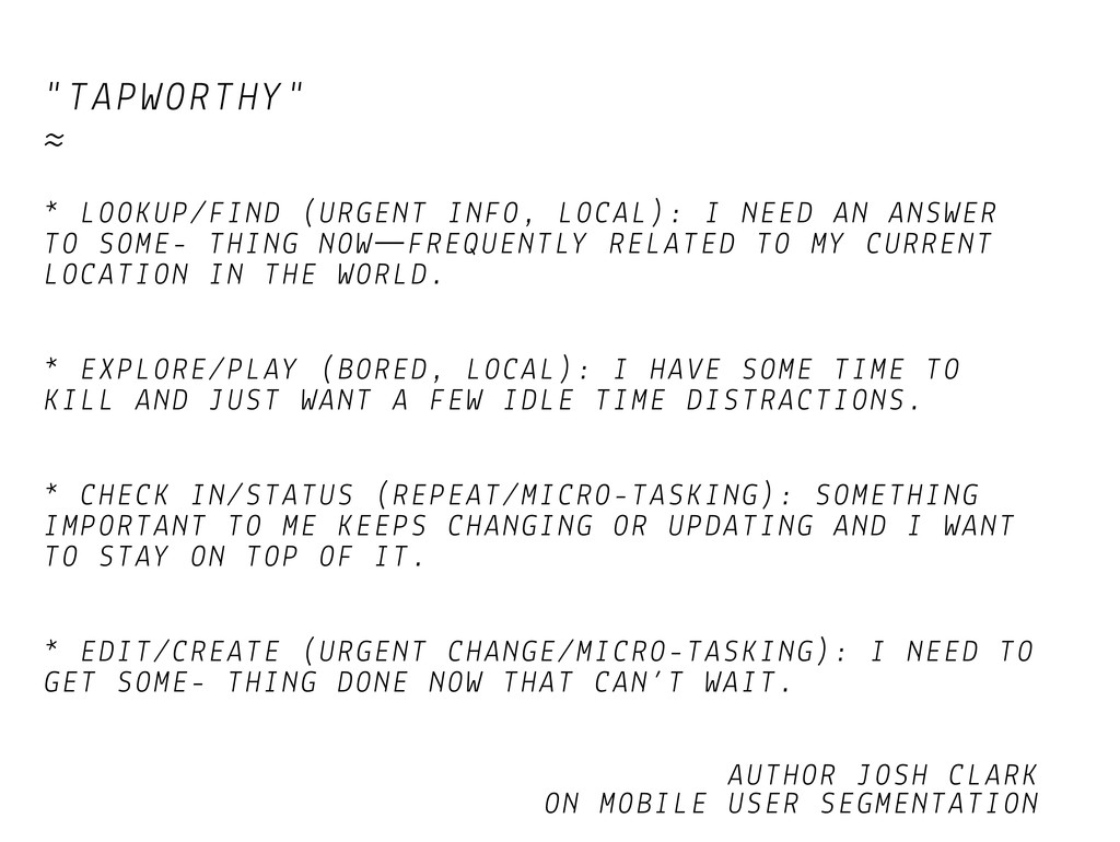
ANSWER TO SOME- THING NOW FREQUENTLY RELATED TO MY CURRENT LOCATION IN THE WORLD. * EXPLORE/PLAY (BORED, LOCAL): I HAVE SOME TIME TO KILL AND JUST WANT A FEW IDLE TIME DISTRACTIONS. * CHECK IN/STATUS (REPEAT/MICRO-TASKING): SOMETHING IMPORTANT TO ME KEEPS CHANGING OR UPDATING AND I WANT TO STAY ON TOP OF IT. * EDIT/CREATE (URGENT CHANGE/MICRO-TASKING): I NEED TO GET SOME- THING DONE NOW THAT CAN’T WAIT. AUTHOR JOSH CLARK ON MOBILE USER SEGMENTATION
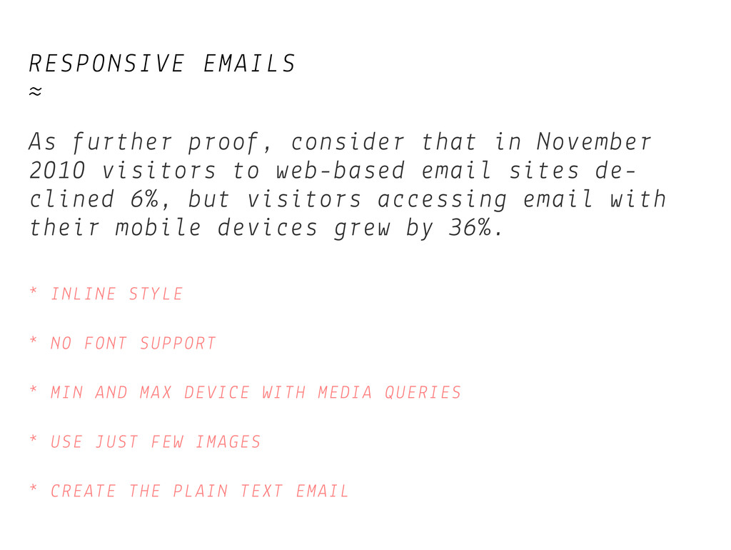
2010 visitors to web-based email sites de- clined 6%, but visitors accessing email with their mobile devices grew by 36%. * INLINE STYLE * NO FONT SUPPORT * MIN AND MAX DEVICE WITH MEDIA QUERIES * USE JUST FEW IMAGES * CREATE THE PLAIN TEXT EMAIL
stopping spam should not fall on your legitimate visitors. Making it more diffi- cult for real people to sign up for an account, request information, or otherwise fill out a form on your site is not worth the trade-off. The burden of spam control should fall squarely on the shoulders of the site owner, and not on the site visitor. Find a new way to control spam, preferably through better filtering and back-end management. This is not the first time a change like this has been proposed, but it’s time that it start being more widely adopted by the design community.
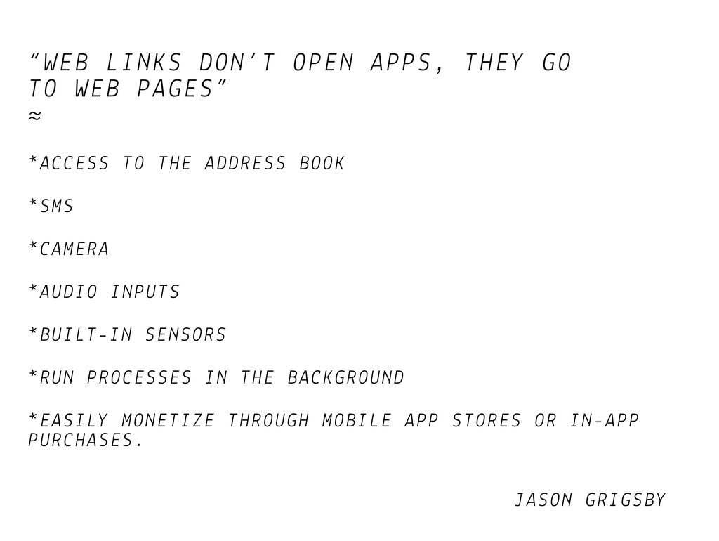
≈ *ACCESS TO THE ADDRESS BOOK *SMS *CAMERA *AUDIO INPUTS *BUILT-IN SENSORS *RUN PROCESSES IN THE BACKGROUND *EASILY MONETIZE THROUGH MOBILE APP STORES OR IN-APP PURCHASES. JASON GRIGSBY
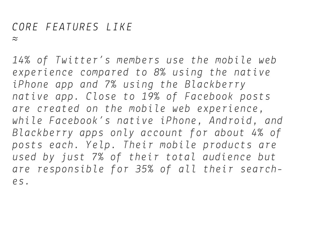
mobile web experience compared to 8% using the native iPhone app and 7% using the Blackberry native app. Close to 19% of Facebook posts are created on the mobile web experience, while Facebook’s native iPhone, Android, and Blackberry apps only account for about 4% of posts each. Yelp. Their mobile products are used by just 7% of their total audience but are responsible for 35% of all their search- es.
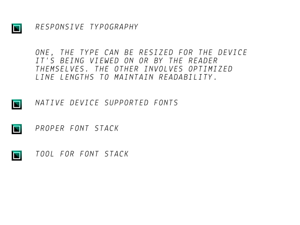
DEVICE IT'S BEING VIEWED ON OR BY THE READER THEMSELVES. THE OTHER INVOLVES OPTIMIZED LINE LENGTHS TO MAINTAIN READABILITY. NATIVE DEVICE SUPPORTED FONTS PROPER FONT STACK TOOL FOR FONT STACK
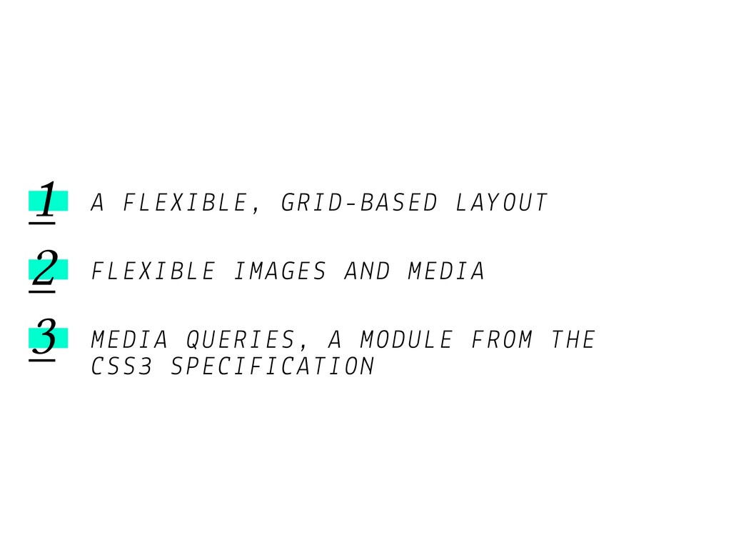
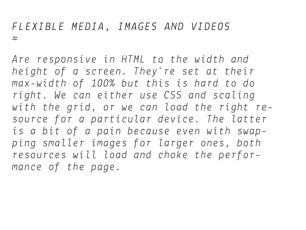
to the width and height of a screen. They're set at their max-width of 100% but this is hard to do right. We can either use CSS and scaling with the grid, or we can load the right re- source for a particular device. The latter is a bit of a pain because even with swap- ping smaller images for larger ones, both resources will load and choke the perfor- mance of the page.
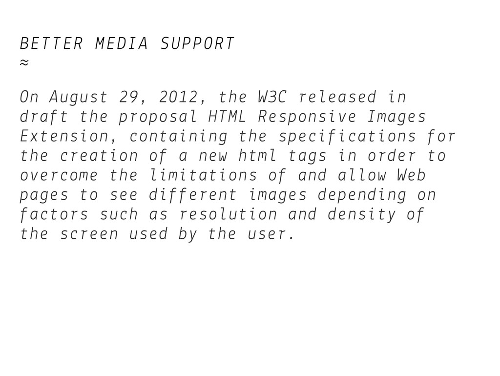
released in draft the proposal HTML Responsive Images Extension, containing the specifications for the creation of a new html tags in order to overcome the limitations of and allow Web pages to see different images depending on factors such as resolution and density of the screen used by the user.
 elacam
 goodpatch
 tararira
 chorkaichan
 satosio
 lynteo
 madoka_portfolio
 poteboy
 mixi_design
 gfht1
gfht1
 vivion
 payatsusan213
 centou
 nikkihalliwell
 charlesmeaden
 signer
 emna__ayadi
 portentint
 destraynor
 ivargrimstad
 palkan
 lemiorhan
 codingconduct
 cassininazir
 akademiya2063
![CONTACTS › http://www.thedoersproject.com [email protected] ≈ http://arcadiaproject.github.com [email protected] ≈](https://files.speakerdeck.com/presentations/d29e7550a0570130ed0d0ebc2299228d/slide_49.jpg)