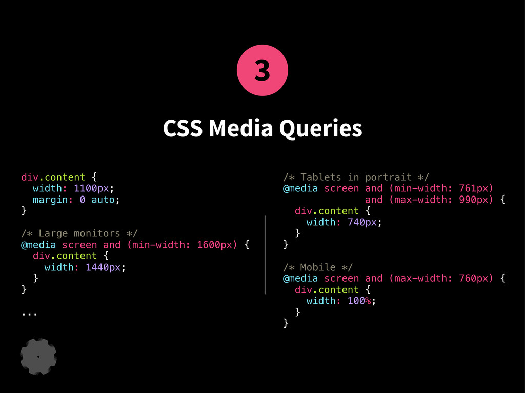
auto; } /* Large monitors */ @media screen and (min-width: 1600px) { div.content { width: 1440px; } } ... /* Tablets in portrait */ @media screen and (min-width: 761px) and (max-width: 990px) { div.content { width: 740px; } } /* Mobile */ @media screen and (max-width: 760px) { div.content { width: 100%; } }
 erikfrisk
 youkidearitai
 yuukiw00w
 thatjeffsmith
 nyafunta9858
 daisuketakeda
 tosuri13
 javiergs
 kamina_zzz
 taku271
 shibayu36
 haochenx
 tomtanaka
 morganepeng
 shlominoach
 shpigford
 sarafernandez
 lfama
lfama
 mclloyd
 productmarketing
 katiecoart
 wayneb77
 jnunemaker
 stephenakadiri
 mojombo
![Responsive Web Design ... in a nutshell. leanmachine.se ▪ [email protected]](https://files.speakerdeck.com/presentations/eb12d900046f01316bc612fad4c95050/slide_0.jpg)
![leanmachine.se ▪ [email protected] ▪ 2013-09-06](https://files.speakerdeck.com/presentations/eb12d900046f01316bc612fad4c95050/slide_25.jpg)