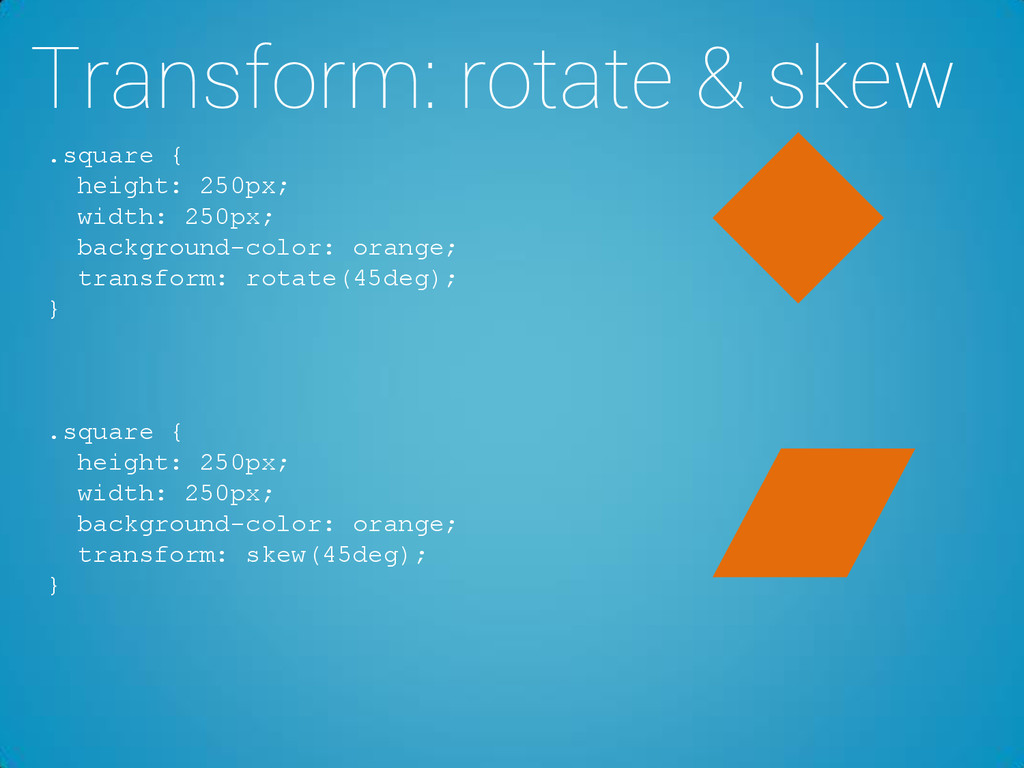
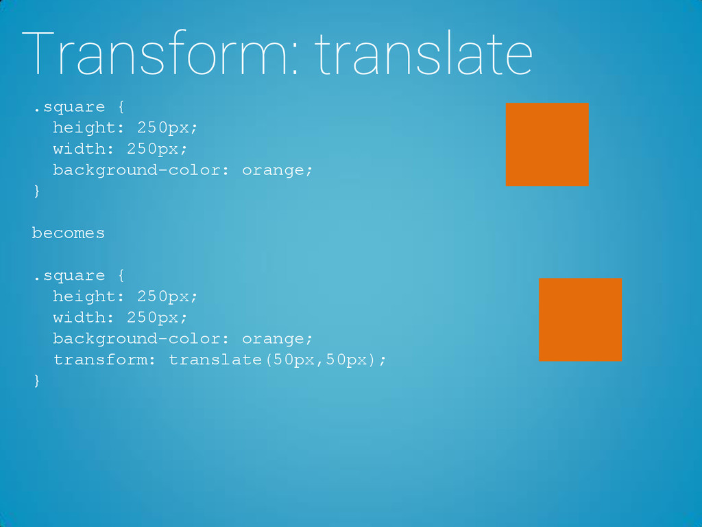
of an element, both 50% horizontally and 50% vertically. .square { transform: rotate(45deg); transform-origin: right top; } .square { transform: rotate(45deg); transform-origin: 100% 100%; }
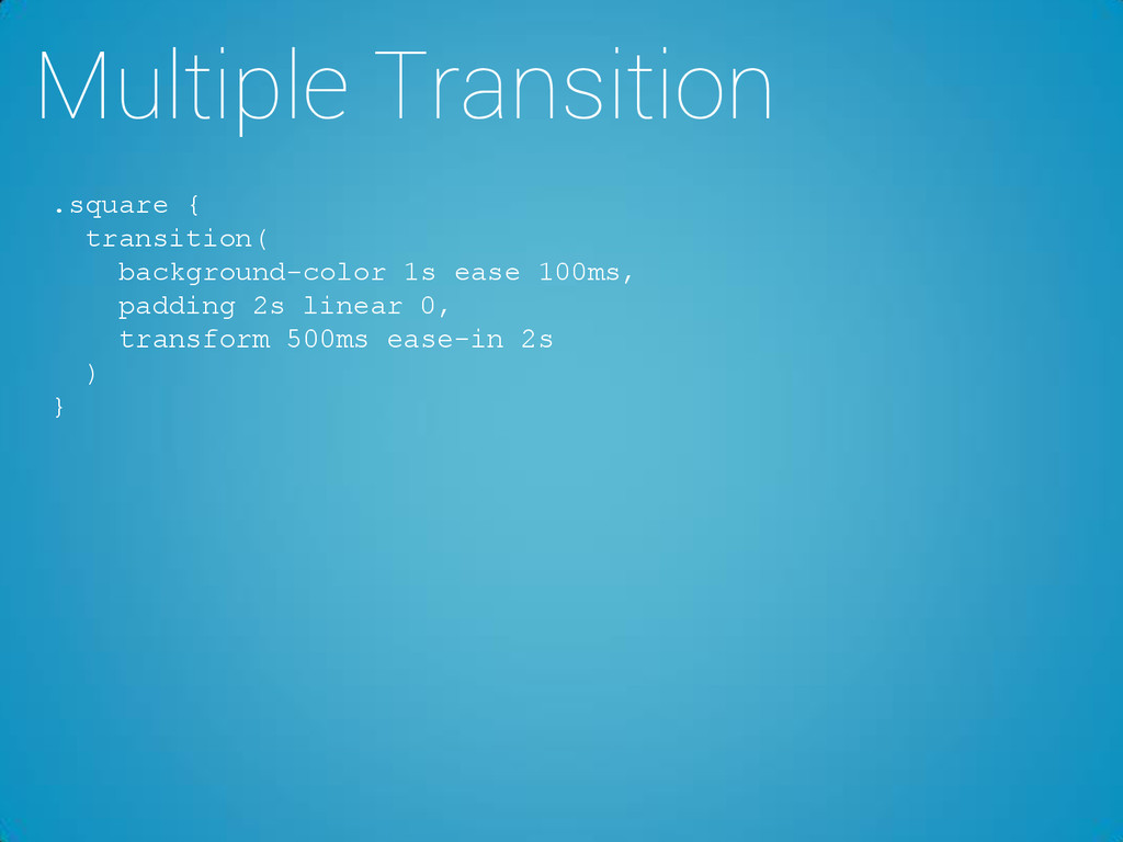
transition effect is for transition-property: width; //how many seconds or milliseconds a transition effect takes to complete transition-duration: 1s; //the speed curve of the transition effect transition-timing-function: linear; //when the transition effect will start transition-delay: 2s; } .square { transition: width 1s linear 2s; }
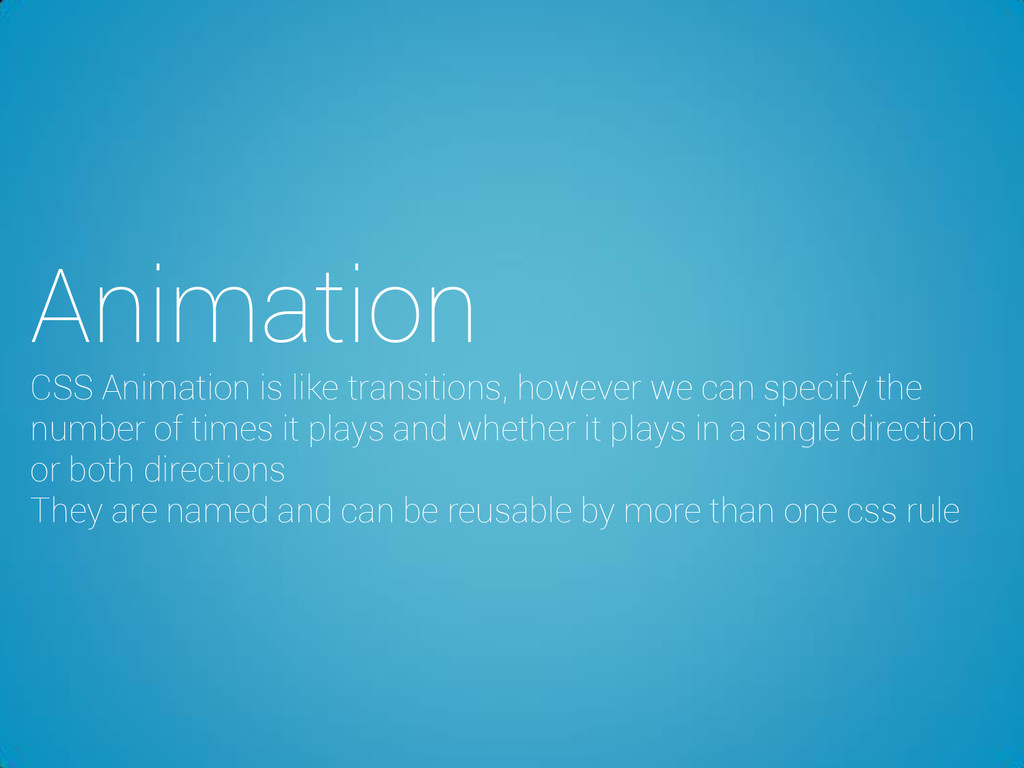
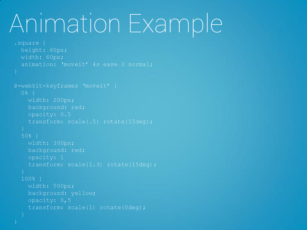
the number of times it plays and whether it plays in a single direction or both directions They are named and can be reusable by more than one css rule
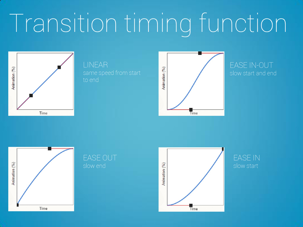
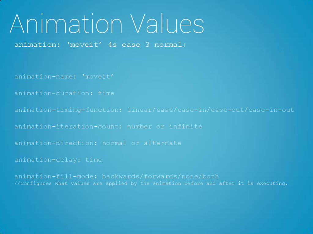
animation-duration: time animation-timing-function: linear/ease/ease-in/ease-out/ease-in-out animation-iteration-count: number or infinite animation-direction: normal or alternate animation-delay: time animation-fill-mode: backwards/forwards/none/both //Configures what values are applied by the animation before and after it is executing.
 fevr
fevr
 ichimichi
 ykagano
 fossamagna
 ynisqa1988
 i35_267
 scrummasudar
 quiver
 tomzoh
 ks91
ks91
 yama3133
 yakumo
 segavvy
 hatefulcrawdad
 popppiees
 jonoalderson
 keavy
keavy
 palkan
 akademiya2063
 csswizardry
 mayatellez
 jnunemaker
 kimpetersen
 tanoku
 jacobian