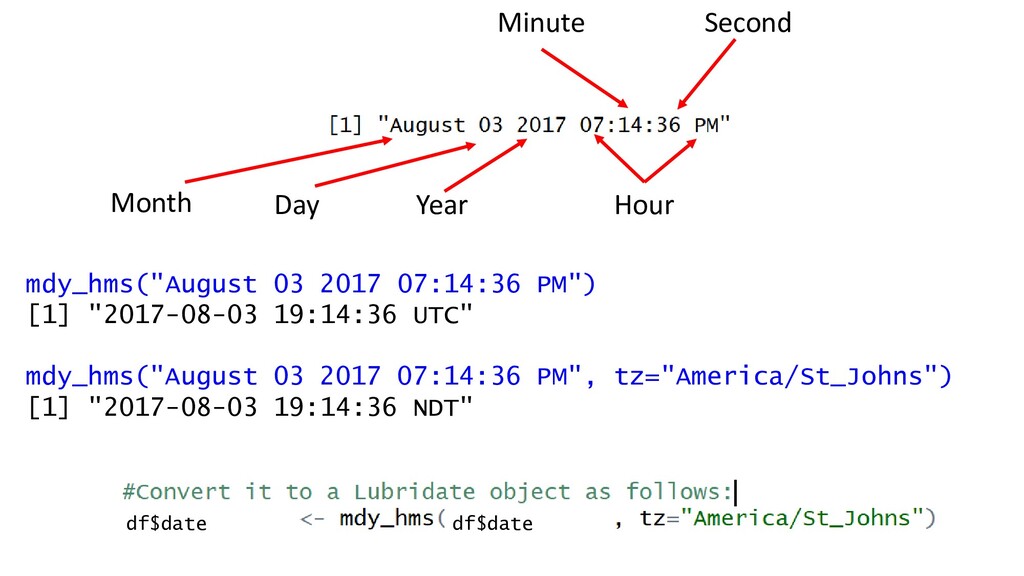
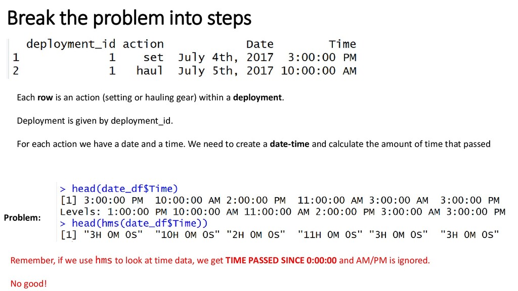
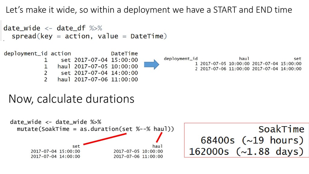
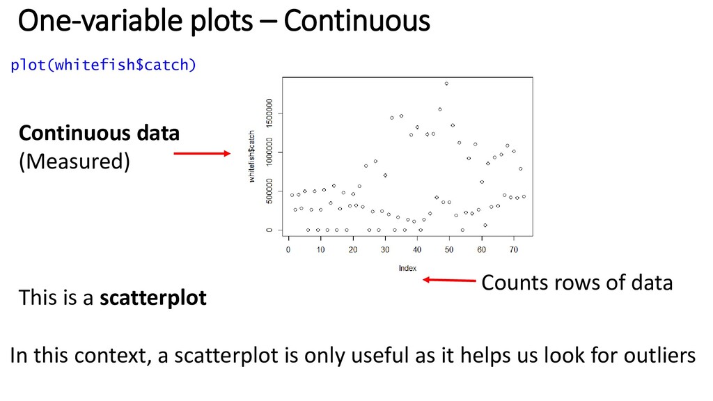
(setting or hauling gear) within a deployment. Deployment is given by deployment_id. For each action we have a date and a time. We need to create a date-time and calculate the amount of time that passed Problem: Remember, if we use hms to look at time data, we get TIME PASSED SINCE 0:00:00 and AM/PM is ignored. No good!
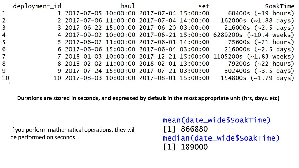
the most appropriate unit (hrs, days, etc) mean(date_wide$SoakTime) [1] 866880 median(date_wide$SoakTime) [1] 189000 If you perform mathematical operations, they will be performed on seconds
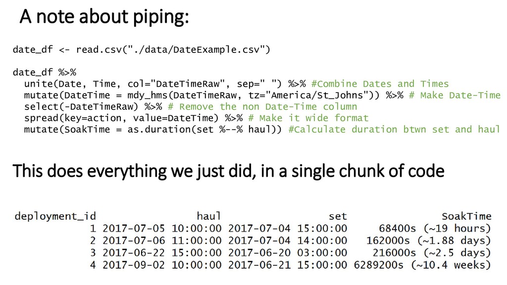
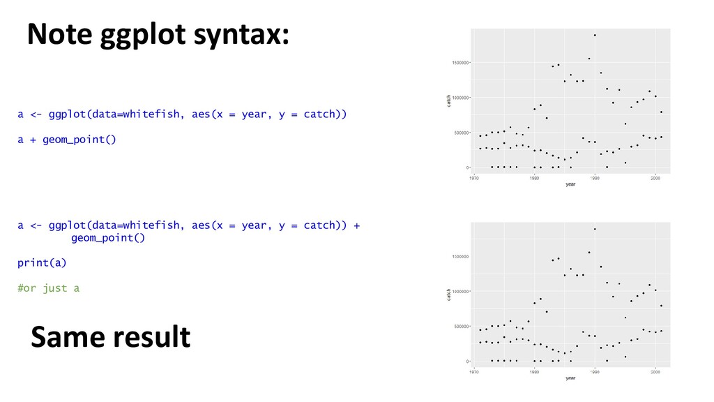
%>% #Combine Dates and Times mutate(DateTime = mdy_hms(DateTimeRaw, tz="America/St_Johns")) %>% # Make Date-Time select(-DateTimeRaw) %>% # Remove the non Date-Time column spread(key=action, value=DateTime) %>% # Make it wide format mutate(SoakTime = as.duration(set %--% haul)) #Calculate duration btwn set and haul A note about piping: This does everything we just did, in a single chunk of code
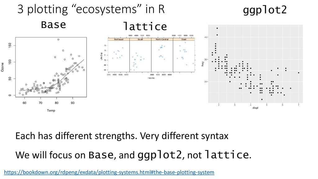
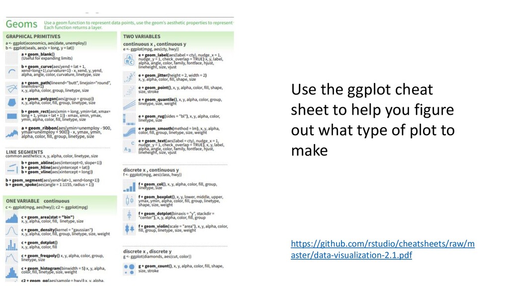
different strengths. Very different syntax We will focus on Base, and ggplot2, not lattice. https://bookdown.org/rdpeng/exdata/plotting-systems.html#the-base-plotting-system
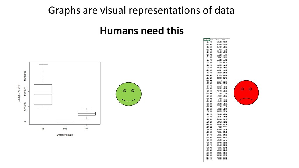
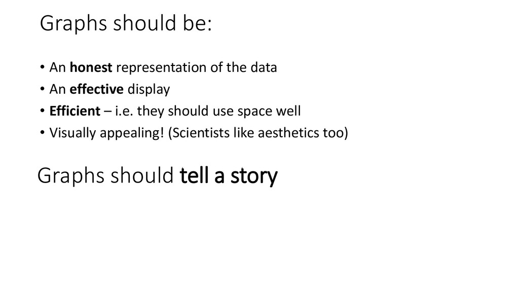
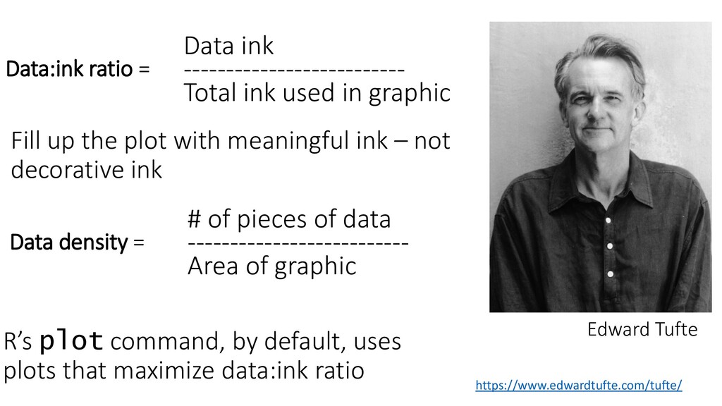
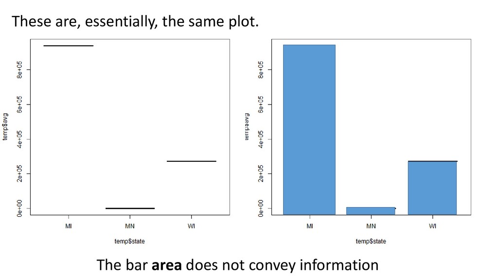
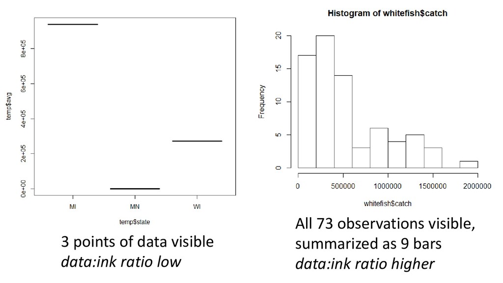
ratio = Fill up the plot with meaningful ink – not decorative ink # of pieces of data -------------------------- Area of graphic Data density = R’s plot command, by default, uses plots that maximize data:ink ratio Edward Tufte
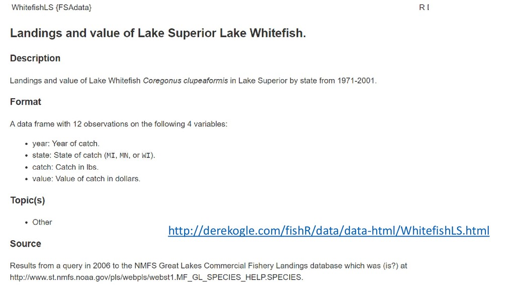
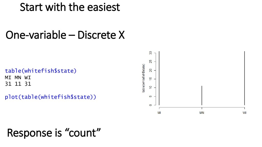
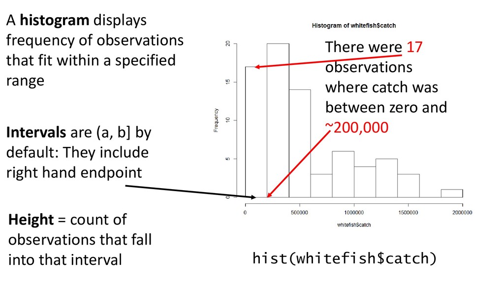
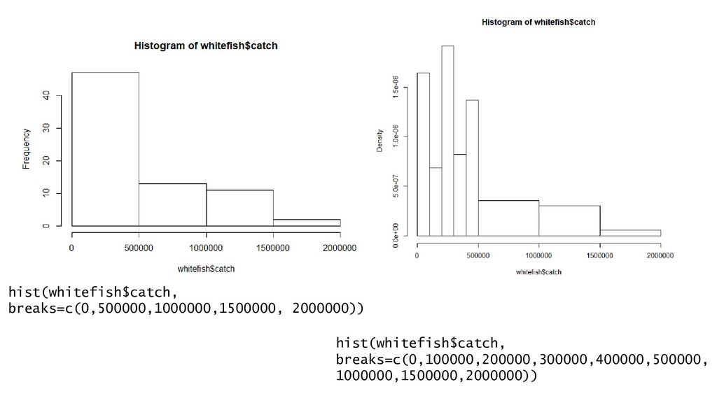
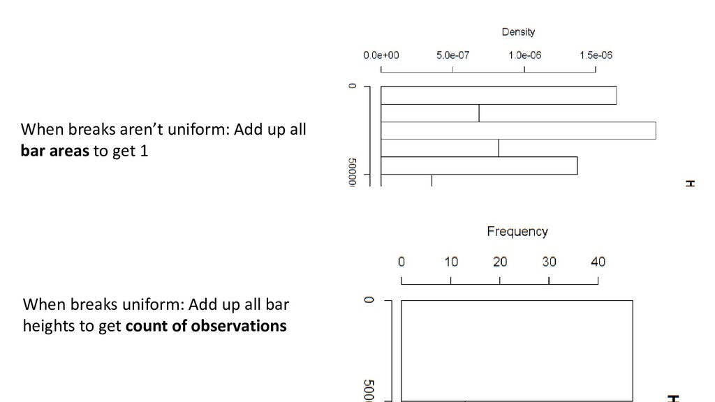
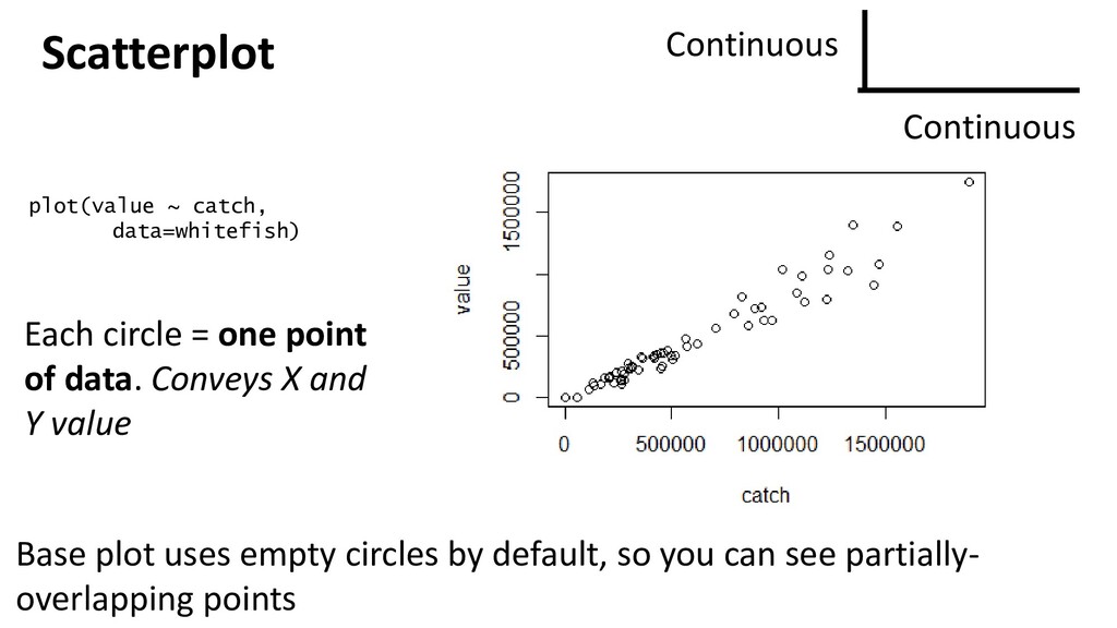
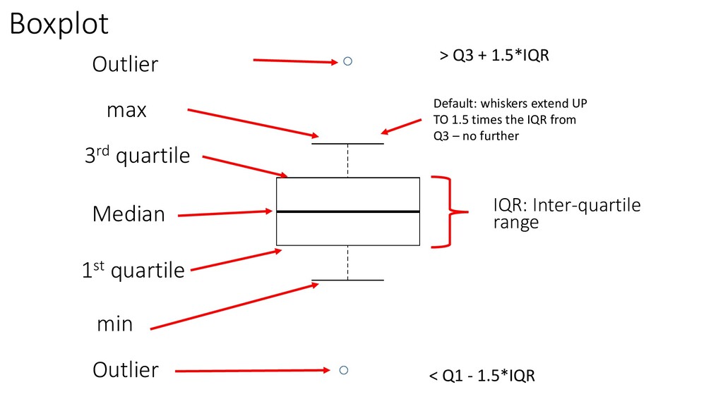
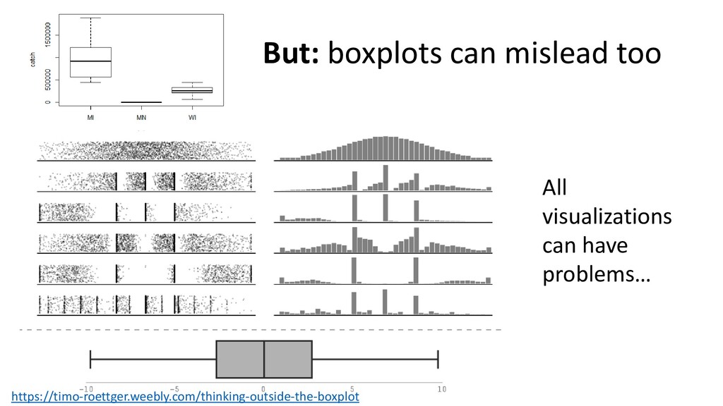
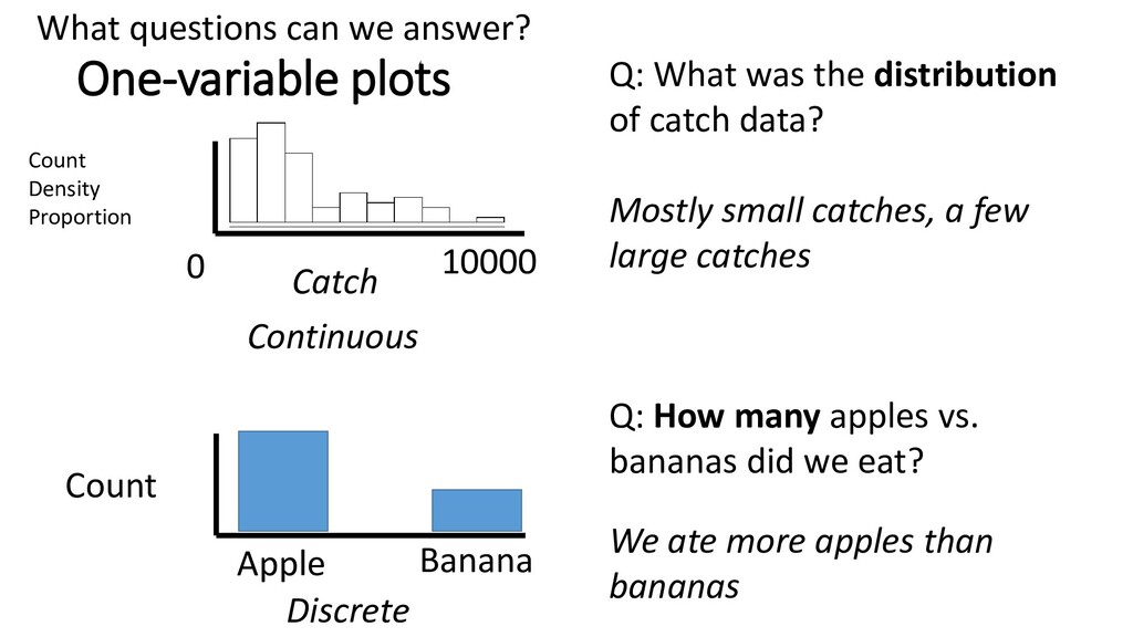
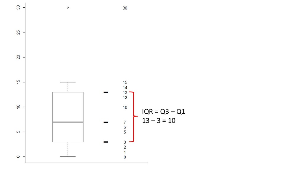
specified range Height = count of observations that fall into that interval Intervals are (a, b] by default: They include right hand endpoint There were 17 observations where catch was between zero and ~200,000 hist(whitefish$catch)
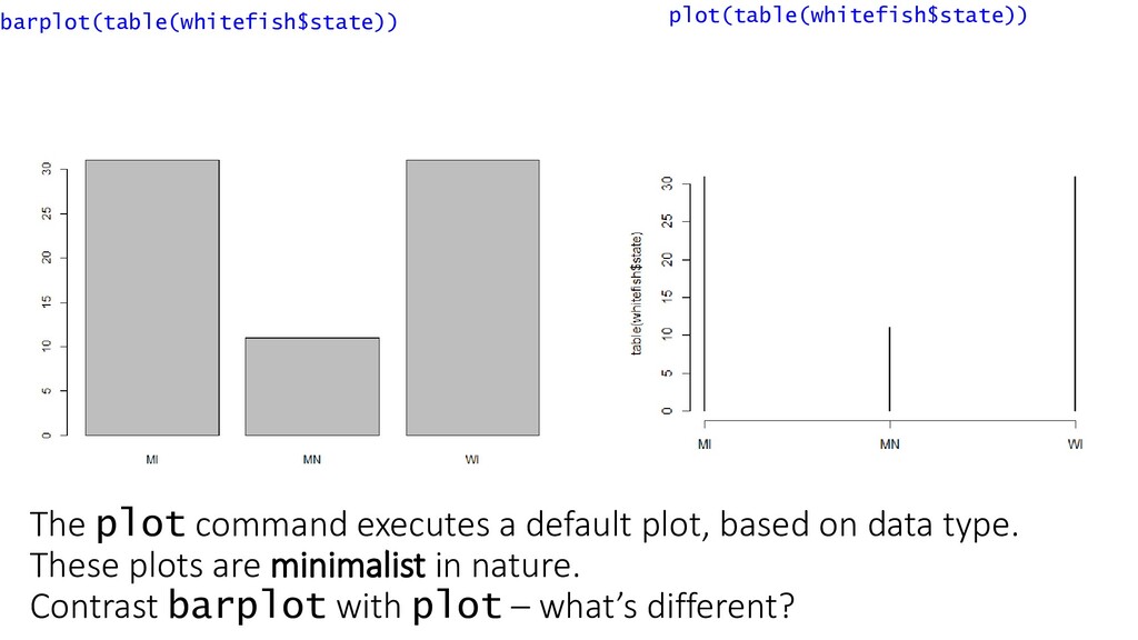
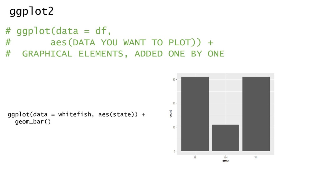
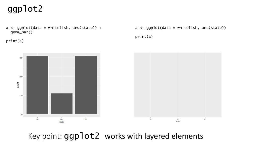
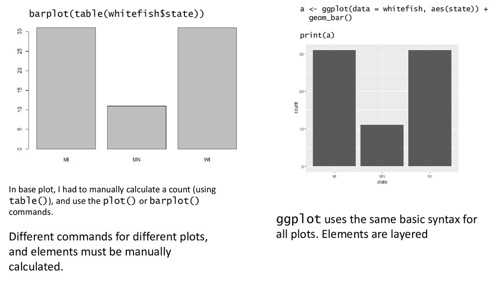
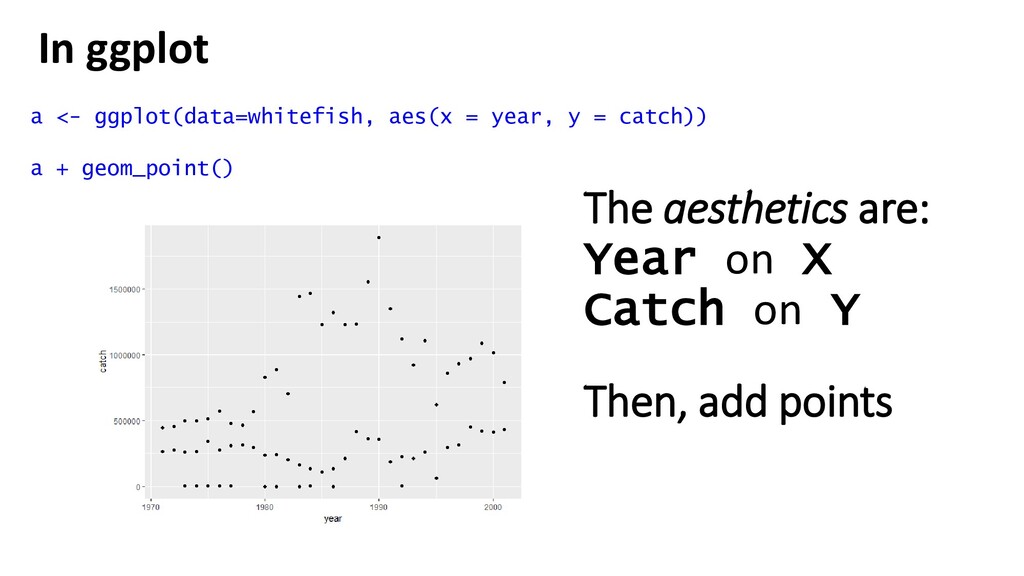
In base plot, I had to manually calculate a count (using table()), and use the plot() or barplot() commands. Different commands for different plots, and elements must be manually calculated. ggplot uses the same basic syntax for all plots. Elements are layered
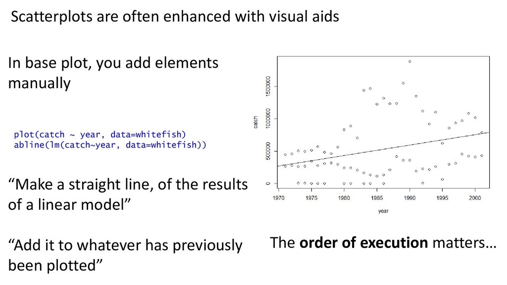
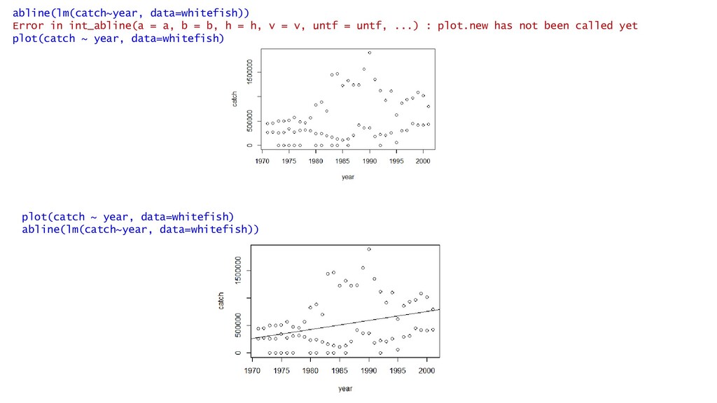
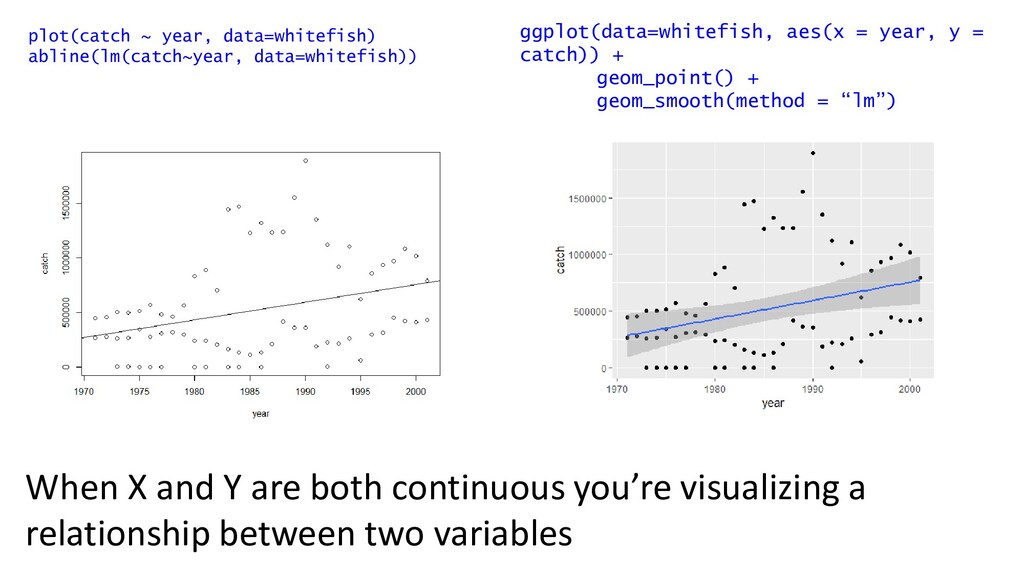
line, of the results of a linear model” “Add it to whatever has previously been plotted” Scatterplots are often enhanced with visual aids plot(catch ~ year, data=whitefish) abline(lm(catch~year, data=whitefish)) The order of execution matters…
h = h, v = v, untf = untf, ...) : plot.new has not been called yet plot(catch ~ year, data=whitefish) plot(catch ~ year, data=whitefish) abline(lm(catch~year, data=whitefish))
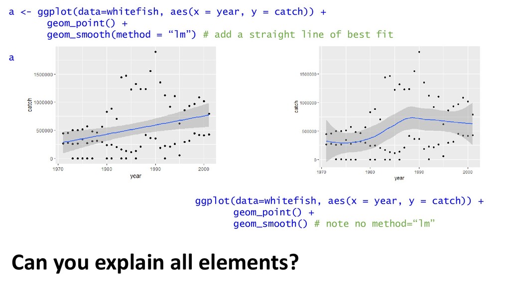
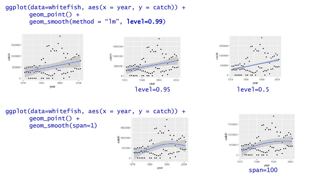
geom_point() + geom_smooth(method = “lm”) # add a straight line of best fit a ggplot(data=whitefish, aes(x = year, y = catch)) + geom_point() + geom_smooth() # note no method=“lm” Can you explain all elements?
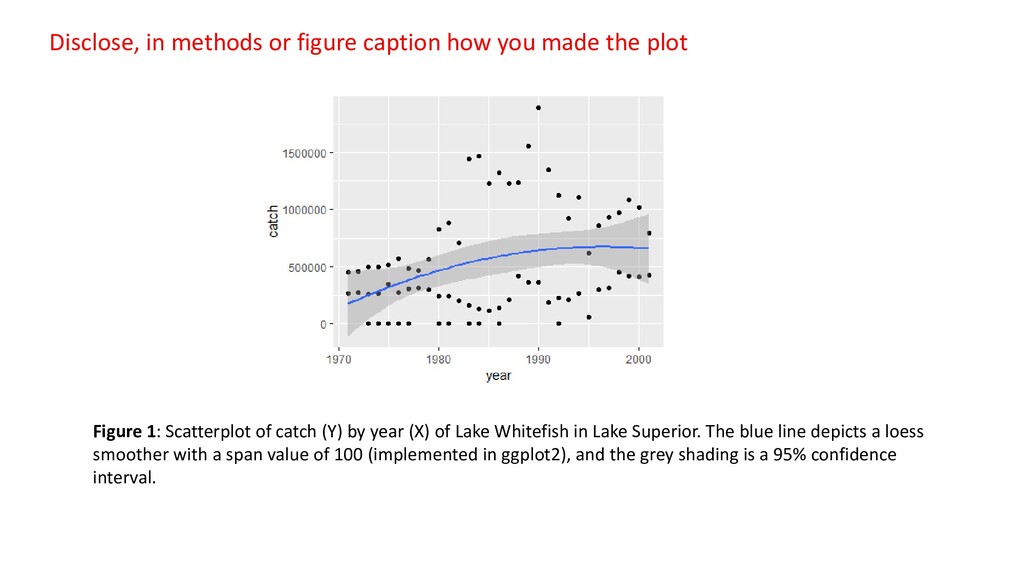
plot Figure 1: Scatterplot of catch (Y) by year (X) of Lake Whitefish in Lake Superior. The blue line depicts a loess smoother with a span value of 100 (implemented in ggplot2), and the grey shading is a 95% confidence interval.
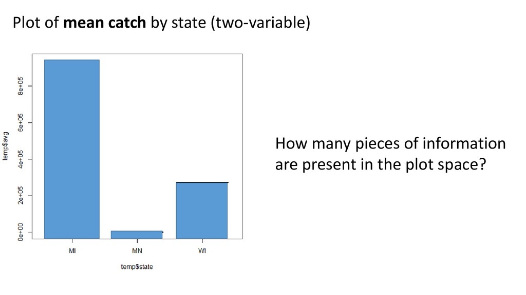
many points of data are shown? - Is data:ink ratio high or low? - Is data density high or low? - How many points of data are shown? - Is data:ink ratio higher, lower, or same? - Is data density higher, lower, or same?
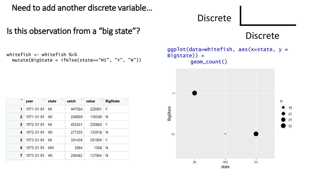
whitefish %>% mutate(BigState = ifelse(state=="MI", "Y", "N")) Is this observation from a “big state”? ggplot(data=whitefish, aes(x=state, y = BigState)) + geom_count()
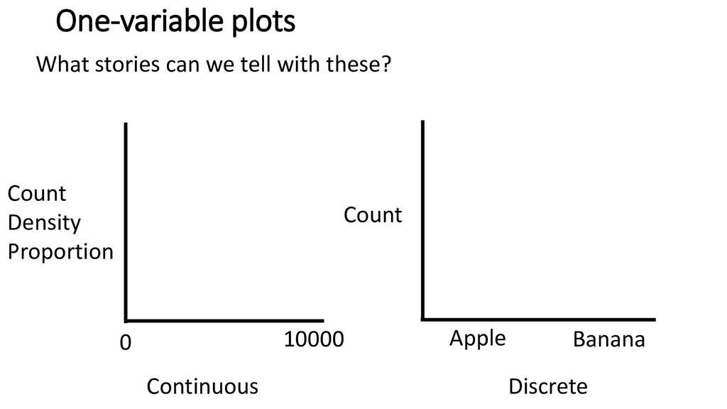
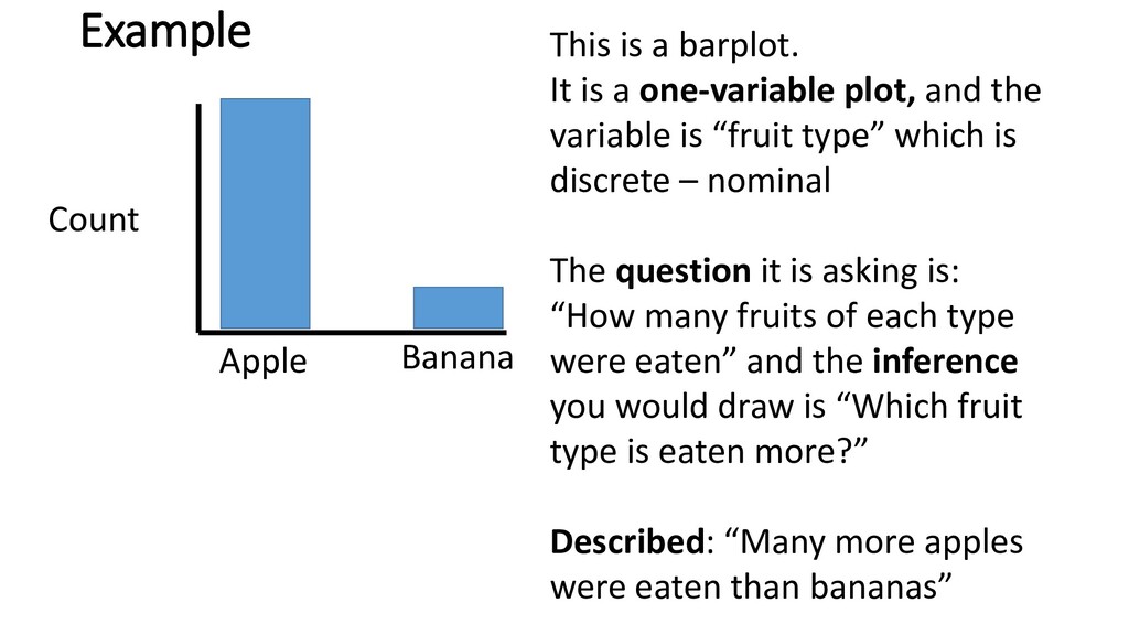
10000 Apple Banana Count Count Density Proportion Q: How many apples vs. bananas did we eat? We ate more apples than bananas Q: What was the distribution of catch data? Mostly small catches, a few large catches Catch
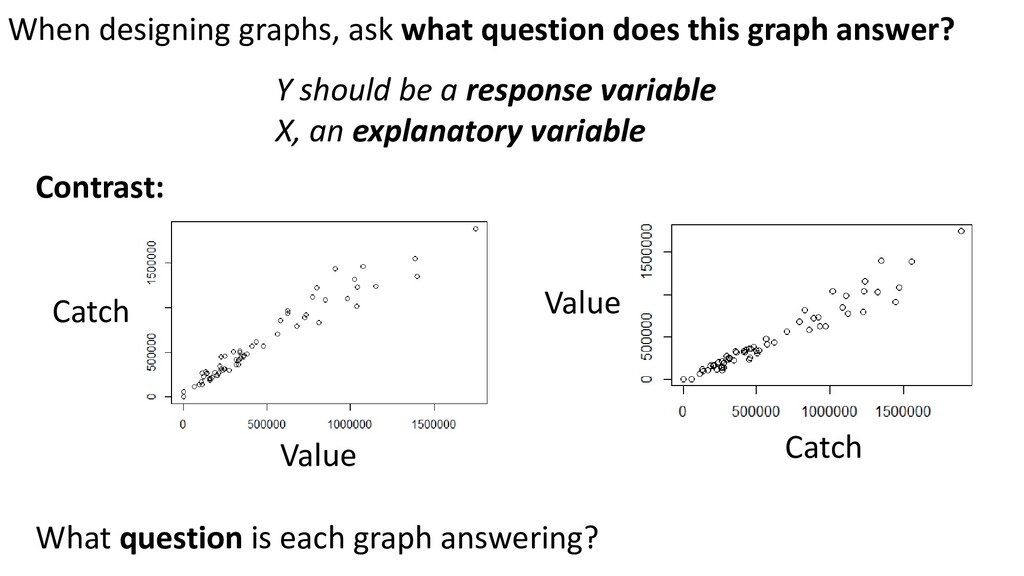
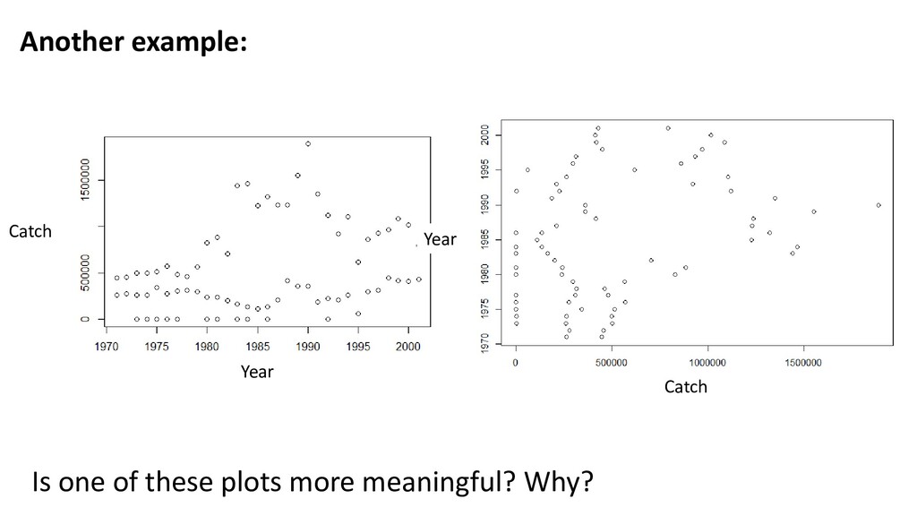
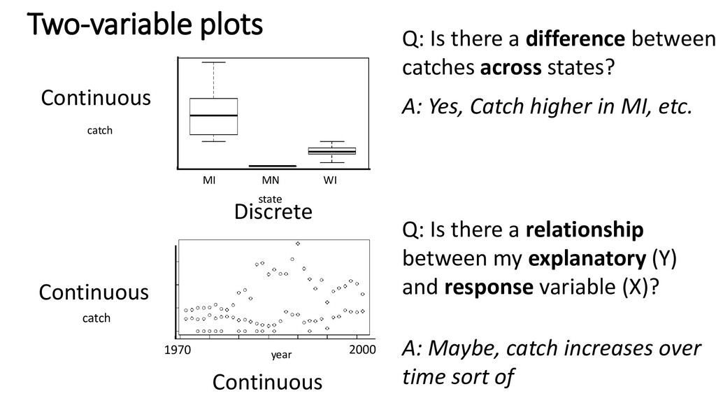
relationship between my explanatory (Y) and response variable (X)? year catch 1970 2000 A: Maybe, catch increases over time sort of state catch Q: Is there a difference between catches across states? A: Yes, Catch higher in MI, etc. MI MN WI
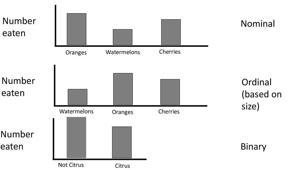
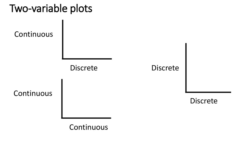
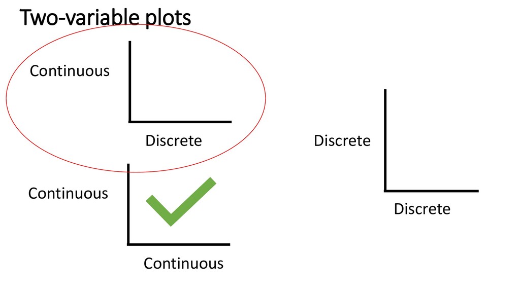
The second most important part is accurately describing your data: - Continuous? - Discrete - Ordinal - Nominal - Binary 3rd: Decide what is explanatory and what is response variables (for two-variable plots) Finally… make the graph! (In base or ggplot)
take one. • What type of graph is it? • What type(s) of data are in the graph? (discrete, continuous) • What question is the graph asking? • What inference could you draw from this graph? • Describe the main finding shown in the graph
a one-variable plot, and the variable is “fruit type” which is discrete – nominal The question it is asking is: “How many fruits of each type were eaten” and the inference you would draw is “Which fruit type is eaten more?” Described: “Many more apples were eaten than bananas”
take one. • What type of graph is it? • What type(s) of data are in the graph? (discrete, continuous) • What question is the graph asking? • What inference could you draw from this graph? • Describe the main finding shown in the graph
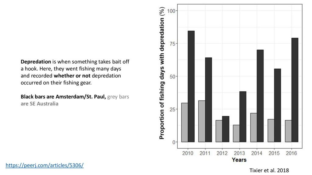
bait off a hook. Here, they went fishing many days and recorded whether or not depredation occurred on their fishing gear. Black bars are Amsterdam/St. Paul, grey bars are SE Australia
![Ellen Edmonson and Hugh Chrisp [Public domain]](https://files.speakerdeck.com/presentations/f8fc9cb53a5a46ebabbaa95c49796510/slide_2.jpg)
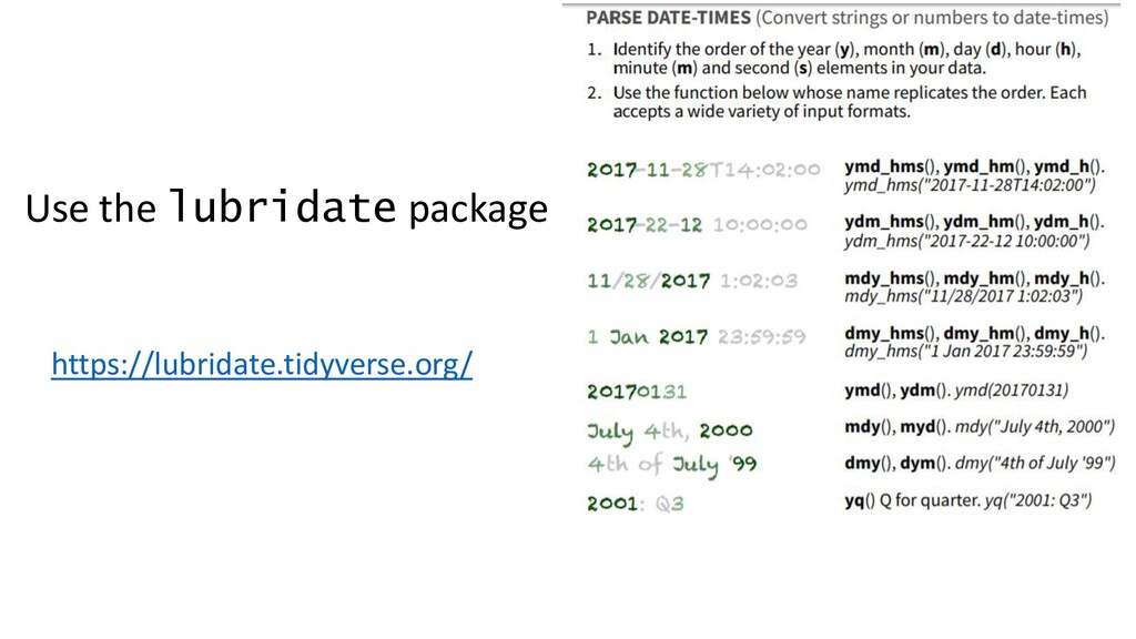
![[1] "2017/08/03 13:53" Month Day Year Hour Minute ymd_hm("2017/08/03 13:53",](https://files.speakerdeck.com/presentations/f8fc9cb53a5a46ebabbaa95c49796510/slide_7.jpg)
![> dmy("3/8/2017") [1] "2017-08-03" > dmy("3/August/2017") [1] "2017-08-03" > dmy("3/Aug/2017")](https://files.speakerdeck.com/presentations/f8fc9cb53a5a46ebabbaa95c49796510/slide_8.jpg)
![Datetime ymd_hm("2017/08/03 13:53", tz="America/St_Johns") [1] "2017-08-03 13:53:00 NDT" hm("13:53") [1]](https://files.speakerdeck.com/presentations/f8fc9cb53a5a46ebabbaa95c49796510/slide_9.jpg)