Upgrade to Pro — share decks privately, control downloads, hide ads and more …

FISH 6002: Week 8 - Displaying Data Visually 2

FISH 6002: Week 8 - Displaying Data Visually 2

Re-uploaded Oct 28 2019

MI Fisheries Science

October 11, 2017
Tweet

More Decks by MI Fisheries Science

Other Decks in Science

Transcript

  1. Week 8: Displaying Data Visually 2 Happy Halloween! FISH 6000:

    Science Communication for Fisheries Brett Favaro 2017 This work is licensed under a Creative Commons Attribution 4.0 International License
  2. One-variable plots Continuous Discrete 0 10000 Apple Banana Count Count

    Density Proportion Catch Two-variable plots Discrete Continuous Continuous Continuous year catch 1970 2000 state catch MI MN WI
  3. Week 8: • Plot customization • Axes, scales, sizes •

    Prepping for publication • Figure captions • In-class activity (Prep a figure for publication)
  4. Plot weight on Y Length on X What type of

    variables are these? Continuous Continuous What type of plot is appropriate? Weight is our ____ variable Length is our ____ variable
  5. Is this publishable? a <- ggplot(data = perch, aes(x =

    length, y = weight)) + geom_point() print(a) Warning message: Removed 5896 rows containing missing values (geom_point). Note the warning!
  6. 2. Data density Lots of data Options? • Zoom in?

    • No – would cut off high values • Make points smaller? • Might help with overplotting but won’t solve density problem When data look like this, consider a log-log transformation
  7. a + scale_y_log10() + scale_x_log10() # great! No modifications are

    made to the data. Only the visualization is changed Also… why log10()? To R, log() is natural log Need to specify log10 log(10) [1] 2.302585 log10(10) [1] 1
  8. But… Unused space > a + scale_y_log10() + scale_x_log10(limits =

    c(25, 300)) limits = c(start, end) X, because it’s in scale_x_log10() Q: How would you set limits on Y axis?
  9. Insufficient information on X. Need more axis ticks a +

    scale_y_log10() + scale_x_log10(limits = c(25, 300), breaks= seq(from=25, to=300, by=75)) seq() makes a number sequence Here, same as: c(25, 100, 175, 250)
  10. 5. Final polish Make axis ticks and labels larger a

    + theme(axis.text = element_text(size=16), axis.title = element_text(size=18)) Style changes are done within theme()
  11. theme(line, rect, text, title, aspect.ratio, axis.title, axis.title.x, axis.title.x.top, axis.title.x.bottom, axis.title.y,

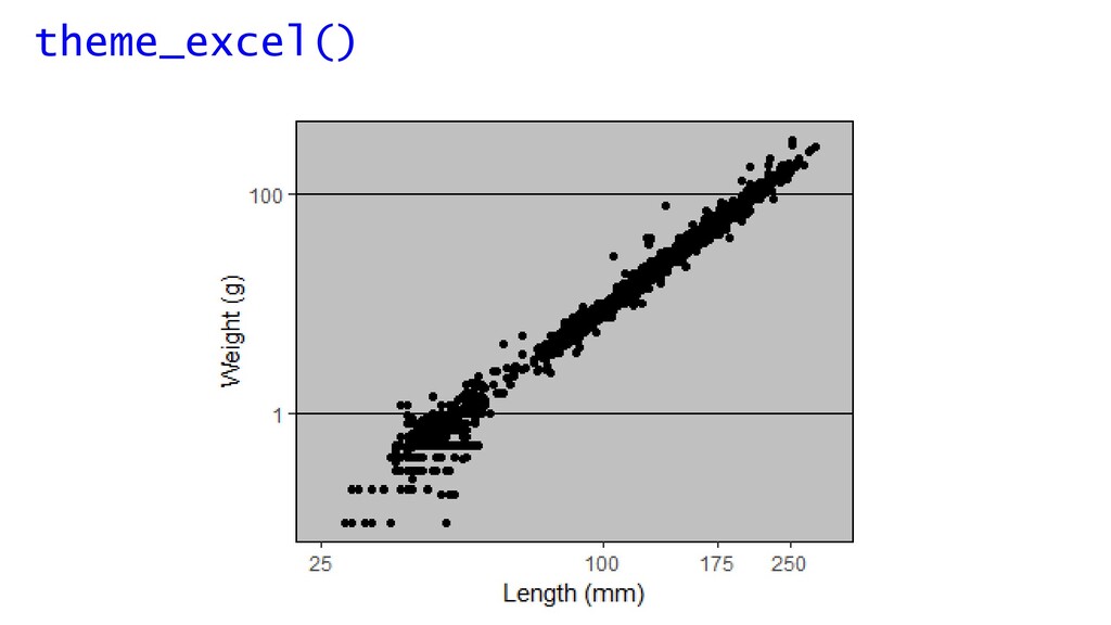
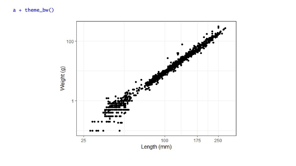
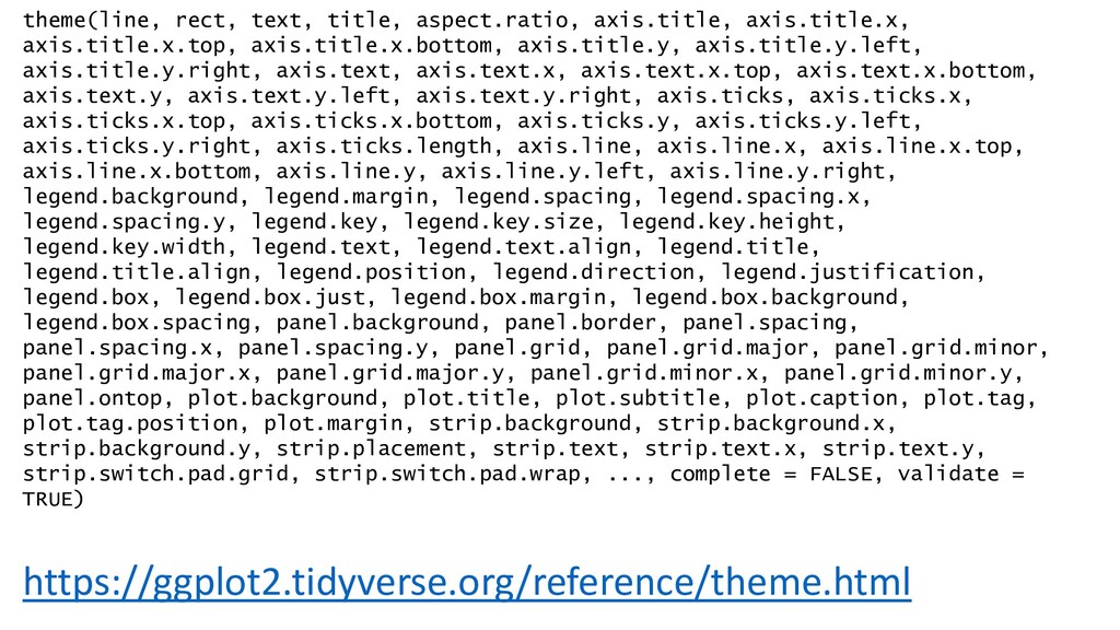
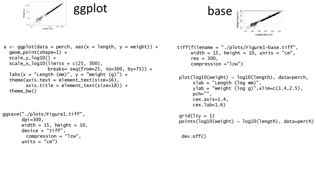
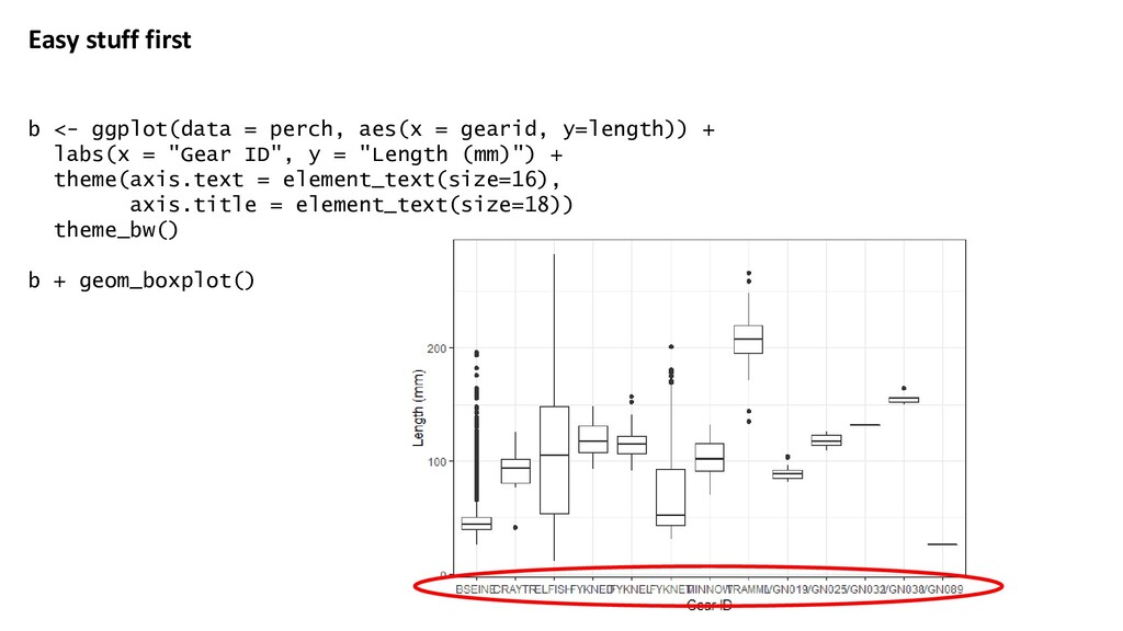
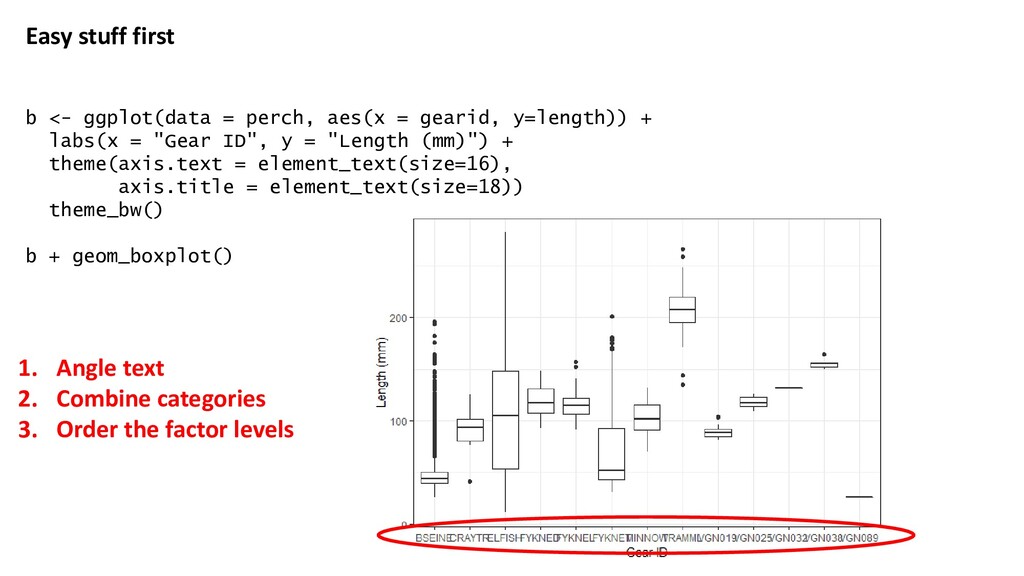
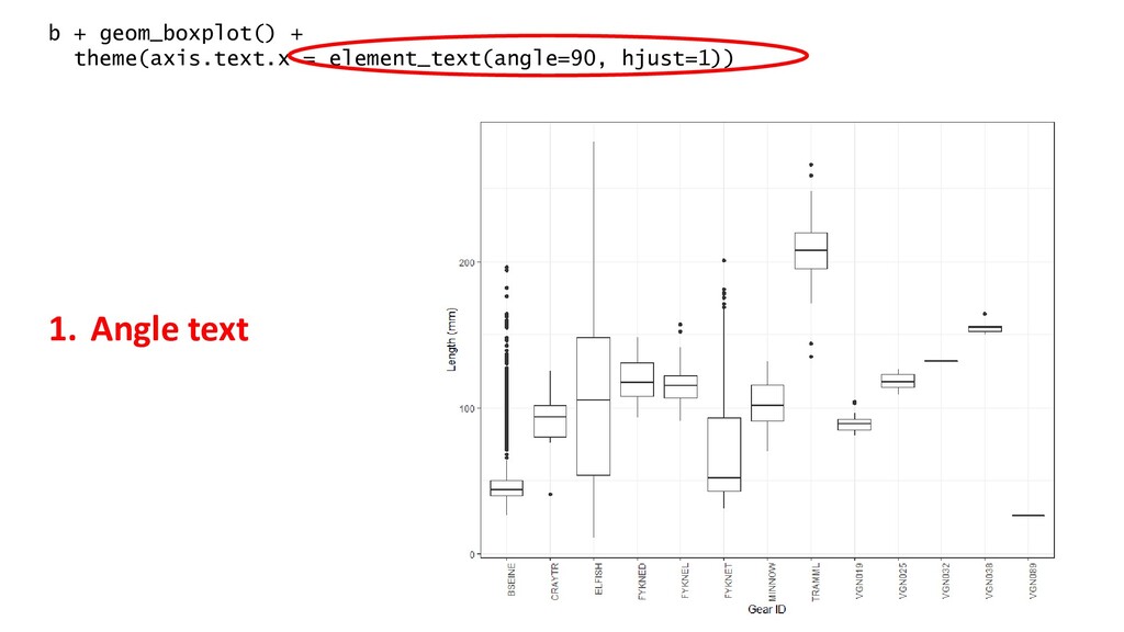
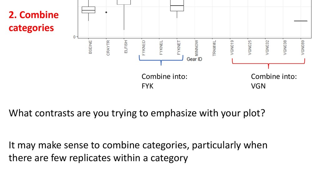
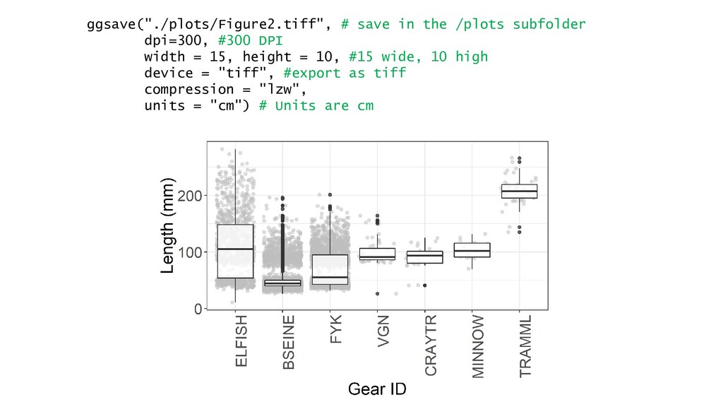
    axis.title.y.left, axis.title.y.right, axis.text, axis.text.x, axis.text.x.top, axis.text.x.bottom, axis.text.y, axis.text.y.left, axis.text.y.right, axis.ticks, axis.ticks.x, axis.ticks.x.top, axis.ticks.x.bottom, axis.ticks.y, axis.ticks.y.left, axis.ticks.y.right, axis.ticks.length, axis.line, axis.line.x, axis.line.x.top, axis.line.x.bottom, axis.line.y, axis.line.y.left, axis.line.y.right, legend.background, legend.margin, legend.spacing, legend.spacing.x, legend.spacing.y, legend.key, legend.key.size, legend.key.height, legend.key.width, legend.text, legend.text.align, legend.title, legend.title.align, legend.position, legend.direction, legend.justification, legend.box, legend.box.just, legend.box.margin, legend.box.background, legend.box.spacing, panel.background, panel.border, panel.spacing, panel.spacing.x, panel.spacing.y, panel.grid, panel.grid.major, panel.grid.minor, panel.grid.major.x, panel.grid.major.y, panel.grid.minor.x, panel.grid.minor.y, panel.ontop, plot.background, plot.title, plot.subtitle, plot.caption, plot.tag, plot.tag.position, plot.margin, strip.background, strip.background.x, strip.background.y, strip.placement, strip.text, strip.text.x, strip.text.y, strip.switch.pad.grid, strip.switch.pad.wrap, ..., complete = FALSE, validate = TRUE) https://ggplot2.tidyverse.org/reference/theme.html
  12. a <- ggplot(data = perch, aes(x = length, y =

    weight)) + geom_point(shape=1) + scale_y_log10() + scale_x_log10(limits = c(25, 300), breaks= seq(from=25, to=300, by=75)) + labs(x = "Length (mm)", y = "Weight (g)") + theme_bw() + theme(axis.text = element_text(size=16), axis.title = element_text(size=18)) Store output in a Make a ggplot, with data from perch, and with x being length and y being weight Draw a scatterplot, with open circles Put both X and Y on a log10 scale. X axis is 25-300, with grid lines 25 to 300, spaced 75 units apart Assign new labels on X and Y Make the axis text bigger Apply the basic black and white theme
  13. Final step: Output at publication-quality Save figures from R a

    few ways: Okay for pasting into powerpoint, etc.
  14. Better… but… • Manual selections – less reproducibility • Height,

    width • File type • No control over figure resolution
  15. When exporting for publication: • File type determined by journal

    • Plos One: TIFF or EPS (use TIFF) • Output at least 300 dots per inch • Manually specify plot dimensions – make sure it’s not too big! ggsave("./plots/Figure1.tiff", dpi=300, width = 15, height = 10, device = “tiff", compression = “lzw”, units = "cm") No compression: With LZW compression: Always use LZW compression!
  16. Doing it all in base plot plot(weight ~ length, data=perch)

    Axes labels need units Data density not equal Overplotting
  17. 1. Labels plot(weight ~ length, data=perch, xlab = "Length (mm)",

    ylab = "Weight (g)") Additional specification comes within a single plot() command I realized after doing all slides that I have an error throughout: Weight should be grams. I have corrected code, but didn’t remake all plots
  18. 2. Data density plot(log10(weight) ~ log10(length), data=perch, xlab = "Length

    (mm)", ylab = "Weight (g)") plot(log(weight) ~ log(length), data=perch, xlab = "Length (mm)", ylab = "Weight (g)") Do you see a problem here?
  19. Here, we are actually plotting different data – not just

    transforming the coordinate system. So: plot(log10(weight) ~ log10(length), data=perch, xlab = “Length (log mm)", ylab = “Weight (log g)") plot(log10(weight) ~ log10(length), data=perch, xlab = "Length (log mm)", ylab = "Weight (log g)", xlim=c(1.4,2.5)) Unused space
  20. 3. Themes No support for themes in base plot. If

    you wanted to manually customize, you can, but it’s a pain plot(log10(weight) ~ log10(length), data=perch, xlab = "Length (log mm)", ylab = "Weight (log g)", xlim=c(1.4,2.5)) grid(lty=1)
  21. plot(log10(weight) ~ log10(length), data=perch, xlab = "Length (log mm)", ylab

    = "Weight (log g)", xlim=c(1.4,2.5), pch="") # Makes the plot blank grid(lty = 1) points(log10(weight) ~ log10(length), data=perch)
  22. plot(log10(weight) ~ log10(length), data=perch, xlab = "Length (log mm)", ylab

    = "Weight (log g)", xlim=c(1.4,2.5), pch="") # Makes the plot blank grid(lty = 1) points(log10(weight) ~ log10(length), data=perch)
  23. 4. Overplotting Not an issue here. FYI: https://www.datanovia.com/en/blog/gg plot-point-shapes-best-tips/ plot(log10(weight)

    ~ log10(length), data=perch, xlab = "Length (log mm)", ylab = "Weight (log g)", xlim=c(1.4,2.5), pch=8) grid(lty = 1) points(log10(weight) ~ log10(length), data=perch)
  24. 5. Final polish Make axis ticks and labels larger plot(log10(weight)

    ~ log10(length), data=perch, xlab = "Length (log mm)", ylab = "Weight (log g)", xlim=c(1.4,2.5), pch="", cex.axis=1.4, cex.lab=1.6) grid(lty = 1) points(log10(weight) ~ log10(length), data=perch) Note cex is a multiplier
  25. 6. Save for publication # START by defining the file

    name and its parameters tiff(filename = "./plots/Figure1-base.tiff", width = 15, height = 10, units = "cm", res = 300, compression ="lzw") # Everything to do with the plot comes next plot(log10(weight) ~ log10(length), data=perch, xlab = "Length (log mm)", ylab = "Weight (log g)",xlim=c(1.4,2.5), pch="", cex.axis=1.4, cex.lab=1.6) grid(lty = 1) points(log10(weight) ~ log10(length), data=perch) # THEN close it off with dev.off() dev.off()
  26. ggplot base tiff(filename = "./plots/Figure1-base.tiff", width = 15, height =

    10, units = "cm", res = 300, compression ="lzw") plot(log10(weight) ~ log10(length), data=perch, xlab = "Length (log mm)", ylab = "Weight (log g)",xlim=c(1.4,2.5), pch="", cex.axis=1.4, cex.lab=1.6) grid(lty = 1) points(log10(weight) ~ log10(length), data=perch) dev.off() a <- ggplot(data = perch, aes(x = length, y = weight)) + geom_point(shape=1) + scale_y_log10() + scale_x_log10(limits = c(25, 300), breaks= seq(from=25, to=300, by=75)) + labs(x = "Length (mm)", y = "Weight (g)") + theme(axis.text = element_text(size=16), axis.title = element_text(size=18)) + theme_bw() ggsave("./plots/Figure1.tiff", dpi=300, width = 15, height = 10, device = “tiff", compression = “lzw”, units = "cm")
  27. ggplot base tiff(filename = "./plots/Figure1-base.tiff", width = 15, height =

    10, units = "cm", res = 300, compression ="lzw") plot(log10(weight) ~ log10(length), data=perch, xlab = "Length (log mm)", ylab = "Weight (log g)",xlim=c(1.4,2.5), pch="", cex.axis=1.4, cex.lab=1.6) grid(lty = 1) points(log10(weight) ~ log10(length), data=perch) dev.off() a <- ggplot(data = perch, aes(x = length, y = weight)) + geom_point(shape=1) + scale_y_log10() + scale_x_log10(limits = c(25, 300), breaks= seq(from=25, to=300, by=75)) + labs(x = "Length (mm)", y = "Weight (g)") + theme(axis.text = element_text(size=16), axis.title = element_text(size=18)) + theme_bw() ggsave("./plots/Figure1.tiff", dpi=300, width = 15, height = 10, device = “tiff", compression = “lzw”, units = "cm") • Default settings are more polished • Logic: “Grammar of graphics” which is common across plot types • Built-in support for common operations (transformations) Similarities: • Both fully customizable • Both can be publication-quality • Neither are publication-quality without modification • Syntax totally different • More flexibility – but you have to code it all yourself • Some things annoyingly complicated
  28. Plot gearid on X Length on Y What type of

    variables are these? Discrete Continuous What type of plot is appropriate? Weight is our ____ variable Length is our ____ variable
  29. Easy stuff first b <- ggplot(data = perch, aes(x =

    gearid, y=length)) + labs(x = "Gear ID", y = "Length (mm)") + theme(axis.text = element_text(size=16), axis.title = element_text(size=18)) theme_bw() b + geom_boxplot()
  30. Easy stuff first b <- ggplot(data = perch, aes(x =

    gearid, y=length)) + labs(x = "Gear ID", y = "Length (mm)") + theme(axis.text = element_text(size=16), axis.title = element_text(size=18)) theme_bw() b + geom_boxplot() 1. Angle text 2. Combine categories 3. Order the factor levels
  31. 2. Combine categories What contrasts are you trying to emphasize

    with your plot? It may make sense to combine categories, particularly when there are few replicates within a category Combine into: FYK Combine into: VGN
  32. perch <- perch %>% mutate(combinedgear = as.factor( case_when( gearid ==

    "FYKNED" ~ "FYK", gearid == "FYKNEL" ~ "FYK", gearid == "FYKNET" ~ "FYK", gearid == "VGN019" ~ "VGN", gearid == "VGN025" ~ "VGN", gearid == "VGN032" ~ "VGN", gearid == "VGN038" ~ "VGN", gearid == "VGN089" ~ "VGN", gearid == "BSEINE" ~ "BSEINE", gearid == "CRAYTR" ~ "CRAYTR", gearid == "ELFISH" ~ "ELFISH", gearid == "MINNOW" ~ "MINNOW", gearid == "TRAMML" ~ "TRAMML", TRUE ~ "missing") )) Introducing case_when()
  33. ggplot(data = perch, aes(x = fct_reorder(combinedgear, length), y=length)) + +

    … Use fct_reorder() to order factor levels by a second variable Here, length
  34. Alternative: Organize by size AND set a control group Let’s

    say ELFISH is our “control” net. We want all other nets to be compared to it.
  35. ggplot(data = perch, aes(x = fct_relevel( fct_reorder(combinedgear, length), "ELFISH"), y=length))

    + … 1. Make our X aesthetic… 2. A relevelled factor, consisting of… 3. combinedgear re-ordered by length 4. …and with ELFISH in first position In other words Order it by length THEN move ELFISH to first position
  36. c <- ggplot(data = perch, aes(x = fct_relevel( fct_reorder(combinedgear, length),

    "ELFISH"), y=length)) + geom_jitter(colour="grey", alpha=0.5) + geom_boxplot(alpha=0.8) + labs(x = "Gear ID", y = "Length (mm)") + theme_bw() + theme(axis.text.x = element_text(angle=90, hjust=1), axis.text = element_text(size=16), axis.title = element_text(size=18) ) print(c)
  37. ggsave("./plots/Figure2.tiff", # save in the /plots subfolder dpi=300, #300 DPI

    width = 15, height = 10, #15 wide, 10 high device = "tiff", #export as tiff compression = "lzw", units = "cm") # Units are cm
  38. Figure caption • Should enable standalone analysis of a figure

    • Must describe every graphical element in use https://journals.plos.org/plosone/article?id=10.1371/journal.pone.0222615
  39. Figure X: Boxplot comparing lengths of Yellow perch caught across

    gear types in the present study. GearIDs are electrofishing (ELFISH), beach seines (BSEINE), Fyke nets (FYK), vertical gillnets (VGN), crayfish traps (CRAYTR), minnow traps (MINNOW), and Trammel nets (TRAMML). Black lines in boxplots represent median values, and black dots are outliers. Grey dots in background represent the raw data, where each dot is an individual perch.
  40. Recap • We have learned 1. Axes 2. Data density

    3. Theme 4. Overplotting 5. Output publication quality 6. Make a caption • New R skills • Specifying themes • Code to output figures in base and ggplot • PACE system to test plots • Manipulating axes (e.g. log scale) • Relevelling factors
  41. Activity: Prep a plot for publication • Open Week8_InClass.R (note

    you must run 001_DataSetup.R first) • I’ve inputted some code to make some plots • Take at least one of these, and make them publication quality Coming: - Colours - Faceting and multipanel plots - Common semi-complex plots: Stacking bar graphs, multi-axis plots, etc.