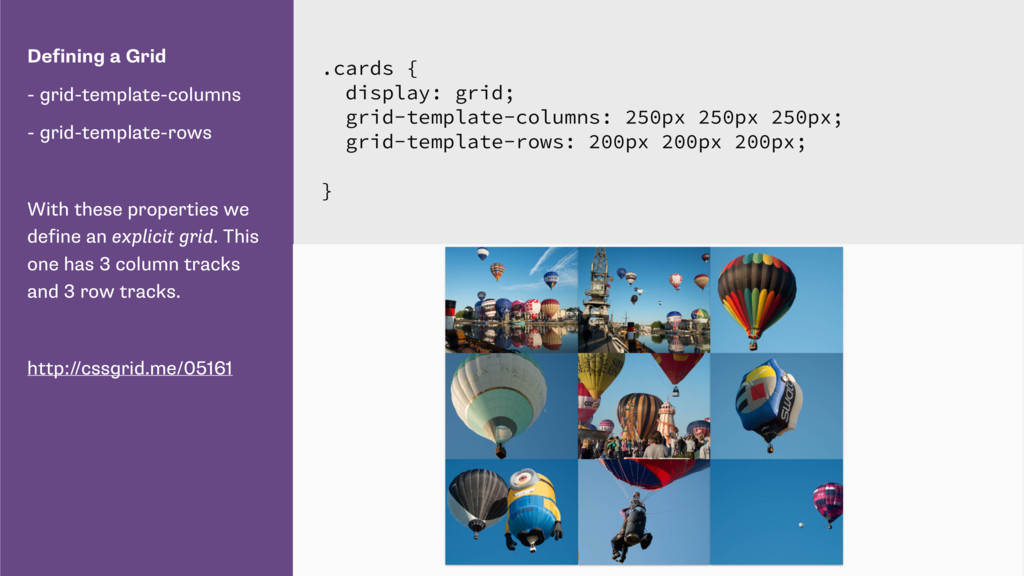
we define an explicit grid. This one has 3 column tracks and 3 row tracks. http://cssgrid.me/05161 .cards { display: grid; grid-template-columns: 250px 250px 250px; grid-template-rows: 200px 200px 200px; }
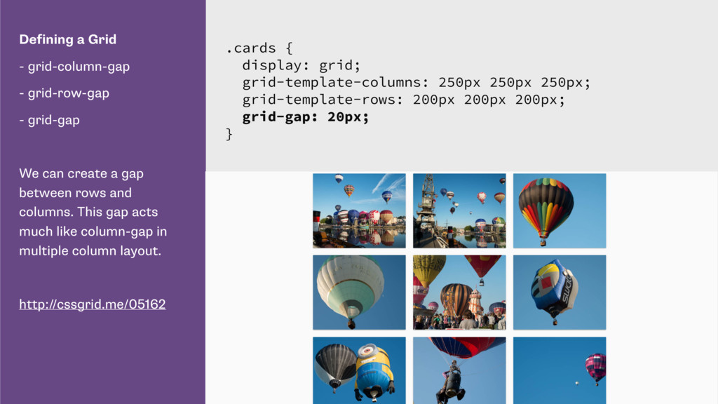
can create a gap between rows and columns. This gap acts much like column-gap in multiple column layout. http://cssgrid.me/05162 .cards { display: grid; grid-template-columns: 250px 250px 250px; grid-template-rows: 200px 200px 200px; grid-gap: 20px; }
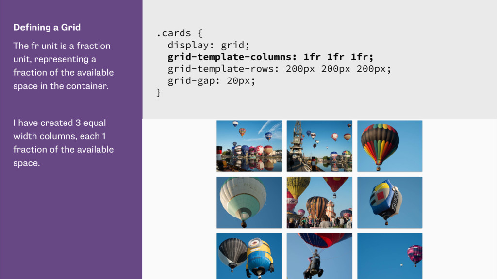
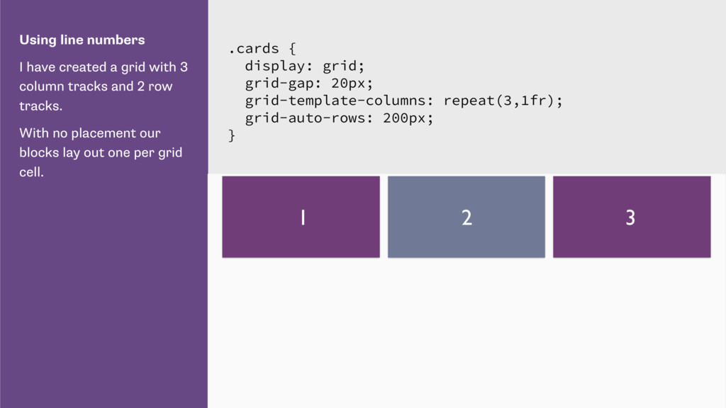
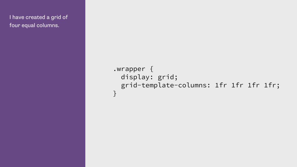
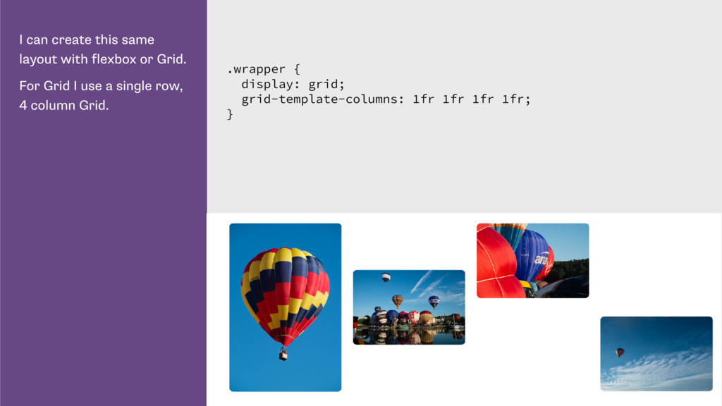
representing a fraction of the available space in the container. I have created 3 equal width columns, each 1 fraction of the available space. .cards { display: grid; grid-template-columns: 1fr 1fr 1fr; grid-template-rows: 200px 200px 200px; grid-gap: 20px; }
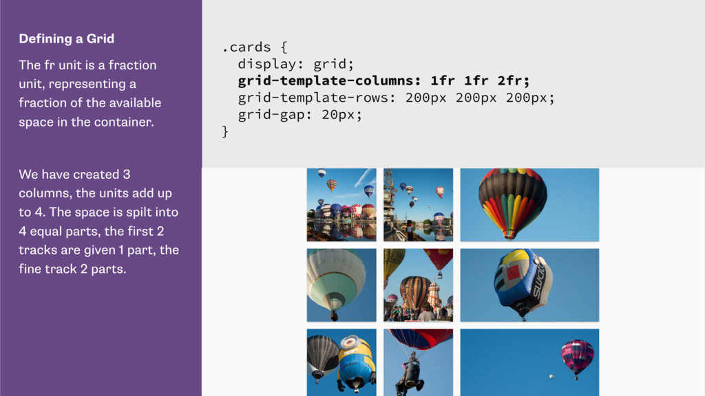
representing a fraction of the available space in the container. We have created 3 columns, the units add up to 4. The space is spilt into 4 equal parts, the first 2 tracks are given 1 part, the fine track 2 parts. .cards { display: grid; grid-template-columns: 1fr 1fr 2fr; grid-template-rows: 200px 200px 200px; grid-gap: 20px; }
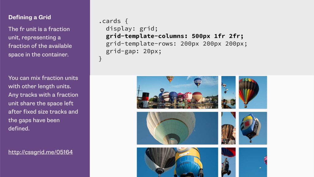
representing a fraction of the available space in the container. You can mix fraction units with other length units. Any tracks with a fraction unit share the space left after fixed size tracks and the gaps have been defined. http://cssgrid.me/05164 .cards { display: grid; grid-template-columns: 500px 1fr 2fr; grid-template-rows: 200px 200px 200px; grid-gap: 20px; }
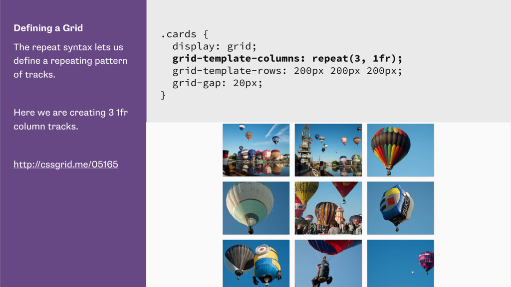
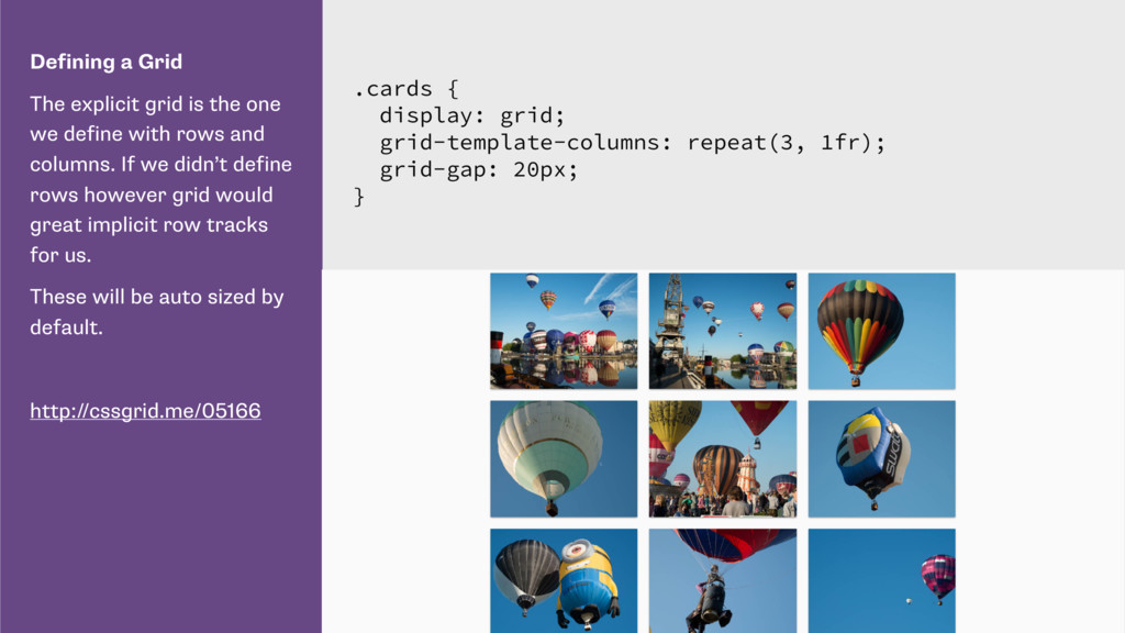
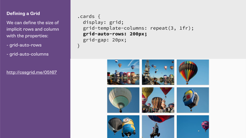
define with rows and columns. If we didn’t define rows however grid would great implicit row tracks for us. These will be auto sized by default. http://cssgrid.me/05166 .cards { display: grid; grid-template-columns: repeat(3, 1fr); grid-gap: 20px; }
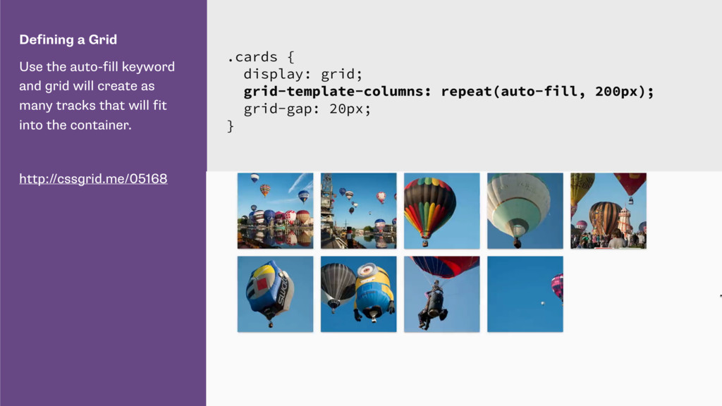
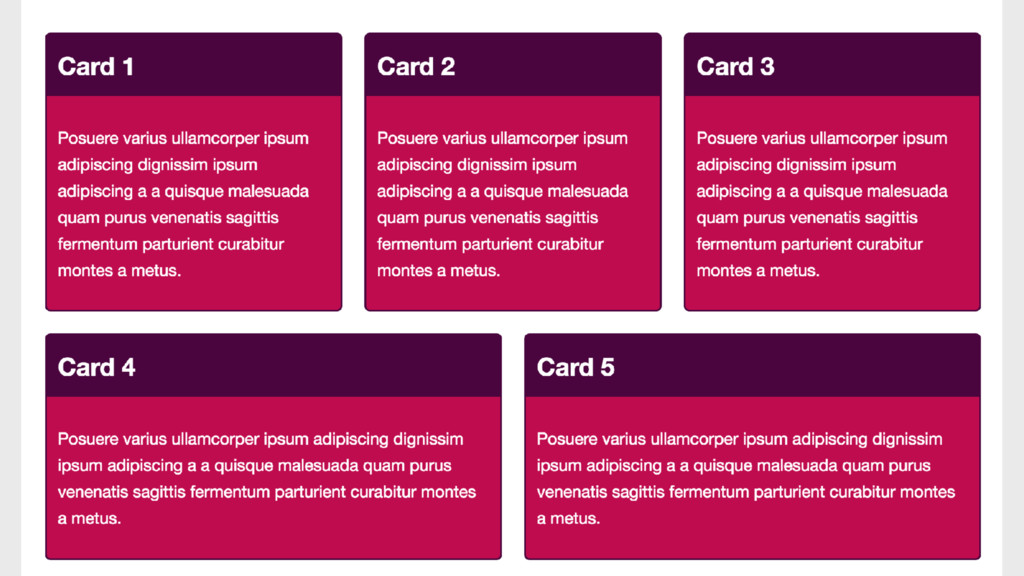
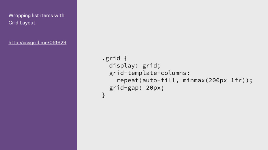
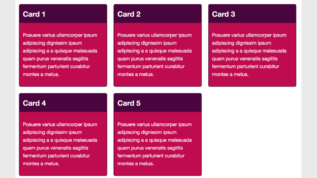
create as many tracks that will fit into the container. http://cssgrid.me/05168 .cards { display: grid; grid-template-columns: repeat(auto-fill, 200px); grid-gap: 20px; }
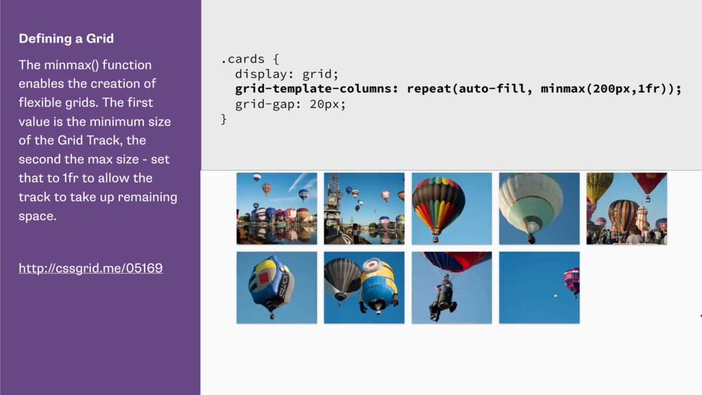
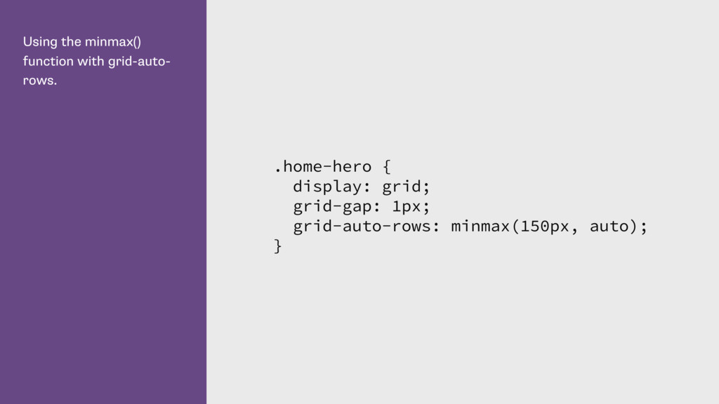
flexible grids. The first value is the minimum size of the Grid Track, the second the max size - set that to 1fr to allow the track to take up remaining space. http://cssgrid.me/05169 .cards { display: grid; grid-template-columns: repeat(auto-fill, minmax(200px,1fr)); grid-gap: 20px; }
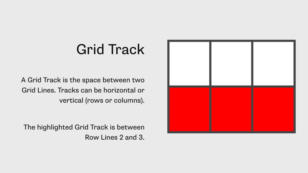
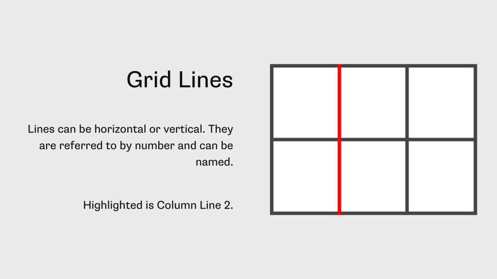
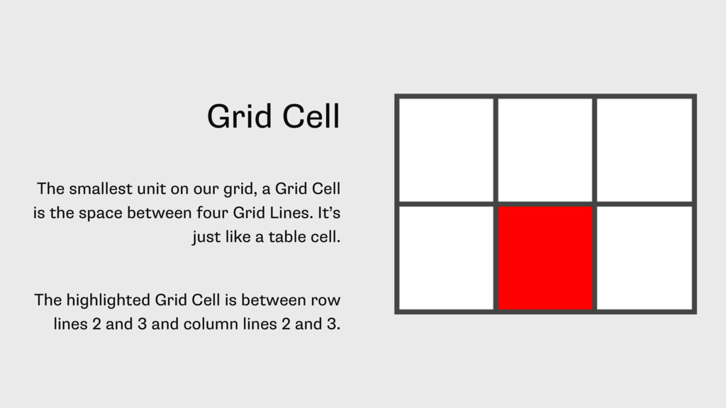
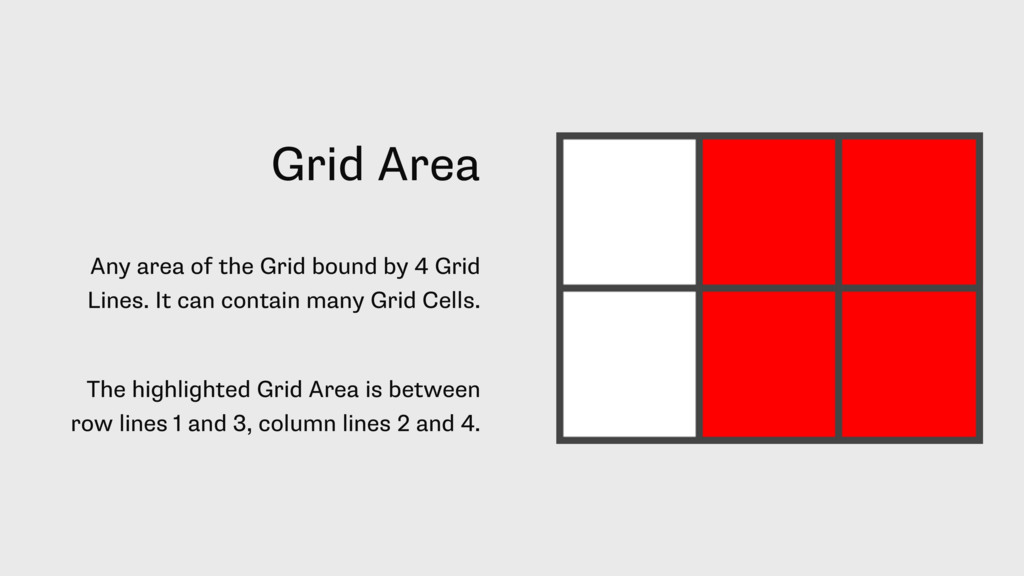
Cell is the space between four Grid Lines. It’s just like a table cell. The highlighted Grid Cell is between row lines 2 and 3 and column lines 2 and 3.
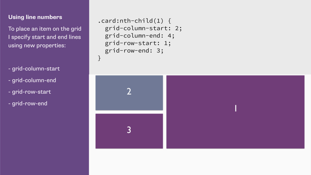
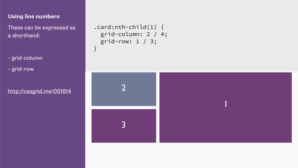
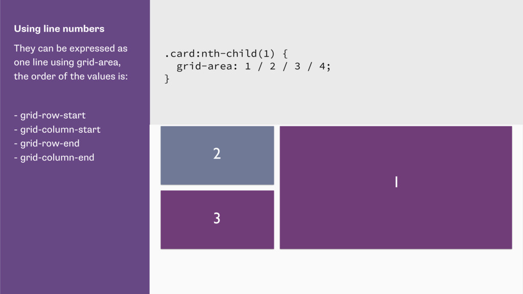
using grid-area, the order of the values is: - grid-row-start - grid-column-start - grid-row-end - grid-column-end .card:nth-child(1) { grid-area: 1 / 2 / 3 / 4; } 1 2 3
number as the value of the placement properties. http://cssgrid.me/051616 .card:nth-child(1) { grid-column: main-start / main-end; grid-row: main-start / main-end; }
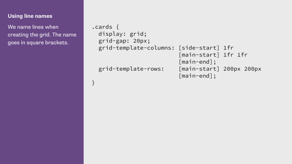
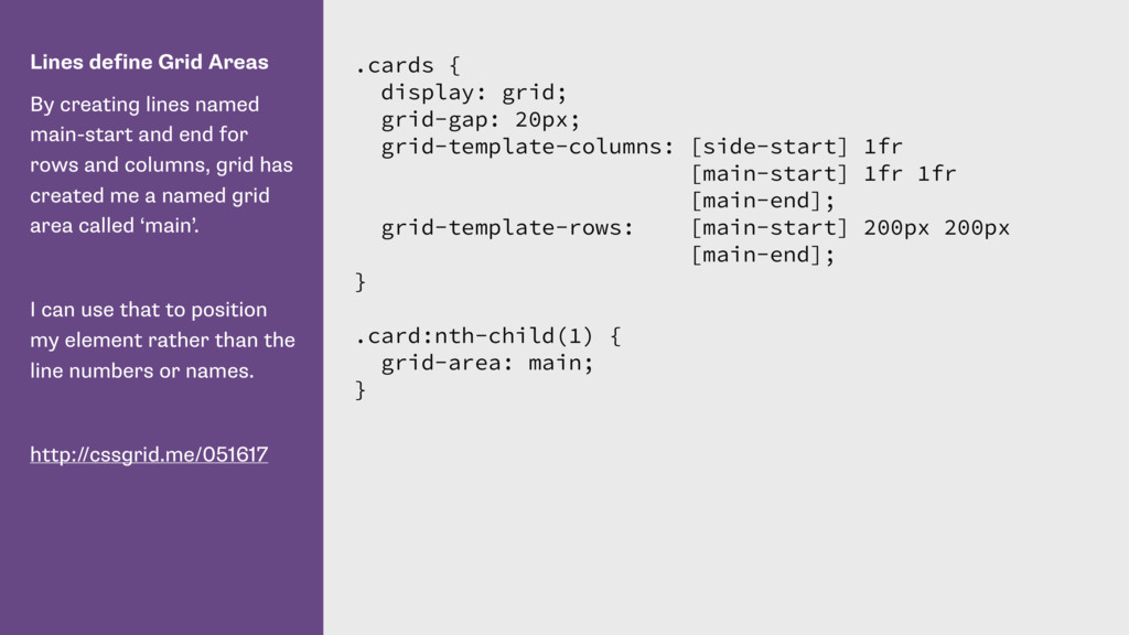
end for rows and columns, grid has created me a named grid area called ‘main’. I can use that to position my element rather than the line numbers or names. http://cssgrid.me/051617 .cards { display: grid; grid-gap: 20px; grid-template-columns: [side-start] 1fr [main-start] 1fr 1fr [main-end]; grid-template-rows: [main-start] 200px 200px [main-end]; } .card:nth-child(1) { grid-area: main; }
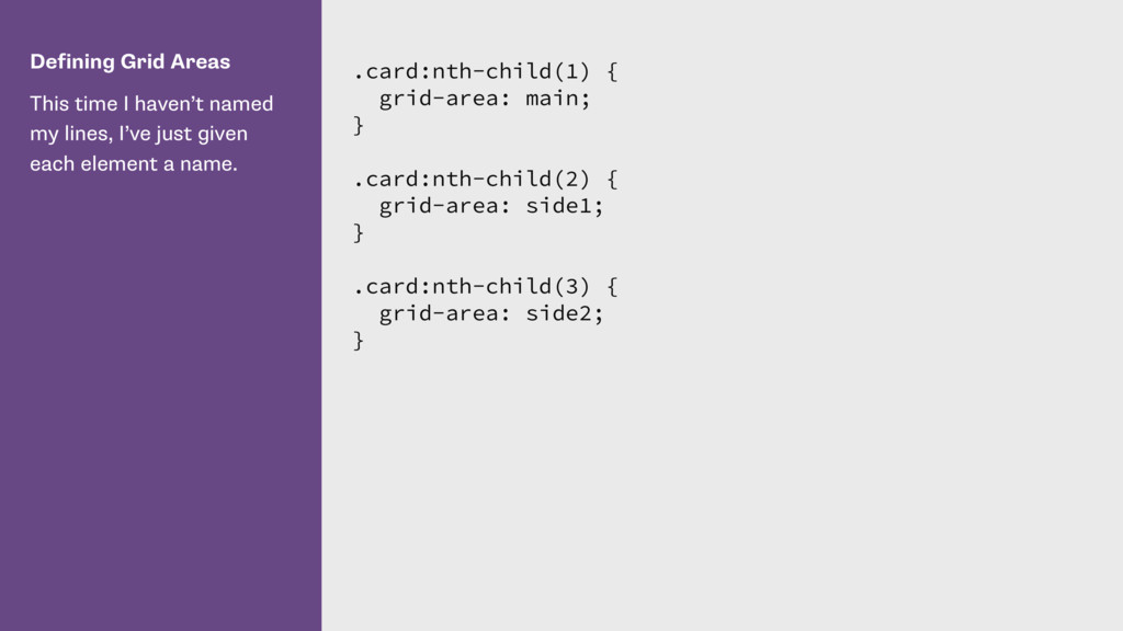
I’ve just given each element a name. .card:nth-child(1) { grid-area: main; } .card:nth-child(2) { grid-area: side1; } .card:nth-child(3) { grid-area: side2; }
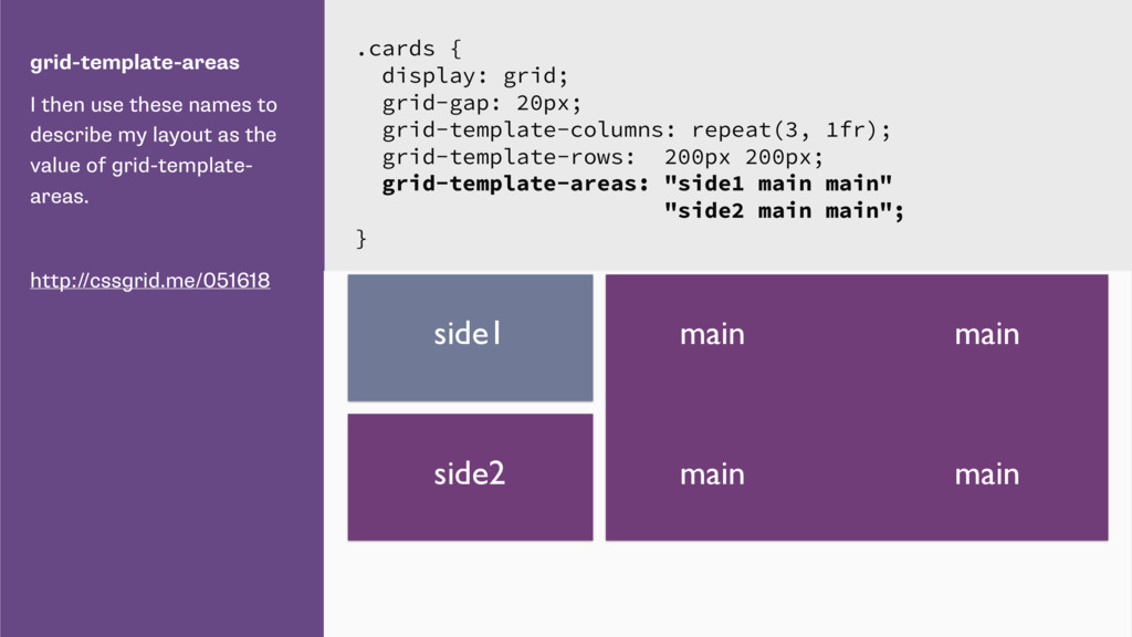
as the value of grid-template- areas. http://cssgrid.me/051618 .cards { display: grid; grid-gap: 20px; grid-template-columns: repeat(3, 1fr); grid-template-rows: 200px 200px; grid-template-areas: "side1 main main" "side2 main main"; } main side1 side2 main main main
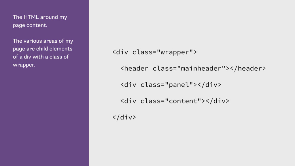
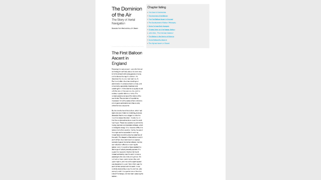
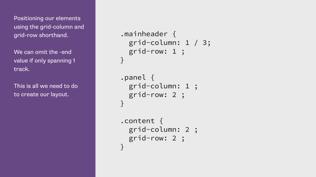
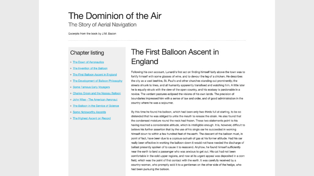
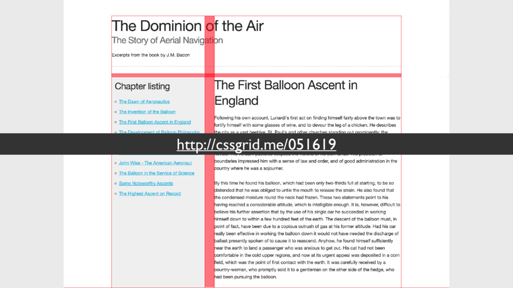
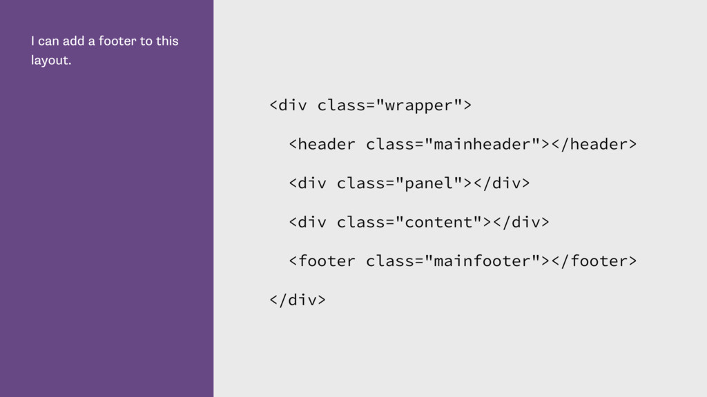
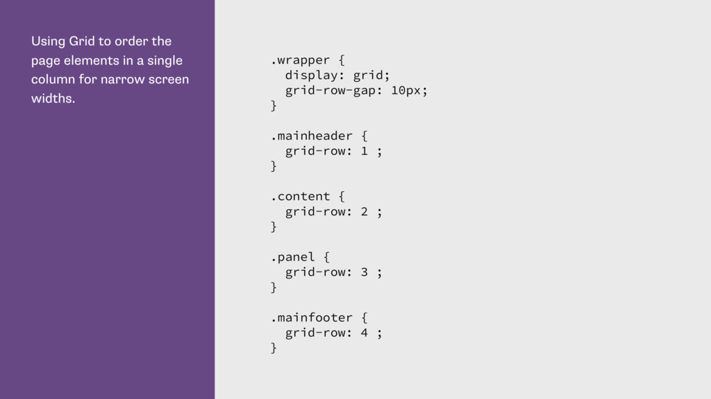
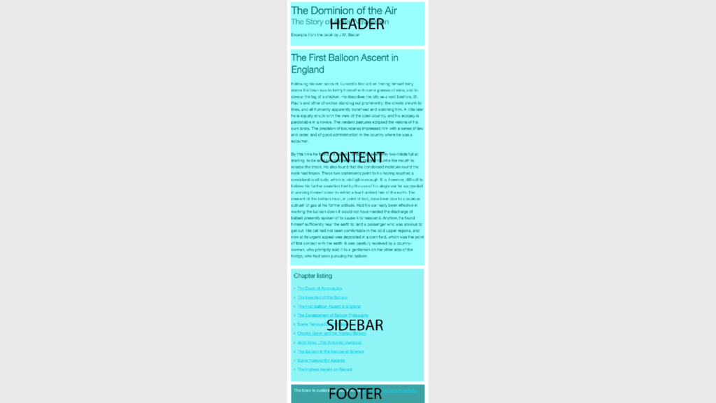
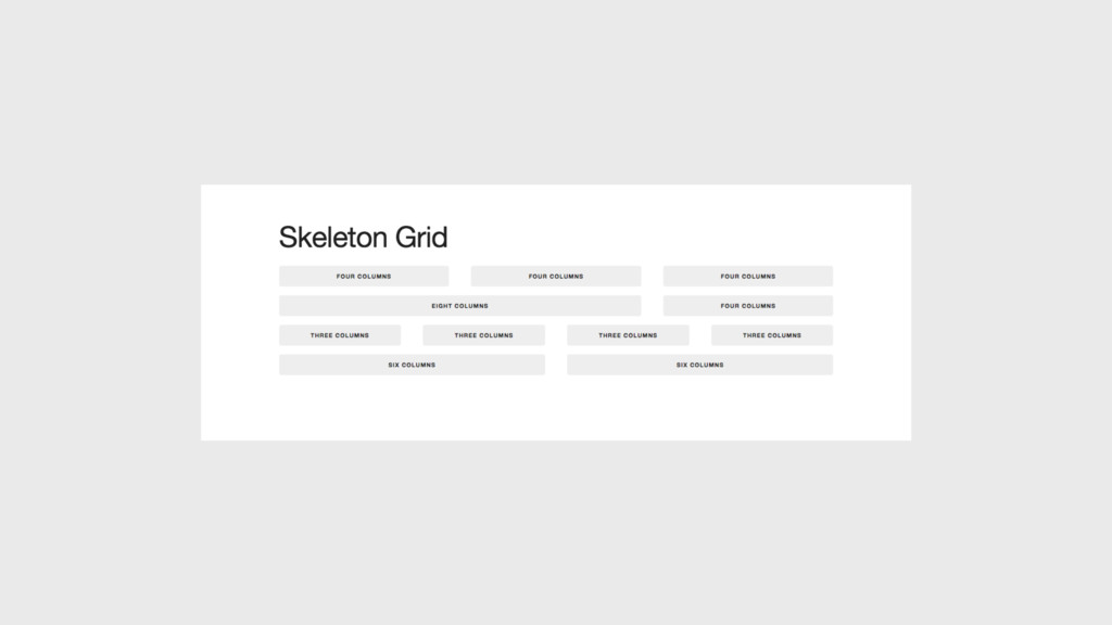
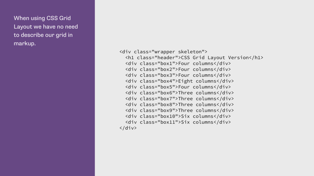
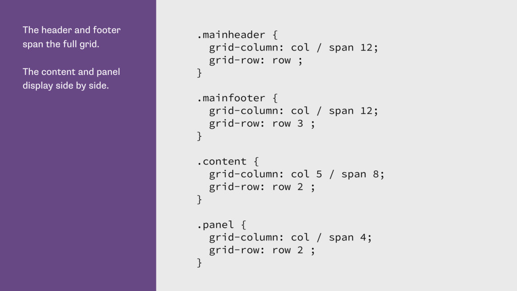
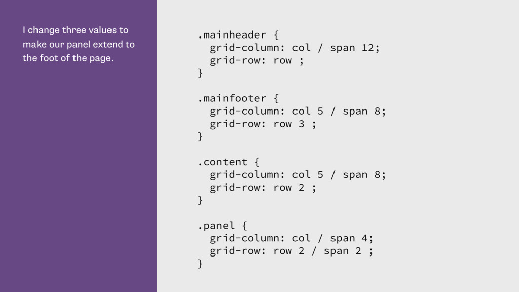
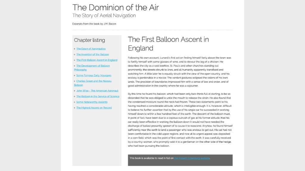
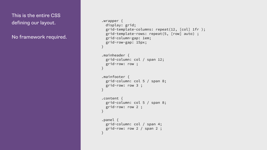
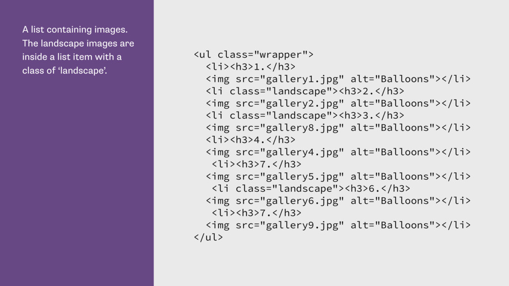
my page are child elements of a div with a class of wrapper. <div class="wrapper"> <header class="mainheader"></header> <div class="panel"></div> <div class="content"></div> </div>
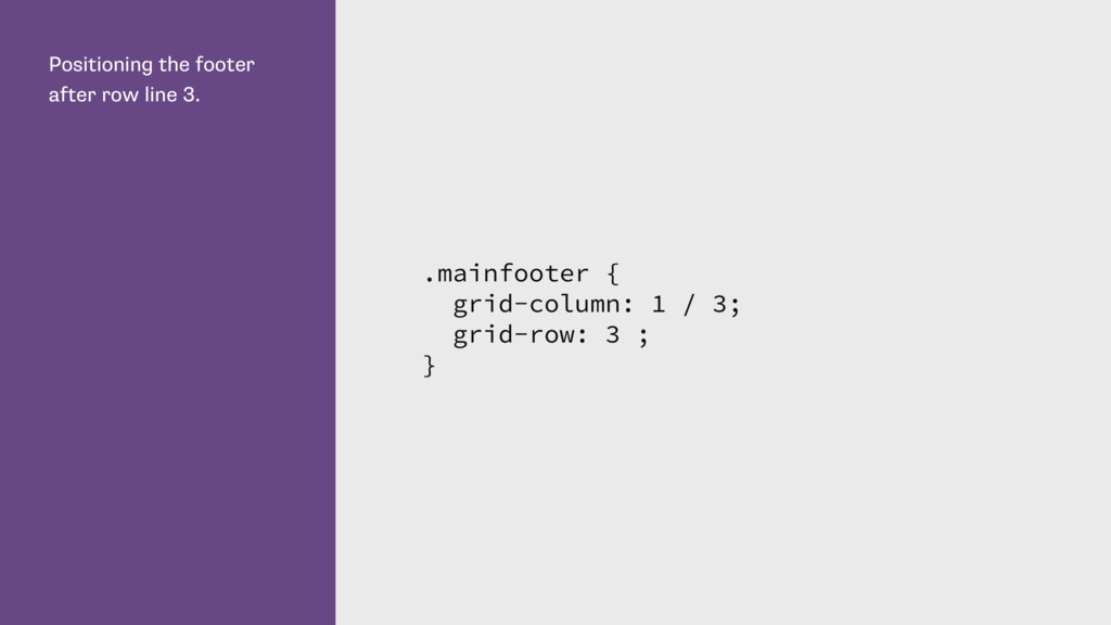
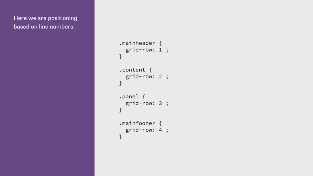
can omit the -end value if only spanning 1 track. This is all we need to do to create our layout. .mainheader { grid-column: 1 / 3; grid-row: 1 ; } .panel { grid-column: 1 ; grid-row: 2 ; } .content { grid-column: 2 ; grid-row: 2 ; }
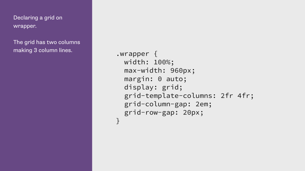
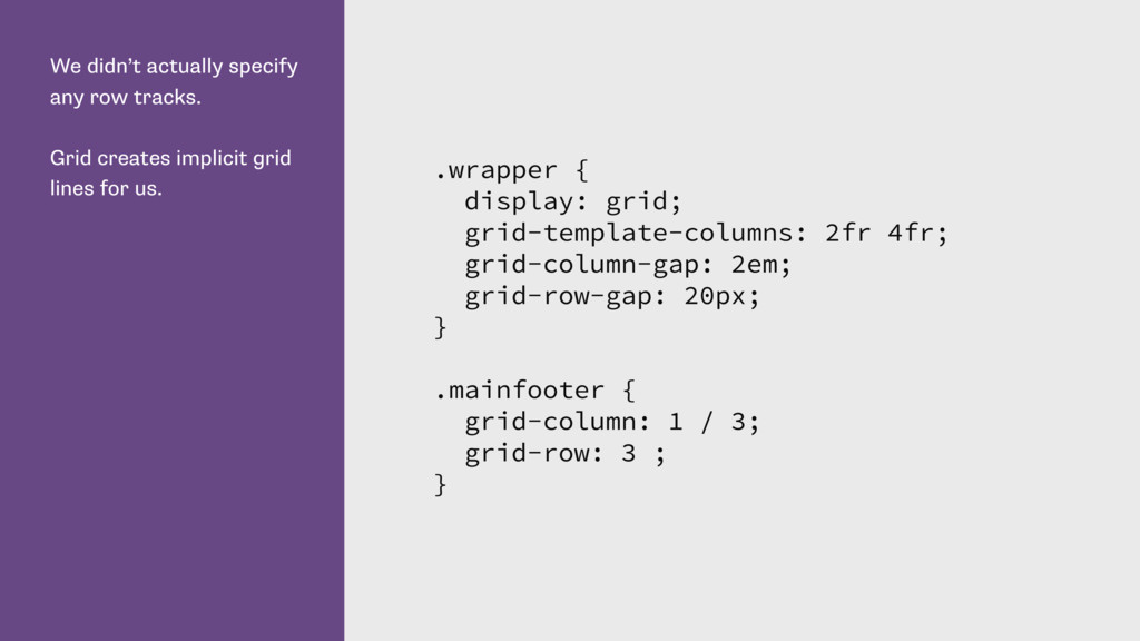
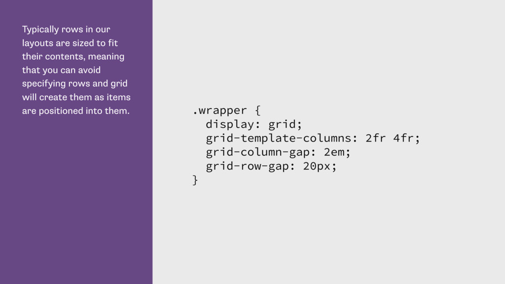
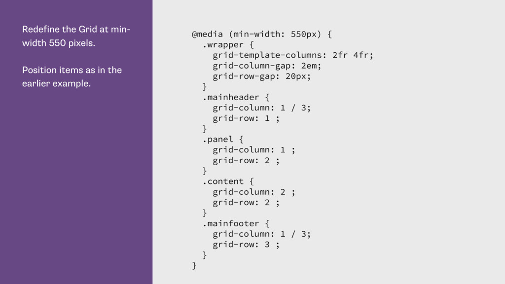
contents, meaning that you can avoid specifying rows and grid will create them as items are positioned into them. .wrapper { display: grid; grid-template-columns: 2fr 4fr; grid-column-gap: 2em; grid-row-gap: 20px; }
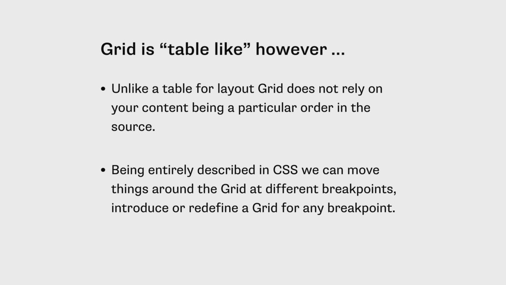
for layout Grid does not rely on your content being a particular order in the source. • Being entirely described in CSS we can move things around the Grid at different breakpoints, introduce or redefine a Grid for any breakpoint.
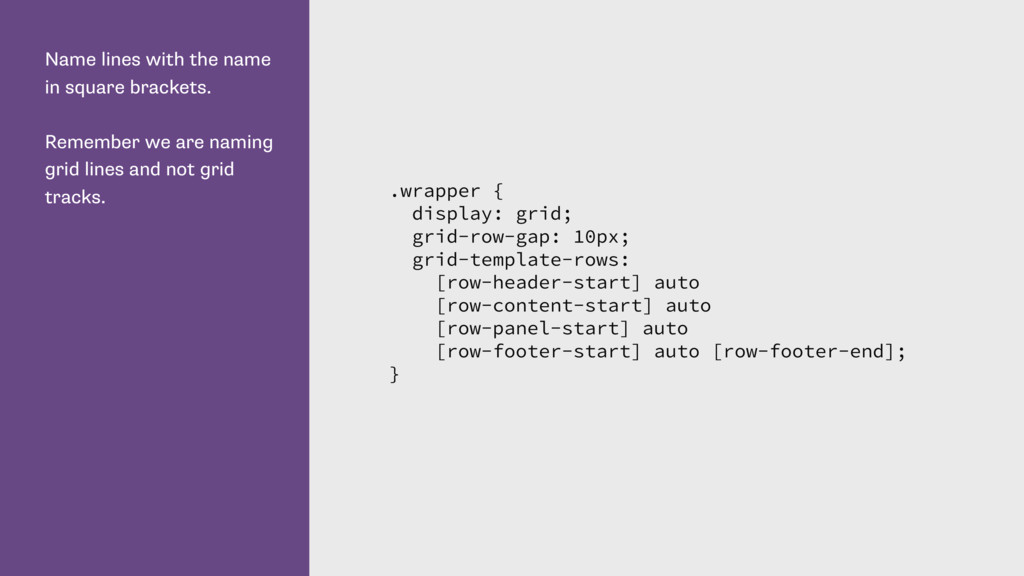
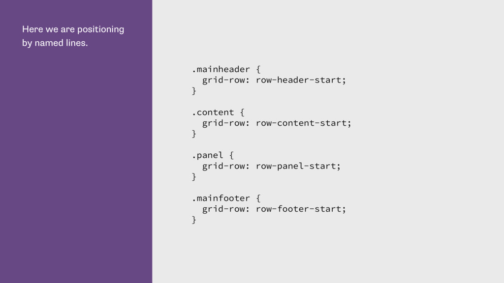
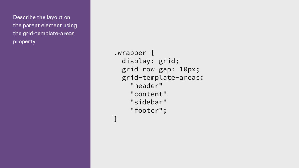
are naming grid lines and not grid tracks. .wrapper { display: grid; grid-row-gap: 10px; grid-template-rows: [row-header-start] auto [row-content-start] auto [row-panel-start] auto [row-footer-start] auto [row-footer-end]; }
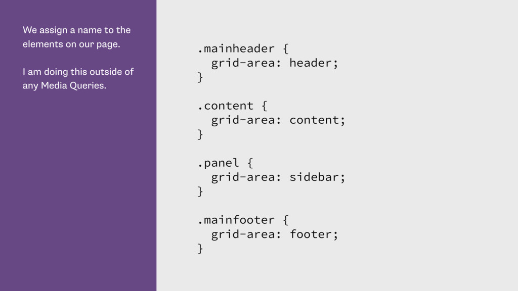
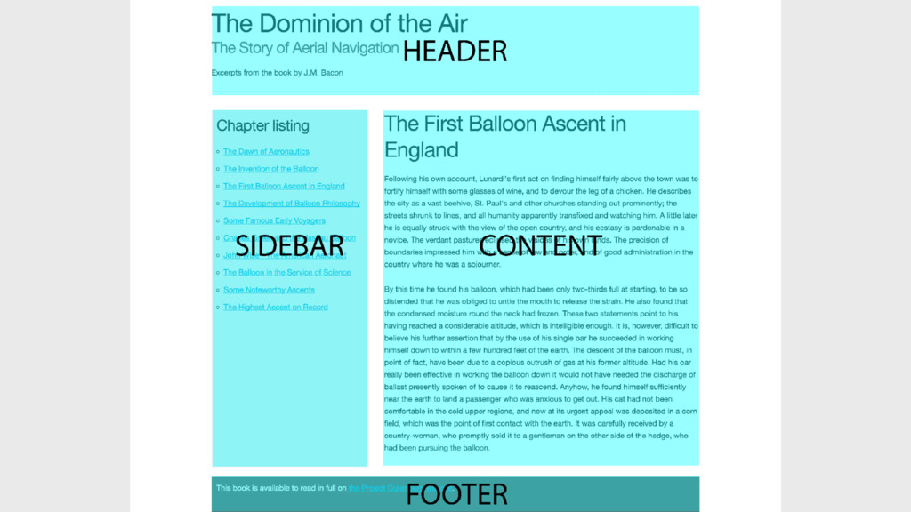
I am doing this outside of any Media Queries. .mainheader { grid-area: header; } .content { grid-area: content; } .panel { grid-area: sidebar; } .mainfooter { grid-area: footer; }
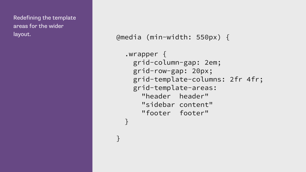
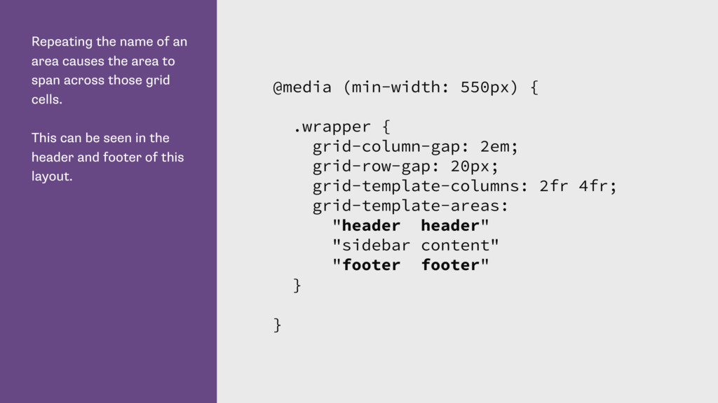
span across those grid cells. This can be seen in the header and footer of this layout. @media (min-width: 550px) { .wrapper { grid-column-gap: 2em; grid-row-gap: 20px; grid-template-columns: 2fr 4fr; grid-template-areas: "header header" "sidebar content" "footer footer" } }
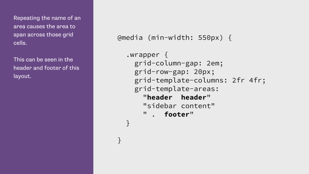
span across those grid cells. This can be seen in the header and footer of this layout. @media (min-width: 550px) { .wrapper { grid-column-gap: 2em; grid-row-gap: 20px; grid-template-columns: 2fr 4fr; grid-template-areas: "header header" "sidebar content" " . footer" } }
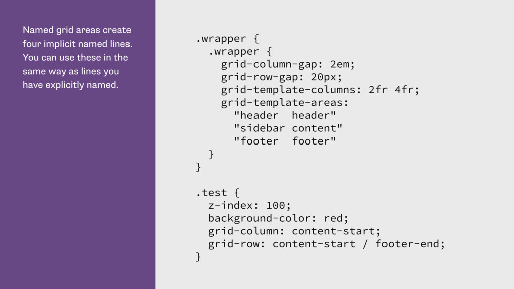
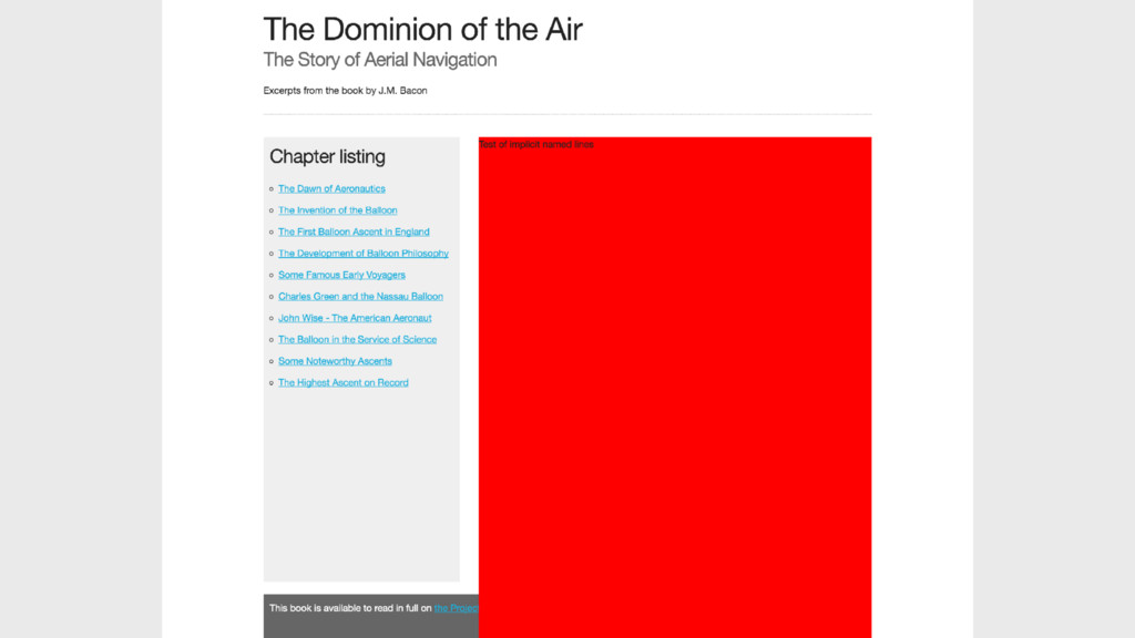
use these in the same way as lines you have explicitly named. .wrapper { .wrapper { grid-column-gap: 2em; grid-row-gap: 20px; grid-template-columns: 2fr 4fr; grid-template-areas: "header header" "sidebar content" "footer footer" } } .test { z-index: 100; background-color: red; grid-column: content-start; grid-row: content-start / footer-end; }
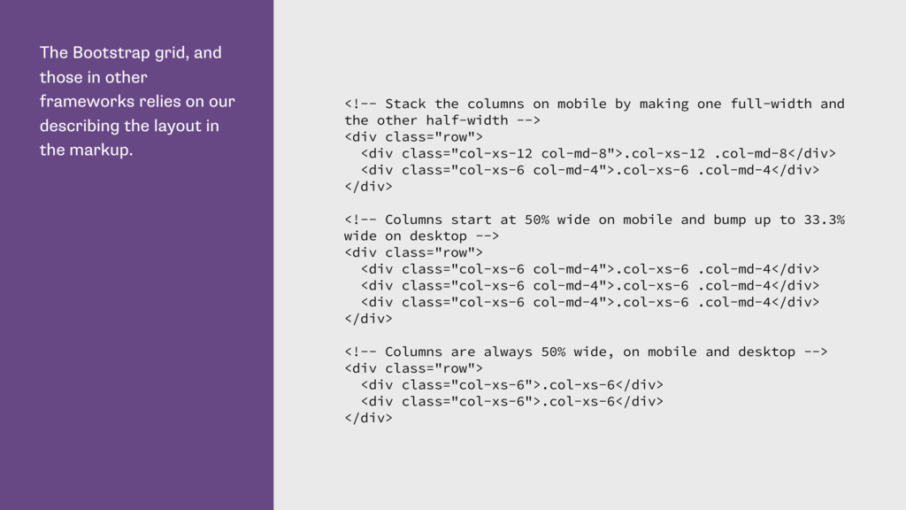
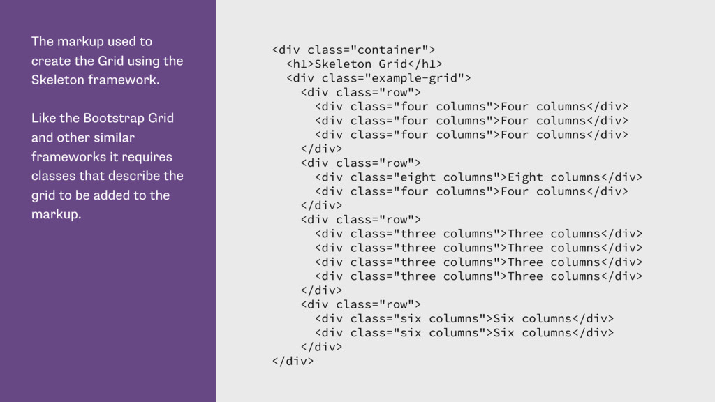
our describing the layout in the markup. <!-- Stack the columns on mobile by making one full-width and the other half-width --> <div class="row"> <div class="col-xs-12 col-md-8">.col-xs-12 .col-md-8</div> <div class="col-xs-6 col-md-4">.col-xs-6 .col-md-4</div> </div> <!-- Columns start at 50% wide on mobile and bump up to 33.3% wide on desktop --> <div class="row"> <div class="col-xs-6 col-md-4">.col-xs-6 .col-md-4</div> <div class="col-xs-6 col-md-4">.col-xs-6 .col-md-4</div> <div class="col-xs-6 col-md-4">.col-xs-6 .col-md-4</div> </div> <!-- Columns are always 50% wide, on mobile and desktop --> <div class="row"> <div class="col-xs-6">.col-xs-6</div> <div class="col-xs-6">.col-xs-6</div> </div>
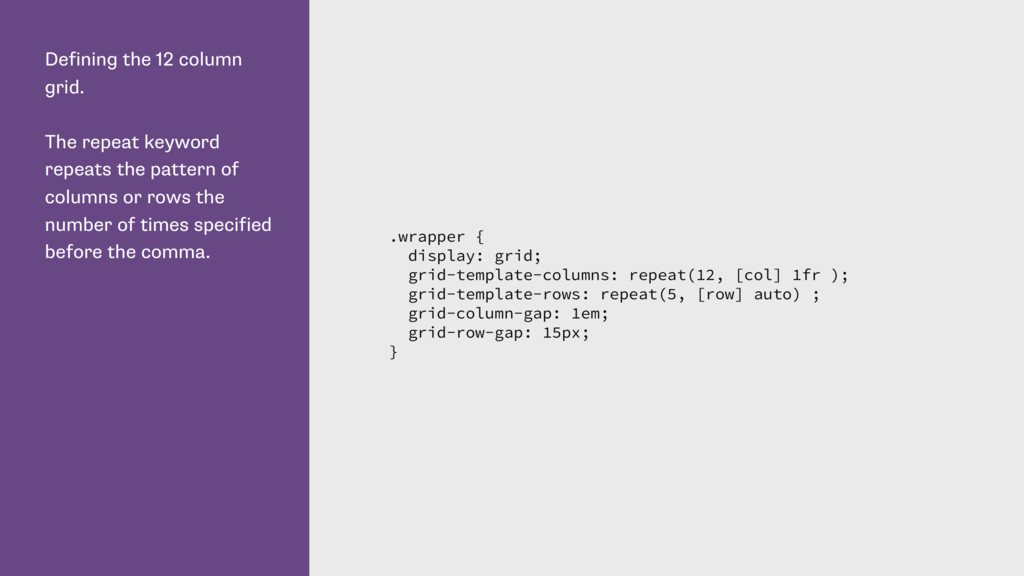
pattern of columns or rows the number of times specified before the comma. .wrapper { display: grid; grid-template-columns: repeat(12, [col] 1fr ); grid-template-rows: repeat(5, [row] auto) ; grid-column-gap: 1em; grid-row-gap: 15px; }
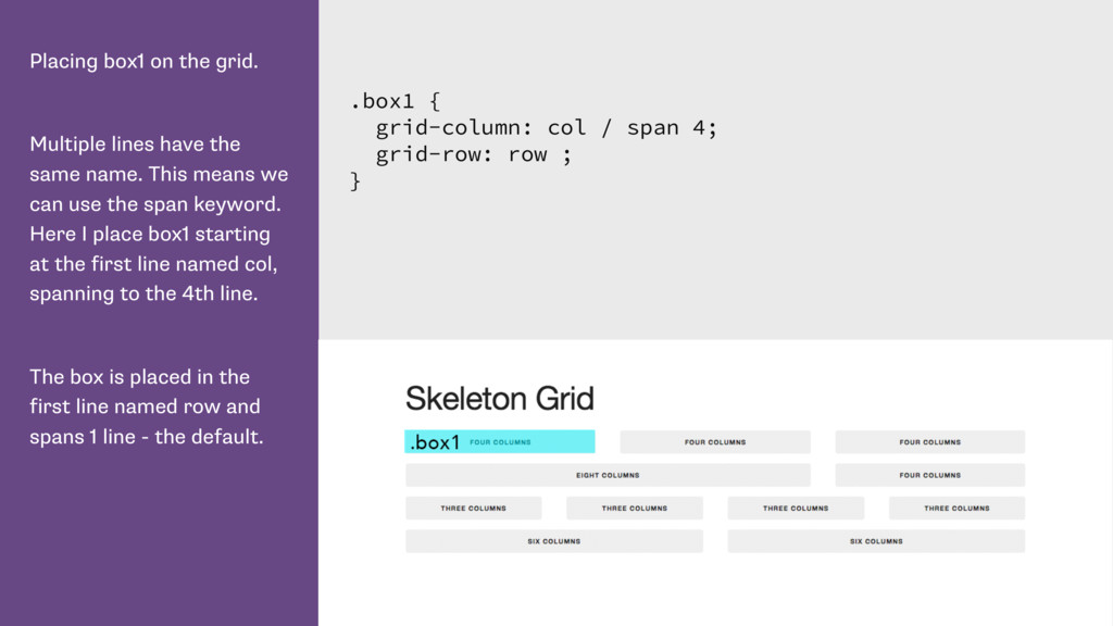
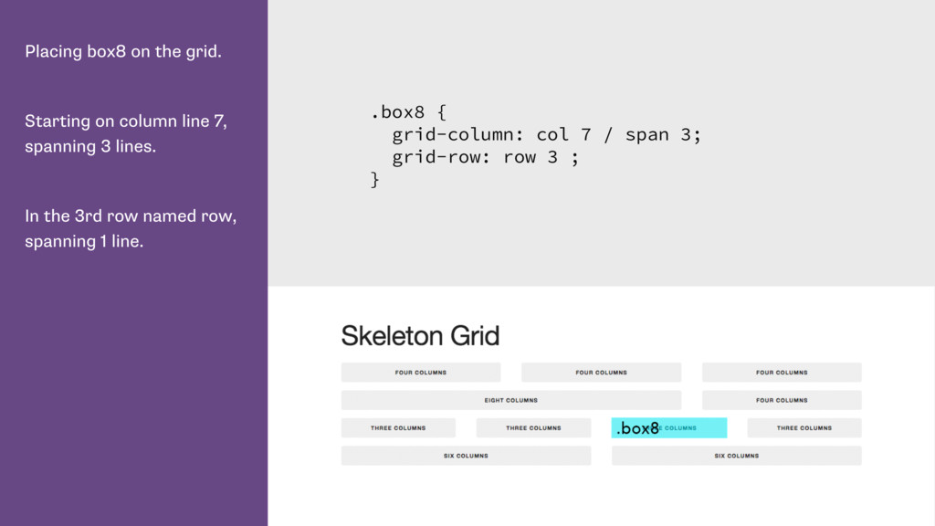
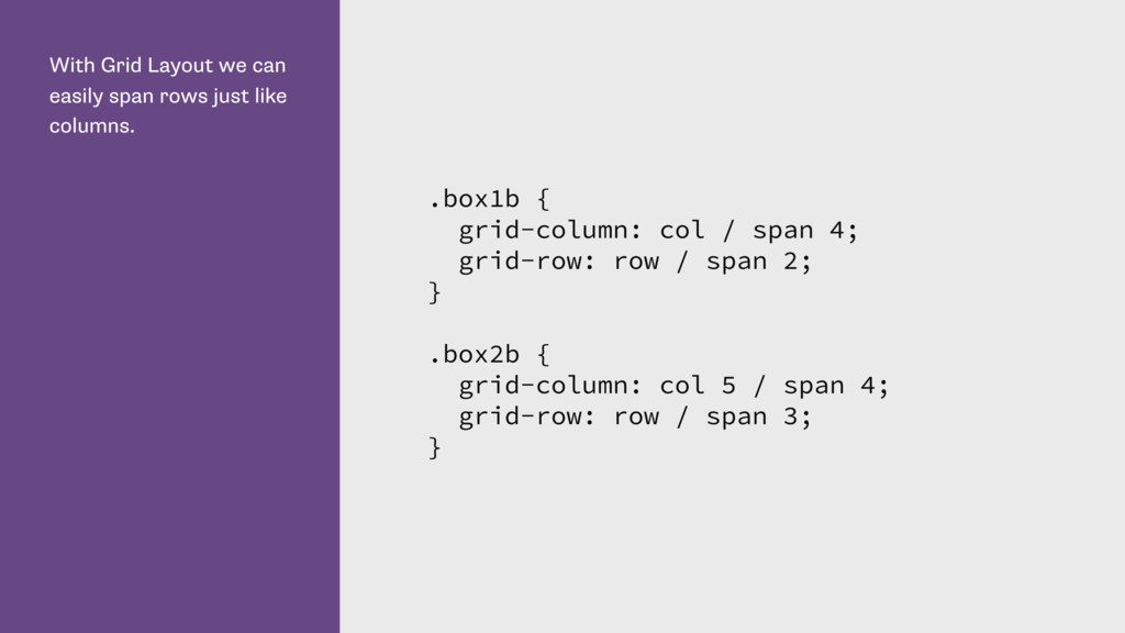
name. This means we can use the span keyword. Here I place box1 starting at the first line named col, spanning to the 4th line. The box is placed in the first line named row and spans 1 line - the default. .box1 { grid-column: col / span 4; grid-row: row ; }
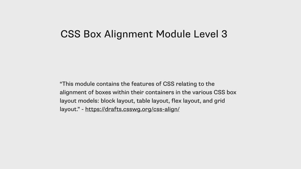
features of CSS relating to the alignment of boxes within their containers in the various CSS box layout models: block layout, table layout, flex layout, and grid layout.” - https://drafts.csswg.org/css-align/
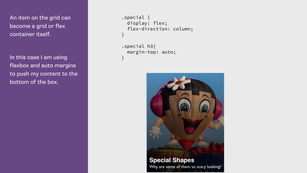
flex container itself. In this case I am using flexbox and auto margins to push my content to the bottom of the box. .special { display: flex; flex-direction: column; } .special h3{ margin-top: auto; }
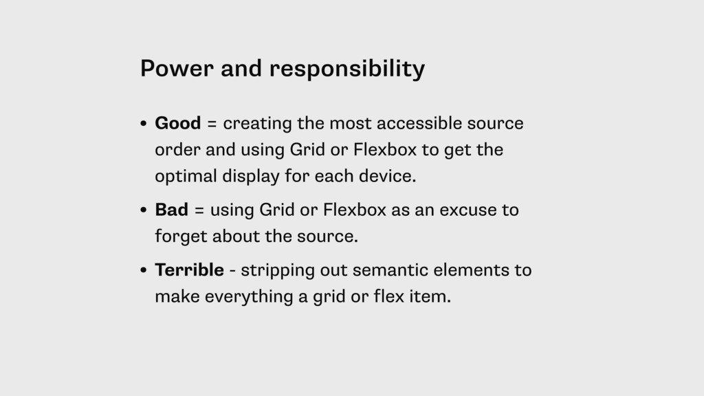
source order and using Grid or Flexbox to get the optimal display for each device. • Bad = using Grid or Flexbox as an excuse to forget about the source. • Terrible - stripping out semantic elements to make everything a grid or flex item.
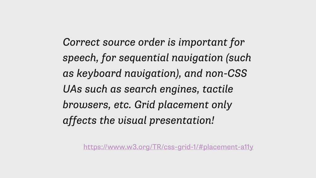
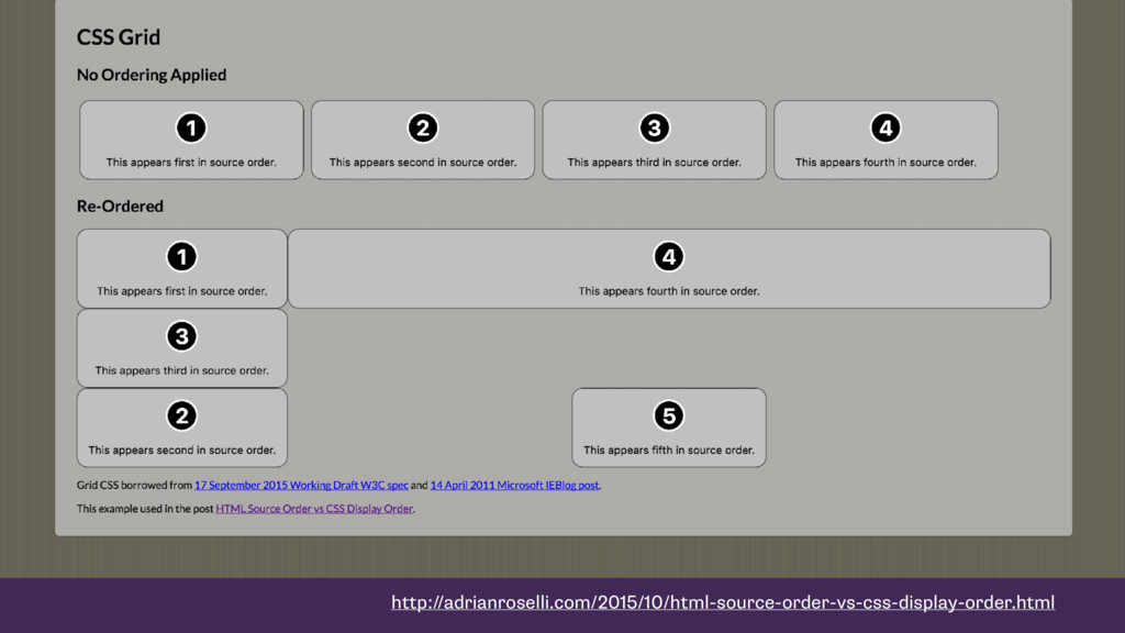
navigation (such as keyboard navigation), and non-CSS UAs such as search engines, tactile browsers, etc. Grid placement only affects the visual presentation!
 frontendne
 nealle
 iotcomjpadmin
 tamaiyutaro
 you
you
 askul
askul
 yamasatimi
 ymhiroki
 techtekt
 appleboy
 y150saya
 ueponx
 tanimuyk
 chriscoyier
 skipperchong
 caitiem20
 kastner
 nmsamuel
 danielanewman
 rkaga
rkaga
 techseoconnect
 baasie
 kneath
 madoxten
 gurzu
gurzu