Upgrade to Pro — share decks privately, control downloads, hide ads and more …

[SF HTML5] (Updated) Responsive Cross-Device Development with Web Standards

Tomomi Imura
November 15, 2013

[SF HTML5] (Updated) Responsive Cross-Device Development with Web Standards

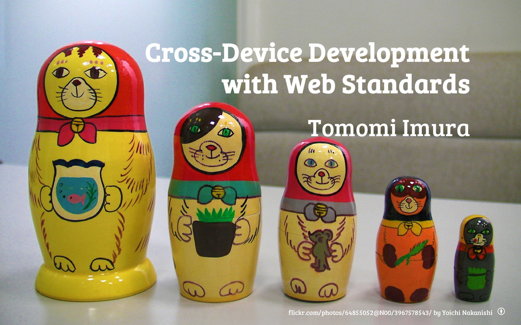
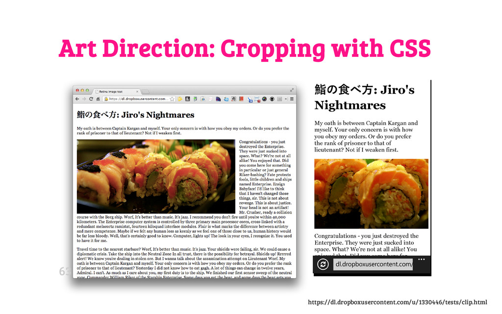
Cross-device development using standard technologies- current stable state and emerging standards.

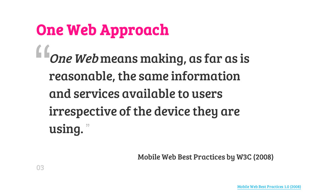
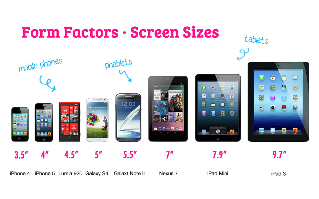
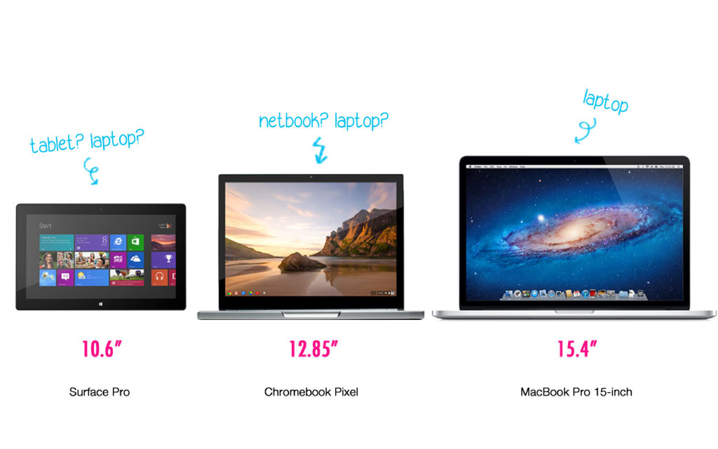
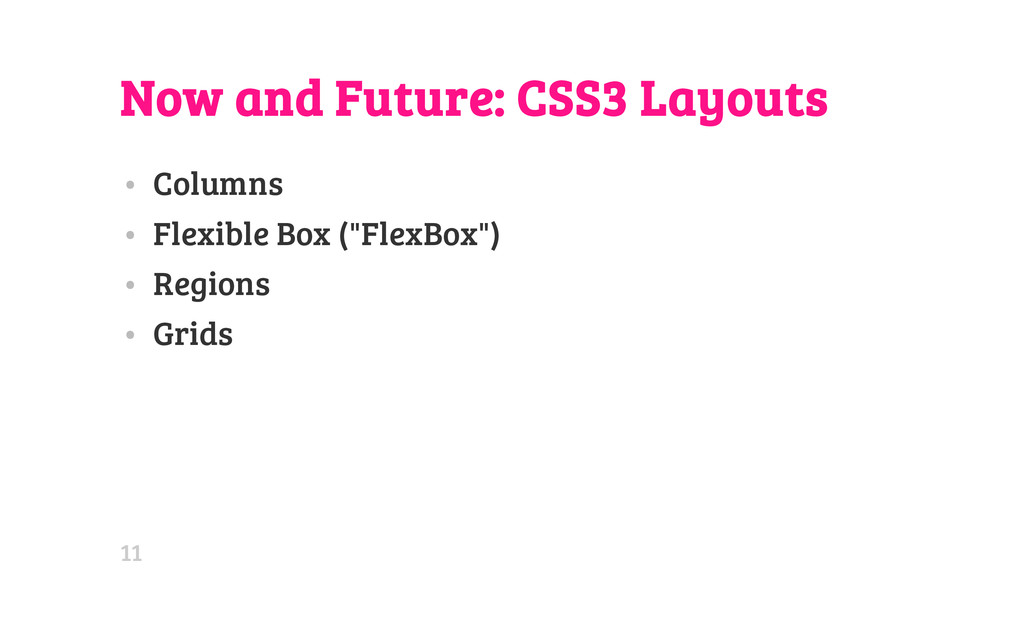
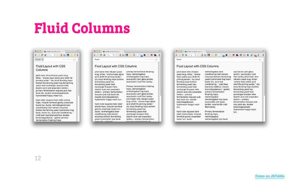
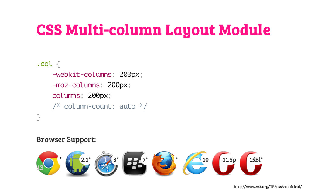
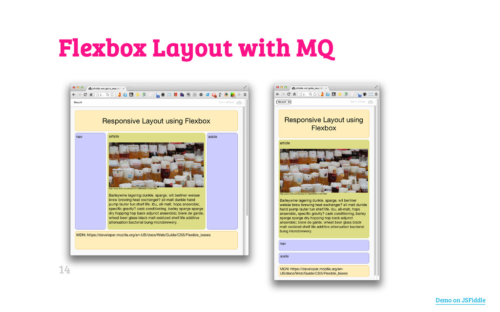
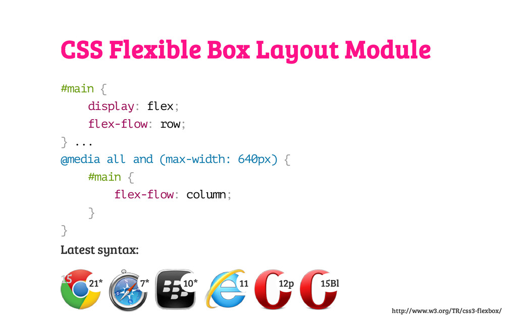
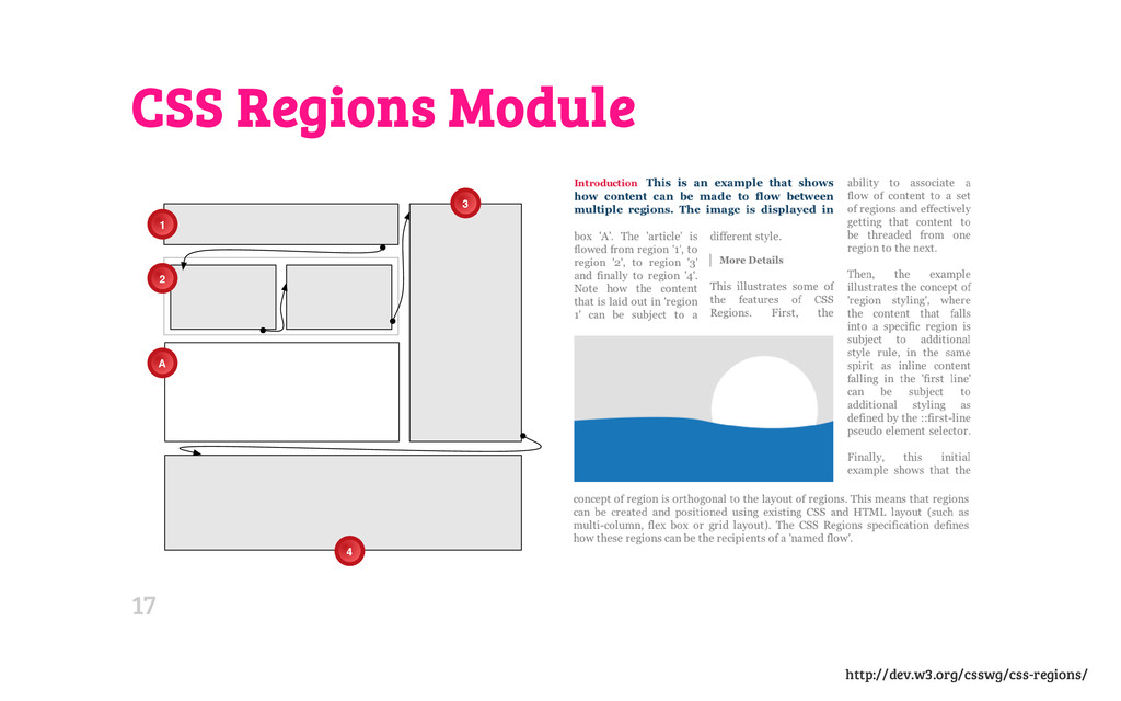
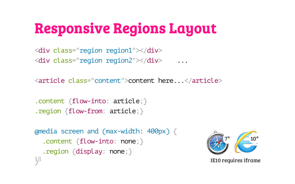
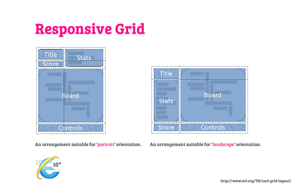
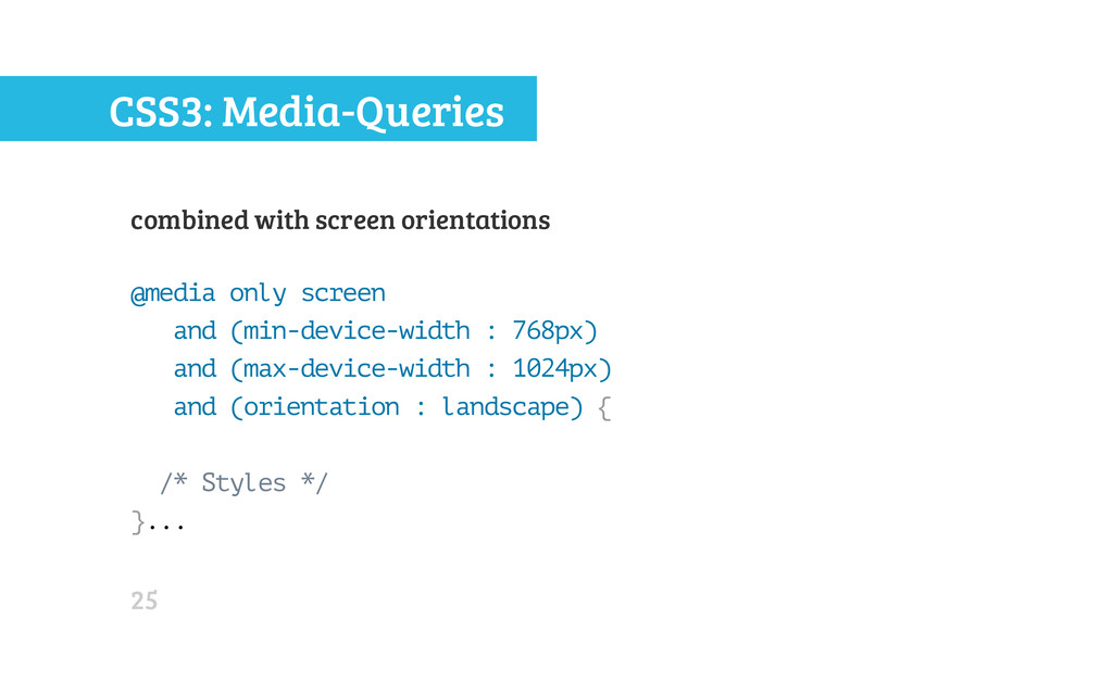
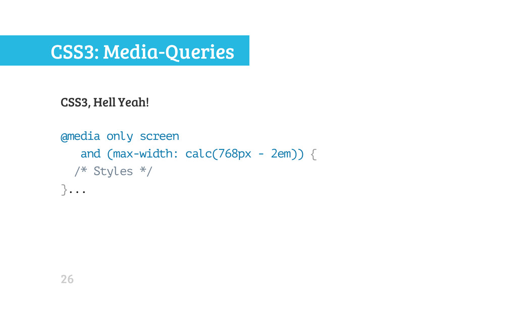
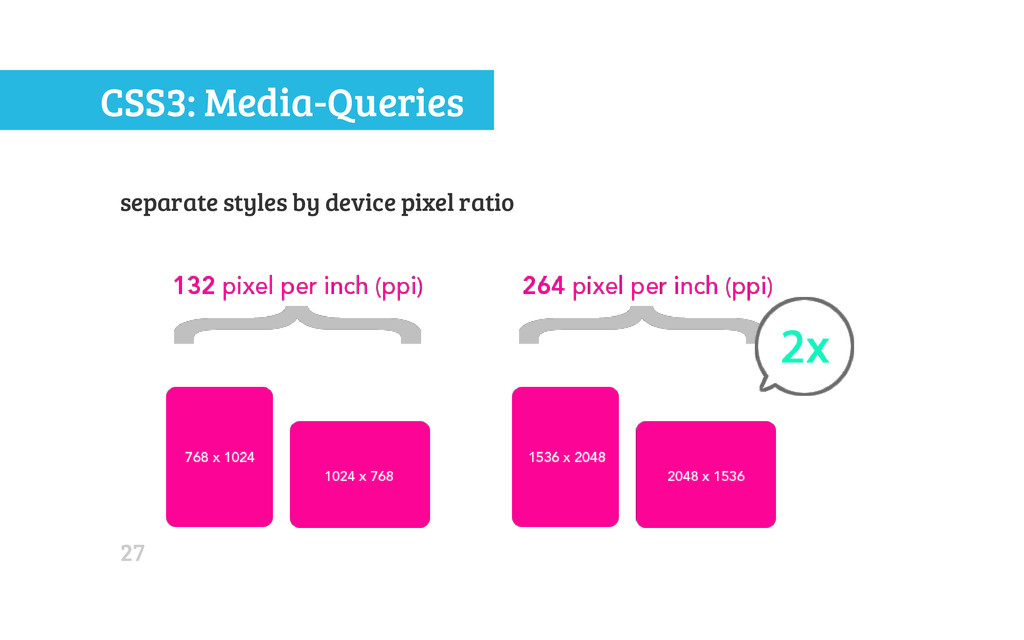
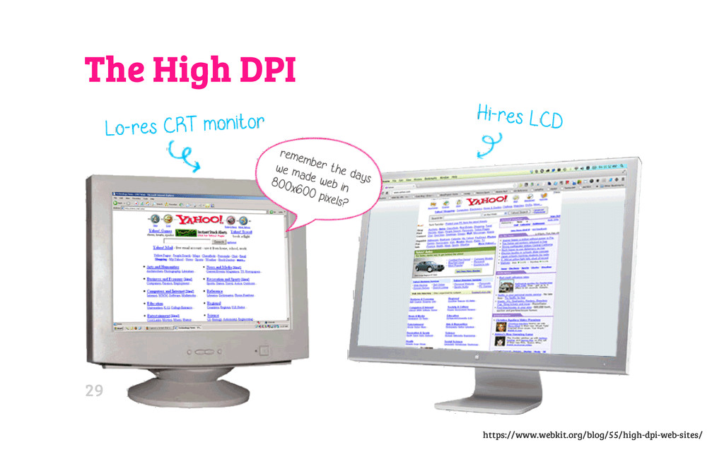
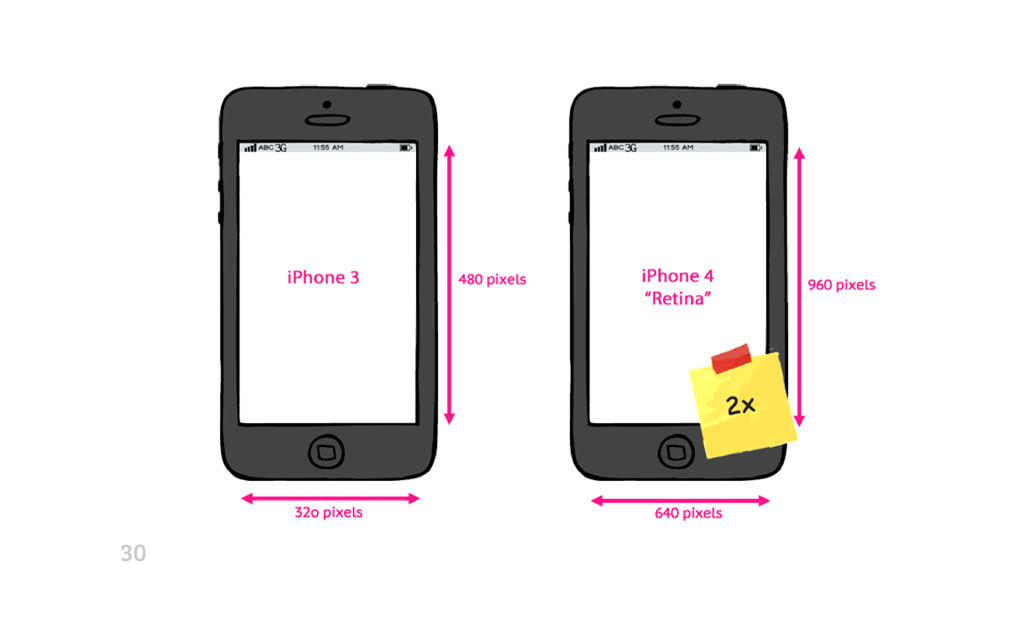
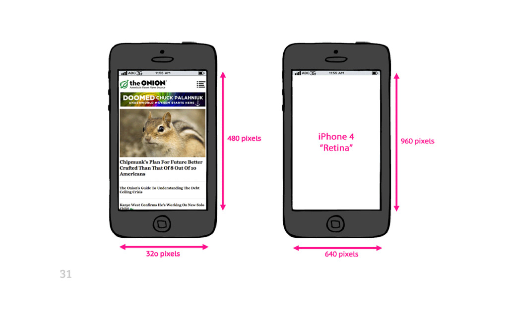
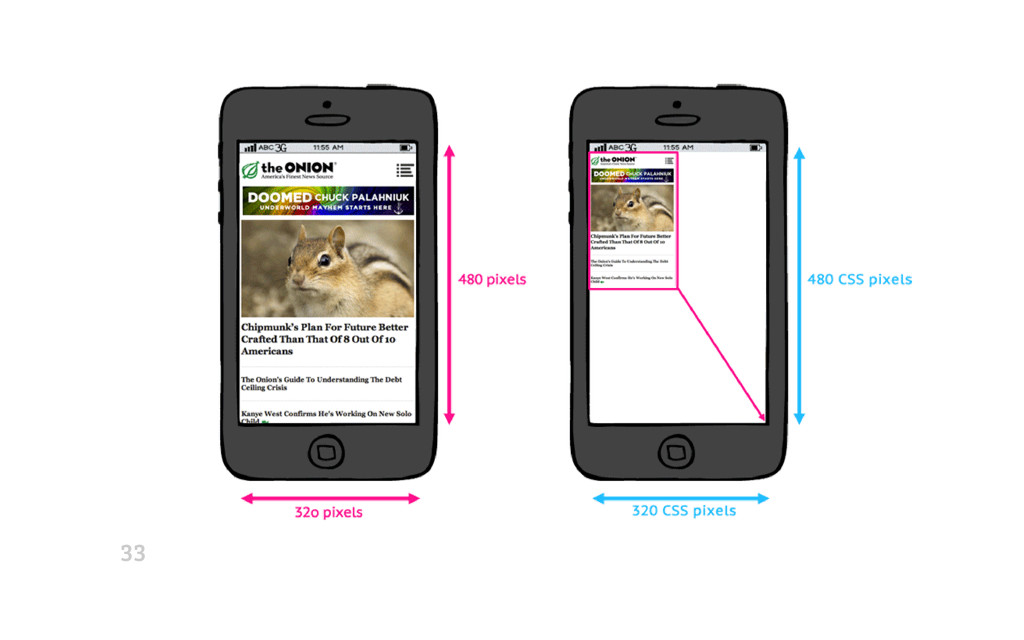
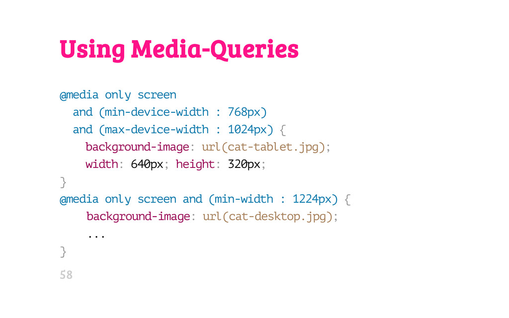
I am covering media-queries (incl. high-DPI screen support, matchMedia(), MQ Level 4), Fluid Layout Neue with CSS 3 (regions, columns, flex box, and grids), and responsive images.

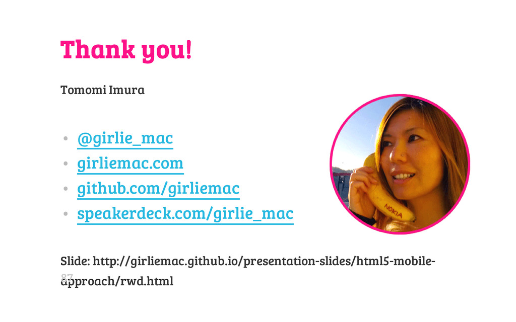
The interactive slides (in html) is hosted on Github:
http://girliemac.github.io/presentation-slides/html5-mobile-approach/rwd.html

thanks :-)

Tomomi Imura

November 15, 2013
Tweet

More Decks by Tomomi Imura

Other Decks in Technology

Transcript

  1. H E L L O M Y N A M

    E I S Tomomi @girlie_mac 02
  2. One Web Approach Mobile Web Best Practices by W3C (2008)

    One Web means making, as far as is reasonable, the same information and services available to users irrespective of the device they are using. ” “ Mobile Web Best Practices 1.0 (2008) 03
  3. Adaptive Design 1. Progressive Enhancement • Enhancing Experiences based on

    browser capabilities • Graceful Degradation - Fallbacks 2. Responsive Design • Fluid Layout • Media Queries • Responsive Images 08
  4. Then • HTML Table Layout (Party like it's 1999) •

    The CSS "Holy Grail" Column Liquid Layout • Float • Negative margin • All the hacks that are PITA • UI Frameworks for Grid Layout • YUI • jQuery Masonry 10
  5. Now and Future: CSS3 Layouts • Columns • Flexible Box

    ("FlexBox") • Regions • Grids 11
  6. CSS Multi-column Layout Module . c o l { -

    w e b k i t - c o l u m n s : 2 0 0 p x ; - m o z - c o l u m n s : 2 0 0 p x ; c o l u m n s : 2 0 0 p x ; / * c o l u m n - c o u n t : a u t o * / } Browser Support: * 2.1* 3* 7* * 10 11.5p 15Bl* http://www.w3.org/TR/css3-multicol/ 13
  7. CSS Flexible Box Layout Module # m a i n

    { d i s p l a y : f l e x ; f l e x - f l o w : r o w ; } . . . @ m e d i a a l l a n d ( m a x - w i d t h : 6 4 0 p x ) { # m a i n { f l e x - f l o w : c o l u m n ; } } Latest syntax: 21* 7* 10* 11 12p 15Bl http://www.w3.org/TR/css3-flexbox/ 15
  8. Responsive Regions Layout < d i v c l a

    s s = " r e g i o n r e g i o n 1 " > < / d i v > < d i v c l a s s = " r e g i o n r e g i o n 2 " > < / d i v > . . . < a r t i c l e c l a s s = " c o n t e n t " > c o n t e n t h e r e . . . < / a r t i c l e > . c o n t e n t { f l o w - i n t o : a r t i c l e ; } . r e g i o n { f l o w - f r o m : a r t i c l e ; } @ m e d i a s c r e e n a n d ( m a x - w i d t h : 4 0 0 p x ) { . c o n t e n t { f l o w - i n t o : n o n e ; } . r e g i o n { d i s p l a y : n o n e ; } } 7* 10* IE10 requires iframe 18
  9. Responsive Grid An arrangement suitable for ‘portrait’ orientation. An arrangement

    suitable for ‘landscape’ orientation. 10* http://www.w3.org/TR/css3-grid-layout/ 19
  10. CSS2.1 @media Media-Types For mobile phones: @ m e d

    i a h a n d h e l d { / * S o m e m o b i l e - s p e c i f i c C S S h e r e * / } Only supported by: • Opera Mini • OpenWave • Obigo • PIE (partial) 21
  11. CSS3: Media-Queries allows content rendering to adapt to conditions: •

    width of the target viewport • width of the device's screen size • screen orientations (landscape v. portrait) • device pixel ratio (aka. Retina) etc... 22
  12. CSS3: Media-Queries Separate styles by the width of the target

    viewport (browser display area) @ m e d i a o n l y s c r e e n a n d ( m i n - w i d t h : 7 6 8 p x ) a n d ( m a x - w i d t h : 1 0 2 4 p x ) { / * S t y l e s * / } 23
  13. CSS3: Media-Queries by device-width, the width of the device's screen

    size @ m e d i a o n l y s c r e e n a n d ( m i n - d e v i c e - w i d t h : 3 2 0 p x ) a n d ( m a x - d e v i c e - w i d t h : 4 8 0 p x ) { / * S t y l e s * / } 24
  14. CSS3: Media-Queries combined with screen orientations @ m e d

    i a o n l y s c r e e n a n d ( m i n - d e v i c e - w i d t h : 7 6 8 p x ) a n d ( m a x - d e v i c e - w i d t h : 1 0 2 4 p x ) a n d ( o r i e n t a t i o n : l a n d s c a p e ) { / * S t y l e s * / } . . . 25
  15. CSS3: Media-Queries CSS3, Hell Yeah! @ m e d i

    a o n l y s c r e e n a n d ( m a x - w i d t h : c a l c ( 7 6 8 p x - 2 e m ) ) { / * S t y l e s * / } . . . 26
  16. 30

  17. 31

  18. 32

  19. 33

  20. 34

  21. CSS Pixel vs. Device Pixel • Pixel in CSS is

    relative • 1 CSS pixel != 1 device pixel 35
  22. Pixel Density in DOM w i n d o w

    . d e v i c e P i x e l R a t i o Device Browser Pixel Density Nexus One Android browser 1.5 Galaxy Nexus Chrome 2.0 Galaxy Nexus Opera Mobile 2.25 Samsung Galaxy S4 Chrome 3.0 36
  23. Zoom Dependent Pixel Density ⌘+ and ⌘- , but not

    for pinch-zoom Test page (Firefox and Chrome 31+) 37
  24. Media-Queries for "Retina" @ m e d i a o

    n l y s c r e e n a n d ( m i n - d e v i c e - p i x e l - r a t i o : 2 ) { / * s t y l e s f o r h i - D P I s c r e e n s * / } 38
  25. WTF Vendor Prefix! @ m e d i a o

    n l y s c r e e n a n d ( - w e b k i t - m i n - d e v i c e - p i x e l - r a t i o : 1 . 5 ) { . . . } @ m e d i a o n l y s c r e e n a n d ( m i n - - m o z - d e v i c e - p i x e l - r a t i o : 1 . 5 ) { . . . } @ m e d i a o n l y s c r e e n a n d ( - o - m i n - d e v i c e - p i x e l - r a t i o : 3 / 2 ) { . . . } 39
  26. Unprefix: resolution MQ @ m e d i a (

    - w e b k i t - m i n - d e v i c e - p i x e l - r a t i o : 2 ) , ( m i n - r e s o l u t i o n : 1 9 2 d p i ) { . . . } Typical Browser: 96dpi (96 CSS-pixel in 1 CSS-inch) 40
  27. ...even easier @ m e d i a ( -

    w e b k i t - m i n - d e v i c e - p i x e l - r a t i o : 2 ) , ( m i n - r e s o l u t i o n : 2 d p p x ) { . . . } 29 16 41
  28. CSSOM View Module: matchMedia() approaching media-queries in DOM v a

    r m q l = w i n d o w . m a t c h M e d i a ( m e d i a Q u e r y S t r i n g ) ; Browser Support: 9 3 5 10 6 10 12.1p 15Bl http://dev.w3.org/csswg/cssom-view/#the-mediaquerylist-interface 42
  29. v a r m q l = w i n

    d o w . m a t c h M e d i a ( ' ( o r i e n t a t i o n : l a n d s c a p e ) ' ) ; i f ( m q l . m a t c h e s ) { / * t h e c u r r e n t o r i e n t a t i o n i s i n l a n d s c a p e * / } e l s e { / * p o r t r a i t * / } 43
  30. CSS Device Adaptation < m e t a n a

    m e = " v i e w p o r t " c o n t e n t = " w i d t h = d e v i c e - w i d t h " > ↓ CSS @ v i e w p o r t { w i d t h : d e v i c e - w i d t h ; } 44
  31. CSS Device Adaptation @ - o - v i e

    w p o r t { w i d t h : d e v i c e - w i d t h } @ - m s - v i e w p o r t { w i d t h : d e v i c e - w i d t h } * @ v i e w p o r t { w i d t h : d e v i c e - w i d t h } 11P 10 * bug in IE10 - reports in device pixel value 45
  32. @viewport in @media @ m e d i a s

    c r e e n a n d ( o r i e n t a t i o n : p o r t r a i t ) { @ v i e w p o r t { w i d t h : 7 6 8 p x ; h e i g h t : 1 0 2 4 p x ; } / * C S S f o r p o r t r a i t l a y o u t g o e s h e r e * / } 46
  33. Media Queries Level 4 • "pointer" - accuracy of a

    pointing device. • n o n e • c o a r s e aka "fat finger" • f i n e • "hover" • 0 • 1 http://dev.w3.org/csswg/mediaqueries4/#pointer 47
  34. Media Queries Level 4 @ m e d i a

    ( h o v e r ) { . m e n u l i : h o v e r { b a c k g r o u n d - c o l o r : # b a d a 5 5 ; } } 48
  35. MQ L4: Range Features @ m e d i a

    ( m i n - h e i g h t : 6 0 0 p x ) { . . . } ↓ @ m e d i a ( h e i g h t > = 6 0 0 p x ) { . . . } http://dev.w3.org/csswg/mediaqueries/#mq-range-context 49
  36. MQ L4: Luminosity @ m e d i a (

    l u m i n o s i t y : n o r m a l ) { b o d y { b a c k g r o u n d - c o l o r : # d d d ; c o l o r : # 0 0 0 ; } } @ m e d i a ( l u m i n o s i t y : d i m ) { b o d y { b a c k g r o u n d - c o l o r : # 4 4 4 ; c o l o r : # f f f ; } } @ m e d i a ( l u m i n o s i t y : w a s h e d ) { b o d y { b a c k g r o u n d - c o l o r : # f f f ; c o l o r : # 3 3 3 ; } } http://dev.w3.org/csswg/mediaqueries4/#luminosity 50
  37. Using Media-Queries @ m e d i a o n

    l y s c r e e n a n d ( m i n - d e v i c e - w i d t h : 7 6 8 p x ) a n d ( m a x - d e v i c e - w i d t h : 1 0 2 4 p x ) { b a c k g r o u n d - i m a g e : u r l ( c a t - t a b l e t . j p g ) ; w i d t h : 6 4 0 p x ; h e i g h t : 3 2 0 p x ; } @ m e d i a o n l y s c r e e n a n d ( m i n - w i d t h : 1 2 2 4 p x ) { b a c k g r o u n d - i m a g e : u r l ( c a t - d e s k t o p . j p g ) ; . . . } 58
  38. Yay • Easy enough. No scripts. Meh • Hard to

    figure out MQ Breakpoint • Not semantic to use b a c k g r o u n d for contents • Some browsers download all assets (Tests by Tim Kadlec) 59
  39. Fluid Resizing an Image Shrink and Stretch without MQ <

    i m g s r c = " i m a g e s / r e l a t i v e l y - l a r g e - p h o t o . j p g " a l t = " c a t " > i m g { w i d t h : 1 0 0 % ; h e i g h t : a u t o ; } 61
  40. Yay • Only one asset • Easy to implement. No

    MQ breakpoints needed. Meh • CPU intensive • Westing bandwidth 62
  41. CSS2 Clip Property < d i v c l a

    s s = " i m a g e - c o n t a i n e r " > < i m g s r c = " i m a g e s / s u s h i - l a r g e . j p g " > < / d i v > . i m a g e - c o n t a i n e r { p o s i t i o n : r e l a t i v e ; } . i m a g e - c o n t a i n e r i m g { p o s i t i o n : a b s o l u t e ; } @ m e d i a o n l y s c r e e n a n d ( m a x - w i d t h : 4 8 0 p x ) { . i m a g e - c o n t a i n e r i m g { c l i p : r e c t ( 8 0 p x 2 7 0 p x 2 7 0 p x 2 4 0 p x ) ; / / B L E H ! ! ! } } 64
  42. CSS2 Clip Property p o s i t i o

    n : a b s o l u t e ; c l i p : r e c t ( t o p r i g h t b o t t o m l e f t ) ; Photo: http://www.flickr.com/photos/nicolelee/1798352472/ by Nicole Lee bna 65
  43. Yay • Only one asset Meh • CSS clip is

    cumbersome • Westing bandwidth 66
  44. Up-Res Images with MQ . b a n n e

    r { b a c k g r o u n d - i m a g e : u r l ( b a n n e r . p n g ) ; w i d t h : 3 2 0 p x ; h e i g h t : 1 6 0 p x ; } @ m e d i a ( - w e b k i t - m i n - d e v i c e - p i x e l - r a t i o : 2 ) , ( m i n - r e s o l u t i o n : 2 d p p x ) { . b a n n e r { b a c k g r o u n d - i m a g e : u r l ( b a n n e r - 2 x . p n g ) ; b a c k g r o u n d - s i z e : 1 0 0 % ; } } 68
  45. Yay • Simple enough to implement Meh • Browser-dependent MQ

    data types / prefix • Not semantic to use b a c k g r o u n d for contents • Some browsers download all assets (Tests by Tim Kadlec) 69
  46. Up-Res with CSS image-set() < d i v i d

    = " p h o t o 0 1 " > < / d i v > # p h o t o 0 1 { w i d t h : 3 0 0 p x ; h e i g h t : 2 0 0 p x ; b a c k g r o u n d - i m a g e : u r l ( i m a g e s / l o w r e s . j p g ) ; b a c k g r o u n d - i m a g e : - w e b k i t - i m a g e - s e t ( u r l ( i m a g e s / l o w r e s . j p g ) 1 x , u r l ( i m a g e s / h i r e s . j p g ) 2 x ) ; } 6* 19* 15bl* CSS Image Values and Replaced Content Module Level 4 70
  47. Yay • Less hassle syntax Meh • Not enough browser

    supports. Spec is unstable. • Not semantic to use b a c k g r o u n d for contents 71
  48. SVG < i m g s r c = "

    l o g o . s v g " w i d t h = "4 3 2 " > 73
  49. Web Font Icons < s p a n d a

    t a - i c o n = " & # x e 0 0 0 ; " > f o r k m e < / s p a n > @ f o n t - f a c e { f o n t - f a m i l y : ' i c o n s ' ; s r c : u r l ( ' f o n t s / i c o n s . w o f f ' ) f o r m a t ( ' w o f f ' ) ; } [ d a t a - i c o n ] : : b e f o r e { f o n t - f a m i l y : ' i c o n s ' ; c o n t e n t : a t t r ( d a t a - i c o n ) ; f o n t - s i z e : 7 2 p x ; } 75
  50. Other Solutions • Javascript • Mobify.js etc. • Polyfills (Picturefill.js,

    x-picture/Polymer) • Server-side • "Adaptive Images" (PHP) • Sencha.io Src (UA lookup in Cloud) • Creative Hacks • Clown Car Technique 76
  51. The srcset attribute Proposal by Apple & adopted by WhatWG

    < i m g a l t = " T h e B r e a k f a s t C o m b o " s r c = " b a n n e r . j p e g " s r c s e t = " b a n n e r - H D . j p e g 2 x , b a n n e r - p h o n e . j p e g 1 0 0 w , b a n n e r - p h o n e - H D . j p e g 1 0 0 w 2 x " > WebKit Nightly r154002 The srcset attribute - An HTML extension for adaptive images 80
  52. Picture Element Proposal RespImg CG < p i c t

    u r e w i d t h = " 5 0 0 " h e i g h t = " 5 0 0 " > < s o u r c e m e d i a = " ( m i n - w i d t h : 4 5 e m ) " s r c = " l a r g e . j p g " > < s o u r c e m e d i a = " ( m i n - w i d t h : 1 8 e m ) " s r c = " m e d . j p g " > < s o u r c e s r c = " s m a l l . j p g " > < i m g s r c = " f a l l b a c k . j p g " > < p > A c c e s s i b l e t e x t < / p > < / p i c t u r e > Responsive Images Community Group 81
  53. HTTP Client-Hints Proposal from Google: let the server selects the

    right asset [ R e q u e s t ] G E T / k i t t e n . j p g H T T P / 1 . 1 U s e r - A g e n t : . . . A c c e p t : i m a g e / w e b p , i m a g e / j p g C H : d p r = 2 . 0 http://www.igvita.com/2013/08/29/automating-dpr-switching-with-client-hints/ 82
  54. Automotive proposals for standardizing HTML5-based vehicle APIs: • Tizen •

    Webinos • GENIVI • QNX W3C: Automotive and Web Platform Business Group QNX Auto Blog 85
  55. Thank you! Tomomi Imura • @girlie_mac • girliemac.com • github.com/girliemac

    • speakerdeck.com/girlie_mac Slide: http://girliemac.github.io/presentation-slides/html5-mobile- approach/rwd.html 87
  56. 88