Upgrade to Pro — share decks privately, control downloads, hide ads and more …

Gracelle Mesina: Design Compilation Vol.1

Gracelle M.
February 22, 2013

Gracelle Mesina: Design Compilation Vol.1

This is a "resume", if you will, about the recent design work I've done. As a design student, I'm trying to cultivate and master my craft and hope to get a great career out of this. If you'd like to know more about me and my work, feel free to view my LinkedIn: http://ca.linkedin.com/in/gracellemesina/

This is a work-in-progress and will continue to be updated throughout the year! Enjoy!

Gracelle M.

February 22, 2013
Tweet

More Decks by Gracelle M.

Other Decks in Design

Transcript

  1. The following works were created between 2011 to 2013. This

    is a pie chart breakdown of what kind of work is in this compilation: graphic design experience design SFU Engage Native Shoes interaction design identity design Fortune Events Native Shoes schoo lw ork self-initiated freelance work Glimmer Infomodel Positive Posters #ExtendTheNetwork Science Poster Series SFU Engage
  2. experience design, interaction design In the summer semester of 2012,

    I was a student of the first Semester of Innovation: SFU Mobile at the Surrey campus. Our goal was to create a mobile education application to supplement our academia. The web application my team and I created is called SFU Engage, and its purpose is to facilitate information- and resource-sharing relevant to the courses a user is currently taking (or teaching) by creating an online community between classmates and instructors. It was a collaboration between business, interactive arts + technology (design), and computer science students that made the fruition of our concept possible. For more details and to play around with our app demo, visit: http://54.245.114.240:3000/splash or http://catherine-tan.com/projects/engage 1/5 SFU Engage Project #1
  3. designing for mobile + Customization Engage is a resource-sharing and

    reading platform designed to supplement the learning experience for any institution. Users are able to post links to articles or upload files to share with other collaborators/classmates/teammates, as well as read the articles straight from the application and converse with other users. The above is our final product and an example of a customized interface. Any corporation or institution can have colours and the banner changed to suit their brand identities. 2/5 SFU Engage Project #1
  4. 1/5 SFU Engage seeking inspiration + sketching We had an

    idea of what functions and interactions to incorporate into our interface, but we needed more inspiration. We definitely did not want it to look as conservative as our school’s existing online educational supplements did, so we turned to existing applications and websites, that had some quality of resource-sharing, such as Pocket and yourquestions.mcdonalds.ca, to analyze the way they presented information. In order to progress from the sketching stage, the design team also explored branding possibilities (see upper-left corner) to help us get an idea of the look and feel for later stages in our process. 3/5 SFU Engage Project #1
  5. brainstorming through wireframing After we decided what kind of functions

    we wanted to implement into our interface, we sketched potential layouts through wireframing using Balsamiq. Pages we wanted in our application were a resource overview with search capabilities, as well as a reading view. By creating and exploring several iterations, we were able to find what would become our final product as an ideal flow of interaction. 4/5 SFU Engage Project #1
  6. ENGAGE SFU All Resources | Starred | Instructors Posts |

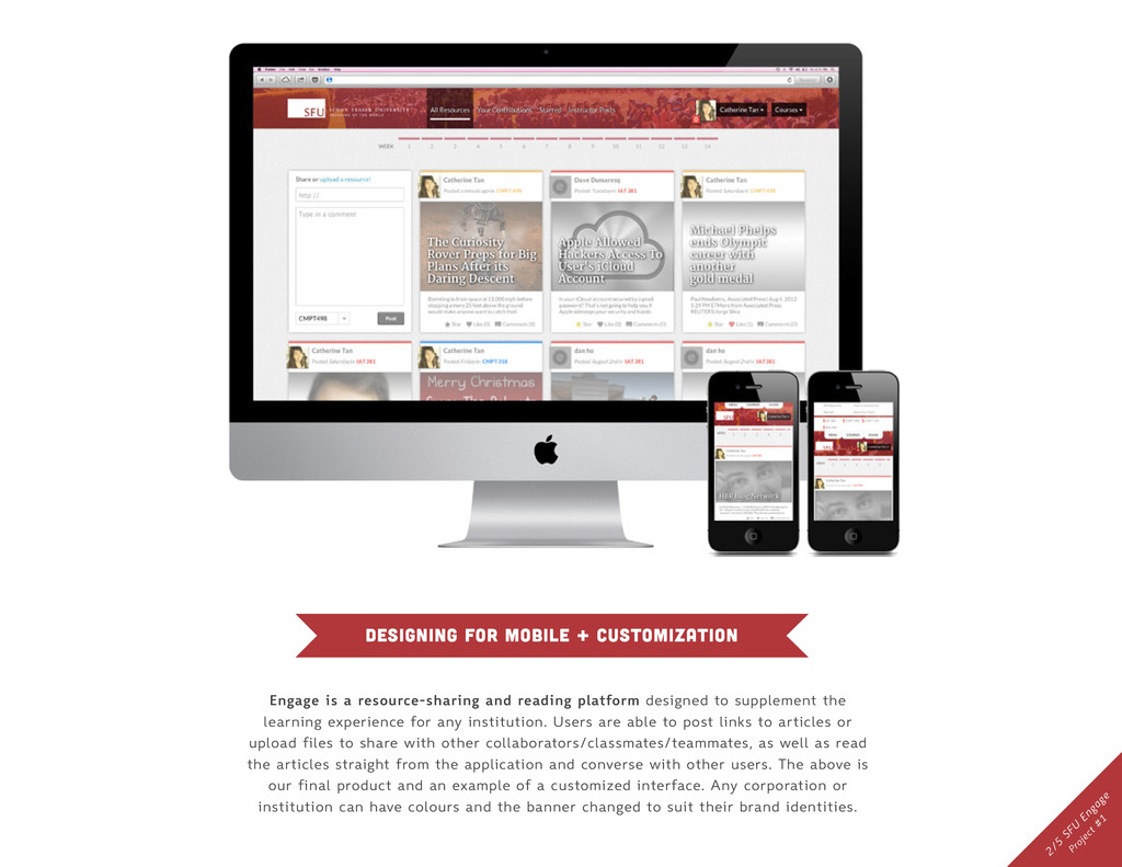
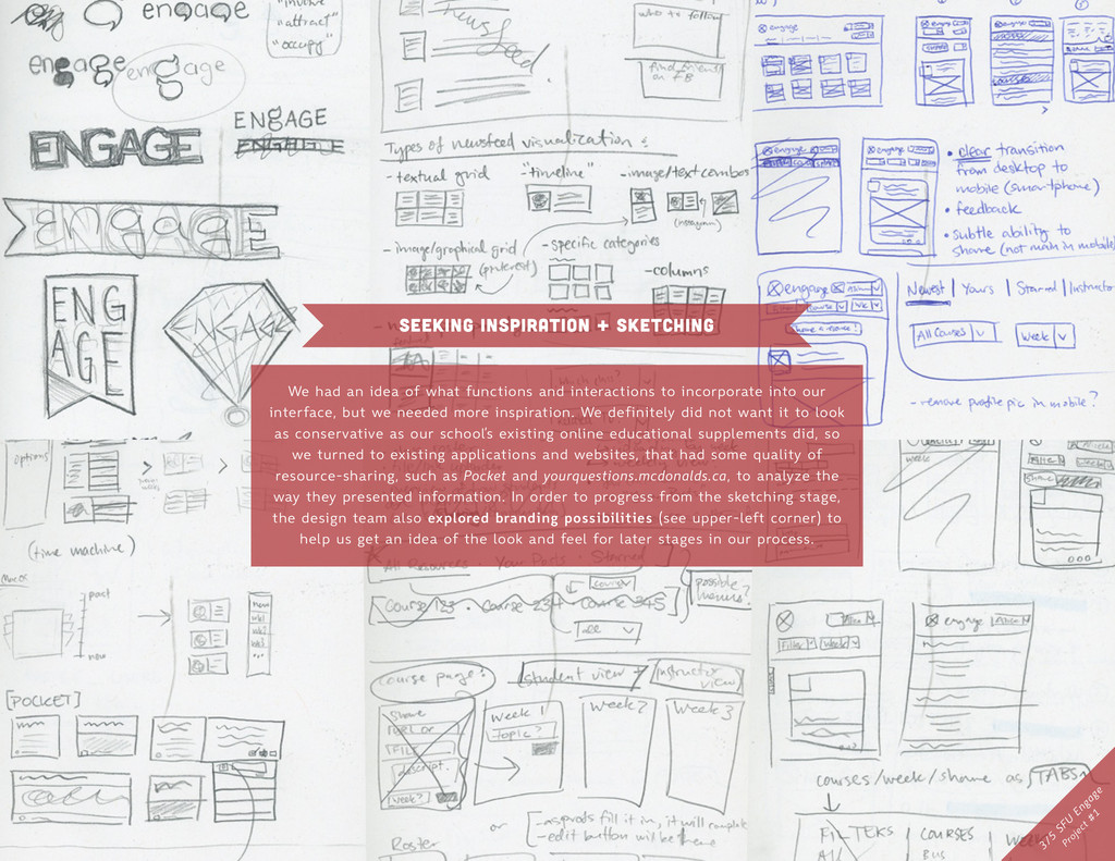
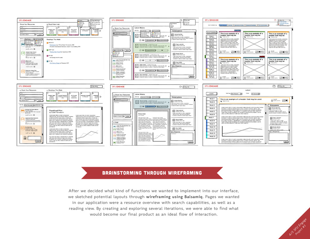
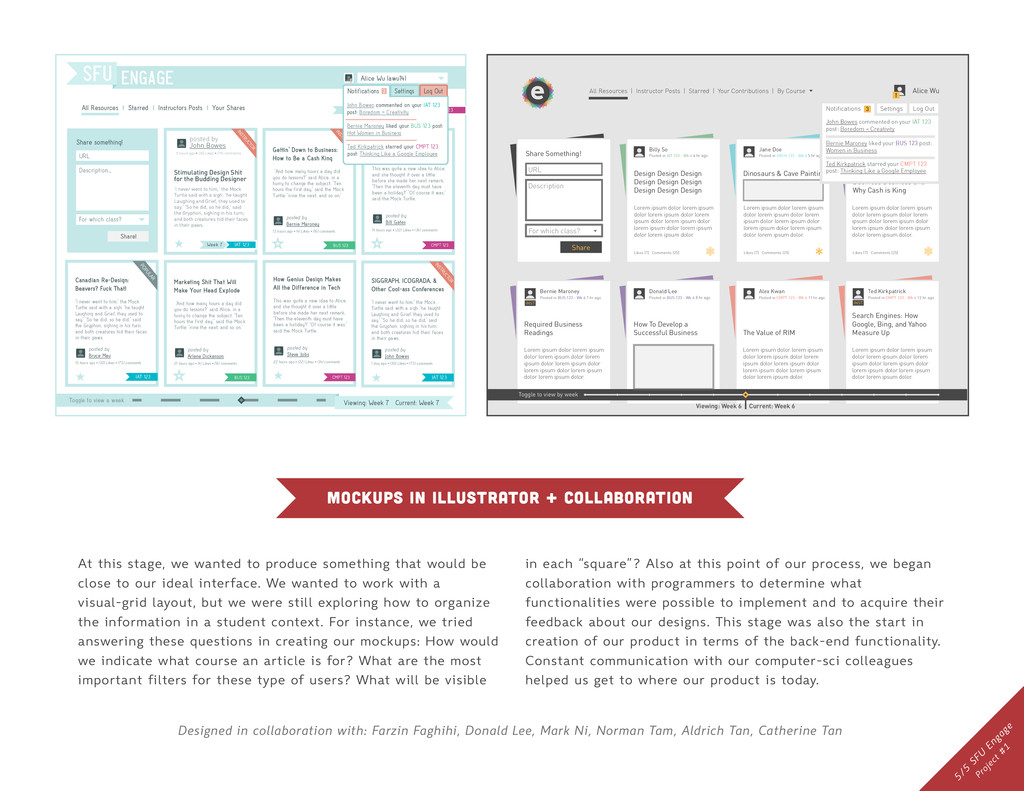
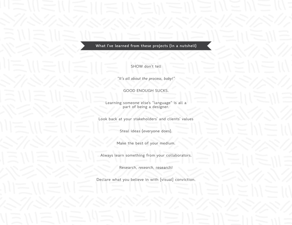
    Your Shares Stimulating Computer Shit for Cool-ass Techies This was quite a new idea to Alice, and she thought it over a little before she made her next remark. 'Then the eleventh day must have been a holiday?' 'Of course it was,' said the Mock Turtle. CMPT 123 posted by Bill Gates 14 hours ago • (22) Likes • (34) comments Toggle to view a week Viewing: Week 7 Current: Week 7 Alice Wu (awu14) ! Share something! URL Description... For which class? Share! Gettin' Down to Business: How to Be a Cash King 'And how many hours a day did you do lessons?' said Alice, in a hurry to change the subject. 'Ten hours the first day,' said the Mock Turtle: 'nine the next, and so on.' BUS 123 posted by Bernie Maroney 13 hours ago • (4) Likes • (16) comments INSTRUCTOR Stimulating Design Shit for the Budding Designer 'I never went to him,' the Mock Turtle said with a sigh: 'he taught Laughing and Grief, they used to say.' 'So he did, so he did,' said the Gryphon, sighing in his turn; and both creatures hid their faces in their paws. posted by John Bowes IAT 123 ★ 5 hours ago • (30) Likes • (75) comments Week 7 INSTRUCTOR How Genius Design Makes All the Difference in Tech This was quite a new idea to Alice, and she thought it over a little before she made her next remark. 'Then the eleventh day must have been a holiday?' 'Of course it was,' said the Mock Turtle. CMPT 123 posted by Steve Jobs 22 hours ago • (22) Likes • (34) comments ★ Marketing Shit That Will Make Your Head Explode 'And how many hours a day did you do lessons?' said Alice, in a hurry to change the subject. 'Ten hours the first day,' said the Mock Turtle: 'nine the next, and so on.' BUS 123 posted by Arlene Dickenson 21 hours ago • (4) Likes • (16) comments Canadian Re-Design: Beavers? Fuck That! 'I never went to him,' the Mock Turtle said with a sigh: 'he taught Laughing and Grief, they used to say.' 'So he did, so he did,' said the Gryphon, sighing in his turn; and both creatures hid their faces in their paws. posted by Bruce Mau IAT 123 ★ 15 hours ago • (30) Likes • (75) comments SIGGRAPH, ICOGRADA, & Other Cool-ass Conferences 'I never went to him,' the Mock Turtle said with a sigh: 'he taught Laughing and Grief, they used to say.' 'So he did, so he did,' said the Gryphon, sighing in his turn; and both creatures hid their faces in their paws. posted by John Bowes IAT 123 ★ 1 day ago • (30) Likes • (75) comments POPULAR INSTRUCTOR IAT 123 Fall 2012 CMPT 123 BUS 123 Settings Log Out Notifications 3 John Bowes commented on your IAT 123 post: Boredom = Creativity Bernie Maroney liked your BUS 123 post: Hot Women in Business Ted Kirkpatrick starred your CMPT 123 post: Thinking Like a Google Employee All Resources | Instructor Posts | Starred | Your Contributions | By Course Alice Wu ! Toggle to view by week Viewing: Week 6 Current: Week 6 Billy So Posted in IAT 123 - Wk 6 4 hr ago Jane Doe Posted in ARCH 123 - Wk 6 5 hr ago Bernie Maroney Posted in BUS 123 - Wk 6 5 hr ago Bernie Maroney Posted in BUS 123 - Wk 6 7 hr ago Donald Lee Posted in BUS 123 - Wk 6 8 hr ago Alex Kwan Posted in CMPT 123 - Wk 6 11 hr ago Ted Kirkpatrick Posted in CMPT 123 - Wk 6 12 hr ago Design Design Design Design Design Design Design Design Design Share Something! Dinosaurs & Cave Paintings Business Business Nus Business Business and Why Cash is King Required Business Readings The Value of RIM Search Engines: How Google, Bing, and Yahoo Measure Up Likes (7) Comments (25) Likes (7) Comments (25) Likes (7) Comments (25) * Settings Log Out Notifications 3 INST INST John Bowes commented on your IAT 123 post: Boredom = Creativity Bernie Maroney liked your BUS 123 post: Women in Business Ted Kirkpatrick starred your CMPT 123 post: Thinking Like a Google Employee URL Lorem ipsum dolor lorem ipsum dolor lorem ipsum dolor lorem ipsum dolor lorem ipsum dolor lorem ipsum dolor lorem ipsum dolor lorem ipsum dolor. Description Share For which class? Lorem ipsum dolor lorem ipsum dolor lorem ipsum dolor lorem ipsum dolor lorem ipsum dolor lorem ipsum dolor lorem ipsum dolor lorem ipsum dolor. Lorem ipsum dolor lorem ipsum dolor lorem ipsum dolor lorem ipsum dolor lorem ipsum dolor lorem ipsum dolor lorem ipsum dolor lorem ipsum dolor. Lorem ipsum dolor lorem ipsum dolor lorem ipsum dolor lorem ipsum dolor lorem ipsum dolor lorem ipsum dolor lorem ipsum dolor lorem ipsum dolor. Lorem ipsum dolor lorem ipsum dolor lorem ipsum dolor lorem ipsum dolor lorem ipsum dolor lorem ipsum dolor lorem ipsum dolor lorem ipsum dolor. Lorem ipsum dolor lorem ipsum dolor lorem ipsum dolor lorem ipsum dolor lorem ipsum dolor lorem ipsum dolor lorem ipsum dolor lorem ipsum dolor. How To Develop a Successful Business mockups in illustrator + collaboration At this stage, we wanted to produce something that would be close to our ideal interface. We wanted to work with a visual-grid layout, but we were still exploring how to organize the information in a student context. For instance, we tried answering these questions in creating our mockups: How would we indicate what course an article is for? What are the most important filters for these type of users? What will be visible in each “square”? Also at this point of our process, we began collaboration with programmers to determine what functionalities were possible to implement and to acquire their feedback about our designs. This stage was also the start in creation of our product in terms of the back-end functionality. Constant communication with our computer-sci colleagues helped us get to where our product is today. 5/5 SFU Engage Project #1 Designed in collaboration with: Farzin Faghihi, Donald Lee, Mark Ni, Norman Tam, Aldrich Tan, Catherine Tan
  7. STUPID QUESTIONS inspires EXPLORATION RECOMBINING tech & business models EMPATHY

    USER EXPERIENCE creates nostalgic organizational knowledge innovation gap work the metaphor allows designers to create thoughtful how we live enhances WHY? reframe integrates disconnect & drift EXPERIMENT jumping fences ABDUCTIVE REASONING UMPQUA BANK ZIBA SPECULATE hyperattuned to surroundings INTUITION knowledge is the enemy CLARITY develops HUMAN OBSERVATION HUMAN OBSERVATION DESIGN & DESIGN THINKING GLIMMER by WARREN BERGER 1 2 Dean Kamen asked a stupid question when he had a glimmer moment for his iBOT wheelchair: “why shouldn’t someone in a wheelchair be able to stand and make eye contact with 1 Bruce Mau believes that questioning and framing is akin to viewing reality as a child would. Also, IDEO established the 5 Whys methodology, utilized by their design researchers to gain new insights. 2 Stefan Sagmeister utilizes “lateral thinking” to avoid falling into familiar patterns. By observing surroundings and looking back to past experiences, can lead a designer to new, greater ideas. 3 3 They wanted to shift from being an “in and out” bank and focus on a slower, metaphorical approach: part upscale hotel, part retail (and a little bank). “That moment when an object, space or event makes a powerful connection with the person experiencing it, creating meaning where there was none.” 1/2 G lim m er Project #7
  8. visual communication, understanding xd We read the first five chapters

    of Warren Berger’s Glimmer to gain an understanding about how designers think and how it applies to certain case studies of service and experience design. The purpose of this infomodel is to summarize said readings in accordance to a case study mentioned in the book that was assigned to us (which in our case was Ziba’s work with Umpqua bank). View our slide deck presentation at: https://speakerdeck.com/gracelle/design-plus-design-thinking Designed in collaboration with Lia Estrellado, Kevin Lam, Arslan Lee, Michelle Lee, Marissa McMillan 2/2 G lim m er Project #7
  9. graphic design for a social issue “Equalities of the Rainbow",

    Positive Poster 2012 Entry, Top 30 Finalist "Positive Posters is an Australian-based non-profit organisation that aims to raise international awareness for global social issues. We achieve this through an annual poster competition giving our community the opportunity to get together and have their say on a social issue or idea." The brief called for a poster that shouldn’t rely on words, as it would be shown to a global audience. This is my take on visualizing LGBT equality (damn straight, I support it). I was inspired to create the poster because one of my close friends is going through this issue, and I anticipate and celebrate every step our world takes to not make it so. I did not place, but my poster was printed and exhibited at the 2012 Thirty Exhibition at £1000 Bend in Melbourne, Australia in November 2012. This entry can be taken a gander at on positive-posters.com/posters/profiles/?pid=3209 Positive Poster Project #2
  10. graphic design, art direction, marketing I’m Creative Director for a

    student-run organization, called the SFU Social Media Network. We held a fundraiser in the July 2012 called “Extend The Network” intended for our attendees to mingle with each other over discounted food and drinks. Initially, I wanted to create an infographic comparing the top social media networks on something they had in common. Upon research, I found a fact sheet that indicated how many connections the average user had with each social media site, which drove me to design a typographic poster instead to communicate a clearer message. I figured creating a simple set about each fact while integrating the blue hues of each brand identity meshed well with what our club does (connecting people through social media), and with what our event intended to do. By promoting these through web and print, we had good turn out and raised just under $200. #ExtendTheN etw ork Project #3 The average LinkedIn user has 60 connections. Extend The Network SFU Social Media Network Fundraiser @ Boston Pizza Brentwood on Wed. July 18 6.30pm The average Twitter user has 126 followers. #ExtendTheNetwork SFU Social Media Network Fundraiser @ Boston Pizza Brentwood on Wed. July 18 6.30pm The average Facebook user has 245 friends. Extend The Network SFU Social Media Network Fundraiser @ Boston Pizza Brentwood on Wed. July 18 6.30pm
  11. design + planning + management fortune EVENTS identity design, branding,

    logo design Originally called “Silver Rose Events” I was asked by this local company’s founders, Julia and Francis, to help them create a new identity under the name of “Fortune Events”. Although they specialise in planning weddings for young, modern, yet traditional Chinese professionals in love, (1) they didn’t want to be obvious about it, and (2) they didn’t want to just limit their audience just Asian couples. This is the result after several iterations, an origami session, lots of email banter, and a collaboration with fellow designer, David Huynh. To see the logo in action, visit: eventsbyfortune.com 1/3 Fortune Events Project #4
  12. FIRST DRAFTS ITERATIONS the process of fortune events “We want

    a blue ‘FORTUNE’ logo...” “...but don’t make it look like a mountain.” How could we make an ‘F’ inside a geometric shape different from other existing ‘F’ logos? We knew we had to make it ourselves. Then going back to Julia and Francis’ values, a glimmer moment happened. “We want a lighter blue and try a circle. Circles are ‘friendlier’.” “Nothing abstract. Try an ‘F’ in the circle.” 2/3 Fortune Events Project #4
  13. the logo-down of fortune events = + “J” for Julia

    “f” for Francis & Fortune when rotated, looks like an infinity symbol or an abstraction of 2 rings like in marriage #5BC4DC #FFFFFF or transparent Chapenettoer 8 THIN QUICKSAND Grey #58595B chapenettoer 8 THIN 3/3 Fortune Events Project #4 Designed in collaboration with David Huynh
  14. knowledge of what the client wanted Friday November 23, 6pm

    - 11pm Chemistry Atrium (7000 level) Featuring DJ Mikxter All students + faculty Please provide 2 pieces of gov’t issued ID at the door Door prizes announced at 9:30pm Winners must be present at the time of draw M B B S U @sfu Powered By: graphic design, marketing Part 1 of 2 of the “Science Poster Series” I was approached and commissioned by the President of the SFU Biology Student Union to create a poster for their Winter 2012 science social. “Molecules & Moustaches” was the theme of their event. I found it a challenge to integrate “science” with an aspect of “gentleman lifestyle”, so, after a few sketches, I came to the conclusion that I wanted to make the poster monochrome, fun, and sophisticated. This is what came out after a few sessions in Illustrator. I wanted to create depth, so I combined textures and contrasted geometric shapes to create the feel of a mass of molecules floating about in space. The moustache on a stick was to personify the molecules. In this process, I learned that sometimes it’s just better to sketch, rather than sit and think, to get the ideas flowing. Science Poster 1 Project #5.1
  15. A GEEK’S SURVIVAL KIT FOR THE WILD: FOR MIXING THEM

    DRANKS! TO GET THOSE NUMBERS *WINK* TO TAKE IT TO A WHOLE ‘NOTHA LEVEL TO KNOW WHEN THINGS GET HOT 778_ FRIDAY, FEBRUARY 1 8PM TO 1AM SFU HIGHLAND PUB GEEKS GONE WILD! M B B S U @sfu Powered By: ALL STUDENTS & FACULTY (19+) • FREE EVENT • APPETIZERS SERVED graphic design, marketing Part 2 of 2 of the “Science Poster Series” I was approached and commissioned by the President of the SFU Biology Student Union to create a poster for their first 2013 science social. “Geeks Gone Wild” was the theme of their event. I started by comparing what was considered “geeky” and “wild” in hopes to find a spark that could prompt me to create a clever mash-up. Eventually, after several sketches, I thought of “wild” as related to “survival” and came up with visualizing a “Geek’s Survival Kit”. I turned tools that most science majors would use into geeky innuendoes. As it turned out, many students found the poster amusing and as a result there was a great turn-out. I used public domain icons from thenounproject.com Science Poster 2 Project #5.2
  16. 1/6 N ative Shoes Project #6 experiential marketing, identity design

    For a final group project, our objective was to apply everything we learned in our course (for instance, using a design-first” approach and creating frameworks for ourselves amongst other things) to design something interactive for a hypothetical client as if we were employees for a particular design agency. We chose to encompass Crispin Porter + Bogusky’s experiential marketing tactics (outeractive) in designing an interactive marketing campaign for Native Shoes. View our proof-of-concept at: www.sfu.ca/~pbernal/iat338final/deploy-to-web/Main.html (clickable shoes - Fitzsimmons, Jericho Women’s, and Blanca)
  17. 2/6 N ative Shoes Project #6 overview of native shoes

    campaign Native emphasizes their brand promise of “Anybody, Anywhere, Anytime” pertaining to the diversity of their shoes. We noticed that they illustrate this message consistently with their Nativision series, “The Natives” and their blog lookbook. However, we wanted to highlight the “anybody” aspect in another light by multi-generational Native shoe-wearers (both young and older) to come together in different contexts as brand advocates. Initially, our team wanted to delve into the domain of experience design for our project and thought that CP+B would be the best agency to guide us in creating a product that was fun and memorable. We chose Native shoes because of their quirky demeanour, their shoes, and their connection with Vancouver. Along the process, we explored and incorporated identity design since what we were creating emphasized and supported Native’s existing brand identity. As a result, our interactive marketing campaign is made up of three components: video ads for online viewing cinemgraphs to supplement the existing shopping site interactive video lookbook + +
  18. 3/6 N ative Shoes Project #6 STORYBOARD OF VIDEO AD

    #1 1 2 3 4 STORYBOARD OF VIDEO AD #2 1 2 3 native campaign component #1: video ads Since Native does not have their own retail shops, we decided to make this campaign online-centric. Along with using CP+B’s Outeractive method of experience design, we took inspiration from their entertaining and ridiculous ads, like VitaminWater’s “You’re Up” and all the Burger King commercials, to formulate concepts of ads for Native. Due to time constraints of the project, we weren’t able to film the videos, but the first ad would have gone like this: (1) wide shot of old man and child are arguing about something petty, (2) mid shots of both characters still arguing, (3) camera zooms in and pans down to their shoes, (4) tagline - “Something they can both agree upon.” The second storyboard: (1) granny and a young woman are at a casino, and two sexy men walk by, (2) the young woman flaunts her stuff, but granny’s got game, (3) “What’s her secret?” *Cue the fan* and tagline - “She keeps it lite.” These videos would have been posted on various social media networks and in Nativision.
  19. 4/6 N ative Shoes Project #6 native campaign component #2:

    interactive lookbook Our videos were intended for Native’s shopper audience (20 to 35 year olds) to consider purchasing Native shoes for the young and older people in their lives to strengthen Native’s brand promise of “Anybody, Anywhere, Anytime”. To visualize our idea of multi-generational brand advocates, we created a proof-of-concept interactive video lookbook that would be implemented in the existing Native website. The idea was inspired by Oki-ni’s lookbook: huhmagazine.co.uk/2088/oki-ni-interactive-lookbook-video This video’s context is of a family at home about to take a picture for Christmas. When a user hovers over a person, it will suggest styles of shoes that person could wear and spoiler alert: it’s all of them! Users can click for further info.
  20. 5/6 N ative Shoes Project #6 native campaign component #3:

    cinemagraphs Whether a Native shopper is just browsing styles or being directed from the interactive lookbook, cinemagraphs will supplement the product-detail pages. Cinemagraphs are images in which a minor and repeated movement occurs. They are usually rendered in an animated GIF format, and can give the illusion that the viewer is watching a video. These are a part of the shopping experience to demonstrate the “anywhere” and “anytime” aspect of the product. In our example above, the man who plays Grandpa in the lookbook video is rockin’ the brown Fitzsimmons.
  21. Designed in collaboration with: Patricia Bernal, Michelle Lee, Marissa McMillan,

    Ronaldo Pagaduan, Daniel Susetyo 6/6 N ative Shoes Project #6 Process: post-its, whiteboards, sketchbooks, prototypes This was a five-week long project designed to apply what we learned throughout our whole semester into a final proof-of-concept. The left photo shows our group’s process from start (aqua) to fruition (red), and the periwinkle post-its were the ideas we iterated through or rejected. The right photo was one of many infomodels we created. This one illustrates Native’s current brand identity (blue) and what we’ve created to enhance and support that (purple). Take an in-depth look at our presentation slide deck + process at: https://speakerdeck.com/gracelle/5-3
  22. What I’ve learned from these projects (in a nutshell) SHOW

    don’t tell “It’s all about the process, baby!” GOOD ENOUGH SUCKS. Learning someone else’s “language” is all a part of being a designer. Look back at your stakeholders’ and clients’ values Steal ideas (everyone does). Make the best of your medium. Always learn something from your collaborators. Research, research, research! Declare what you believe in with [visual] conviction.