Upgrade to Pro
— share decks privately, control downloads, hide ads and more …
Speaker Deck
Features
Speaker Deck
PRO
Sign in
Sign up for free
Search
Search
Getting started with Responsive Design [FRENCH]
Search
Greg Hoin
October 20, 2012
Design
0
63
Getting started with Responsive Design [FRENCH]
From the Paris-Web 2012 Workshop
Greg Hoin
October 20, 2012
Tweet
Share
Other Decks in Design
See All in Design
デザイナーがはばたく未来の入り口『hatch』が描く、新しいデザイナー育成のカタチ
goodpatch
3
3.1k
「稼ぐ」だけでなく 「還す」ためのデザイン / Designship2025
culumu
1
570
「自分の仕事はどこまで?」と問い続けたら。デザイナーの「視座」を考える
mukai_takeru
0
300
組織の右腕として共創する ー デザインと経営の二つの視点から見えた、新しい支援のかたち/ Designship2025_Nishimura
root_recruit
0
280
爆速開発でAIプロダクトが40万インプレッションになった話
tsubura
0
160
「ツール」から「パートナー」へ。AI伴走時代のUXデザインとは?~操作を減らし、成果を最大にするための設計~
ncdc
0
110
第18回サイゼミ
lw
1
3.3k
【Designship 2025|10.11】デザイン組織と事業貢献、その挑戦と結果。
payatsusan213
1
910
プロダクトデザイナーに学ぶ、『見る気が起きる』ダッシュボードの作り方 / Creating Engaging Dashboards: Lessons from Product Designers
yamamotoyuta
2
500
2026年の勢い / Momentum for 2026
bebe
0
340
Treasure_Hunting
solmetts
0
240
2026年、デザイナーはなにに賭ける?
0b1tk
0
480
Featured
See All Featured
Utilizing Notion as your number one productivity tool
mfonobong
3
220
Test your architecture with Archunit
thirion
1
2.2k
Why You Should Never Use an ORM
jnunemaker
PRO
61
9.7k
Max Prin - Stacking Signals: How International SEO Comes Together (And Falls Apart)
techseoconnect
PRO
0
86
Heart Work Chapter 1 - Part 1
lfama
PRO
5
35k
Practical Tips for Bootstrapping Information Extraction Pipelines
honnibal
25
1.7k
How to Build an AI Search Optimization Roadmap - Criteria and Steps to Take #SEOIRL
aleyda
1
1.9k
Sharpening the Axe: The Primacy of Toolmaking
bcantrill
46
2.7k
Sam Torres - BigQuery for SEOs
techseoconnect
PRO
0
190
Easily Structure & Communicate Ideas using Wireframe
afnizarnur
194
17k
16th Malabo Montpellier Forum Presentation
akademiya2063
PRO
0
50
New Earth Scene 8
popppiees
1
1.5k
Transcript
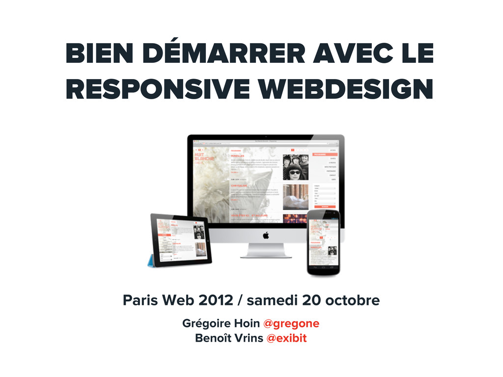
BIEN DÉMARRER AVEC LE RESPONSIVE WEBDESIGN Paris Web 2012 /
samedi 20 octobre Grégoire Hoin @gregone Benoît Vrins @exibit
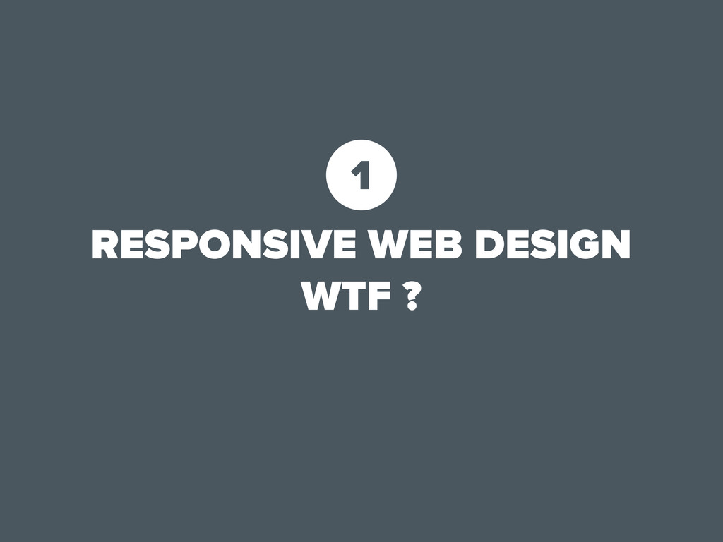
RESPONSIVE WEB DESIGN WTF ? 1
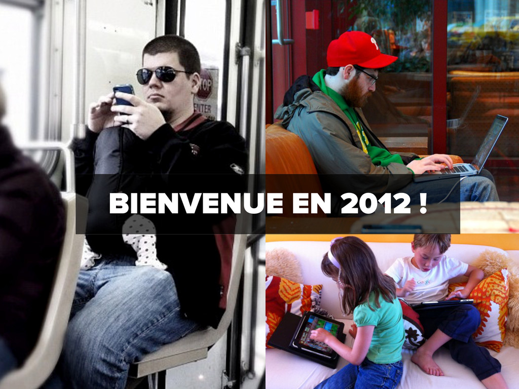
BIENVENUE EN 2012 !
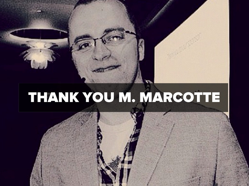
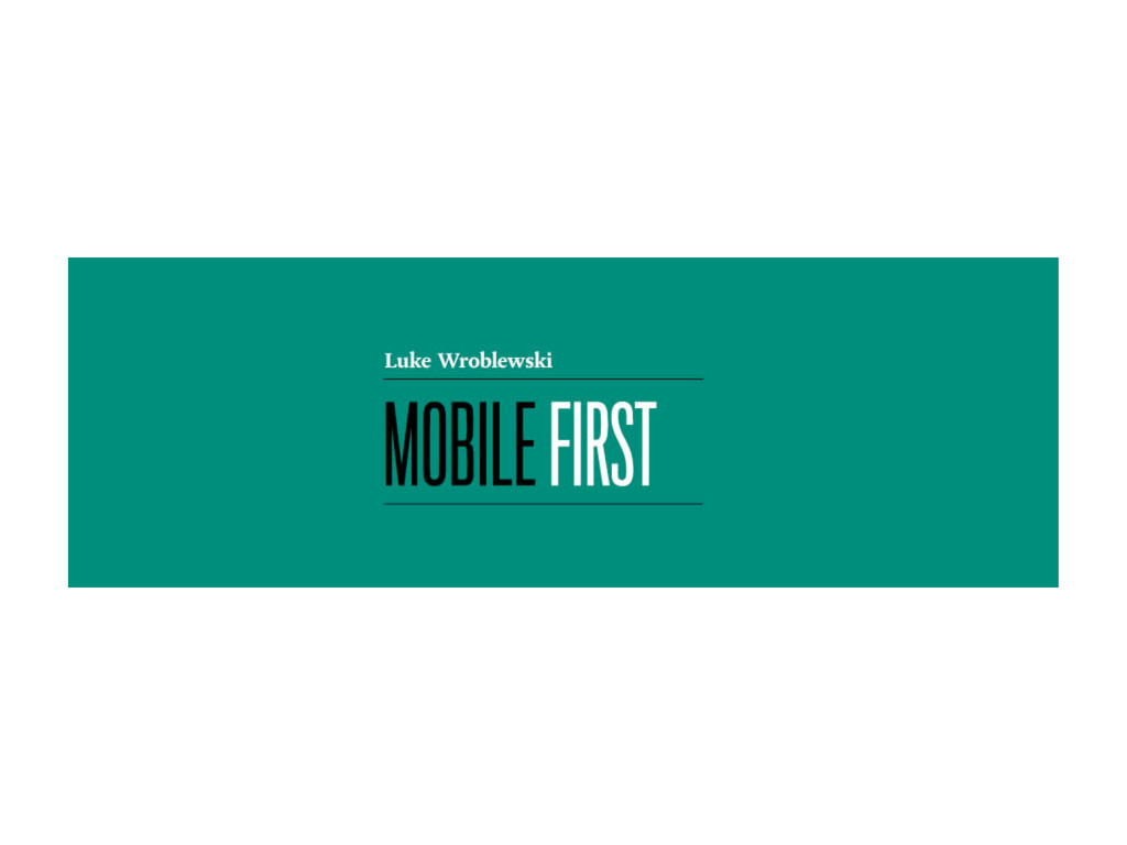
THANK YOU M. MARCOTTE
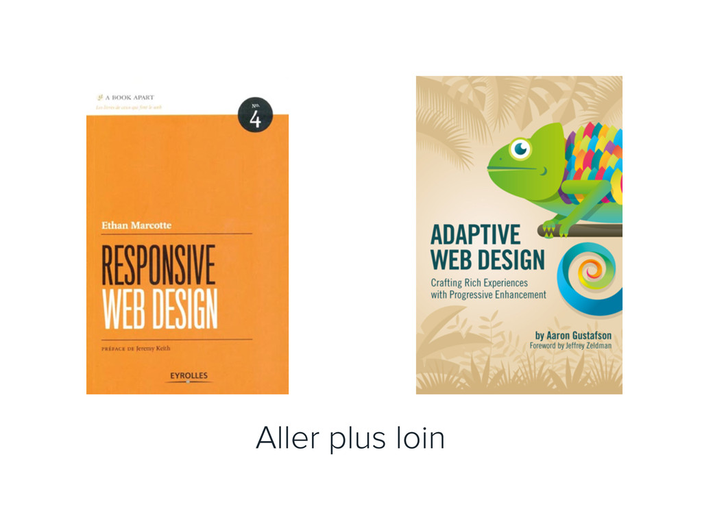
Aller plus loin
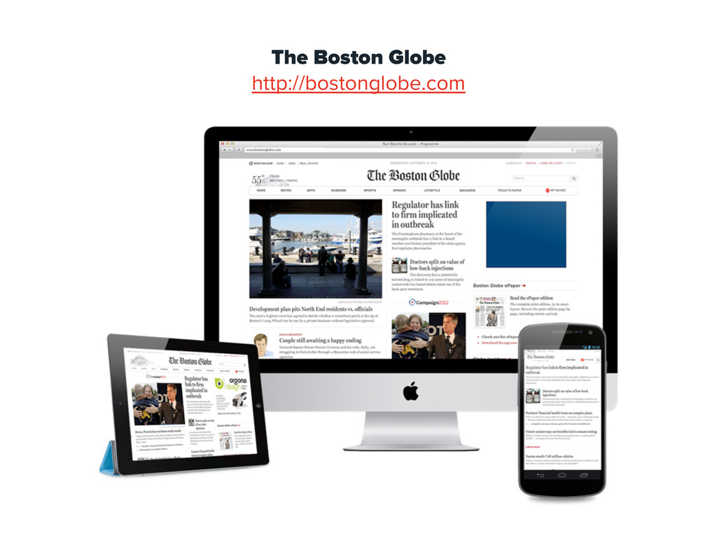
The Boston Globe http://bostonglobe.com
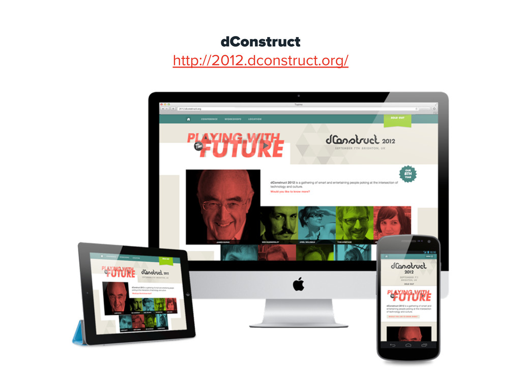
dConstruct http://2012.dconstruct.org/
2 RWD = ADAPTÉ POUR TOUS LES PROJETS?
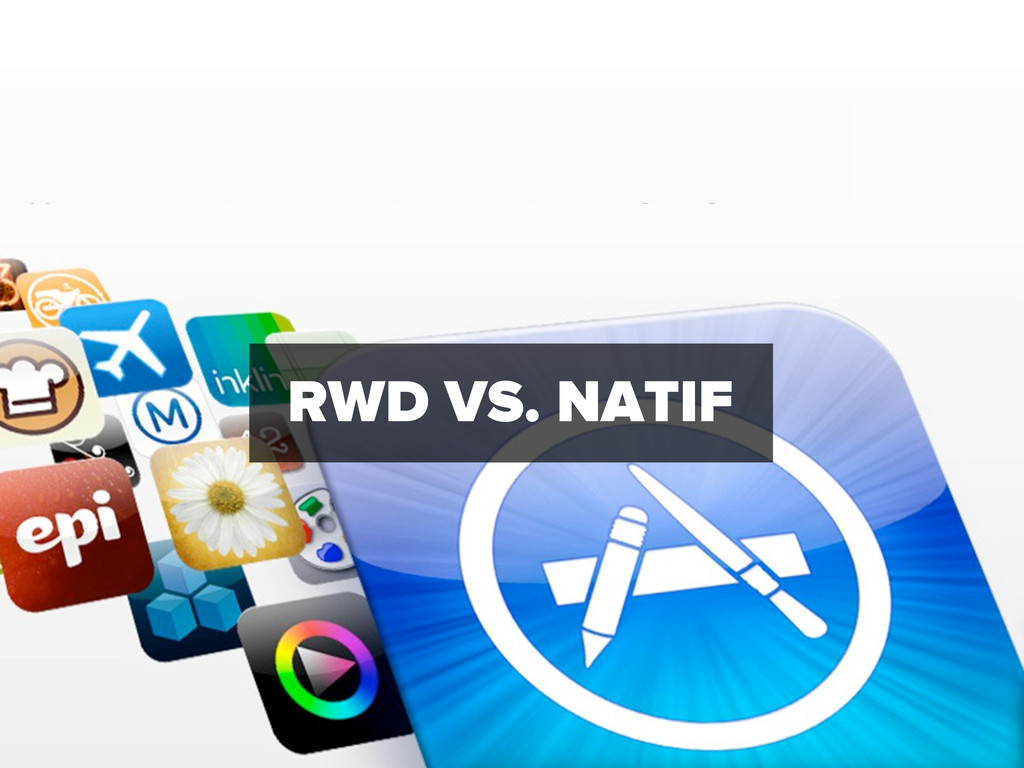
RWD VS. NATIF
• Plateformes multiples: iOS, Android, Window Phone, ... • Besoins
de fonctionnalités Natives, puissance de calcul? • Support et Evolution • Positionnement et Marketing sur l’AppStore
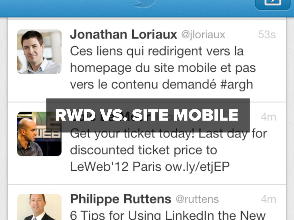
RWD VS. SITE MOBILE
• UA sniffing • Structure des URL • Split du
focus technologique • Split du focus utilisateur
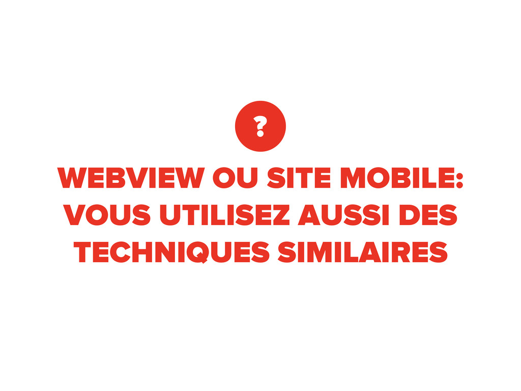
WEBVIEW OU SITE MOBILE: VOUS UTILISEZ AUSSI DES TECHNIQUES SIMILAIRES
?
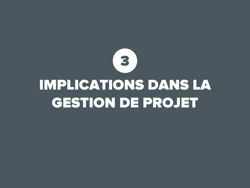
3 IMPLICATIONS DANS LA GESTION DE PROJET
Soyez prêts à changer d’habitudes. Ne vous reposez pas sur
vos acquis.
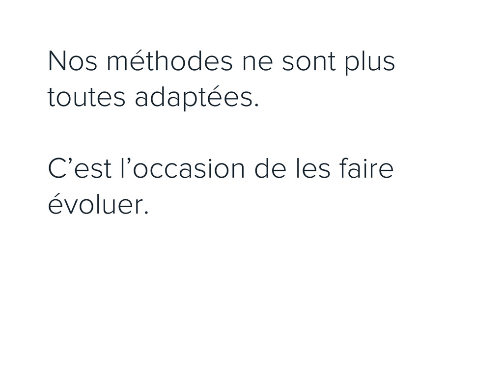
Nos méthodes ne sont plus toutes adaptées. C’est l’occasion de
les faire évoluer.
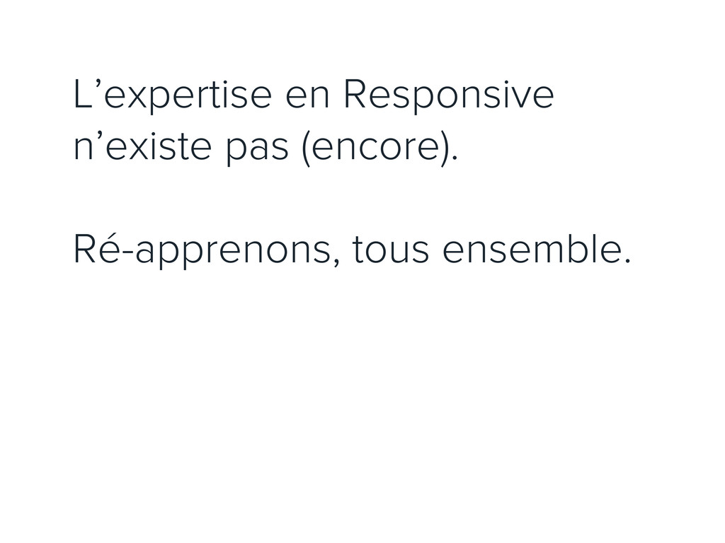
L’expertise en Responsive n’existe pas (encore). Ré-apprenons, tous ensemble.
#FAIL Apprenez par l’erreur (et celles des autres). Soyez prêts
à travailler un peu plus au début.
4 CONTENU & PRIORITÉS
None
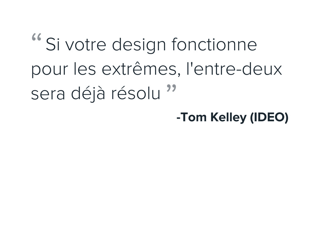
Si votre design fonctionne pour les extrêmes, l'entre-deux sera déjà
résolu -Tom Kelley (IDEO) “ ”
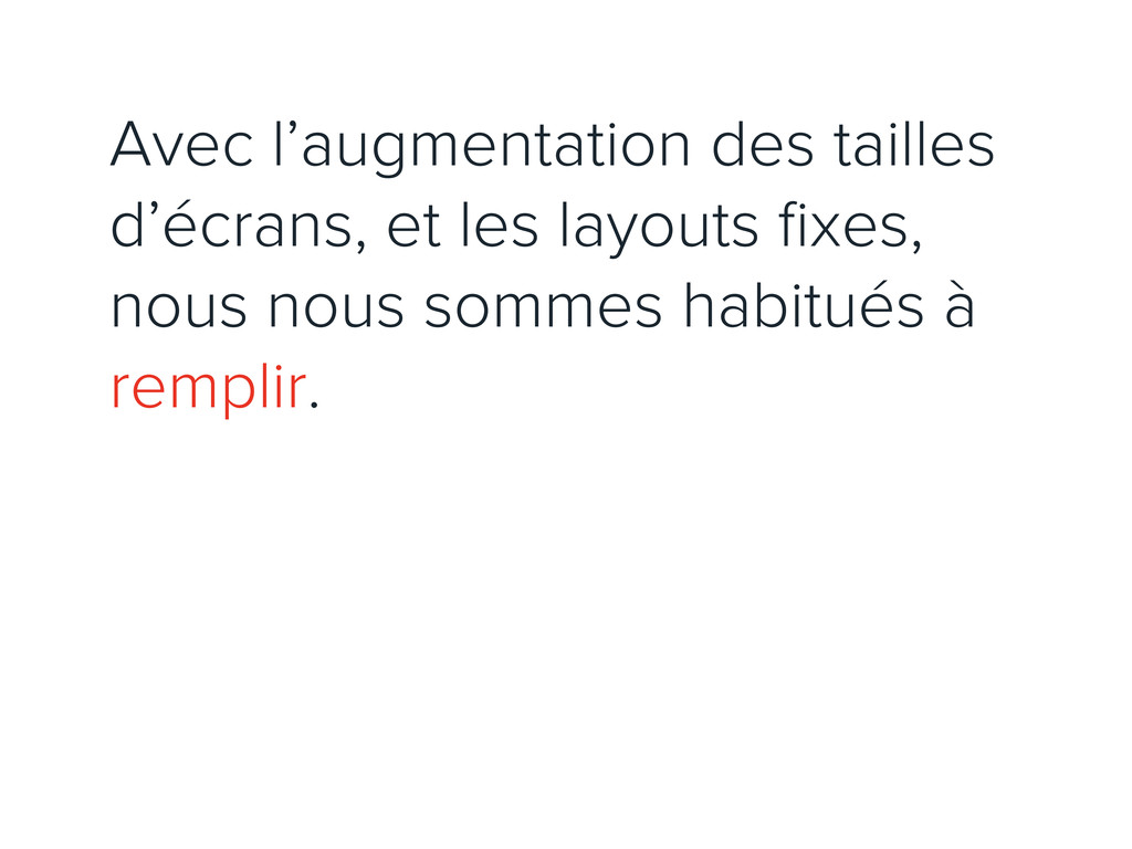
Avec l’augmentation des tailles d’écrans, et les layouts fixes, nous
nous sommes habitués à remplir.
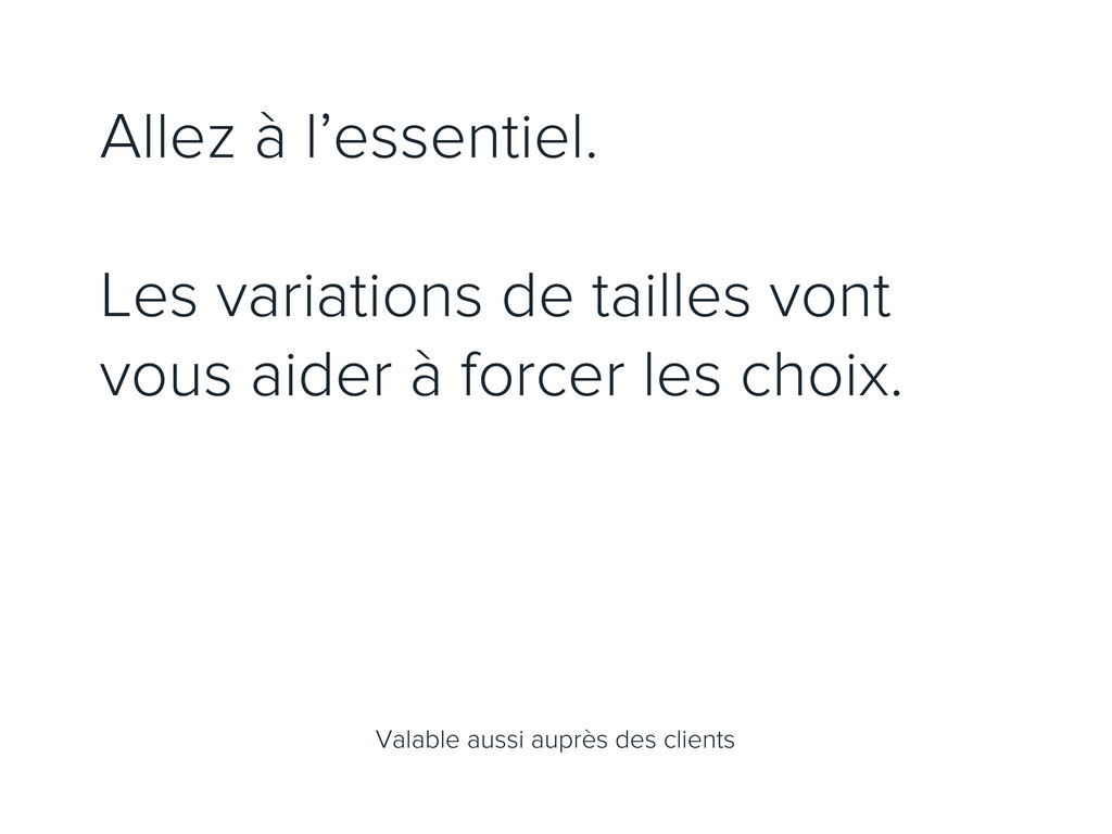
Allez à l’essentiel. Les variations de tailles vont vous aider
à forcer les choix. Valable aussi auprès des clients
Exemple :
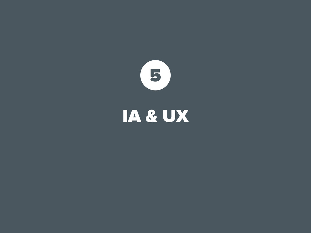
5 IA & UX
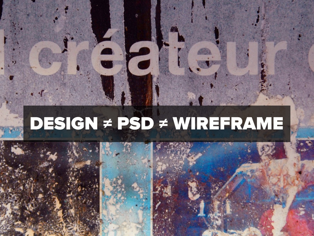
DESIGN ≠ PSD ≠ WIREFRAME
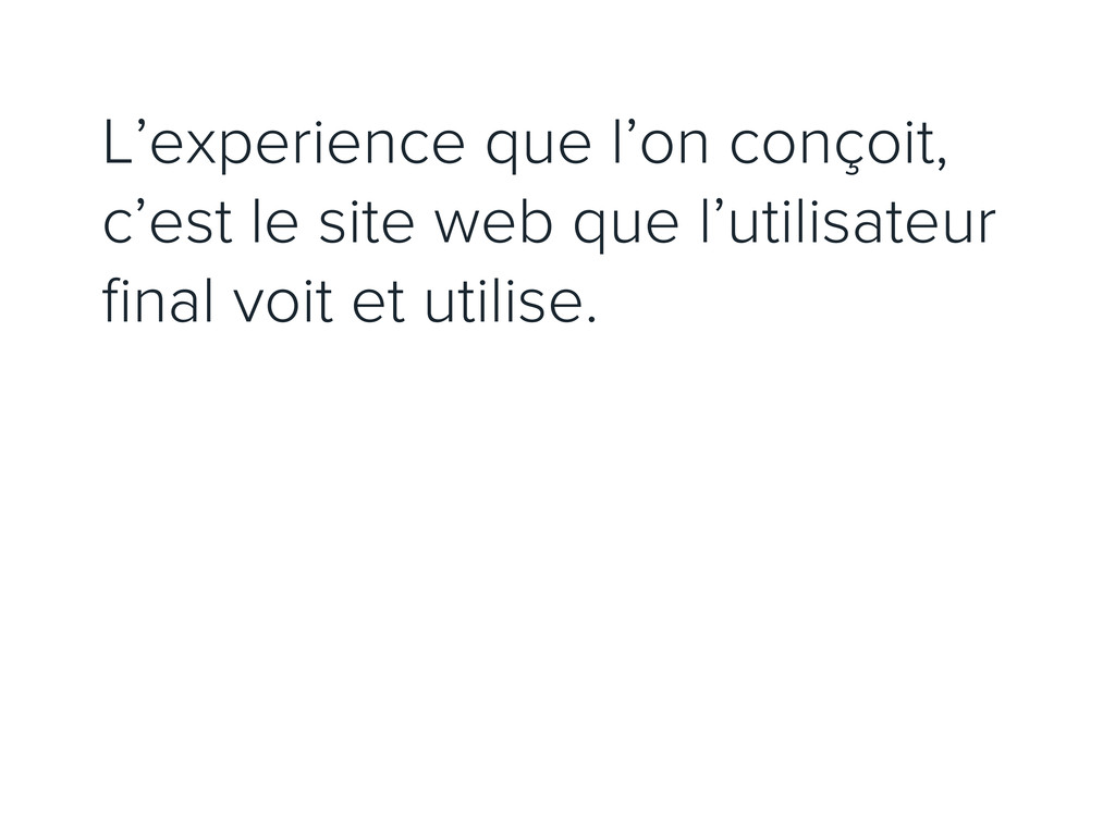
L’experience que l’on conçoit, c’est le site web que l’utilisateur
final voit et utilise.
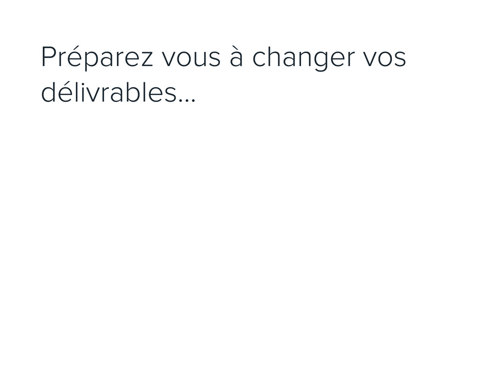
Préparez vous à changer vos délivrables...
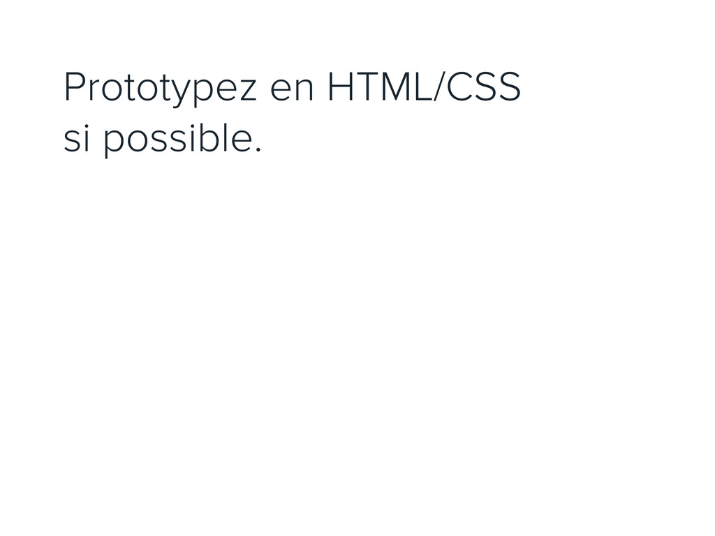
Prototypez en HTML/CSS si possible.
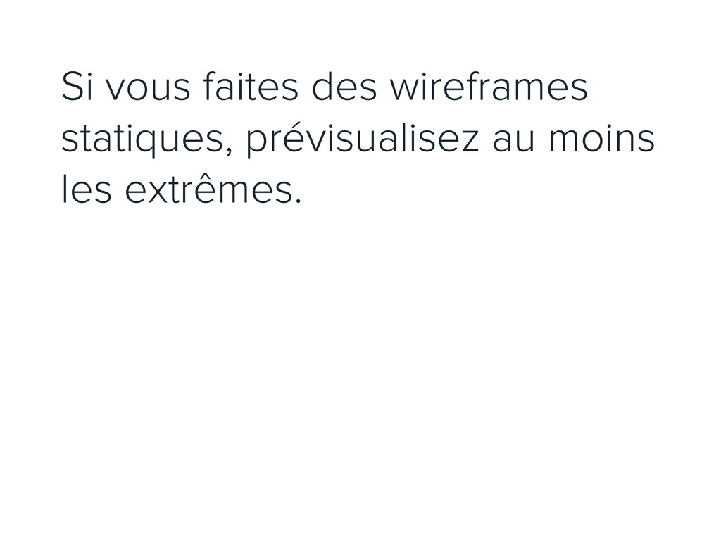
Si vous faites des wireframes statiques, prévisualisez au moins les
extrêmes.
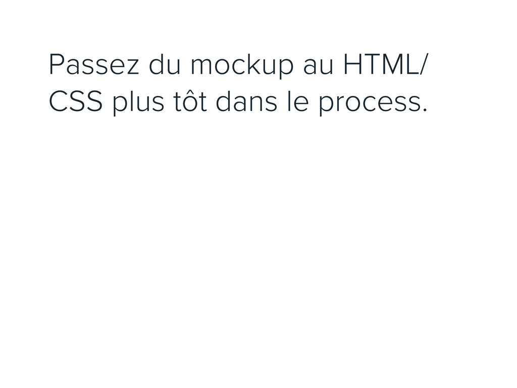
Passez du mockup au HTML/ CSS plus tôt dans le
process.
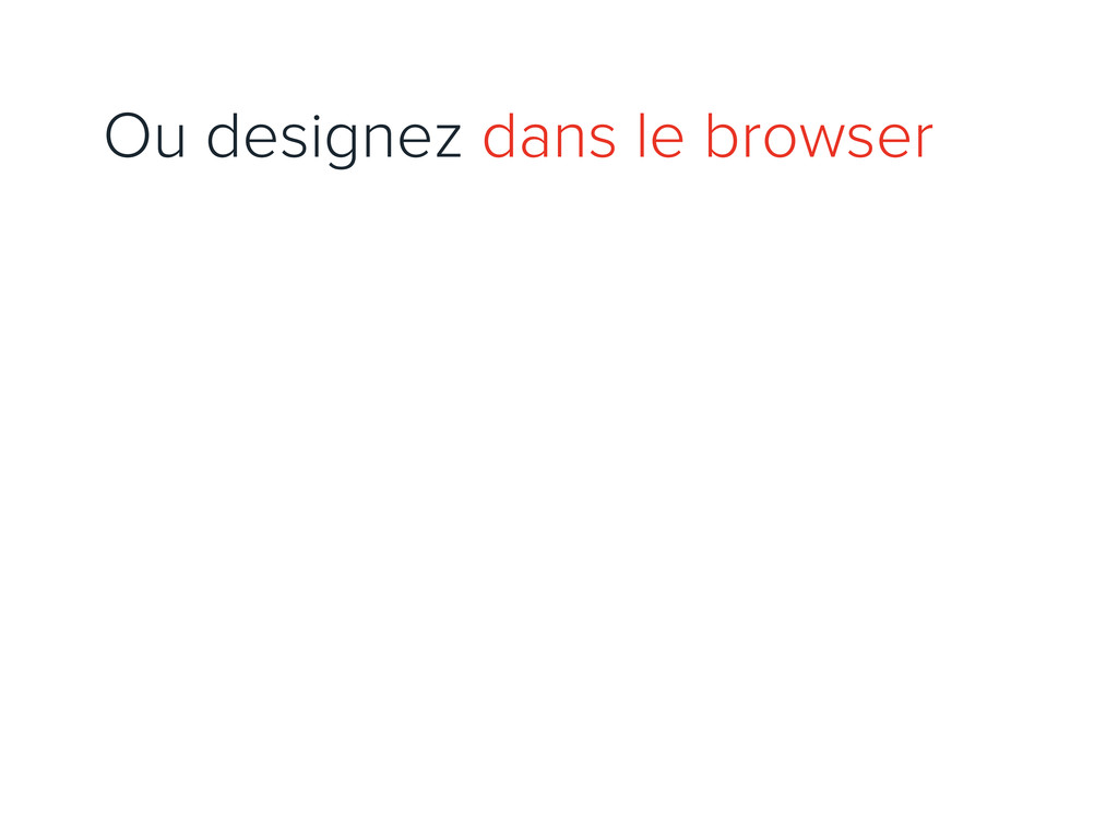
Ou designez dans le browser
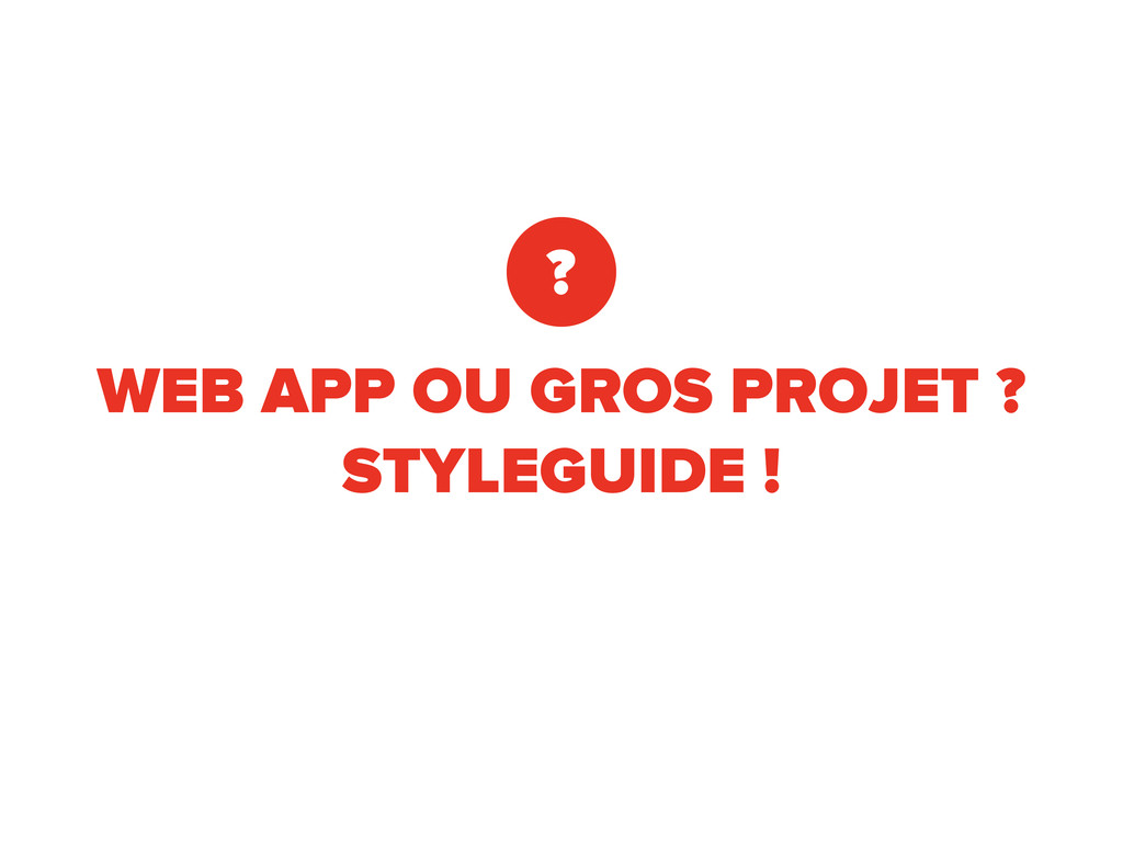
WEB APP OU GROS PROJET ? STYLEGUIDE ! ?
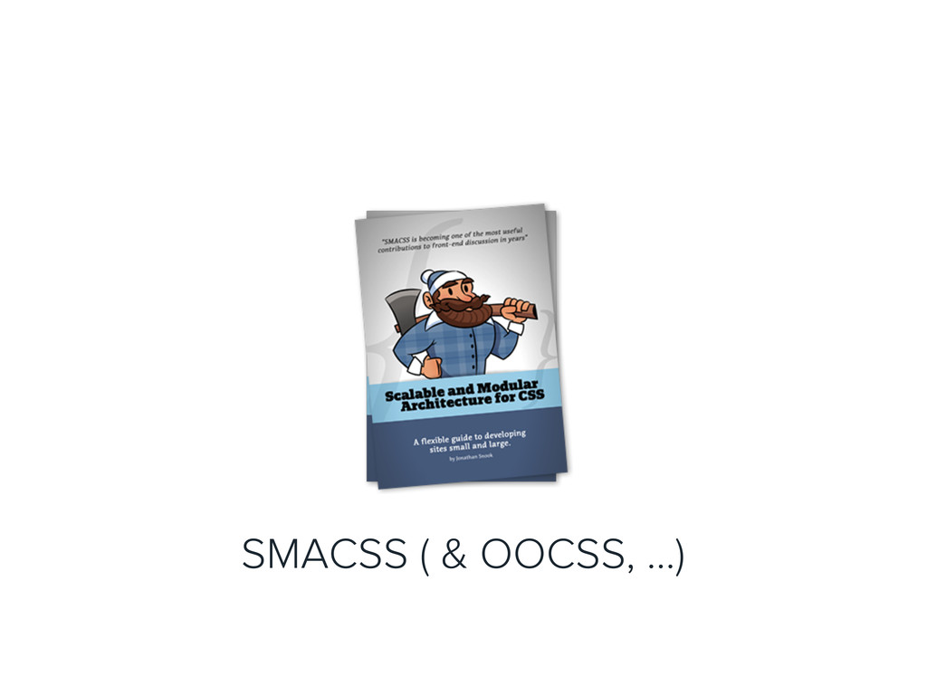
SMACSS ( & OOCSS, ...)
FRAMEWORK CSS + GRILLE FLUIDE
6 C’EST L’HISTOIRE DE DEUX SITES WEB
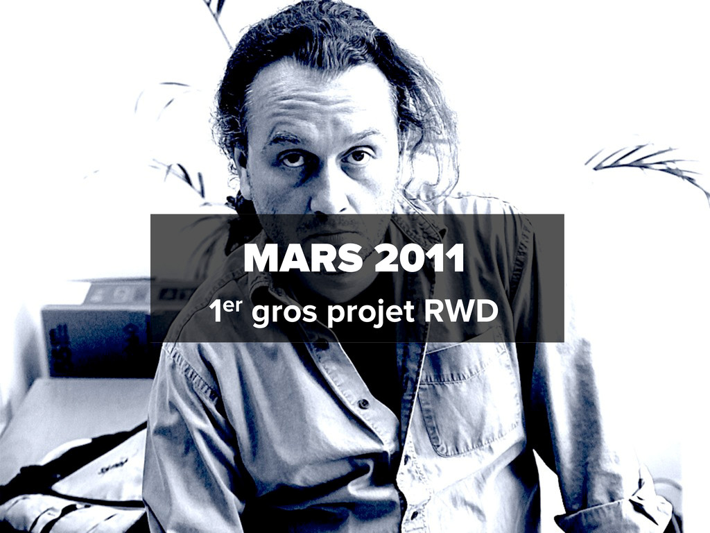
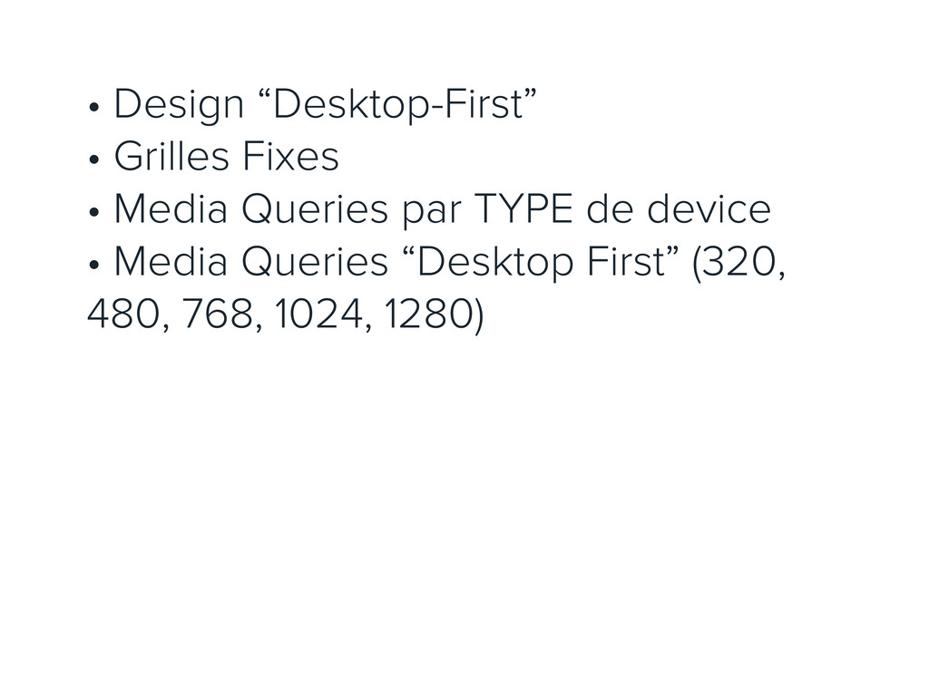
MARS 2011 1er gros projet RWD
• Design “Desktop-First” • Grilles Fixes • Media Queries par
TYPE de device • Media Queries “Desktop First” (320, 480, 768, 1024, 1280)
Food Drink Europe http://fooddrinkeurope.com/
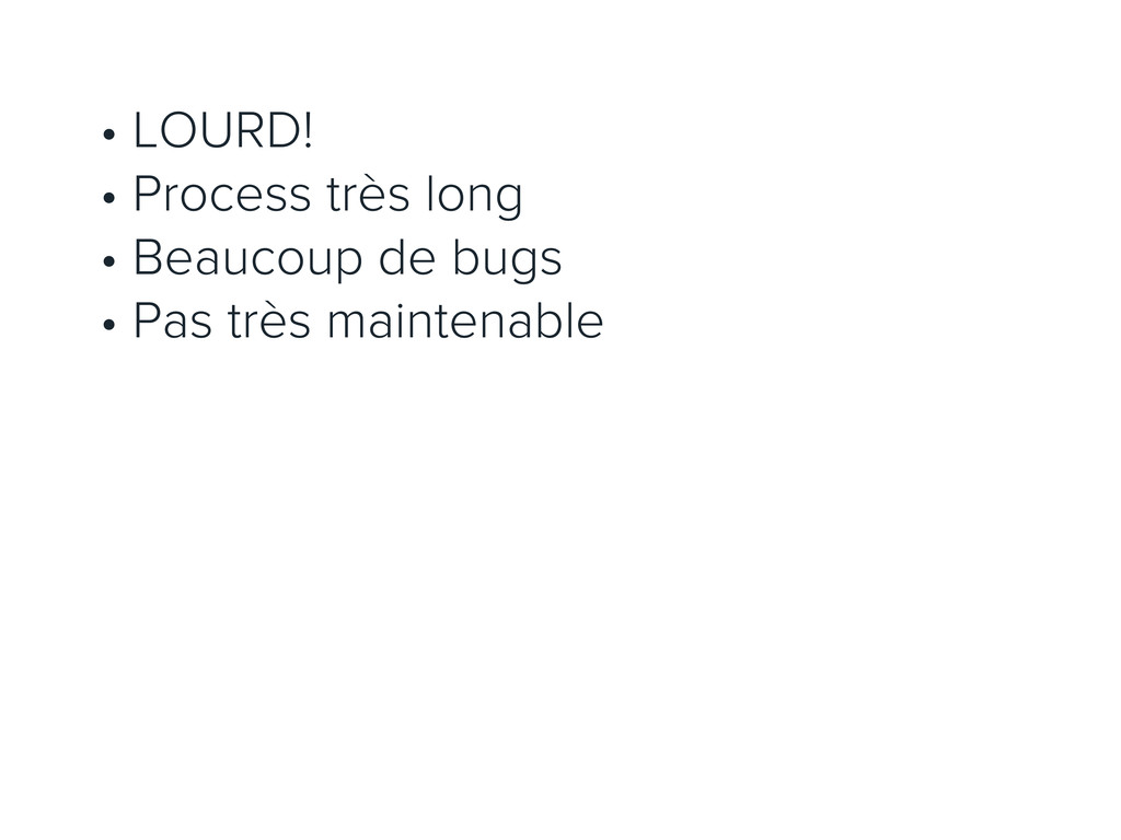
• LOURD! • Process très long • Beaucoup de bugs
• Pas très maintenable
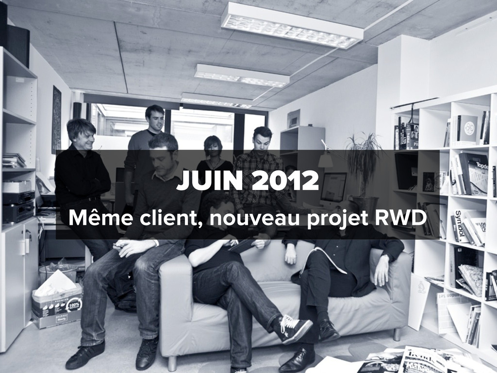
JUIN 2012 Même client, nouveau projet RWD
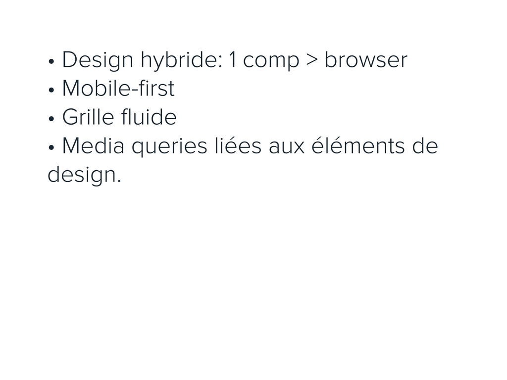
• Design hybride: 1 comp > browser • Mobile-first •
Grille fluide • Media queries liées aux éléments de design.
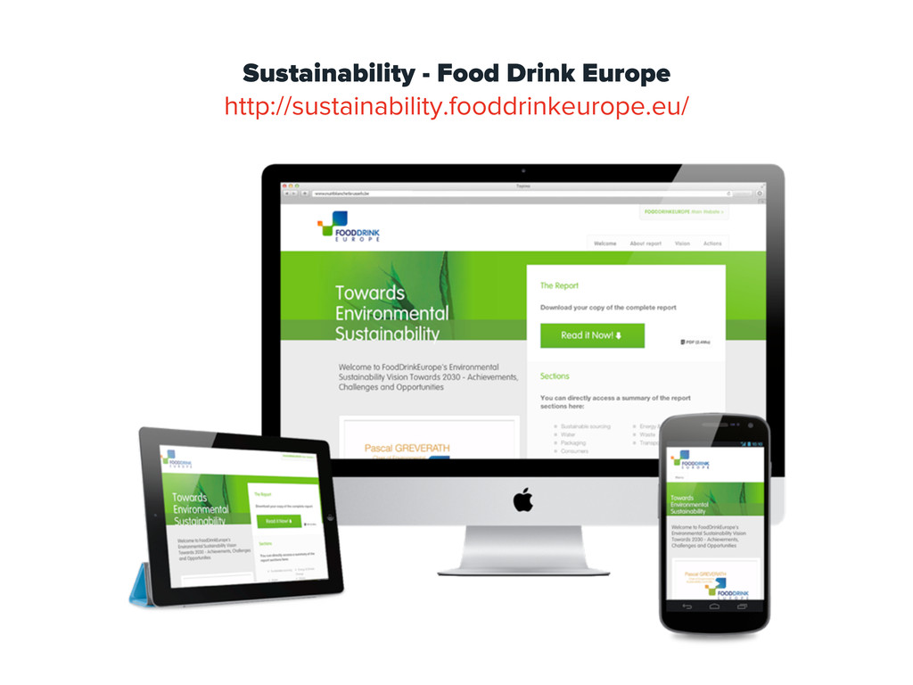
Sustainability - Food Drink Europe http://sustainability.fooddrinkeurope.eu/
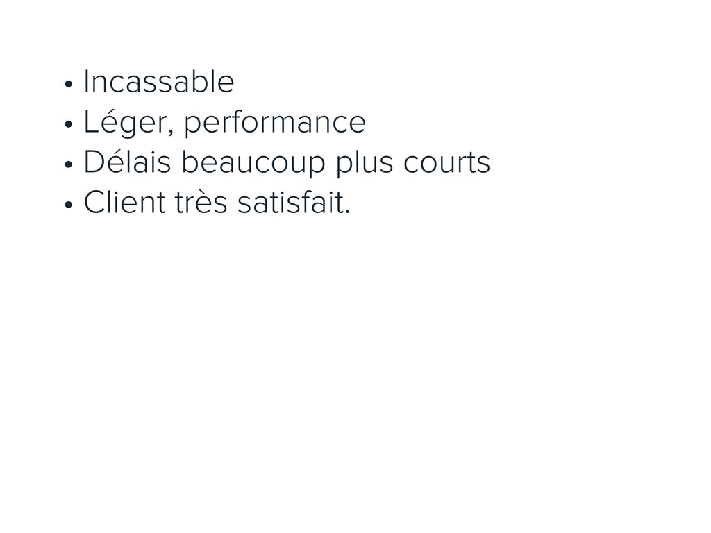
• Incassable • Léger, performance • Délais beaucoup plus courts
• Client très satisfait.
7 PARLONS BUDGET
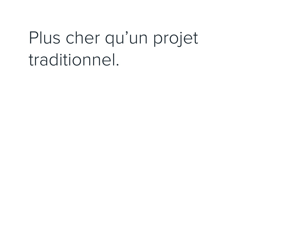
Plus cher qu’un projet traditionnel.
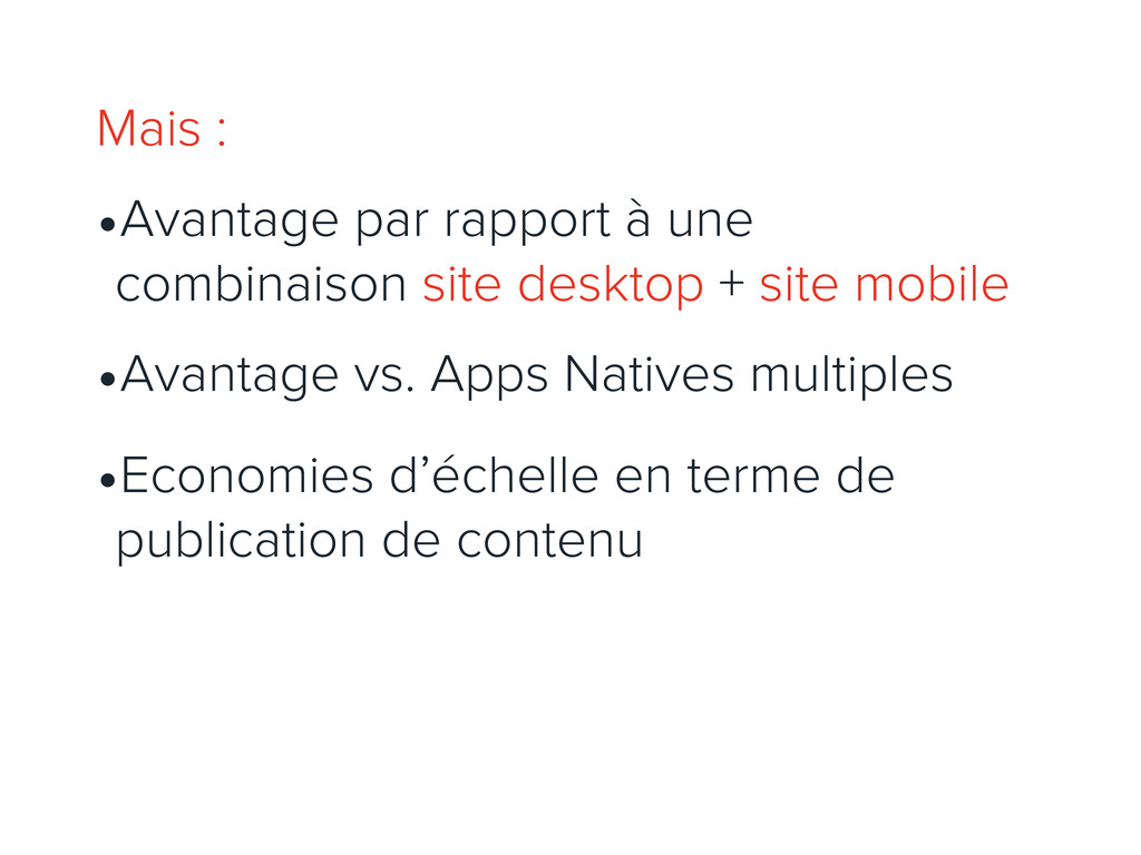
Mais : •Avantage par rapport à une combinaison site desktop
+ site mobile •Avantage vs. Apps Natives multiples •Economies d’échelle en terme de publication de contenu
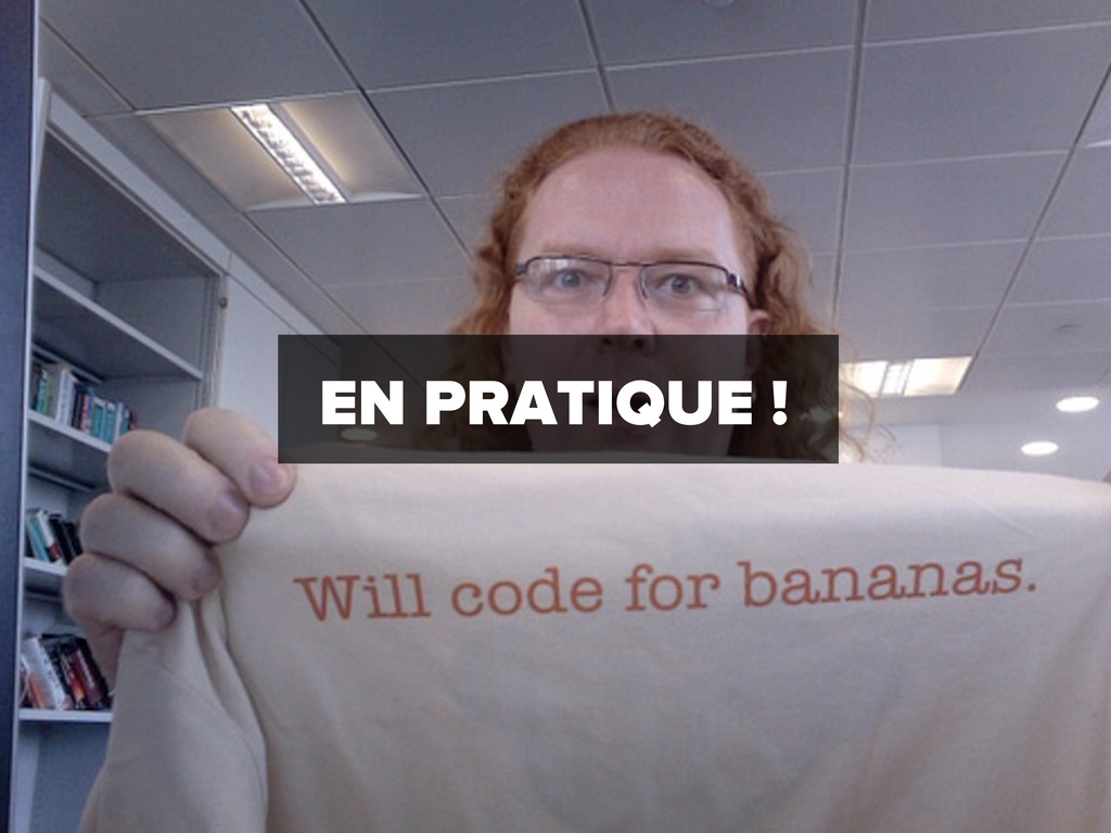
EN PRATIQUE !
8 PROTOTYPONS DANS LE NAVIGATEUR
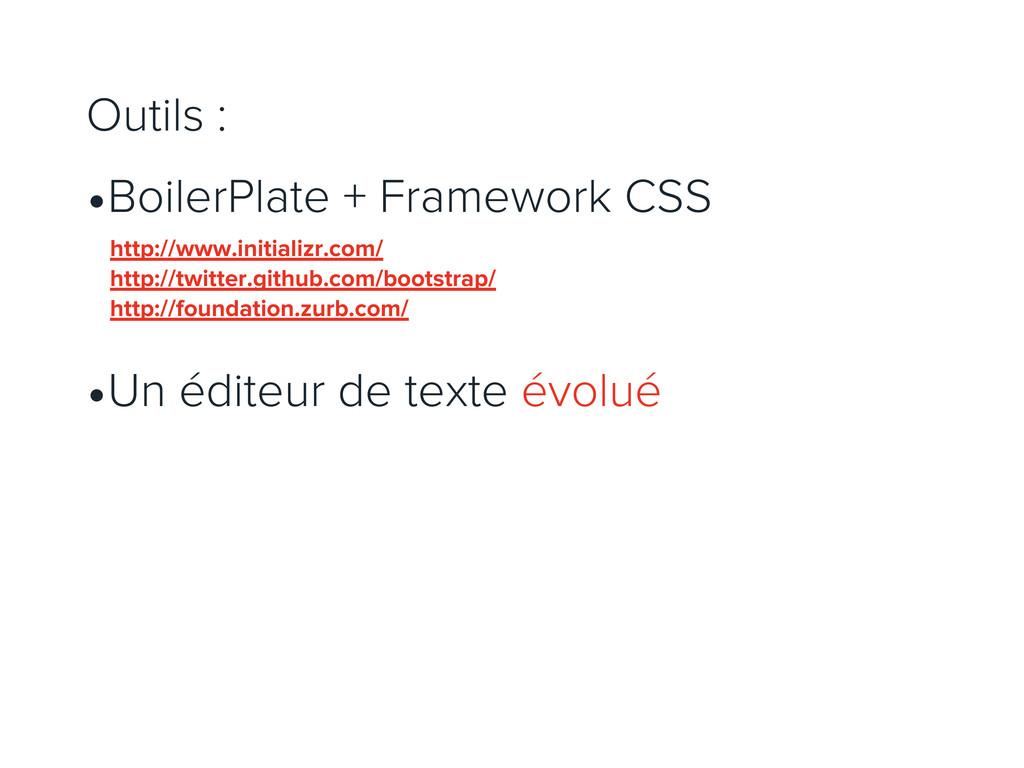
Outils : •BoilerPlate + Framework CSS •Un éditeur de texte
évolué http://www.initializr.com/ http://twitter.github.com/bootstrap/ http://foundation.zurb.com/
9 CODONS UN SITE EN RWD
Outils : •Un éditeur de texte évolué
MERCI @gregone @exibit spade.be
 goodpatch
 culumu
 mukai_takeru
 root_recruit
 tsubura
 ncdc
ncdc
 lw
lw
 payatsusan213
 yamamotoyuta
 bebe
bebe
 solmetts
 0b1tk
0b1tk
 mfonobong
 thirion
 jnunemaker
 techseoconnect
 lfama
lfama
 honnibal
 aleyda
 bcantrill
 afnizarnur
 akademiya2063
 popppiees