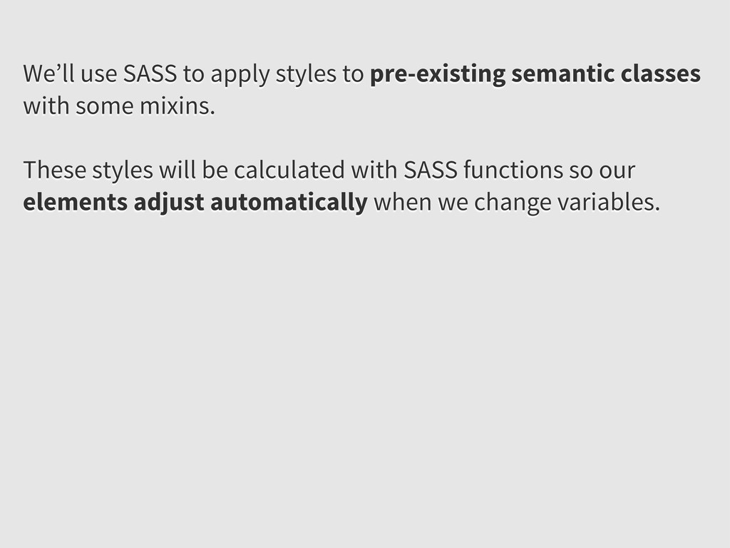
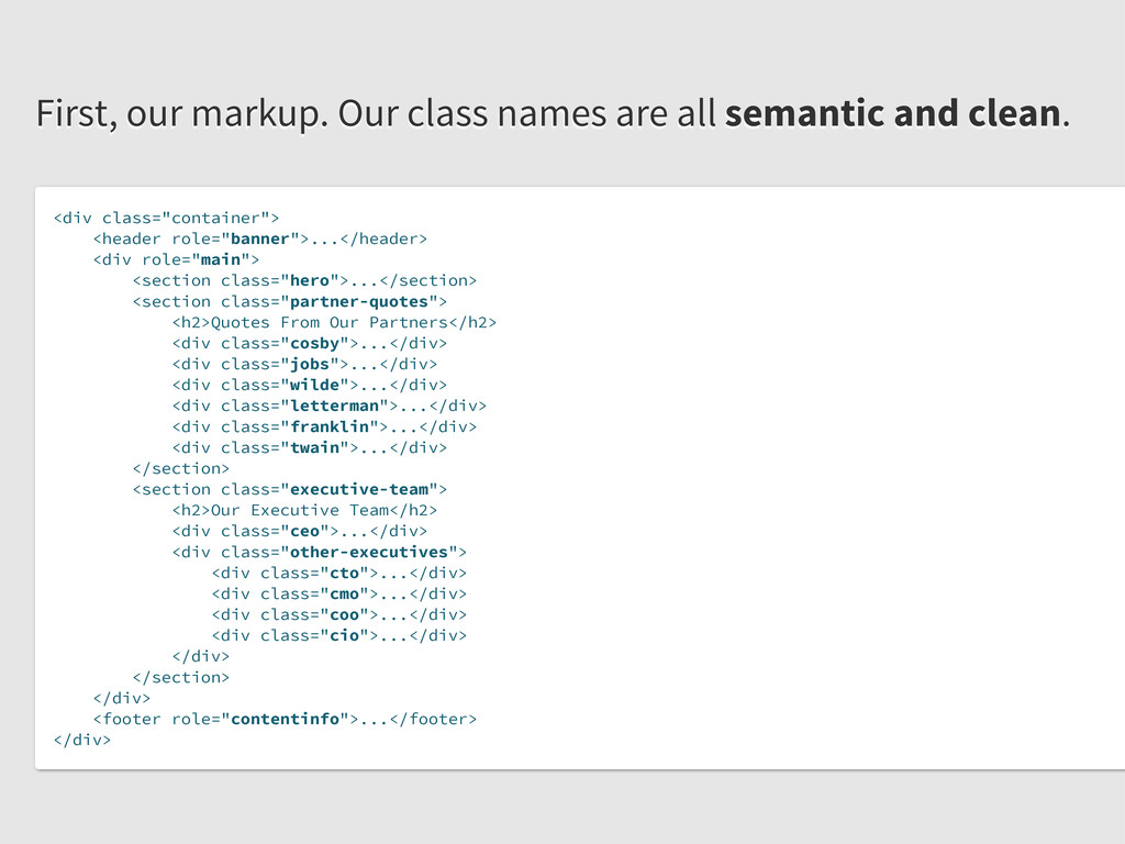
juliennes!</h2> </div> /* ================================================================== */ .row { margin-left: -20px; } .row:before, .row:after { display: table; line-height: 0; content: ""; } .row:after { clear: both; } .span4 { width: 300px; } But they can be difficult to do well on the web. This is why we have so many frameworks, but they have issues.
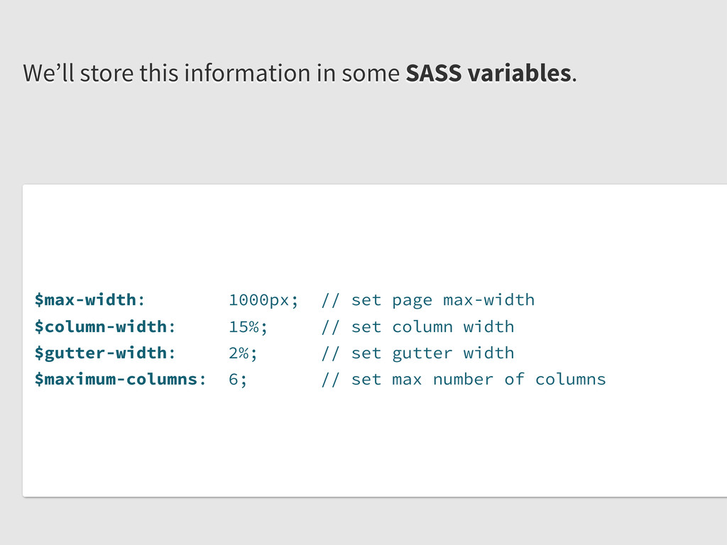
column width $gutter-width: 2%; // set gutter width $maximum-columns: 6; // set max number of columns We’ll store this information in some SASS variables.
display: table; } &:after { clear: both; } } @mixin border-box { -webkit-box-sizing: border-box; -moz-box-sizing: border-box; box-sizing: border-box; } Then we’ll define some helpful mixins. They have use beyond our grid system and should be defined globally.
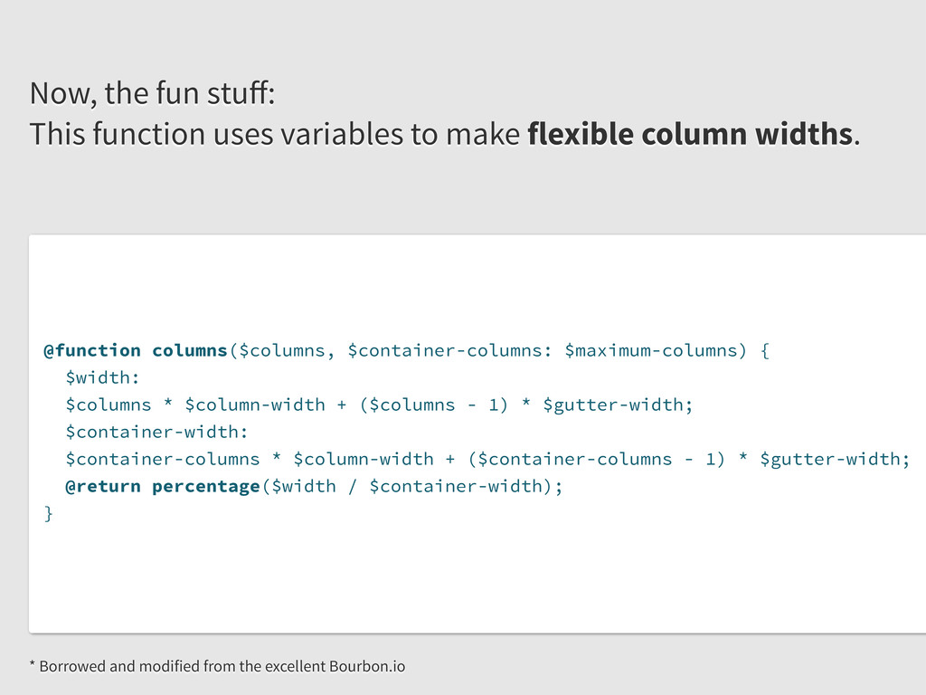
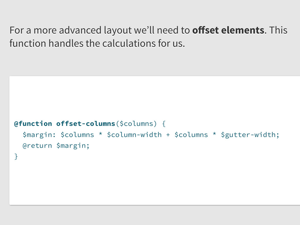
($columns - 1) * $gutter-width; $container-width: $container-columns * $column-width + ($container-columns - 1) * $gutter-width; @return percentage($width / $container-width); } Now, the fun stuff: This function uses variables to make flexible column widths. * Borrowed and modified from the excellent Bourbon.io
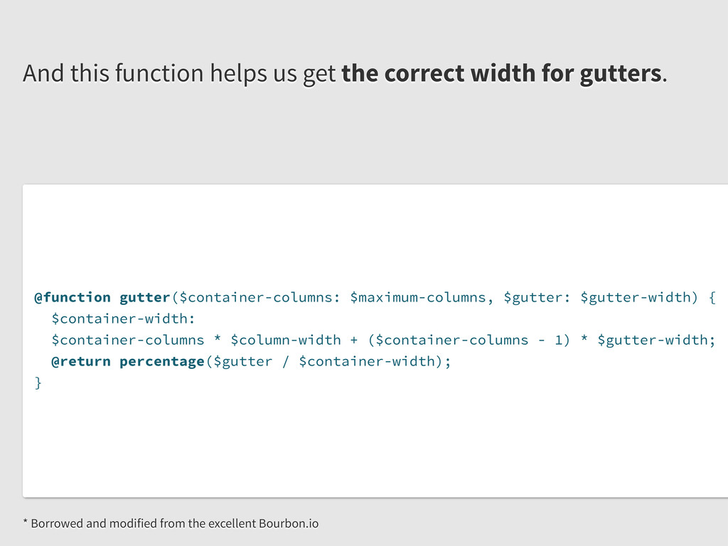
+ ($container-columns - 1) * $gutter-width; @return percentage($gutter / $container-width); } And this function helps us get the correct width for gutters. * Borrowed and modified from the excellent Bourbon.io
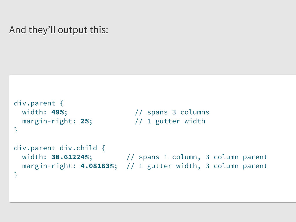
margin-right: gutter; // no args required div.child { width: columns(1, 3); // takes 2 args: span, span of parent margin-right: gutter(3); // takes 1 arg: span of parent } } We’ll use these functions on elements like so:
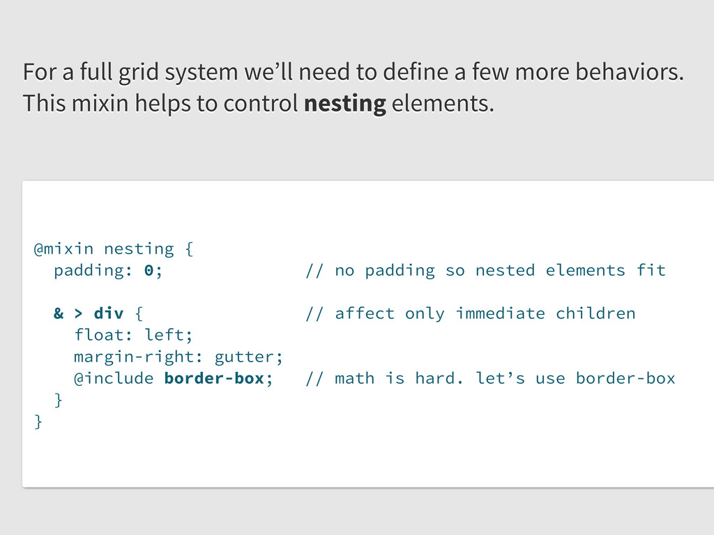
elements fit & > div { // affect only immediate children float: left; margin-right: gutter; @include border-box; // math is hard. let’s use border-box } } For a full grid system we’ll need to define a few more behaviors. This mixin helps to control nesting elements.
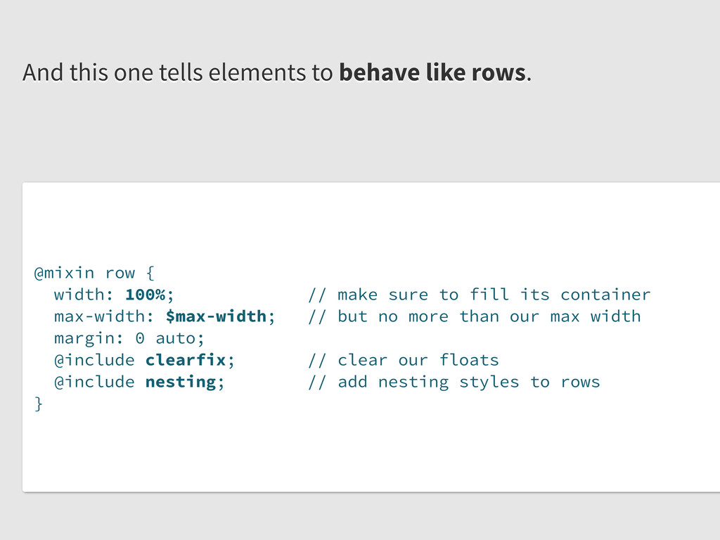
its container max-width: $max-width; // but no more than our max width margin: 0 auto; @include clearfix; // clear our floats @include nesting; // add nesting styles to rows } And this one tells elements to behave like rows.
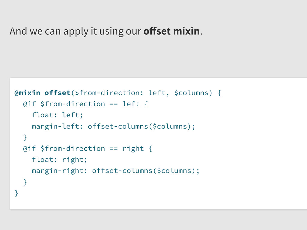
float: left; margin-left: offset-columns($columns); } @if $from-direction == right { float: right; margin-right: offset-columns($columns); } } And we can apply it using our offset mixin.
 javasteve99
 shoko_seven11
 xtone
xtone
 lynteo
 nishame
 ukaoli
 yusukeiyoda
 koyaman
 teba_eleven
 saka2jp
 mottox2
 deadlinepoet
 hiro93n
 jct
jct
 tamaranovitovic
 schroneko
 jcasabona
 charlesmeaden
 jacobtomlinson
 khoart
 62gerente
 addyosmani
 codingconduct
 scottboms
 danielanewman