Upgrade to Pro — share decks privately, control downloads, hide ads and more …

Intro to SASS: Building a flexible grid system

Steve Hickey
October 16, 2013

Intro to SASS: Building a flexible grid system

Steve Hickey

October 16, 2013
Tweet

More Decks by Steve Hickey

Other Decks in Design

Transcript

  1. By Steve Hickey for Launch Academy
    Intro to SASS
    Building a Flexible Grid System

    View Slide

  2. Hi, I’m Steve.
    I design & code applications for Fresh Tilled Soil.

    View Slide

  3. What does SASS allow us to do?
    1. Use variables 
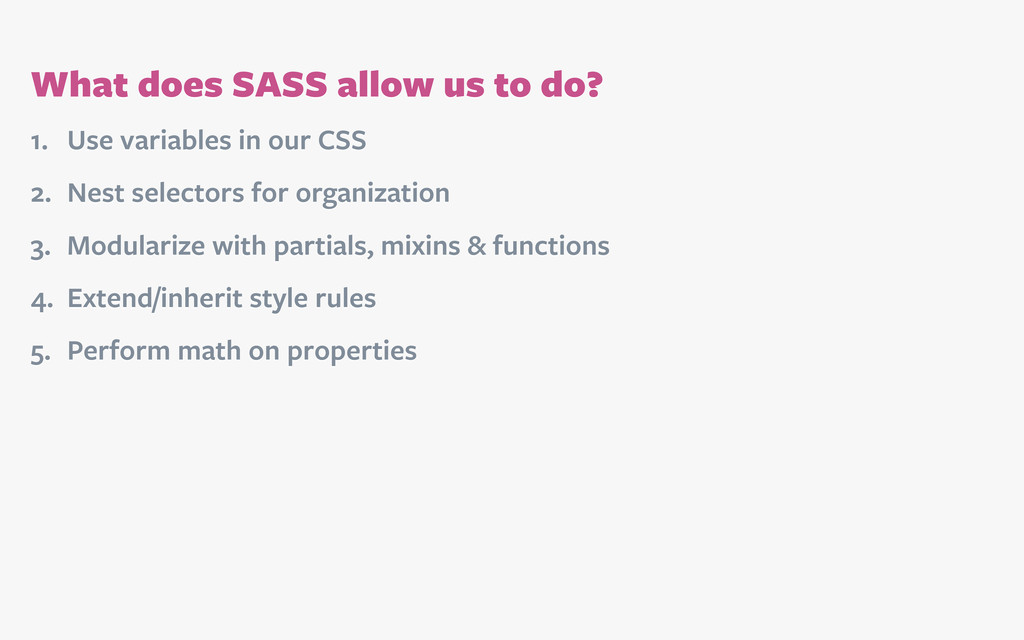
in our CSS
    2. Nest selectors for organization
    3. Modularize with partials, mixins & functions
    4. Extend/inherit style rules
    5. Perform math on properties

    View Slide

  4. [email protected]:~ $ sudo gem install sass
    See sass-lang.com/install
    for other options.
    Install

    View Slide

  5. File structure

    View Slide

  6. @import 'bourbon/bourbon';
    @import 'reset';
    @import 'variables';
    @import 'mixins';
    @import 'grid';
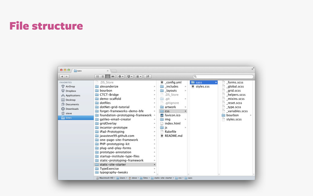
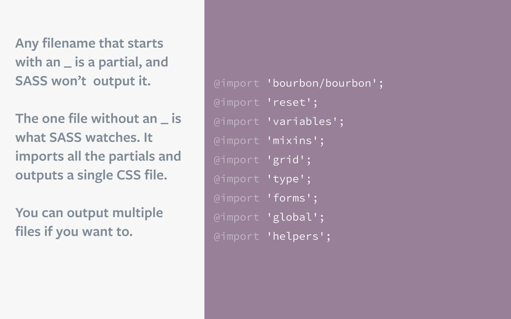
    @import 'type';
    @import 'forms';
    @import 'global';
    @import 'helpers';
    Any filename that starts
    with an _ is a partial, and
    SASS won’t output it.
    The one file without an _ is
    what SASS watches. It
    imports all the partials and
    outputs a single CSS file.
    You can output multiple
    files if you want to.

    View Slide

  7. [email protected]:~ $ cd into/root-of-repo
    [email protected]:~ $ sass --watch css/sass:css
    The terminal can compile
    SASS to CSS whenever a file
    is altered and saved.
    See sass-lang.com and
    RTFM for more options.
    Compile

    View Slide

  8. Variables $primary-color: #049cdb; // blue
    $heading-typeface: Arial, sans-serif;
    $modular-scale-base: 1 // 16px
    $modular-scale-up1: 1.4375; // 22px
    /* ===================================== */
    h2.article-title {
    color: $primary-color;
    font-family: $heading-typeface;
    line-height: $modular-scale-base;
    font-size: #{$modular-scale-up1}em; }
    /* ===================================== */
    h2.article-title {
    color: #049cdb;
    font-family: Arials, sans-serif;
    line-height: 1;
    font-size: 1.4375em; }
    Store and reuse information
    in your stylesheets.
    Pro-tip: this feature alone
    makes SASS worth it.

    View Slide

  9. Nesting
    nav.global {
    width: 100%;
    a {
    background-color: #ddd;
    &:hover 
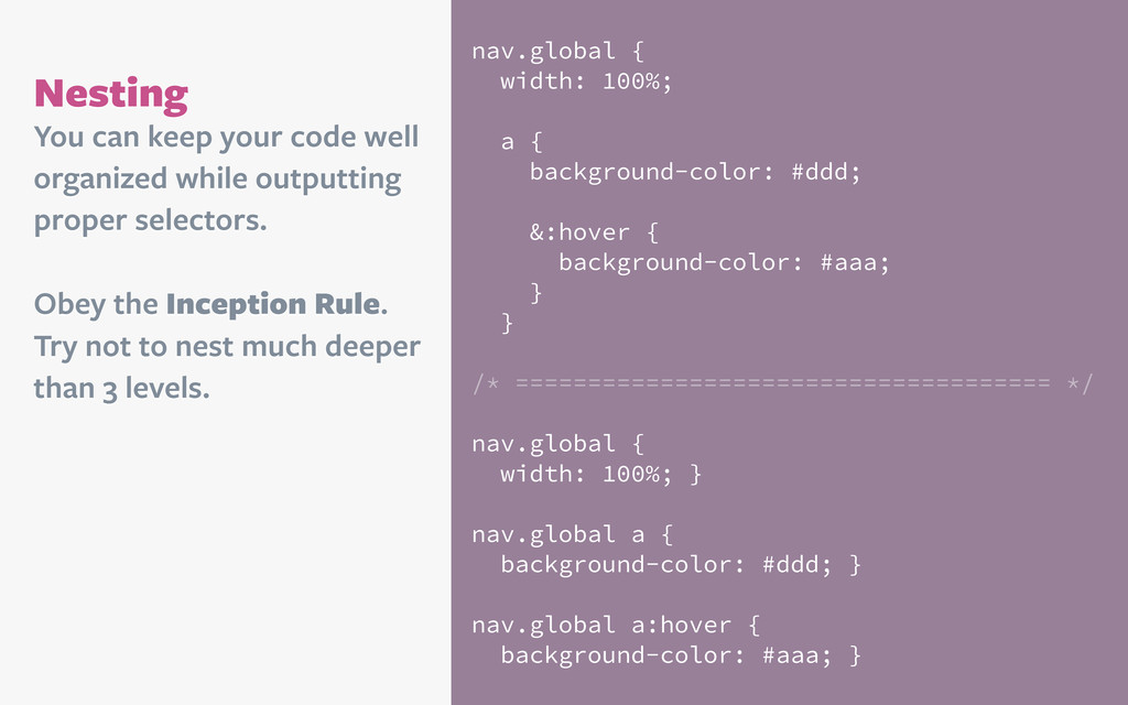
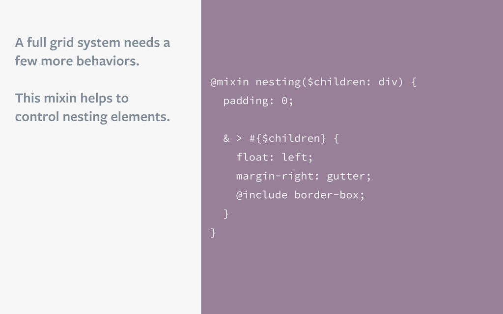
{
    background-color: #aaa;
    }
    }
    /* ===================================== */
    nav.global {
    width: 100%; }
    nav.global a {
    background-color: #ddd; }
    nav.global a:hover {
    background-color: #aaa; }
    You can keep your code well
    organized while outputting
    proper selectors.
    Obey the Inception Rule.
    Try not to nest much deeper
    than 3 levels.

    View Slide

  10. Mixins
    @mixin border-radius($radius: 4px) {
    -webkit-border-radius: $radius;
    -moz-border-radius: $radius;
    border-radius: 
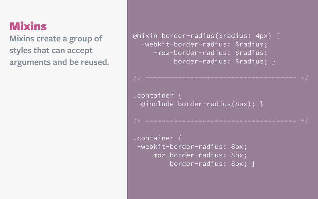
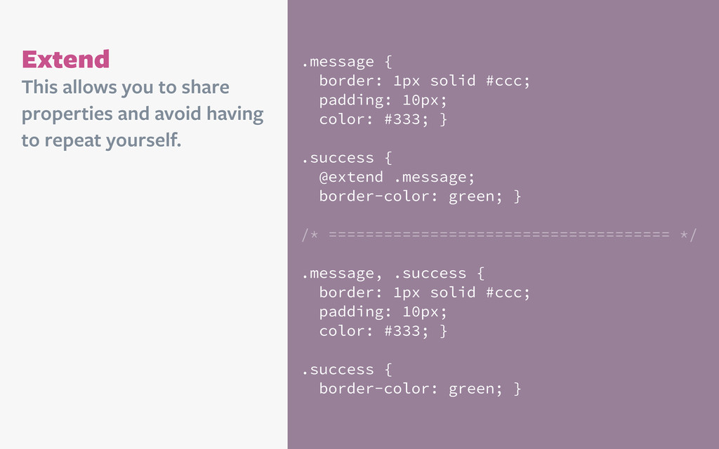
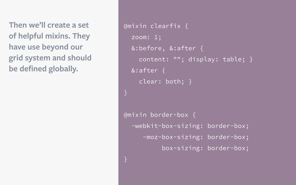
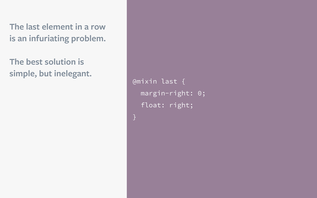
$radius; }
    /* ===================================== */
    .container {
    @include border-radius(8px); }
    /* ===================================== */
    .container {
    -webkit-border-radius: 8px;
    -moz-border-radius: 8px;
    border-radius: 8px; }
    Mixins create a group of
    styles that can accept
    arguments and be reused.

    View Slide

  11. Extend .message {
    border: 1px solid #ccc;
    padding: 10px;
    color: #333; }
    .success {
    @extend .message;
    border-color: green; }
    /* ===================================== */
    .message, .success {
    border: 1px solid #ccc;
    padding: 10px;
    color: #333; }
    .success {
    border-color: green; }
    This allows you to share
    properties and avoid having
    to repeat yourself.

    View Slide

  12. Operators
    article {
    float: left;
    width: (600px / 960px) * 
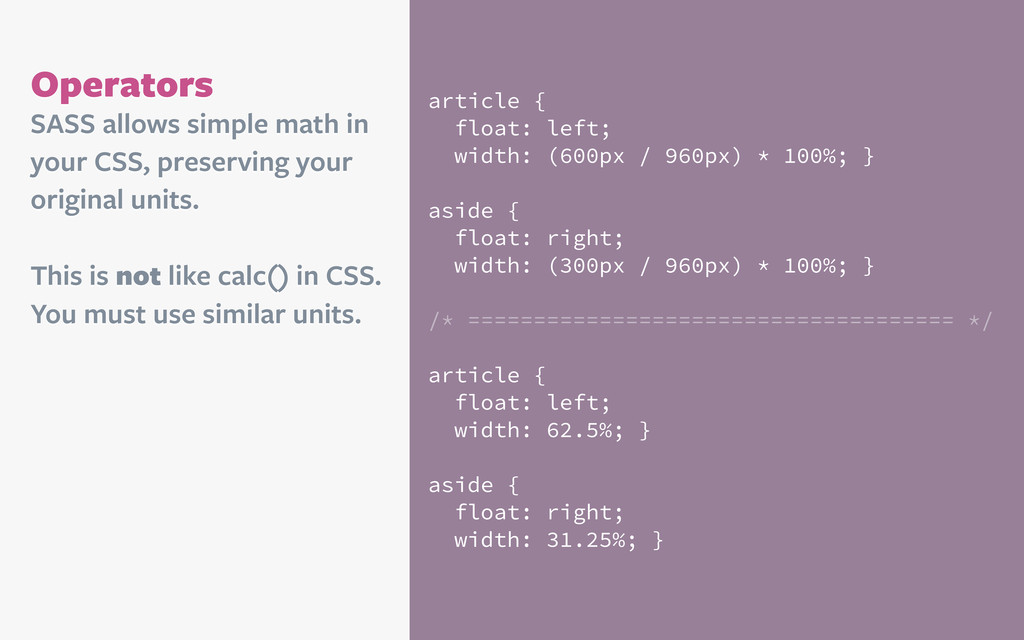
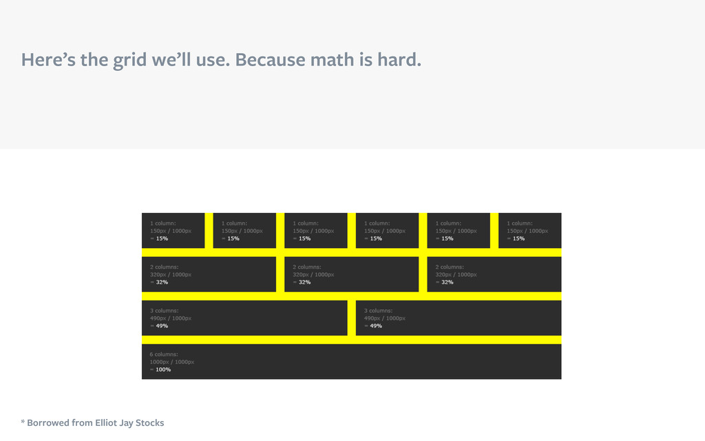
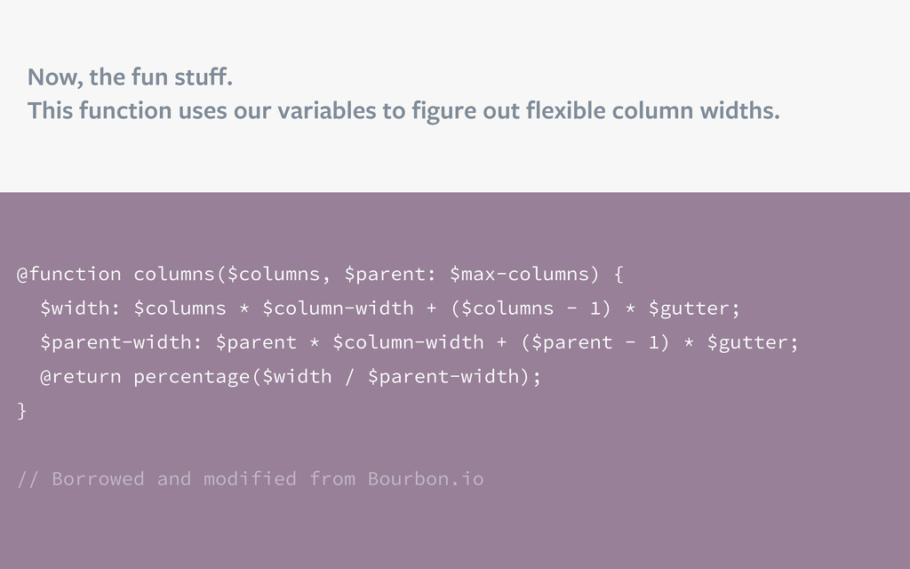
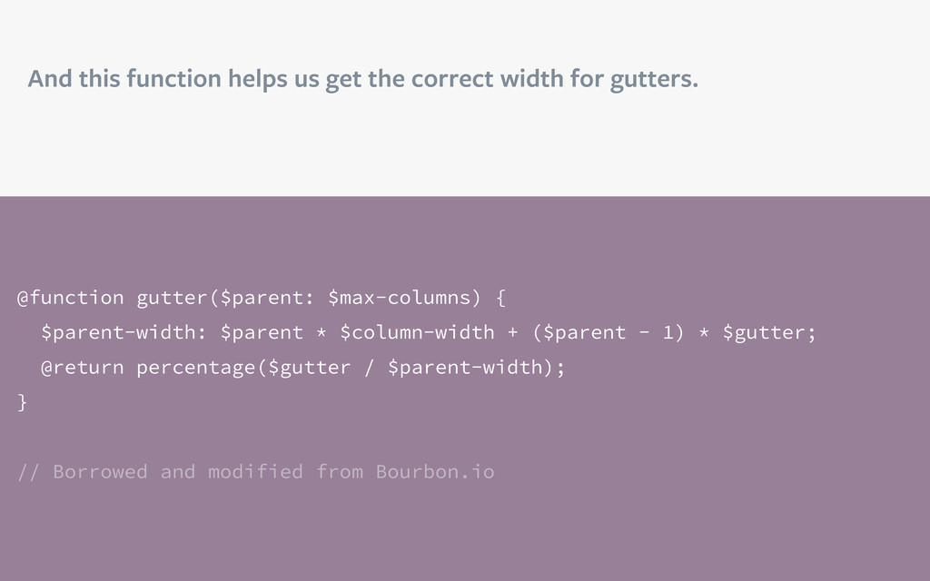
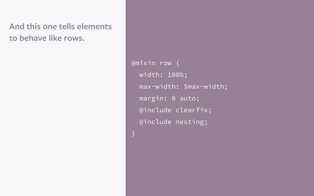
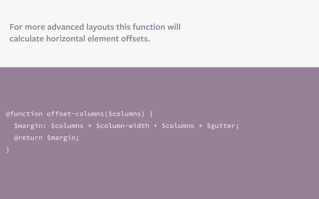
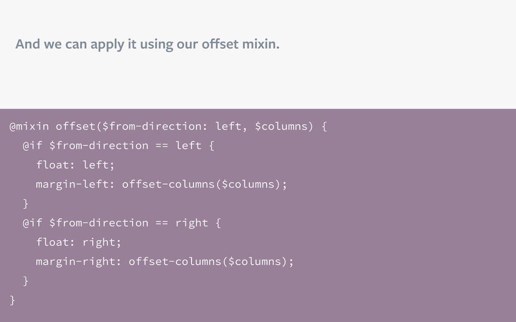
100%; }
    aside {
    float: right;
    width: (300px / 960px) * 100%; }
    /* ===================================== */
    article {
    float: left;
    width: 62.5%; }
    aside {
    float: right;
    width: 31.25%; }
    SASS allows simple math in
    your CSS, preserving your
    original units.
    This is not like calc() in CSS.
    You must use similar units.

    View Slide

  13. Functions
    @function flex-width($target, $context) {
    @return ($target / $context) * 100%; }
    /* ===================================== */
    article {
    float: left;
    width: flex-width(600px, 960px); }
    aside {
    float: right;
    width: flex-width(300px, 960px); }
    /* ===================================== */
    article {
    float: left;
    width: 62.5%; }
    aside {
    float: right;
    width: 31.25%; }
    Determine your style rules
    programmatically and reuse
    the methods.

    View Slide

  14. Let’s build a grid.

    View Slide

  15. Grids can be difficult to
    do well on the web.
    This is why we have so
    many frameworks, but
    they have issues.

    It slices!
    It dices!
    It juliennes!

    /* ===================================== */
    .row {
    margin-left: -20px; }
    .row:before, .row:after {
    display: table;
    line-height: 0;
    content: ""; }
    .row:after {
    clear: both; }
    .span4 {
    width: 300px; }

    View Slide

  16. Our markup will be
    clean and use (mostly)
    semantic class 
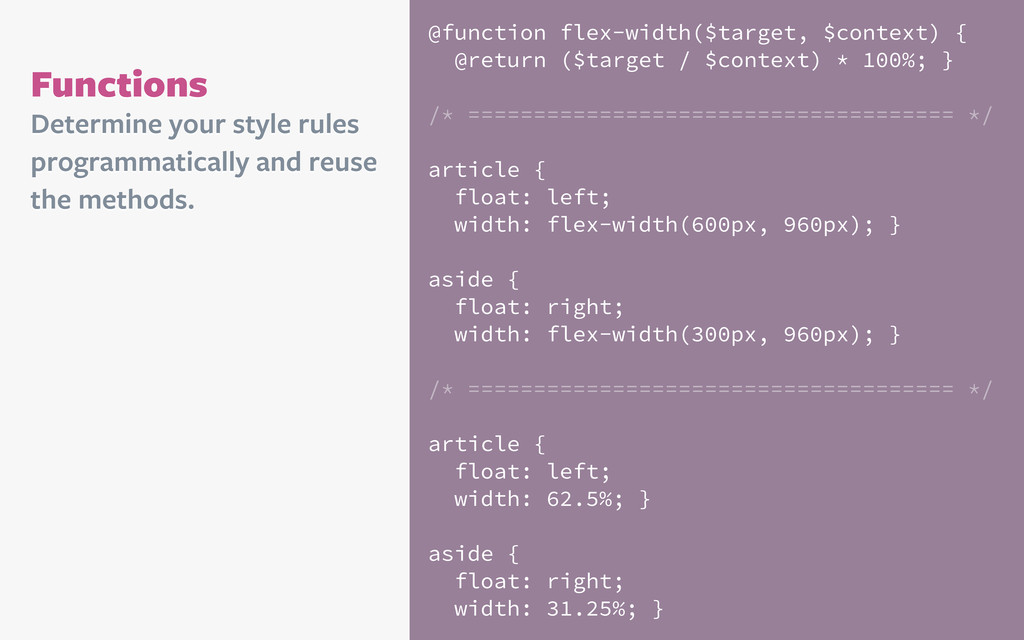
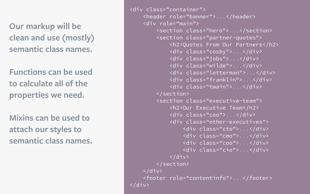
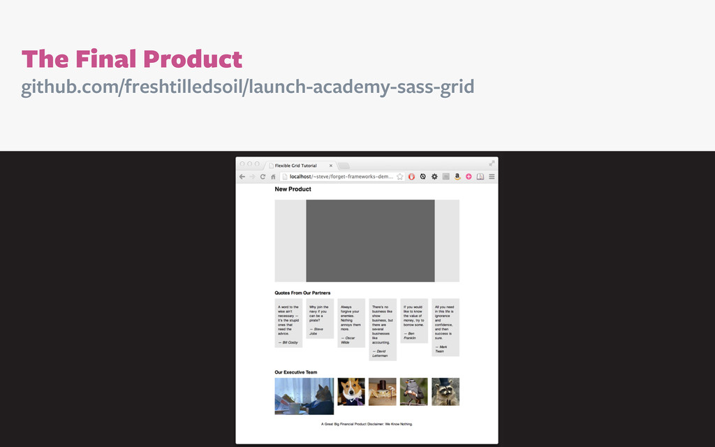
names.
    Functions can be used
    to calculate all of the
    properties we need.
    Mixins can be used to
    attach our styles to
    semantic class names.

    ...

    ...

    Quotes From Our Partners
    ...
    ...
    ...
    ...
    ...
    ...


    Our Executive Team
    ...

    ...
    ...
    ...
    ...


    ...

    View Slide

  17. Here’s the grid we’ll use. Because math is hard.
    * Borrowed from Elliot Jay Stocks

    View Slide

  18. We’ll store the grid’s
    important details in some
    SASS variables.
    $max-width: 1000px;
    $column-width: 15%;
    $gutter: 2%;
    $max-columns: 6;

    View Slide

  19. Then we’ll create a set
    of helpful mixins. They
    have use beyond our
    grid system and should
    be defined globally.
    @mixin clearfix {
    zoom: 1;
    &:before, &:after {
    content: ""; display: table; }
    &:after {
    clear: both; }
    }
    @mixin border-box {
    -webkit-box-sizing: border-box;
    -moz-box-sizing: border-box;
    box-sizing: border-box;
    }

    View Slide

  20. @function columns($columns, $parent: $max-columns) {
    $width: $columns * $column-width + ($columns - 1) * $gutter;
    $parent-width: $parent * $column-width + ($parent - 1) * $gutter;
    @return percentage($width / $parent-width);
    }
    // Borrowed and modified from Bourbon.io
    Now, the fun stuff.
    This function uses our variables to figure out flexible column widths.

    View Slide

  21. And this function helps us get the correct width for gutters.
    @function gutter($parent: $max-columns) {
    $parent-width: $parent * $column-width + ($parent - 1) * $gutter;
    @return percentage($gutter / $parent-width);
    }
    // Borrowed and modified from Bourbon.io

    View Slide

  22. We’ll use these functions
    on elements like so:
    div.parent {
    width: columns(3);
    margin-right: gutter();
    div.child {
    width: columns(1, 3);
    margin-right: gutter(3);
    }
    }
    /* ===================================== */
    div.parent {
    width: 49%;
    margin-right: 2%;
    }
    div.parent div.child {
    width: 30.61224%;
    margin-right: 4.08163%;
    }
    And they’ll output this:

    View Slide

  23. A full grid system needs a
    few more behaviors.
    This mixin helps to
    control nesting elements.
    @mixin nesting($children: div) {
    padding: 0;
    & > #{$children} {
    float: left;
    margin-right: gutter;
    @include border-box;
    }
    }

    View Slide

  24. And this one tells elements
    to behave like rows.
    @mixin row {
    width: 100%;
    max-width: $max-width;
    margin: 0 auto;
    @include clearfix;
    @include nesting;
    }

    View Slide

  25. For more advanced layouts this function will
    calculate horizontal element offsets.
    @function offset-columns($columns) {
    $margin: $columns * $column-width + $columns * $gutter;
    @return $margin;
    }

    View Slide

  26. And we can apply it using our offset mixin.
    @mixin offset($from-direction: left, $columns) {
    @if $from-direction == left {
    float: left;
    margin-left: offset-columns($columns);
    }
    @if $from-direction == right {
    float: right;
    margin-right: offset-columns($columns);
    }
    }

    View Slide

  27. The last element in a row
    is an infuriating problem.
    The best solution is
    simple, but inelegant.
    @mixin last {
    margin-right: 0;
    float: right;
    }

    View Slide

  28. Note:
    I tried :last-child, :first-child
    and :nth-child().
    They would be good
    solutions, but support is
    bad or intent is wrong.

    View Slide

  29. github.com/freshtilledsoil/launch-academy-sass-grid
    The Final Product

    View Slide

  30. Thanks!
    @stevehickeydsgn
    stevehickeydesign.com
    freshtilledsoil.com

    View Slide