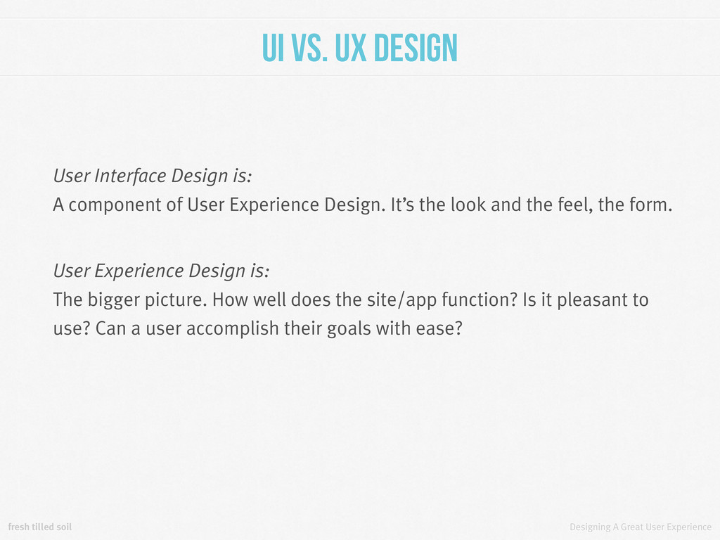
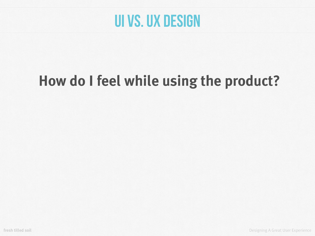
UX Design User Interface Design is: A component of User Experience Design. It’s the look and the feel, the form. User Experience Design is: The bigger picture. How well does the site/app function? Is it pleasant to use? Can a user accomplish their goals with ease?
UX Design All of the pieces of building a product affect the UX. Excellent user interface design is part of what creates a great user experience. But you can have a great UI with a terrible experience.
Let’s talk about some of the things that a great user experience designer must keep in mind when building a truly amazing product for the web. This list is not exhaustive, but the provided sources have a lot more info.
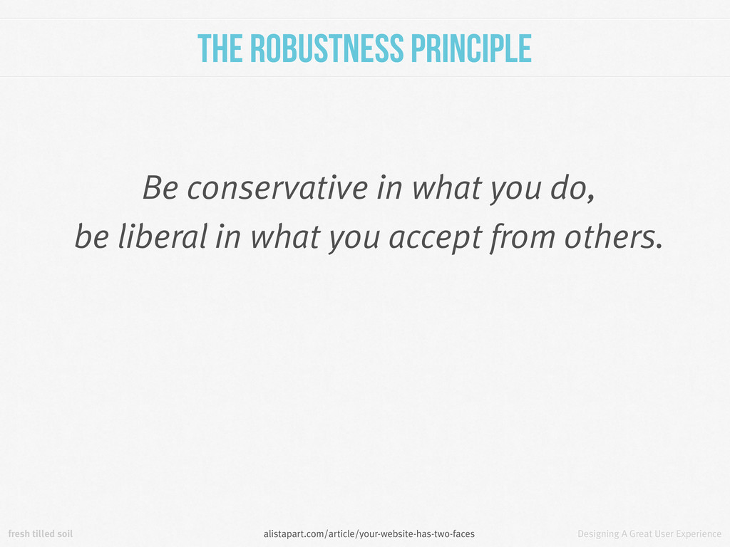
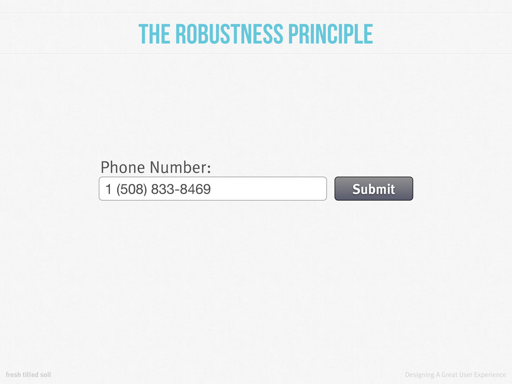
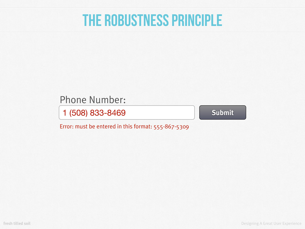
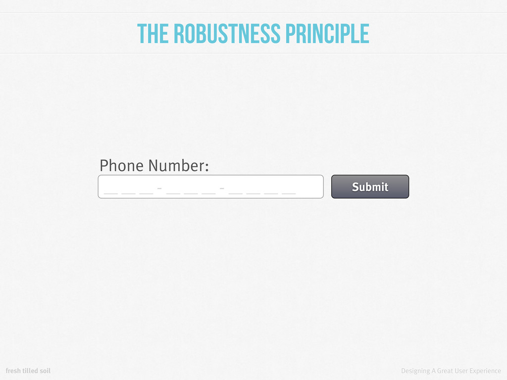
Principle In other words, there are certain constraints that must be embraced to balance human needs with computer needs for a robust web application. • It must accept input in a human-friendly fashion. • It must accept the burden of translating info to a computer-friendly format. • It must be clear about what human input is reasonable. • It must provide feedback on this input. alistapart.com/article/your-website-has-two-faces
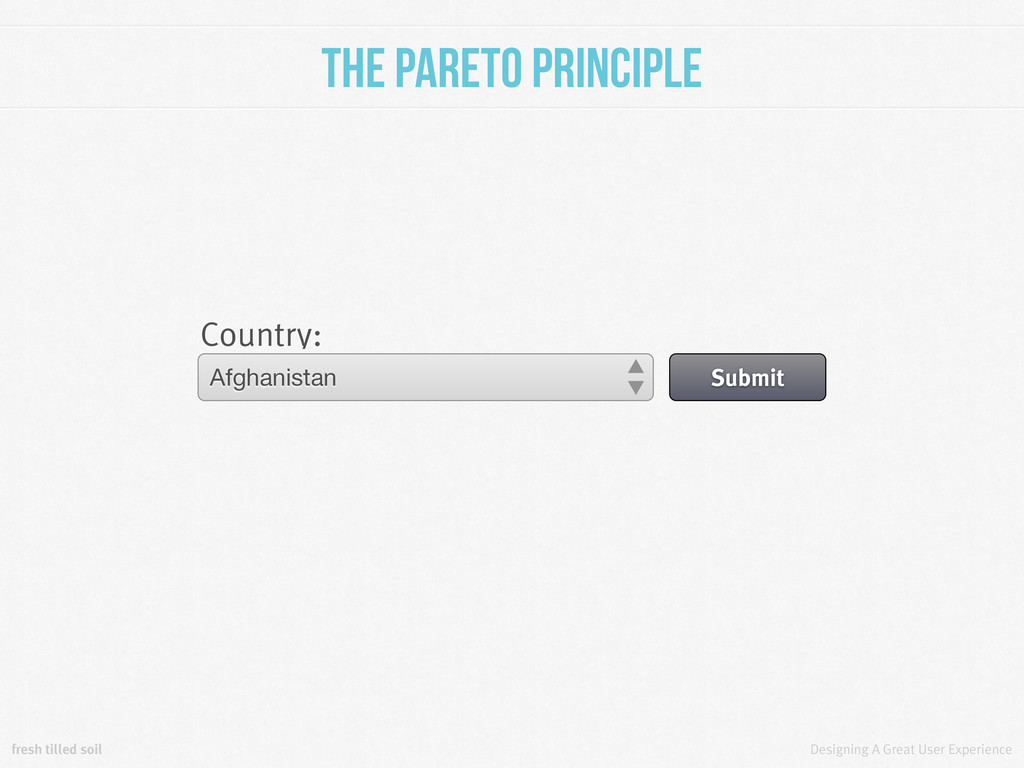
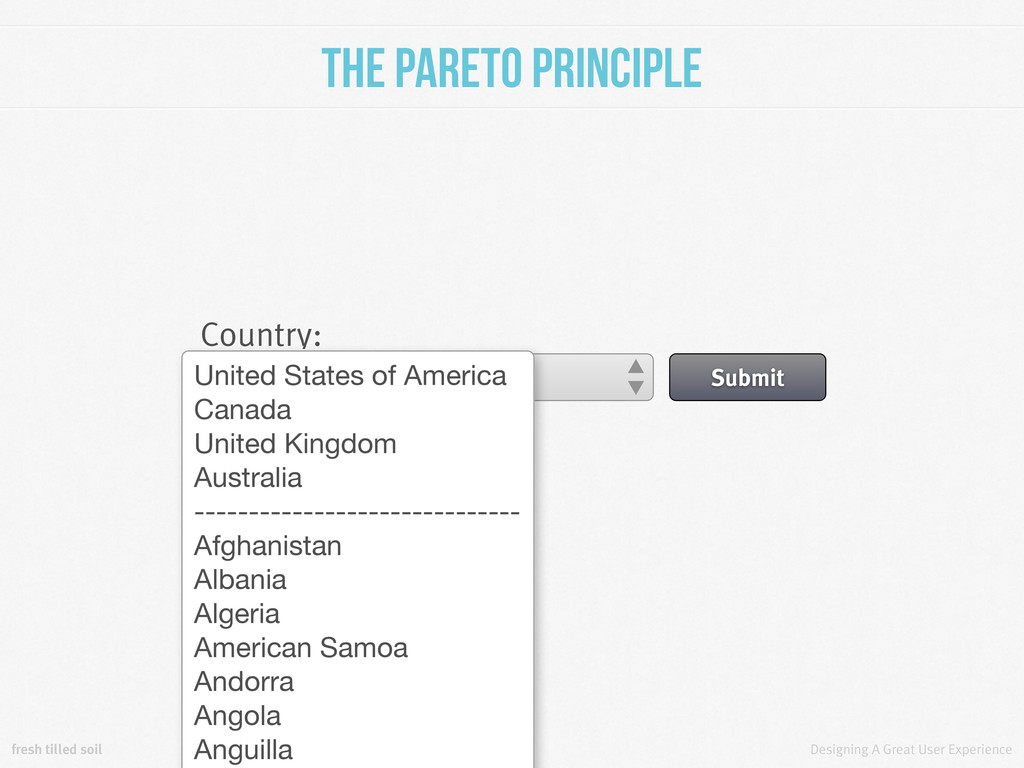
Principle In other words, focusing on the top 20% of your bugs and design problems can fix 80% of the problems encountered by your users. Or, 80% of your users will only use 20% of your features/options. measuringusability.com/blog/pareto-ux.php
Principle Country: United States of America Submit Afghanistan Albania Algeria American Samoa Andorra Angola Anguilla Antarctica Antigua And Barbuda Argentina Armenia Aruba
Principle Country: United States of America Submit United States of America Canada United Kingdom Australia ------------------------------ Afghanistan Albania Algeria American Samoa Andorra Angola Anguilla
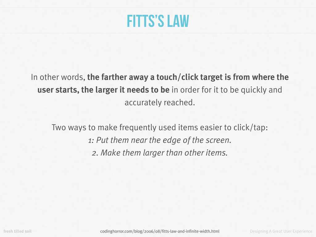
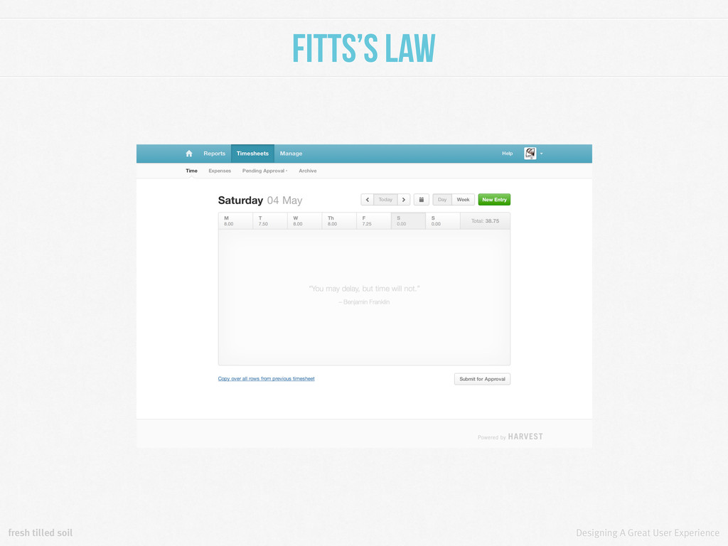
The time required to rapidly move to a target area is a function of the distance to the target and the size of the target. codinghorror.com/blog/2006/08/fitts-law-and-infinite-width.html
In other words, the farther away a touch/click target is from where the user starts, the larger it needs to be in order for it to be quickly and accurately reached. Two ways to make frequently used items easier to click/tap: 1: Put them near the edge of the screen. 2. Make them larger than other items. codinghorror.com/blog/2006/08/fitts-law-and-infinite-width.html
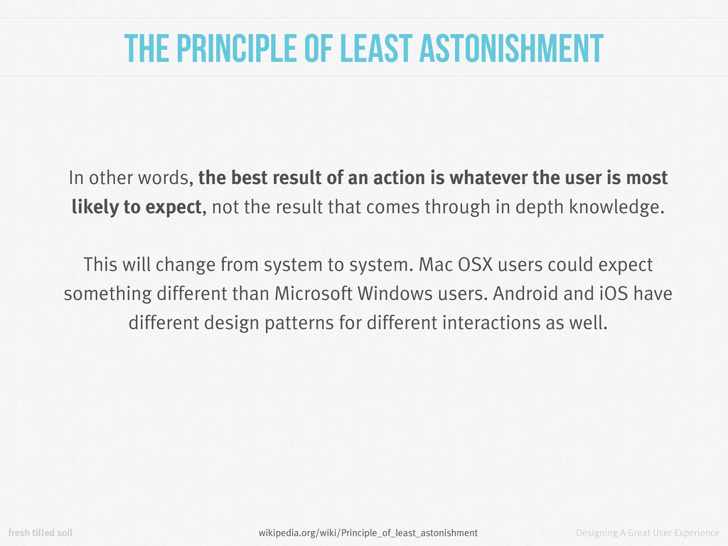
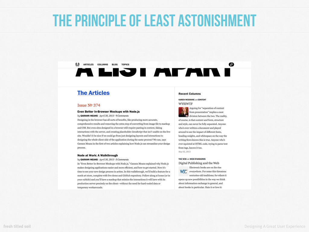
of Least Astonishment When two elements of an interface conflict or are ambiguous, the behavior should be that which will least surprise the user. wikipedia.org/wiki/Principle_of_least_astonishment
of Least Astonishment In other words, the best result of an action is whatever the user is most likely to expect, not the result that comes through in depth knowledge. This will change from system to system. Mac OSX users could expect something different than Microsoft Windows users. Android and iOS have different design patterns for different interactions as well. wikipedia.org/wiki/Principle_of_least_astonishment
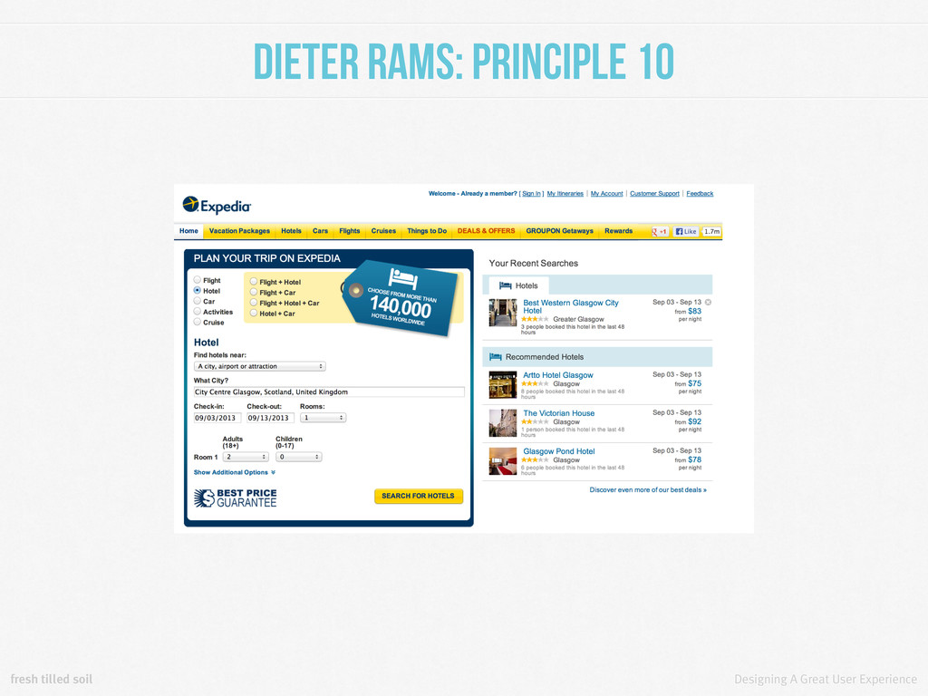
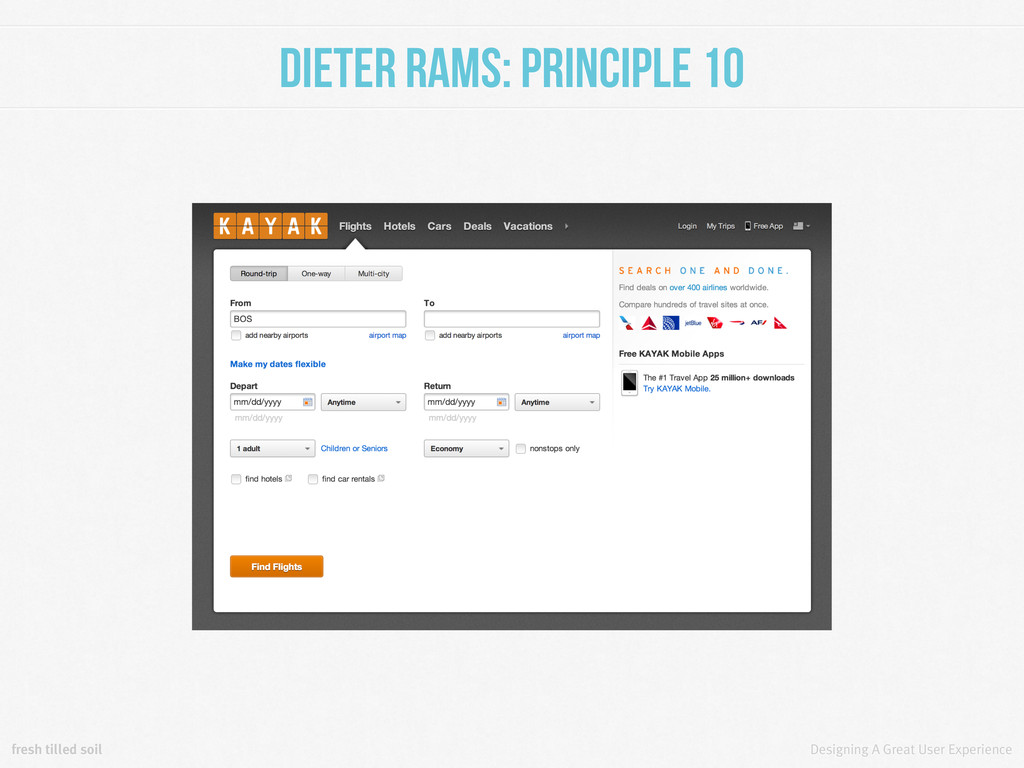
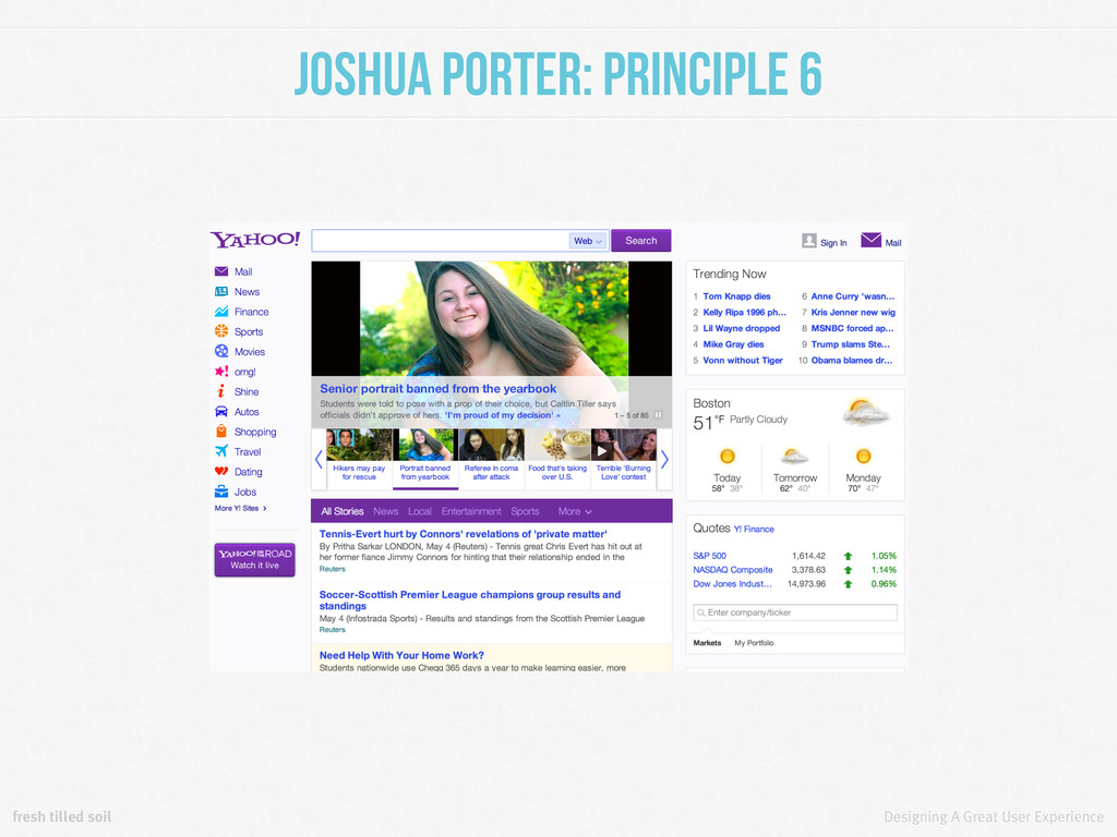
Principle 6 Screens or states with more than one primary action become confusing. It’s better for any screen to have one primary reason for existing. bokardo.com/principles-of-user-interface-design/
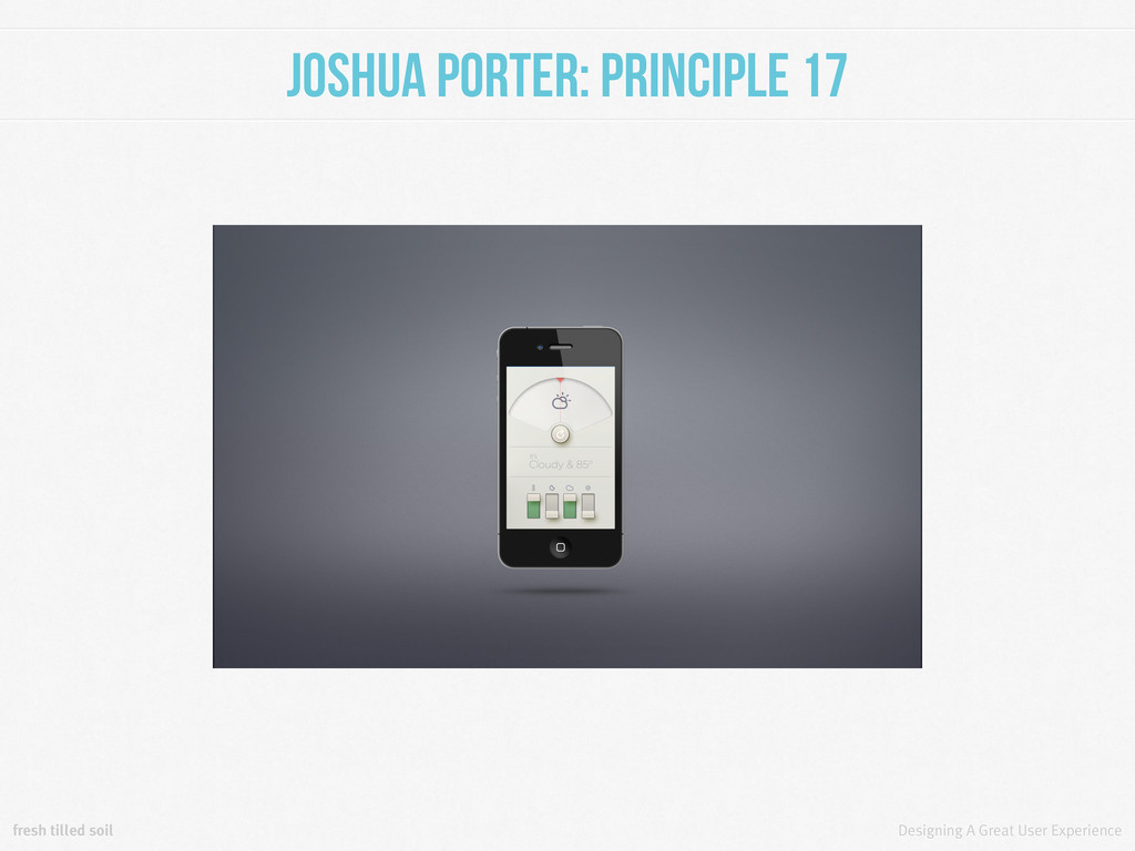
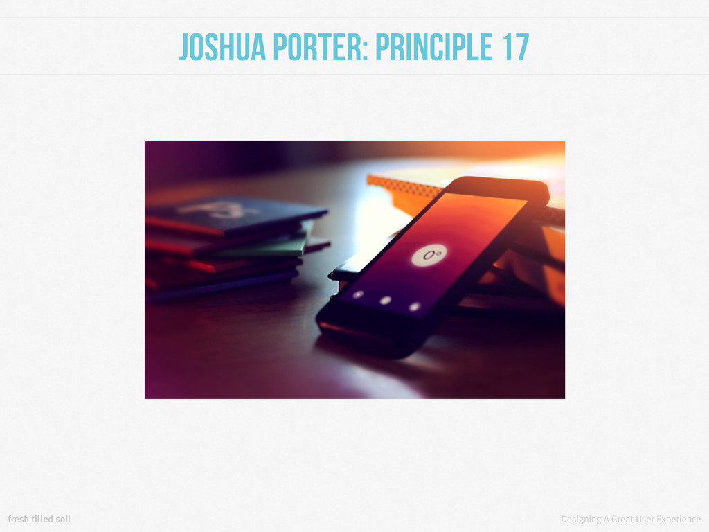
Principle 17 An interface shouldn’t distract a user from what they are trying to accomplish, which is the reason the interface exists in the first place. Turn the special effects down a notch. bokardo.com/principles-of-user-interface-design/
Behavior Model Three factors drive behavior: motivation, ability and triggers. ability motivation High Low Low High Target behavior Triggers fail here. Triggers succeed here. behaviormodel.org/
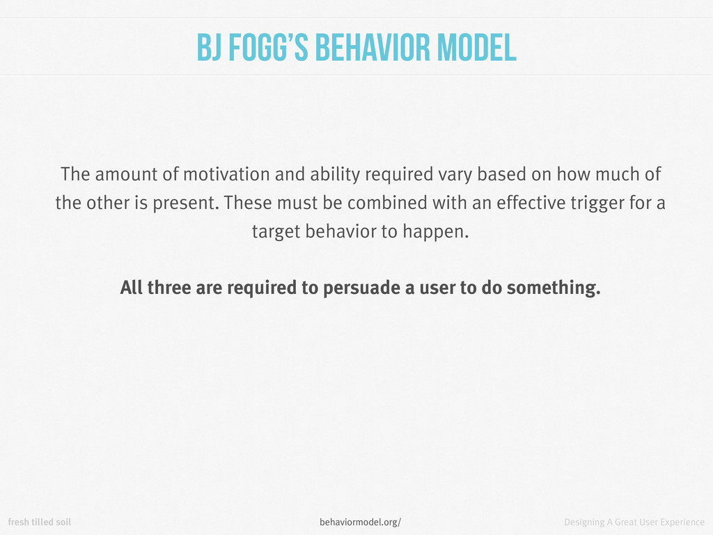
Behavior Model The amount of motivation and ability required vary based on how much of the other is present. These must be combined with an effective trigger for a target behavior to happen. All three are required to persuade a user to do something. behaviormodel.org/
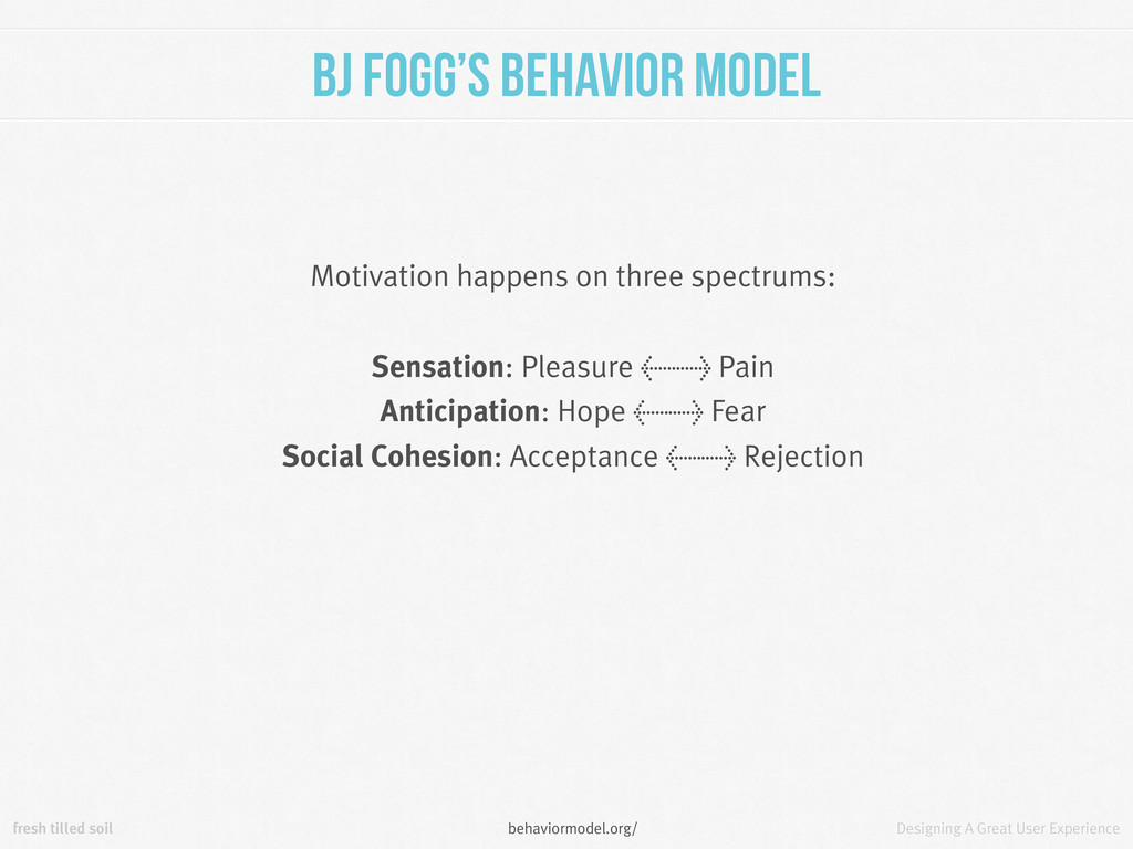
Behavior Model Motivation happens on three spectrums: Sensation: Pleasure <> Pain Anticipation: Hope <> Fear Social Cohesion: Acceptance <> Rejection behaviormodel.org/
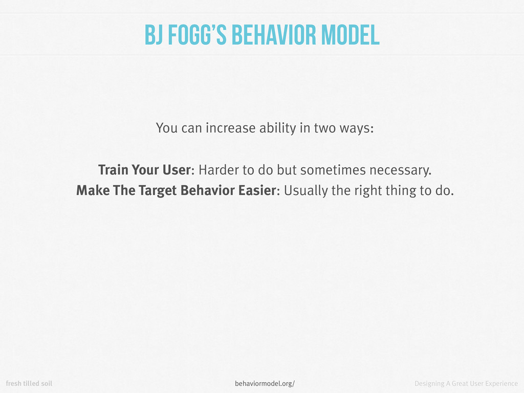
Behavior Model You can increase ability in two ways: Train Your User: Harder to do but sometimes necessary. Make The Target Behavior Easier: Usually the right thing to do. behaviormodel.org/
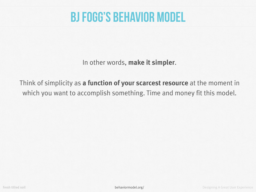
Behavior Model In other words, make it simpler. Think of simplicity as a function of your scarcest resource at the moment in which you want to accomplish something. Time and money fit this model. behaviormodel.org/
can read a lot more at these sites: Joshua Porter: bokardo.com/principles-of-user-interface-design/ Dieter Rams: vitsoe.com/us/about/good-design Jeremy Keith: principles.adactio.com/ BJ Fogg: behaviormodel.org/
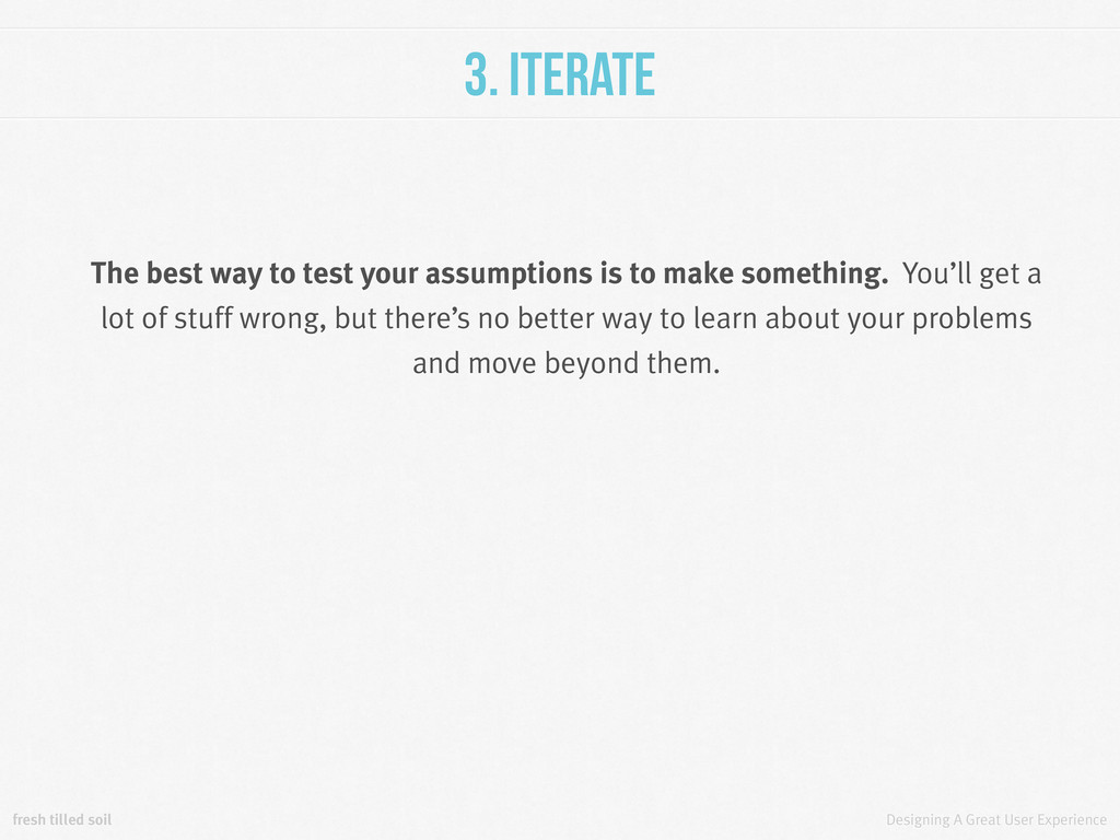
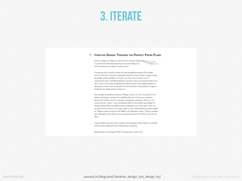
The best way to test your assumptions is to make something. You’ll get a lot of stuff wrong, but there’s no better way to learn about your problems and move beyond them.
Flexible As you work you’ll realize that previous assumptions needs to be changed. You shouldn’t think of deliverables as a checklist, they are a web of connected items.
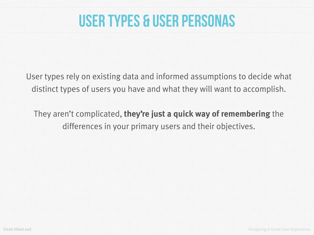
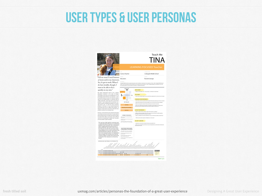
& User Personas User types rely on existing data and informed assumptions to decide what distinct types of users you have and what they will want to accomplish. They aren’t complicated, they’re just a quick way of remembering the differences in your primary users and their objectives.
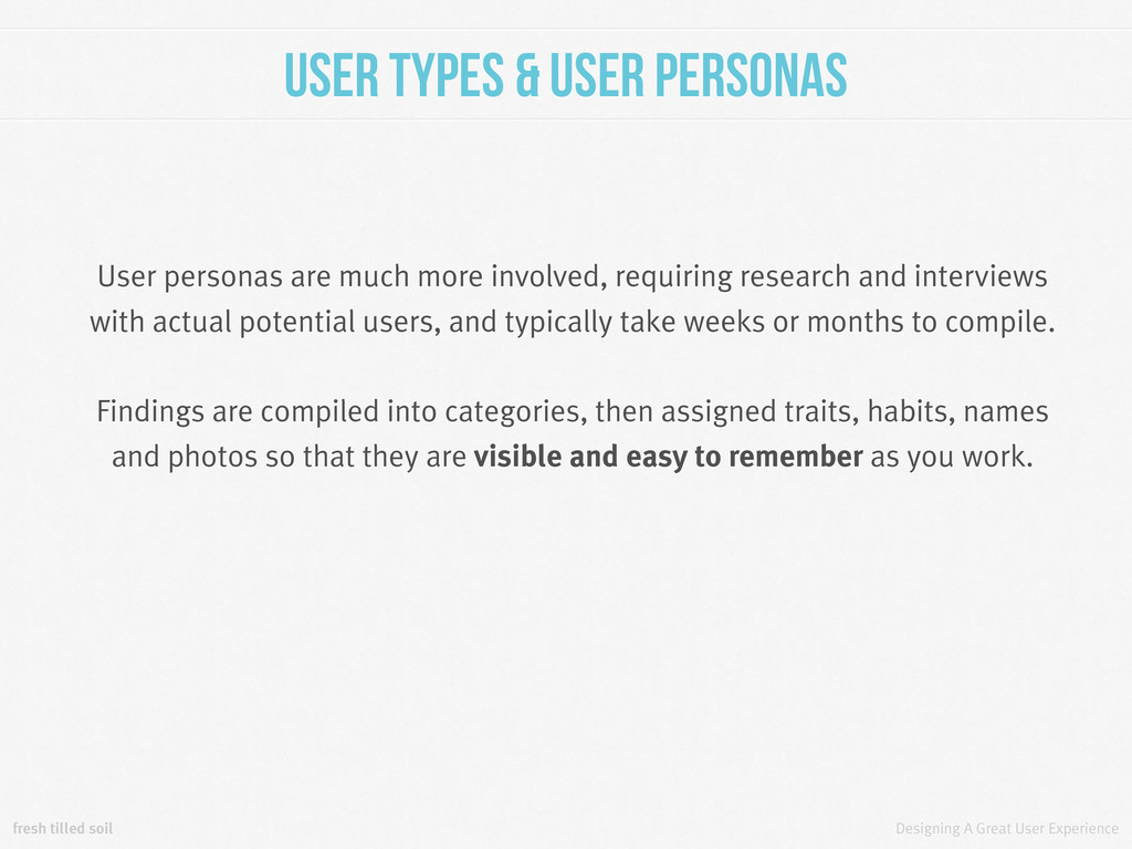
& User Personas User personas are much more involved, requiring research and interviews with actual potential users, and typically take weeks or months to compile. Findings are compiled into categories, then assigned traits, habits, names and photos so that they are visible and easy to remember as you work.
& User Personas Whether you decide to deal with user types or user personas is a question of resources and time, but using at least one of them tends to remind you that your users are real.
& Features As a { type } user, I would like to { task/objective }. These become your features. Have you come up with a feature idea that doesn’t fit into a user story? It may not be nearly as important as you thought it was.
& User Journeys Features are going to fit into logical groups that define pages and flows. Placing these into a site map will help you create the appropriate relationships between components, and show you just how simple or complex your plan is.
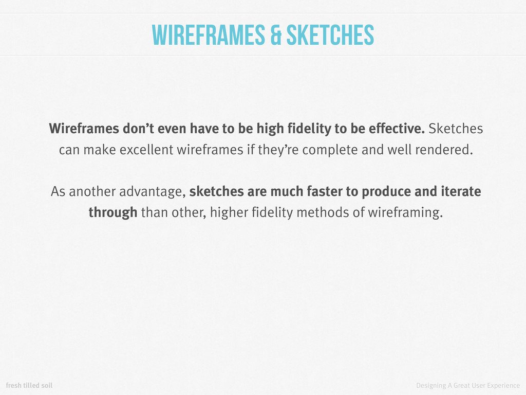
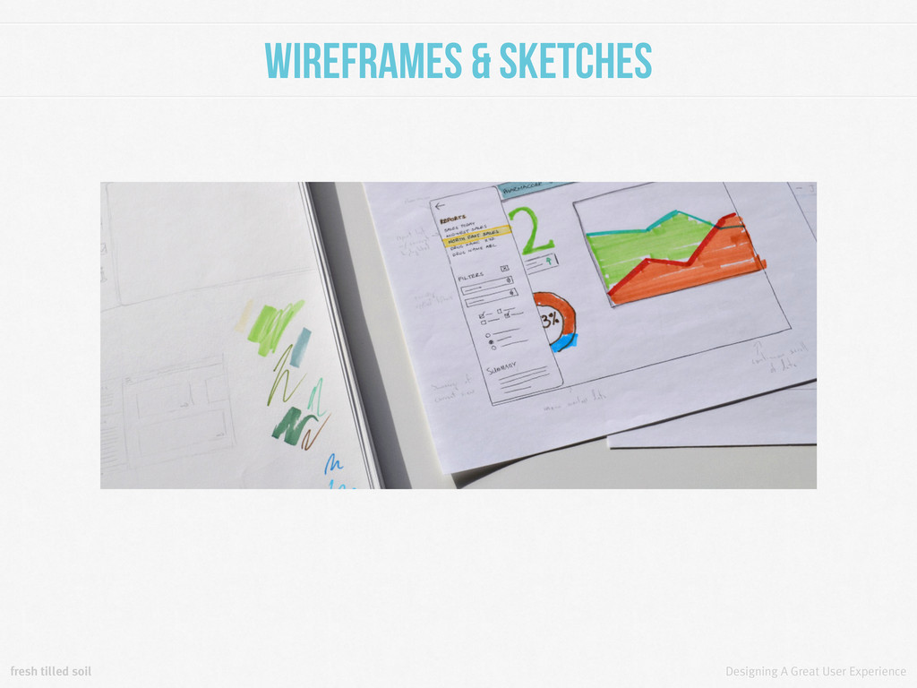
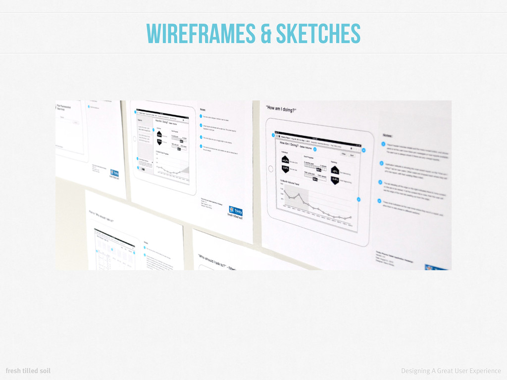
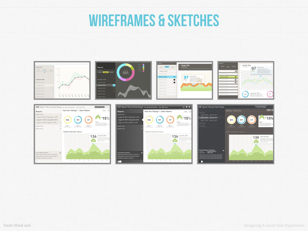
Sketches Your wireframes are the blueprints for your product. They generally consist of layouts of the pages and flows you listed previously. They help make sure all functionality is available, and that there is a logical hierarchy. Beyond those basics, wireframes really shouldn’t be used to dictate design decisions.
Sketches Wireframes don’t even have to be high fidelity to be effective. Sketches can make excellent wireframes if they’re complete and well rendered. As another advantage, sketches are much faster to produce and iterate through than other, higher fidelity methods of wireframing.
can be as small as a single piece of functionality, or they can mimic a completed product in every meaningful way. They are used to test a product without building it. A good prototype helps you decide what to build.
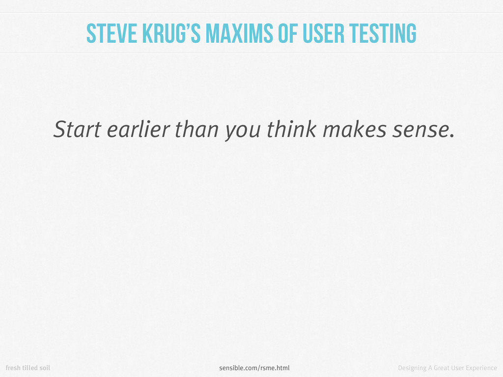
A user test helps you validate whatever you decided to build. You can test a finished product and get lots of great information, but the greatest advantage is conferred when you are able to start testing early. We’ll discuss this more in the next section.
Should I build? Whatever you can. Sometimes that’s not much. But ask yourself this: Would you rather invest years and millions of dollars into building something only to find out nobody can figure out how it works? Or even worse, that nobody wants it?
us, the answer is often a prototype. We aren’t back-end developers, we don’t employ back-end developers. If we aren’t working with a dev team yet we still need to build something to test. Fortunately, front-end tech makes it easy to fake a back-end.
Product For startups and product companies a minimum viable product is often the answer. An MVP is popular in Lean circles. Building one means building the smallest thing you can learn something from. Build it, test it, learn from those tests, build something new. It is the smallest amount of effort you can go to and still get validated learning from it.