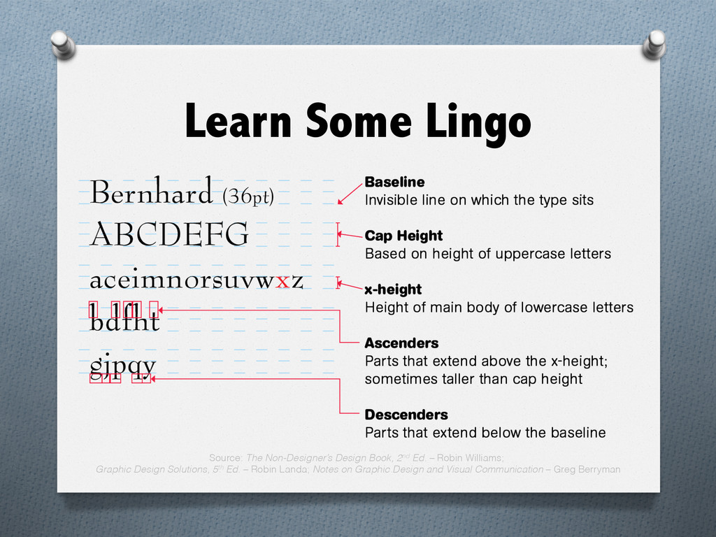
content, usually in the form of paragraphs, columns, or captions. O Letterform – the particular style and form of each individual letter of our alphabet.
of letterforms, numerals, and signs unified by consistent visual properties. These properties create the essential character, which remains recognizable even if the face is modified by design.
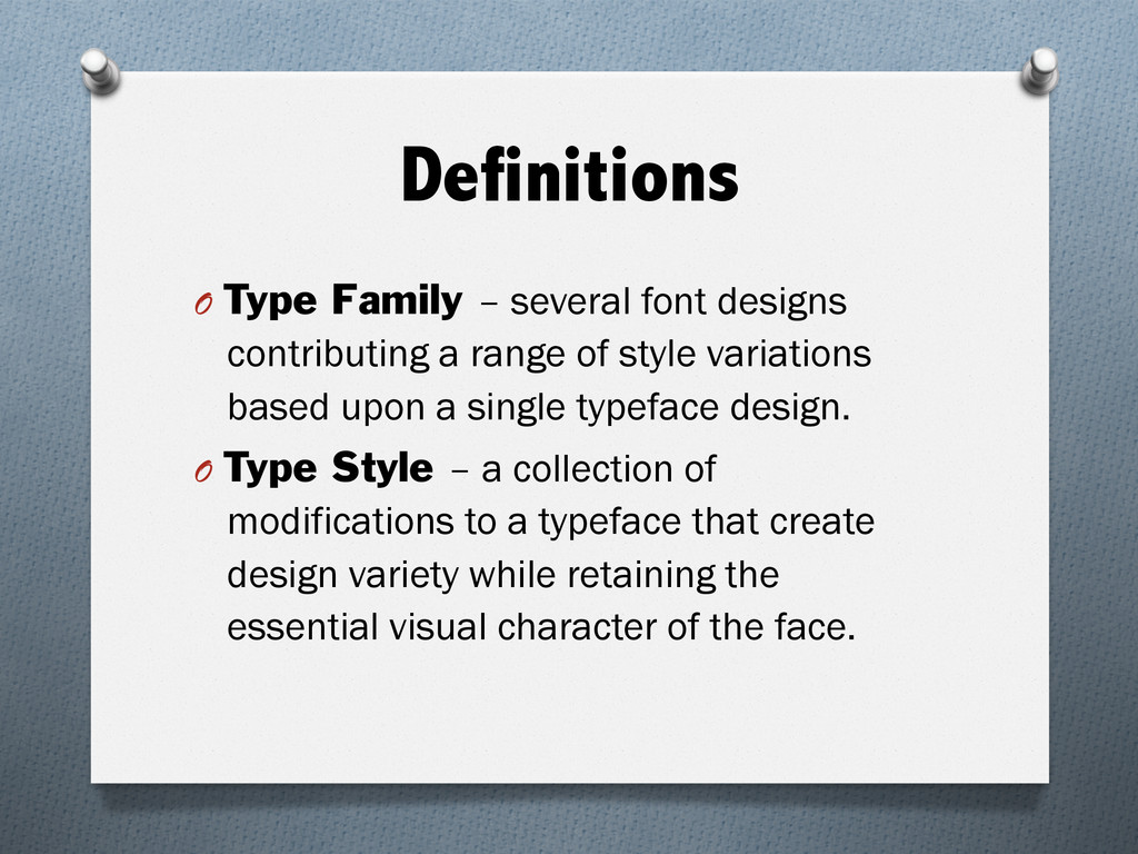
range of style variations based upon a single typeface design. O Type Style – a collection of modifications to a typeface that create design variety while retaining the essential visual character of the face.
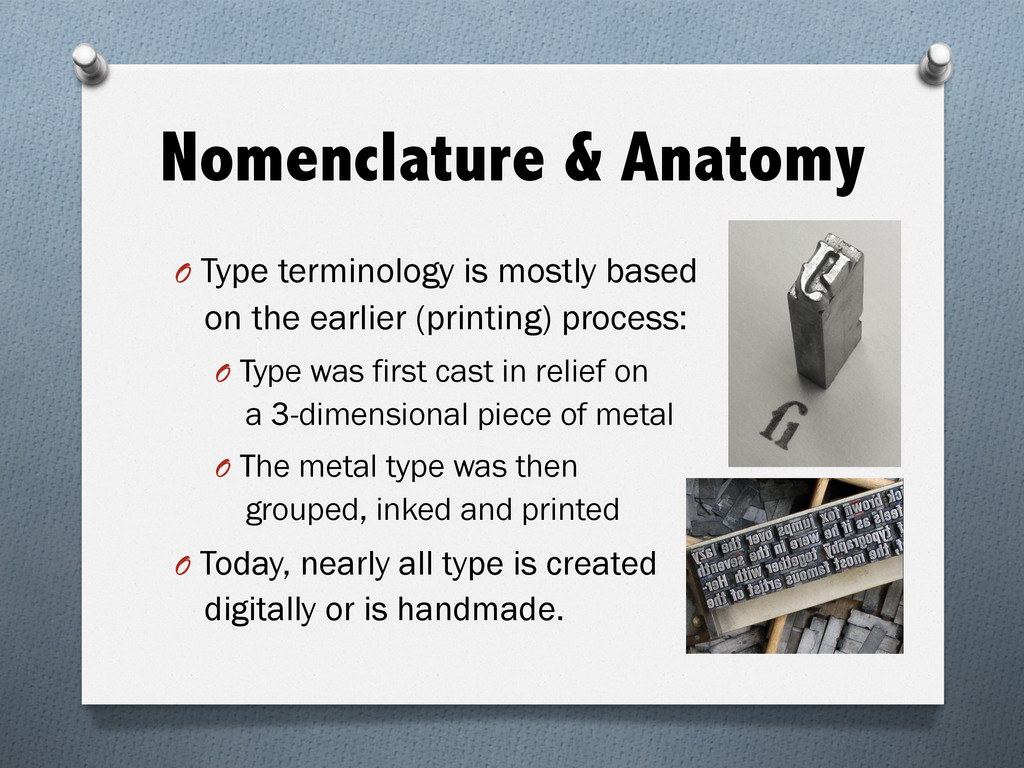
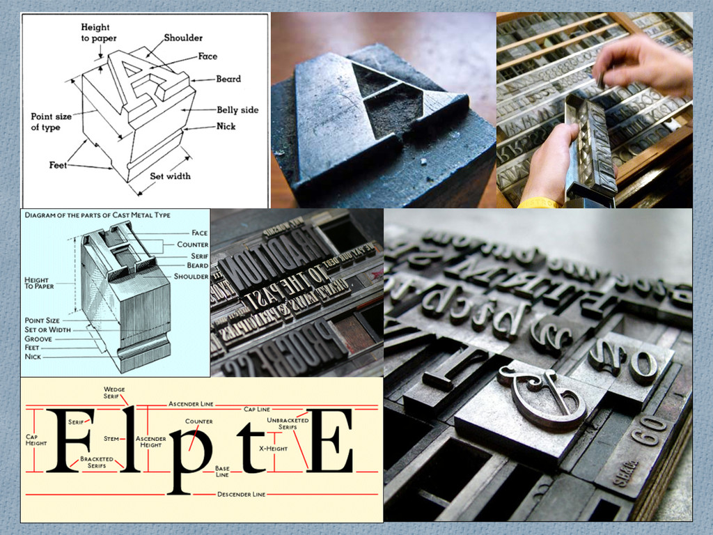
the earlier (printing) process: O Type was first cast in relief on a 3-dimensional piece of metal O The metal type was then grouped, inked and printed O Today, nearly all type is created digitally or is handmade.
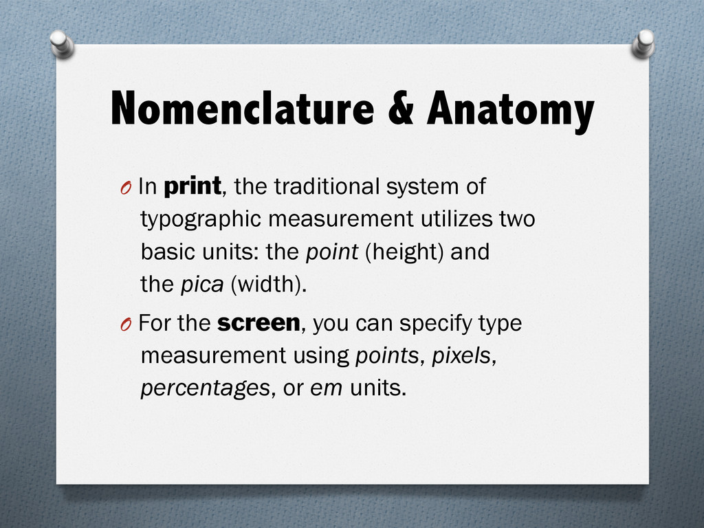
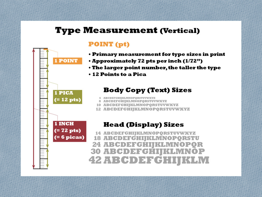
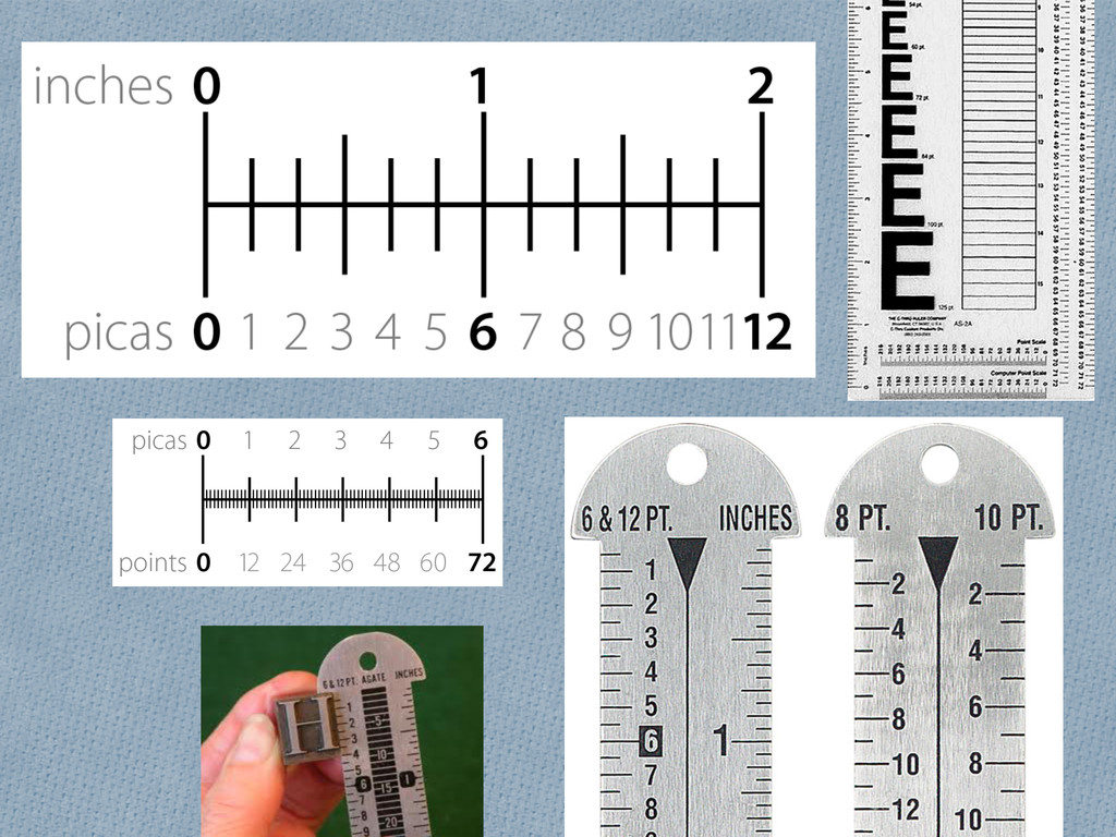
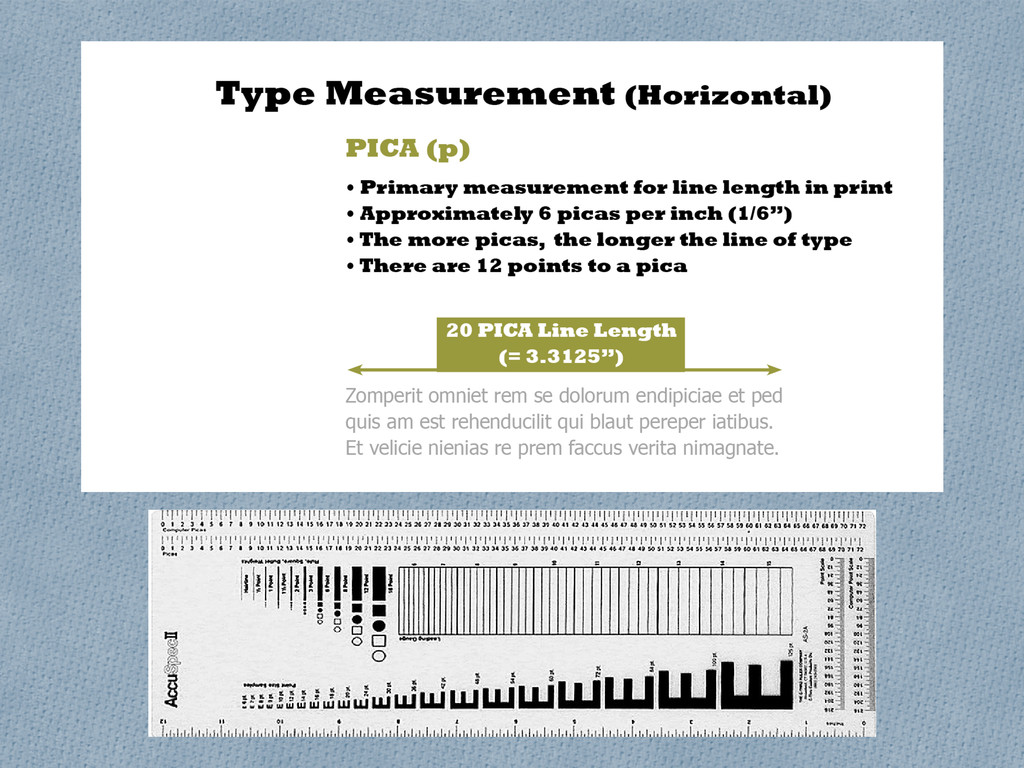
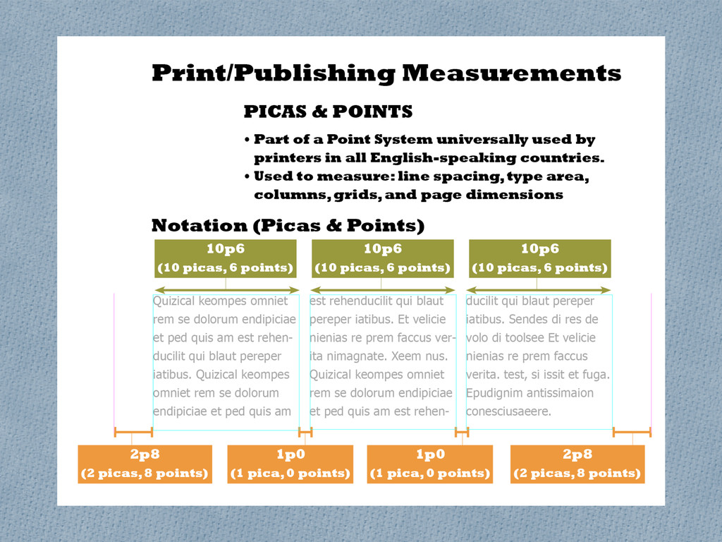
typographic measurement utilizes two basic units: the point (height) and the pica (width). O For the screen, you can specify type measurement using points, pixels, percentages, or em units.
O Control “subconscious” components of layout O Study what works, avoid what does not O Recognize flaws, make corrections O Enhance communication O Always maintain legibility
O Understand similarities and differences O Acquire knowledge, acquire more control O Recognize flaws, make corrections O Create conscious design decisions O Reach solutions faster
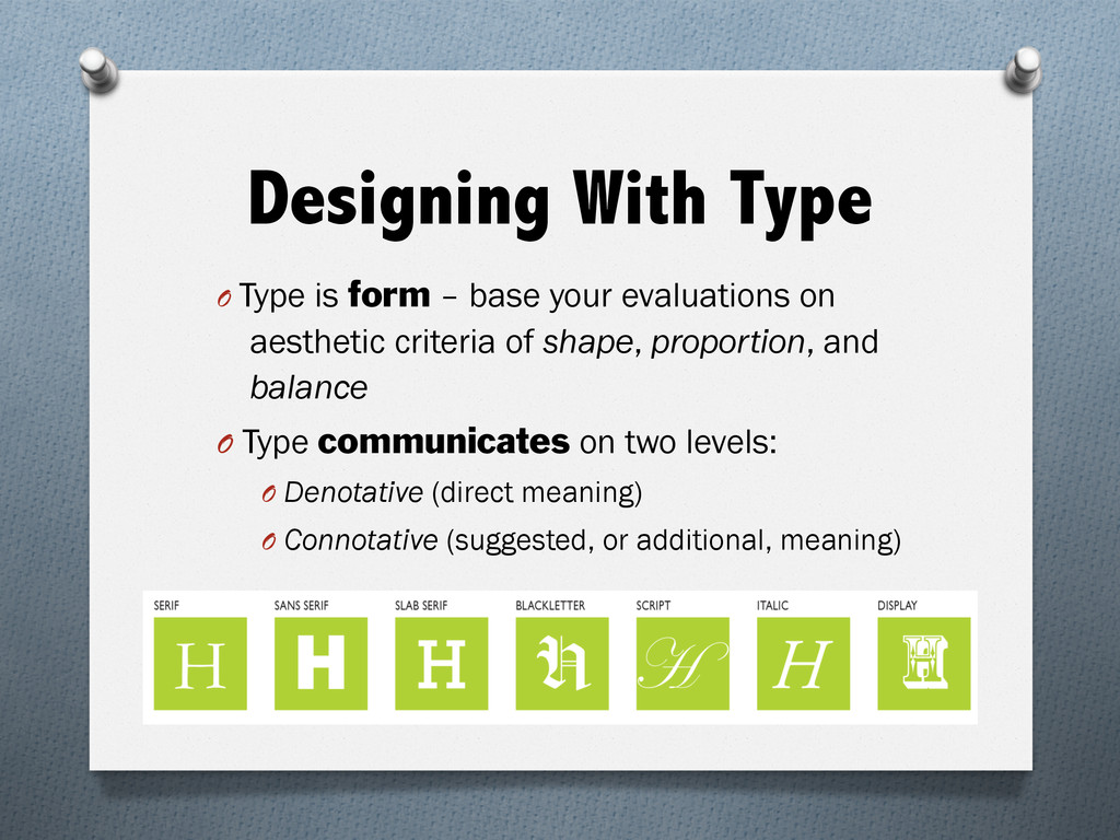
criteria of shape, proportion, and balance O Type communicates on two levels: O Denotative (direct meaning) O Connotative (suggested, or additional, meaning) Designing With Type
with visuals O Must be readable O Must respect margins, so that text type will be properly presented O Must flow visually. Transitions between letters, words, and paragraphs are critical. Spacing can make or break communication. Designing With Type
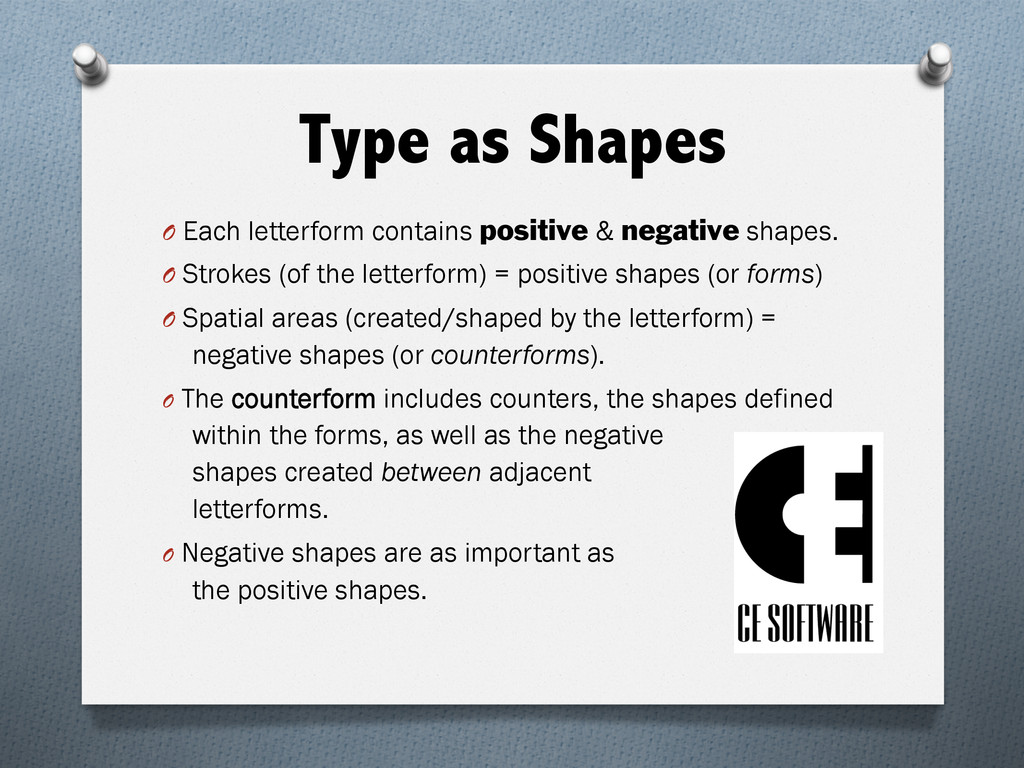
(of the letterform) = positive shapes (or forms) O Spatial areas (created/shaped by the letterform) = negative shapes (or counterforms). O The counterform includes counters, the shapes defined within the forms, as well as the negative shapes created between adjacent letterforms. O Negative shapes are as important as the positive shapes. Type as Shapes
of a typeface (for its aesthetic value and the impact) is as important as creation, or selection, of an image O Every characteristic of a typeface contributes to communication and should be evaluated: O Aesthetics based on proportion, balance, visual weight, thick-thin contrast, positive and negative shapes of each individual letter and counters O Shape relationships between and among letters
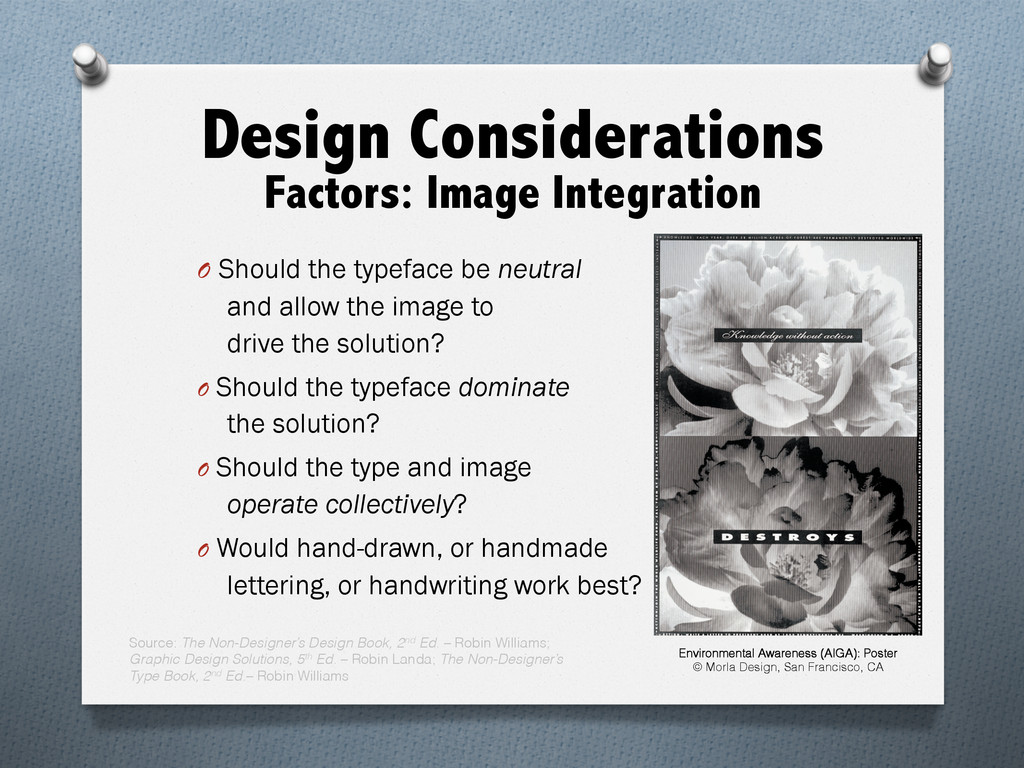
typeface should be considered for integration with the characteristics of the accompanying images. O Make these design decisions: O Should the typeface share visual characteristics with the image? O Should the typeface contrast with the characteristics of the image?