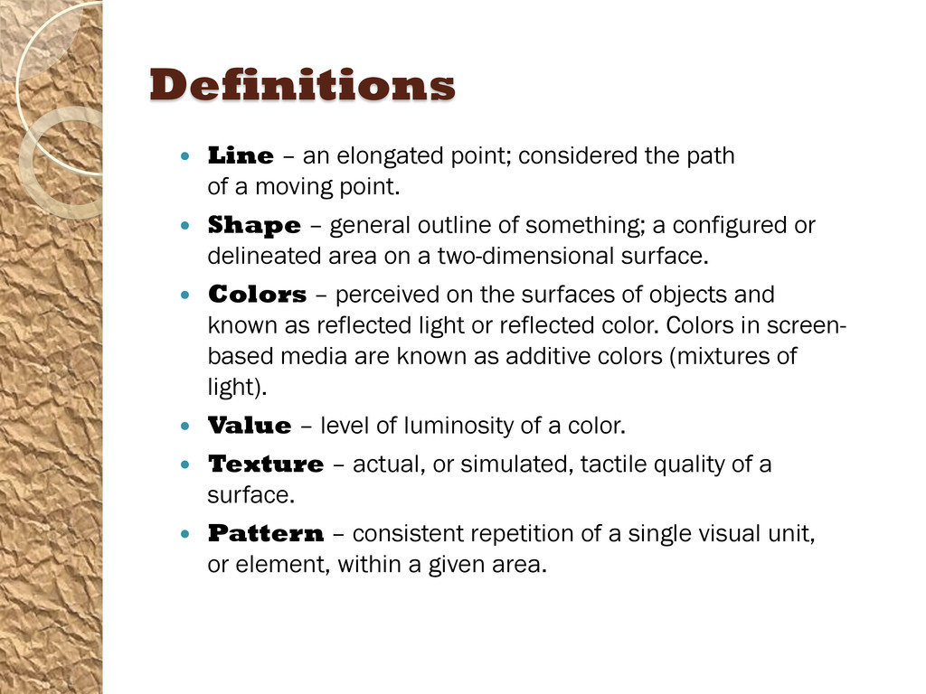
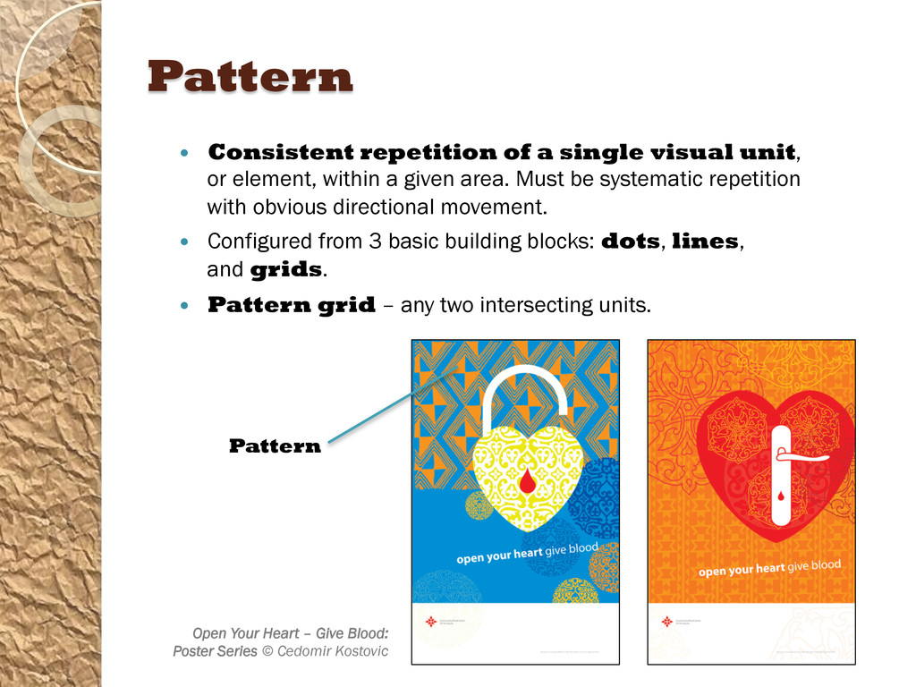
of a moving point. Shape – general outline of something; a configured or delineated area on a two-dimensional surface. Colors – perceived on the surfaces of objects and known as reflected light or reflected color. Colors in screen- based media are known as additive colors (mixtures of light). Value – level of luminosity of a color. Texture – actual, or simulated, tactile quality of a surface. Pattern – consistent repetition of a single visual unit, or element, within a given area.
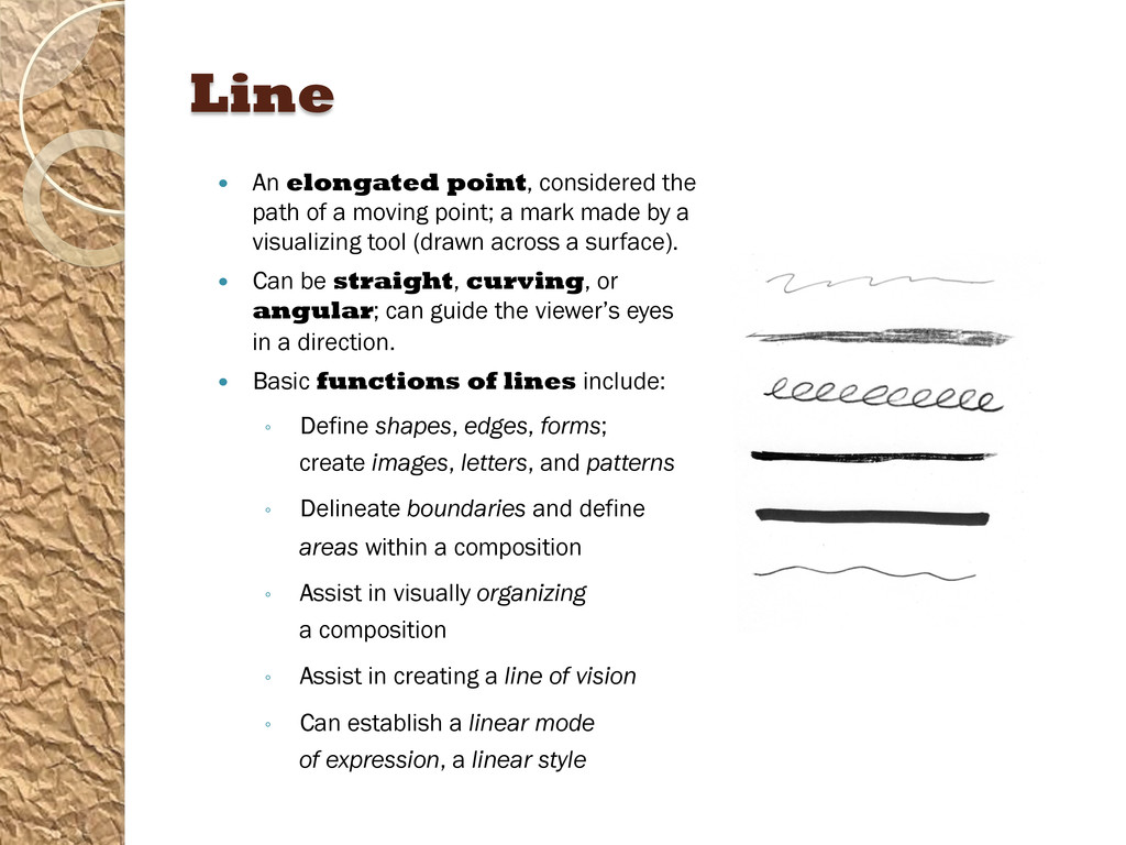
moving point; a mark made by a visualizing tool (drawn across a surface). Can be straight, curving, or angular; can guide the viewer’s eyes in a direction. Basic functions of lines include: ◦ Define shapes, edges, forms; create images, letters, and patterns ◦ Delineate boundaries and define areas within a composition ◦ Assist in visually organizing a composition ◦ Assist in creating a line of vision ◦ Can establish a linear mode of expression, a linear style
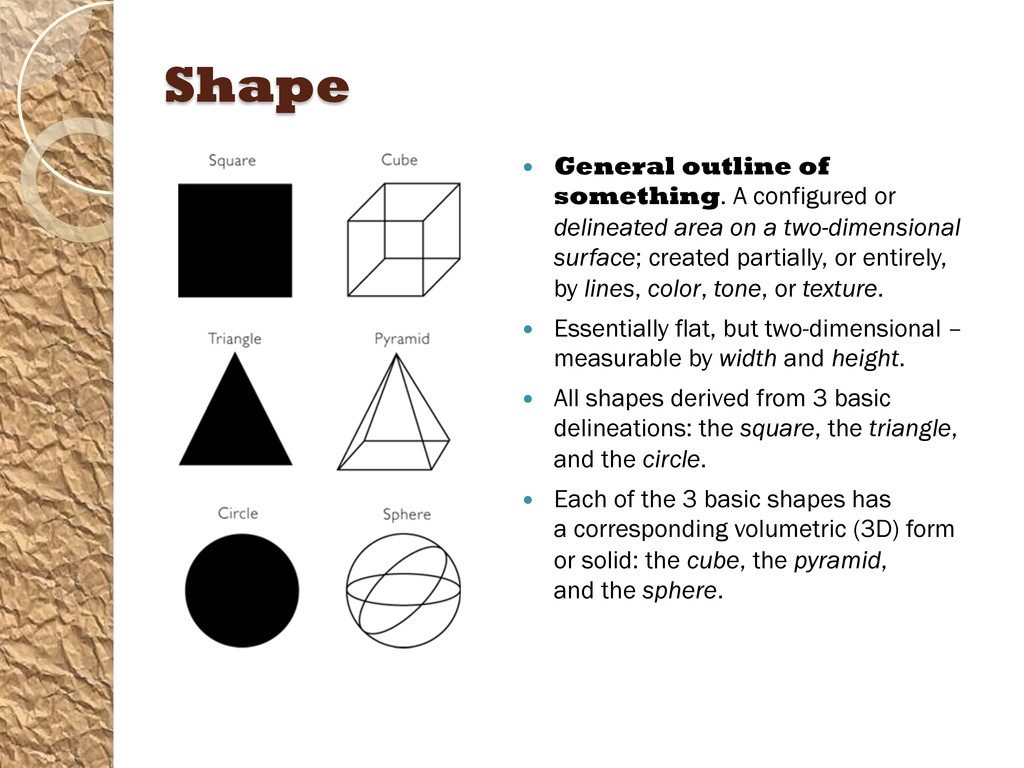
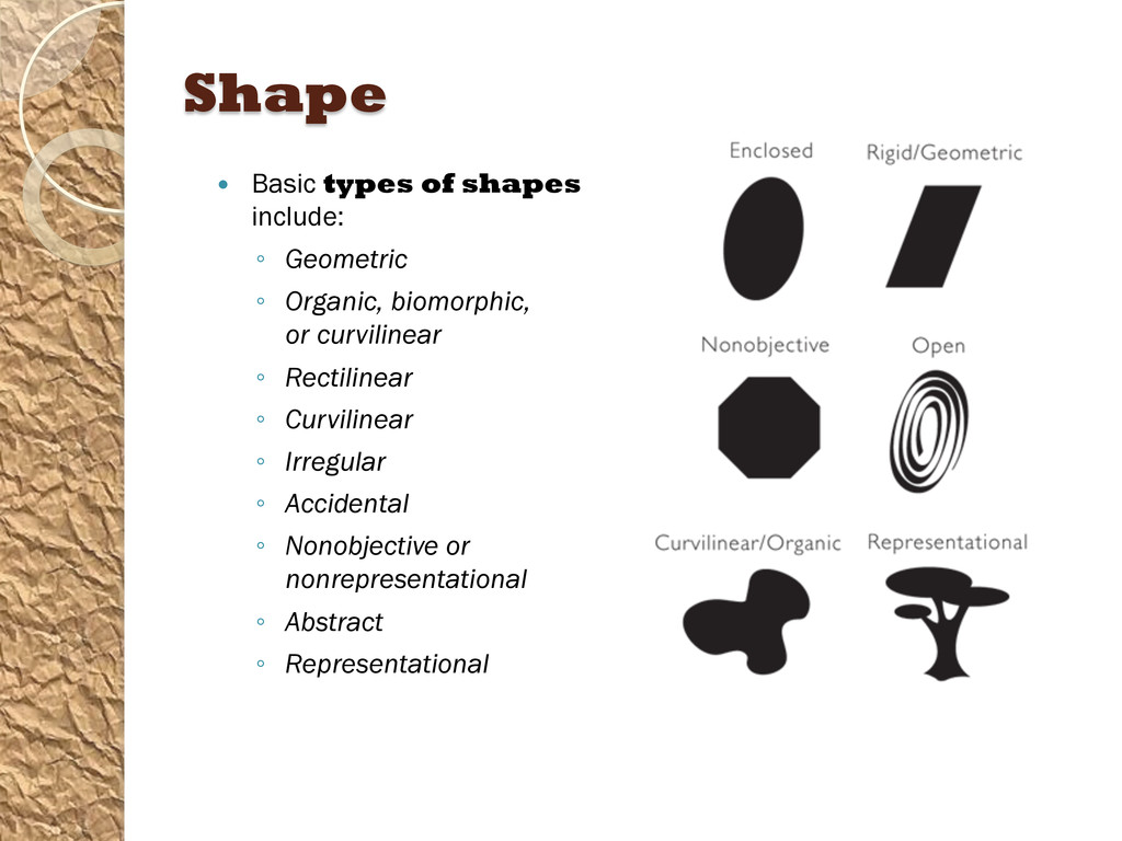
area on a two-dimensional surface; created partially, or entirely, by lines, color, tone, or texture. Essentially flat, but two-dimensional – measurable by width and height. All shapes derived from 3 basic delineations: the square, the triangle, and the circle. Each of the 3 basic shapes has a corresponding volumetric (3D) form or solid: the cube, the pyramid, and the sphere.
are perceived, and known, as reflected light or reflected color (aka subtractive color). • Colors on a computer screen are visible wavelengths of light energy; these mixtures of light result in digital color (aka additive color). • Element of color generally divided into 3 categories: • Hue – name of a color, red or green, blue or orange, etc. A hue also can be perceived as warm or cool in temperature, which refers to whether the color looks hot or cold. • Saturation – the brightness or dullness of a color. • Value – the level of luminosity (lightness or darkness) of a color. Shade, tone, and tint are different aspects of value.
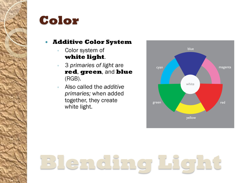
light. ◦ 3 primaries of light are red, green, and blue (RGB). ◦ Also called the additive primaries; when added together, they create white light. Blending Light
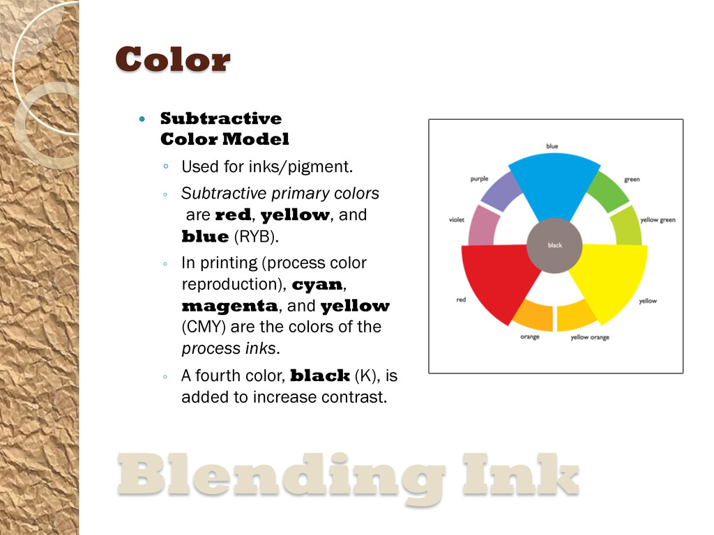
Subtractive primary colors are red, yellow, and blue (RYB). ◦ In printing (process color reproduction), cyan, magenta, and yellow (CMY) are the colors of the process inks. ◦ A fourth color, black (K), is added to increase contrast. Blending Ink
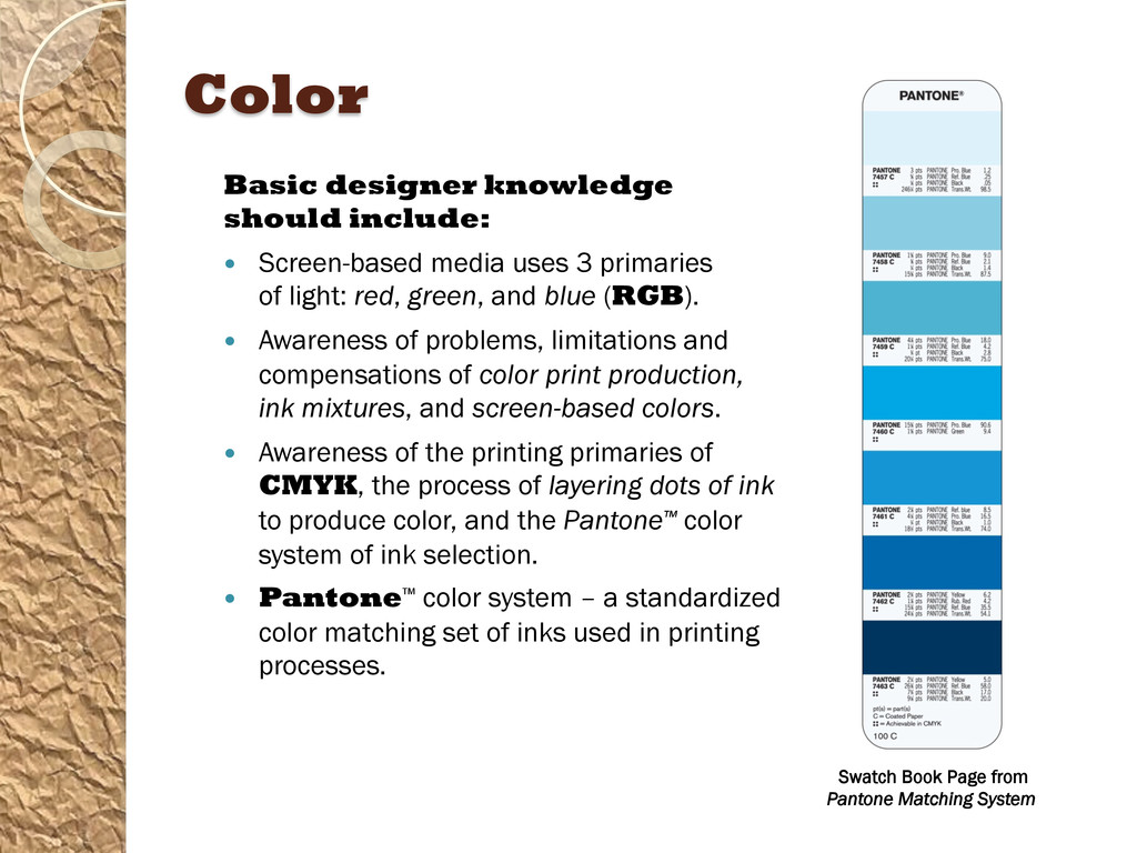
3 primaries of light: red, green, and blue (RGB). Awareness of problems, limitations and compensations of color print production, ink mixtures, and screen-based colors. Awareness of the printing primaries of CMYK, the process of layering dots of ink to produce color, and the Pantone™ color system of ink selection. Pantone™ color system – a standardized color matching set of inks used in printing processes. Swatch Book Page from Pantone Matching System
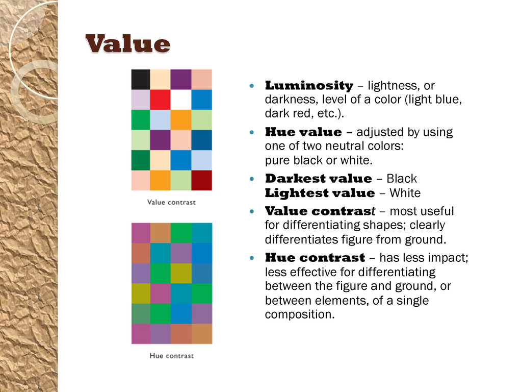
color (light blue, dark red, etc.). Hue value – adjusted by using one of two neutral colors: pure black or white. Darkest value – Black Lightest value – White Value contrast – most useful for differentiating shapes; clearly differentiates figure from ground. Hue contrast – has less impact; less effective for differentiating between the figure and ground, or between elements, of a single composition.
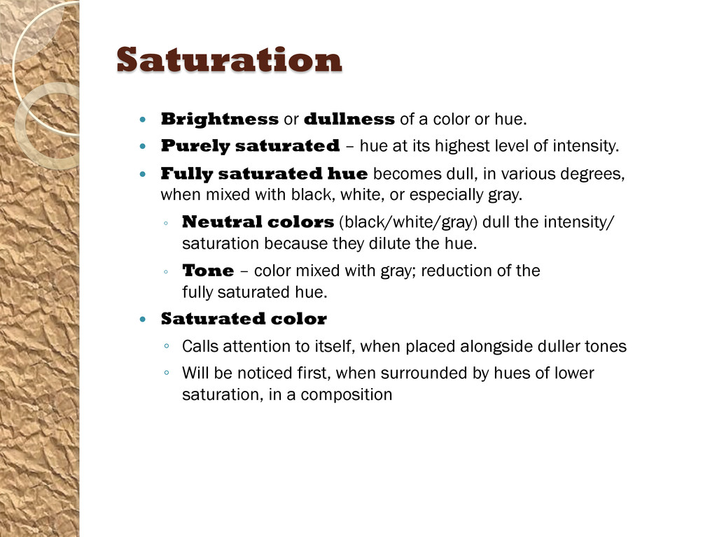
Purely saturated – hue at its highest level of intensity. Fully saturated hue becomes dull, in various degrees, when mixed with black, white, or especially gray. ◦ Neutral colors (black/white/gray) dull the intensity/ saturation because they dilute the hue. ◦ Tone – color mixed with gray; reduction of the fully saturated hue. Saturated color ◦ Calls attention to itself, when placed alongside duller tones ◦ Will be noticed first, when surrounded by hues of lower saturation, in a composition
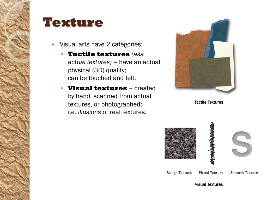
(aka actual textures) – have an actual physical (3D) quality; can be touched and felt. ◦ Visual textures – created by hand, scanned from actual textures, or photographed; i.e. illusions of real textures. Tactile Textures Visual Textures
Basic design principles are absolutely interdependent: ◦ Balance – creates equilibrium; helps stabilize a composition. ◦ Visual Hierarchy – creates emphasis through organization; improves communication. ◦ Unity – considers the design of a whole composition; all graphic elements have a discernible visual relationship. ◦ Rhythm – establishes the visual pulse and flow from one graphic element to another. Designing Smart
the outer edges or boundaries of a design. Term often used by designers to describe the shape/type of a design application. Format examples: ◦ CD Cover (square shape) ◦ Single-Page Magazine Ad (vertical rectangular shape) ◦ Two-page Spread (horizontal rectangular shape) ◦ Different-sized screens – mobile, computers and tablets. Each has a specific rectangular aspect ratio and screen image width-height ratio. Regardless what shape or type of format – every component of the composition must form a significant relationship to the format’s boundaries.
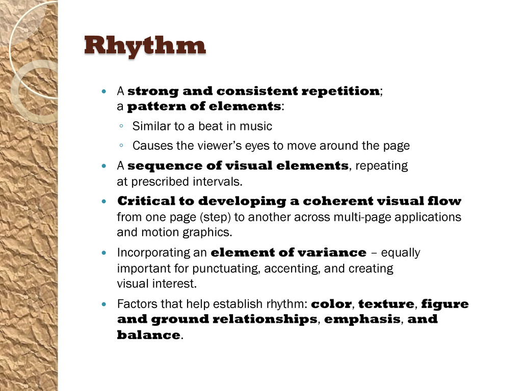
elements: ◦ Similar to a beat in music ◦ Causes the viewer’s eyes to move around the page A sequence of visual elements, repeating at prescribed intervals. Critical to developing a coherent visual flow from one page (step) to another across multi-page applications and motion graphics. Incorporating an element of variance – equally important for punctuating, accenting, and creating visual interest. Factors that help establish rhythm: color, texture, figure and ground relationships, emphasis, and balance.
design are so interrelated that they form a greater whole – all the pieces look as though they “belong together”. Unified compositions – typically the best understood, and most remembered, by viewers. Relies on gestalt (German for “form”) – places emphasis on the perception of forms as organized wholes. ◦ Primarily concerned with how the mind attempts to impose order on the world, to unify and order perceptions.
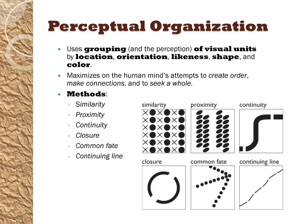
units by location, orientation, likeness, shape, and color. Maximizes on the human mind’s attempts to create order, make connections, and to seek a whole. Methods: ◦ Similarity ◦ Proximity ◦ Continuity ◦ Closure ◦ Common fate ◦ Continuing line
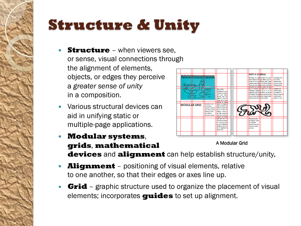
sense, visual connections through the alignment of elements, objects, or edges they perceive a greater sense of unity in a composition. Various structural devices can aid in unifying static or multiple-page applications. Modular systems, grids, mathematical devices and alignment can help establish structure/unity. Alignment – positioning of visual elements, relative to one another, so that their edges or axes line up. Grid – graphic structure used to organize the placement of visual elements; incorporates guides to set up alignment. A Modular Grid
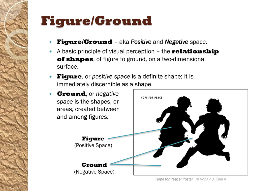
visual solution. Without a complete understanding of two-dimensional design, a designer creates primitively rather than with design intelligence. The formal elements of two-dimensional design are line, shape, color, and texture. A line is an elongated point, considered the path of a moving point. The general outline of something is a shape; it is a configured or delineated area on a two-dimensional surface. Figure/ground, also called positive and negative space, is a basic principle of visual perception and refers to the relationship of shapes, of figure to ground, on a two-dimensional surface.
is a definite shape; it is immediately discernible as a shape. The shapes or areas created between and among figures are known as the ground or negative space. The colors we see on the surfaces of objects in our environment are perceived and known as reflected light or reflected color. The digital colors seen in screen-based media are also known as additive colors – mixtures of light. Value refers to the level of luminosity – the lightness or darkness of a color. Texture can be either the actual tactile quality of a surface or the simulation, or representation, of such a surface quality.
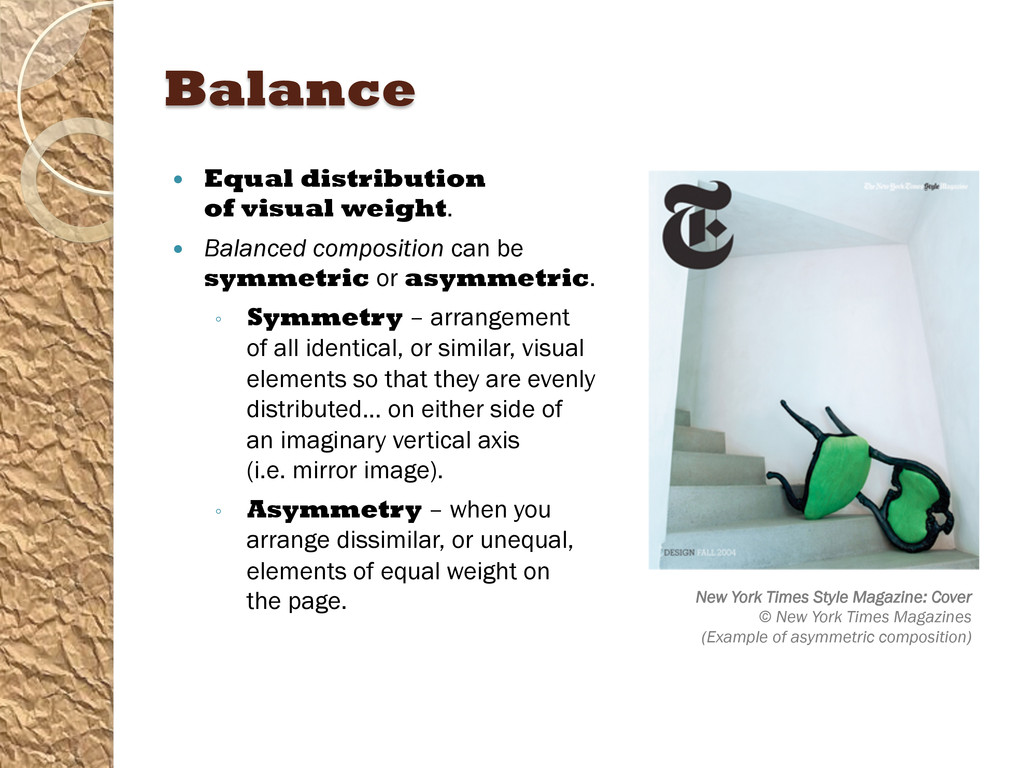
of a single visual unit or element within a given area. The basic principles of design are absolutely interdependent. The format is the defined perimeter as well as the field it encloses; the outer edges or boundaries of a design. Balance is stability or equilibrium created by an even distribution of visual weight on each side of a central axis; an even distribution of weight among all the elements of the composition. Symmetry is a mirroring of equivalent elements, an equal distribution of visual weights, on either side of a central axis. Asymmetry is an equal distribution of visual weights achieved through weight and counterweight, by balancing one element with the weight of a counterpointing element, without mirroring elements on either side of a central axis.
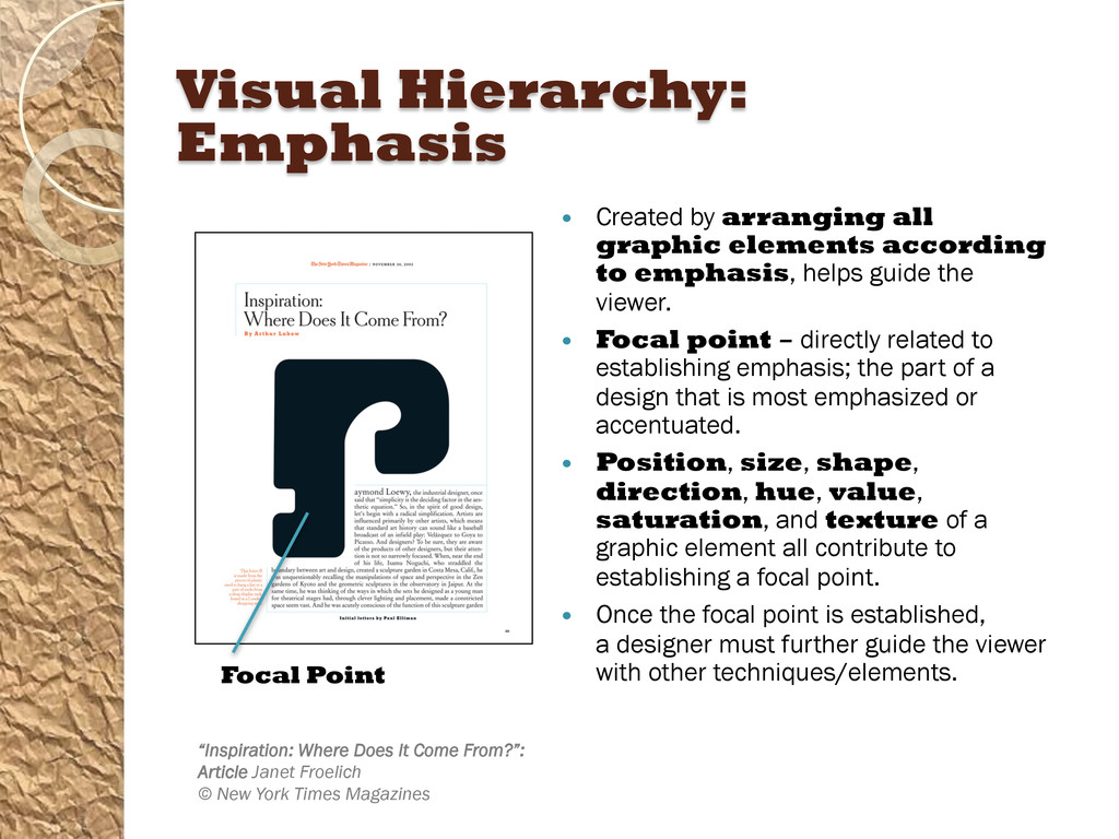
designer uses visual hierarchy, the arrangement of all graphic elements according to emphasis. Emphasis is the arrangement of visual elements according to importance, stressing some elements over others; making some superordinate (dominant) elements and subordinating other elements. In graphic design, a strong and consistent repetition pattern of elements can set up a rhythm, similar to a beat in music, which causes the viewer’s eyes to move around the page.
one, or a few, visual elements a number times or with great or total consistency. Variation is established by a break or modification in the pattern or by changing elements, such as the color, size, shape, spacing, position, and visual weight. Unity occurs when all the graphic elements in a design are so interrelated that they form a greater whole. Alignment is the positioning of visual elements relative to one another so that their edges or axes line up. In a design, scale is the size of an element or form seen in relation to other elements or forms within the format. Proportion is the comparative size relationships of parts to one another and to the whole. Source: Graphic Design Solutions, 5th Ed; Robin Landa