Upgrade to Pro — share decks privately, control downloads, hide ads and more …

Typography 02

Typography 02

Classifications, differences& implications

jeffsullivan

March 17, 2014
Tweet

More Decks by jeffsullivan

Other Decks in Design

Transcript

  1. Why You Should Care O  Improved integration of type and

    images O  Improved layouts and message expression O  Less distractions in layouts O  Better connection with reader/viewer
  2. Type Classifications O  Major classification categories exist for the numerous

    typefaces available today O  Generally sorted by style and history O  Classifications serve only as guidelines; categories vary among type historians
  3. Type Classifications O  Old Style (Humanist) O  Transitional O  Modern

    O  Slab Serif O  Sans Serif O  Blackletter O  Script O  Display
  4. Know Your Style(s) O  Recognize major categories of type O 

    Develop awareness of typeface details O  Search more selectively/consciously O  Prevent random/sloppy typeface choices
  5. Oldstyle O  Based on scribes' handlettering (angled pen) O  Always

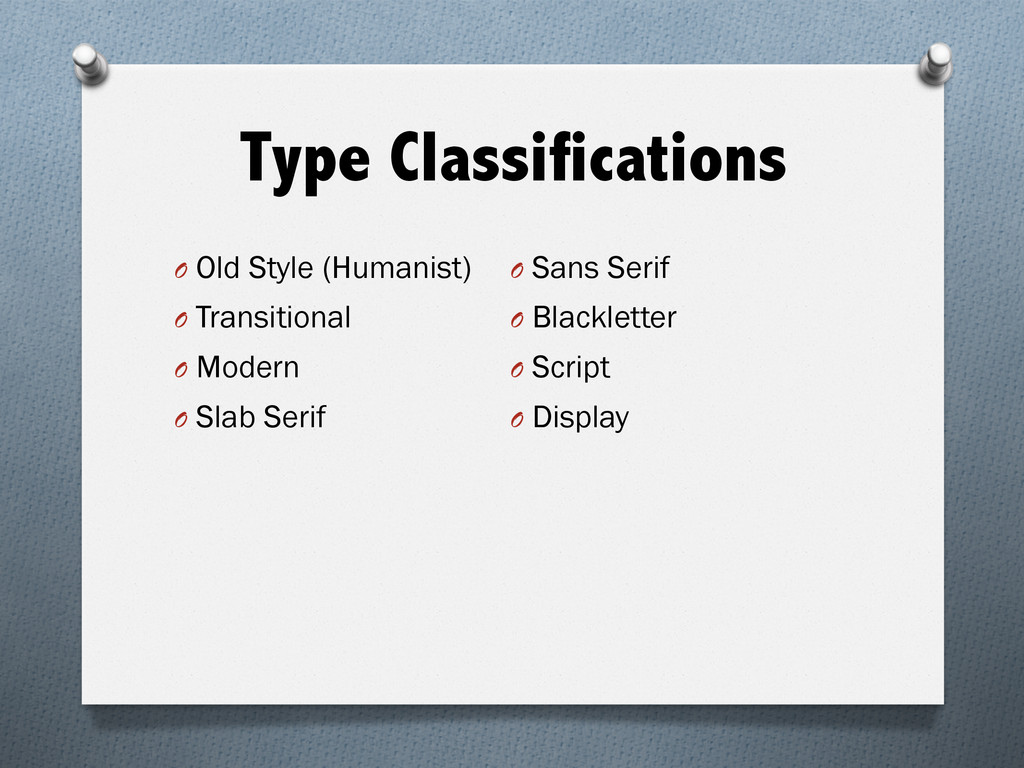
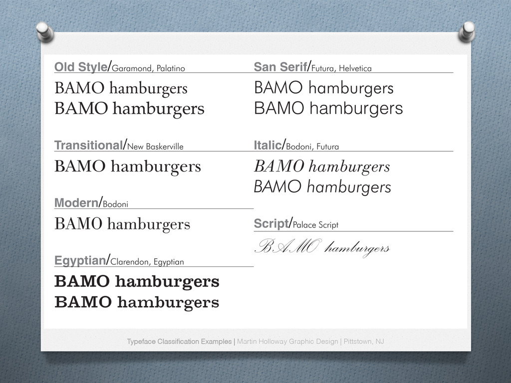
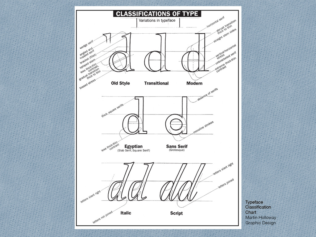
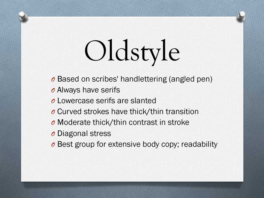
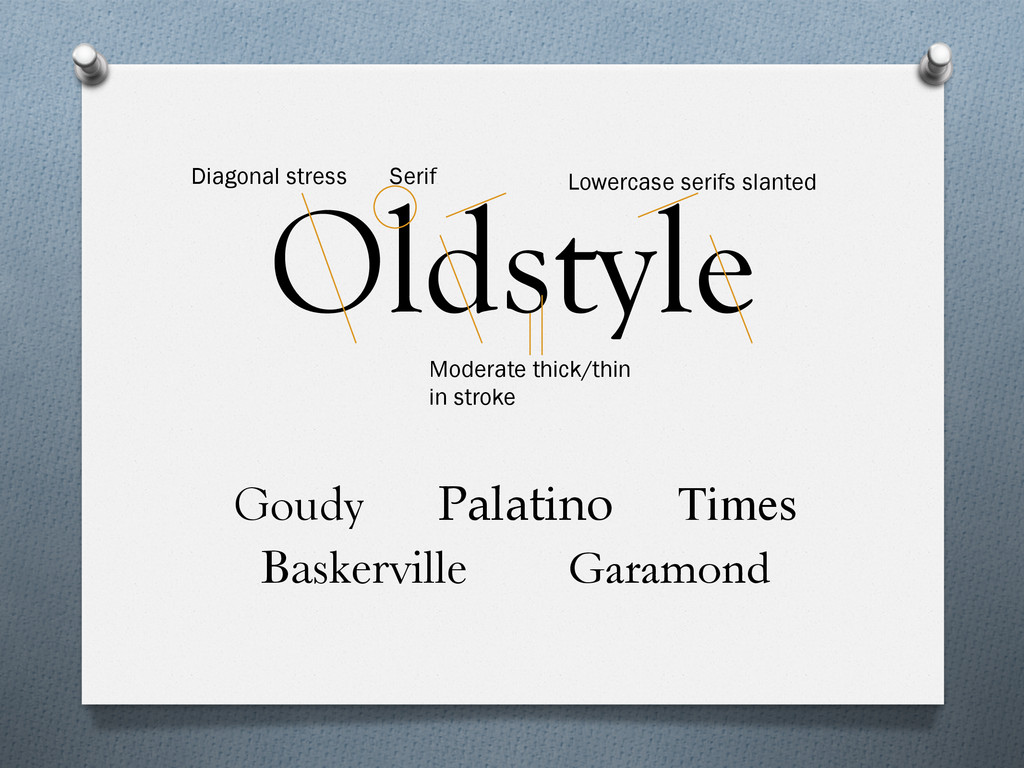
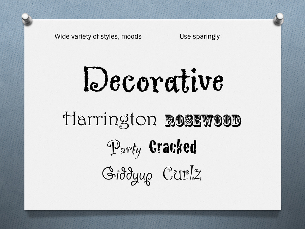
    have serifs O  Lowercase serifs are slanted O  Curved strokes have thick/thin transition O  Moderate thick/thin contrast in stroke O  Diagonal stress O  Best group for extensive body copy; readability
  6. Modern O  Post-1600s, based on mechanical type vs. handlettering O 

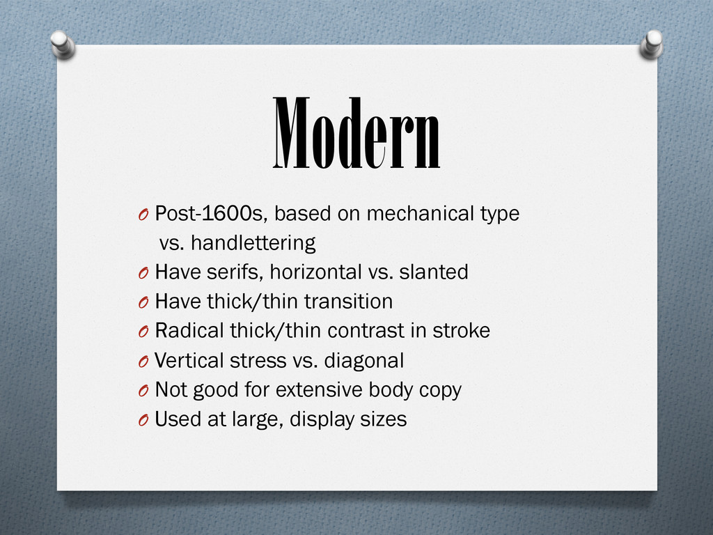
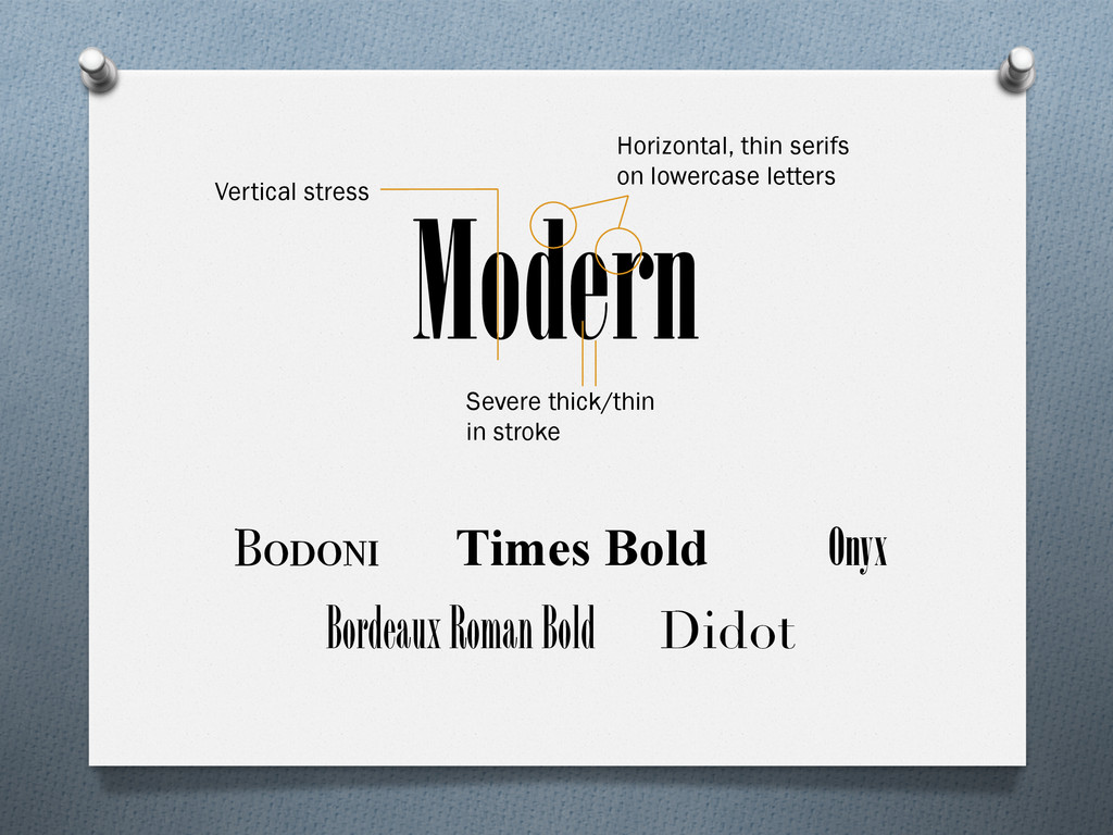
    Have serifs, horizontal vs. slanted O  Have thick/thin transition O  Radical thick/thin contrast in stroke O  Vertical stress vs. diagonal O  Not good for extensive body copy O  Used at large, display sizes
  7. Slab Serif O  Introduced in industrial revolution, advertising O  Have

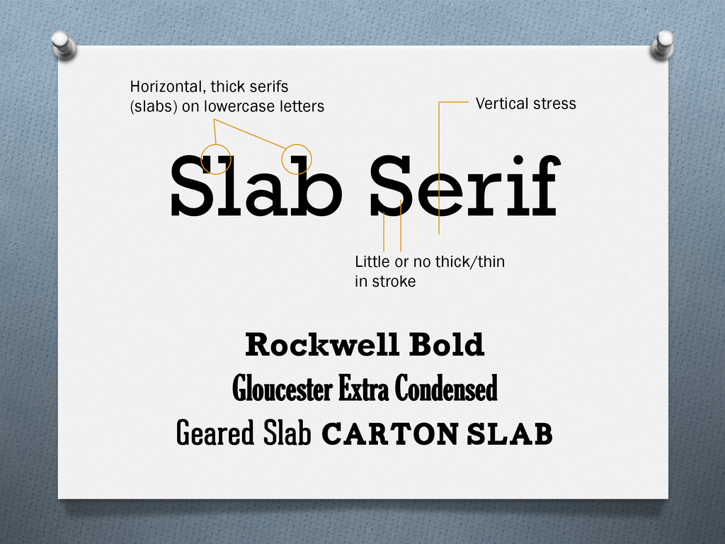
    serifs, horizontal and thick O  Little or no thick/thin transition O  Vertical stress vs. diagonal O  Often used for extensive body copy (when thick/thin transition exists) O  High readability, clean, straightforward
  8. Sans Serif O  Introduced in 1900s O  “Sans” = French

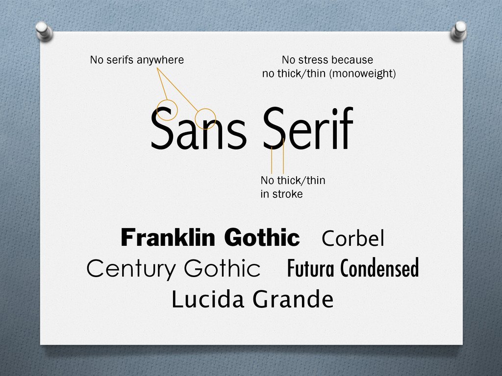
    for “without” O  No serifs O  Usually monoweight, no thick/thin transition O  No stress because no thick/thin transition O  Some families vary from light to extra black
  9. Sans Serif Franklin Gothic Corbel Century Gothic Futura Condensed Lucida

    Grande No stress because no thick/thin (monoweight) No thick/thin in stroke No serifs anywhere
  10. Script O  Appear handlettered (calligraphy pen, brush, pencil, technical pen)

    O  Many subcategories O  Best used only in moderation O  Never set as as long blocks of text O  Never set as all caps O  Dramatic when set very large
  11. Decorative O  Distinct, fun, stylized O  Many subcategories, each unique

    O  Best used only in moderation O  May carry obvious, initial emotions O  Manipulate usage for other connotations O  Never used for large amounts of copy
  12. First Rule of Type Club: Don't Decorate… Communicate! Choosing the

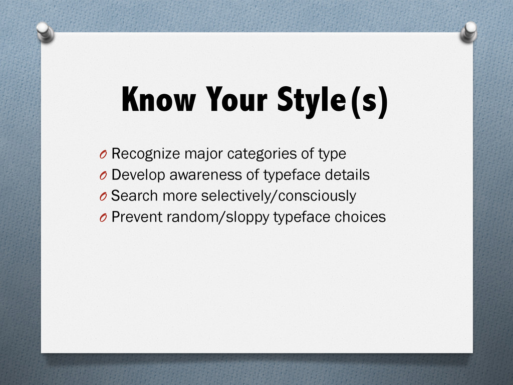
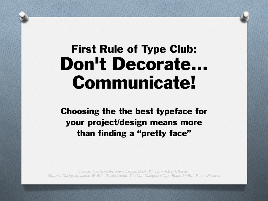
    the best typeface for your project/design means more than finding a “pretty face” Source: The Non-Designer’s Design Book, 2nd Ed. – Robin Williams; Graphic Design Solutions, 5th Ed. – Robin Landa; The Non-Designer’s Type Book, 2nd Ed.– Robin Williams