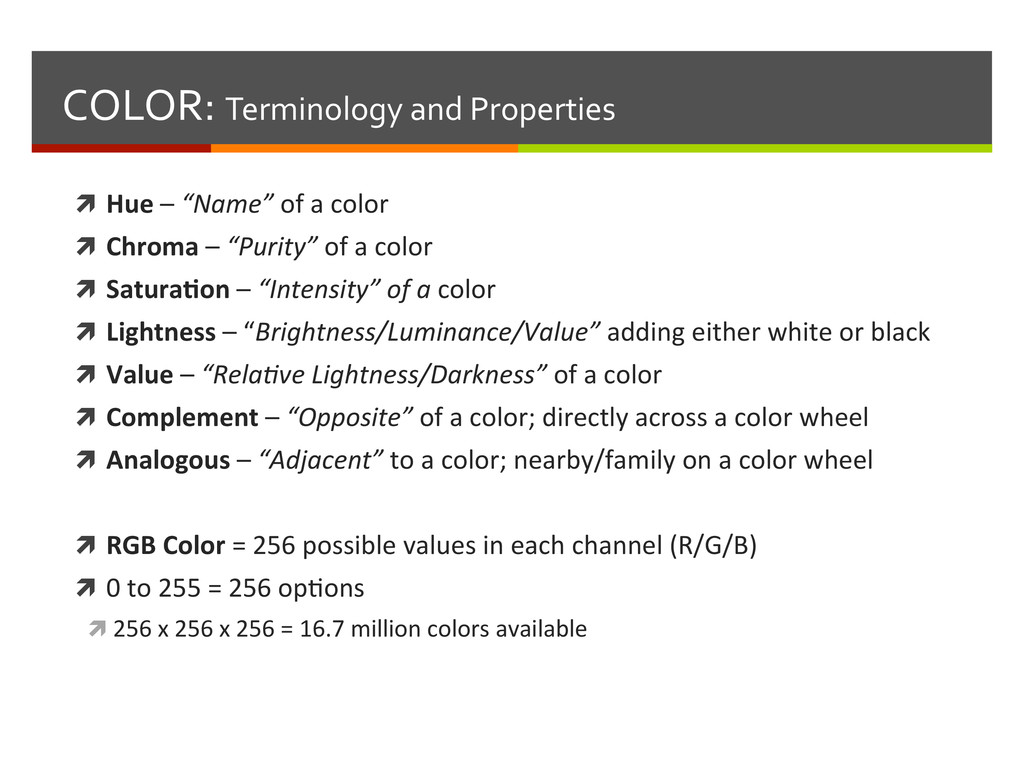
a color ì Chroma – “Purity” of a color ì Satura3on – “Intensity” of a color ì Lightness – “Brightness/Luminance/Value” adding either white or black ì Value – “Rela<ve Lightness/Darkness” of a color ì Complement – “Opposite” of a color; directly across a color wheel ì Analogous – “Adjacent” to a color; nearby/family on a color wheel ì RGB Color = 256 possible values in each channel (R/G/B) ì 0 to 255 = 256 opBons ì 256 x 256 x 256 = 16.7 million colors available
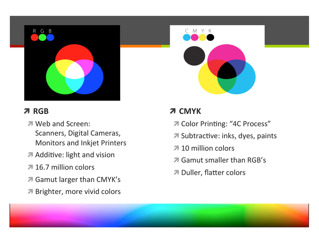
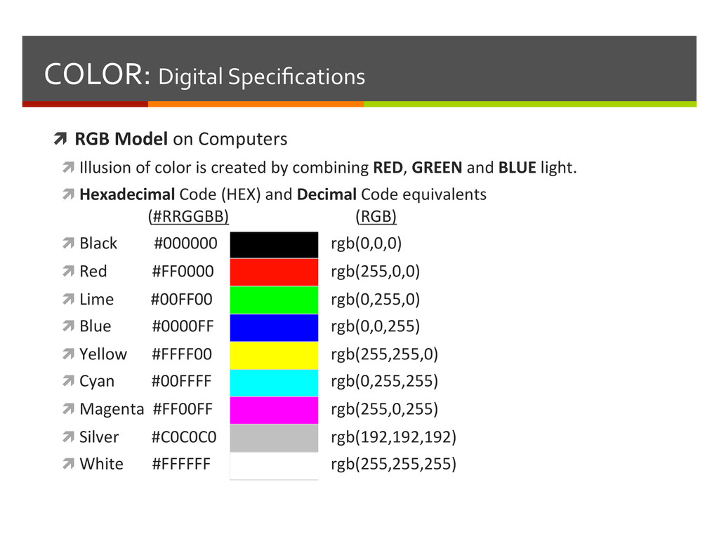
ì Illusion of color is created by combining RED, GREEN and BLUE light. ì Hexadecimal Code (HEX) and Decimal Code equivalents (#RRGGBB) (RGB) ì Black #000000 rgb(0,0,0) ì Red #FF0000 rgb(255,0,0) ì Lime #00FF00 rgb(0,255,0) ì Blue #0000FF rgb(0,0,255) ì Yellow #FFFF00 rgb(255,255,0) ì Cyan #00FFFF rgb(0,255,255) ì Magenta #FF00FF rgb(255,0,255) ì Silver #C0C0C0 rgb(192,192,192) ì White #FFFFFF rgb(255,255,255)
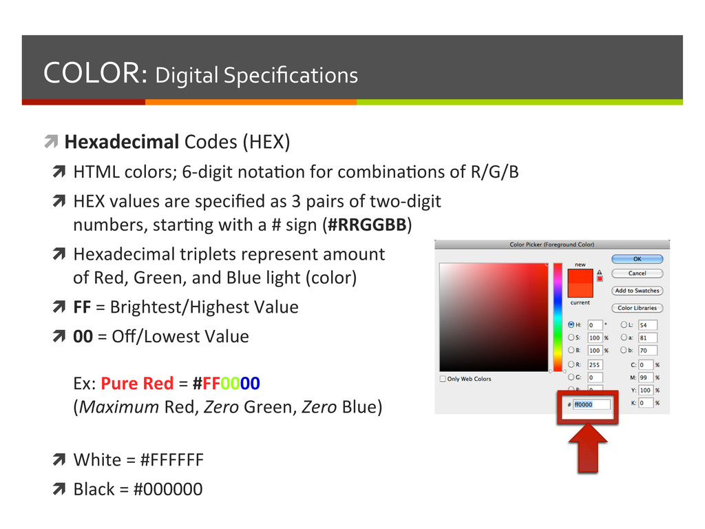
colors; 6-‐digit notaBon for combinaBons of R/G/B ì HEX values are specified as 3 pairs of two-‐digit numbers, starBng with a # sign (#RRGGBB) ì Hexadecimal triplets represent amount of Red, Green, and Blue light (color) ì FF = Brightest/Highest Value ì 00 = Off/Lowest Value Ex: Pure Red = #FF0000 (Maximum Red, Zero Green, Zero Blue) ì White = #FFFFFF ì Black = #000000
of R/G/B values from 255 to 0 (256 opBons per digit) ì 255 = Brightest/Highest Value ì 0 = Off/Lowest Value Ex: Pure Red = rgb(255,0,0) ('255' Red, '0' Green, and '0' Blue) or (Maximum Red, Zero Green, Zero Blue) ì White = rgb(255,255,255) ì Black = rgb(0,0,0)
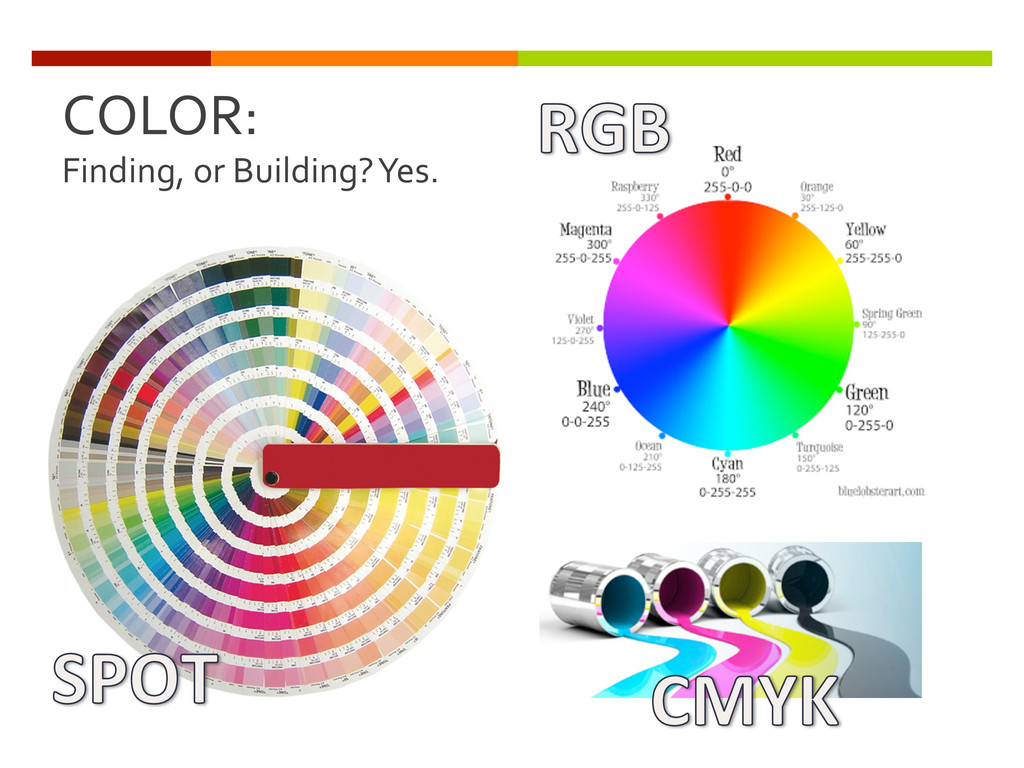
Several tools and means to build, or find, the right color ì Layout, Design and Imaging SoTware ì InDesign, Illustrator, Photoshop, Dreamweaver, Flash, A8er Effects… ì Color Sliders and Blending ì Color Swatches ì Swatch Libraries ì Color Pickers ì Color, Pixel and Photo Sampling
Several sites, tools and examples to build or find the right color ì Online Resources ì Choose your colors, explore harmonies ì Find the build recipes, names and numbers ì Find, build and test color schemes/pale-es ì Share, import, and export schemes/pale-es
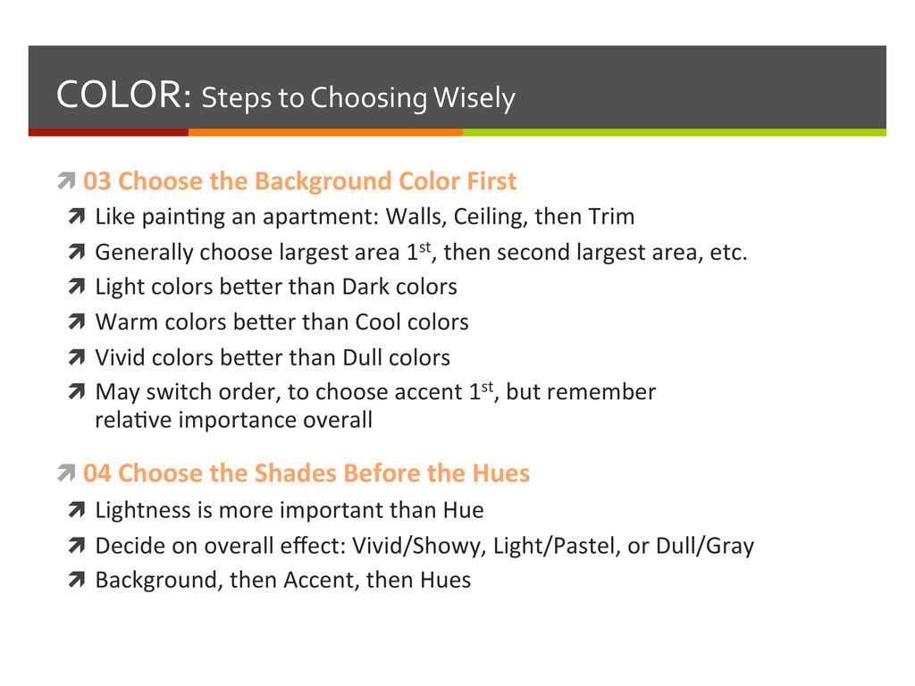
Color First ì Like painBng an apartment: Walls, Ceiling, then Trim ì Generally choose largest area 1st, then second largest area, etc. ì Light colors be-er than Dark colors ì Warm colors be-er than Cool colors ì Vivid colors be-er than Dull colors ì May switch order, to choose accent 1st, but remember relaBve importance overall ì 04 Choose the Shades Before the Hues ì Lightness is more important than Hue ì Decide on overall effect: Vivid/Showy, Light/Pastel, or Dull/Gray ì Background, then Accent, then Hues
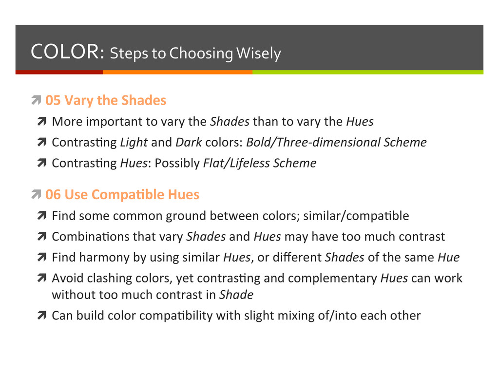
ì More important to vary the Shades than to vary the Hues ì ContrasBng Light and Dark colors: Bold/Three-‐dimensional Scheme ì ContrasBng Hues: Possibly Flat/Lifeless Scheme ì 06 Use Compa3ble Hues ì Find some common ground between colors; similar/compaBble ì CombinaBons that vary Shades and Hues may have too much contrast ì Find harmony by using similar Hues, or different Shades of the same Hue ì Avoid clashing colors, yet contrasBng and complementary Hues can work without too much contrast in Shade ì Can build color compaBbility with slight mixing of/into each other
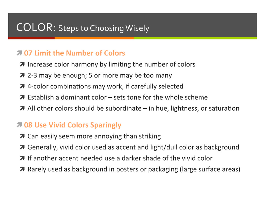
of Colors ì Increase color harmony by limiBng the number of colors ì 2-‐3 may be enough; 5 or more may be too many ì 4-‐color combinaBons may work, if carefully selected ì Establish a dominant color – sets tone for the whole scheme ì All other colors should be subordinate – in hue, lightness, or saturaBon ì 08 Use Vivid Colors Sparingly ì Can easily seem more annoying than striking ì Generally, vivid color used as accent and light/dull color as background ì If another accent needed use a darker shade of the vivid color ì Rarely used as background in posters or packaging (large surface areas)
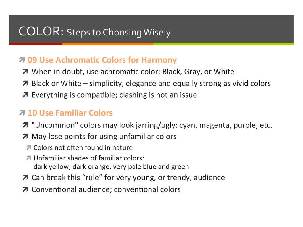
for Harmony ì When in doubt, use achromaBc color: Black, Gray, or White ì Black or White – simplicity, elegance and equally strong as vivid colors ì Everything is compaBble; clashing is not an issue ì 10 Use Familiar Colors ì "Uncommon" colors may look jarring/ugly: cyan, magenta, purple, etc. ì May lose points for using unfamiliar colors ì Colors not oyen found in nature ì Unfamiliar shades of familiar colors: dark yellow, dark orange, very pale blue and green ì Can break this “rule” for very young, or trendy, audience ì ConvenBonal audience; convenBonal colors
ì Most familiar colors available: trees, flowers, birds, insects, sea and sky ì Harmonious by definiBon; no clashing hues in nature ì Human sight highly-‐evolved to disBnguish between light and shadow ì Recall #05: Vary the Shades – more sensiBvity to subtle gradaBons in brightness ì Natural color schemes use a wide range of shades, even of same hue ì 12 Be Original (if necessary) ì Use harmony rules as long as they work – if not, explore to find scheme ì Your original soluBon may be first usage, or go against legibility, logic and common sense… and sBll "work" ì Remember: Original schemes are fresh for only a short while ì Flashy/Unique design trends expire quickly – overuse means triteness