creative brief/checklist • Do more listening than talking • Explore details; be curious and thorough • Learn what makes the client/story different • May be complex/long; define main message, action or takeaway • Identify all important points and client “must-haves”
help guide this • May be multiple goals; focus most energy on the primary one • Consult and crystallize best direction for/with client • Plan a production schedule (with realistic deadlines)
tone/mood/style of the product, service, client or business • All elements (text/imagery/concept) should speak to the goal • Manage expectations along the way (client’s and yours)
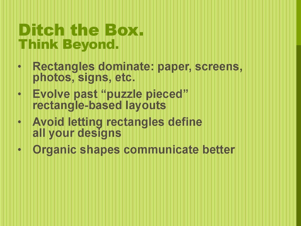
or eliminate excess noise from the concept • Reduce message to its essence; less is more with design elements • Remove anything unrelated to storytelling • Use simpler photos • Use fewer elements • Use bolder elements • Use less copy
boldest or most different, element • Large, dominant photo • Large, dominant type/head • Focal statement; pull quote • Hierarchy: Large, medium and small (1-2-3) • Boldly contrast element sizes
graphic element; dominant over others • Super-size type solution; too large for space (cropped) • Very large vs. very small element; stronger visual interest
Focal Point; leads eyes • Necessary for all design; defines figure and ground • If absent, only visual noise exists • Visual busyness only communicates noise; no relief • Minimal designs retain only communicating elements • Can frame, position and define hierarchy for images
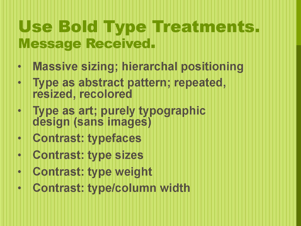
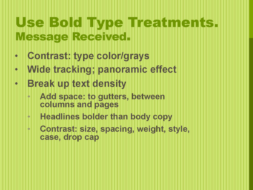
• Wide tracking; panoramic effect • Break up text density • Add space: to gutters, between columns and pages • Headlines bolder than body copy • Contrast: size, spacing, weight, style, case, drop cap
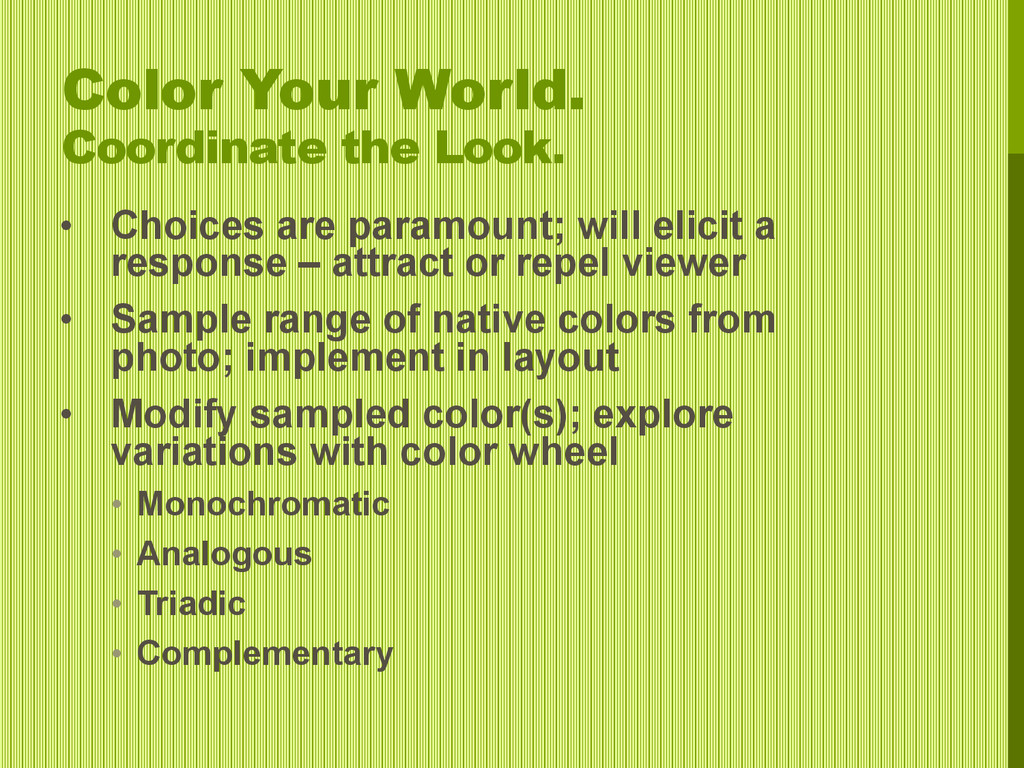
will elicit a response – attract or repel viewer • Sample range of native colors from photo; implement in layout • Modify sampled color(s); explore variations with color wheel • Monochromatic • Analogous • Triadic • Complementary