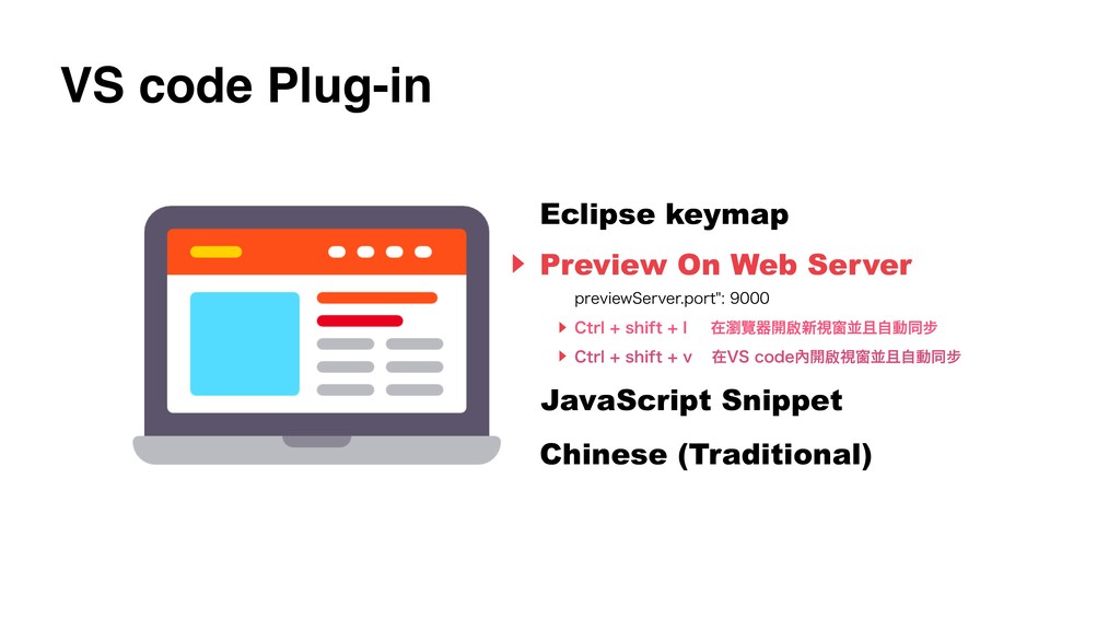
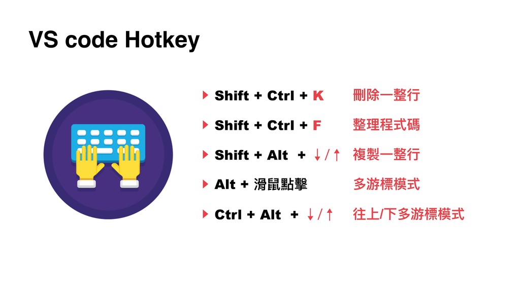
Share
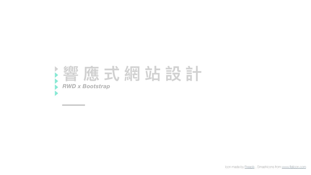
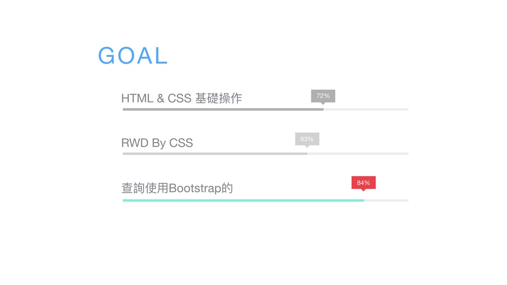
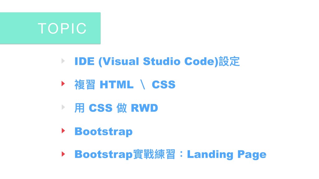
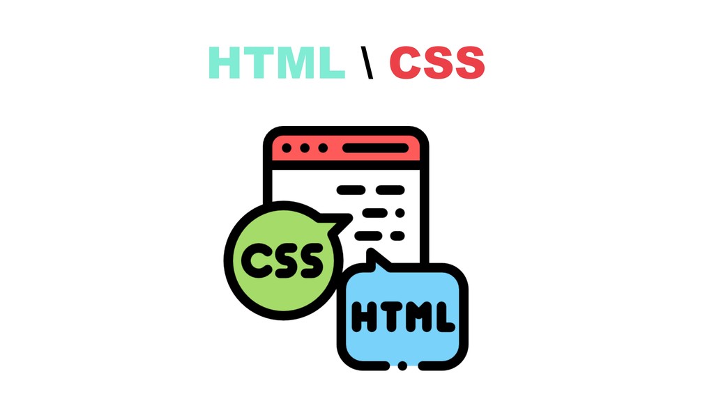
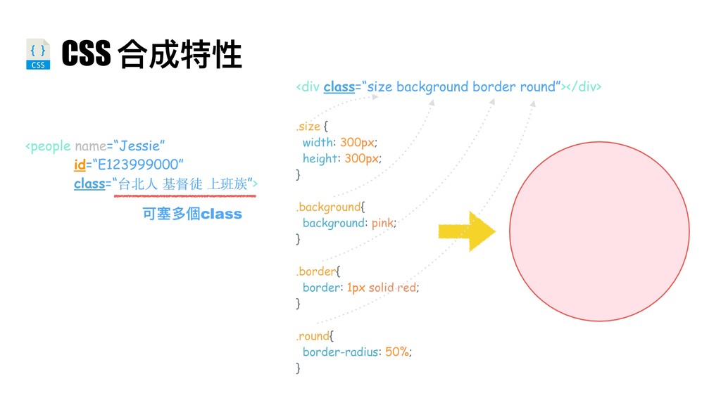
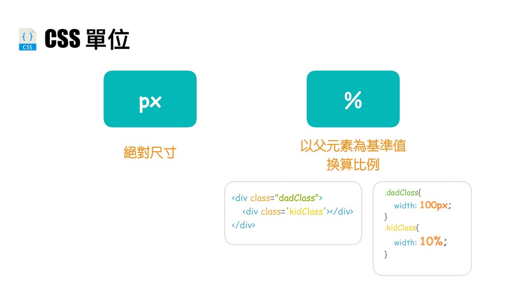
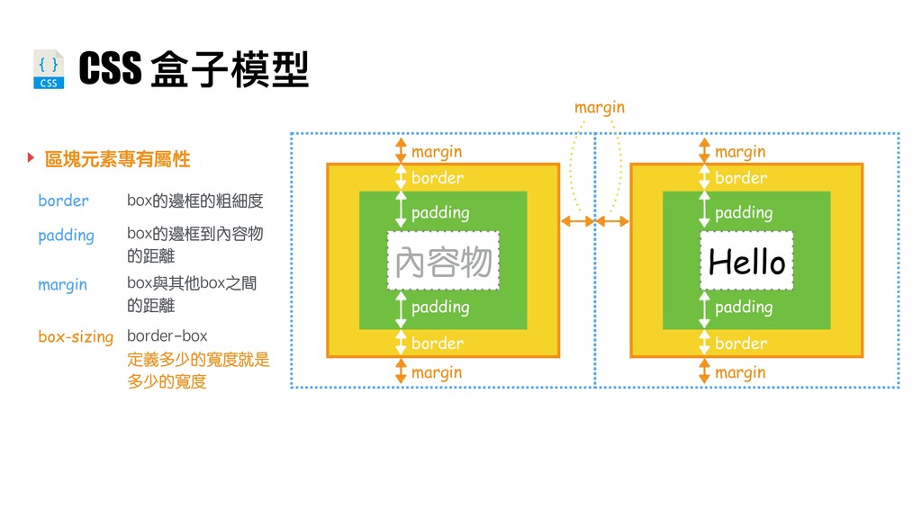
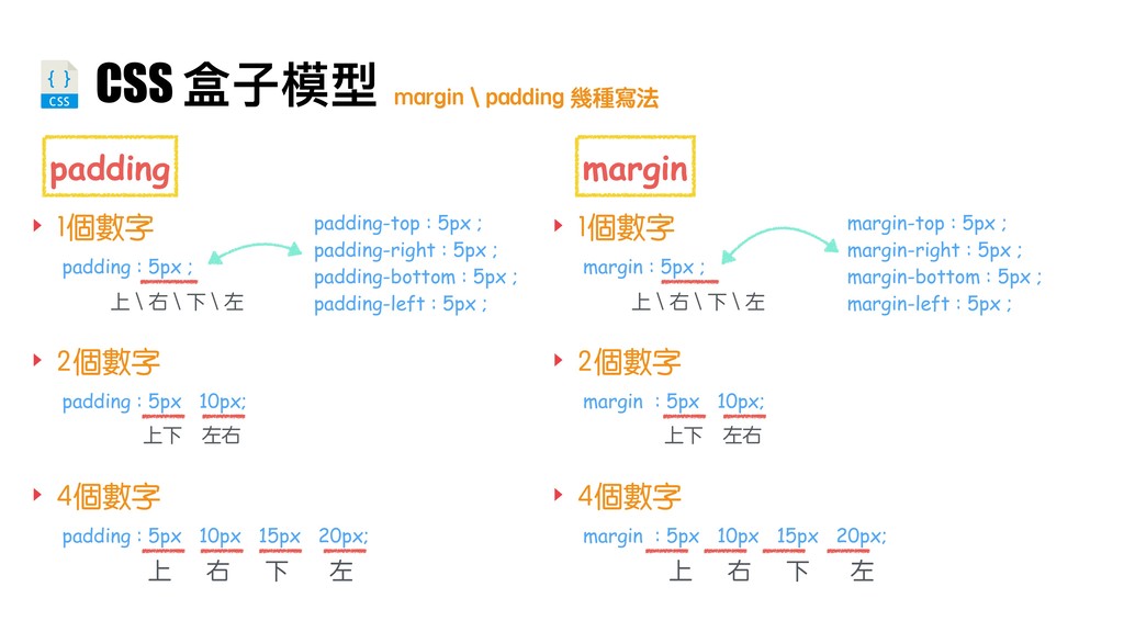
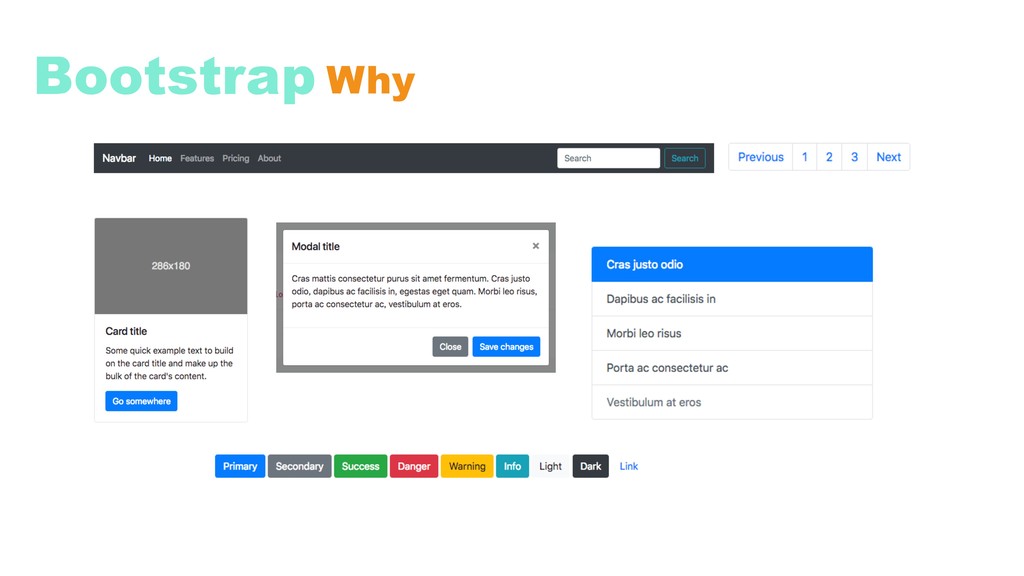
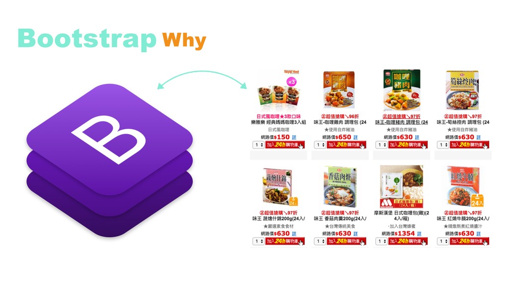
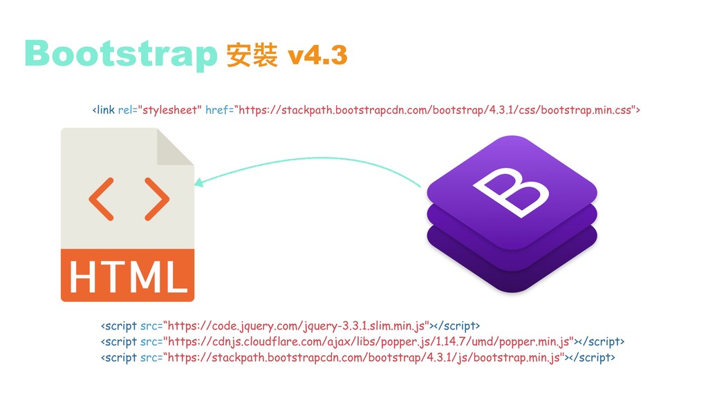
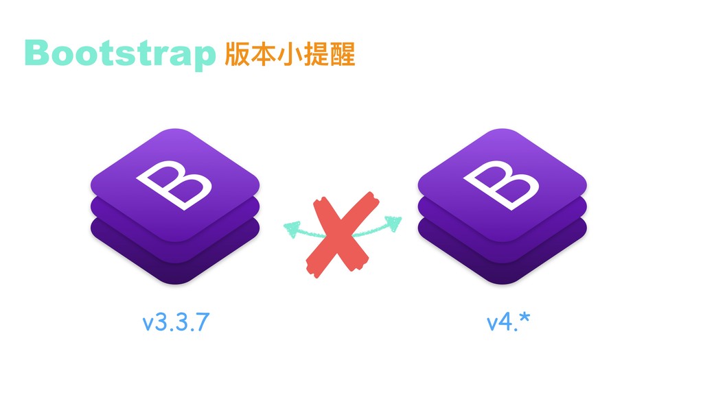
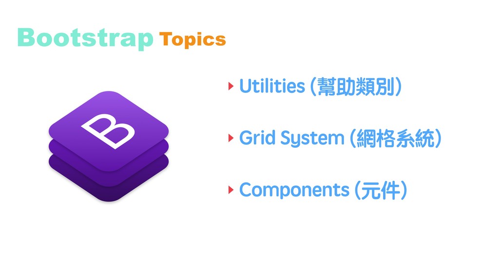
the PDF is consisted of the basic knowledge of HTML \ CSS , and basic concept of RWD, and bootstrap basic staff .
 chankawa919
 signer
 gabrielramirezv
 nomizone
 territorium
 kaityo256
 masakiokuda
 bernhardsvt
 kentaro1981
 matleenalaakso
 mongodb
 uxyall
 rasagy
 lindahogenes
 lara
lara
 chriscoyier
 cassininazir
 kimpetersen
 keathley
 tomoyanonymous
 helmedeiros
 aleyda
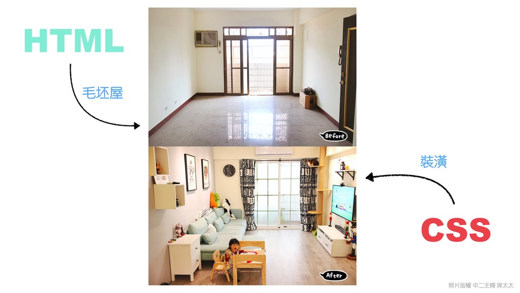
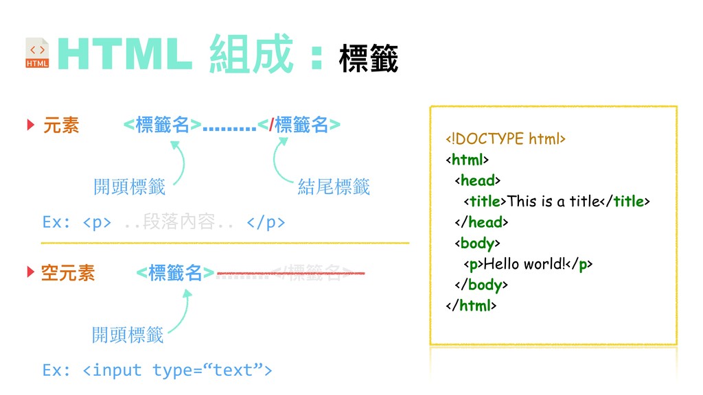
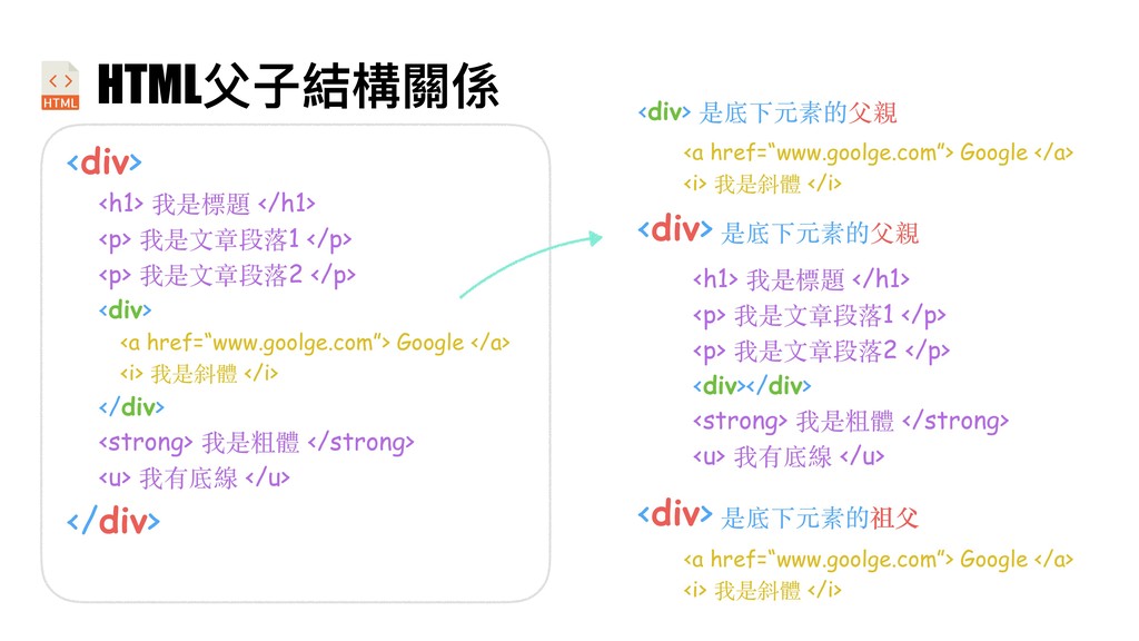
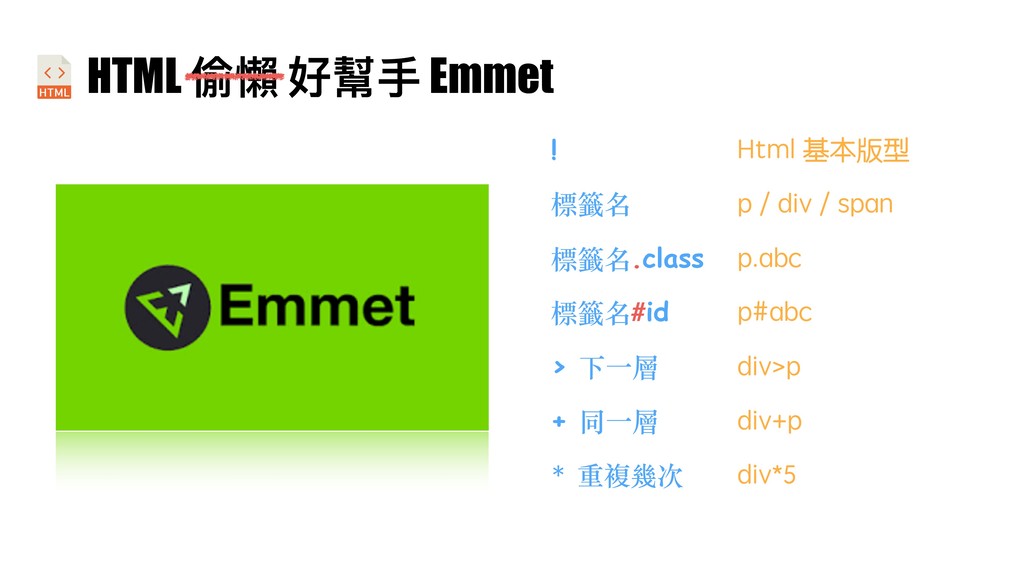
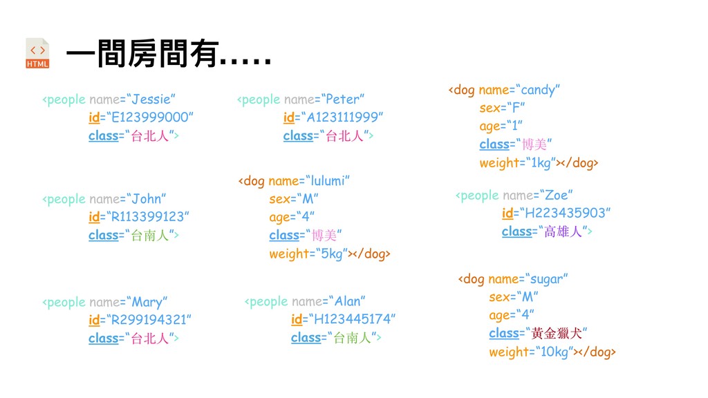
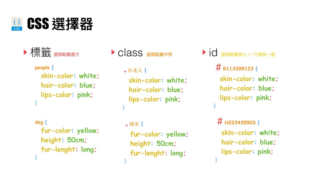
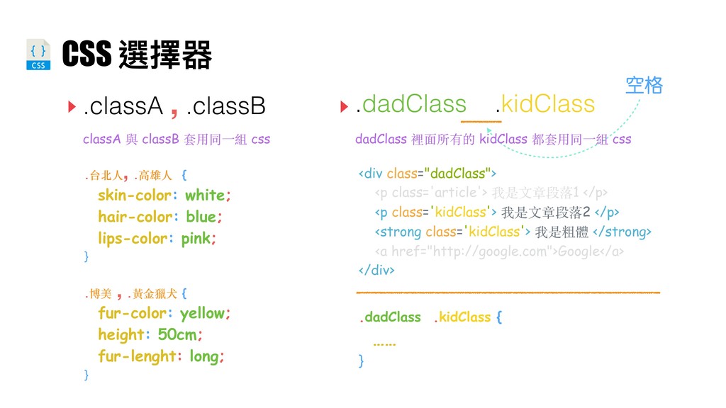
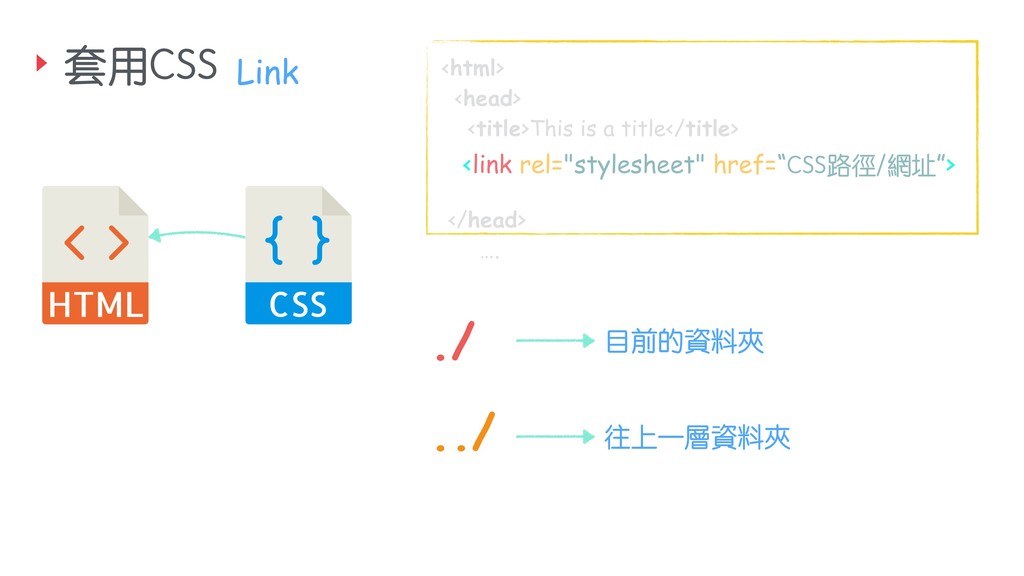
![HTML 超⽂文本標記語⾔言(英語:HyperText Markup Language,簡稱:HTML)是⼀一種⽤用於 建立網⾴頁的標準標記語⾔言。HTML是⼀一種基礎技術,常與CSS、JavaScript⼀一起被眾多 網站⽤用於設計賞⼼心悅⽬目的網⾴頁、網⾴頁應⽤用程式以及⾏行行動應⽤用程式的使⽤用者介⾯面[3]。網 ⾴頁瀏覽器可以讀取HTML檔案,並將其彩現成視覺化網⾴頁。HTML描述了了⼀一個網站的結 構語意隨著線索的呈現,使之成為⼀一種標記語⾔言⽽而非程式語⾔言。 HTML元素是構建網站的基⽯石。HTML允許嵌入圖像與物件,並且可以⽤用於建立互動式 表單,它被⽤用來來結構化資訊——例例如標題、段落落和列列表等等,也可⽤用來來在⼀一定程度上](https://files.speakerdeck.com/presentations/3dd804e5fa6d4d37bac784933ec96e7b/slide_9.jpg)