Design and its Role? Design Trends & Responsive Design Layouts. Return on Investment (ROI). SAP ITS Mobile Technology ITS Mobile Intro and Pre-requisites. Advantages, Disadvantages and Standard Services ITS Mobile - Template Generation Process. ITS Mobile Customization. Responsive Design Techniques and Tools. Applying Responsive Design to SAP ITS Mobile App. Challenges & Best Practices. Wrap Up & Q&A.
provider & systems integrator Founded 1967 in Japan as the technology arm of the NTT Group $15B in annual revenues 60,000 professionals operating in 35 countries Serving 80 of the Global Top 100 organizations Executing aggressive globalization strategy Global delivery provides high quality around-the-clock services for 2,500 clients in all global regions with scalable services
can be applied to ITS Mobile Apps. Consistent user experience can be achieved using the responsive mobile design with cost effective way. Learn Tools, Frameworks, Technologies, Best practices, Challenges and Solutions for designing responsive mobile applications that can lowers the maintenance cost.
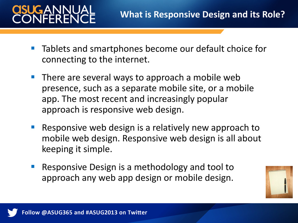
to the internet. There are several ways to approach a mobile web presence, such as a separate mobile site, or a mobile app. The most recent and increasingly popular approach is responsive web design. Responsive web design is a relatively new approach to mobile web design. Responsive web design is all about keeping it simple. Responsive Design is a methodology and tool to approach any web app design or mobile design. What is Responsive Design and its Role?
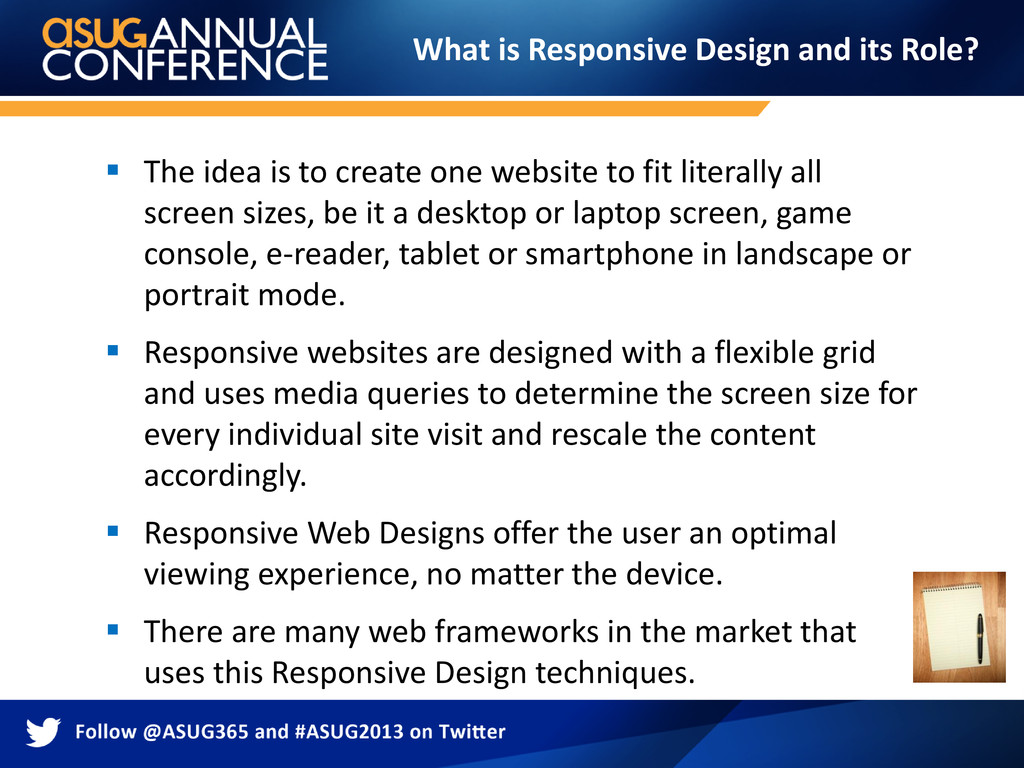
literally all screen sizes, be it a desktop or laptop screen, game console, e-reader, tablet or smartphone in landscape or portrait mode. Responsive websites are designed with a flexible grid and uses media queries to determine the screen size for every individual site visit and rescale the content accordingly. Responsive Web Designs offer the user an optimal viewing experience, no matter the device. There are many web frameworks in the market that uses this Responsive Design techniques. What is Responsive Design and its Role?
responsive design technique, which adopts itself based on different device form factor is a most cost effective way. One Codebase for all devices. It’s a low maintenance, single application supporting multiple devices. Brand consistency across all the screen layouts and different devices gives more user friendly look and feel experience. Responsive web design is highly user friendly.
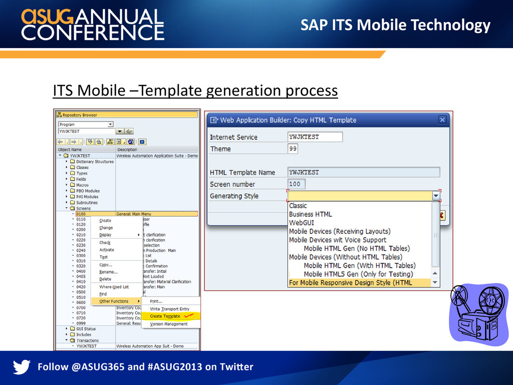
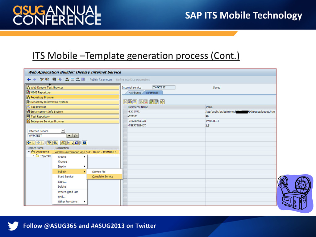
the Internet Transaction Server (ITS) and it uses the ITS template technique. ITSmobile is delivered with a template generator that allows you to generate the templates of simple screens directly. A template generator allows you to easily generate templates of simple application screens for mobile devices of any screen form factor. You can then change these templates further to meet your requirements. You can also create a completely new template generator, or Create a new template generator based on the one delivered. SAP ITS Mobile Technology
templates, you require a functioning SAP Web AS - ABAP application. The screen layout of the application must be designed for mobile devices and their limited visualization functions. – The HTML template generator uses the maintenance size of the screens (number of rows / columns) to build an HTML. – The application should use only screen elements that are supported by ITSmobile. On the SAP Web AS ABAP, you require the following Service/Patch status: – SAP Web AS ABAP 620: Basis Support Package 64 – SAP Web AS ABAP 640: Kernel Patch 161, Basis Support Package 20 You also require an ITS standalone with the following patch status: - ITS 6.20, Patch Level 28 SAP ITS Mobile Technology
devices easily. The application can be developed and tested entirely in ABAP. We can use SAP GUI for Windows to perform ABAP debugging. Generating templates ensures a fast initial visualization of the application in HTML. Consistent branding can be maintained across all the templates. SAP ITS Mobile Technology
Packages than specified. Requires some basic understanding of SAP ITS application development process and the process of generating the HTML templates from ITS Dynpros. To develop more complex screen layouts & user interaction, you need to have working knowledge on HTML, CSS and JavaScript Technologies. If you want to develop a brand new template generator, then you’ll need to understand how the standard template generators are built. SAP ITS Mobile Technology
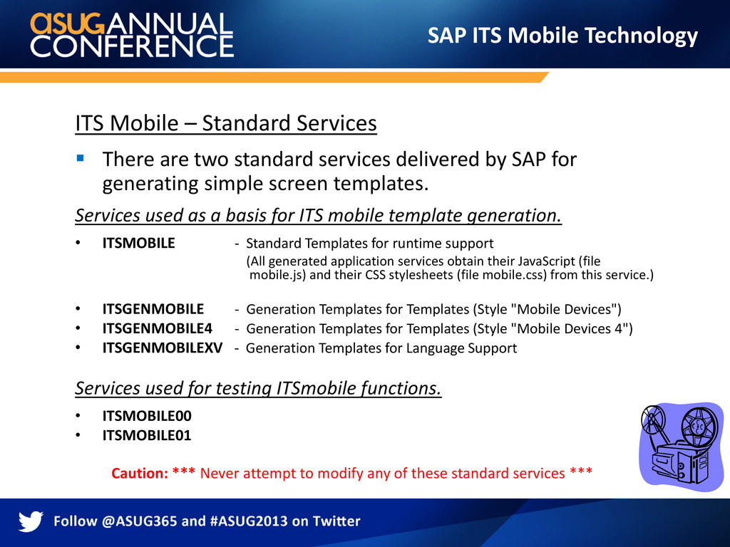
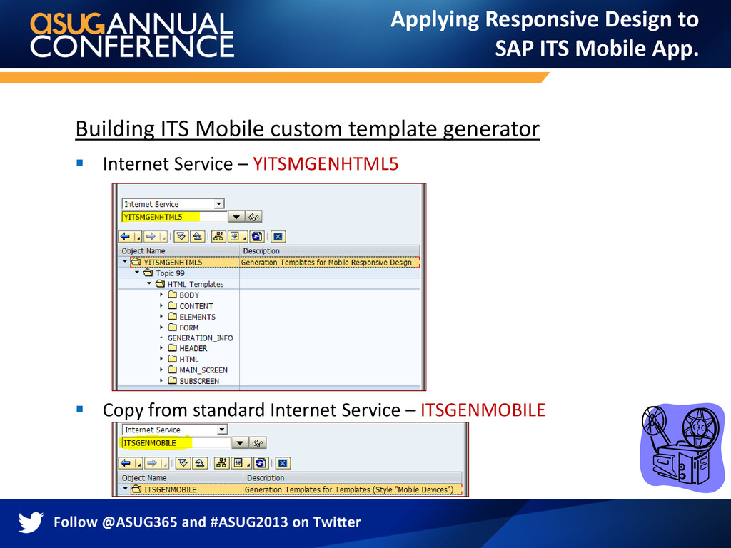
services delivered by SAP for generating simple screen templates. Services used as a basis for ITS mobile template generation. • ITSMOBILE - Standard Templates for runtime support (All generated application services obtain their JavaScript (file mobile.js) and their CSS stylesheets (file mobile.css) from this service.) • ITSGENMOBILE - Generation Templates for Templates (Style "Mobile Devices") • ITSGENMOBILE4 - Generation Templates for Templates (Style "Mobile Devices 4") • ITSGENMOBILEXV - Generation Templates for Language Support Services used for testing ITSmobile functions. • ITSMOBILE00 • ITSMOBILE01 Caution: *** Never attempt to modify any of these standard services *** SAP ITS Mobile Technology
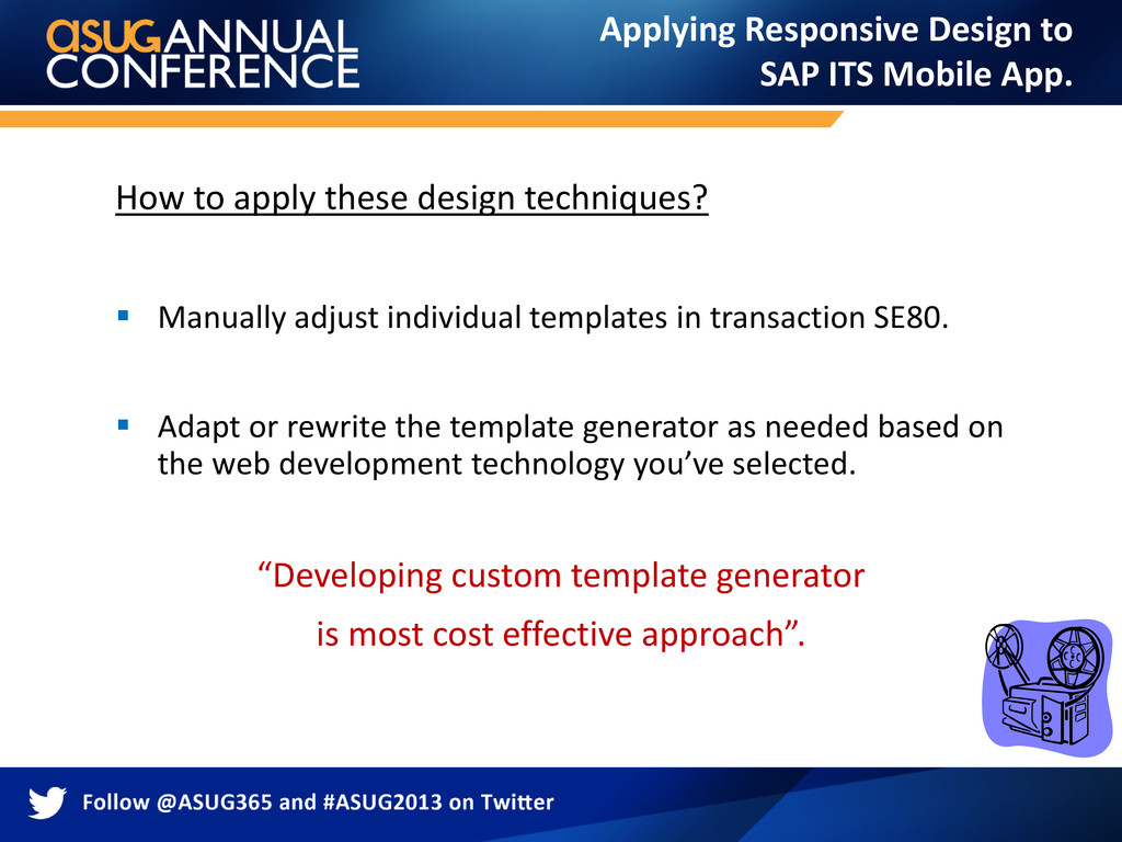
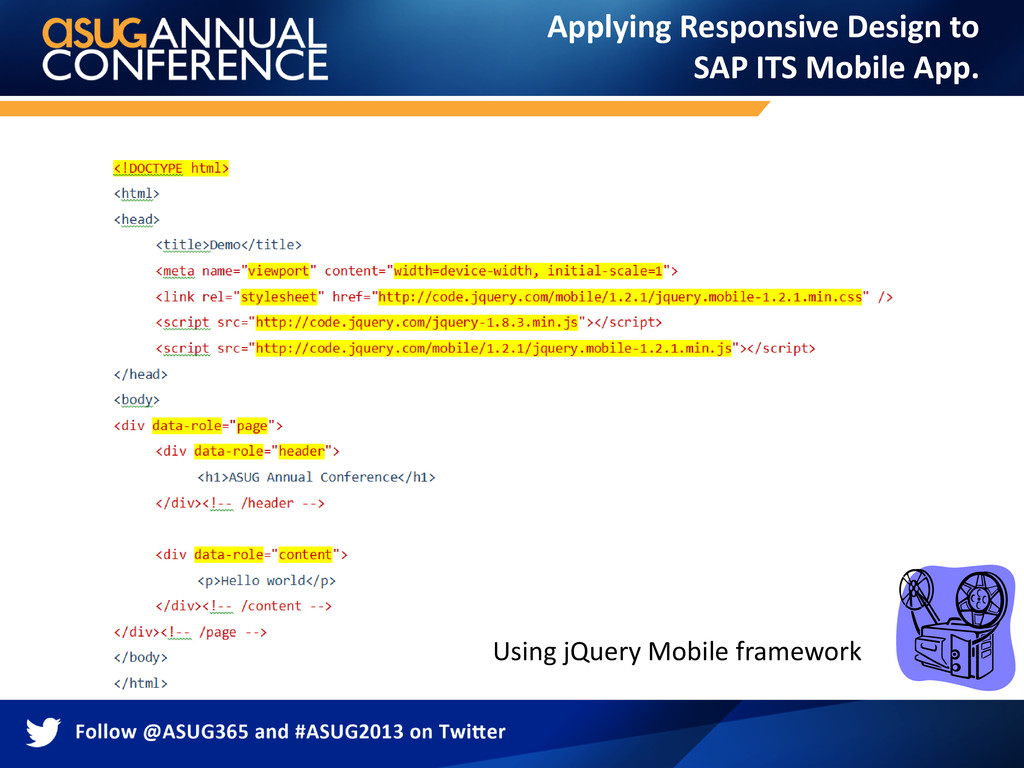
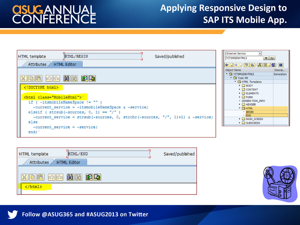
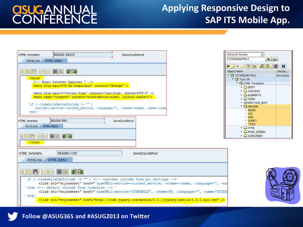
but a very adaptable and flexible framework. You can manually adjust individual templates in transaction SE80. “Remember to republish all the changed templates.” For a Responsive design templates, we will adapt or rewrite the template generator as needed based on the web development technology you’ve selected. The choice of web development technology can be As simple as plain HTML5, CSS3 and Java Scripts based or It can be one of the finest web development frameworks available in the market to build more complex mobile applications which leverages the device specific resources depending on your requirement. SAP ITS Mobile Technology
ITSmobile Services like ITSGENMOBILE or ITSMOBILE directly, since the generation itself and all generated services depends on these standard services. If you change these services, it is no longer possible to regenerate these delivered standard services. If you want to make changes, copy the templates to another theme and make the changes in that theme. Never use the existing application services/screens for generating or publishing unless you really making changes to that particular screen template. When generating make sure you choose the right template generator. SAP ITS Mobile Technology
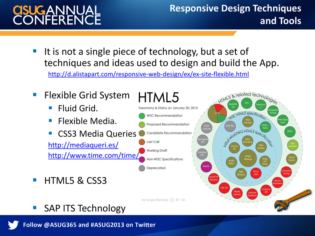
a set of techniques and ideas used to design and build the App. http://d.alistapart.com/responsive-web-design/ex/ex-site-flexible.html Flexible Grid System Fluid Grid. Flexible Media. CSS3 Media Queries http://mediaqueri.es/ http://www.time.com/time/ HTML5 & CSS3 SAP ITS Technology Responsive Design Techniques and Tools
based on rigid pixels or arbitrary percentage values, a fluid grid is more carefully designed in terms of proportions. In order to calculate the proportions for each page element, you must divide the target element by its context. 300px Target / Context = Result 300px / 960px = 31.25% Responsive Design Techniques and Tools
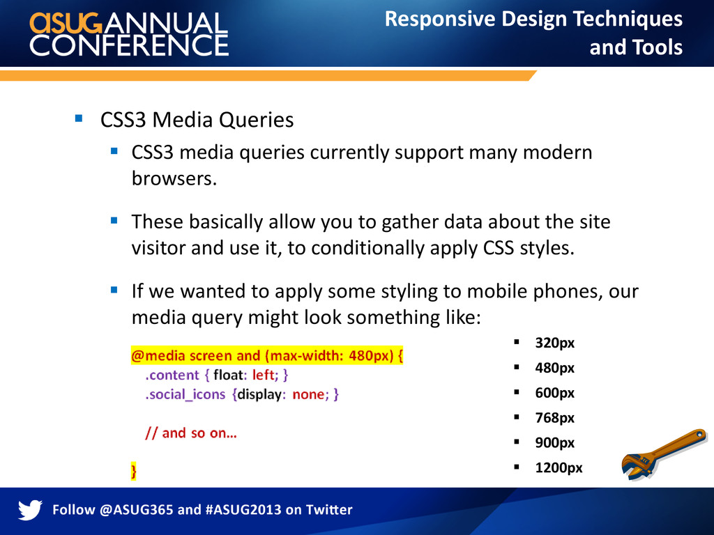
many modern browsers. These basically allow you to gather data about the site visitor and use it, to conditionally apply CSS styles. If we wanted to apply some styling to mobile phones, our media query might look something like: 320px 480px 600px 768px 900px 1200px Responsive Design Techniques and Tools
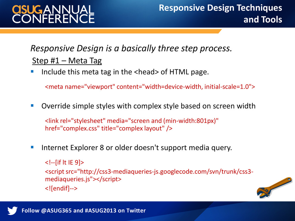
– Meta Tag Include this meta tag in the <head> of HTML page. <meta name="viewport" content="width=device-width, initial-scale=1.0"> Override simple styles with complex style based on screen width <link rel="stylesheet" media="screen and (min-width:801px)" href="complex.css" title="complex layout" /> Internet Explorer 8 or older doesn't support media query. <!--[if lt IE 9]> <script src="http://css3-mediaqueries-js.googlecode.com/svn/trunk/css3- mediaqueries.js"></script> <![endif]--> Responsive Design Techniques and Tools
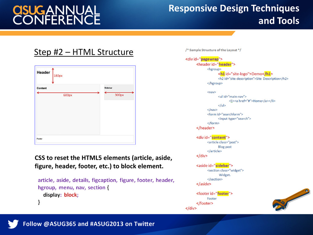
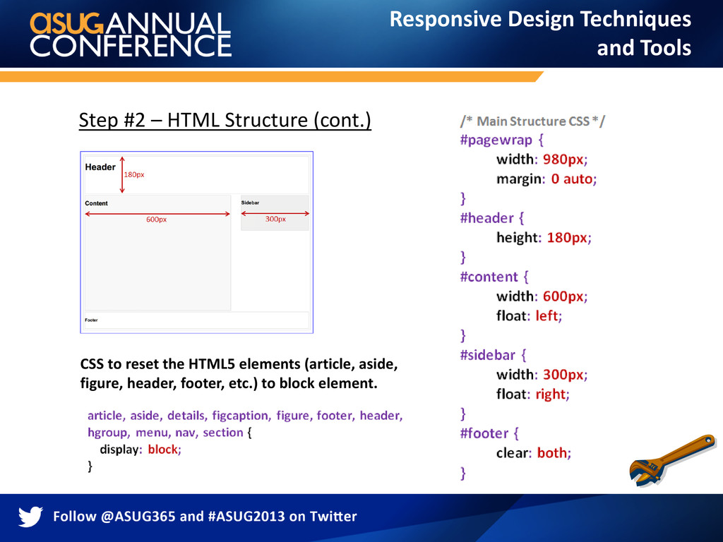
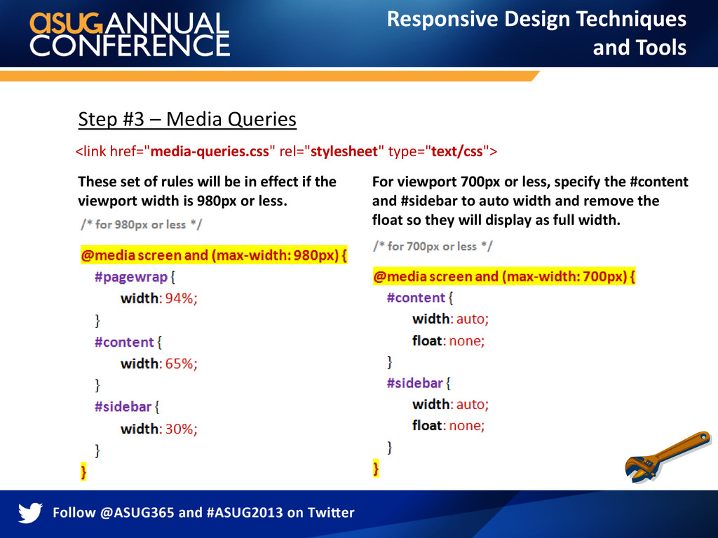
be in effect if the viewport width is 980px or less. For viewport 700px or less, specify the #content and #sidebar to auto width and remove the float so they will display as full width. <link href="media-queries.css" rel="stylesheet" type="text/css"> Responsive Design Techniques and Tools
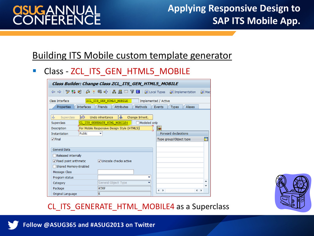
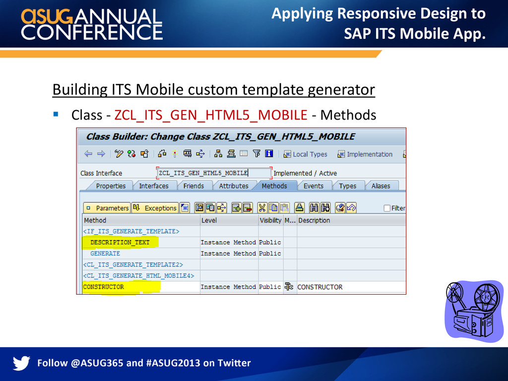
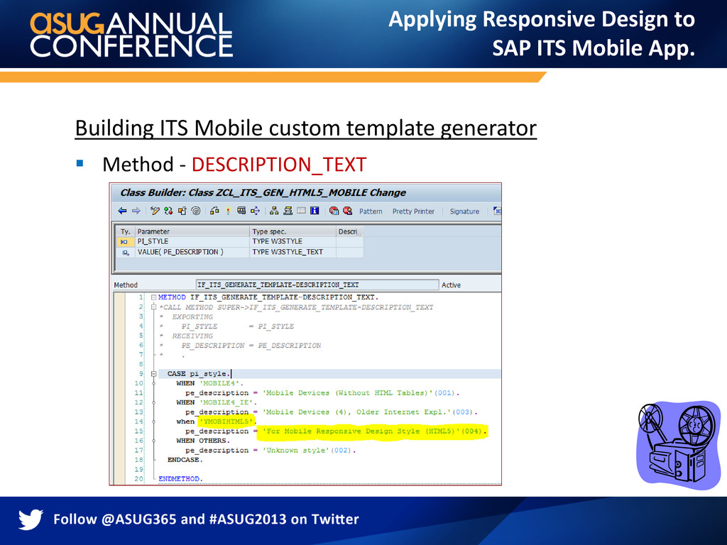
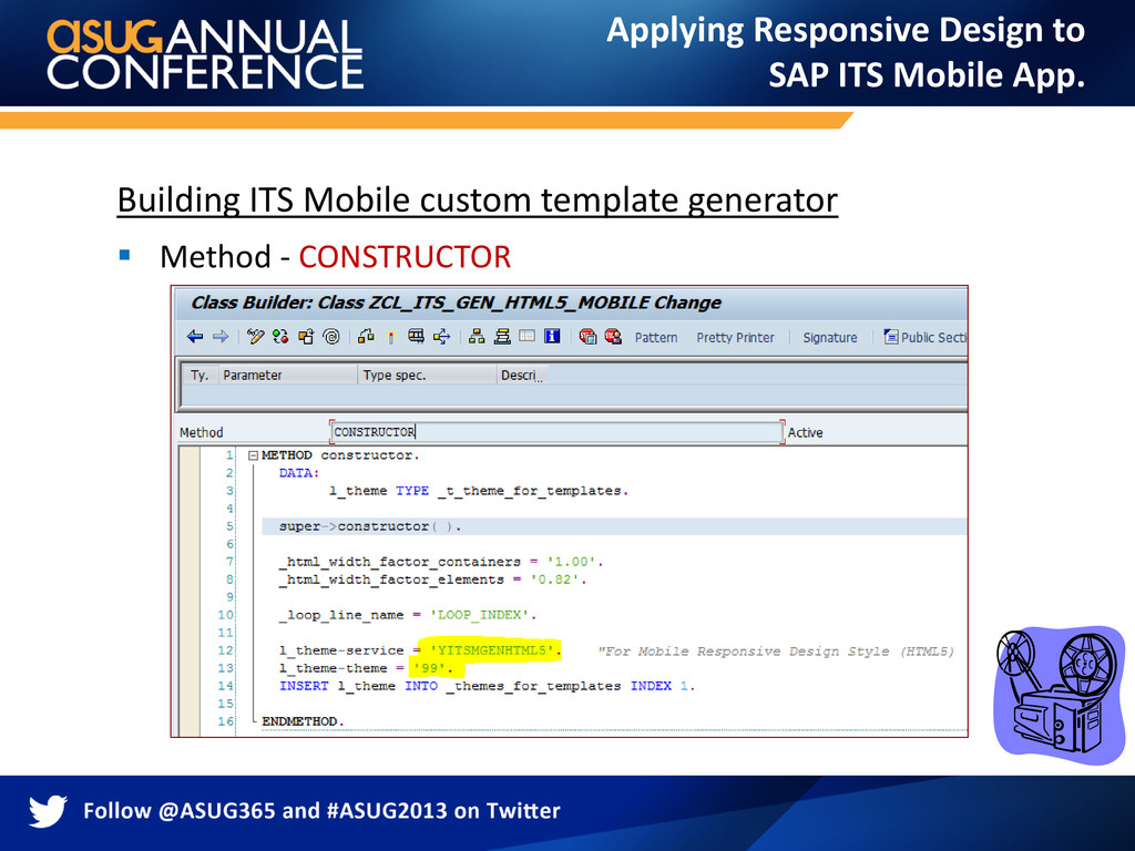
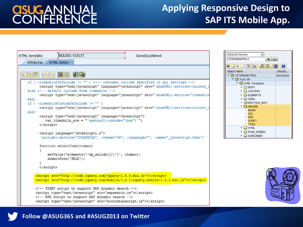
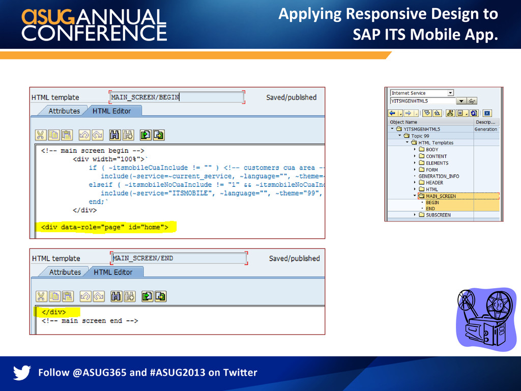
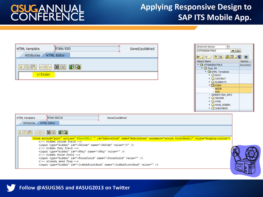
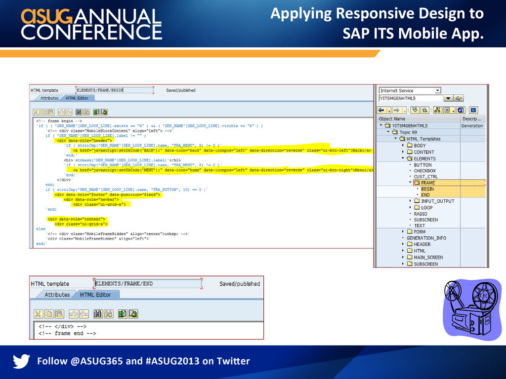
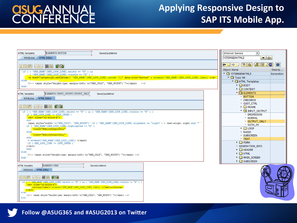
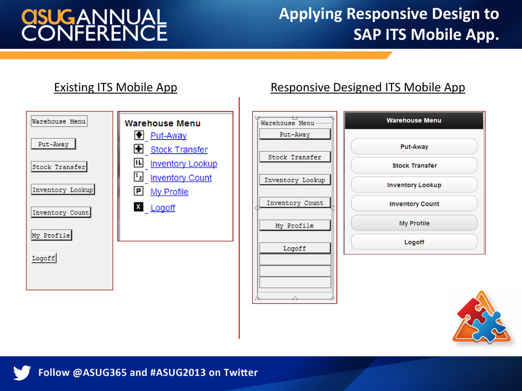
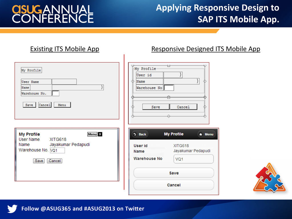
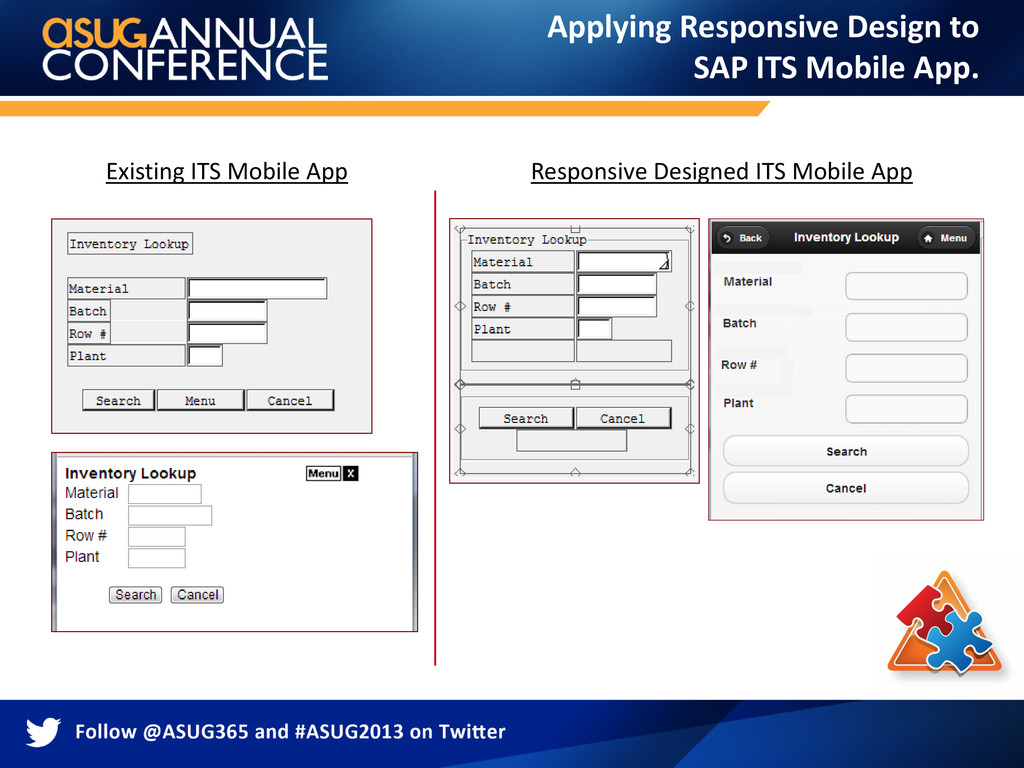
templates in transaction SE80. Adapt or rewrite the template generator as needed based on the web development technology you’ve selected. “Developing custom template generator is most cost effective approach”. Applying Responsive Design to SAP ITS Mobile App.
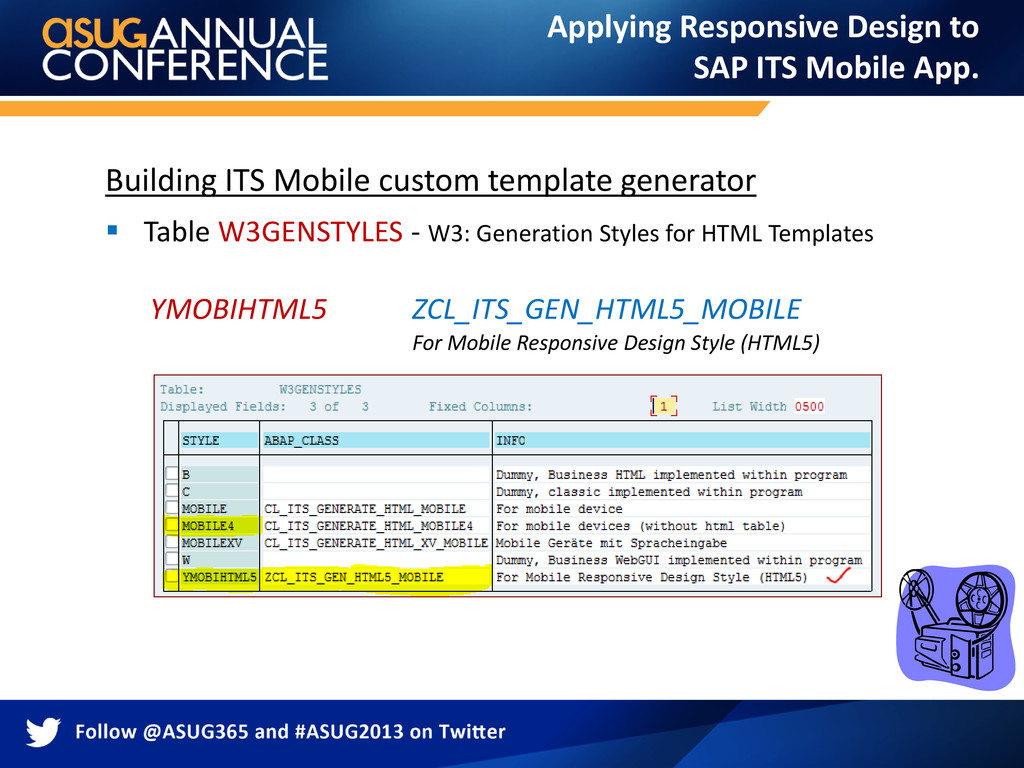
W3: Generation Styles for HTML Templates YMOBIHTML5 ZCL_ITS_GEN_HTML5_MOBILE For Mobile Responsive Design Style (HTML5) Applying Responsive Design to SAP ITS Mobile App.
and lot of effort. After lot of research, we found a transaction that help do this job easily. Transaction Code: SIAC_REGENERATE_TEMP. (Use with caution) During the development, we faced issues publishing the new changes to the Internet Service each time the layout was changed. It was always picking the cached version of the template instead of the newly published version. We developed a custom program to reset the MIMES Objects.
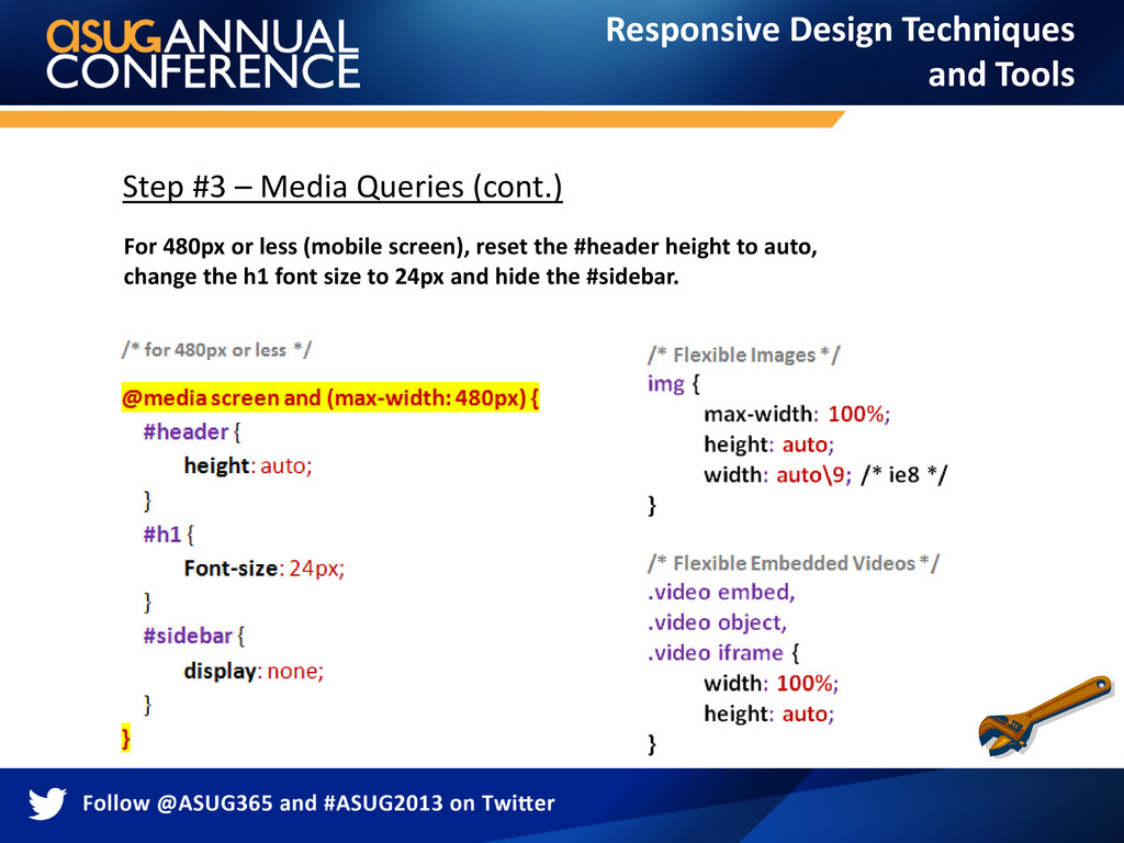
mobile device screen size by following design standards. Keep the screen layout as simple as possible for flexibility. Always maintain a separate resource files for CSS, JavaScript, etc. Use percentage (%) value to make the containers fluid. css3-mediaqueries.js is required to enable media queries for browsers that don't support media queries. Use CSS to override the layout structure based on the viewport width. Use max-width:100% and height:auto to make the images flexible. Use width:100% and height:auto to make the embedded videos flexible. Use -webkit-text-size-adjust:none to disable text size adjust on the iPhone.
used for this design technique. Building custom template generator for high usability, lower maintenance cost and brand consistency. Adopting these techniques to ITS Mobile App for richer user experience with high user friendliness, consistent branding, and cost effective. Challenges, Solutions and Best Practices.
 SiteGround - Reliable hosting with speed, security, and support you can count on.
 jkpedapudi
 higaki_program
 koriym
 koher
koher
 gennei
 hiraoku101
 dunglas
 fadis
fadis
 isanethen
 morim
morim
 serradura
 o0h
o0h
 kajitack
 codingconduct
 aleyda
 tenderlove
 sabderemane
 apolaine
 lfama
lfama
 holman
 inesmontani
 jct
jct
 retrage
 afnizarnur
 smashingmag
![Questions? Presented By: JK ( JayaKumar Pedapudi ) Email: [email protected]](https://files.speakerdeck.com/presentations/d4fc02b0c5c701304cb74a53e4d87d3a/slide_49.jpg)