Author of Beginning Responsive Design • Regular contributor to open source, including SimpleStateManager, Echo.js, CriticalJS, FT’s Polyfill Service, Doccy among many projects • Lover and user of ‘the Twitter’
been and always will be. Content is why users visit your site, subscribe to your newsletters and follow you on social media. Content is the single most important aspect of your website...” http://everydaydesigner.net/design/change-your-focus-and-design-content-first
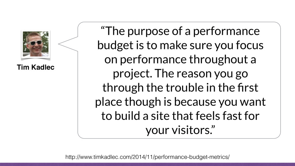
make sure you focus on performance throughout a project. The reason you go through the trouble in the first place though is because you want to build a site that feels fast for your visitors.” http://www.timkadlec.com/2014/11/performance-budget-metrics/
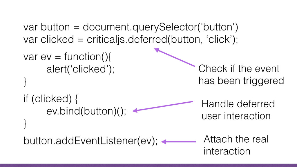
ev = function(){ alert(‘clicked’); } if (clicked) { ev.bind(button)(); } button.addEventListener(ev); Check if the event has been triggered Handle deferred user interaction Attach the real interaction
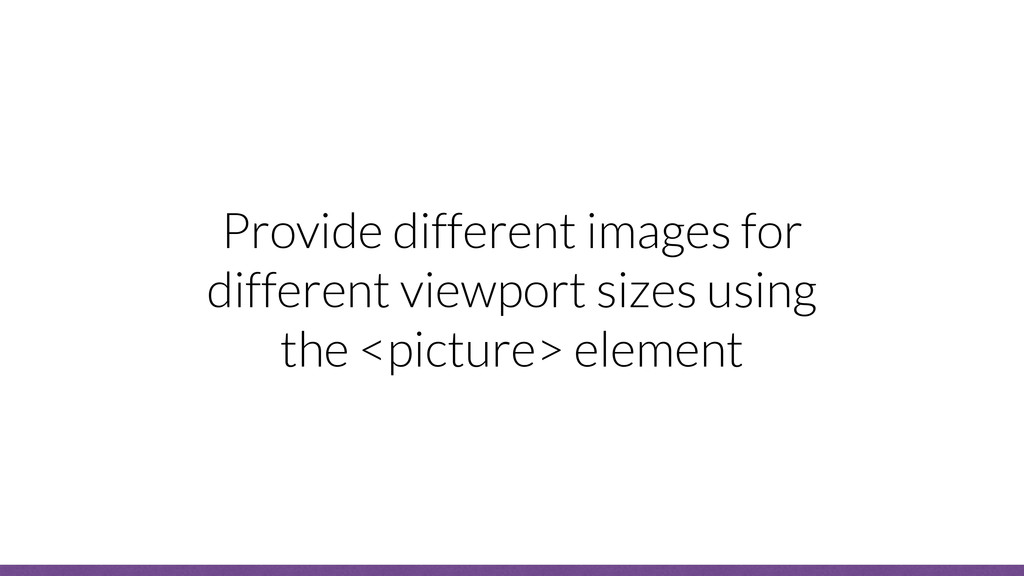
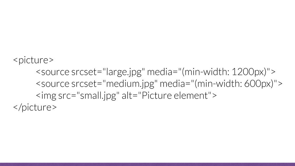
 jonthanfielding
 munakata
 nenonaninu
 tsukamotokenji
 hacobu
 shukob
 geekplus_tech
 srenext
 iqbocchi
 hinac0
 mochico50
 beli68
 kimichan
 inesmontani
 mojombo
 mlcsv
mlcsv
 aleyda
 cassininazir
 honnibal
 philnash
 thekraken
 vanstee
 brad_frost
 reverentgeek
 samtorres