Upgrade to Pro — share decks privately, control downloads, hide ads and more …

Reimagining How We Design Responsively at Web Standards

Reimagining How We Design Responsively at Web Standards

This is a more technical version of the talk I gave at Future of Web Design about how to start building better responsive sites.

Jonathan Fielding

May 19, 2015
Tweet

More Decks by Jonathan Fielding

Other Decks in Technology

Transcript

  1. Reimagining How We
    Design Responsively
    Jonathan Fielding
    @jonthanfielding

    View Slide

  2. A bit about me…
    • Technical Architect at Beamly
    • Author of Beginning Responsive Design
    • Regular contributor to open source, including
    SimpleStateManager, HTML5 Boilerplate,
    Echo.js, Gitissu.es, DigitalOceanCLI, Doccy
    among many projects

    View Slide

  3. Current Responsive Design
    techniques focus on mobile first

    View Slide

  4. There has not been the same
    focus on either the content
    or the performance of our
    site.

    View Slide

  5. Our site content

    View Slide

  6. Bobby Anderson - Everyday Designer
    “Content is king, it always has been and
    always will be. Content is why users visit
    your site, subscribe to your newsletters
    and follow you on social media. Content
    is the single most important aspect of
    your website...”

    View Slide

  7. We need to know our
    content before we can design

    View Slide

  8. Content must work across a
    wide variety of devices

    View Slide

  9. Device usage (Global averages)
    65% 29% 6%
    source: Statcounter http://gs.statcounter.com/#all-comparison-ww-monthly-201403-201504

    View Slide

  10. Where possible, don’t rely on
    global statistics, look at your
    own sites usage stats

    View Slide

  11. Prioritising Content

    View Slide

  12. The first step is to audit your
    site content

    View Slide

  13. Content does not have to be
    in the same order on every
    device

    View Slide

  14. Example: Different content
    priorities for a restaurant
    Small devices Large devices
    Phone number Atmosphere
    Directions Menu
    Booking Booking
    Menu Phone number
    Atmosphere Directions

    View Slide

  15. So this is how it could
    look on mobile

    View Slide

  16. and this is how it transforms to larger devices

    View Slide

  17. To reorder content based on
    the type of device we can use
    CSS Flexbox to handle the
    ordering and target the
    device based on the screen
    size

    View Slide


  18. I am more important on mobile


    I am more important on desktop


    View Slide

  19. @media only screen and (min-width: 768px) {
    .wrapper {
    display: flex;
    flex-direction: column;
    }
    .better-content-for-desktop {
    order: 1;
    }
    .better-content-for-mobile {
    order: 2;
    }
    }

    View Slide

  20. The limitation here is that not all
    older browsers support Flexbox.

    View Slide

  21. If you need to support IE9 or
    below you should order your
    content for larger devices in
    HTML and then use the CSS
    on smaller devices to reorder.

    View Slide

  22. If in doubt about what your
    user’s priorities are, invite
    them in and ask them

    View Slide

  23. Ensure your content is
    discoverable

    View Slide

  24. On larger devices navigating
    a site is often really easy

    View Slide

  25. View Slide

  26. Unfortunately, on the
    majority of smaller devices
    navigation on a site becomes
    less obvious

    View Slide

  27. View Slide

  28. View Slide

  29. Larger devices also have
    more space for content but
    don’t hide content
    completely on small devices

    View Slide

  30. View Slide

  31. Instead think of ways in
    which you can change the
    functionality to better suit
    the device

    View Slide

  32. accordion on mobile
    open content on desktop

    View Slide

  33. accordion on mobile
    tabbed content on desktop
    Thanks to @monsika http://codepen.io/mpiotrowicz/pen/gocmu

    View Slide

  34. new page on mobile
    lightbox on desktop

    View Slide

  35. simple scrollable
    content on mobile
    parallax on desktop

    View Slide

  36. How to measure the
    success of content
    optimisation

    View Slide

  37. Ask users to test your site
    and observe

    View Slide

  38. A-B test different
    functionality

    View Slide

  39. Content is King

    View Slide

  40. Time for a cat break

    View Slide

  41. Site Performance

    View Slide

  42. What is performance?

    View Slide

  43. – Google
    “the action or process of
    performing a task or function”

    View Slide

  44. In relation to a website,
    performance is the measure
    of how long it takes to deliver
    the content to the user

    View Slide

  45. There are two key types of
    performance that are
    important to a website

    View Slide

  46. Page load performance -
    The time it takes to fully load
    a page

    View Slide

  47. Perceived performance -
    the perception of the user of
    the performance of our site

    View Slide

  48. View Slide

  49. Why should I care about
    the performance of the
    site?

    View Slide

  50. A responsive site is expected
    to work on a wide variety of
    internet connections

    View Slide

  51. The trend of the past few
    years however is for pages to
    increase in weight

    View Slide

  52. Average page weight has been increasing
    year on year
    Average Page Size (kB)
    0
    550
    1100
    1650
    2200
    March 2012 March 2013 March 2014 March 2015
    Data from http://httparchive.org/interesting.php

    View Slide

  53. Page weight by content type
    March 2015
    March 2012
    Charts from http://httparchive.org/interesting.php

    View Slide

  54. The average time to start rendering is also
    increasing
    Render start (ms)
    0
    775
    1550
    2325
    3100
    August 2013 March 2014 August 2014 March 2015
    Data from http://httparchive.org/interesting.php

    View Slide

  55. How can I justify spending
    the time on performance?

    View Slide

  56. • Amazon found every 100ms delay in
    loading a page cost them 1% in sales
    • Google found an extra 500ms delay in
    loading of search results decreased traffic
    by 20%

    View Slide

  57. What steps can I take to
    improve site performance?

    View Slide

  58. Optimise how you load
    your assets

    View Slide

  59. Provide different images for
    different viewport sizes using
    the element

    View Slide


  60. View Slide

  61. View Slide

  62. To use the picture element on
    your site you will need to
    include the polyfill which is
    called “picturefill”

    View Slide

  63. Defer loading of both image
    and video to improve the
    initial page load

    View Slide

  64. The most common content to defer
    loading is images

    View Slide

  65. In cases where loading assets
    was deferred, it is important
    to ensure a suitable
    placeholder is in place

    View Slide

  66. Defer loading of
    content

    View Slide

  67. The content is the heart of
    our site but not all content is
    created equal

    View Slide

  68. Lets look at an example of
    how Metro defer the
    loading of related content

    View Slide

  69. View Slide

  70. View Slide

  71. View Slide

  72. Another example where
    content is deferred is
    Facebook

    View Slide

  73. Facebook choose to defer loading the
    majority of the content of their page

    View Slide

  74. The biggest danger of
    deferring content is that if
    JavaScript fails to load the
    content that is deferred will
    not be loaded

    View Slide

  75. View Slide

  76. We should therefore be
    careful with what content we
    choose to defer loading

    View Slide

  77. Optimise how you load
    your JavaScript

    View Slide

  78. We can separate our
    JavaScript into two distinct
    types

    View Slide

  79. Critical JavaScript is the
    JavaScript required to
    initialise our page.

    View Slide

  80. Add events which track how
    user tries to interact with the
    page

    View Slide

  81. Show states which let the
    user know something is
    happening while we still wait
    for Main JS to load

    View Slide

  82. Trigger loading of the Main
    JS when the rest of the page
    has loaded

    View Slide

  83. Then we have our main
    JavaScript,

    View Slide

  84. Fire any events that had been
    deferred

    View Slide

  85. Replace the deferred event
    listeners with the real ones

    View Slide

  86. Include all the rest of the
    functionality required for the
    site to function

    View Slide

  87. How this works in practice

    View Slide

  88. View Slide

  89. View Slide

  90. So how do I do it?

    View Slide

  91. Use a library called CriticalJS

    View Slide

  92. Download CriticalJS from
    https://github.com/jonathan-
    fielding/criticaljs

    View Slide


  93. Load the CriticalJS library
    Tell it where your main JavaScript is

    View Slide


  94. Click Me

    Add data attribute specifying
    what events are to be deferred

    View Slide

  95. Then in your main JavaScript

    View Slide

  96. var button = document.querySelector('button')
    var clicked = criticaljs.deferred(button, ‘click’);
    var 
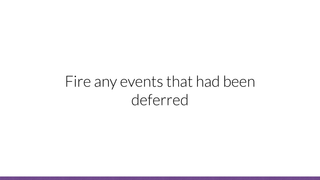
ev = function(){
    alert(‘clicked’);
    }
    if (clicked) {
    ev.bind(button)();
    }
    button.addEventListener(ev);
    Check if the event
    has been triggered
    Handle deferred
    user interaction
    Attach the real
    interaction

    View Slide

  97. Measure your performance
    improvements

    View Slide

  98. It is important to regularly
    measure the site
    performance

    View Slide

  99. The simplest tool for
    measuring performance is
    www.webpagetest.org

    View Slide

  100. View Slide

  101. View Slide

  102. View Slide

  103. Need for speed

    View Slide

  104. In Summary

    View Slide

  105. When building a responsive
    site we should spend time
    focusing on the content and
    performance

    View Slide

  106. Our content should be
    prioritised and discoverable

    View Slide

  107. And the perception of our
    site to our users should be
    that it loads fast

    View Slide

  108. Full examples of everything we have
    talked about can be found at
    www.jonathanfielding.com/
    fowd2015

    View Slide

  109. A special thanks goes out to to Charlie
    Fielding, Kate Montgomery, Phil Nash,
    Callum Macrae and everyone at Beamly who
    helped me with putting these slides together.

    View Slide

  110. Thank you,
    any questions?

    View Slide