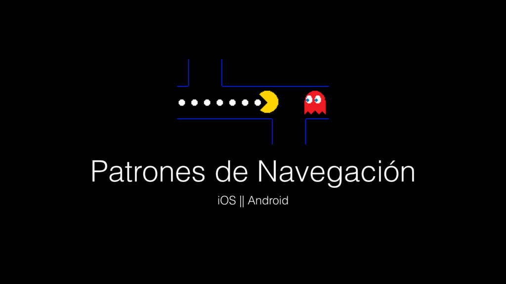
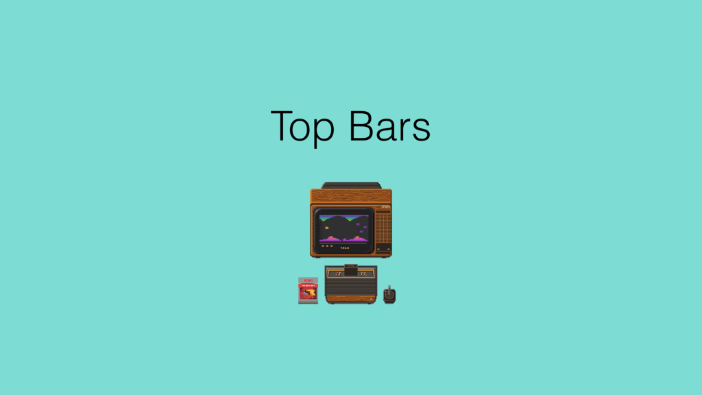
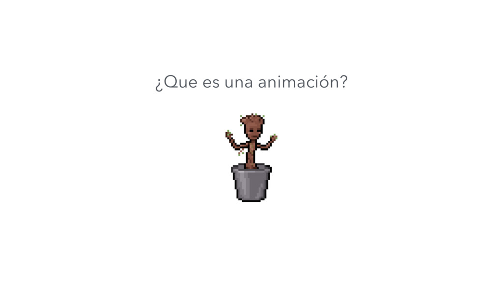
Patrones de navegación y animaciones - iOS y Android
A talk I gave with a good friend and an excellent iOS dev{signer} (Felipe Hernandez) in Santiago de Chile about iOS/Android navigation and animation patterns.
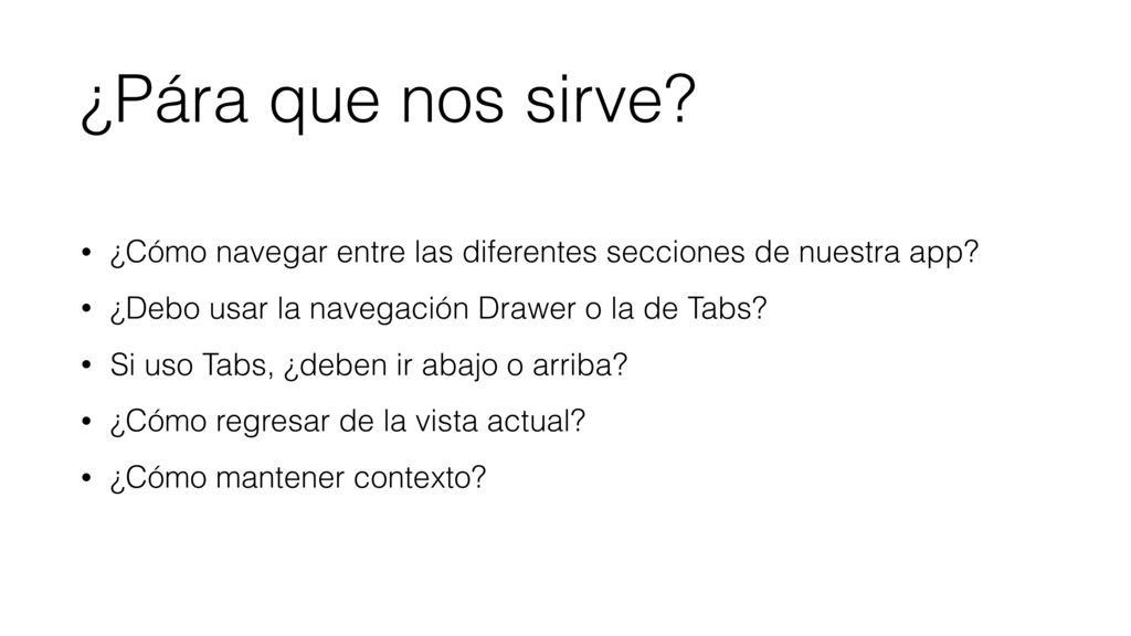
secciones de nuestra app? • ¿Debo usar la navegación Drawer o la de Tabs? • Si uso Tabs, ¿deben ir abajo o arriba? • ¿Cómo regresar de la vista actual? • ¿Cómo mantener contexto?
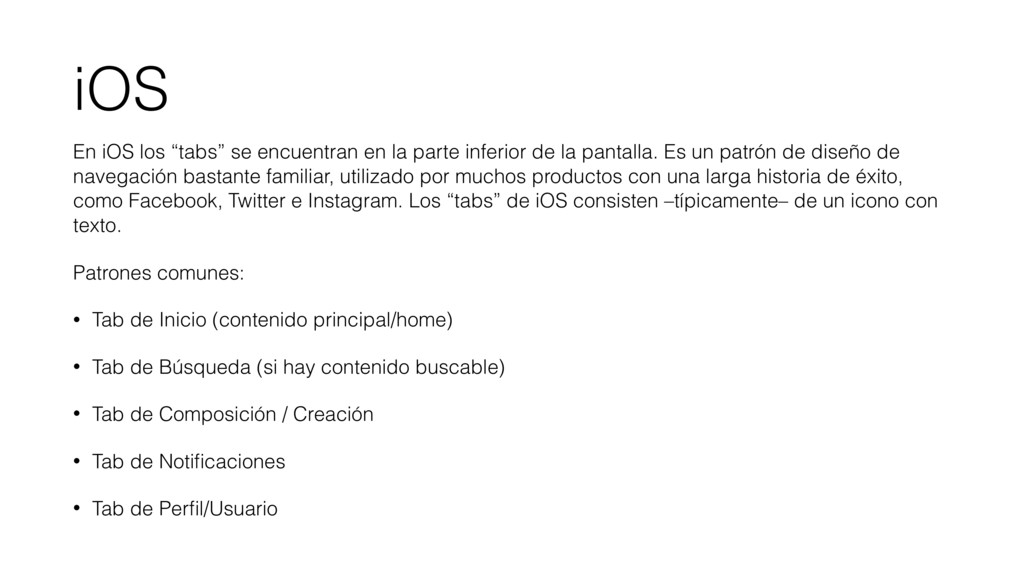
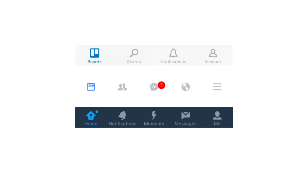
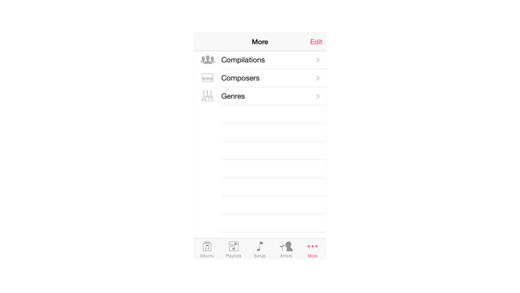
inferior de la pantalla. Es un patrón de diseño de navegación bastante familiar, utilizado por muchos productos con una larga historia de éxito, como Facebook, Twitter e Instagram. Los “tabs” de iOS consisten –típicamente– de un icono con texto. Patrones comunes: • Tab de Inicio (contenido principal/home) • Tab de Búsqueda (si hay contenido buscable) • Tab de Composición / Creación • Tab de Notificaciones • Tab de Perfil/Usuario
superior de nuestra pantalla y están –usualmente– representados por texto o ícono (a diferencia de iOS), a menos que se utilice la relativamente nueva Boston Navigation. Common Patterns:
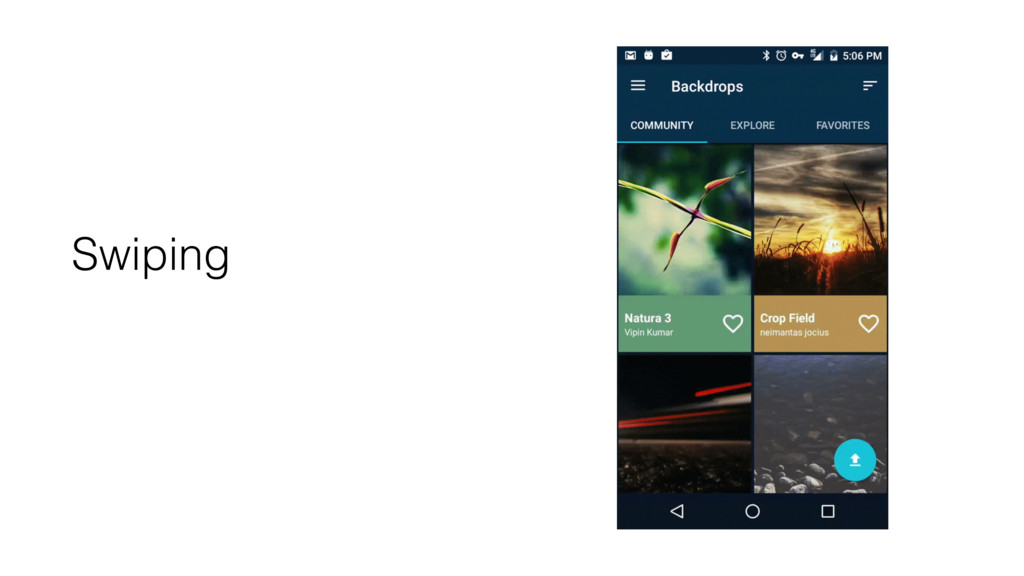
Bottom Navigation: Tabs make it easy to explore and switch between different views and Bottom Navigation bars make it easy to explore and switch between top-level views in a single tap.
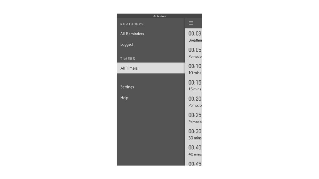
came to the platform as iOS design evolved but are still an important part of navigation in a lot of applications. *Since Apple does not provide an API to implement Navigation Drawers, developers typically use third party libraries.
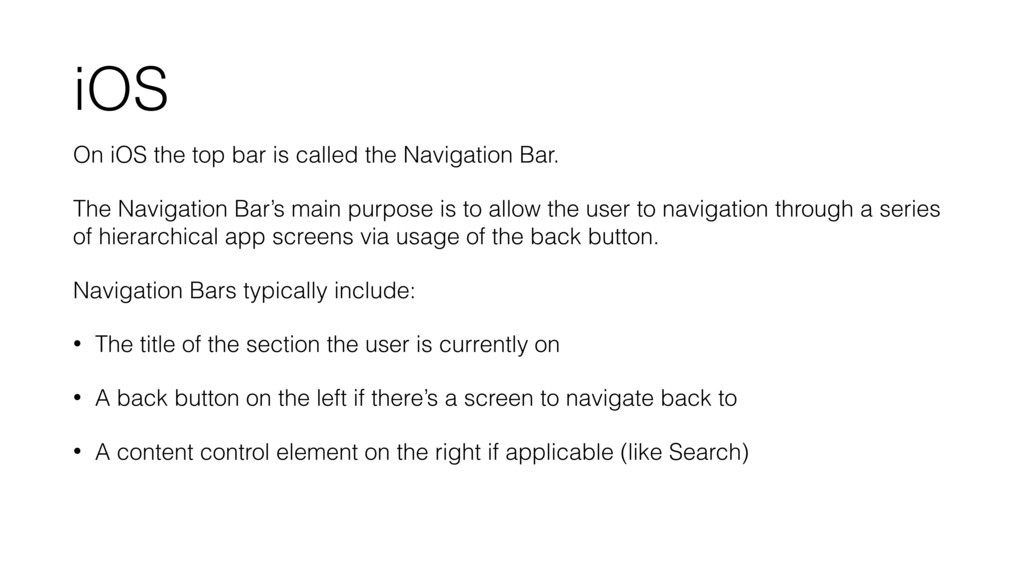
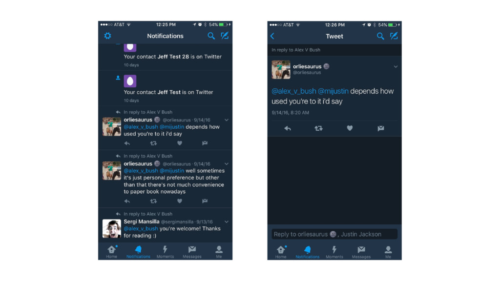
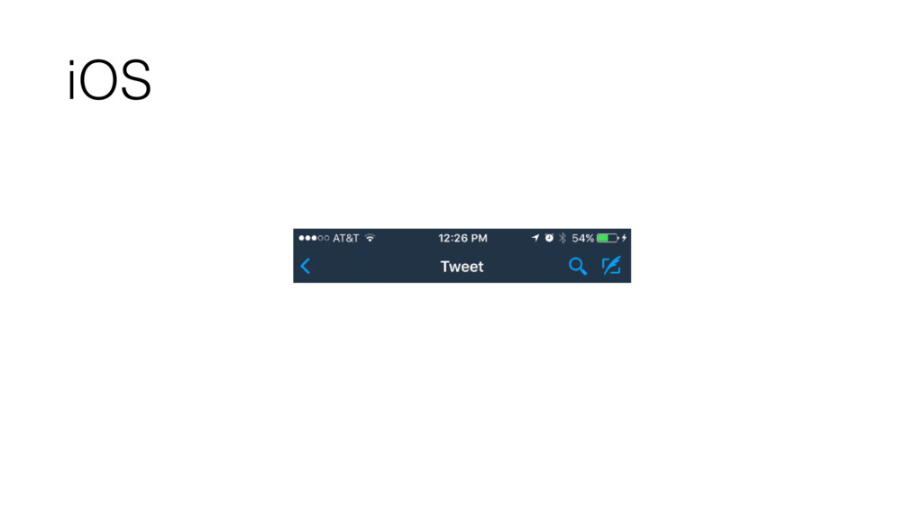
Bar. The Navigation Bar’s main purpose is to allow the user to navigation through a series of hierarchical app screens via usage of the back button. Navigation Bars typically include: • The title of the section the user is currently on • A back button on the left if there’s a screen to navigate back to • A content control element on the right if applicable (like Search)
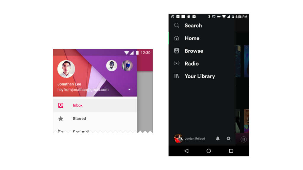
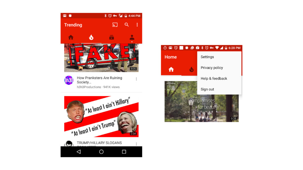
Android’s Toolbar is more standardized than iOS and typically includes: Navigation Bars typically include: • The title of the section the user is currently on • An Up button on the left if there’s a screen to navigate back to • A Navigation Drawer button if there is no Up button • Menu buttons and overflow menu with more options The menu buttons and overflow menu can be used as an both alternative and a supplement to a Side Navigation Drawer. An overflow menu can potentially remove the need for a Side Navigation Drawer depending on how many different views your app needs to contain. Alternatively, you can let each section from your Side Navigation Drawer have it’s own overflow menu with further options that your user can interact with.
documentation distinguishes between The Up Button and the Back Button. The back button is part of the Navigation Bar and “navigates in reverse chronological order through the history of recently viewed screens”. While the Up button won’t take users out of your app, the Back button can take the user from the current app to the one they were previously using.
 Your Podcast. Everywhere. Effortlessly.
 juanmnl
 a2k
a2k
 securecat
 hicard
 yamasaku
 centou
 kspace
 mhand01
 sony
sony
 aonomasahiro
 terencebasart
 yuri_ohashi
 tonyrice
 panda_program
 palkan
 greggifford
 uxyall
 morganepeng
 raygrieselhuber
 addyosmani
 dougneiner
 aleyda
 axbom
axbom
 katarinadahlin