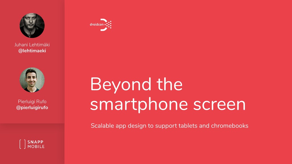
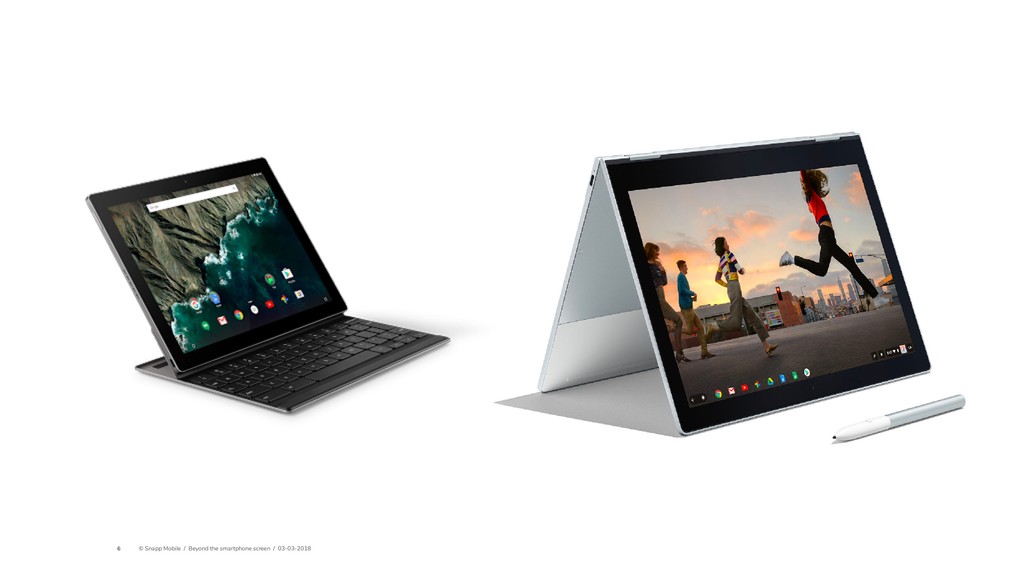
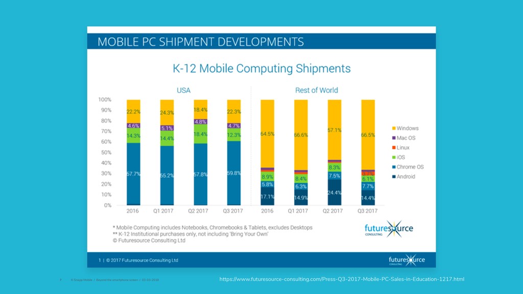
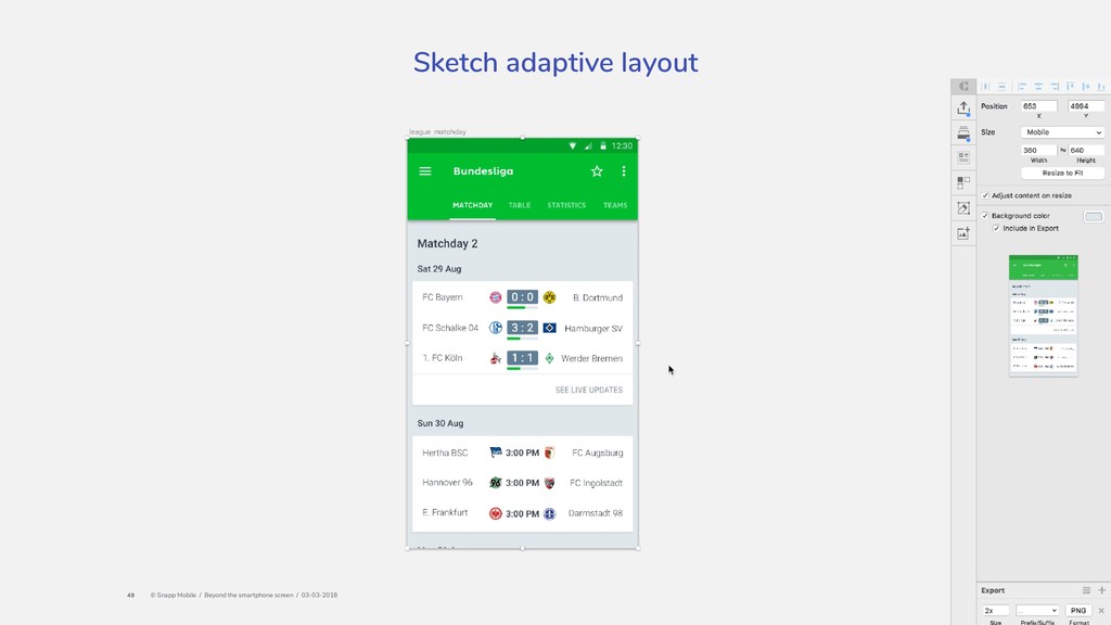
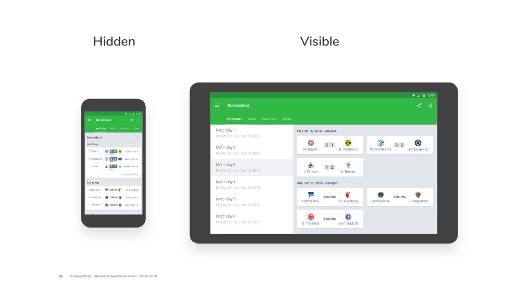
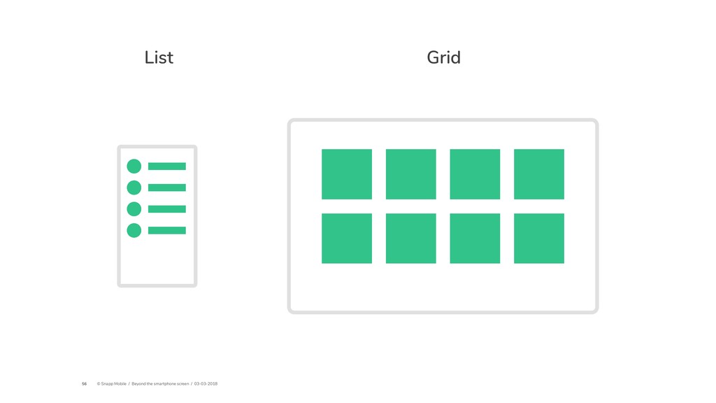
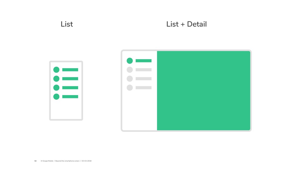
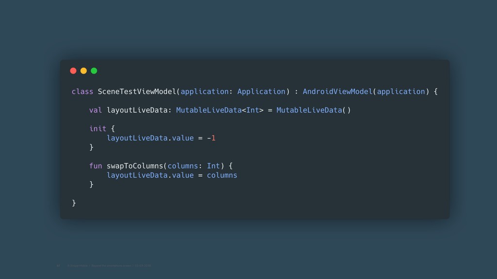
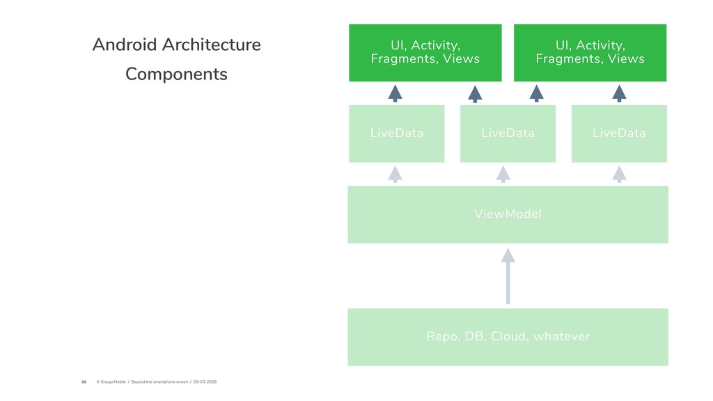
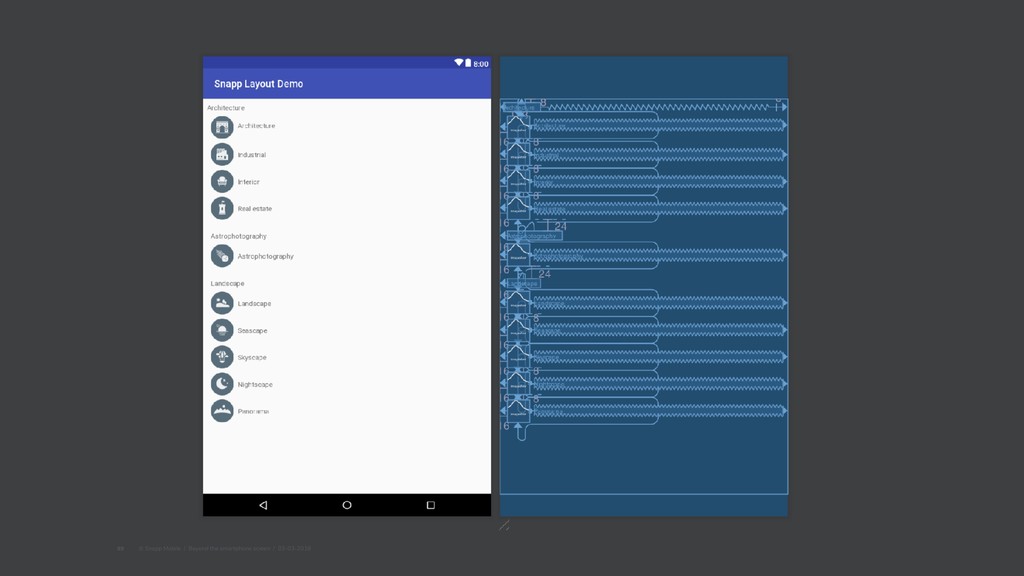
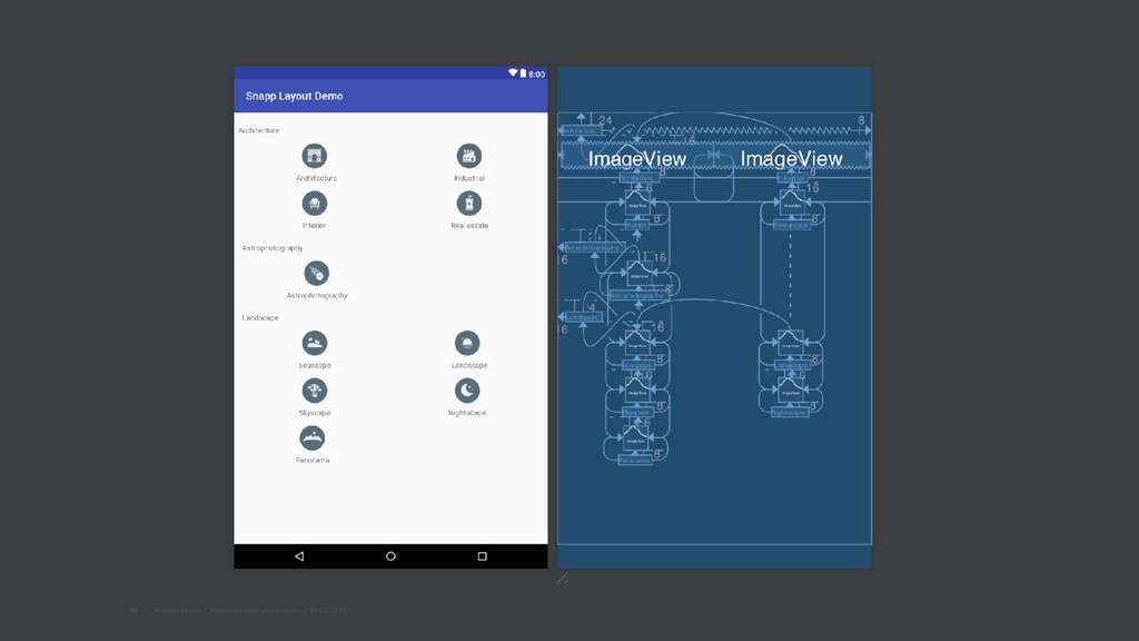
Scalable app design to support tablets and chromebooks
by Pierluigi Rufo and Juhani Lehtimäki. Snapp Mobile Germany http://snappmobile.io/
 juhanilehtimaeki
 touyou
 mkasumi
 root_recruit
 muture
 lw
lw
 goodpatch
 ajstarks
 uto
uto
 akatsuki174
 spacemarket
 hilokifigma
 takanorip
 tamaranovitovic
 aleyda
 nonsquared
 katiecoart
 jeffersonlam
 lauravandoore
 bcantrill
 smashingmag
 cassininazir
 nikkihalliwell
 swwweet
 axbom
axbom