Upgrade to Pro — share decks privately, control downloads, hide ads and more …

Data Wrangling for Visualizing COVID-19 Data

Data Wrangling for Visualizing COVID-19 Data

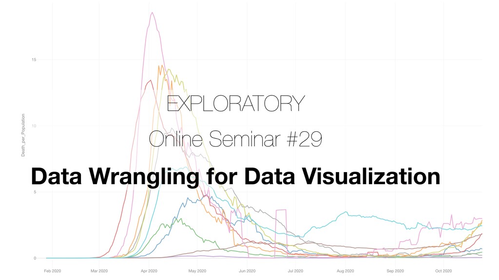
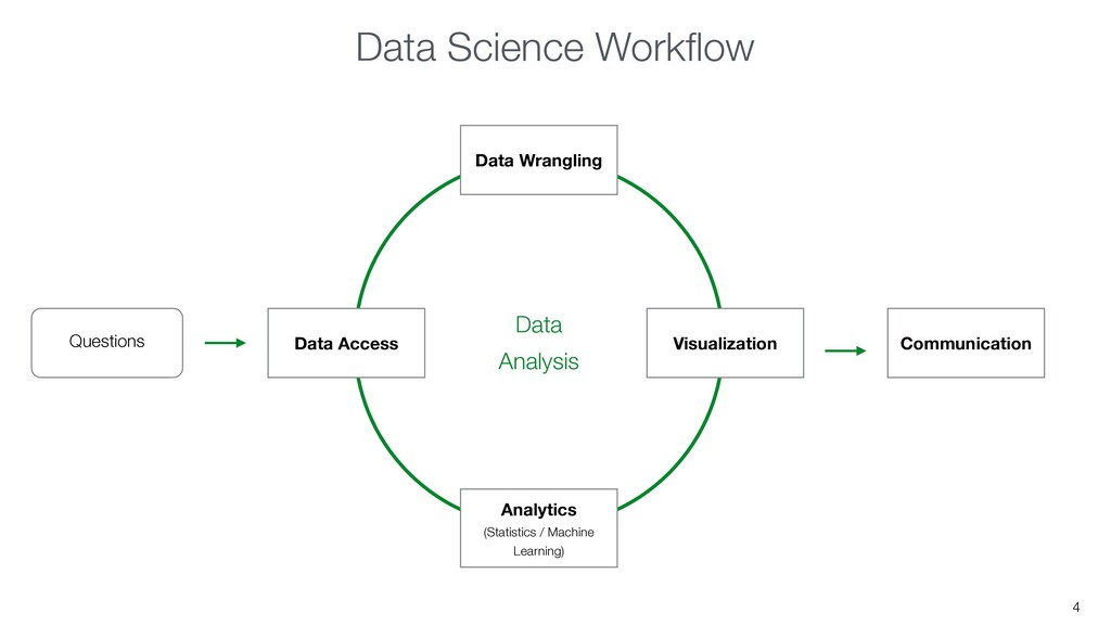
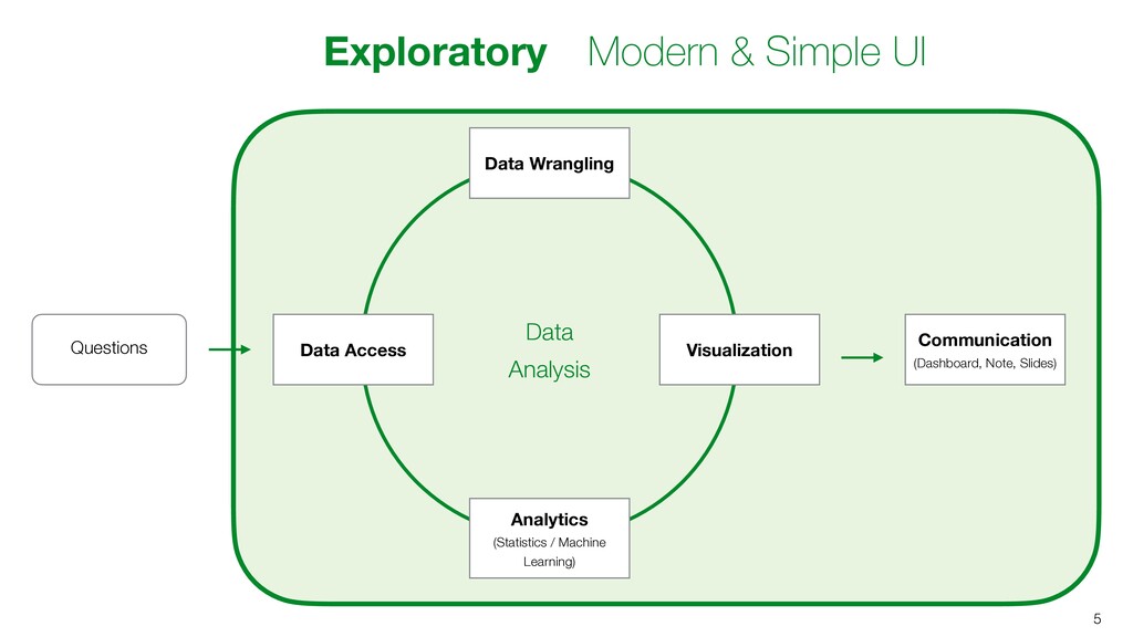
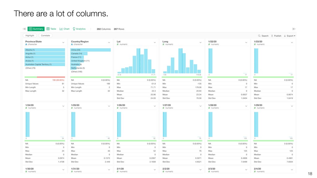
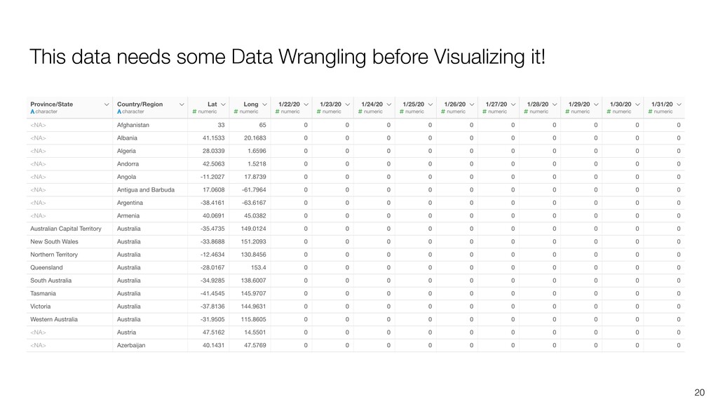
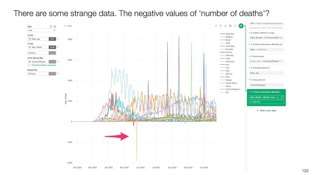
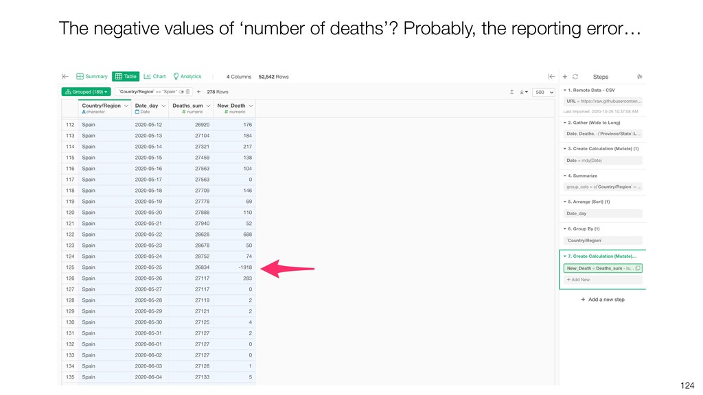
Once you get your data, more often than not, you'd find a need to clean and transform the data before even visualizing it to make any sense. We call this task Data Wrangling.

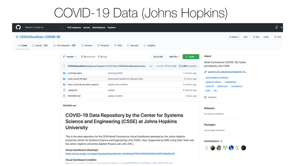
In this seminar, I'm going to introduce a few commonly used techniques to clean and transform data with COVID-19 data.

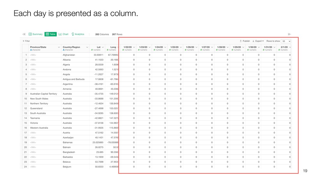
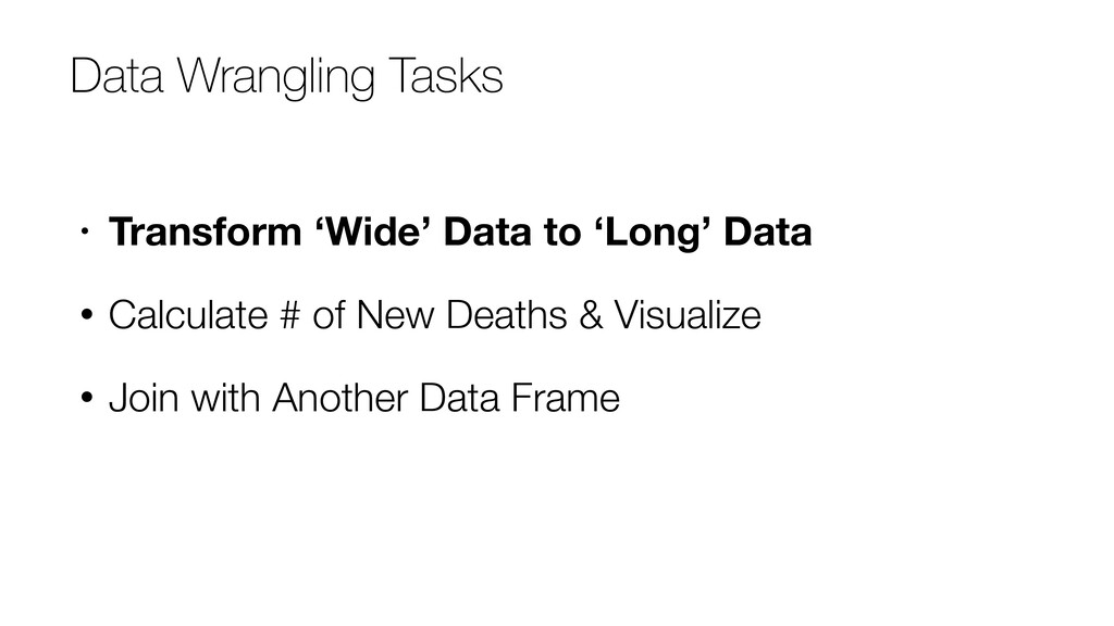
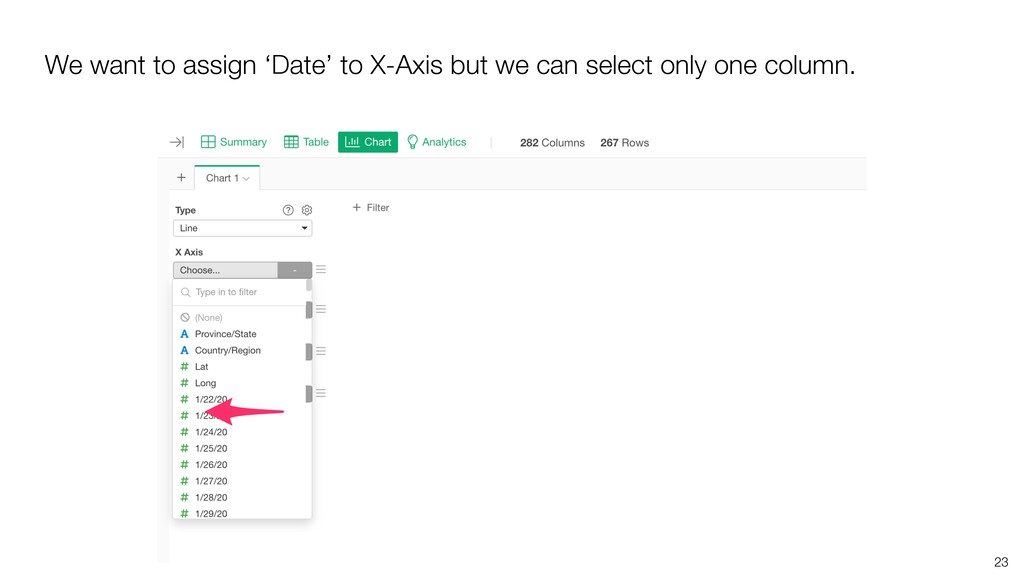
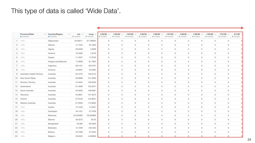
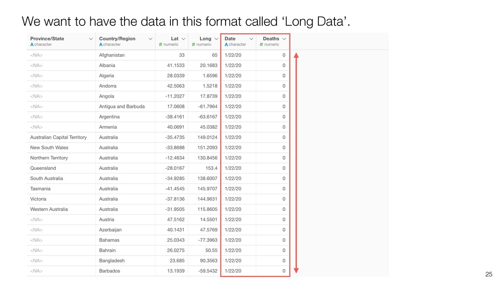
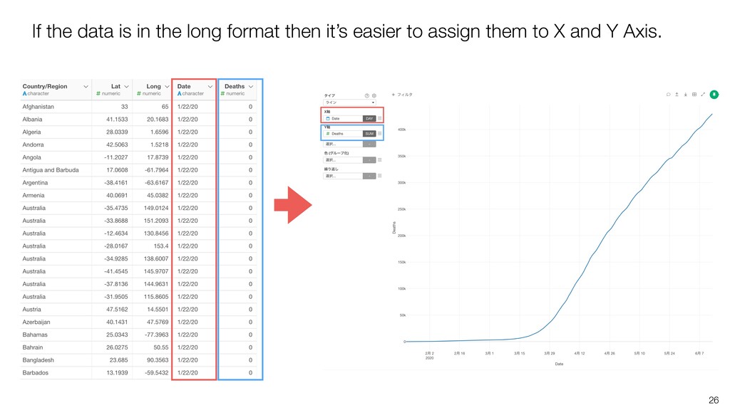
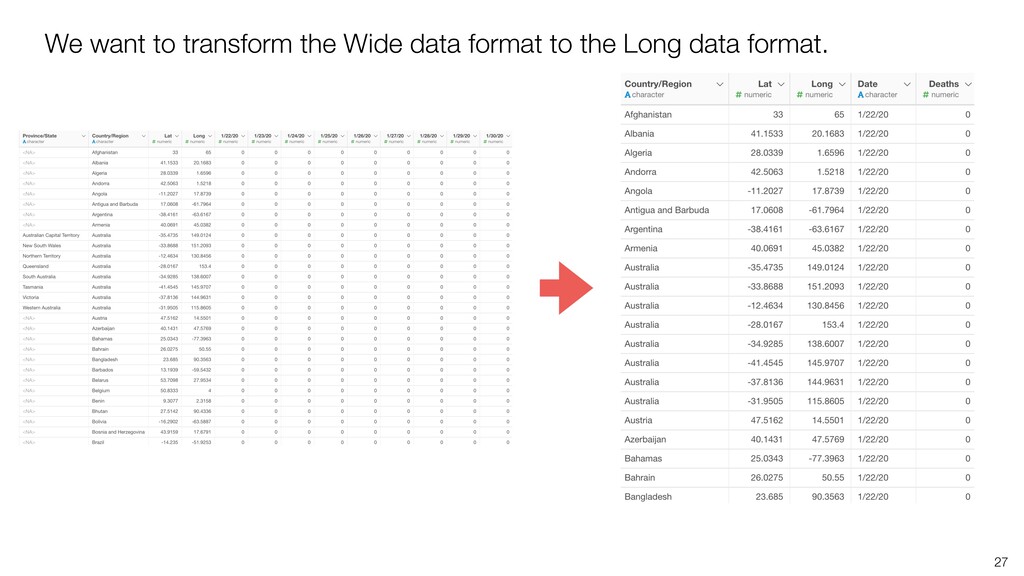
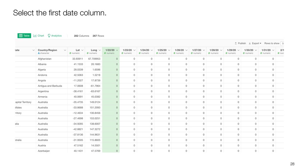
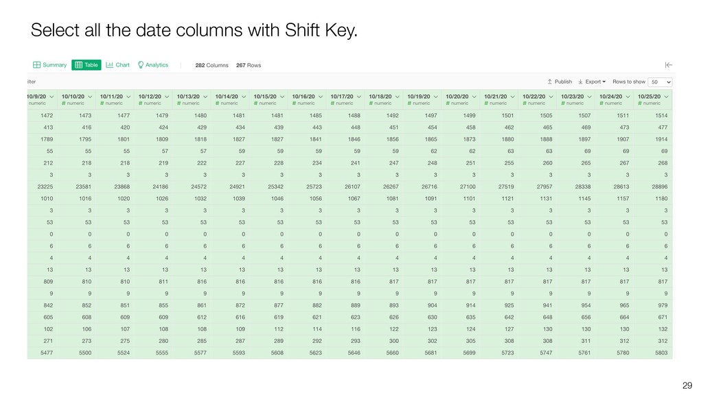
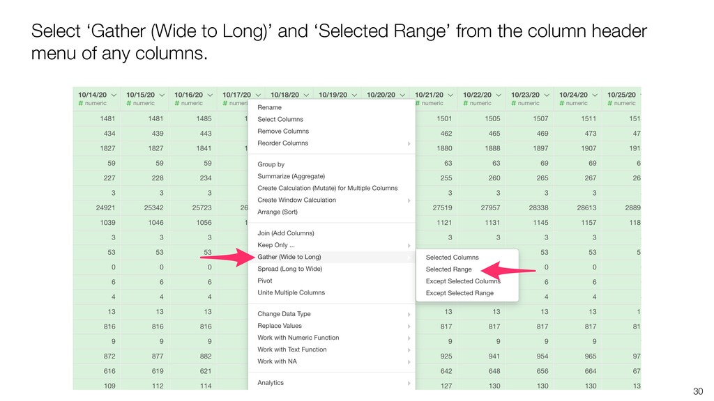
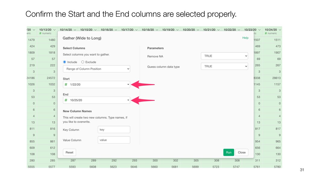
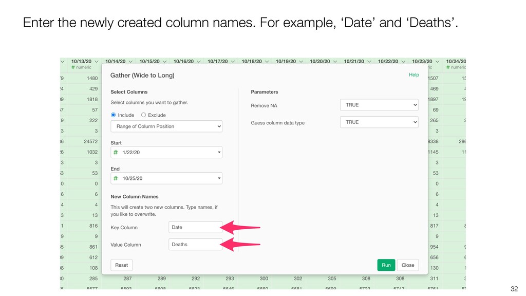
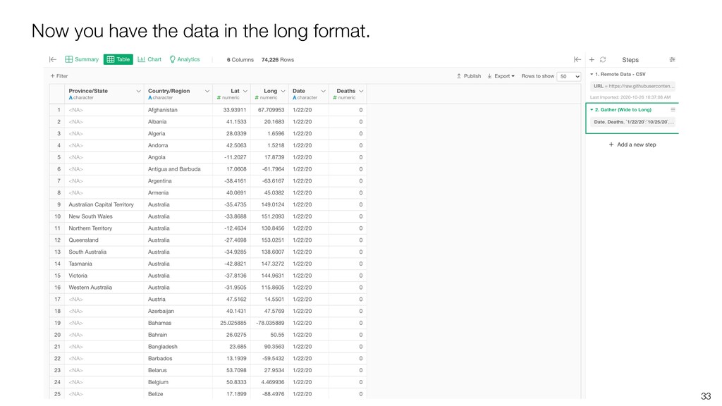
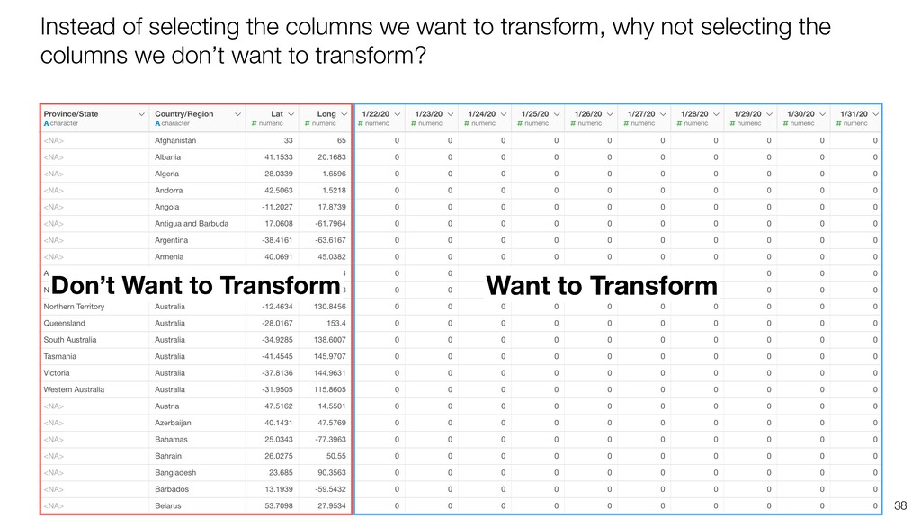
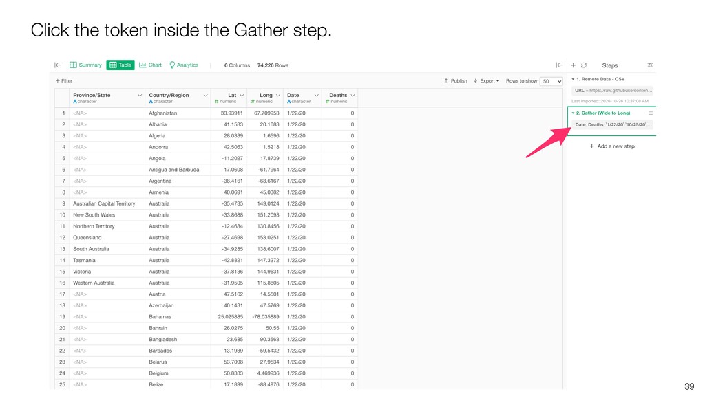
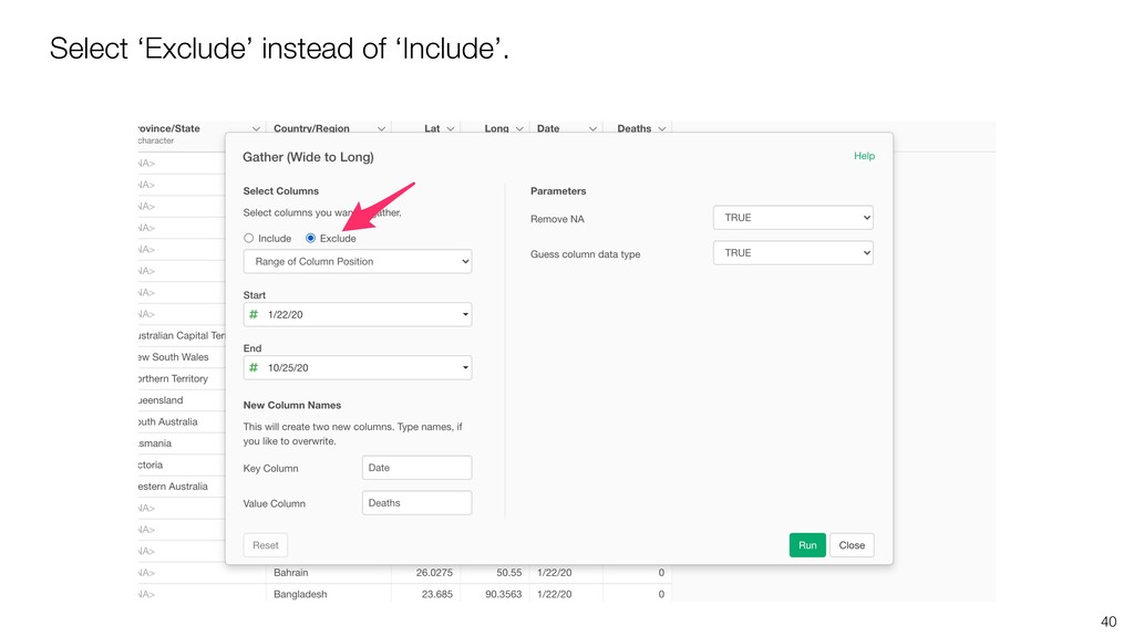
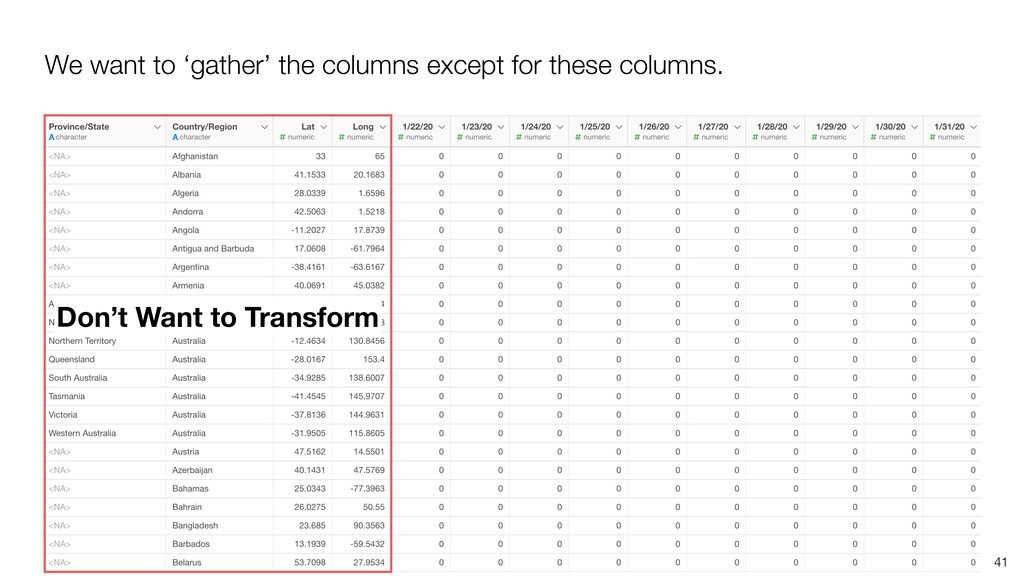
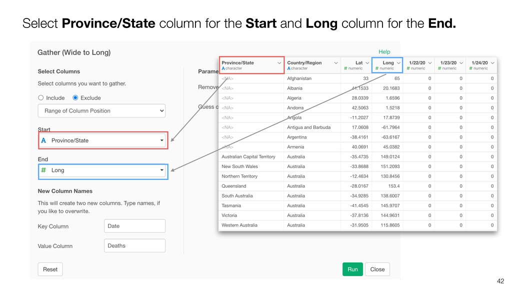
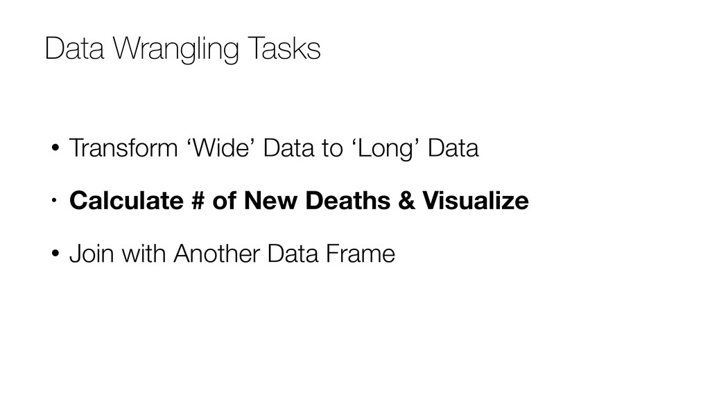
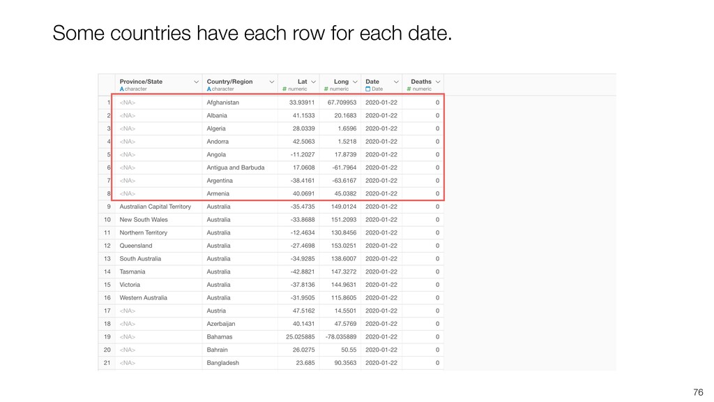
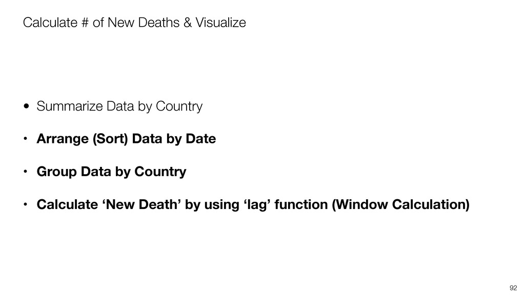
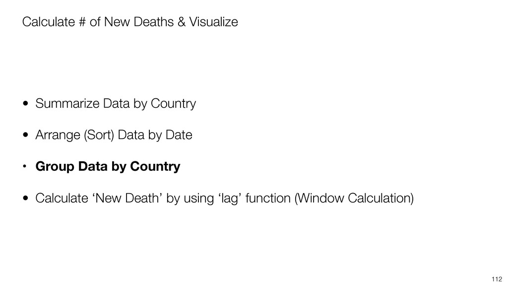
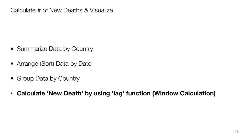
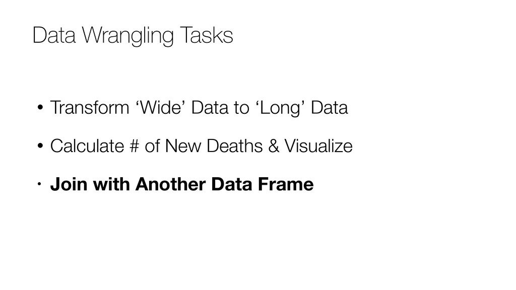
* Transform Wide data to Long data
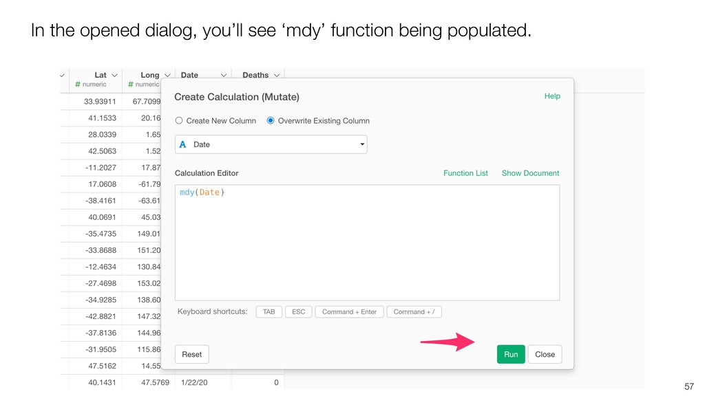
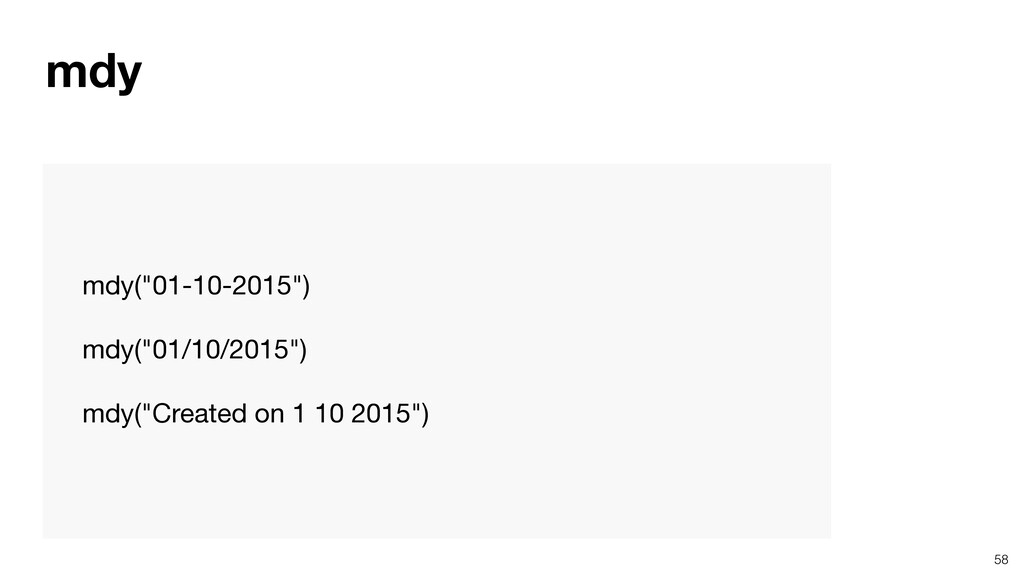
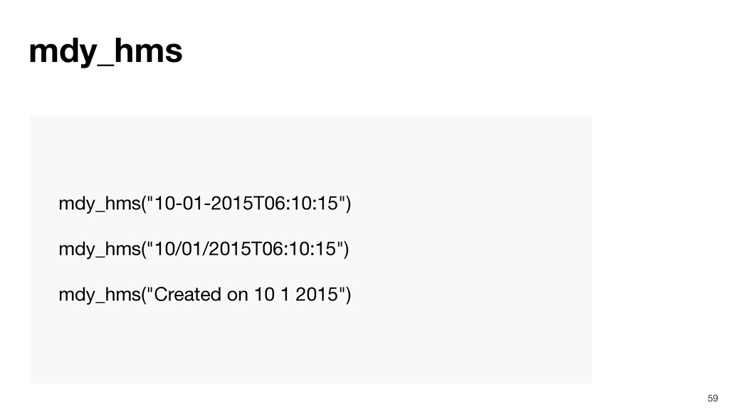
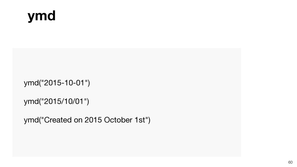
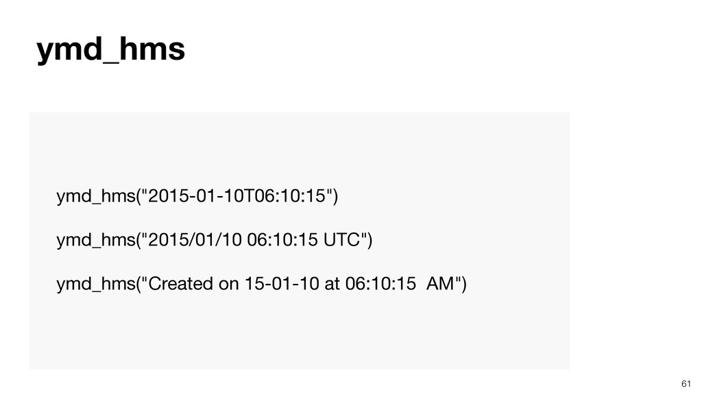
* Convert Text to Date data type
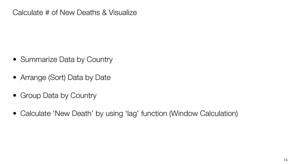
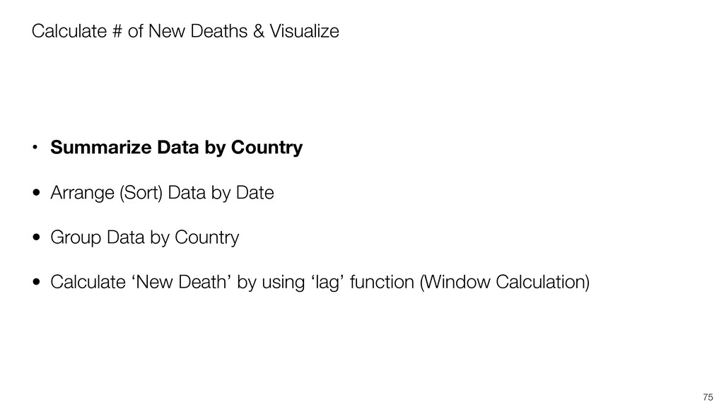
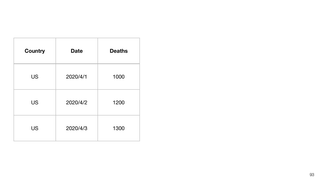
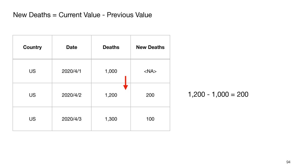
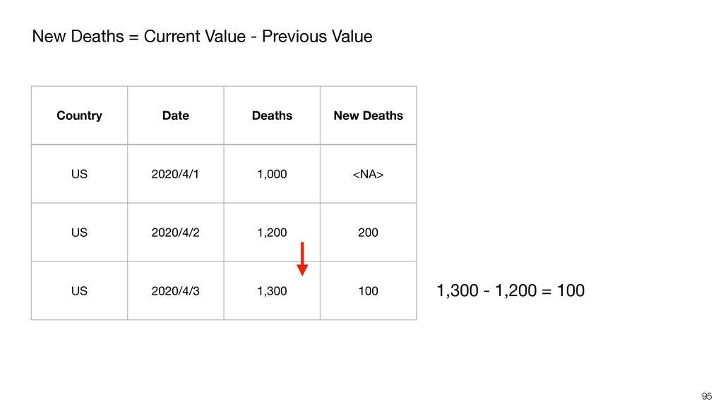
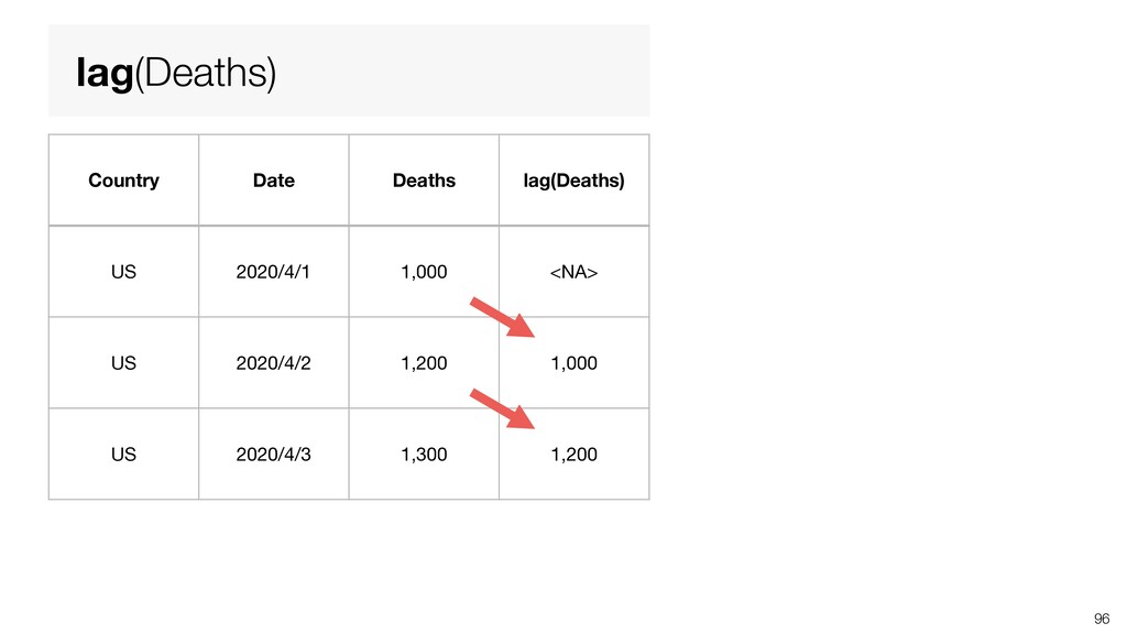
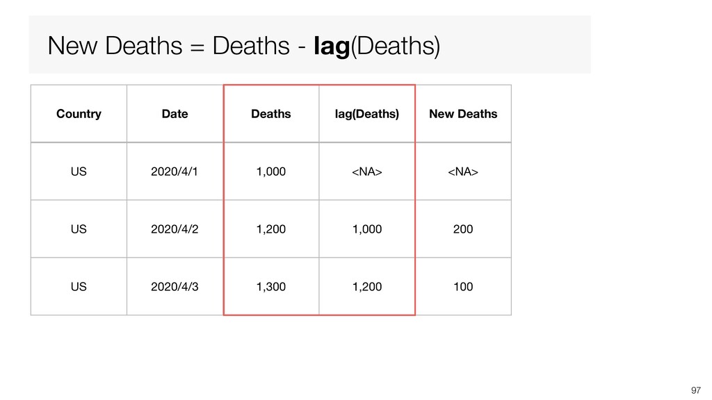
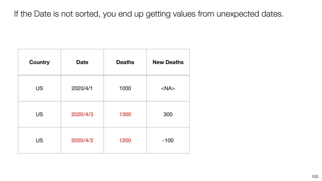
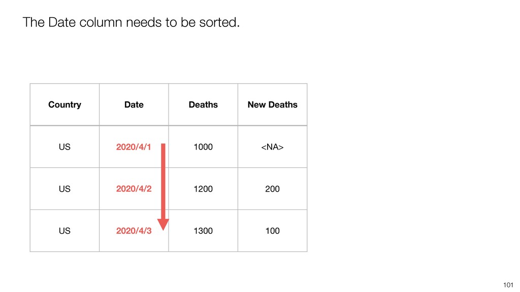
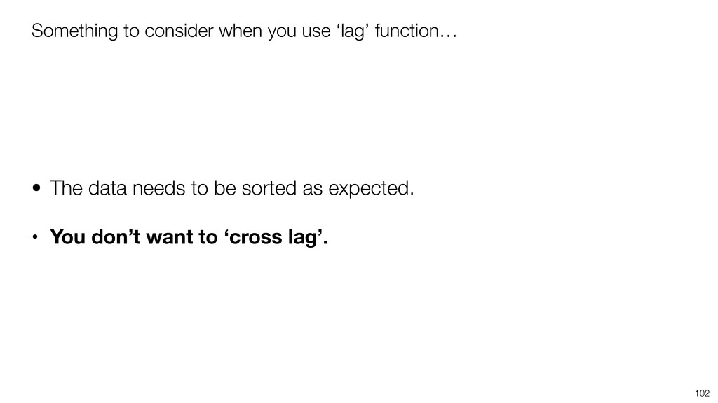
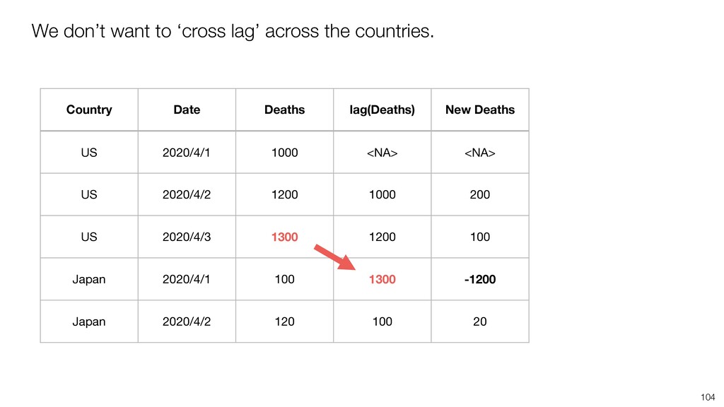
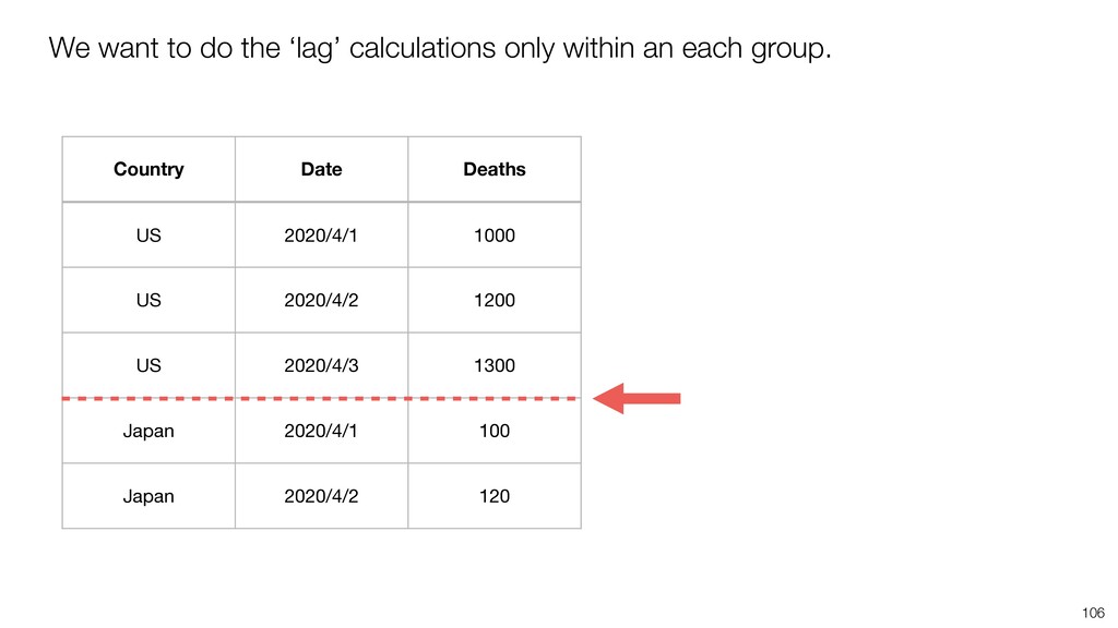
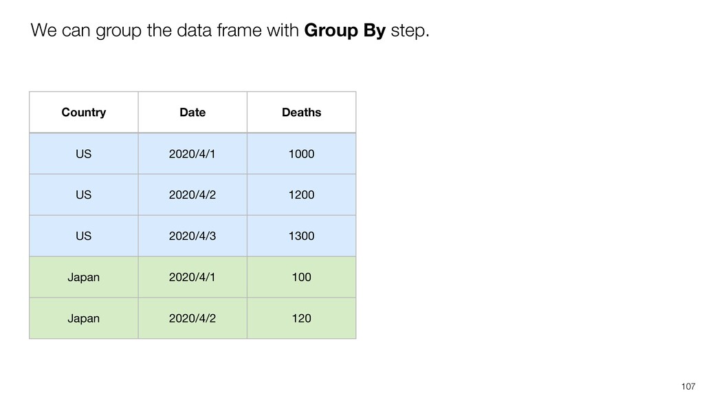
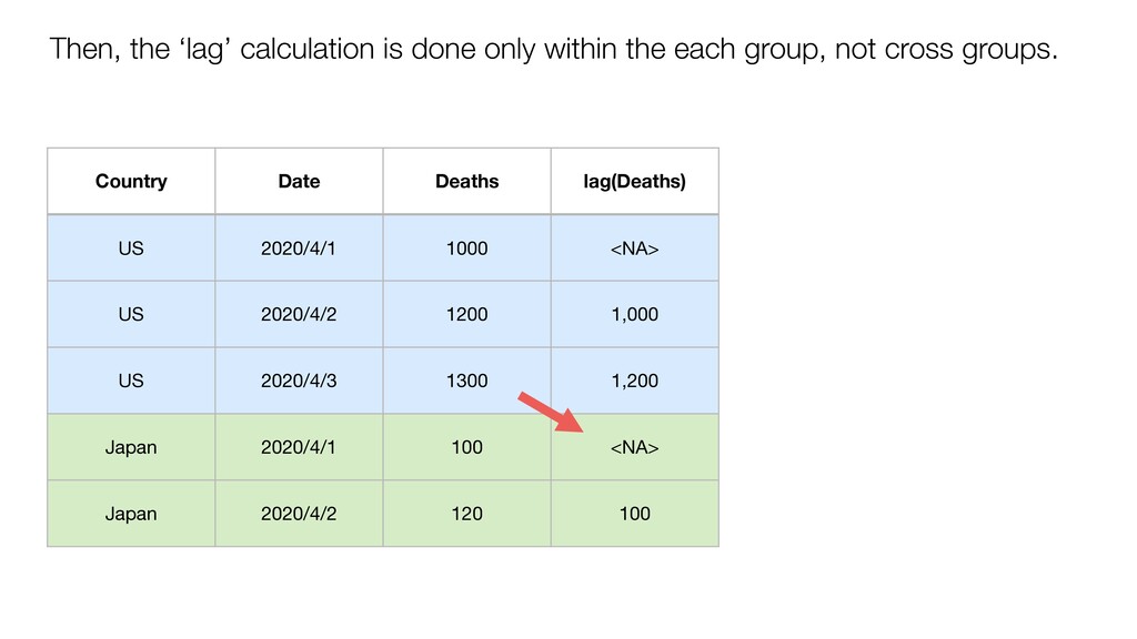
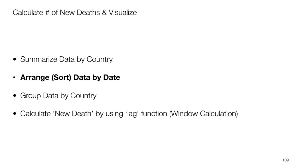
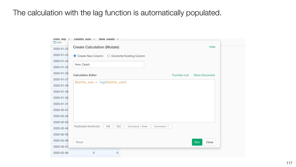
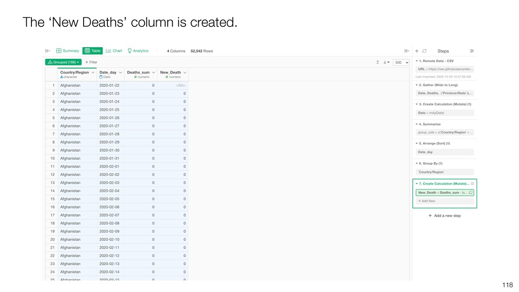
* Calculate the difference from the previous row with Lag function
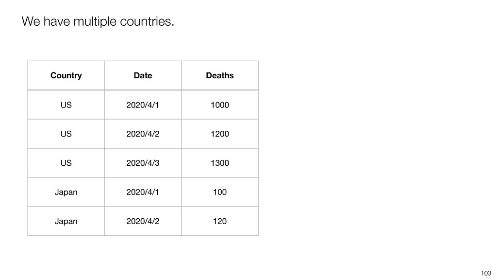
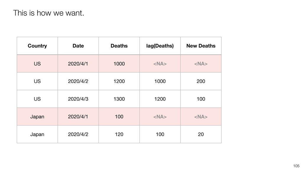
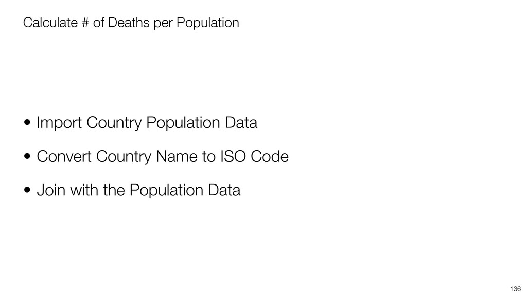
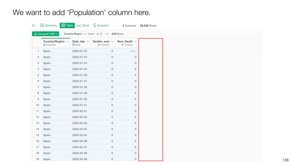
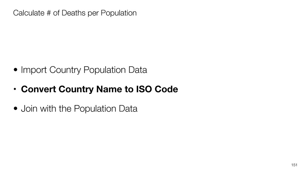
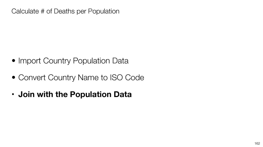
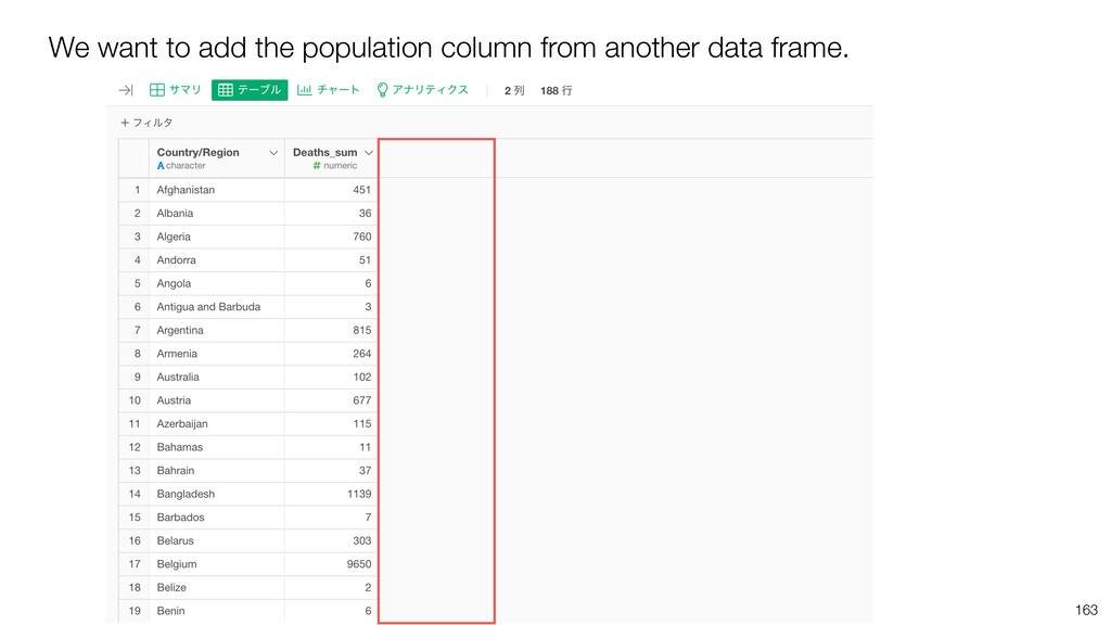
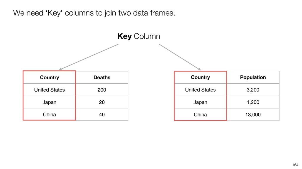
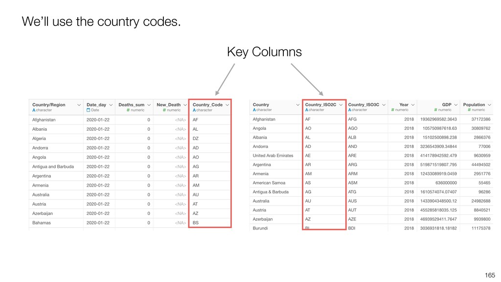
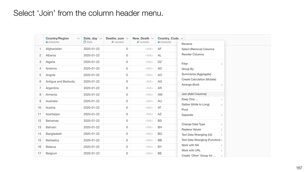
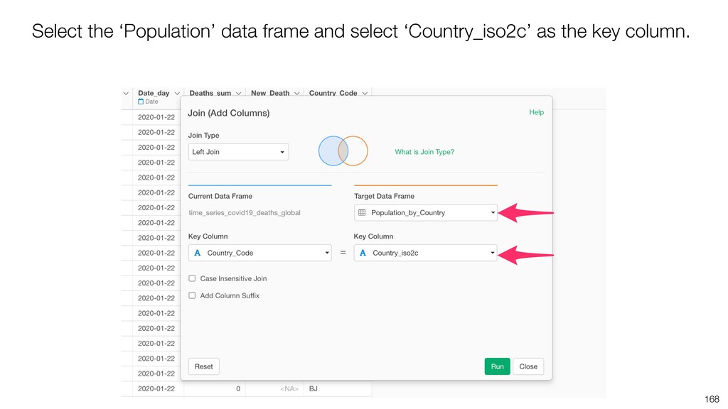
* Join with another data frame

Knowing these simple techniques is essential for creating effective visualizations.

This is a part of the Data Visualization Workshop. The past recording and tutorial slides can be found at the workshop page (https://exploratory.io/note/kanaugust/Data-Visualization-Workshop-YAZ6azM0MU).

Kan Nishida

October 28, 2020
Tweet

More Decks by Kan Nishida

Other Decks in Technology

Transcript

  1. Kan Nishida CEO/co-founder Exploratory Summary Beginning of 2016, launched Exploratory,

    Inc. to democratize Data Science. Prior to Exploratory, Kan was a director of product development at Oracle leading teams to build various Data Science products in areas including Machine Learning, BI, Data Visualization, Mobile Analytics, Big Data, etc. @KanAugust Speaker
  2. 4 Questions Communication Data Access Data Wrangling Visualization Analytics (Statistics

    / Machine Learning) Data Analysis Data Science Workflow
  3. 5 Questions Communication (Dashboard, Note, Slides) Data Access Data Wrangling

    Visualization Analytics (Statistics / Machine Learning) Data Analysis ExploratoryɹModern & Simple UI
  4. You can download this data and save it on your

    local PC. Then, you can import it as a local CSV file. But, It’s actually better to directly import it as a remote file. This will make it easier to re-import the data when the original data (at Github repository) is updated, which is ‘daily’.
  5. • Transform ‘Wide’ Data to ‘Long’ Data • Calculate #

    of New Deaths & Visualize • Join with Another Data Frame Data Wrangling Tasks
  6. • Transform ‘Wide’ Data to ‘Long’ Data • Calculate #

    of New Deaths & Visualize • Join with Another Data Frame Data Wrangling Tasks
  7. 26 If the data is in the long format then

    it’s easier to assign them to X and Y Axis.
  8. 35 The hosted data (at Johns Hopkins) gets updated everyday.

    We will want to click on this ‘Re-import’ button to import the latest date in any future days.
  9. 37 And that means that we need to manually update

    the ‘End’ column setting every time we re-import the data.
  10. 38 Instead of selecting the columns we want to transform,

    why not selecting the columns we don’t want to transform? Want to Transform Don’t Want to Transform
  11. 41 We want to ‘gather’ the columns except for these

    columns. Don’t Want to Transform
  12. 44 You’ll get the same result as before. Just a

    different way of selecting the columns!
  13. 45 Now, in any future dates, all you’ll need to

    do to get the latest data is to simply click the Re-import button!
  14. 47 Go to the Chart view and move the Chart

    Pin to the 2nd step so that you’ll be able to use the transformed data.
  15. 48 • X-Axis: Date • Y-Axis: Deaths • Calculation for

    Y-Axis: SUM Select ‘Line’ chart and setup as follows.
  16. 2017-01-01 y m d 2017-01-01 08:10:10 y m d h

    m s 55 All you need to know is the order in which the date components are presented.
  17. 56 For example, this data is presented in Month, Day,

    and Year order so we can select ‘Month, Day, Year’ from the menu.
  18. 70 We can see that the Deaths column has the

    cumulative number of deaths.
  19. • Transform ‘Wide’ Data to ‘Long’ Data • Calculate #

    of New Deaths & Visualize • Join with Another Data Frame Data Wrangling Tasks
  20. Calculate # of New Deaths & Visualize • Summarize Data

    by Country • Arrange (Sort) Data by Date • Group Data by Country • Calculate ‘New Death’ by using ‘lag’ function (Window Calculation) 74
  21. Calculate # of New Deaths & Visualize • Summarize Data

    by Country • Arrange (Sort) Data by Date • Group Data by Country • Calculate ‘New Death’ by using ‘lag’ function (Window Calculation) 75
  22. 77 This will become a problem when we want to

    perform ‘Window Calculation’ later on, so we want to Summarize the data at Country level first.
  23. 79 Select ‘Country/Region’ and ‘Date’ for the Group By, and

    select ‘Day’ as the aggregation function for the Date column.
  24. 82 Go back to the previous chart and move the

    Pin to the new step (Step 4).
  25. 85 There are 189 countries, and that will make too

    many lines to show in the chart. So, we want to limit the number of the countries to be show in the chart.
  26. 87 Configure it so that it will pick the top

    20 countries based on the number of deaths.
  27. 91 Now we are looking at the trend of top

    20 countries based on the deaths numbers.
  28. Calculate # of New Deaths & Visualize • Summarize Data

    by Country • Arrange (Sort) Data by Date • Group Data by Country • Calculate ‘New Death’ by using ‘lag’ function (Window Calculation) 92
  29. 94 Country Date Deaths New Deaths US 2020/4/1 1,000 <NA>

    US 2020/4/2 1,200 200 US 2020/4/3 1,300 100 1,200 - 1,000 = 200 New Deaths = Current Value - Previous Value
  30. 95 Country Date Deaths New Deaths US 2020/4/1 1,000 <NA>

    US 2020/4/2 1,200 200 US 2020/4/3 1,300 100 New Deaths = Current Value - Previous Value 1,300 - 1,200 = 100
  31. 96 Country Date Deaths lag(Deaths) US 2020/4/1 1,000 <NA> US

    2020/4/2 1,200 1,000 US 2020/4/3 1,300 1,200 lag(Deaths)
  32. 97 Country Date Deaths lag(Deaths) New Deaths US 2020/4/1 1,000

    <NA> <NA> US 2020/4/2 1,200 1,000 200 US 2020/4/3 1,300 1,200 100 New Deaths = Deaths - lag(Deaths)
  33. Something to consider when you use ‘lag’ function… • The

    data needs to be sorted as expected. • You don’t want to ‘cross lag’. 98
  34. Something to consider when you use ‘lag’ function… • The

    data needs to be sorted as expected. • You don’t want to ‘cross lag’. 99
  35. 100 If the Date is not sorted, you end up

    getting values from unexpected dates. Country Date Deaths New Deaths US 2020/4/1 1000 <NA> US 2020/4/3 1300 300 US 2020/4/2 1200 -100
  36. 101 The Date column needs to be sorted. Country Date

    Deaths New Deaths US 2020/4/1 1000 <NA> US 2020/4/2 1200 200 US 2020/4/3 1300 100
  37. Something to consider when you use ‘lag’ function… • The

    data needs to be sorted as expected. • You don’t want to ‘cross lag’. 102
  38. 103 We have multiple countries. Country Date Deaths US 2020/4/1

    1000 US 2020/4/2 1200 US 2020/4/3 1300 Japan 2020/4/1 100 Japan 2020/4/2 120
  39. 104 We don’t want to ‘cross lag’ across the countries.

    Country Date Deaths lag(Deaths) New Deaths US 2020/4/1 1000 <NA> <NA> US 2020/4/2 1200 1000 200 US 2020/4/3 1300 1200 100 Japan 2020/4/1 100 1300 -1200 Japan 2020/4/2 120 100 20
  40. 105 Country Date Deaths lag(Deaths) New Deaths US 2020/4/1 1000

    <NA> <NA> US 2020/4/2 1200 1000 200 US 2020/4/3 1300 1200 100 Japan 2020/4/1 100 <NA> <NA> Japan 2020/4/2 120 100 20 This is how we want.
  41. 106 We want to do the ‘lag’ calculations only within

    an each group. Country Date Deaths US 2020/4/1 1000 US 2020/4/2 1200 US 2020/4/3 1300 Japan 2020/4/1 100 Japan 2020/4/2 120
  42. 107 We can group the data frame with Group By

    step. Country Date Deaths US 2020/4/1 1000 US 2020/4/2 1200 US 2020/4/3 1300 Japan 2020/4/1 100 Japan 2020/4/2 120
  43. Country Date Deaths lag(Deaths) US 2020/4/1 1000 <NA> US 2020/4/2

    1200 1,000 US 2020/4/3 1300 1,200 Japan 2020/4/1 100 <NA> Japan 2020/4/2 120 100 Then, the ‘lag’ calculation is done only within the each group, not cross groups.
  44. Calculate # of New Deaths & Visualize • Summarize Data

    by Country • Arrange (Sort) Data by Date • Group Data by Country • Calculate ‘New Death’ by using ‘lag’ function (Window Calculation) 109
  45. 110

  46. 111

  47. Calculate # of New Deaths & Visualize • Summarize Data

    by Country • Arrange (Sort) Data by Date • Group Data by Country • Calculate ‘New Death’ by using ‘lag’ function (Window Calculation) 112
  48. Calculate # of New Deaths & Visualize • Summarize Data

    by Country • Arrange (Sort) Data by Date • Group Data by Country • Calculate ‘New Death’ by using ‘lag’ function (Window Calculation) 115
  49. 129 It is hard to see the trend. Let’s smooth

    out the lines by calculating ‘Moving Average’. This can be done as the Data Wrangling step. But, You can do it directly inside the chart, which is a bit quicker!
  50. 132 Select ‘Mean (Average)’ to make it ‘Moving Average’ and

    set the window size to 7 to make it ‘7 days moving average’.
  51. • Transform ‘Wide’ Data to ‘Long’ Data • Calculate #

    of New Deaths & Visualize • Join with Another Data Frame Data Wrangling Tasks
  52. Calculate # of Deaths per Population • Import Country Population

    Data • Convert Country Name to ISO Code • Join with the Population Data 136
  53. Calculate # of Deaths per Population • Import Country Population

    Data • Convert Country Name to ISO Code • Join with the Population Data 137
  54. 144 Country Year Population US 1960 2,000 US 1961 2,100

    US ɾɾɾ ɾɾɾ US 2018 3,200 We want to keep only the last year data with ‘Filter’ step.
  55. 146 We can use the ‘Summarize Function’ to get the

    max value of the Year for each country and keep only the matching rows.
  56. 149 We’d recommend you ‘un-group’ the data when not necessary

    to avoid unexpected result. You can ‘un-group’ from the Grouped button.
  57. 150

  58. Calculate # of Deaths per Population • Import Country Population

    Data • Convert Country Name to ISO Code • Join with the Population Data 151
  59. 153 We can convert the country names / codes to

    various options. United States / US Country Name/Code Continent: Americas Country Name: United States ISO2C: US ISO3C: USA and others…
  60. Calculate # of Deaths per Population • Import Country Population

    Data • Convert Country Name to ISO Code • Join with the Population Data 162
  61. 164 We need ‘Key’ columns to join two data frames.

    Country Deaths United States 200 Japan 20 China 40 Country Population United States 3,200 Japan 1,200 China 13,000 Key Column
  62. Calculate # of Deaths per Population • Import Country Population

    Data • Convert Country Name to ISO Code • Join with Population Data • Calculate ‘# of Deaths per Population’ 170
  63. 177

  64. 179 Now, we can see the number of deaths per

    population trend for the selected countries.