Upgrade to Pro
— share decks privately, control downloads, hide ads and more …
Speaker Deck
Sign up for free
Menu
Search
Features
All features
Private URLs
Password Protection
Custom URLS
Scheduled publishing
Remove Branding
Restrict embedding
Deck Collections
Notes
Features
All features
Private URLs
Password Protection
Custom URLS
Scheduled publishing
Remove Branding
Restrict embedding
Deck Collections
Notes
Explore
Featured decks
Featured speakers
Programming
Technology
Storyboards
Explore
Featured decks
Featured speakers
Programming
Technology
Storyboards
Pricing
Search
Sign in
Sign up for free
Designing for accessibility
Search
Sponsored
·
Your Podcast. Everywhere. Effortlessly.
Share. Educate. Inspire. Entertain. You do you. We'll handle the rest.
→
Laura Kalbag
August 29, 2013
Design
530
3
Share
Embed
Copy iframe code
Copy JS code
Copy link
Start on current slide
Designing for accessibility
From a talk at Front-end London in August 2013
Laura Kalbag
August 29, 2013
More Decks by Laura Kalbag
See All by Laura Kalbag
Ethical Design
laurakalbag
1
150
Intro to UX
laurakalbag
1
220
Ethical Design
laurakalbag
1
3k
Accessibility By Design
laurakalbag
1
150
Designing For Accessibility
laurakalbag
2
190
Indie Design
laurakalbag
4
2.2k
WAI-ARIA in 10
laurakalbag
1
300
Designing for Accessibility
laurakalbag
0
110
Designing for Accessibility
laurakalbag
1
560
Other Decks in Design
See All in Design
The decksh tutorial
ajstarks
1
100
「おすすめ」はなぜ信用されないのか - 信頼を築くUI/UX設計
ryu1013
0
320
デザイナーがいない部署にハーネスを設計する
kenichiota0711
5
5.3k
Webデザイナー中田美穂_ポートフォリオ
omy
0
170
コールセンターのオペレーターに6時間だけなってみた
h0sa
0
100
ポートフォリオ_あやの
ngyenmazt1412
0
1.9k
「惜しいデザイン」 を生み出さないための AIレビューループ
0b1tk
3
4.6k
Техники структурирования беседы с собой, заказчиком и командо
ashapiro
0
340
Jun Wei | Information Design & Presentation Portfolio
wjw100788
PRO
0
150
トランジションの冒険 自分と世界を変える冒険の書 / Transition Adventure
dmattsun
2
770
JBUG大阪#9_登壇資料_引き継ぎで困らないためのBacklogWikiの整え方_ミスと属人化を防ぐために、 “次の人が動ける状態”をどう残すか
webnaut
2
290
富山デザイン勉強会_生成AIを使ったデザイン制作2026最新版.pdf
keita_yoshikawa
0
160
Featured
See All Featured
I Don’t Have Time: Getting Over the Fear to Launch Your Podcast
jcasabona
35
2.9k
Believing is Seeing
oripsolob
1
240
The World Runs on Bad Software
bkeepers
PRO
72
12k
Test your architecture with Archunit
thirion
2
2.4k
Mind Mapping
helmedeiros
1
400
svc-hook: hooking system calls on ARM64 by binary rewriting
retrage
2
620
How to Align SEO within the Product Triangle To Get Buy-In & Support - #RIMC
aleyda
2
1.8k
Docker and Python
trallard
47
4.2k
Navigating Algorithm Shifts & AI Overviews - #SMXNext
aleyda
1
1.7k
Code Reviewing Like a Champion
maltzj
529
40k
Practical Orchestrator
shlominoach
192
12k
A brief & incomplete history of UX Design for the World Wide Web: 1989–2019
jct
2
530
Transcript
Designing for accessibility Laura Kalbag @laurakalbag laurakalbag.com
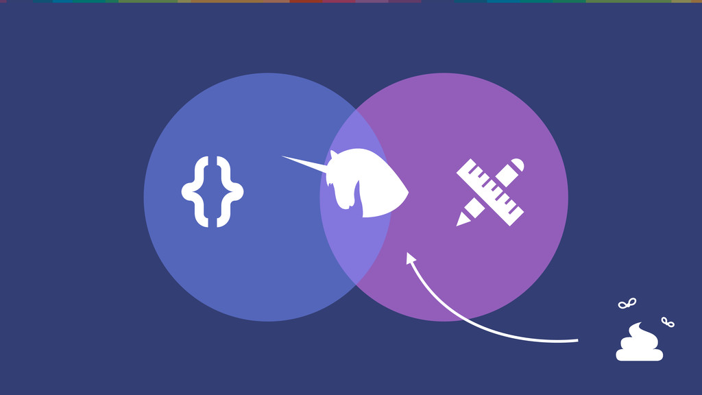
Are you are developer or a designer?
None
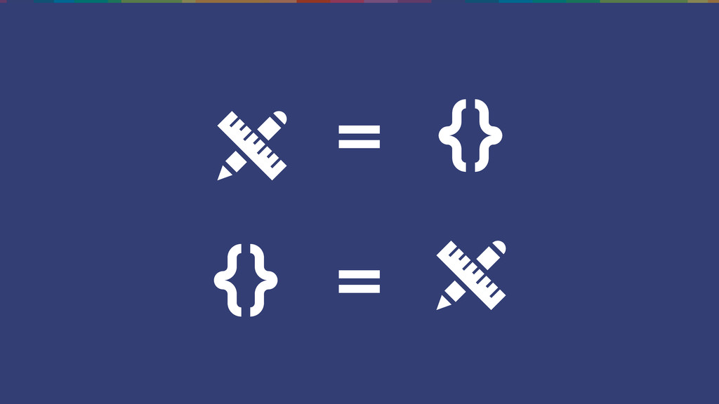
= =
designing for accessibility isn’t just for “designers”
What is accessibility?
Accessibility is the degree to which a website is available
to as many people as possible.
accessibility isn’t just about screen readers
None
None
Shiny Shiny
Is it because we don’t understand who we’re trying to
help?
Is it because we just don’t know what to do?
Is it because it’s too hard, and there’s too much
to think about?
I’ve not got the answers
None
None
Design decisions made in the name of accessibility will largely
benefit everyone.
The four (main) types of disability that affect use of
the web
Visual
Hearing
Motor
Cognitive
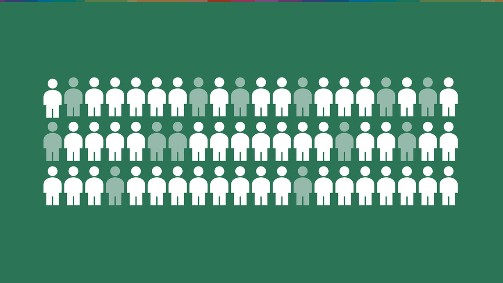
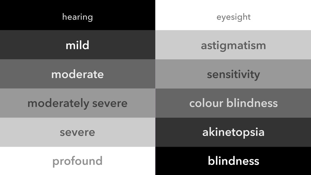
None of these disabilities are completely black and white
mild moderate moderately severe severe profound astigmatism sensitivity colour blindness
akinetopsia blindness hearing eyesight
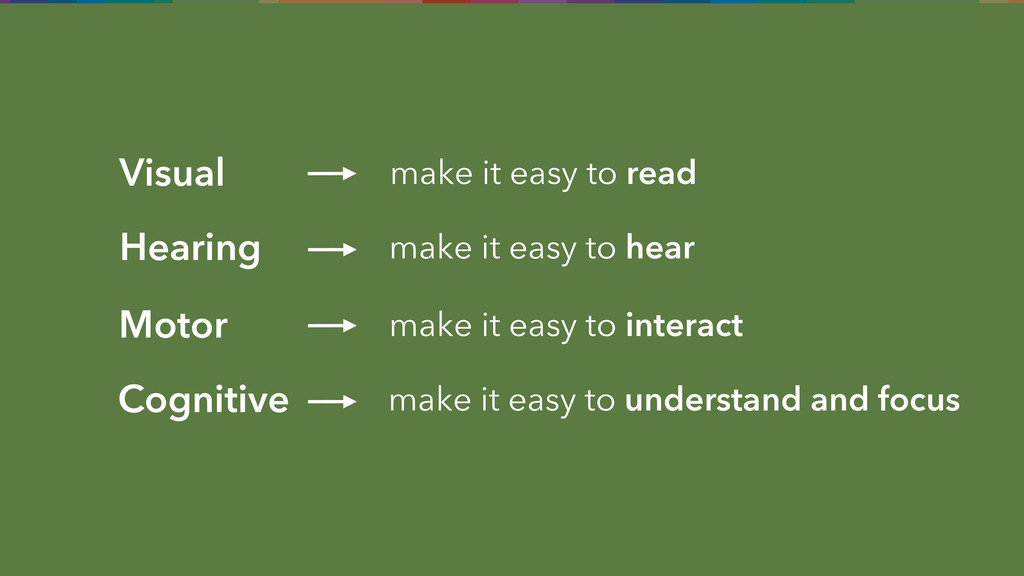
Visual make it easy to read Hearing make it easy
to hear make it easy to understand and focus Cognitive Motor make it easy to interact
Good accessibility is good usability
Examples
Disclaimer
Text
None
None
None
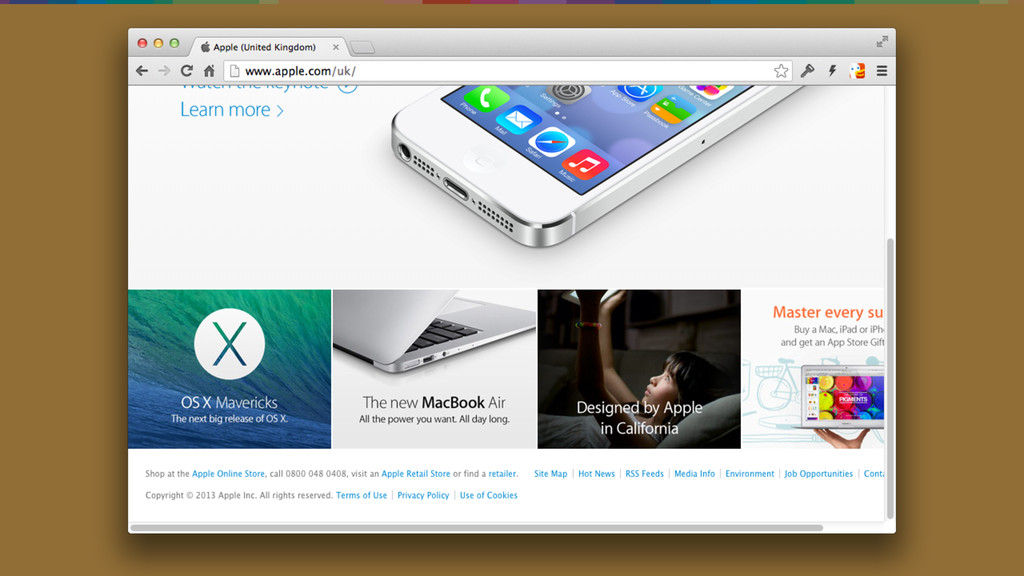
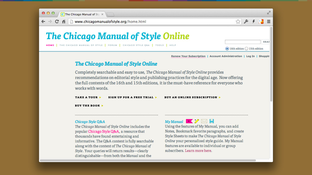
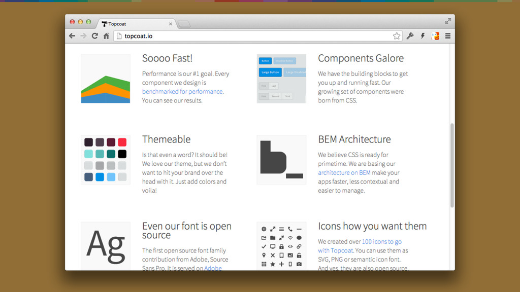
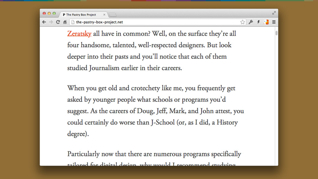
Squinting does not make an enjoyable reading experience
1. Make text content easy to read. 2. Ensure sensible
font sizes. 3. Don’t prevent the user from resizing the fonts themselves in the browser.
None
None
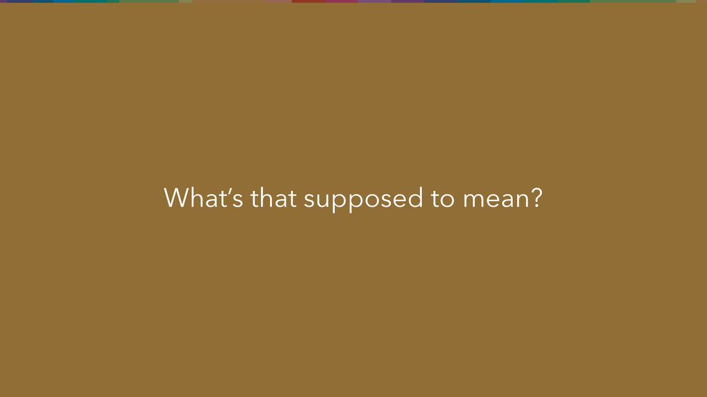
What’s that supposed to mean?
1. Good copy is a part of good accessibility. Keep
your text simple and your meaning clear.
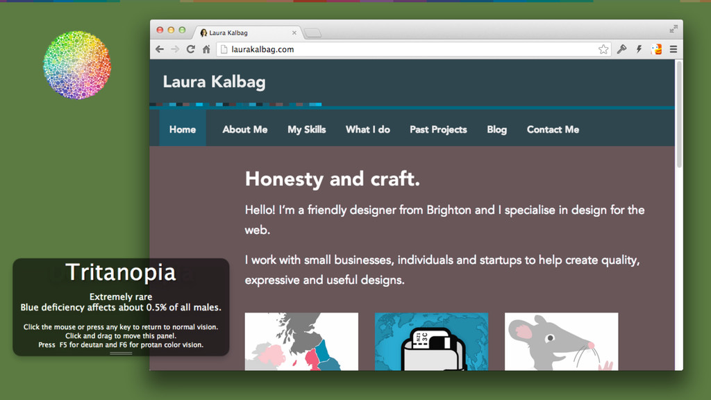
Colour
None
None
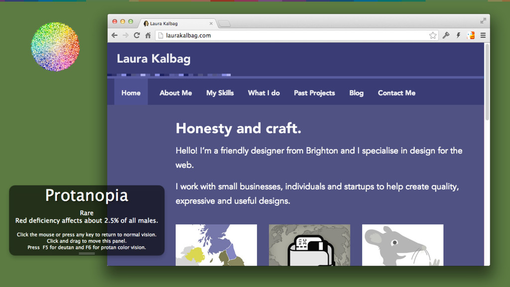
Your screen isn’t the same as everybody else’s screens
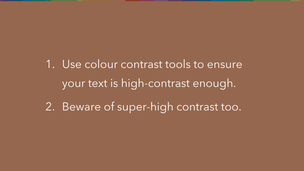
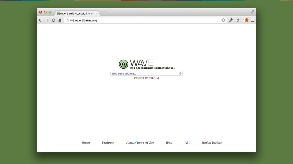
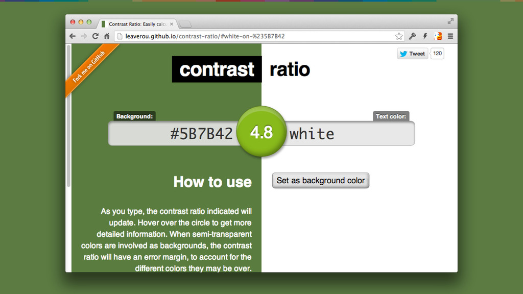
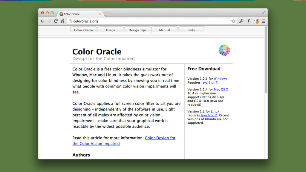
1. Use colour contrast tools to ensure your text is
high-contrast enough. 2. Beware of super-high contrast too.
Content hierarchy
Randomly enlarging and colouring text does not make a hierarchy.
1. Use semantic headings, lists and other relevant HTML elements.
2. Make the content structure clear and consistent.
Links
Finding links should not be a game.
1. Make links easy to recognise by using an underline.
None
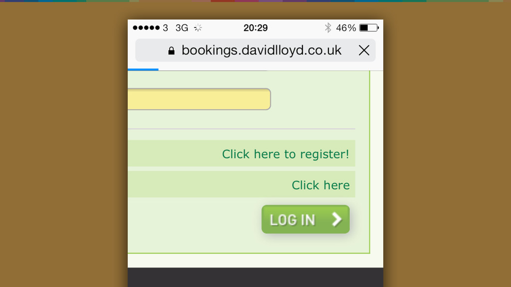
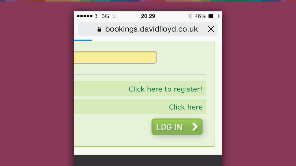
Why should I click there?
1. Use link text that makes sense out of context.
Don’t use “click here”. 2. Remember that not all your users are clicking.
Alt text
None
None
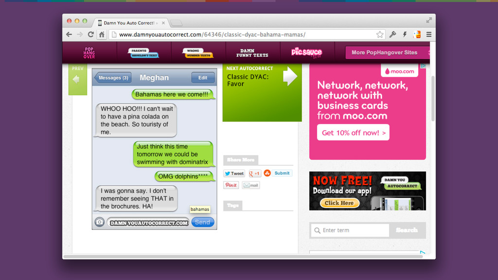
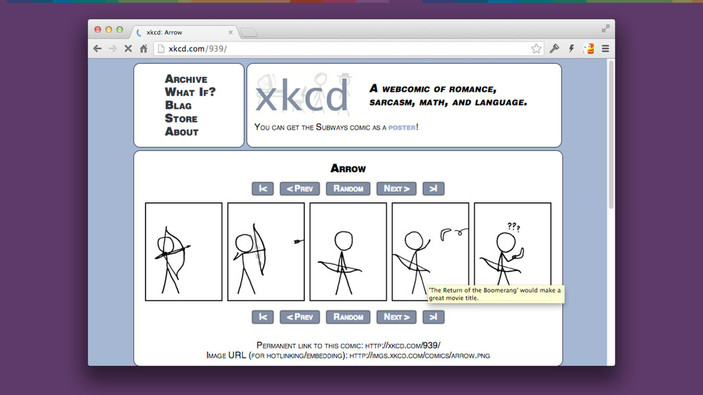
Unhelpful alt text has its place on XKCD
None
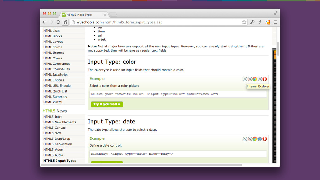
1. Provide text alternatives for images that helps a user
understand the context of the image.
Media
No, I don’t want to listen to your podcast or
watch your video tutorial. Give me text!
1. Provide text transcripts for audio. 2. Provide subtitles for
video.
JavaScript
I don’t want to wait forever for your page to
load because you want to show me how many Likes it has on Facebook
1. Use JavaScript with care and load it in a
sensible place. 2. If your web app needs JavaScript, ensure you use WAI ARIA to guide assistive technologies.
Navigation and way-finding
The days of flash are over, stop punishing me with
your artsy navigation.
1. Provide consistent ways to help users navigate, find content,
and determine where they are.
Forms
Don’t make me guess what and where the error is.
1. Help users correct and avoid mistakes in their input.
Animations
Wait for me!
1. Give users enough time to read and use content
Resources
None
None
None
None
None
None
None
None
None
None
None
None
Consider accessibility at every point of planning. It is content
hierarchy, copy, visual design and code.
Accessibility as default
Accessibility is easy to consider once you start caring about
it.
Laura Kalbag @laurakalbag laurakalbag.com


 laurakalbag
 ajstarks
 ryu1013
 kenichiota0711
 omy
omy
 h0sa
h0sa
 ngyenmazt1412
 0b1tk
0b1tk
 ashapiro
 wjw100788
 dmattsun
 webnaut
 keita_yoshikawa
 jcasabona
 oripsolob
 bkeepers
 thirion
 helmedeiros
 retrage
 aleyda
 trallard
 maltzj
 shlominoach
 jct
jct