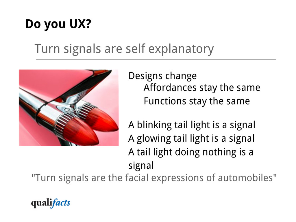
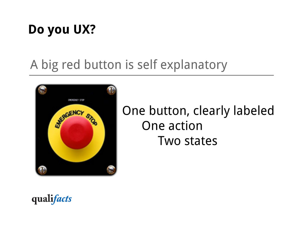
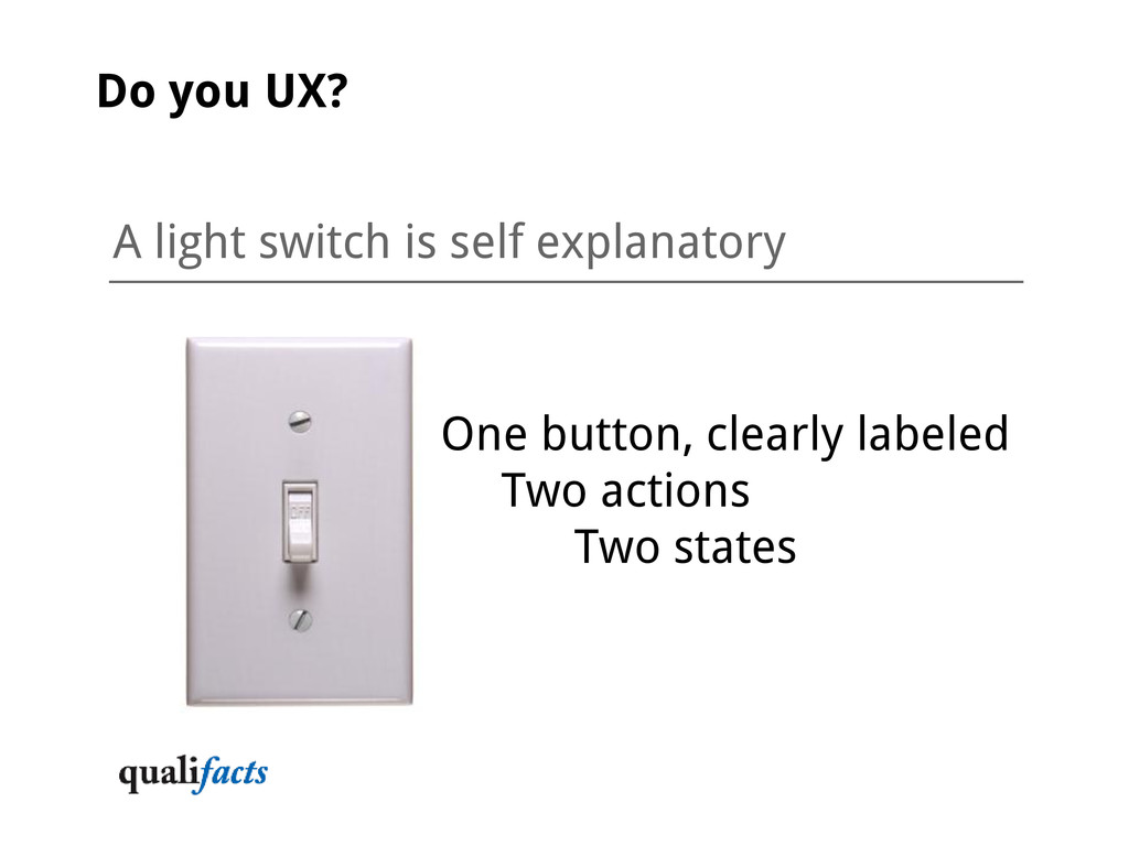
same Functions stay the same A blinking tail light is a signal A glowing tail light is a signal A tail light doing nothing is a signal Do you UX? "Turn signals are the facial expressions of automobiles"
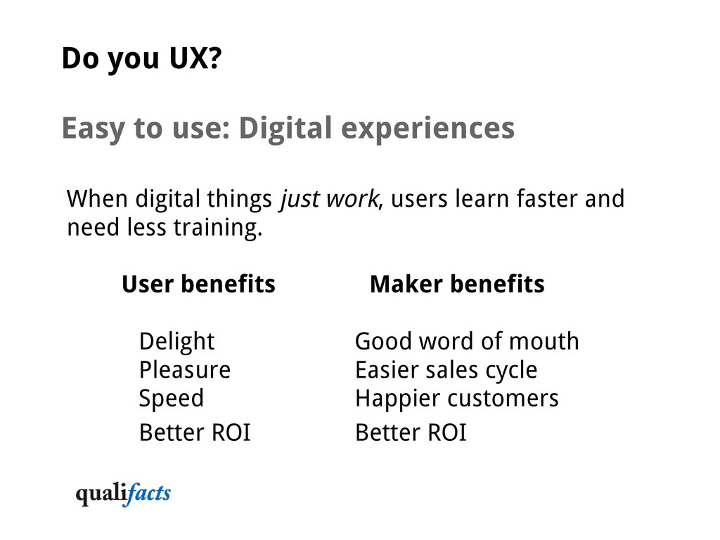
things just work, users learn faster and need less training. User benefits Maker benefits Delight Good word of mouth Pleasure Easier sales cycle Speed Happier customers Better ROI Better ROI
feel natural to users, based on their knowledge and needs Navigation, taxonomy, categories and subcategories Language, titles, labels and names match experience Choose your language Wide audience e-commerce sites use words consumers speak Specialized enterprise systems use language experts speak Workflows match mental models from the real world User flow identified in the discovery process makes sense
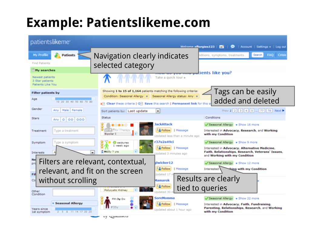
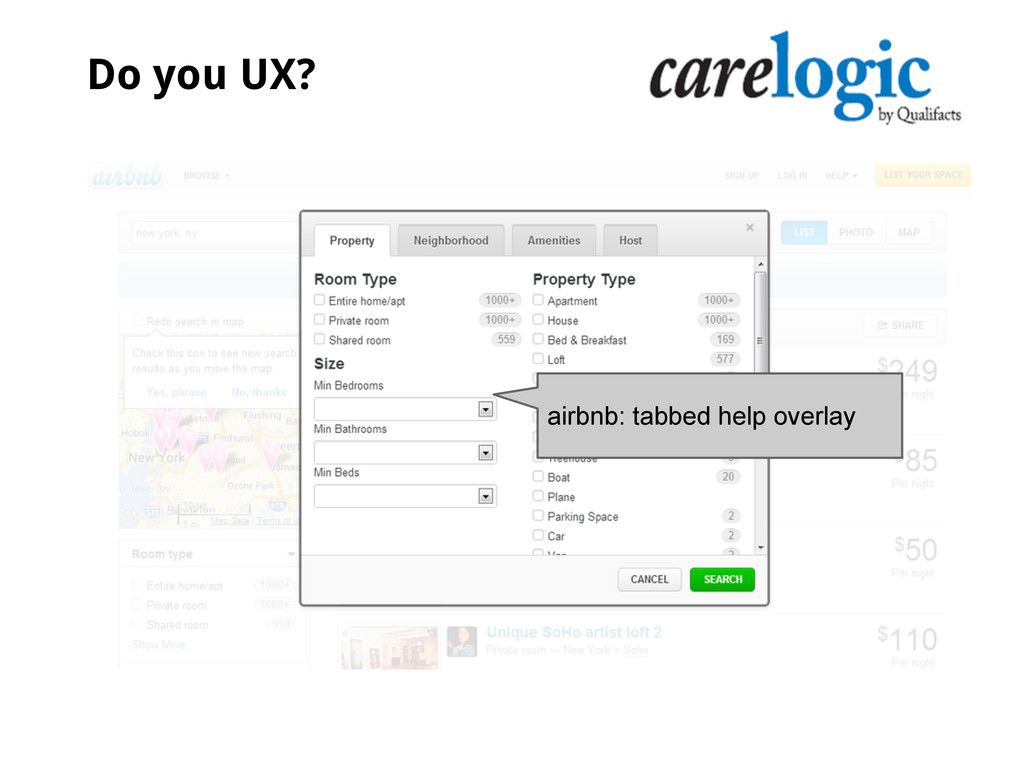
Tags can be easily added and deleted Filters are relevant, contextual, relevant, and fit on the screen without scrolling Results are clearly tied to queries
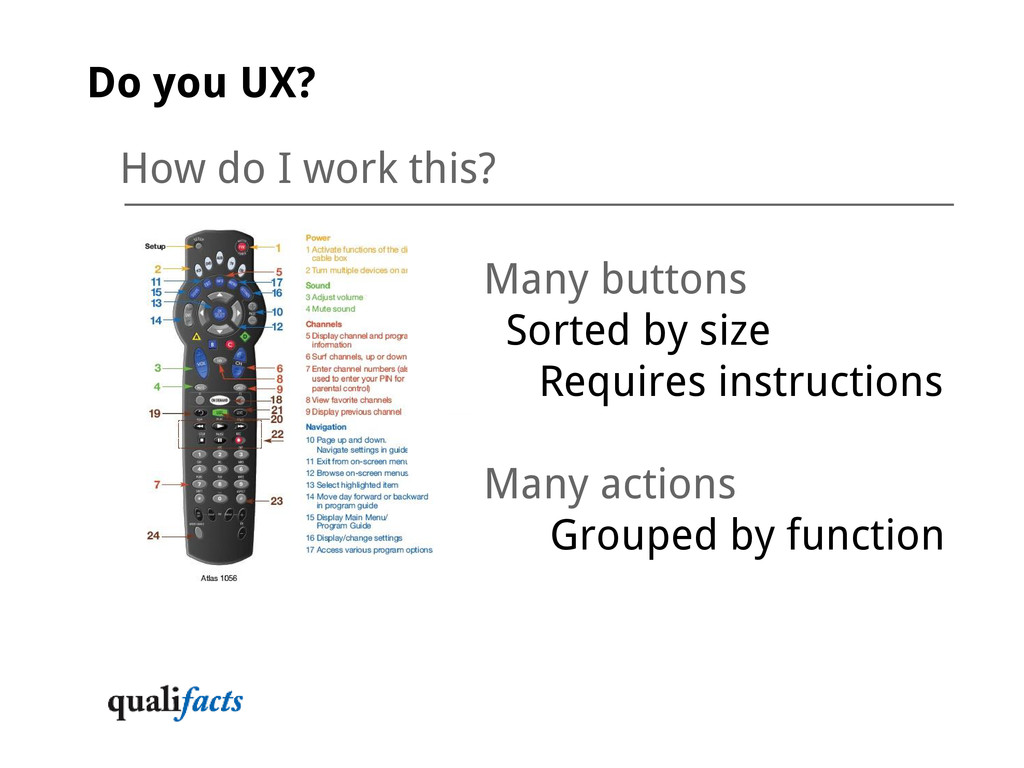
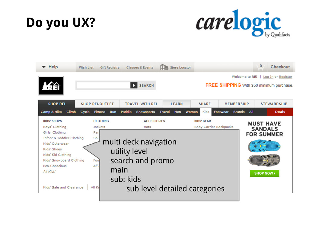
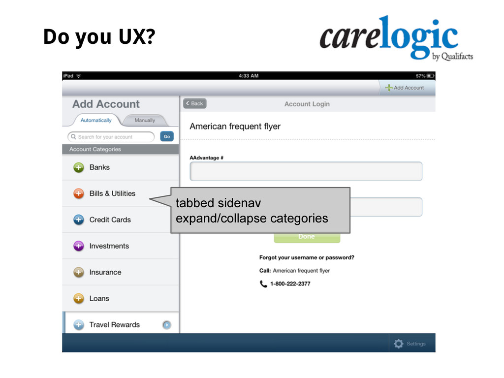
and workflows are obvious and continuous Actions are fluid and continuous No starting, stopping, hunting Users are prevented from getting lost Process and workflows proceed in order Hierarchies, categories and subcategories present information efficiently through lists, menus and selection options that shape the workflow Grouping actions and processes Main Related Do you UX?
users oriented as to actions, reactions, status and results is as simple as Who, What, When, Where, Why and How. You're doing it right if users: Always know where they are, and never feel lost Can easily get to where they want to go next, and get back to where they were, without memorizing the trail Can undo an action or redo an action until it is final: when it's about to become final, users should know that Do you UX?
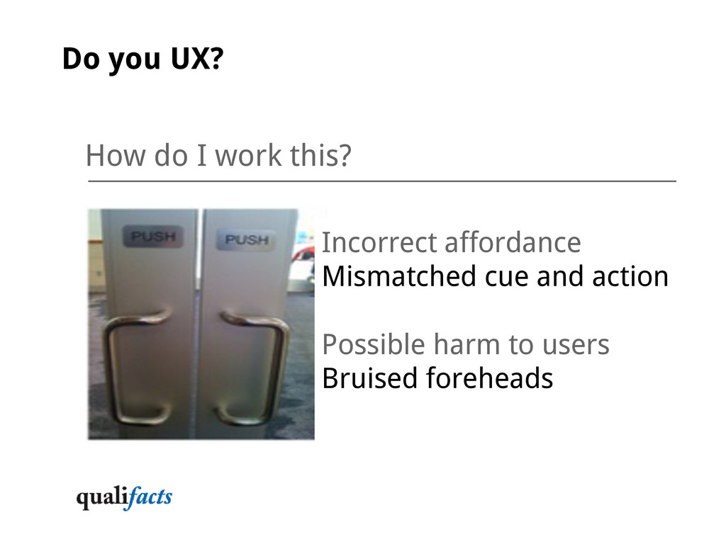
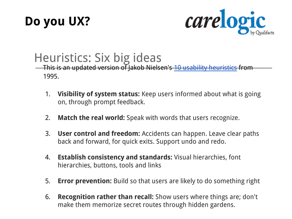
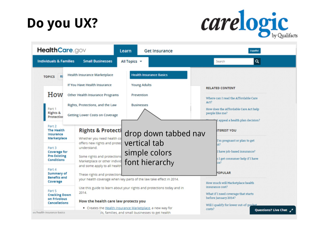
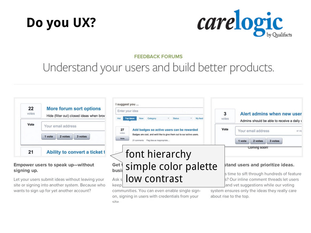
Jakob Nielsen's 10 usability heuristics from 1995. 1. Visibility of system status: Keep users informed about what is going on, through prompt feedback. 2. Match the real world: Speak with words that users recognize. 3. User control and freedom: Accidents can happen. Leave clear paths back and forward, for quick exits. Support undo and redo. 4. Establish consistency and standards: Visual hierarchies, font hierarchies, buttons, tools and links 5. Error prevention: Build so that users are likely to do something right 6. Recognition rather than recall: Show users where things are; don't make them memorize secret routes through hidden gardens. Do you UX?
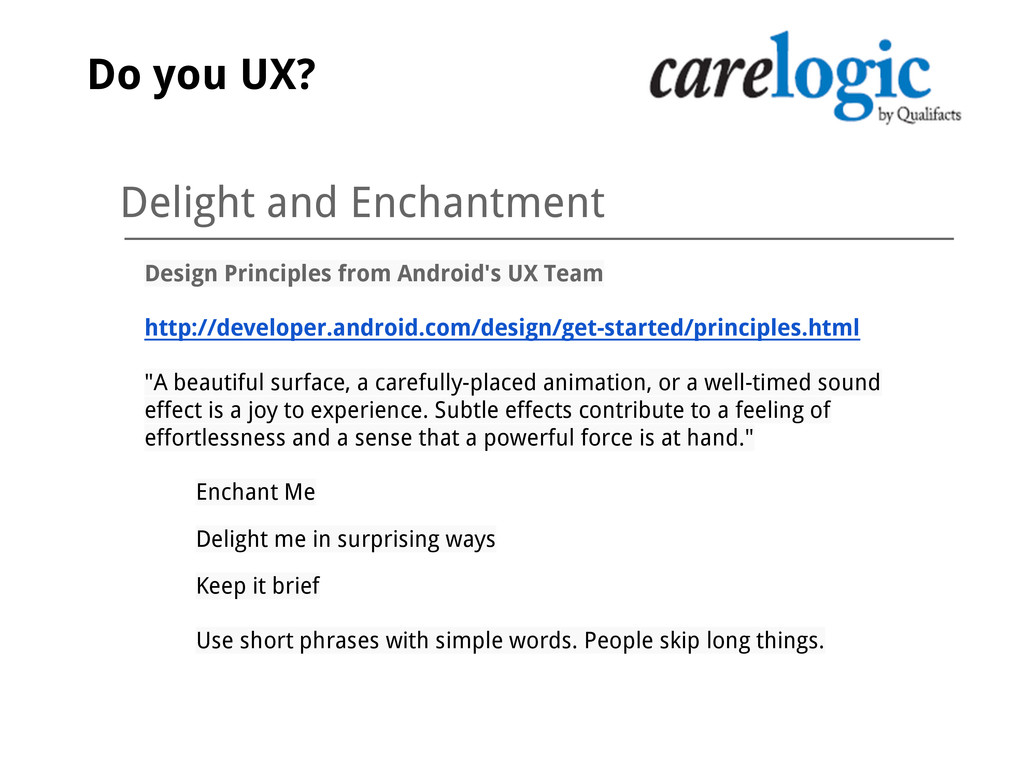
"A beautiful surface, a carefully-placed animation, or a well-timed sound effect is a joy to experience. Subtle effects contribute to a feeling of effortlessness and a sense that a powerful force is at hand." Enchant Me Delight me in surprising ways Keep it brief Use short phrases with simple words. People skip long things. Do you UX?
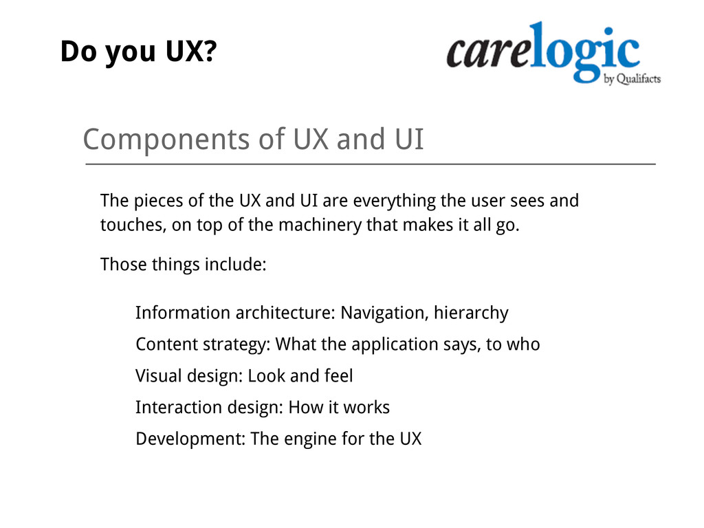
and UI are everything the user sees and touches, on top of the machinery that makes it all go. Those things include: Information architecture: Navigation, hierarchy Content strategy: What the application says, to who Visual design: Look and feel Interaction design: How it works Development: The engine for the UX Do you UX?
sorting and presentation of information when it flows in ways that customers can track it. IA that makes sense to customers has clear and consistent: Navigation categories and subcategories Naming conventions Content strategy and structure Do you UX?
the foundation for an information architecture that offers users clear, bright paths through tasks and actions. Depth and breadth are accounted for during initial discovery Categories and subcategories are named the way users would name them Information is sorted and presented with these tools, as appropriate: A to Z order Card metaphors Chronological order Filtering Sorting Summaries Do you UX?
Easy to read: Look and feel deploys type hierarchy, color, placement and prominence to guide users through workflows ◦ Easy to comprehend: Cognitive load is minimized through conservation of the user's mental energy ▪ Grids use just enough contrast: not too much, not too little ▪ Headings flow naturally to subheads ▪ Space is not too crowded: no clutter ▪ Hands and eyes are aligned: actions begin at the end of the visual path Do you UX?
interact with something? Swipe, tap, tab? Expand/collapse? Establish metaphors and actions based on depth, breadth and scenarios for how users interact with the tools. Development How the machinery works: reliable, fast, smooth and efficient. Putting users first typically takes more effort than building things the easiest way. Avoid the dev-first trap at all costs. Do you UX?
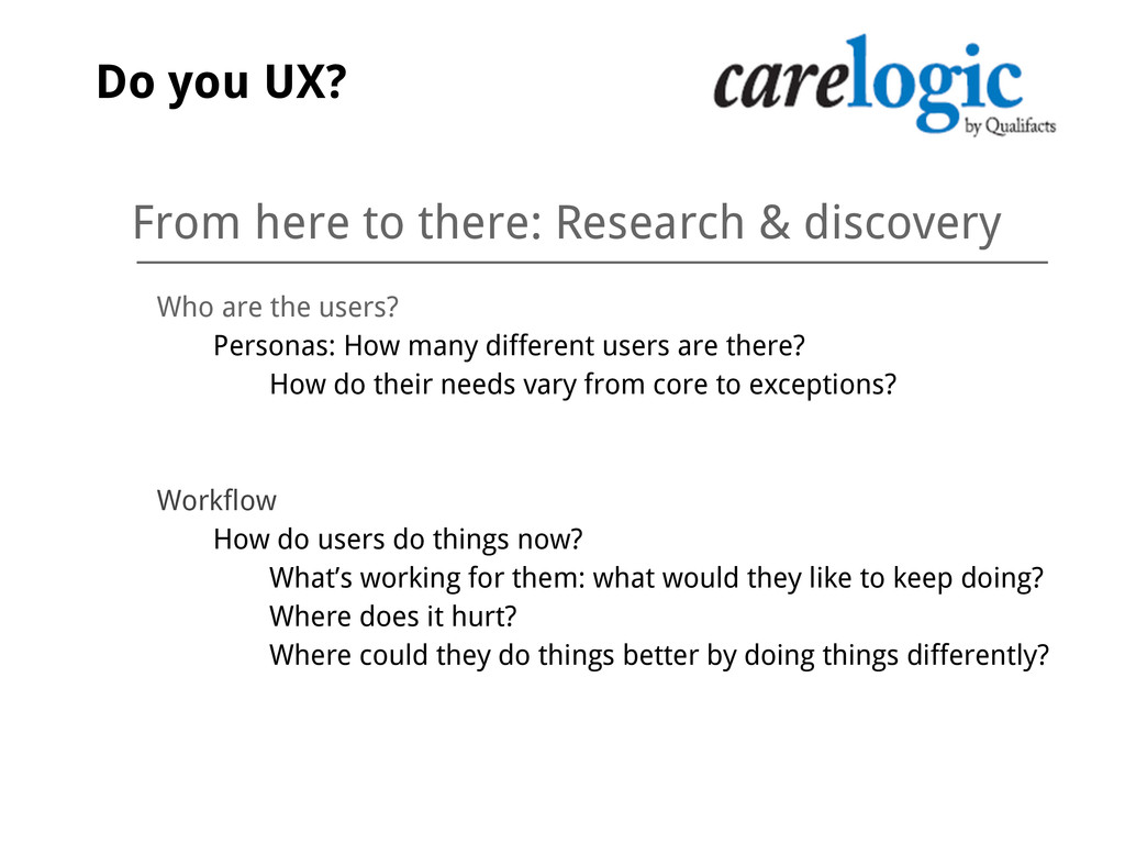
users? Personas: How many different users are there? How do their needs vary from core to exceptions? Workflow How do users do things now? What’s working for them: what would they like to keep doing? Where does it hurt? Where could they do things better by doing things differently? Do you UX?
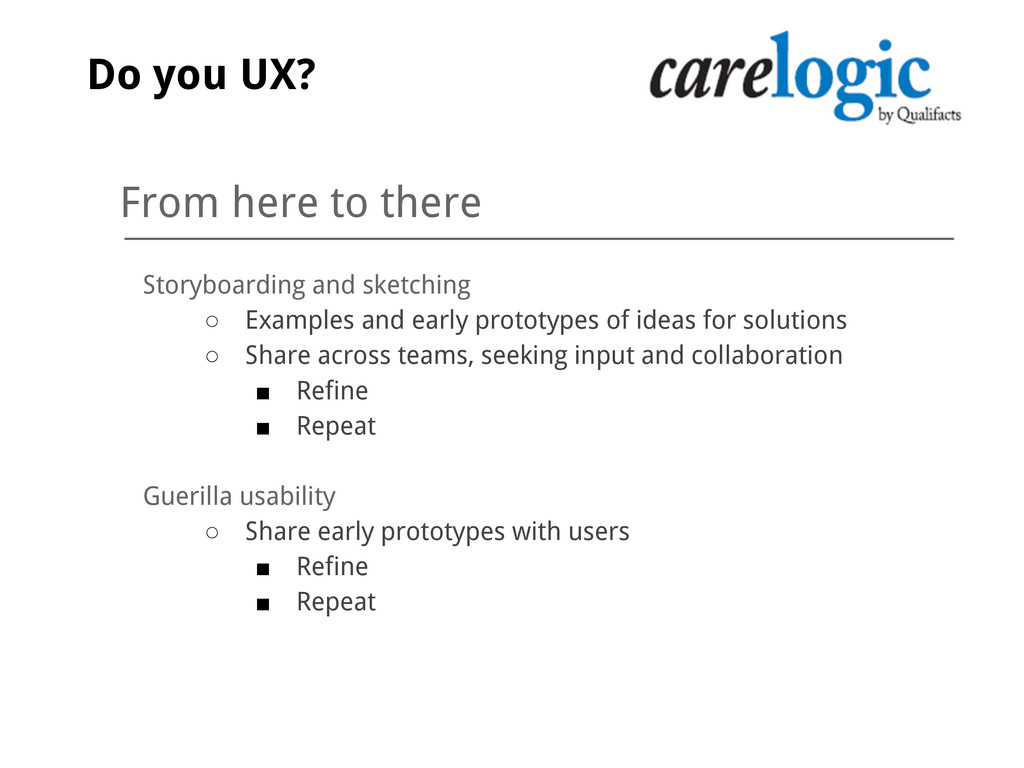
early prototypes of ideas for solutions ◦ Share across teams, seeking input and collaboration ▪ Refine ▪ Repeat Guerilla usability ◦ Share early prototypes with users ▪ Refine ▪ Repeat Do you UX?
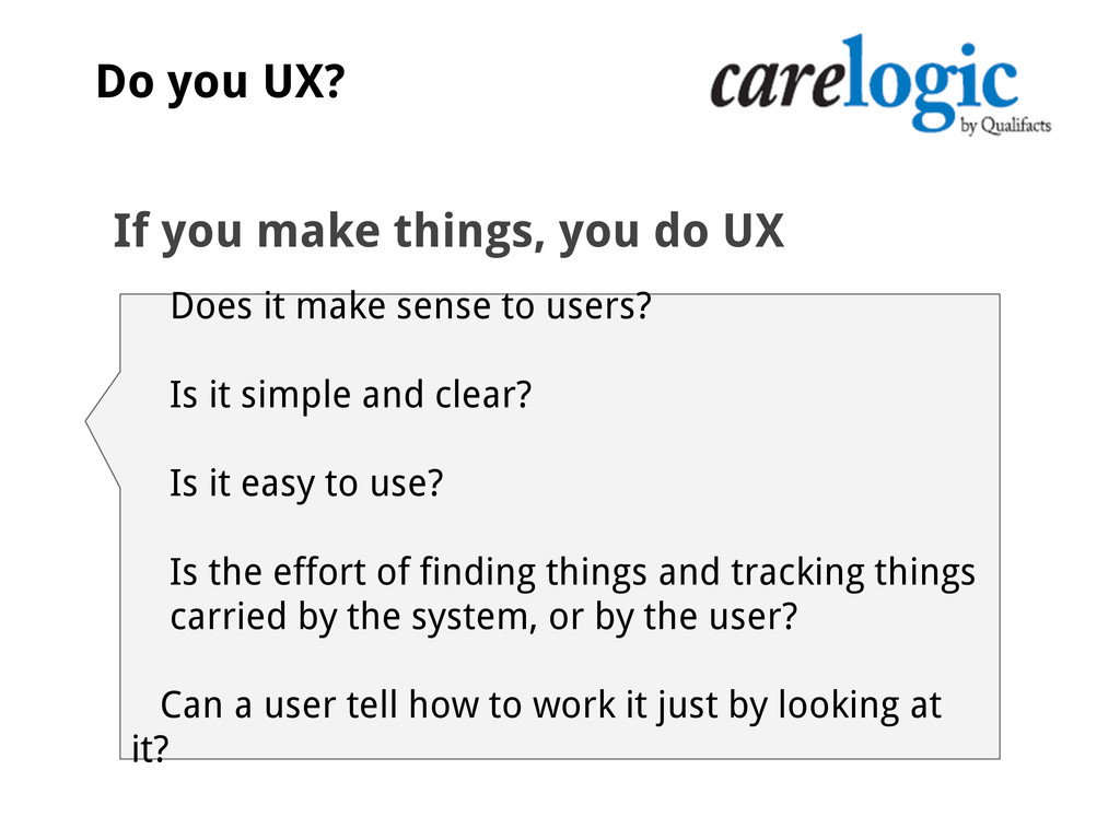
it simple and clear? Is it easy to use? Is the effort of finding things and tracking things carried by the system, or by the user? Can a user tell how to work it just by looking at it? If you make things, you do UX
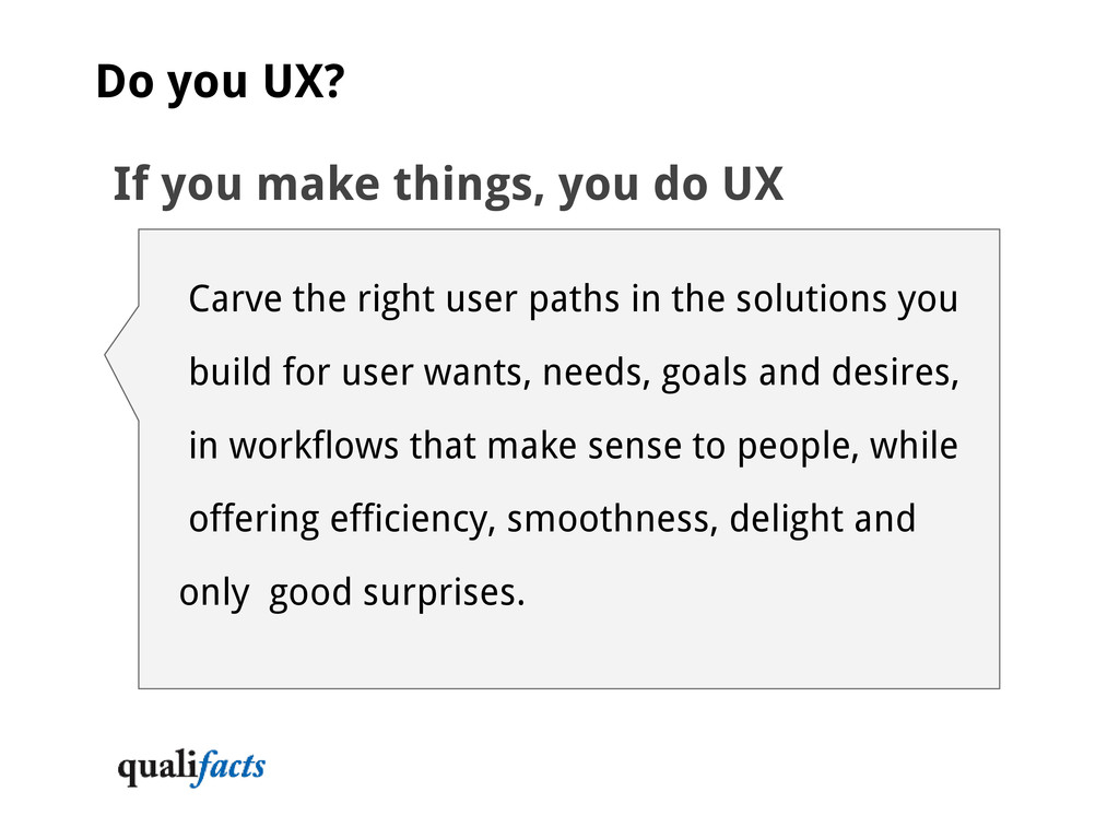
Carve the right user paths in the solutions you build for user wants, needs, goals and desires, in workflows that make sense to people, while offering efficiency, smoothness, delight and only good surprises.