Android @ Astrotalk • Core Team Member @ Google Developer Groups Chandigarh • Android Educator @ Android Educators Community India • Phd Research Scholar • Develop Mobile Applications • Technical Speaker • Happy Android Developer :)
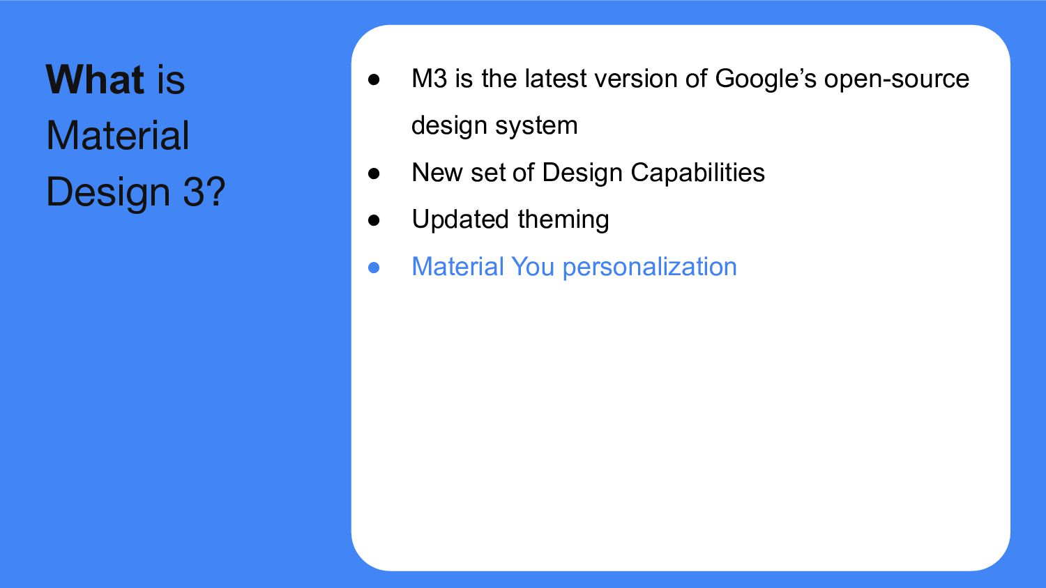
system • New set of Design Capabilities • Updated theming • Material You personalization • Updates to Android 12 visual style and system UI What is Material Design 3?
system • New set of Design Capabilities • Updated theming • Material You personalization • Updates to Android 12 visual style and system UI What is Material Design 3?
the UX. compose.compiler Transform @Composable functions and enable optimizations with a Kotlin compiler plugin. compose.foundation Write Jetpack Compose applications with ready to use building blocks. compose.material Build Jetpack Compose UIs with ready to use Material Design Components. compose.material3 Build Jetpack Compose UIs with Material Design 3 Components. compose.runtime Fundamental building blocks of Compose's programming model and state management. compose.ui Fundamental components of compose UI needed to interact with the device, including layout, drawing, and input. Stable Release-1.0.1 Latest Update-April 19, 2023 Compose Material 3
with all the roles defined for both light and dark theme colors. val md_theme_light_primary = Color(0xFF476810) val md_theme_light_onPrimary = Color(0xFFFFFFFF) val md_theme_light_primaryContainer = Color(0xFFC7F089) // .. // .. val md_theme_dark_primary = Color(0xFFACD370) val md_theme_dark_onPrimary = Color(0xFF213600) val md_theme_dark_primaryContainer = Color(0xFF324F00) // .. // ..
• This color palette is used as the starting point to generate light and dark color schemes. • Dynamic color is available on Android 12 and above. Dynamic Color Scheme
• This color palette is used as the starting point to generate light and dark color schemes. • Dynamic color is available on Android 12 and above. Dynamic Color Scheme
main components like prominent buttons, active states, and the tint of elevated surfaces. • The secondary key color is used for less prominent components in the UI, such as filter chips, and expands the opportunity for color expression. • The tertiary key color is used to derive the roles of contrasting accents that can be used to balance primary and secondary colors or bring enhanced attention to an element.
Shape scale defines style of container corners, offering a range of roundedness. • There are different sizes of shapes- Extra Small, Small, Medium, Large, Extra Large Shapes
Shape scale defines style of container corners, offering a range of roundedness. • There are different sizes of shapes- Extra Small, Small, Medium, Large, Extra Large Shapes
version(s) of your app’s theme(s) alongside M2 version(s) of your app’s theme(s). 3. Migrate individual modules, screens, or composables to M3, depending on the size and complexity of your app. Steps of Migration
version(s) of your app’s theme(s) alongside M2 version(s) of your app’s theme(s). 3. Migrate individual modules, screens, or composables to M3, depending on the size and complexity of your app. 4. Once fully migrated, remove the M2 version(s) of your app’s theme(s). Steps of Migration
version(s) of your app’s theme(s) alongside M2 version(s) of your app’s theme(s). 3. Migrate individual modules, screens, or composables to M3, depending on the size and complexity of your app. 4. Once fully migrated, remove the M2 version(s) of your app’s theme(s). 5. Remove M2 dependency. Steps of Migration
version(s) of your app’s theme(s) alongside M2 version(s) of your app’s theme(s). 3. Migrate individual modules, screens, or composables to M3, depending on the size and complexity of your app. 4. Once fully migrated, remove the M2 version(s) of your app’s theme(s). 5. Remove M2 dependency. Steps of Migration
 loveleenkaur
 sakajunquality
 shin1988
 sansantech
 chmikata
 lycorptech_jp
 shinyasaita
 ysknsid25
 kobayashiyorimitsu
 shibuiwilliam
 sugitak
 sbspsy
 mayatellez
 inesmontani
 popppiees
 axbom
axbom
 cassininazir
 malarkey
 madoxten
 rkendrick25
 addyosmani
 aki_iinuma
 chriscoyier
 notwaldorf