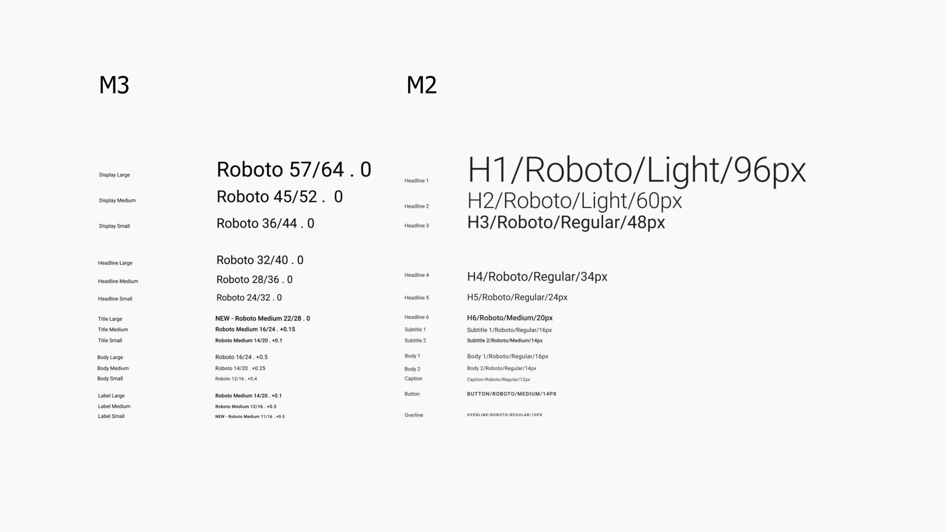
component changes it brings. • Migrating from Material Design 2. • Using Material You personalization features and Material Theme Builder. • Transition patterns and how to use them in your app. • Adding Material Motion to your app.
capabilities to adapt to users’ preferences, allowing users to customize the appearance of most things on their phones. • It also provides app support in a more personal feeling, something that wasn’t possible before. • Material Components have a lot of updates too. All these changes will be available to Android 12 users first.
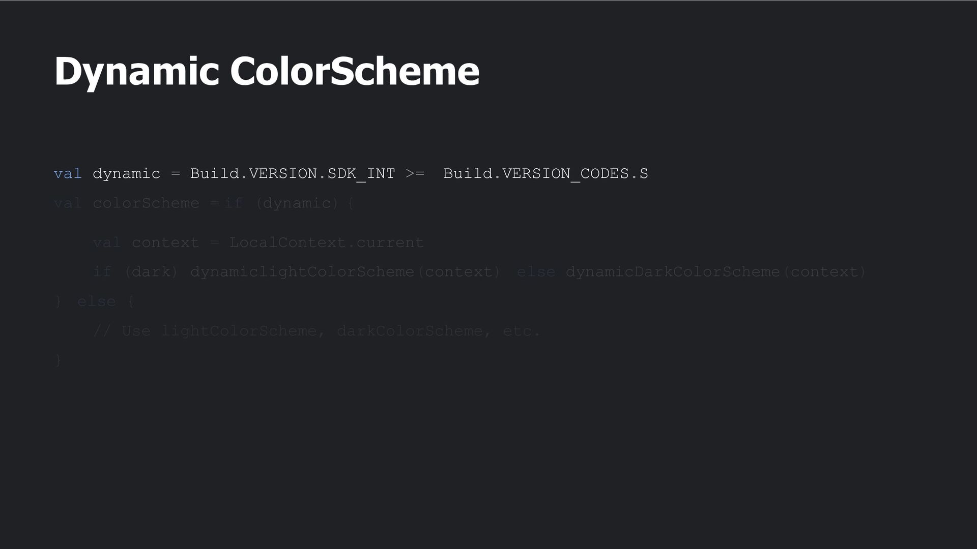
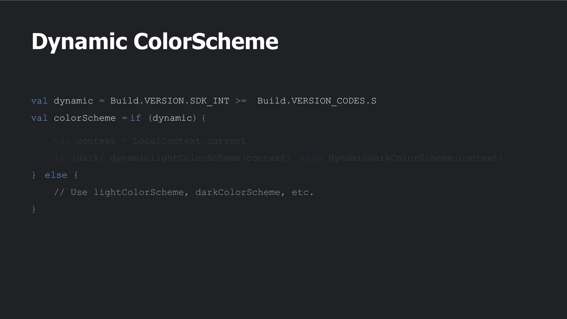
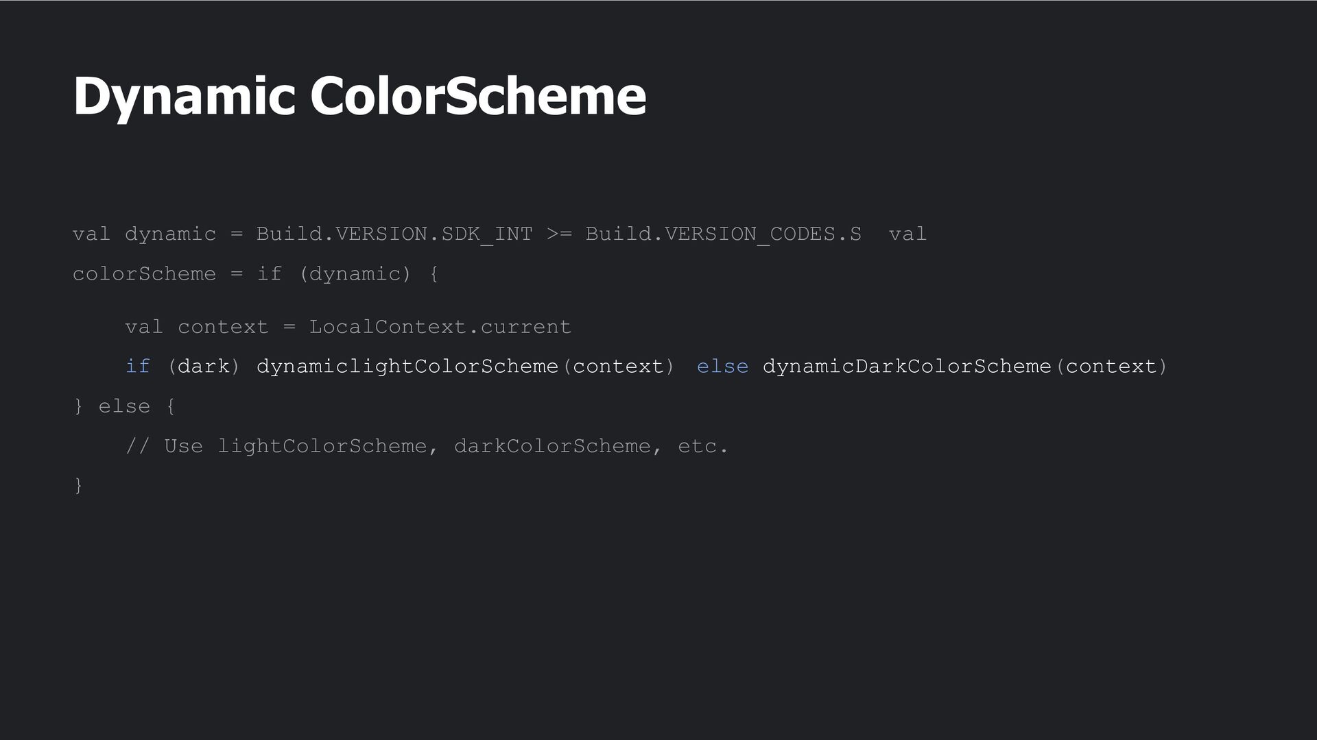
• Support for foldable devices. • Ability to customize the operating system and give it a personal feel. • Introduction of dynamic color, which enables you to personalize the colors in your apps. • Very responsive UI.
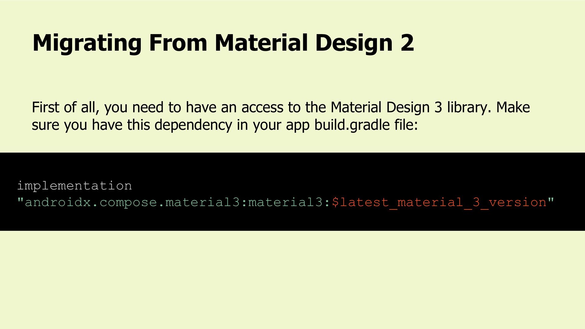
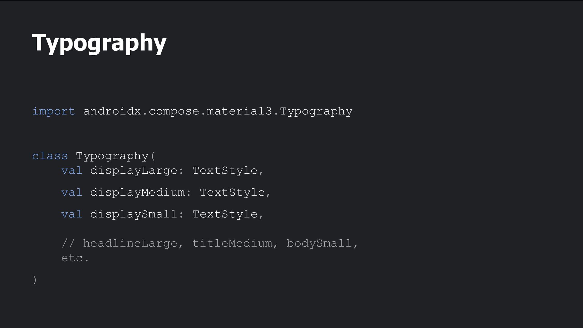
to have an access to the Material Design 3 library. Make sure you have this dependency in your app build.gradle file: implementation "androidx.compose.material3:material3:$latest_material_3_version"
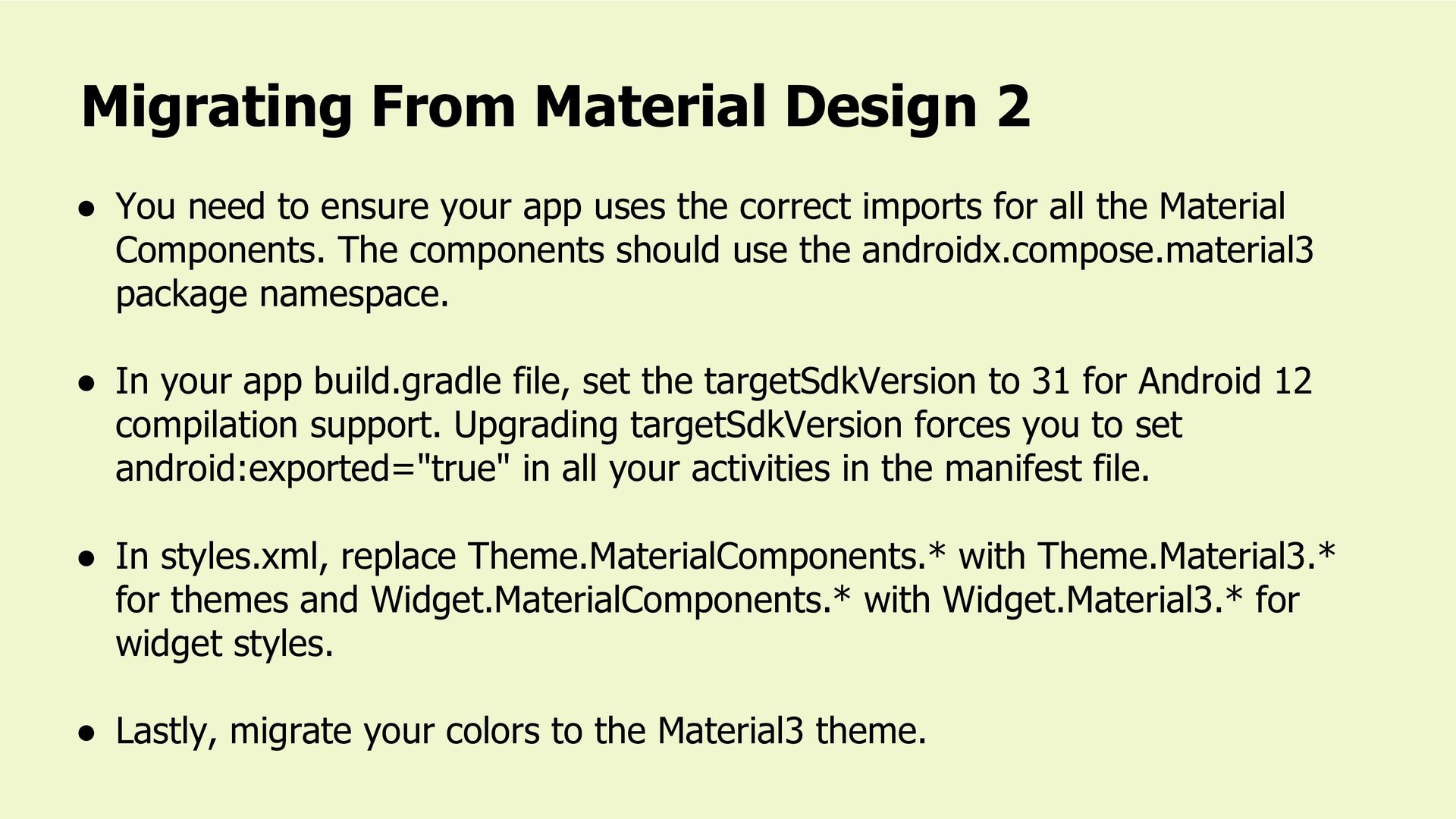
imports for all the Material Components. The components should use the androidx.compose.material3 package namespace. • In your app build.gradle file, set the targetSdkVersion to 31 for Android 12 compilation support. Upgrading targetSdkVersion forces you to set android:exported="true" in all your activities in the manifest file. • In styles.xml, replace Theme.MaterialComponents.* with Theme.Material3.* for themes and Widget.MaterialComponents.* with Widget.Material3.* for widget styles. • Lastly, migrate your colors to the Material3 theme. Migrating From Material Design 2
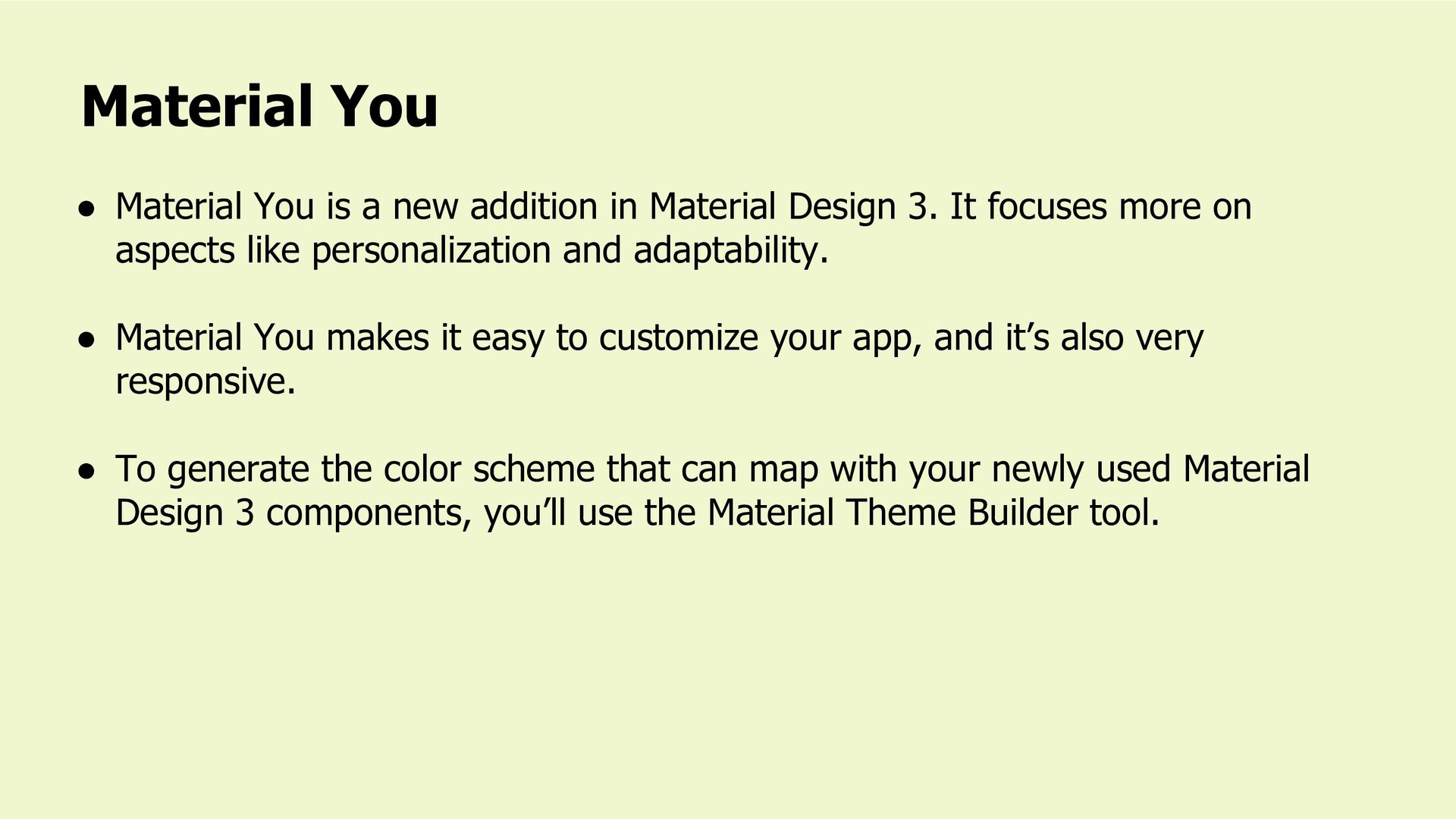
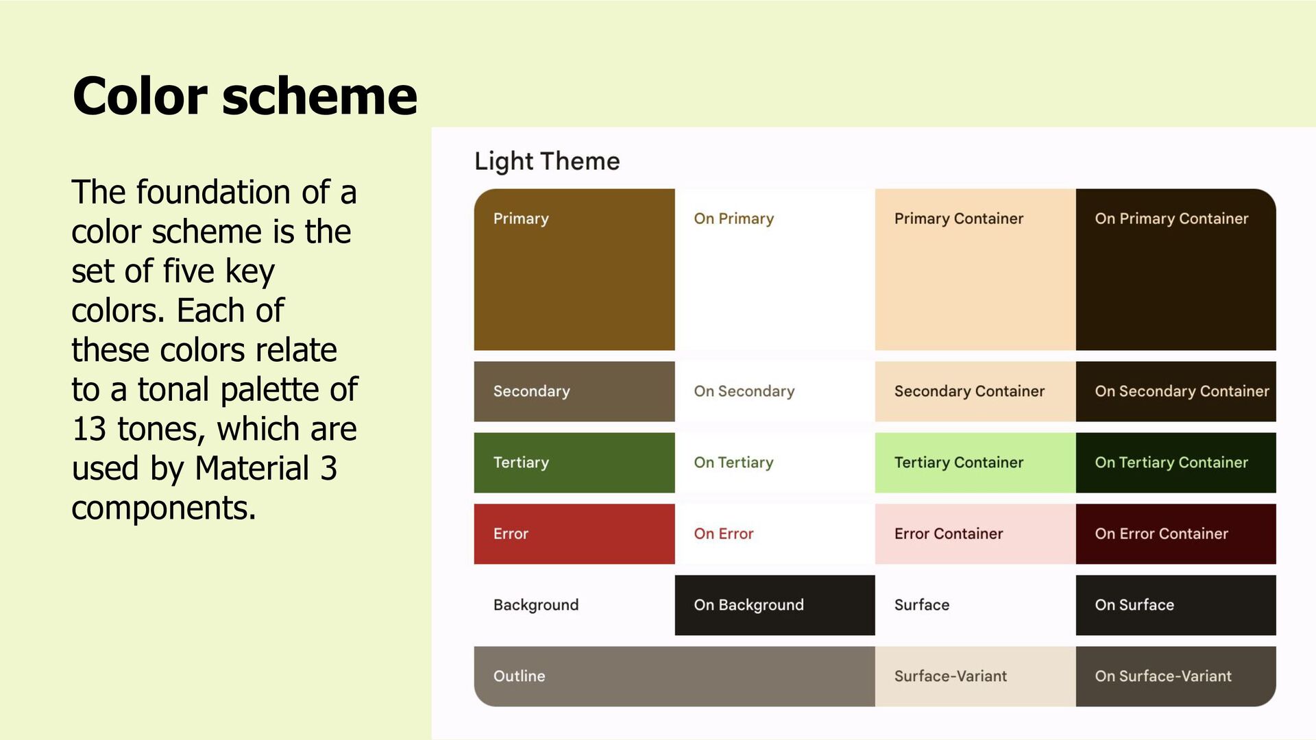
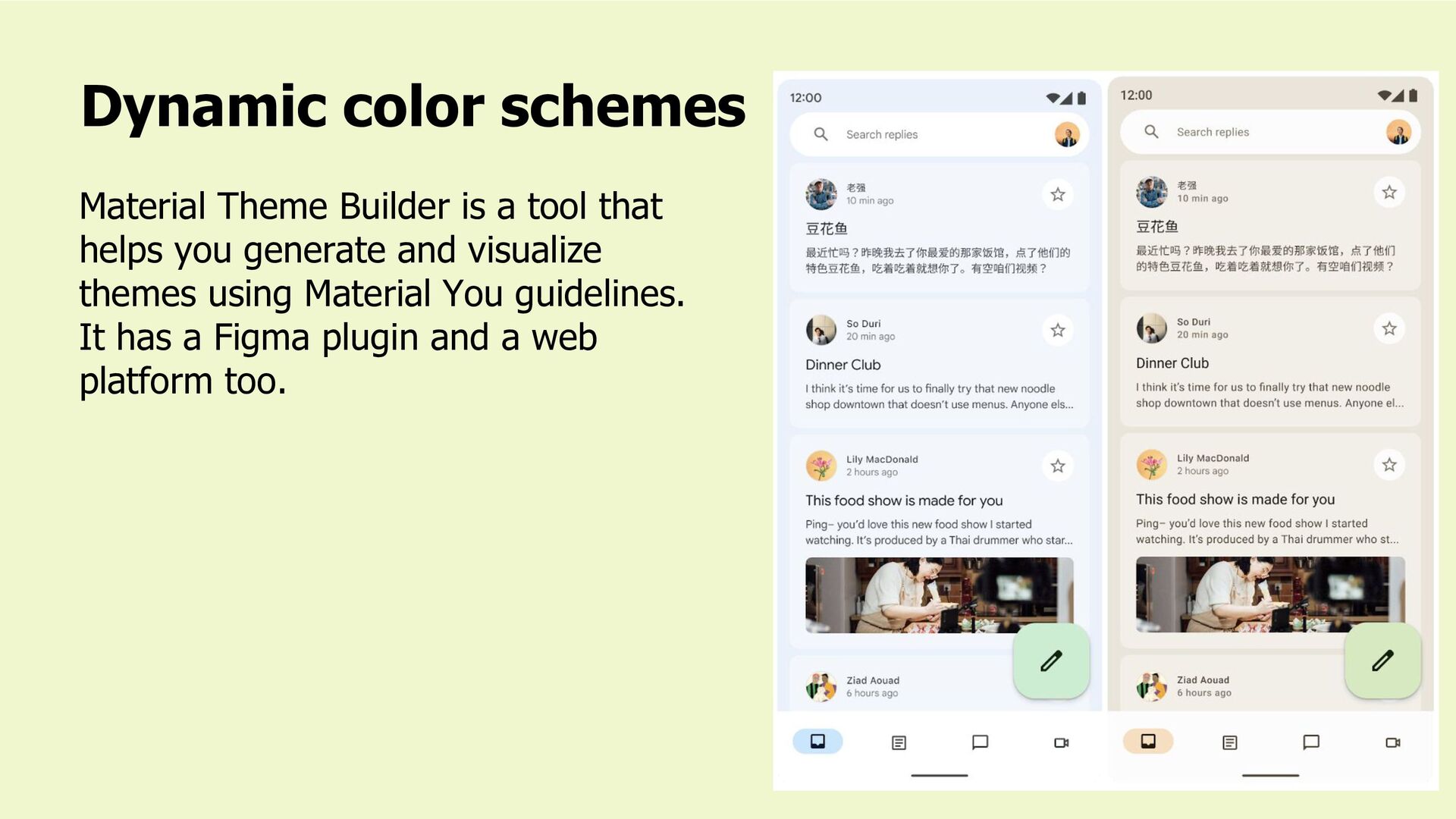
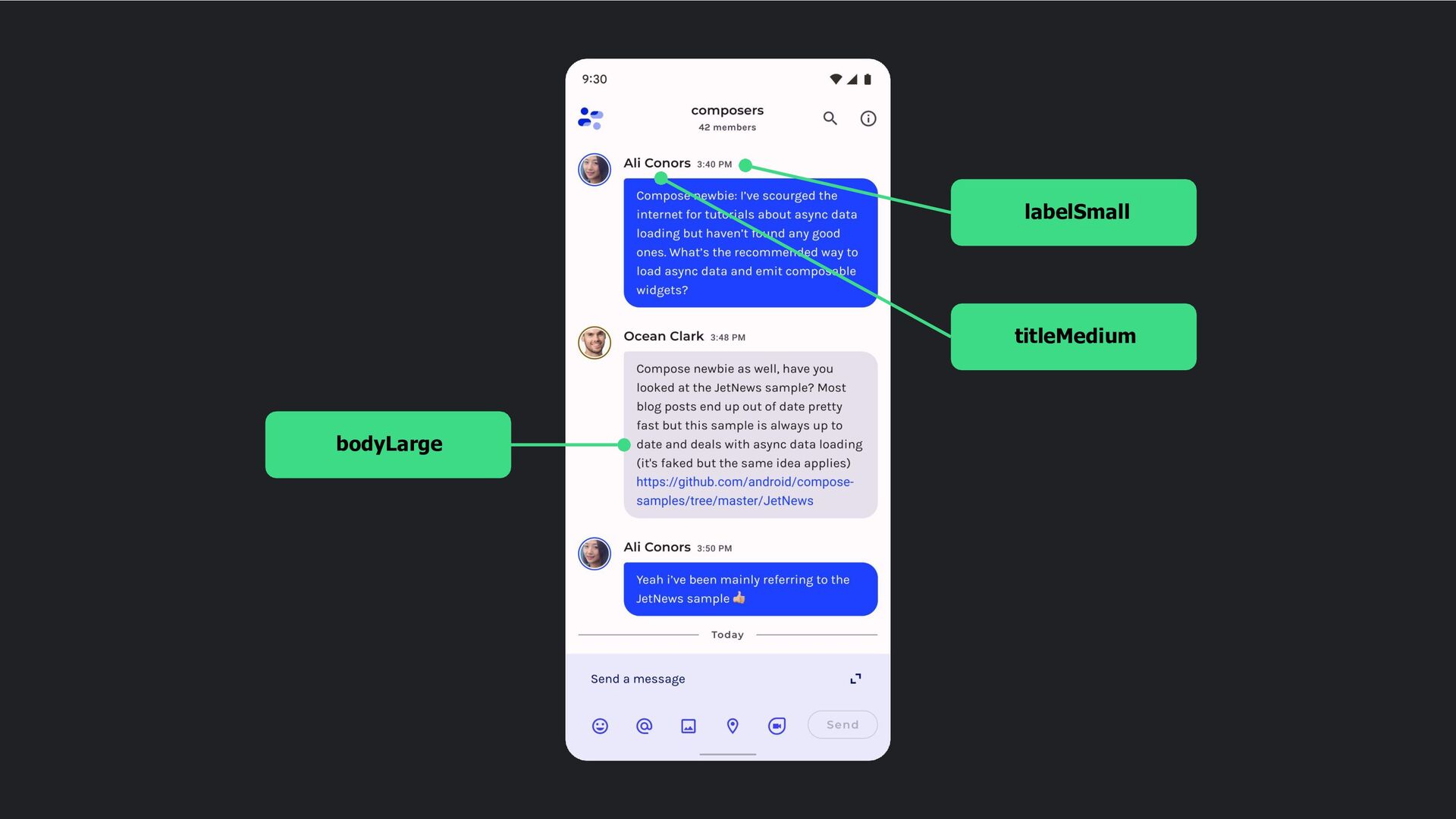
3. It focuses more on aspects like personalization and adaptability. • Material You makes it easy to customize your app, and it’s also very responsive. • To generate the color scheme that can map with your newly used Material Design 3 components, you’ll use the Material Theme Builder tool. Material You
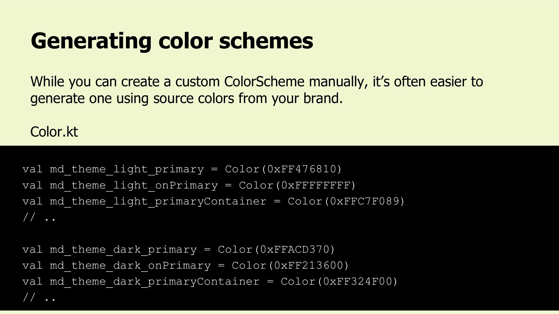
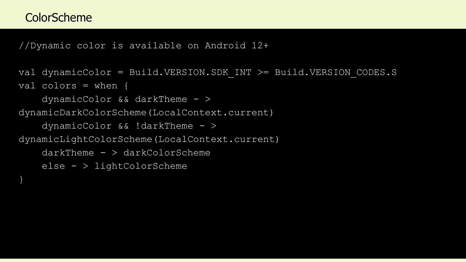
manually, it’s often easier to generate one using source colors from your brand. Color.kt val md_theme_light_primary = Color(0xFF476810) val md_theme_light_onPrimary = Color(0xFFFFFFFF) val md_theme_light_primaryContainer = Color(0xFFC7F089) // .. val md_theme_dark_primary = Color(0xFFACD370) val md_theme_dark_onPrimary = Color(0xFF213600) val md_theme_dark_primaryContainer = Color(0xFF324F00) // ..
 loveleenkaur
 fossamagna
 oracle4engineer
 kekke_n
 jnishime_dresscode
 rakus_dev
 prgckwb
 sugitak
 yanzm
yanzm
 k_adachi_01
 muziyoshiz
 sue445
 bto
bto
 sstephenson
 mlcsv
mlcsv
 rkendrick25
 cassininazir
 bkeepers
 chrislema
 addyosmani
 swwweet
 holman
 denniskardys
 mfonobong