Upgrade to Pro — share decks privately, control downloads, hide ads and more …

Teaching computing via visualization

Teaching computing via visualization

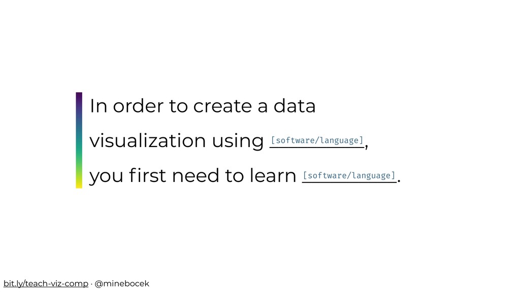
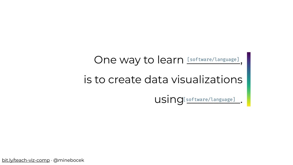
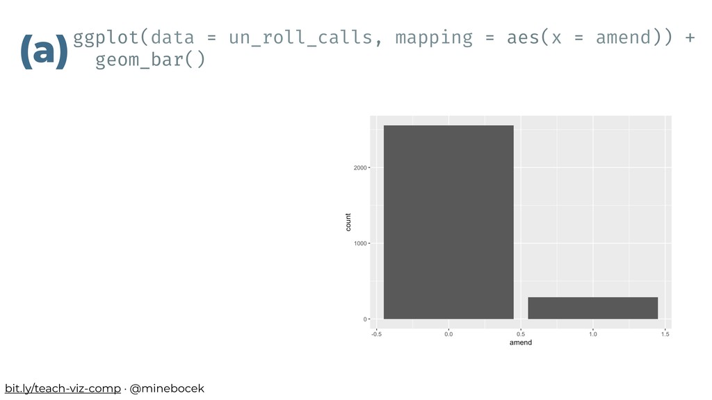
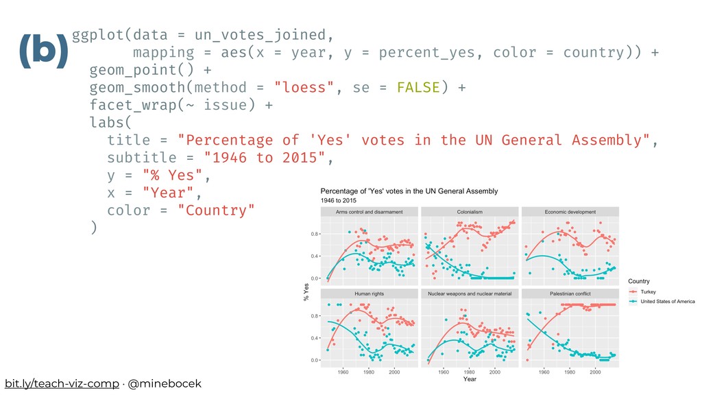
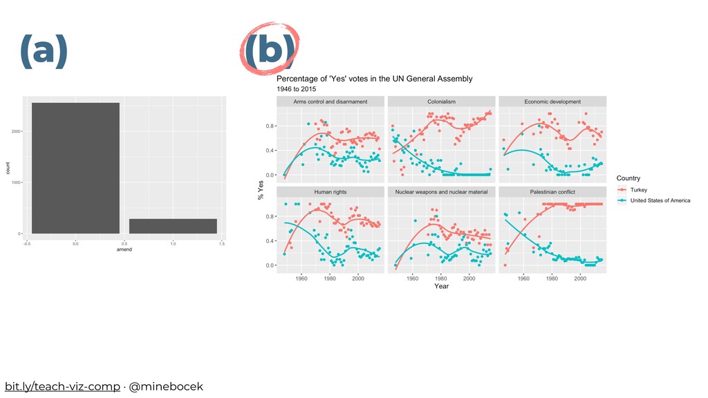
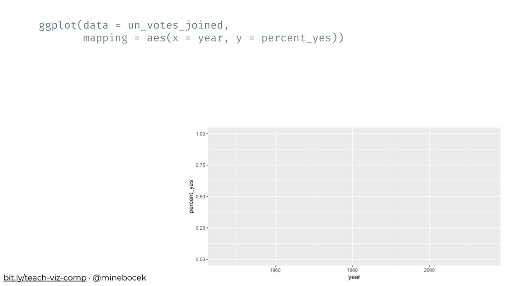
The following is not a particularly controversial statement: "In order to create a data visualization using [software/language], you first need to learn that [software/language]." But if one of the more exciting things you can do with [software/language] is data visualization, why not start learning [software/language] by learning to build data visualizations? In this talk we present a data-centric approach to teaching and learning R through creating data visualizations, as opposed to starting with fundamentals of R as a programming language. The talk will feature examples of in class activities, details of a curriculum that introduces students to data science through data visualization, and sample student work.

Mine Cetinkaya-Rundel

September 28, 2018
Tweet

More Decks by Mine Cetinkaya-Rundel

Other Decks in Education

Transcript

  1. In order to create a data visualization using __________, you

    first need to learn __________. [software/language] [software/language] bit.ly/teach-viz-comp · @minebocek
  2. One way to learn __________, is to create data visualizations

    using __________. [software/language] [software/language] bit.ly/teach-viz-comp · @minebocek
  3. In which of the following two scenarios do you feel

    like you have a better handle on the final product? Q bit.ly/teach-viz-comp · @minebocek
  4. Which of the following two examples is more likely to

    be interesting for a wide range of students? Q bit.ly/teach-viz-comp · @minebocek
  5. # Declare variables # of different types x !<- 8

    y !<- "monkey" z !<- FALSE # Check class of x class(x) #> [1] "numeric" # Check class of y class(y) #> [1] "character" # Check class of z class(z) #> [1] "logical" Declare the following variables Then, determine the class of each variable (a) bit.ly/teach-viz-comp · @minebocek
  6. (b) Open today’s example project Knit the document and discuss

    the results with your neighbor Then, change Turkey to a different country, and plot again bit.ly/teach-viz-comp · @minebocek
  7. # Declare variables # of different types x !<- 8

    y !<- "monkey" z !<- FALSE # Check class of x class(x) #> [1] "numeric" # Check class of y class(y) #> [1] "character" # Check class of z class(z) #> [1] "logical" (a) (b) bit.ly/teach-viz-comp · @minebocek
  8. but let’s focus on the task at hand… Open today’s

    example project Knit the document and discuss the results with your neighbor Then, change Turkey to a different country, and plot again bit.ly/teach-viz-comp · @minebocek
  9. bit.ly/teach-viz-comp · @minebocek un_votes %>% filter(country %in% c("United States of

    America", "Turkey")) %>% inner_join(un_roll_calls, by = "rcid") %>% inner_join(un_roll_call_issues, by = "rcid") %>% group_by(country, year = year(date), issue) %>% summarize( votes = n(), percent_yes = mean(vote !== "yes") ) %>% filter(votes > 5) %>% # only use records where there are more than 5 votes ggplot(mapping = aes(x = year, y = percent_yes, color = country)) + geom_point() + geom_smooth(method = "loess", se = FALSE) + facet_wrap(~ issue) + labs( title = "Percentage of 'Yes' votes in the UN General Assembly", subtitle = "1946 to 2015", y = "% Yes", x = "Year", color = "Country" )
  10. bit.ly/teach-viz-comp · @minebocek un_votes %>% filter(country %in% c("United States of

    America", "Turkey")) %>% inner_join(un_roll_calls, by = "rcid") %>% inner_join(un_roll_call_issues, by = "rcid") %>% group_by(country, year = year(date), issue) %>% summarize( votes = n(), percent_yes = mean(vote !== "yes") ) %>% filter(votes > 5) %>% # only use records where there are more than 5 votes ggplot(mapping = aes(x = year, y = percent_yes, color = country)) + geom_point() + geom_smooth(method = "loess", se = FALSE) + facet_wrap(~ issue) + labs( title = "Percentage of 'Yes' votes in the UN General Assembly", subtitle = "1946 to 2015", y = "% Yes", x = "Year", color = "Country" )
  11. Source: datasciencebox.org/hello/topics Making rigorous conclusions Looking forward Fundamentals of data

    & data viz, revision exercises, confounding variables and Simpson’s paradox Rmd + Git + GitHub Tidy data, data frames vs. summary tables, recoding and transforming variables, web scraping and iteration Building and selecting models, visualizing interactions, prediction and model validity, inference via simulation & discussion of CLT Interactive visualization and reporting, Bayesian inference, text analysis, … Exploring data Visualize Wrangle bit.ly/teach-viz-comp · @minebocek
  12. Which of the following two visualizations is more likely to

    be motivating for a wide range of students? Q bit.ly/teach-viz-comp · @minebocek
  13. ggplot(data = un_votes_joined, mapping = aes(x = year, y =

    percent_yes, color = country)) + geom_point() + geom_smooth(method = "loess", se = FALSE) + facet_wrap(~ issue) + labs( title = "Percentage of 'Yes' votes in the UN General Assembly", subtitle = "1946 to 2015", y = "% Yes", x = "Year", color = "Country" ) (b) bit.ly/teach-viz-comp · @minebocek
  14. ggplot(data = un_votes_joined, mapping = aes(x = year, y =

    percent_yes)) bit.ly/teach-viz-comp · @minebocek
  15. ggplot(data = un_votes_joined, mapping = aes(x = year, y =

    percent_yes)) bit.ly/teach-viz-comp · @minebocek function( arguments ) often a verb what to apply that Verb to
  16. ggplot(data = un_votes_joined, mapping = aes(x = year, y =

    percent_yes)) bit.ly/teach-viz-comp · @minebocek rows = observations columns = variables “tidy” data frame
  17. ggplot(data = un_votes_joined, mapping = aes(x = year, y =

    percent_yes)) + geom_point() bit.ly/teach-viz-comp · @minebocek
  18. ggplot(data = un_votes_joined, mapping = aes(x = year, y =

    percent_yes, color = country)) + geom_point() bit.ly/teach-viz-comp · @minebocek
  19. ggplot(data = un_votes_joined, mapping = aes(x = year, y =

    percent_yes, color = country)) + geom_point() + geom_smooth(method = "loess", se = FALSE) bit.ly/teach-viz-comp · @minebocek
  20. ggplot(data = un_votes_joined, mapping = aes(x = year, y =

    percent_yes, color = country)) + geom_point() + geom_smooth(method = "loess", se = FALSE) + facet_wrap(~ issue) bit.ly/teach-viz-comp · @minebocek
  21. ggplot(data = un_votes_joined, mapping = aes(x = year, y =

    percent_yes, color = country)) + geom_point() + geom_smooth(method = "loess", se = FALSE) + facet_wrap(~ issue) + labs( title = "Percentage of 'Yes' votes in the UN General Assembly", subtitle = "1946 to 2015", y = "% Yes", x = "Year", color = "Country" ) bit.ly/teach-viz-comp · @minebocek
  22. Which of the following two tasks is more likely to

    be welcoming for a wide range of students? Q bit.ly/teach-viz-comp · @minebocek
  23. (a) Install R Install RStudio Install the following packages: tidyverse

    rmarkdown … Load these packages Install git (b) Go to vm- manage.oit.duke.edu or rstudio.cloud (or some other server based solution) Log in with your ID & pass > hello R! bit.ly/teach-viz-comp · @minebocek
  24. Let them eat cake (first)! You can tell them all

    about the ingredients later… mine-cetinkaya-rundel [email protected] @minebocek bit.ly/teach-viz-comp