Upgrade to Pro — share decks privately, control downloads, hide ads and more …

Introduction to Stanford's Responsive Drupal Themes: Open Framework and Stanford Framework

Introduction to Stanford's Responsive Drupal Themes: Open Framework and Stanford Framework

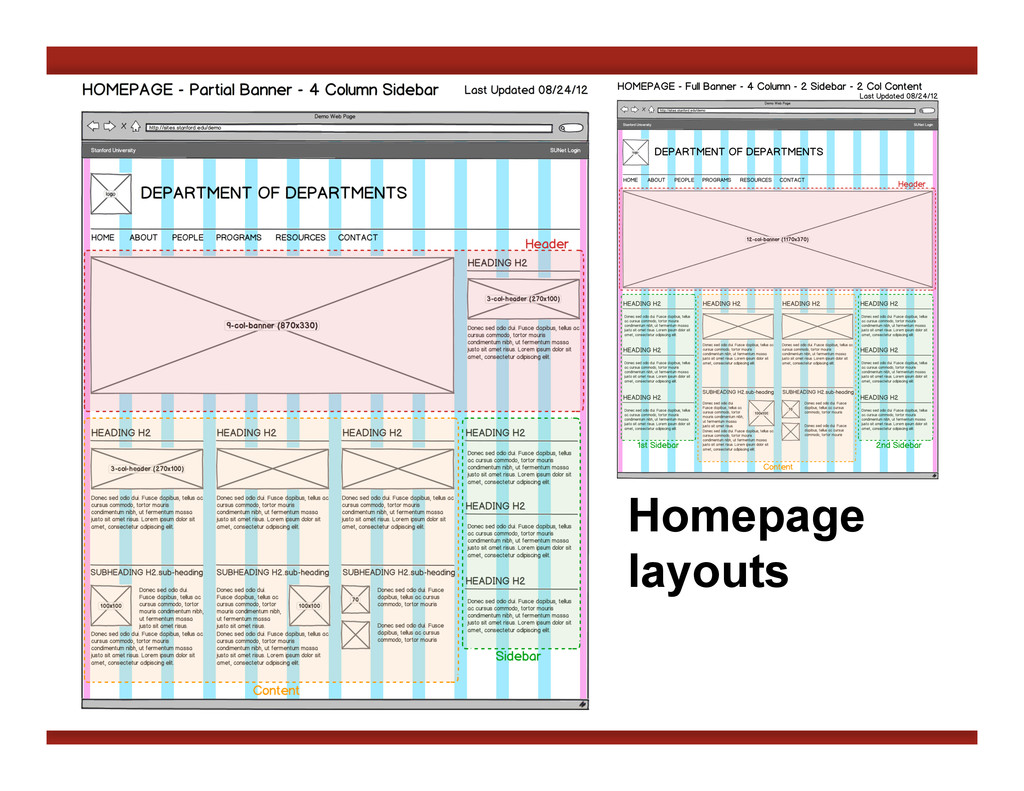
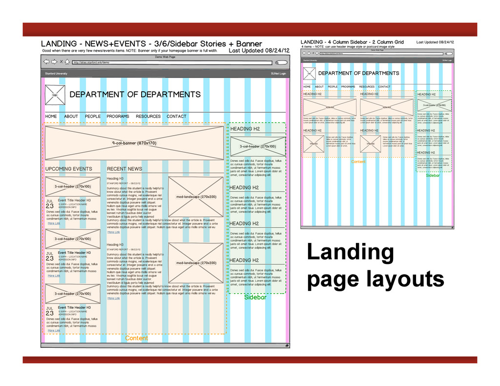
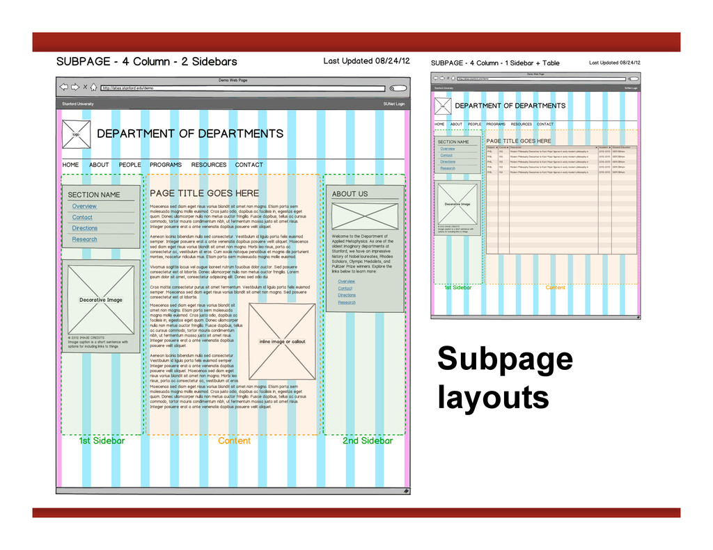
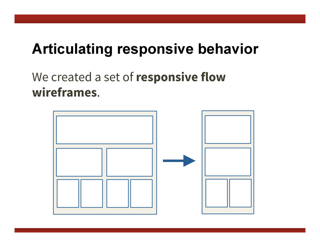
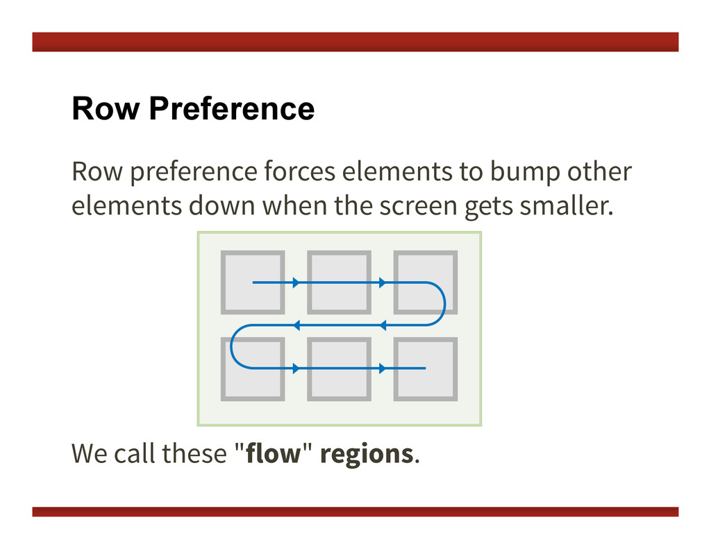
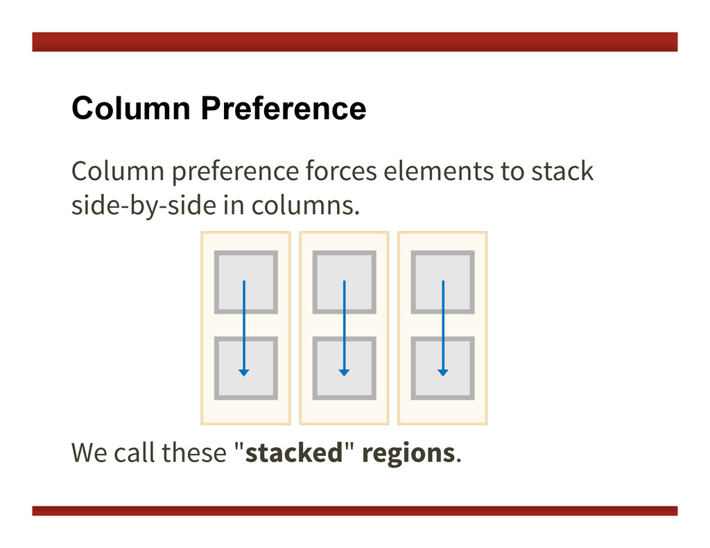
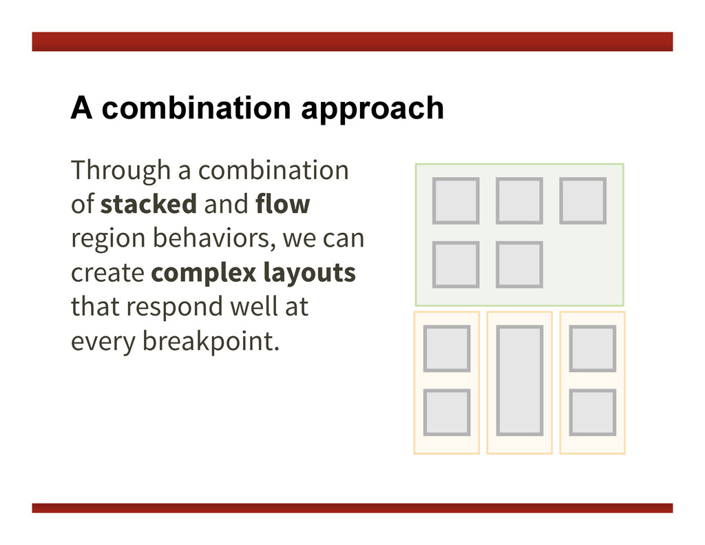
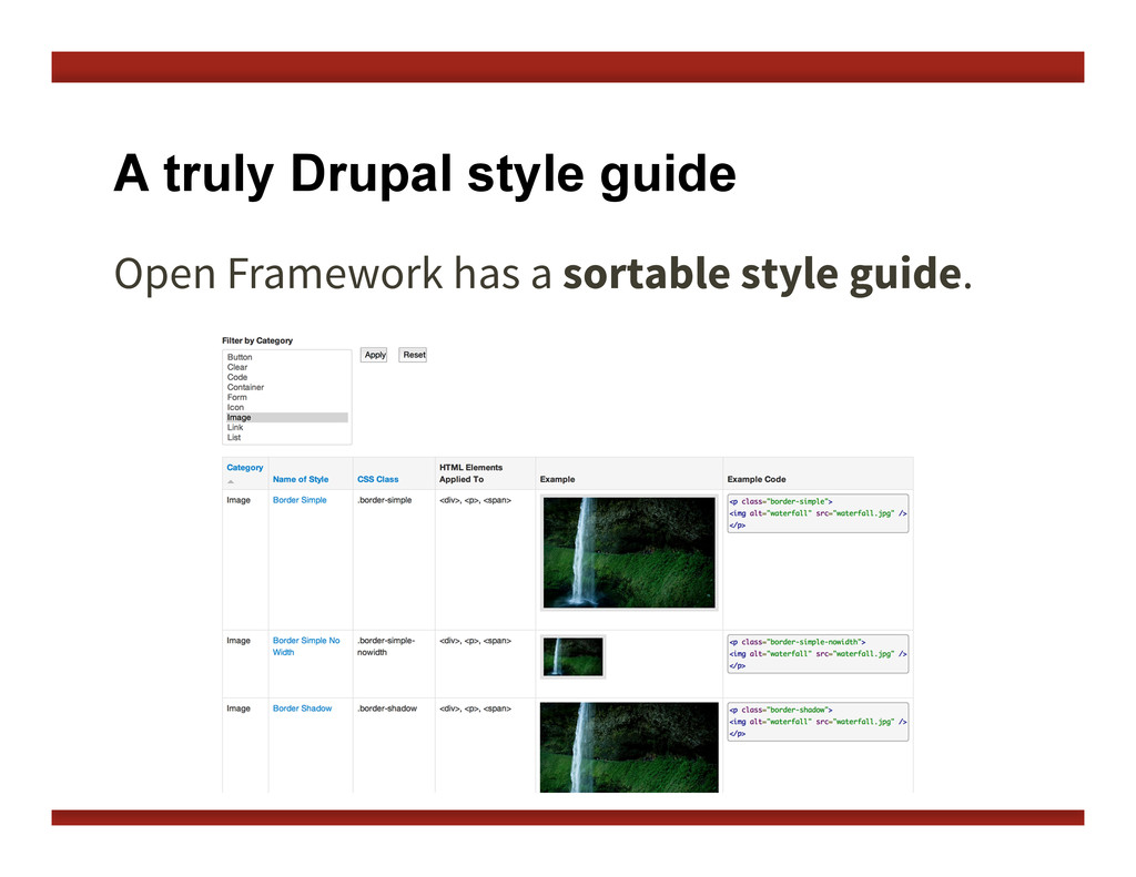
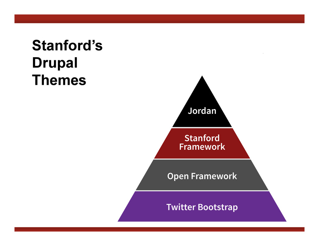
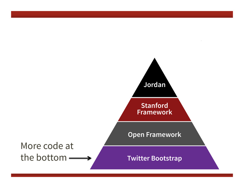
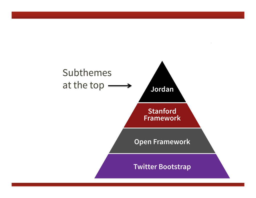
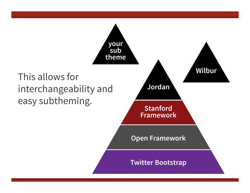
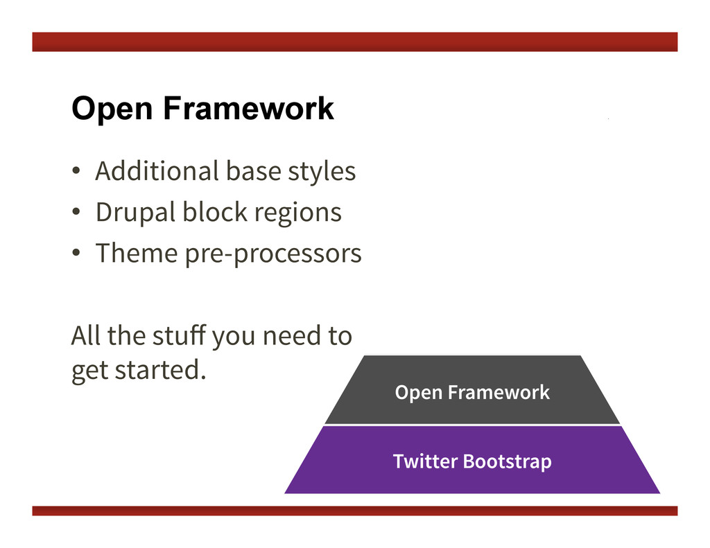
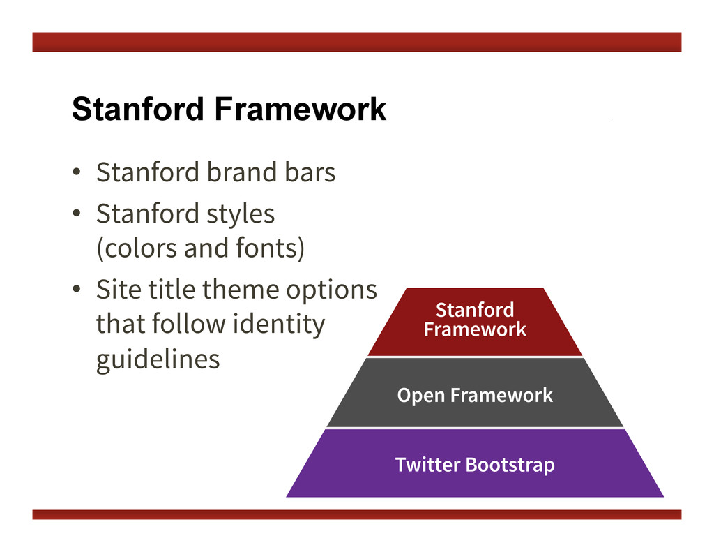
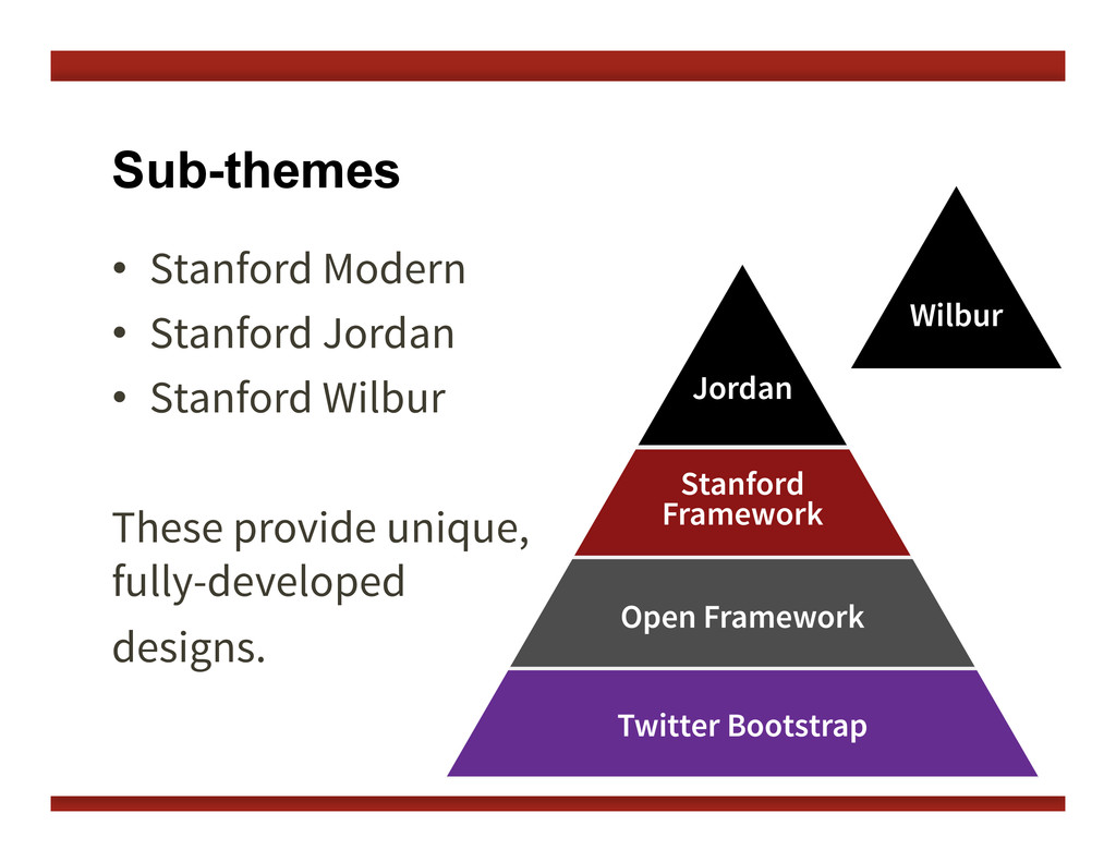
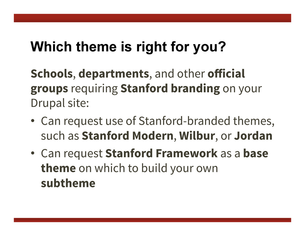
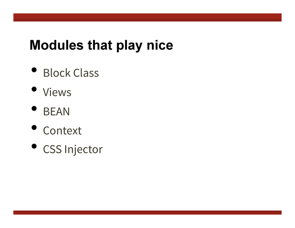
In this presentation we introduce Stanford's responsive, Drupal 7 themes: Open Framework, Stanford Framework, and its subthemes. We will introduce responsive web design, discuss which themes are best for what use (e.g. department vs. personal), and share our development process and what went in to planning the responsive behaviors for these themes.

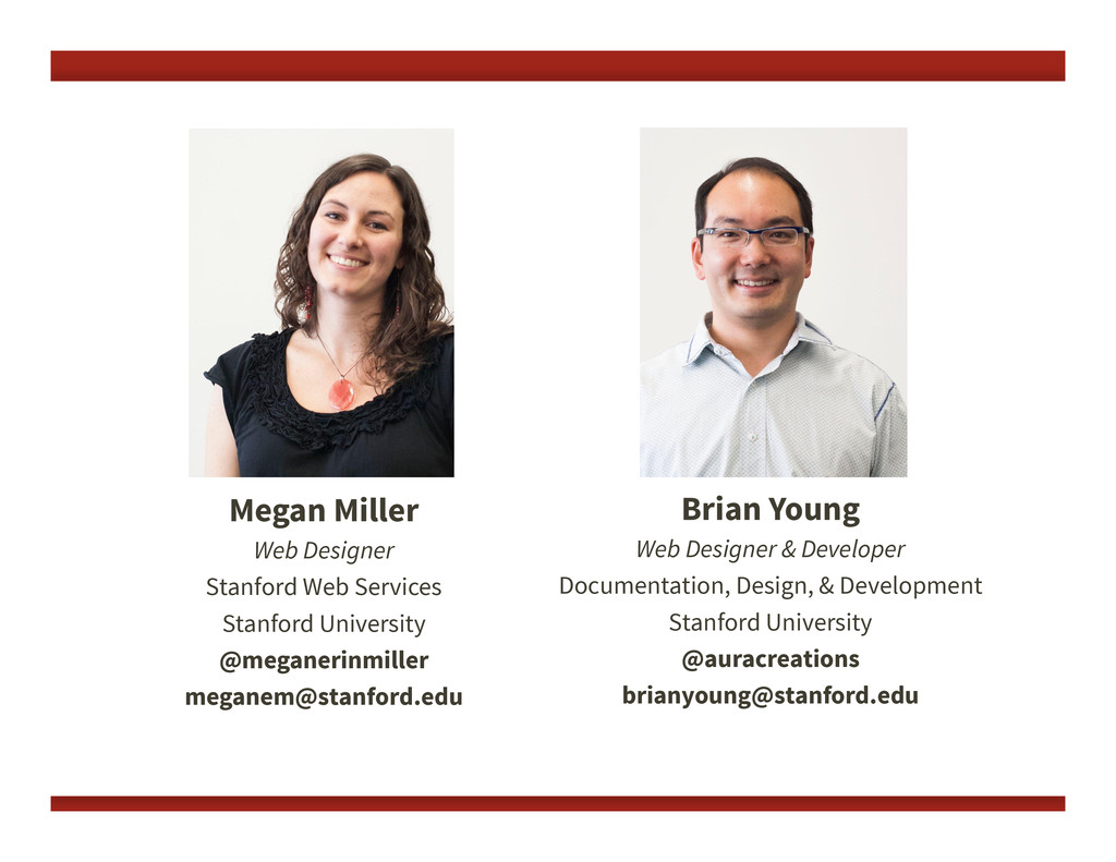
Presented at Stanford Drupal Camp on April 6, 2013 by Megan Miller and Brian Young.

Watch the video of this presentation online at http://www.youtube.com/watch?v=W2sMlXu-fQ4&feature=youtu.be

Morgan Miller

April 06, 2013
Tweet

More Decks by Morgan Miller

Other Decks in Design

Transcript

  1. Introduction to Stanford's Responsive Drupal Themes: Megan Miller & Brian

    Young, Stanford IT Services Stanford Drupal Camp — April 6, 2013 Open Framework and Stanford Framework
  2. Brian Young Web Designer & Developer Documentation, Design, & Development

    Stanford University @auracreations [email protected] Megan Miller Web Designer Stanford Web Services Stanford University @meganerinmiller [email protected]
  3. Drupal at Stanford There are several ways to have a

    Drupal website at Stanford. •  AFS http://afs.stanford.edu •  Collaboration Tools Installer http://tools.stanford.edu •  Stanford Sites http://sites.stanford.edu
  4. Centralized Tools and Resources •  Technical training •  Self-help web

    services and documentation •  Stanford Sites hosting service •  Stanford-specific Drupal features •  Drupal themes •  And much more.
  5. What is a Drupal theme? The look and feel of

    your site. The “Skin.” The design, separate from content.
  6. Our themes are: •  Centrally maintained •  Accessible •  Standards

    compliant •  Mobile responsive •  Stanford branded
  7. In this talk, we will cover: •  What we mean

    by responsive •  How we developed our themes •  How our theme stack is structured •  Which theme is right for you •  How to create a subtheme
  8. Device diversity We can't predict the device of the future.

    How can we know what size of device we are designing for?
  9. "Mobile" Trends 35% of American adults own a smartphone 25%

    of smartphone users say they only use their phone to browse the web Source: Pew Internet & American Life Project – http://www.pewinternet.org/Reports/2011/Smartphones.aspx
  10. We go responsive. same content reused for each screen size

    Sparkbox website at different browser sizes (from http://mediaqueri.es)
  11. "Responsive" A design that responds to the size of the

    browser or device. Microso# website at different browser sizes (from http://mediaqueri.es)
  12. A single code base Creating one website, and displaying it

    in different ways. Atlanta Ballet website at different browser sizes (from http://mediaqueri.es)
  13. Embrace Flexibility RWD is a philosophy and a practice. By

    embracing the inherent flexibility of the web, we can design for the future.
  14. Flexible Media Flexible containers constrain proportions of images and media

    by using max-­‐width:100%;   image fills width of container
  15. Media Queries Detect your device screen width, then load different

    styles. @media  screen  and  (max-­‐width:  480px)  {   .mything  {   width:100%;   }   }   @media  screen  and  (max-­‐width:  1200px)  {   .mything  {   width:30%;   }   }  
  16. Preserve legibility An even better solution... Build a responsive theme

    that never requires a drastic size adjustment of micro-layouts. desktop size... ~ same size on mobile!
  17. We started with content We developed a "layout library" —

    sets of common layouts that we needed to support.
  18. This is complicated! Can we find a way to support

    all this sophisticated behavior in a theme? Can we make it easy to implement for site builders and content creators?
  19. Our Solution Open Framework uses new responsive block regions to

    add sophisticated responsive behaviors in an easy-to-use fashion. Blocks and regions are native to Drupal, so we capitalized on that.
  20. Sophisticated responsive behaviors Open Framework provides support for two conflicting

    responsive patterns: • Row preference • Column preference
  21. Row Preference Row preference forces elements to bump other elements

    down when the screen gets smaller. We call these "flow" regions.
  22. A combination approach Through a combination of stacked and flow

    region behaviors, we can create complex layouts that respond well at every breakpoint.
  23. New responsive regions New set of responsive regions that support

    "flow" and "stacked" behavior. Content placed in specific block regions will respond based on that region’s pre-defined behavior.
  24. Drupal-specific styles support Open Framework takes the basics of Twitter

    Bootstrap and adds in Drupal-friendly, semantic styles. Some examples:      .more-­‐link        .descriptor        .border-­‐simple  
  25. Support for common micro-layouts We have developed a set of

    styles and implementation strategies for common micro- layouts we refer to as "postcard" layouts.
  26. Support for common micro-layouts We have developed a set of

    styles and implementation strategies for common micro- layouts we refer to as "postcard" layouts. <div  class="postcard-­‐left">    <div>left</div>    <div>right</div>   </div>  
  27. •  Base styles •  Responsive behaviors Note: This is NOT

    a Drupal theme! Just a CSS/Javascript framework. Twitter Bootstrap
  28. Open Framework •  Additional base styles •  Drupal block regions

    •  Theme pre-processors All the stuff you need to get started.
  29. Stanford Framework •  Stanford brand bars •  Stanford styles (colors

    and fonts) •  Site title theme options that follow identity guidelines
  30. Which theme is right for you? Schools, departments, and other

    official groups requiring Stanford branding on your Drupal site: •  Can request use of Stanford-branded themes, such as Stanford Modern, Wilbur, or Jordan •  Can request Stanford Framework as a base theme on which to build your own subtheme
  31. Which theme is right for you? Other university organizations, such

    as a student groups, or an individual looking to create a personal website: •  Can use Stanford Basic or Open Framework •  Can use Open Framework as a base theme on which to build a subtheme
  32. When/Where can I get my theme? For Drupal 7 sites:

    •  Open Framework, Stanford Framework, Stanford Modern, Jordan, and Wilbur will be available starting end of March 2013 •  Stanford Basic is available now on Stanford Sites or Collaboration Tools Installer
  33. When/Where can I get my theme? For Drupal 6 sites:

    •  Stanford departments and official groups can request to use Stanford Modern via HelpSU
  34. When CSS Injector isn’t enough… Create your own subtheme! Note:

    If you are on Stanford Sites, you cannot create and use subthemes, only use CSS Injector.
  35. First, choose a base theme Choose whether you want to

    start with: Stanford Framework or Open Framework Use Stanford Framework for any Stanford-branded themes.
  36. Create your subtheme Copy the subtheme_kit folder from Open Framework.

    Follow the instructions in the README.txt to rename your subtheme and require the appropriate base theme (Open Framework or Stanford Framework).
  37. Create your subtheme Edit the CSS, or go even further

    adding custom template files, or change block regions. Do not edit the code of your base theme! Instead, build off of it, and override when necessary.