Upgrade to Pro — share decks privately, control downloads, hide ads and more …

Material theme creation

Material theme creation

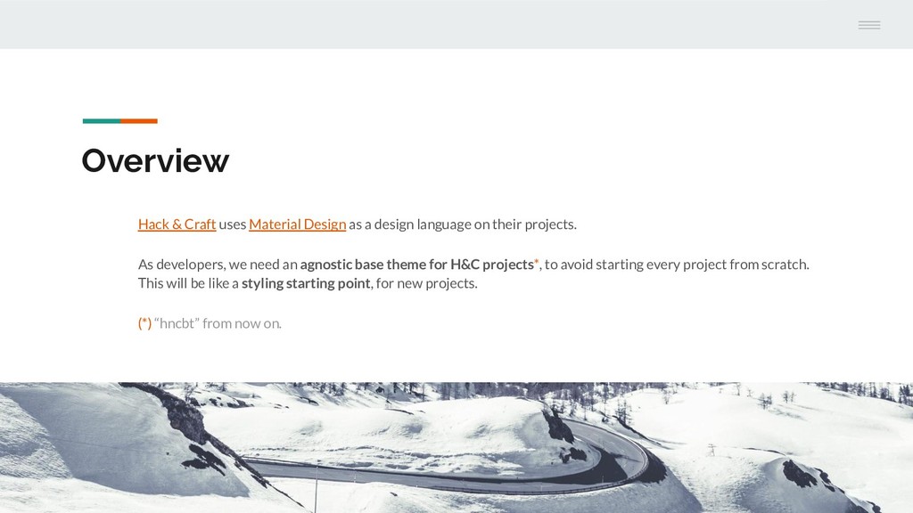
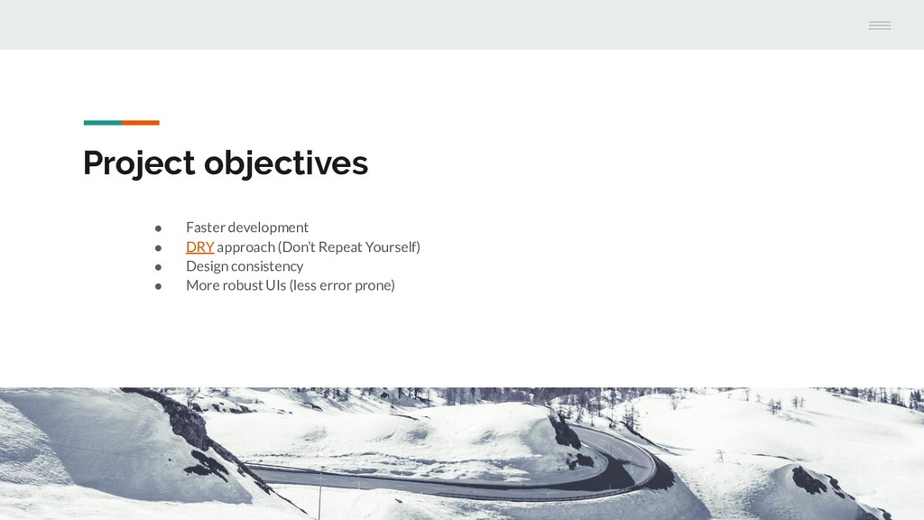
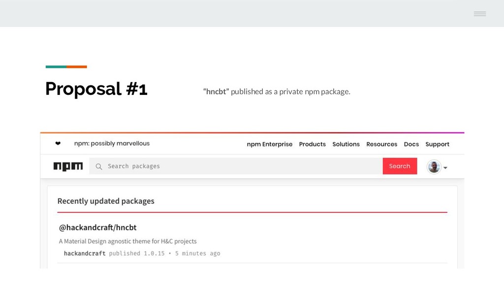
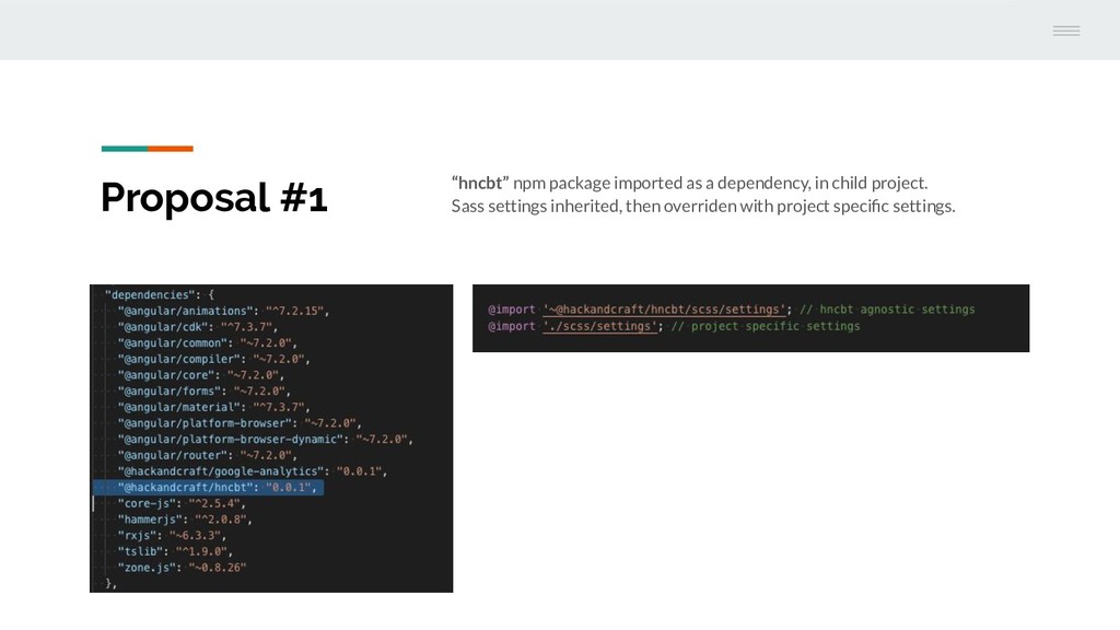
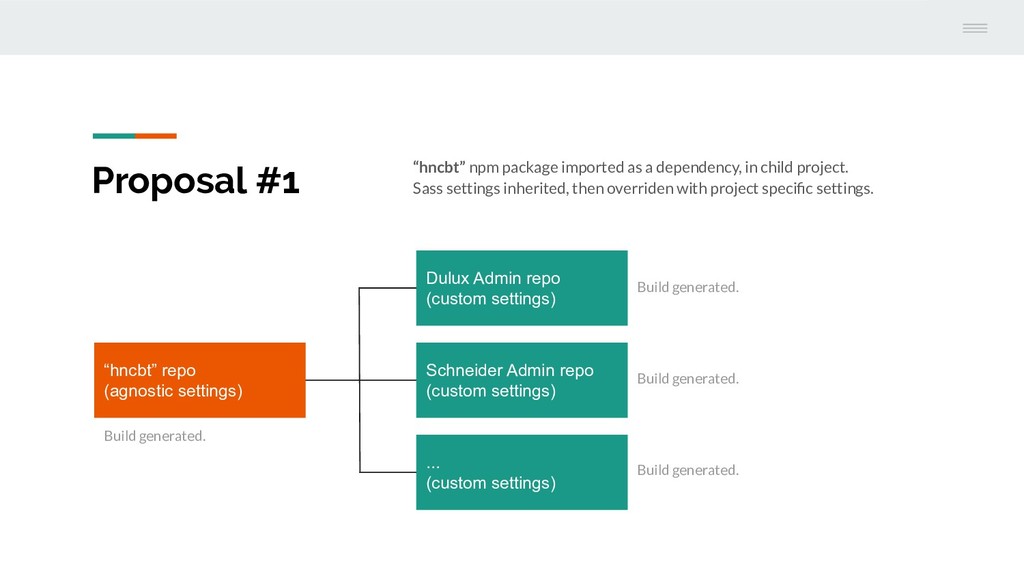
[Hack & Craft](https://hackandcraft.com) uses [Material Design](https://material.io/design/) as a design language on their projects.

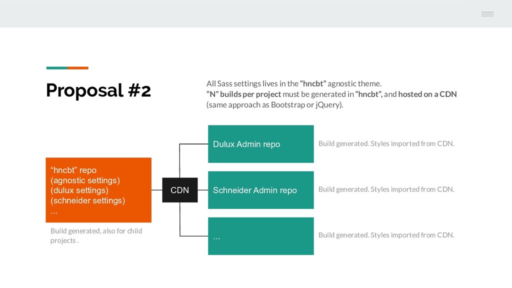
As developers, we need an agnostic base theme for H&C projects, to avoid starting every project from scratch.

This will be like a styling starting point, for new projects.

Nadal Soler

August 29, 2019
Tweet

More Decks by Nadal Soler

Other Decks in Programming

Transcript

  1. Overview Hack & Craft uses Material Design as a design

    language on their projects. As developers, we need an agnostic base theme for H&C projects*, to avoid starting every project from scratch. This will be like a styling starting point, for new projects. (*) “hncbt” from now on.
  2. Problems to solve 1 Material components customisation. Development time for

    H&C projects is short, so we must be quicker. 2 CSS code repetition*. A good example are H&C input fields –quite different from Material– so a lot of styles must be customised per project. This is time consuming for developers. 3 Angular Material library only provides color theming (no theming for font-size, font-weight, line-height, spacing…), so Angular Material theming is not an option. (*) Code repetition also happens with HTML and probably JS, but this is out of our scope for now.
  3. Project objectives • Faster development • DRY approach (Don’t Repeat

    Yourself) • Design consistency • More robust UIs (less error prone)
  4. Proposal #1 “hncbt” npm package imported as a dependency, in

    child project. Sass settings inherited, then overriden with project specific settings.
  5. Proposal #1 “hncbt” npm package imported as a dependency, in

    child project. Sass settings inherited, then overriden with project specific settings. “hncbt” repo (agnostic settings) Dulux Admin repo (custom settings) Schneider Admin repo (custom settings) ... (custom settings) Build generated. Build generated. Build generated. Build generated.
  6. Proposal #2 All Sass settings lives in the “hncbt” agnostic

    theme. “N” builds per project must be generated in “hncbt”, and hosted on a CDN (same approach as Bootstrap or jQuery).
  7. Proposal #2 All Sass settings lives in the “hncbt” agnostic

    theme. “N” builds per project must be generated in “hncbt”, and hosted on a CDN (same approach as Bootstrap or jQuery). “hncbt” repo (agnostic settings) (dulux settings) (schneider settings) ... Dulux Admin repo Schneider Admin repo ... Build generated, also for child projects . Build generated. Styles imported from CDN. Build generated. Styles imported from CDN. Build generated. Styles imported from CDN. CDN
  8. Constraints 1 2 Designers must follow some rules in order

    to reuse components*. We’re already using Material Design, so this shouldn’t be a problem. 3 The “hncbt“ will be an external package. New iterations must be done there first, then child projects must update its dependency and fix breaking changes (if any). This implies more dev. time. 4 Need a Pattern Library in “hncbt”, in order to see how components looks like. Nice to have: also in child projects. Theming does not include layout changes, functionality or any other topic (only cosmetics). (*) For instance, defining dialog variants like small, medium and large (same for all projects).
  9. Doubts 1 2 Components behaviour (interaction) must be the same

    (i.e. dialogs always closing with an “x” icon or “Close” button). Of course, new components may always be extended. Theming will work for Admins (backoffices). I don’t think it will for more complex websites, like Dulux Connect.