I made this talk to help my Design Team colleagues, at [Digital Origin](https://www.digitalorigin.com/), to better understand the importance of designing in a modular way.
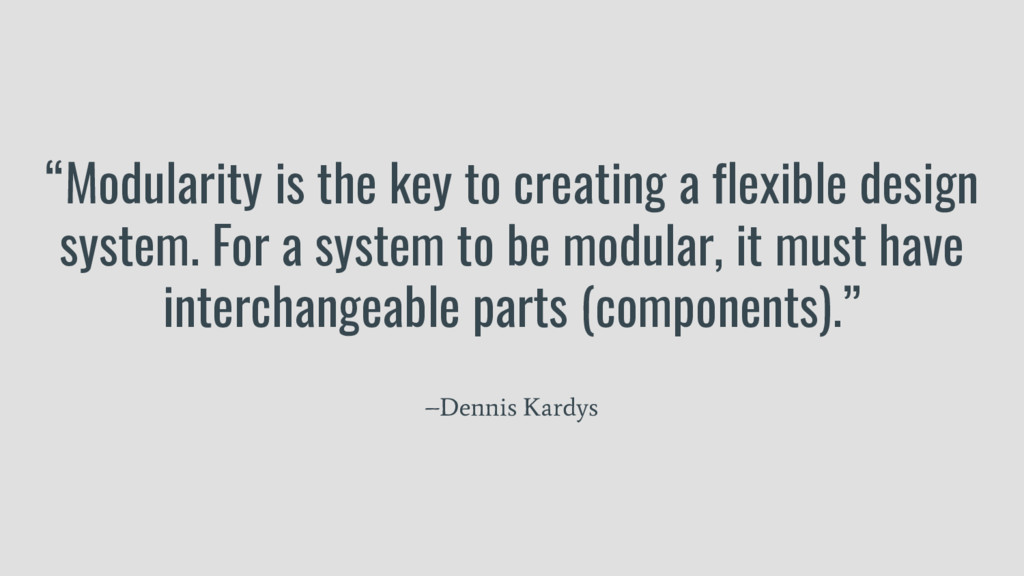
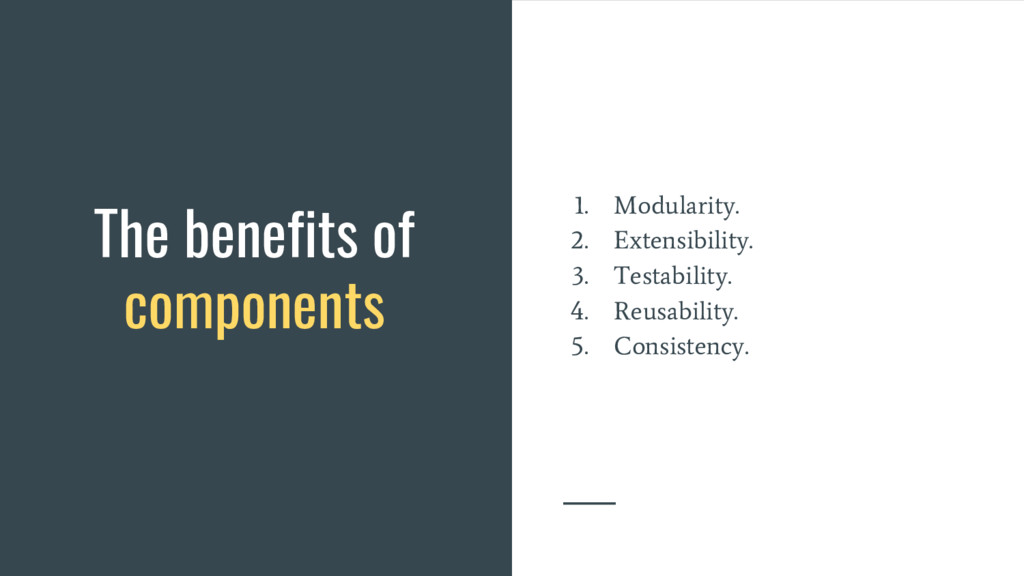
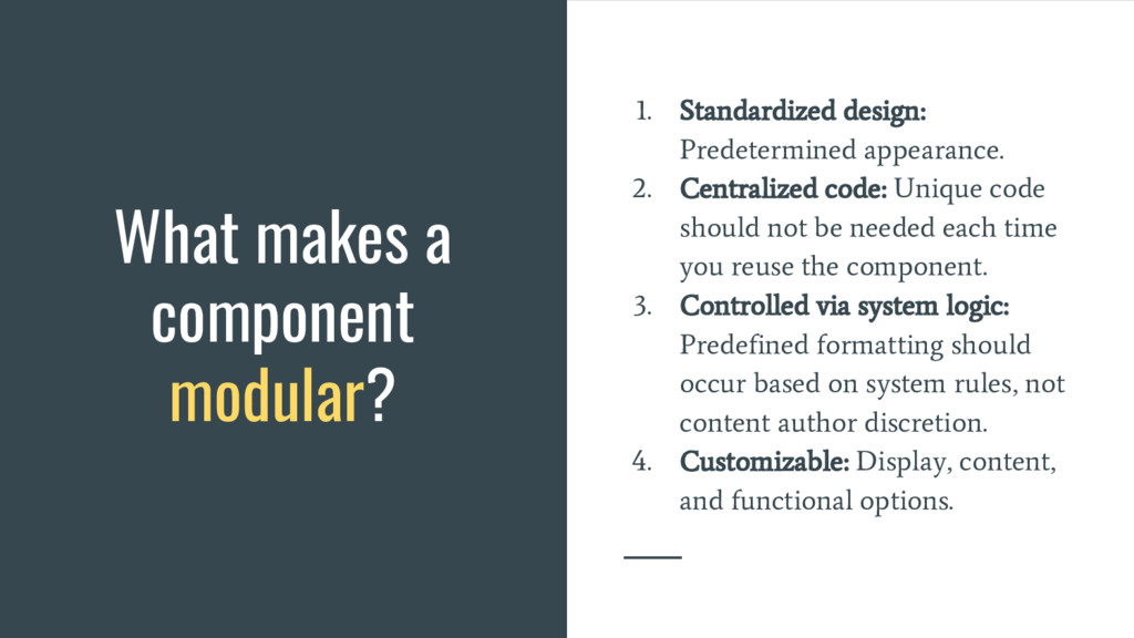
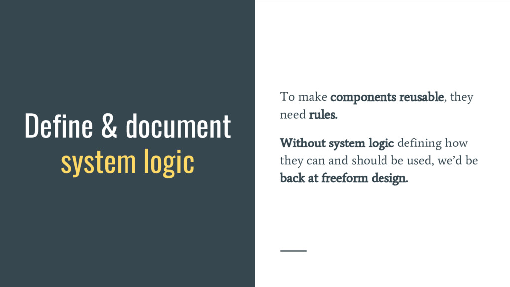
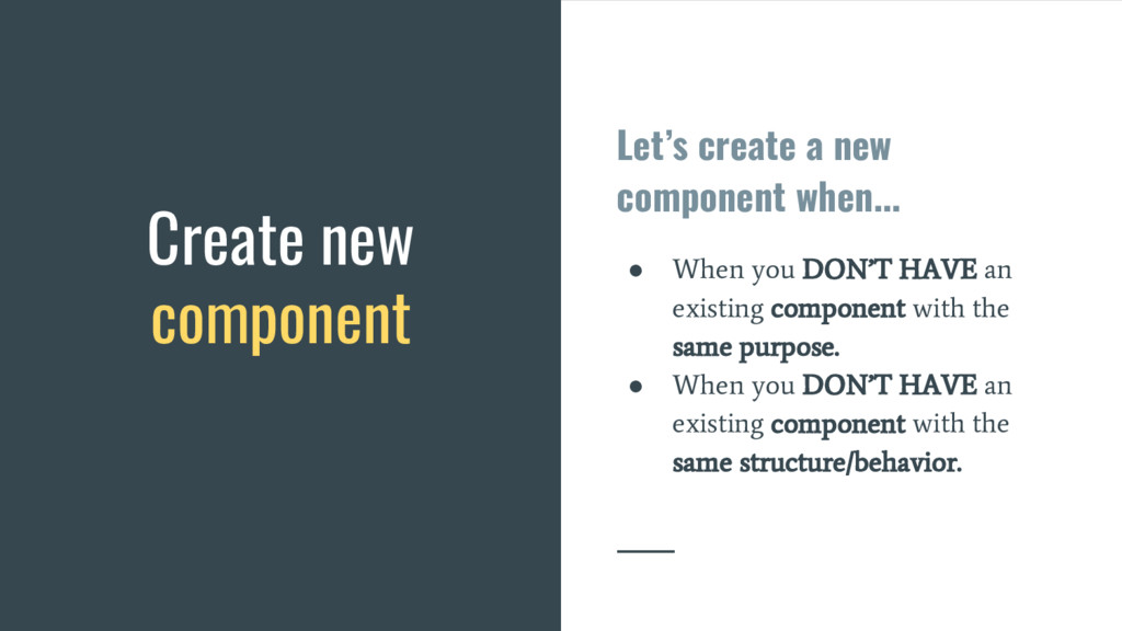
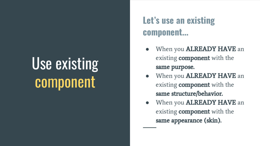
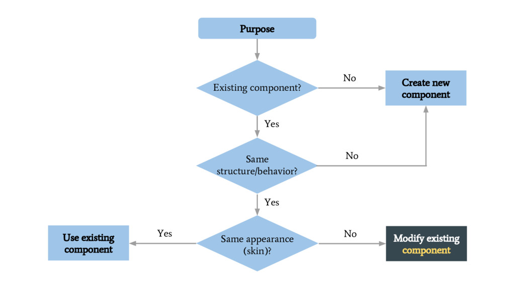
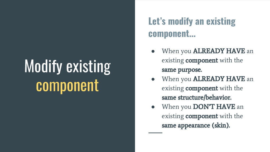
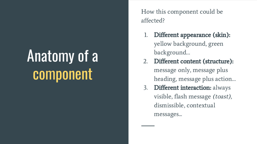
Modularity is the key to creating a flexible design system. For a system to be modular, it must have interchangeable parts (components).
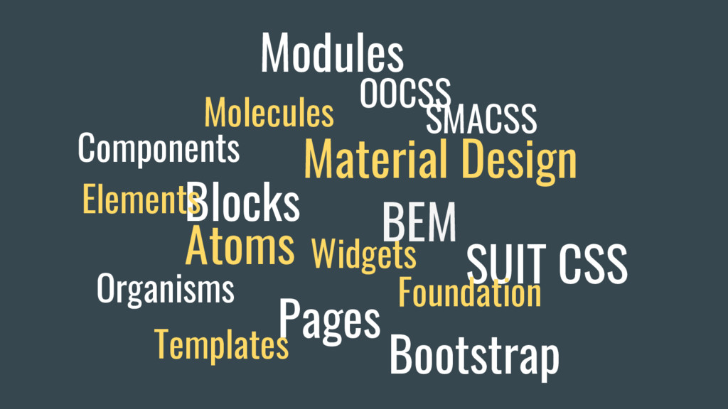
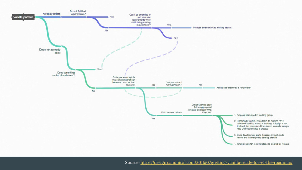
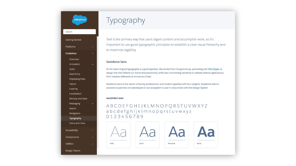
Watch my slides if you want to learn Modular Web Design, to reach a smart system of reusable design patterns, interchangeable components, and well-planned system logic.
 nadalsol
 toshihidemurata
 sony
sony
 nttcom
 yusukeiyoda
 kenichiota0711
 hiro93n
 ashapiro
 centou
 kitanosirokuma
 hjmkth
 terencebasart
 uxman
uxman
 mayatellez
 mkilby
 aleyda
 pauljervisheath
 philnash
 inesmontani
 baasie
 sstephenson
 addyosmani
 codingconduct
 holman
 tomoyanonymous
![[`nadal sol ear] Meticulous Front-end Developer. Proudly coding since 2001.](https://files.speakerdeck.com/presentations/109f23a0514e4bc3ba63e2d9d4de132f/slide_1.jpg)