Share
Embed
Droid Knights 2024 Accessibility in Android
정부에서 시행한 모바일 앱 접근성 준수 지침이 의무화 되었습니다.
혹시 여러분들은 개발하실 때, 접근성을 고려하고 계시나요?
접근성에 대해 가볍게 알아보고, 향상시키는 기술적 방안들을 소개합니다.
이번 기회에 모든 사용자가 쉽게 사용할 수 있는 앱을 만드는 방법을 함께 배워봅시다!
Nanamare
June 12, 2024
Transcript
96 slides
-
목차 ❏ 접근성이란 ❏ 안드로이드 접근성 서비스 ❏ 안드로이드 접근성
가이드 ❏ 자주 발생하는 접근성 문제 해결 -
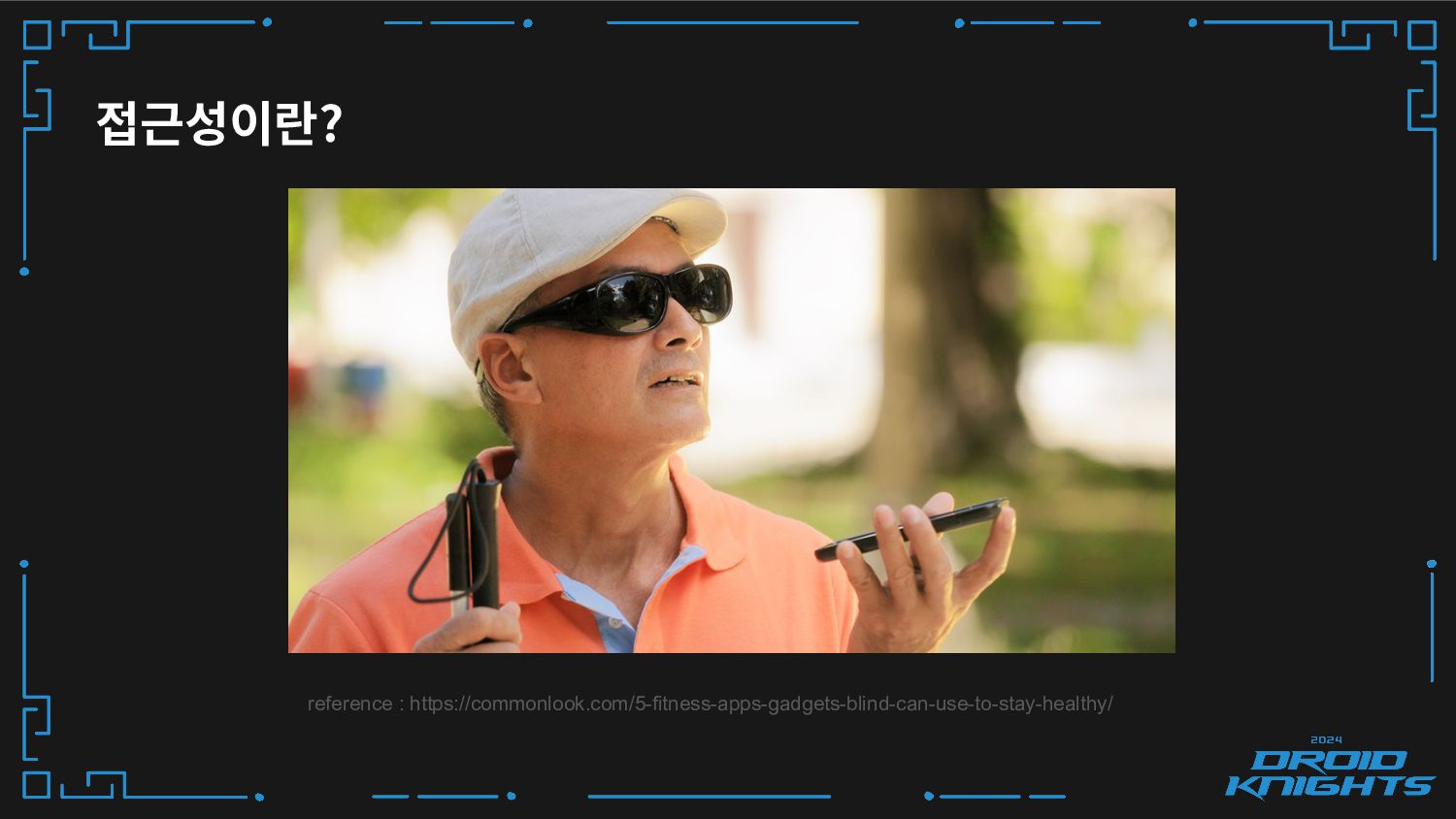
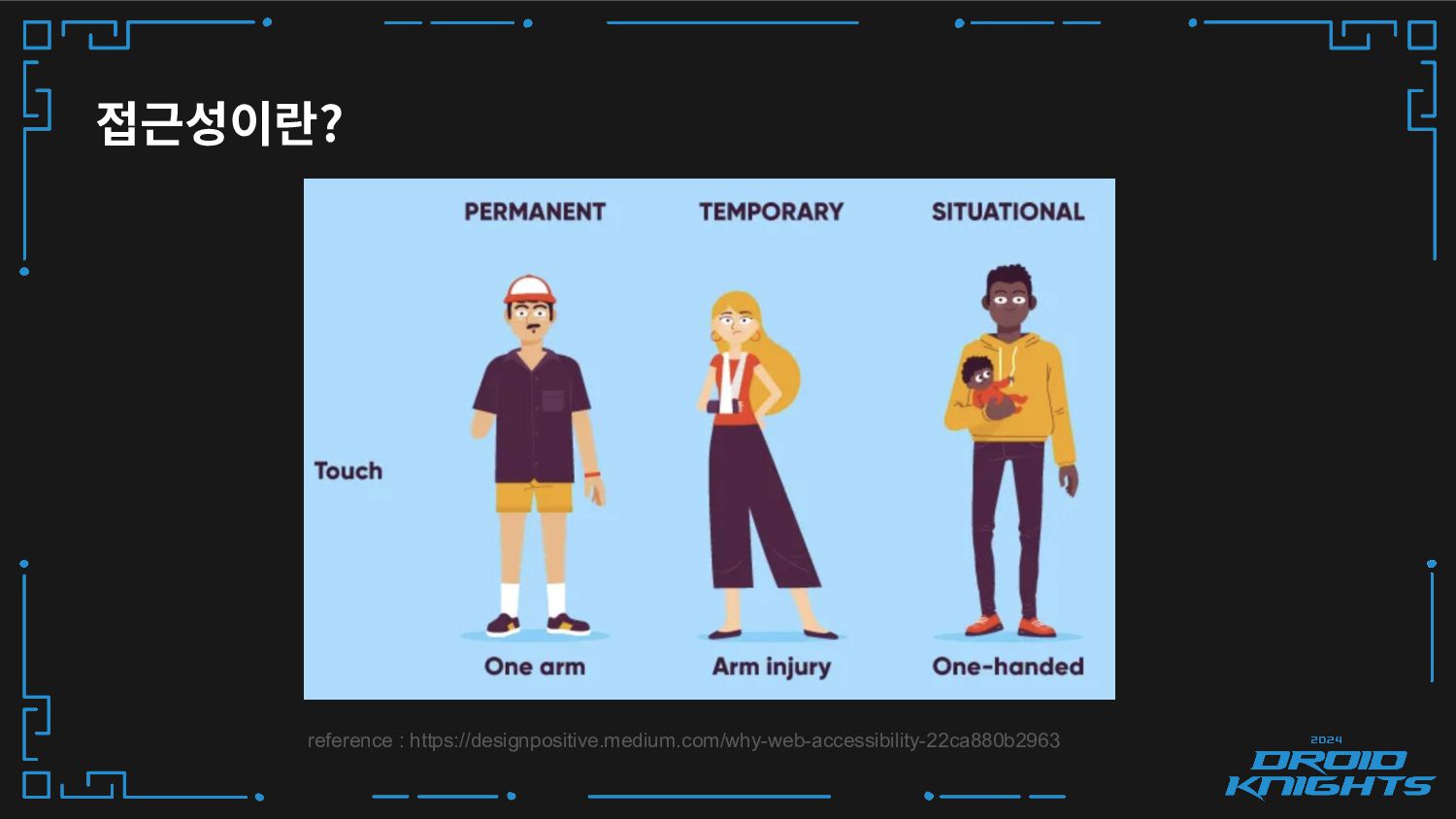
접근성이란? ❏ 모든 사람을 포용할 수 있는 제품, 기기, 서비스
또는 환경을 만드는 것을 의미해요 -
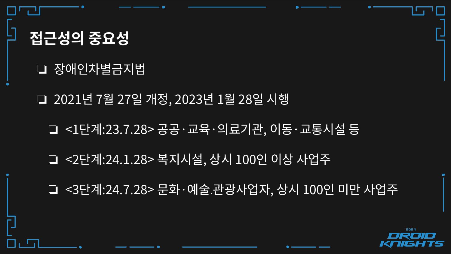
❏ 장애인차별금지법 ❏ 2021년 7월 27일 개정, 2023년 1월 28일
시행 ❏ <1단계:23.7.28> 공공·교육·의료기관, 이동·교통시설 등 ❏ <2단계:24.1.28> 복지시설, 상시 100인 이상 사업주 ❏ <3단계:24.7.28> 문화·예술․관광사업자, 상시 100인 미만 사업주 접근성의 중요성 -
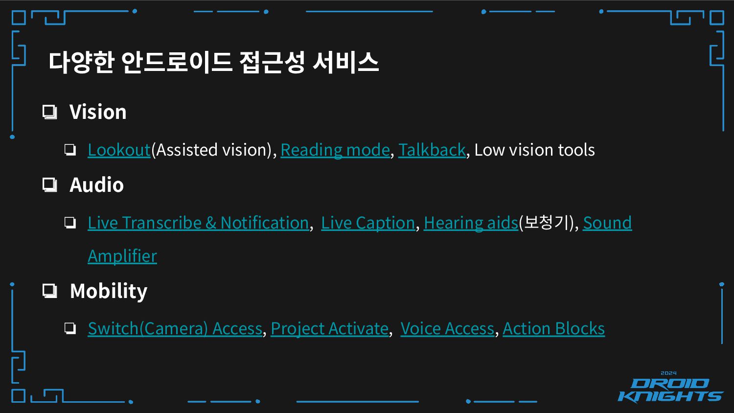
다양한 안드로이드 접근성 서비스 ❏ Vision ❏ Lookout(Assisted vision), Reading
mode, Talkback, Low vision tools ❏ Audio ❏ Live Transcribe & Notification, Live Caption, Hearing aids(보청기), Sound Amplifier ❏ Mobility ❏ Switch(Camera) Access, Project Activate, Voice Access, Action Blocks -
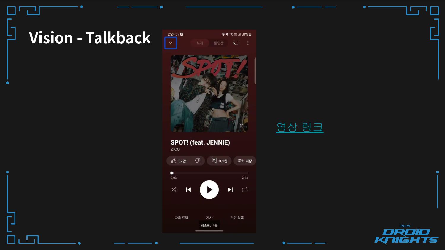
Vision - Talkback ❏ 화면 콘텐츠를 음성으로 읽어주는 보조 기술이에요.
❏ 다양한 제스처를 통해 화면 요소간의 이동, 선택, 클릭, 스크롤, 컨텍스트 메뉴 등을 제공해요. -
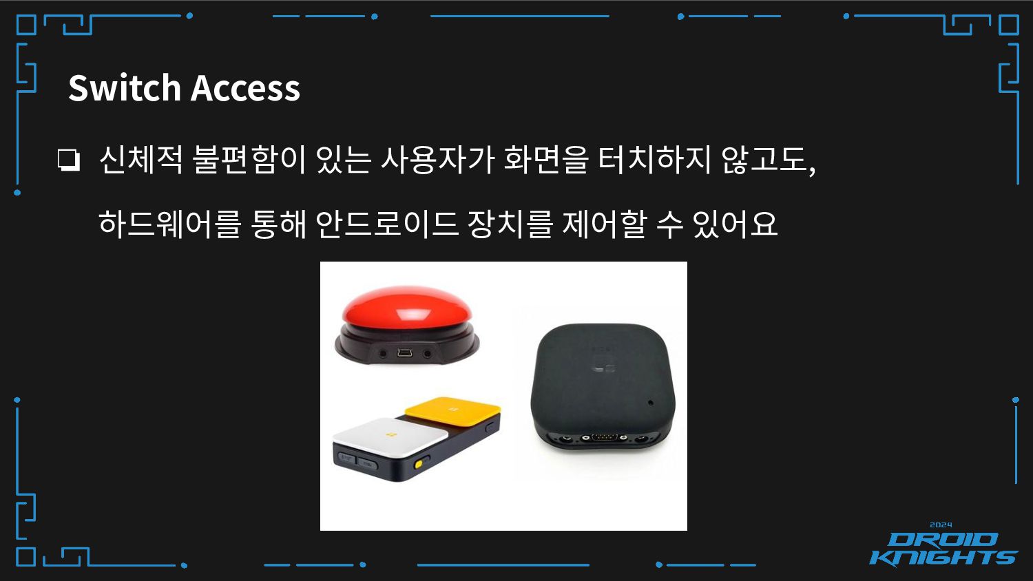
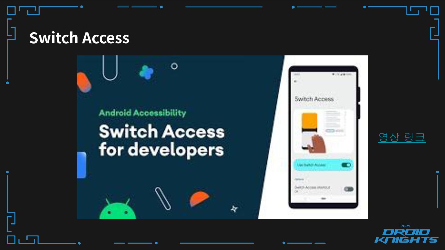
Switch Access ❏ 신체적 불편함이 있는 사용자가 화면을 터치하지 않고도,
하드웨어를 통해 안드로이드 장치를 제어할 수 있어요 -
안드로이드 접근성 가이드 라인 1. Increase text visibility(텍스트 가시성 향상)
2. Use Large, simple controls(더 큰 터치 영역 사용) 3. Describe each UI element (UI 요소 설명) 4. 기타 개선 사항 -
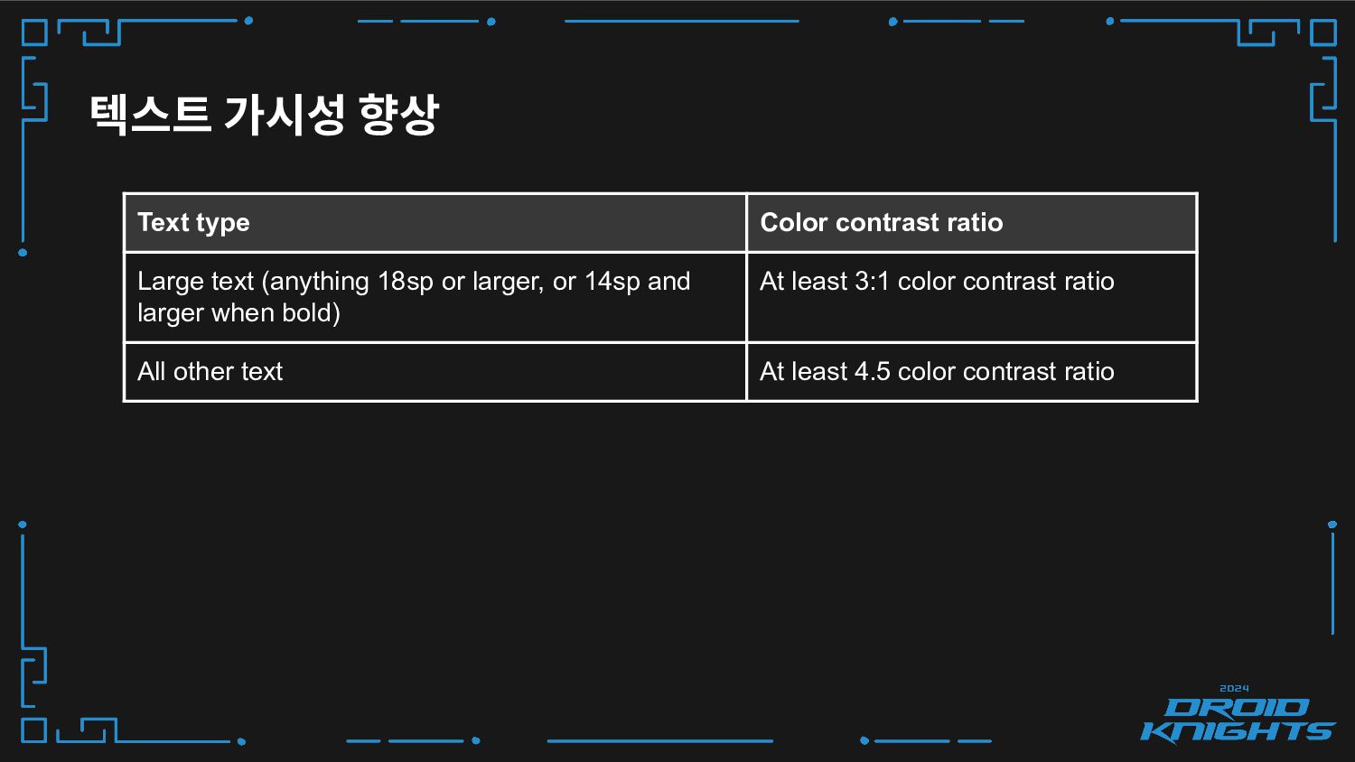
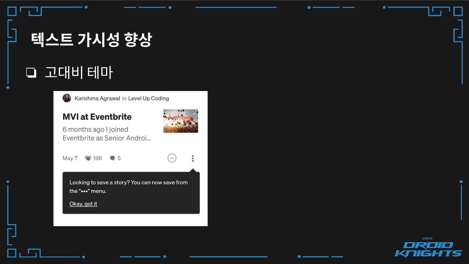
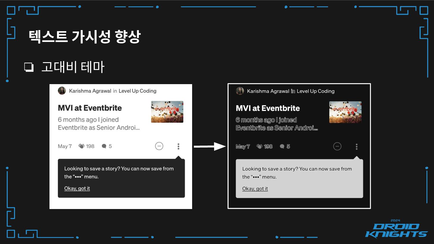
텍스트 가시성 향상 ❏ 색상 대비 높이기 ❏ 텍스트 색상과
배경 색상 간의 밝기 차이를 수치로 나타낸 것이에요 ❏ ColorUtils.calculateContrast(fgColor, bgColor) -
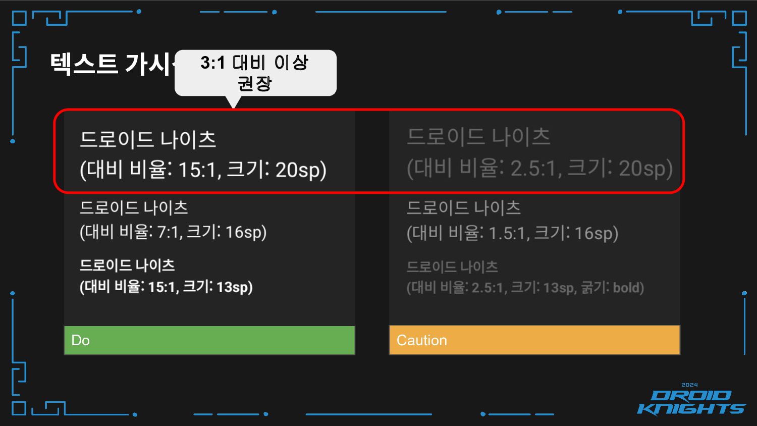
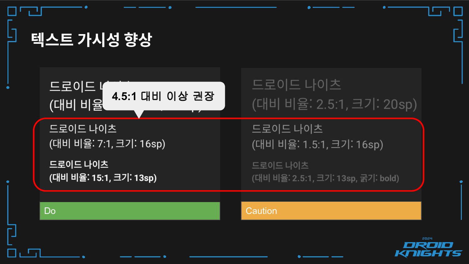
텍스트 가시성 향상 Text type Color contrast ratio Large text
(anything 18sp or larger, or 14sp and larger when bold) At least 3:1 color contrast ratio All other text At least 4.5 color contrast ratio -
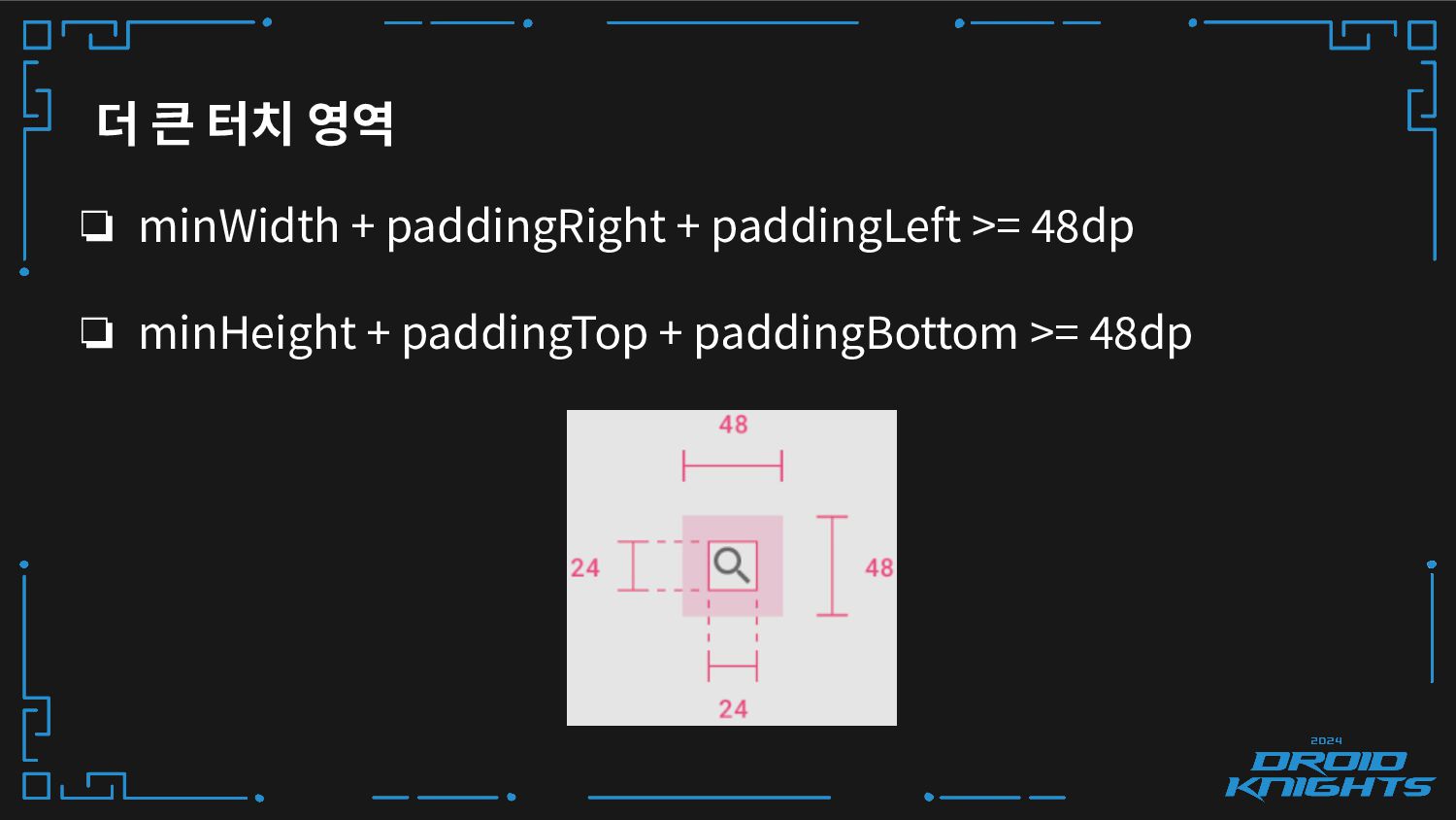
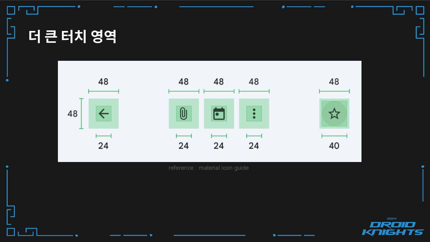
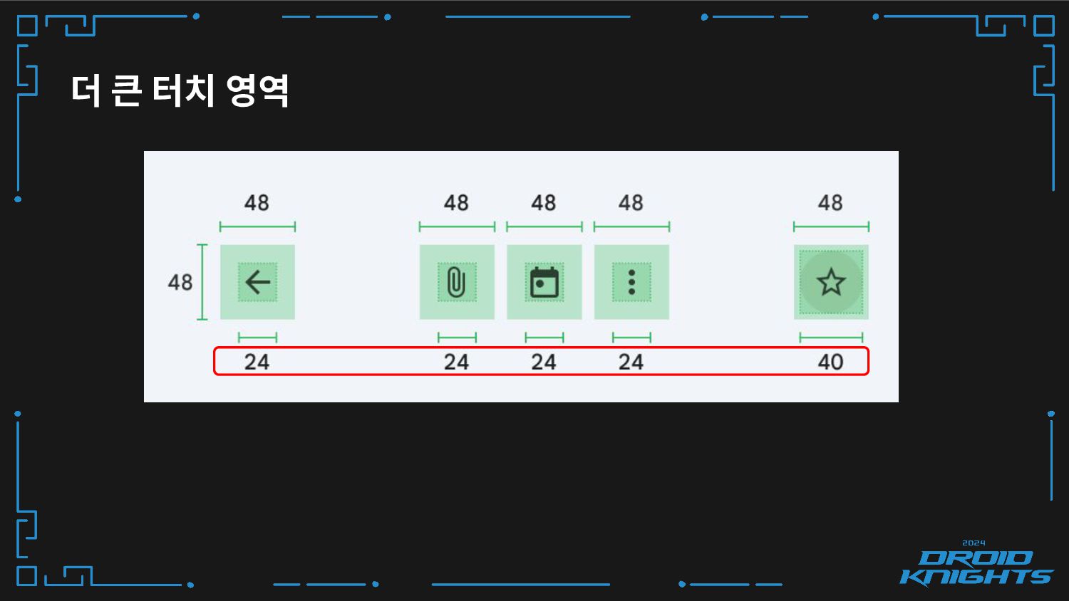
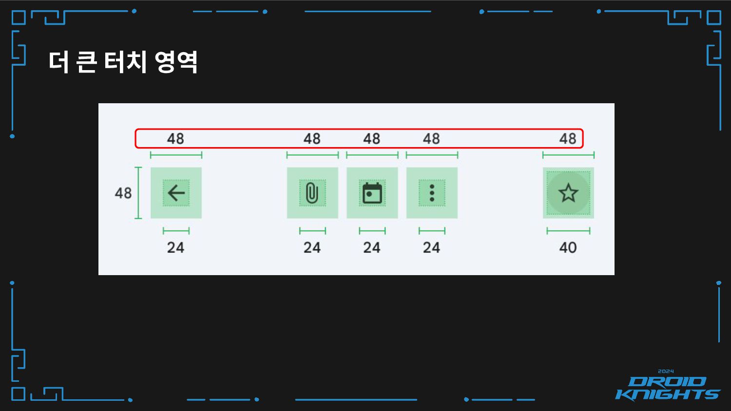
더 큰 터치 영역 ❏ minWidth + paddingRight + paddingLeft
>= 48dp ❏ minHeight + paddingTop + paddingBottom >= 48dp -
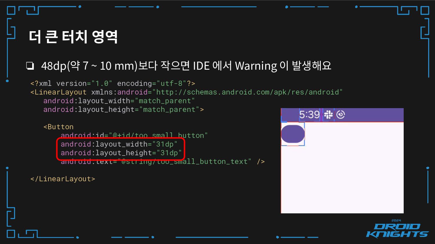
더 큰 터치 영역 ❏ 48dp(약 7 ~ 10 mm)보다
작으면 IDE 에서 Warning 이 발생해요 <?xml version="1.0" encoding="utf-8"?> <LinearLayout xmlns:android="http://schemas.android.com/apk/res/android" android:layout_width="match_parent" android:layout_height="match_parent"> <Button android:id="@+id/too_small_button" android:layout_width="31dp" android:layout_height="31dp" android:text="@string/too_small_button_text" /> </LinearLayout> -
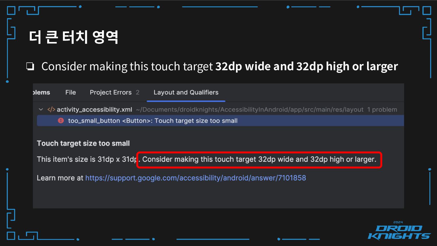
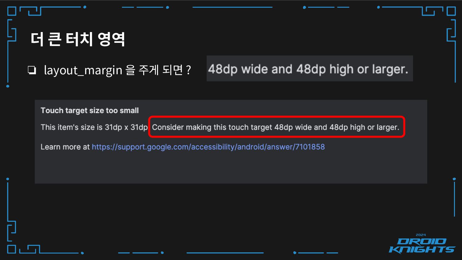
더 큰 터치 영역 ❏ Consider making this touch target
32dp wide and 32dp high or larger -
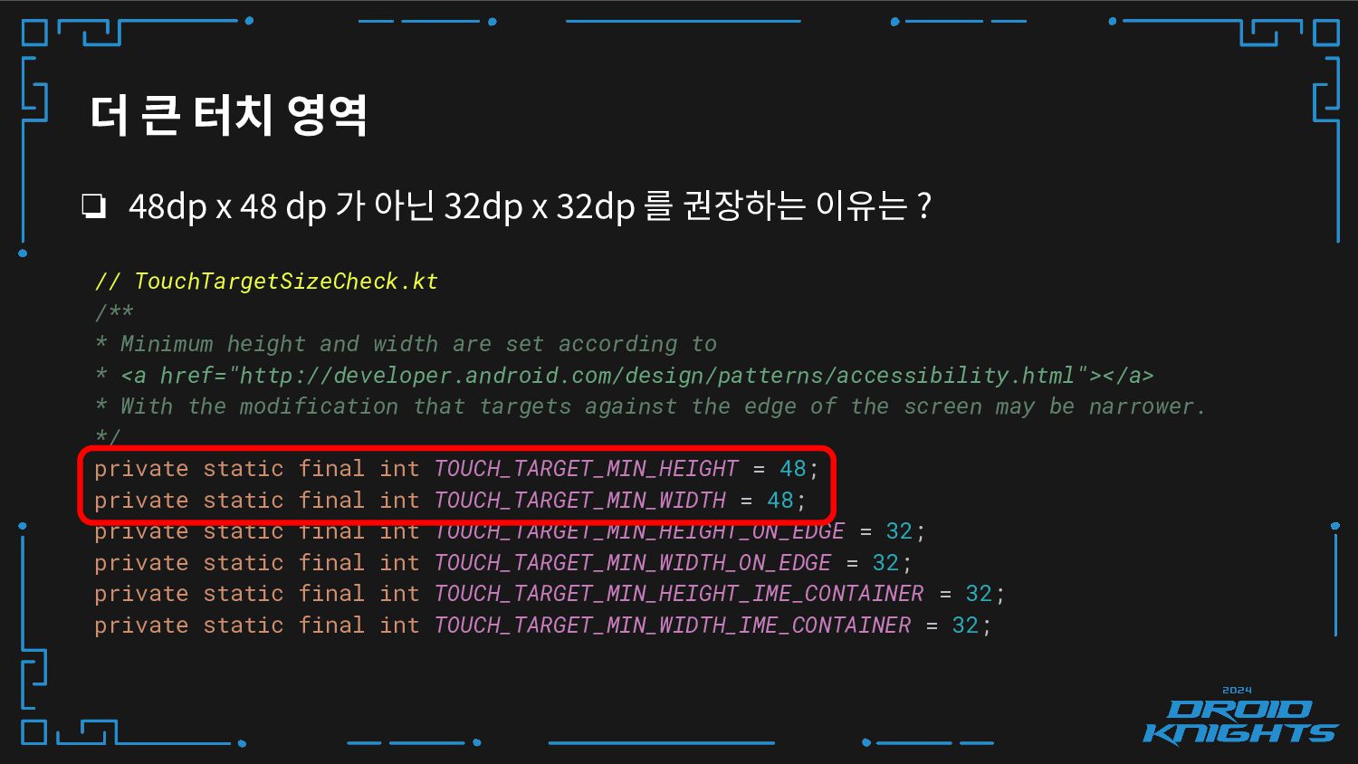
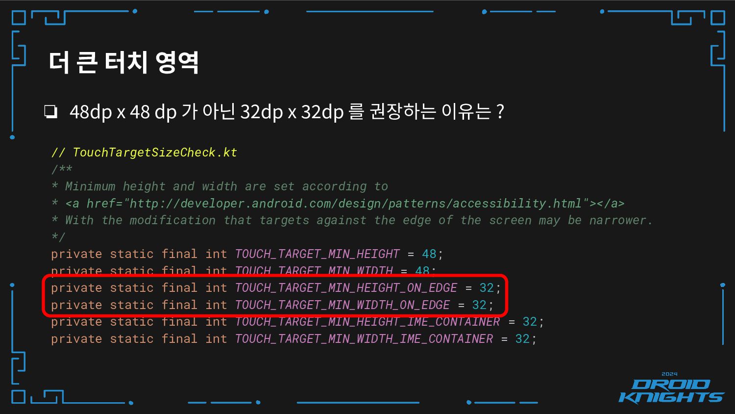
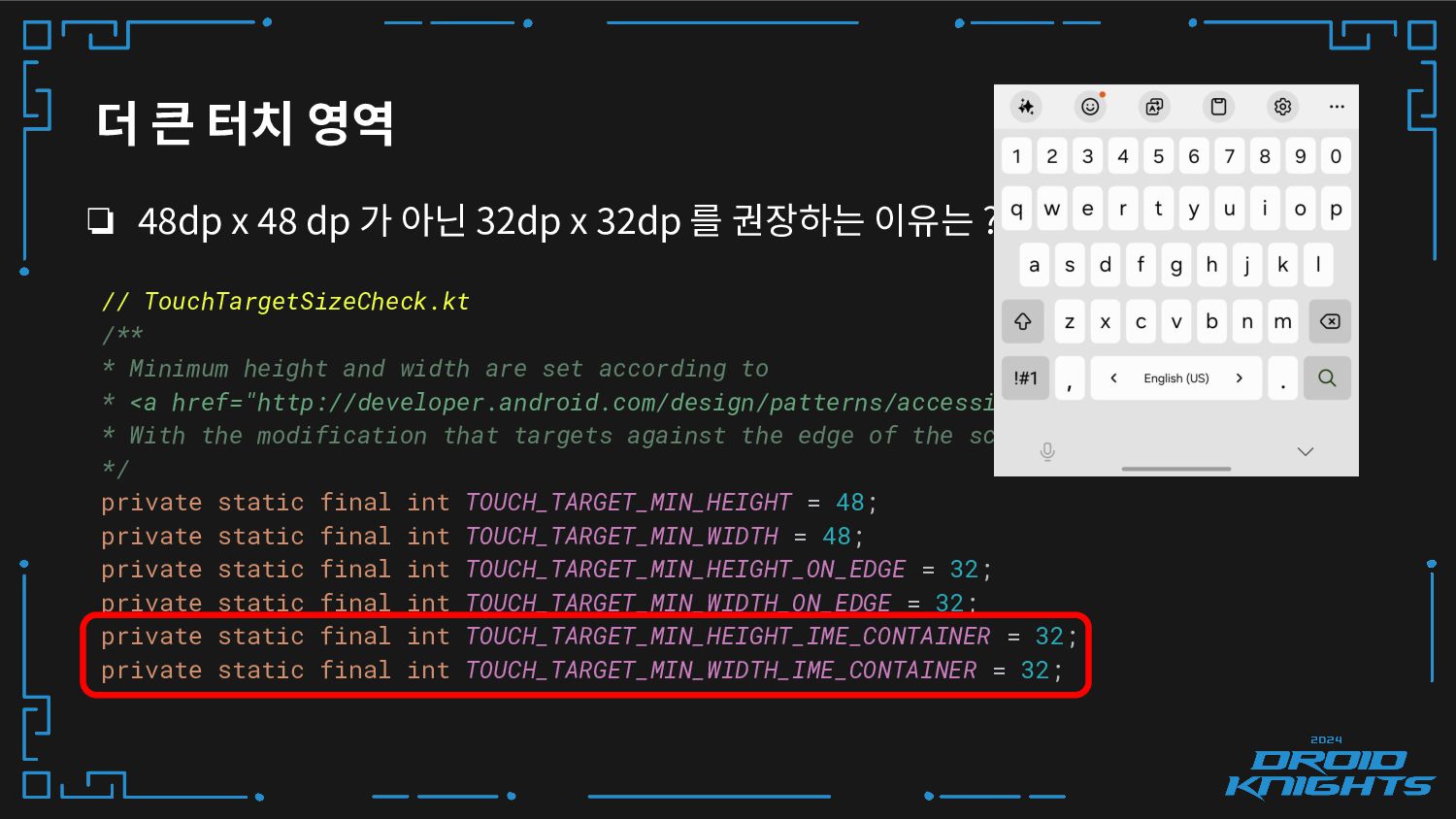
더 큰 터치 영역 ❏ 48dp x 48 dp 가
아닌 32dp x 32dp 를 권장하는 이유는 ? // TouchTargetSizeCheck.kt /** * Minimum height and width are set according to * <a href="http://developer.android.com/design/patterns/accessibility.html"></a> * With the modification that targets against the edge of the screen may be narrower. */ private static final int TOUCH_TARGET_MIN_HEIGHT = 48; private static final int TOUCH_TARGET_MIN_WIDTH = 48; private static final int TOUCH_TARGET_MIN_HEIGHT_ON_EDGE = 32; private static final int TOUCH_TARGET_MIN_WIDTH_ON_EDGE = 32; private static final int TOUCH_TARGET_MIN_HEIGHT_IME_CONTAINER = 32; private static final int TOUCH_TARGET_MIN_WIDTH_IME_CONTAINER = 32; -
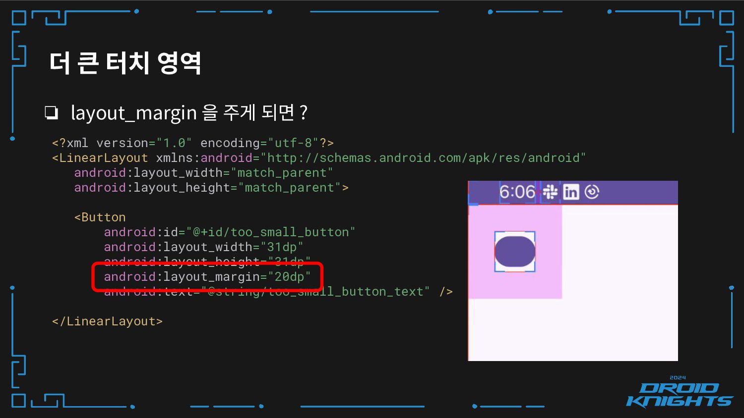
더 큰 터치 영역 ❏ layout_margin 을 주게 되면 ?
<?xml version="1.0" encoding="utf-8"?> <LinearLayout xmlns:android="http://schemas.android.com/apk/res/android" android:layout_width="match_parent" android:layout_height="match_parent"> <Button android:id="@+id/too_small_button" android:layout_width="31dp" android:layout_height="31dp" android:layout_margin="20dp" android:text="@string/too_small_button_text" /> </LinearLayout> -
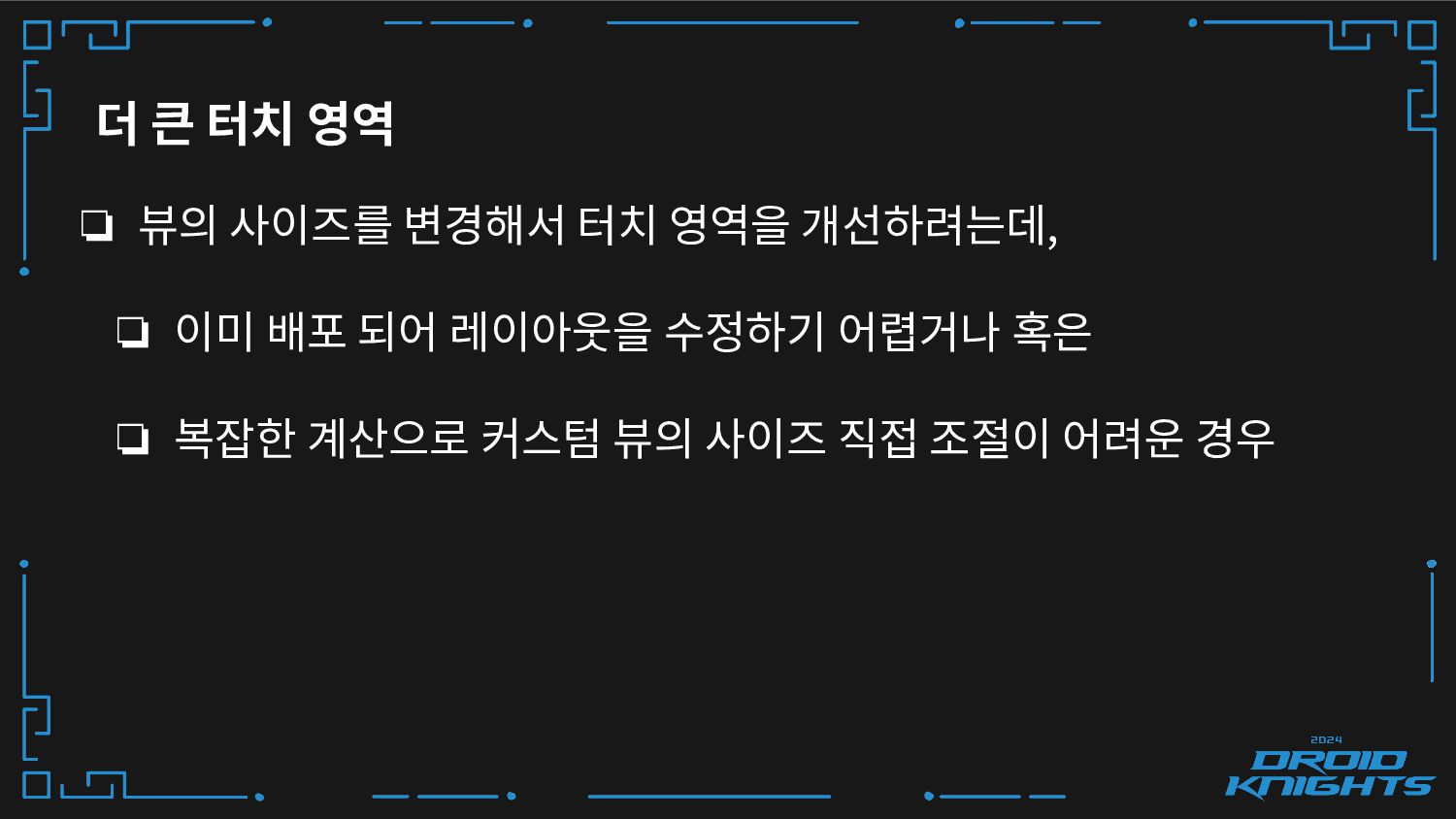
더 큰 터치 영역 ❏ 뷰의 사이즈를 변경해서 터치 영역을
개선하려는데, ❏ 이미 배포 되어 레이아웃을 수정하기 어렵거나 혹은 ❏ 복잡한 계산으로 커스텀 뷰의 사이즈 직접 조절이 어려운 경우 -
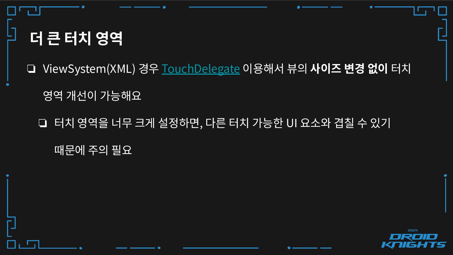
더 큰 터치 영역 ❏ ViewSystem(XML) 경우 TouchDelegate 이용해서 뷰의
사이즈 변경 없이 터치 영역 개선이 가능해요 ❏ 터치 영역을 너무 크게 설정하면, 다른 터치 가능한 UI 요소와 겹칠 수 있기 때문에 주의 필요 -
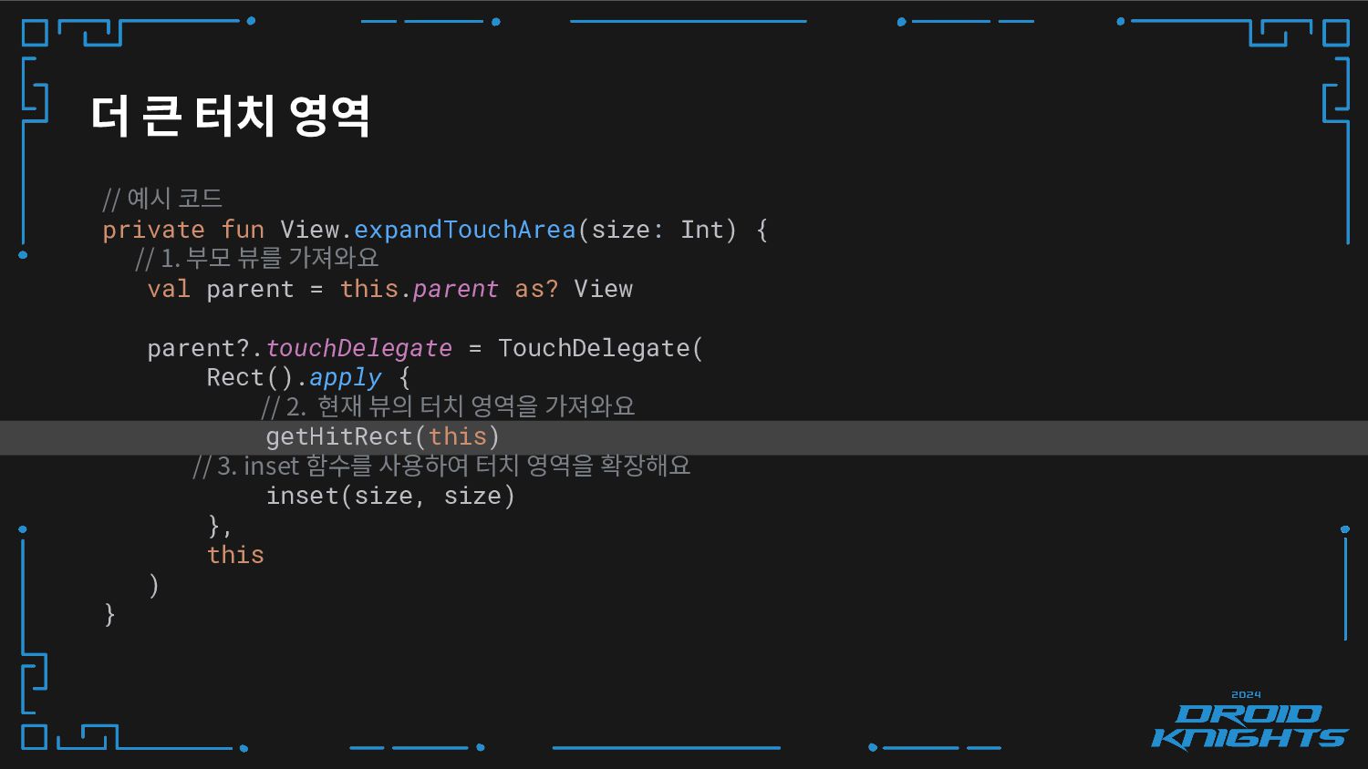
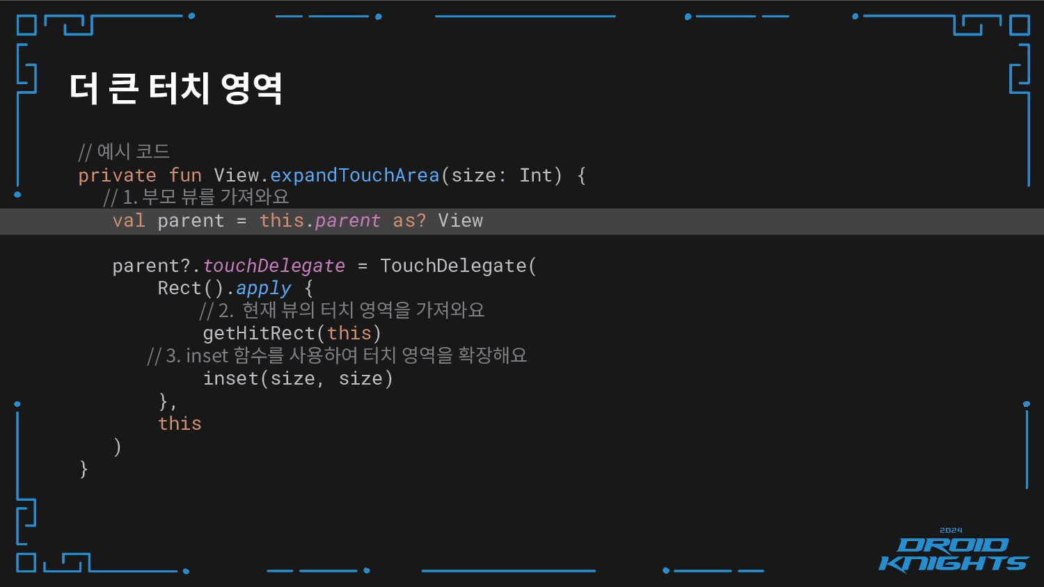
더 큰 터치 영역 // 예시 코드 private fun View.expandTouchArea(size:
Int) { // 1. 부모 뷰를 가져와요 val parent = this.parent as? View parent?.touchDelegate = TouchDelegate( Rect().apply { // 2. 현재 뷰의 터치 영역을 가져와요 getHitRect(this) // 3. inset 함수를 사용하여 터치 영역을 확장해요 inset(size, size) }, this ) } -
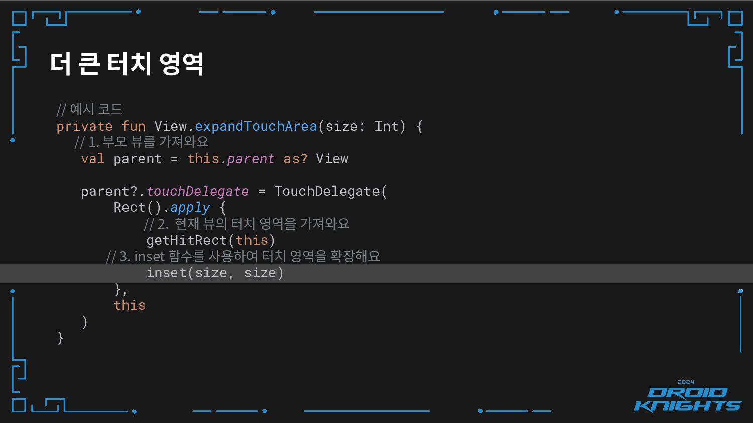
더 큰 터치 영역 // 예시 코드 private fun View.expandTouchArea(size:
Int) { // 1. 부모 뷰를 가져와요 val parent = this.parent as? View parent?.touchDelegate = TouchDelegate( Rect().apply { // 2. 현재 뷰의 터치 영역을 가져와요 getHitRect(this) // 3. inset 함수를 사용하여 터치 영역을 확장해요 inset(size, size) }, this ) } -
더 큰 터치 영역 // 예시 코드 private fun View.expandTouchArea(size:
Int) { // 1. 부모 뷰를 가져와요 val parent = this.parent as? View parent?.touchDelegate = TouchDelegate( Rect().apply { // 2. 현재 뷰의 터치 영역을 가져와요 getHitRect(this) // 3. inset 함수를 사용하여 터치 영역을 확장해요 inset(size, size) }, this ) } -
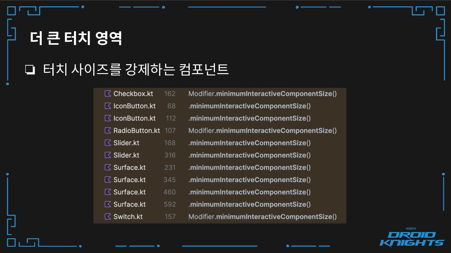
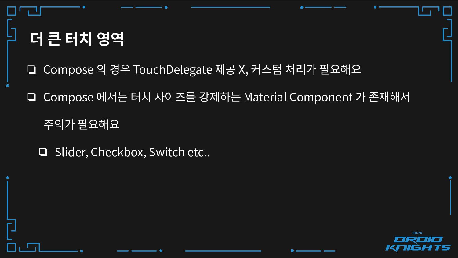
더 큰 터치 영역 ❏ Compose 의 경우 TouchDelegate 제공
X, 커스텀 처리가 필요해요 ❏ Compose 에서는 터치 사이즈를 강제하는 Material Component 가 존재해서 주의가 필요해요 ❏ Slider, Checkbox, Switch etc.. -
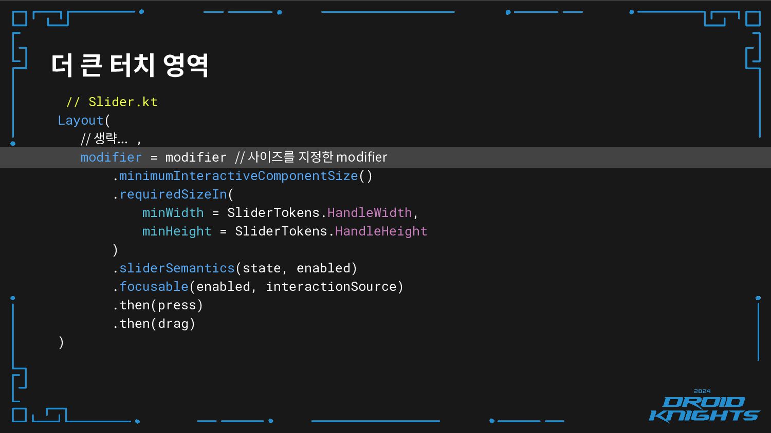
더 큰 터치 영역 // Slider.kt Layout( // 생략... ,
modifier = modifier // 사이즈를 지정한 modifier .minimumInteractiveComponentSize() .requiredSizeIn( minWidth = SliderTokens.HandleWidth, minHeight = SliderTokens.HandleHeight ) .sliderSemantics(state, enabled) .focusable(enabled, interactionSource) .then(press) .then(drag) ) -
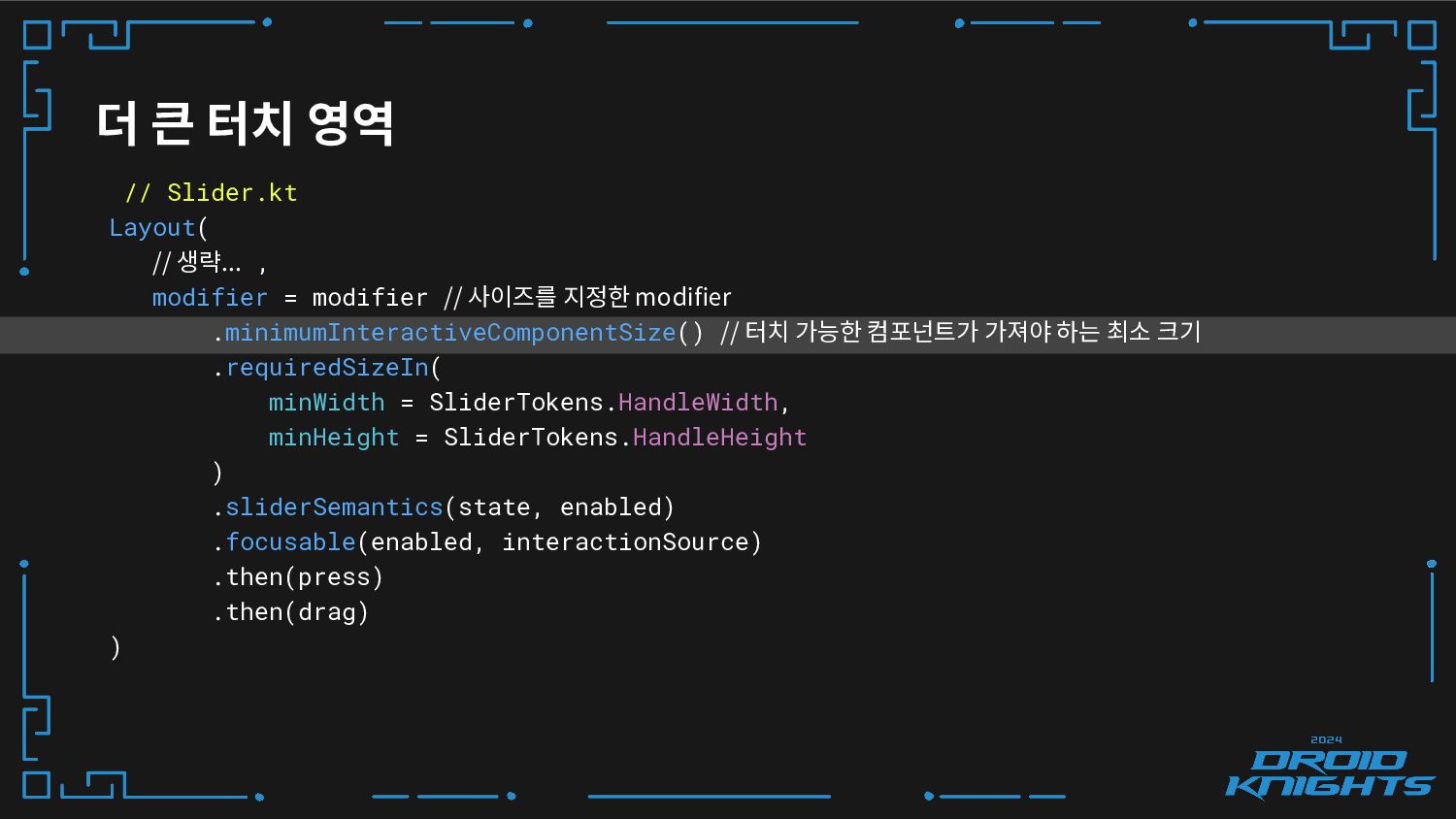
더 큰 터치 영역 // Slider.kt Layout( // 생략... ,
modifier = modifier // 사이즈를 지정한 modifier .minimumInteractiveComponentSize() // 터치 가능한 컴포넌트가 가져야 하는 최소 크기 .requiredSizeIn( minWidth = SliderTokens.HandleWidth, minHeight = SliderTokens.HandleHeight ) .sliderSemantics(state, enabled) .focusable(enabled, interactionSource) .then(press) .then(drag) ) -
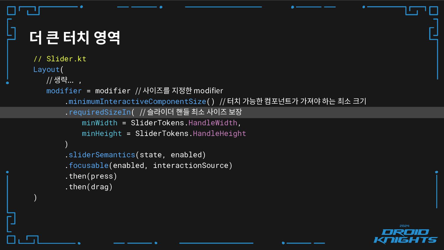
더 큰 터치 영역 // Slider.kt Layout( // 생략... ,
modifier = modifier // 사이즈를 지정한 modifier .minimumInteractiveComponentSize() // 터치 가능한 컴포넌트가 가져야 하는 최소 크기 .requiredSizeIn( // 슬라이더 핸들 최소 사이즈 보장 minWidth = SliderTokens.HandleWidth, minHeight = SliderTokens.HandleHeight ) .sliderSemantics(state, enabled) .focusable(enabled, interactionSource) .then(press) .then(drag) ) -
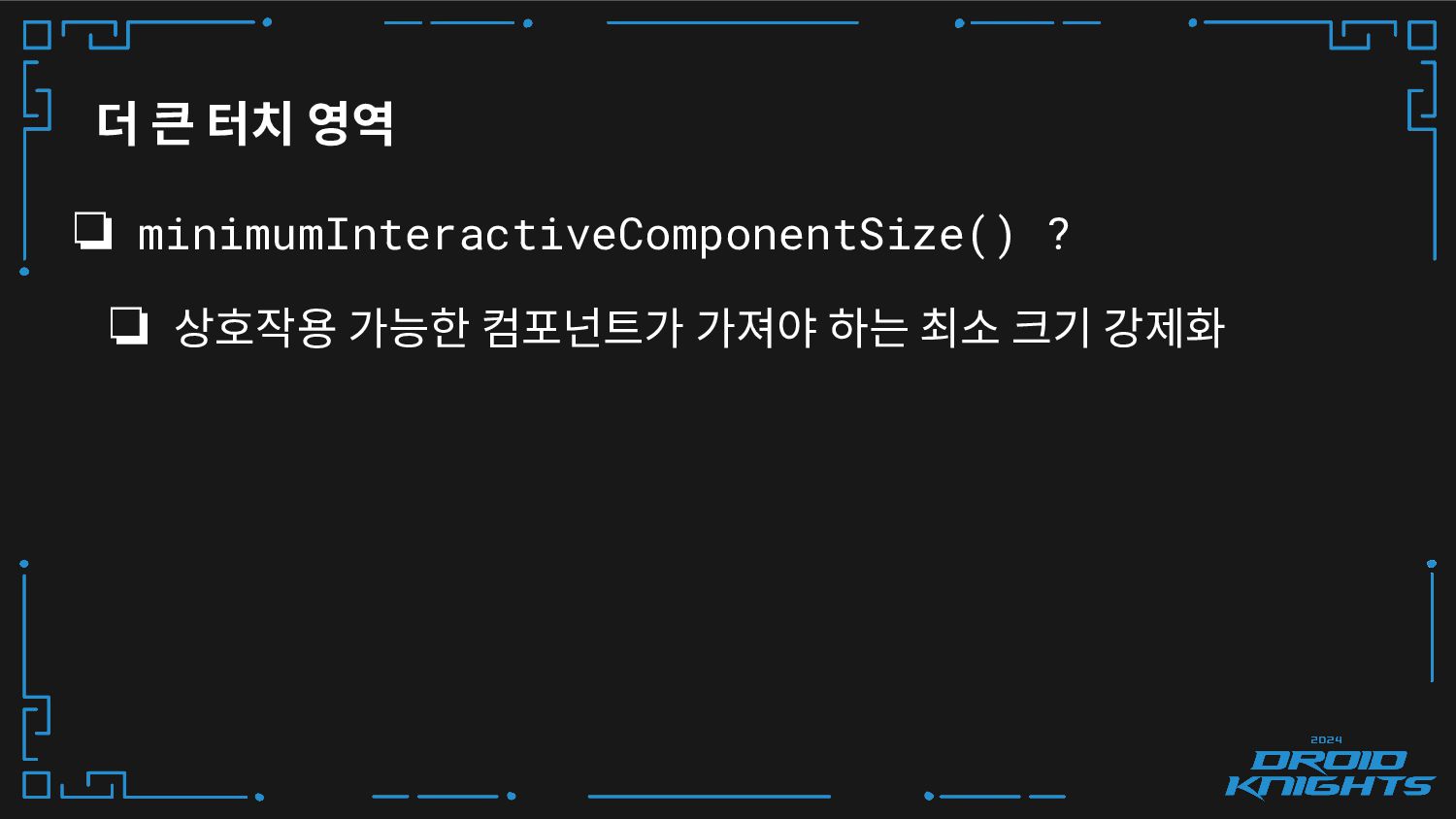
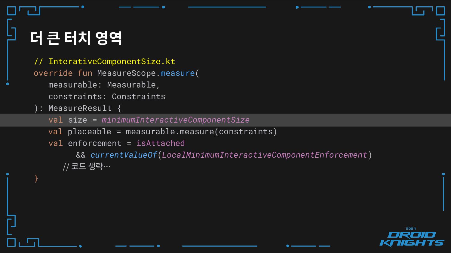
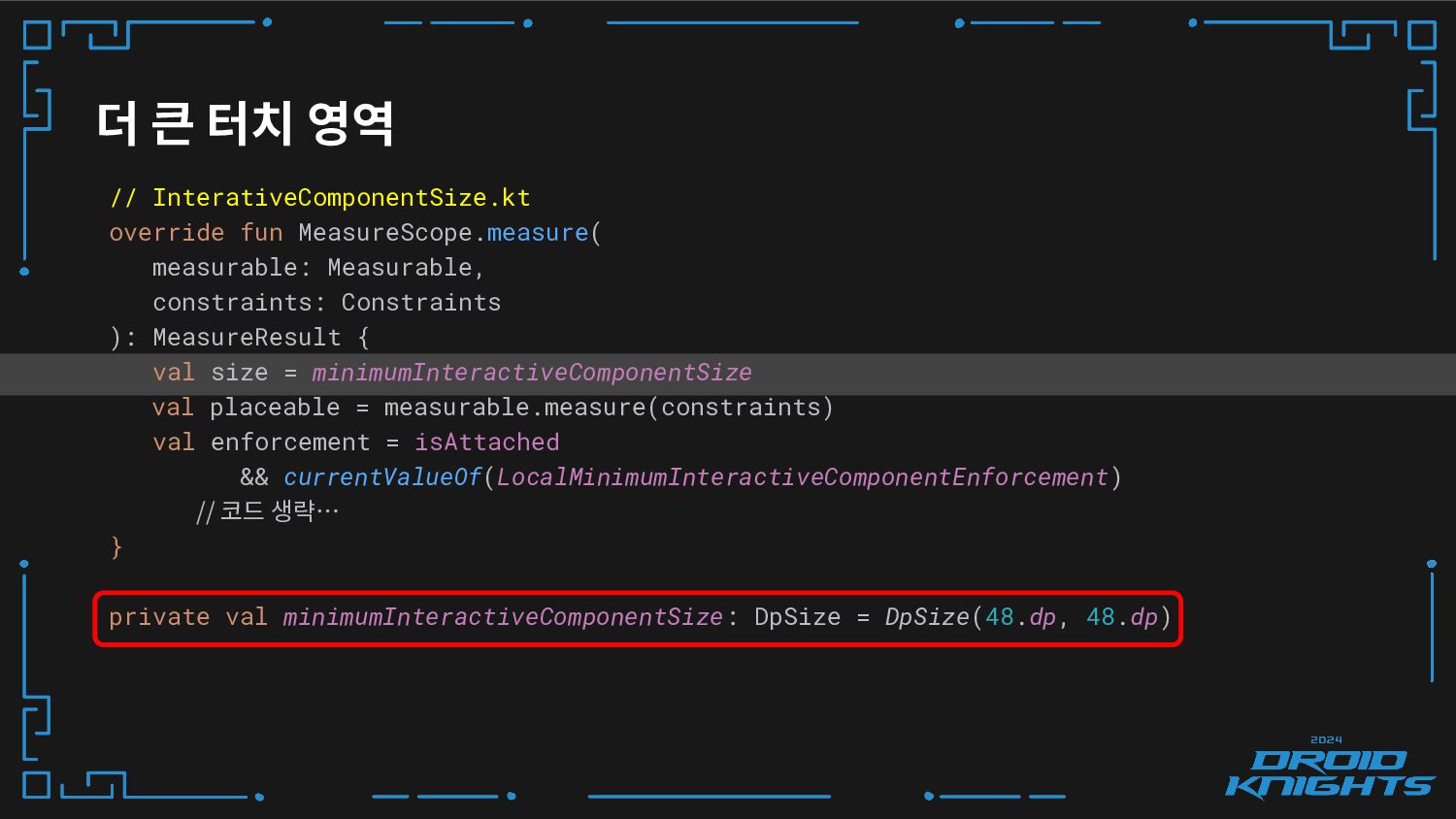
더 큰 터치 영역 ❏ minimumInteractiveComponentSize() ? ❏ 상호작용 가능한
컴포넌트가 가져야 하는 최소 크기 강제화 -
// InterativeComponentSize.kt override fun MeasureScope.measure( measurable: Measurable, constraints: Constraints ):
MeasureResult { val size = minimumInteractiveComponentSize val placeable = measurable.measure(constraints) val enforcement = isAttached && currentValueOf(LocalMinimumInteractiveComponentEnforcement) // 코드 생략… } 더 큰 터치 영역 -
// InterativeComponentSize.kt override fun MeasureScope.measure( measurable: Measurable, constraints: Constraints ):
MeasureResult { val size = minimumInteractiveComponentSize val placeable = measurable.measure(constraints) val enforcement = isAttached && currentValueOf(LocalMinimumInteractiveComponentEnforcement) // 코드 생략… } private val minimumInteractiveComponentSize: DpSize = DpSize(48.dp, 48.dp) 더 큰 터치 영역 -
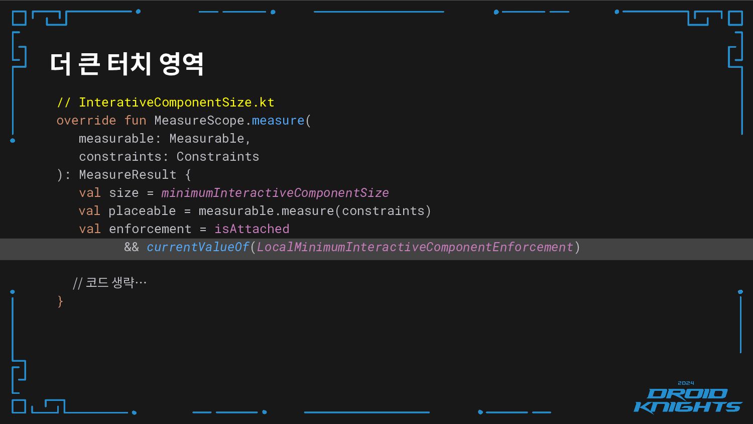
더 큰 터치 영역 // InterativeComponentSize.kt override fun MeasureScope.measure( measurable:
Measurable, constraints: Constraints ): MeasureResult { val size = minimumInteractiveComponentSize val placeable = measurable.measure(constraints) val enforcement = isAttached && currentValueOf(LocalMinimumInteractiveComponentEnforcement) // 코드 생략… } -
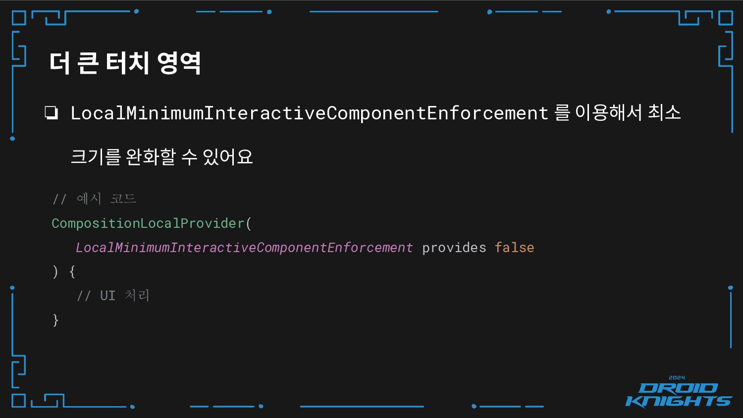
더 큰 터치 영역 ❏ LocalMinimumInteractiveComponentEnforcement 를 이용해서 최소 크기를
완화할 수 있어요 // 예시 코드 CompositionLocalProvider( LocalMinimumInteractiveComponentEnforcement provides false ) { // UI 처리 } -
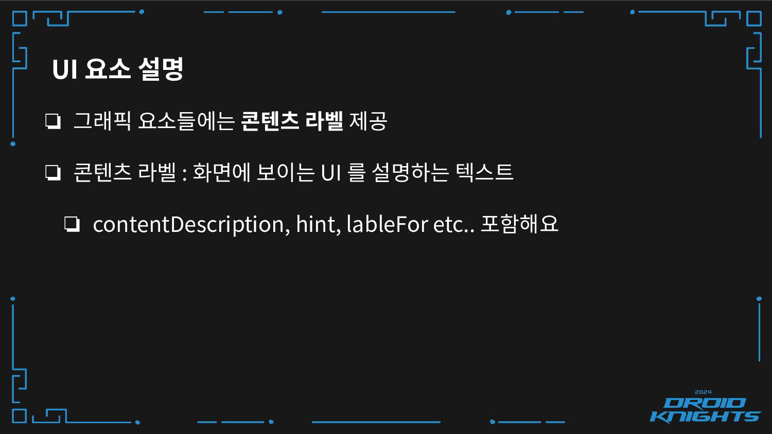
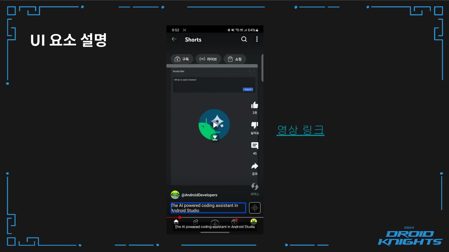
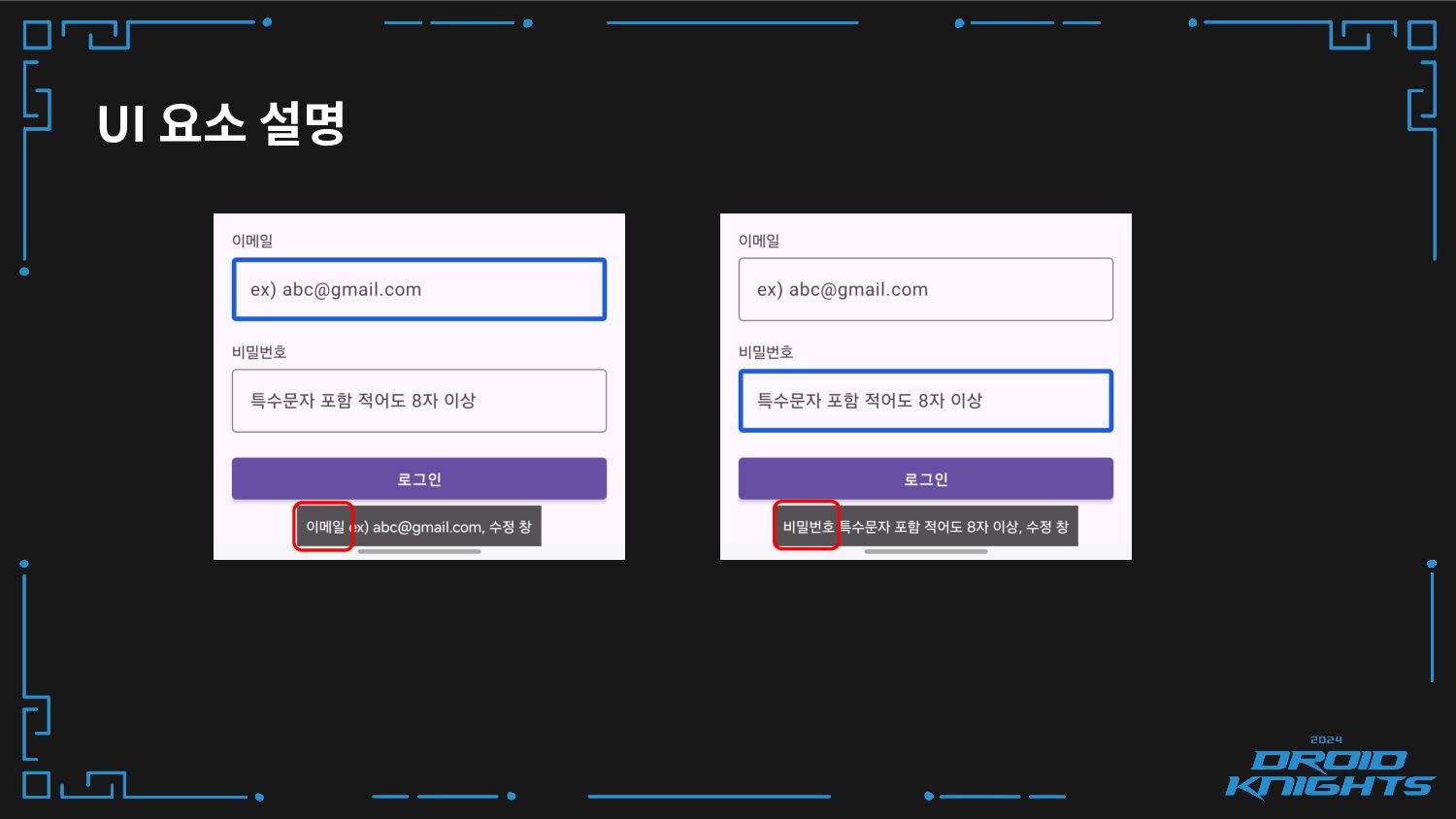
❏ 그래픽 요소들에는 콘텐츠 라벨 제공 ❏ 콘텐츠 라벨 :
화면에 보이는 UI 를 설명하는 텍스트 ❏ contentDescription, hint, lableFor etc.. 포함해요 UI 요소 설명 -
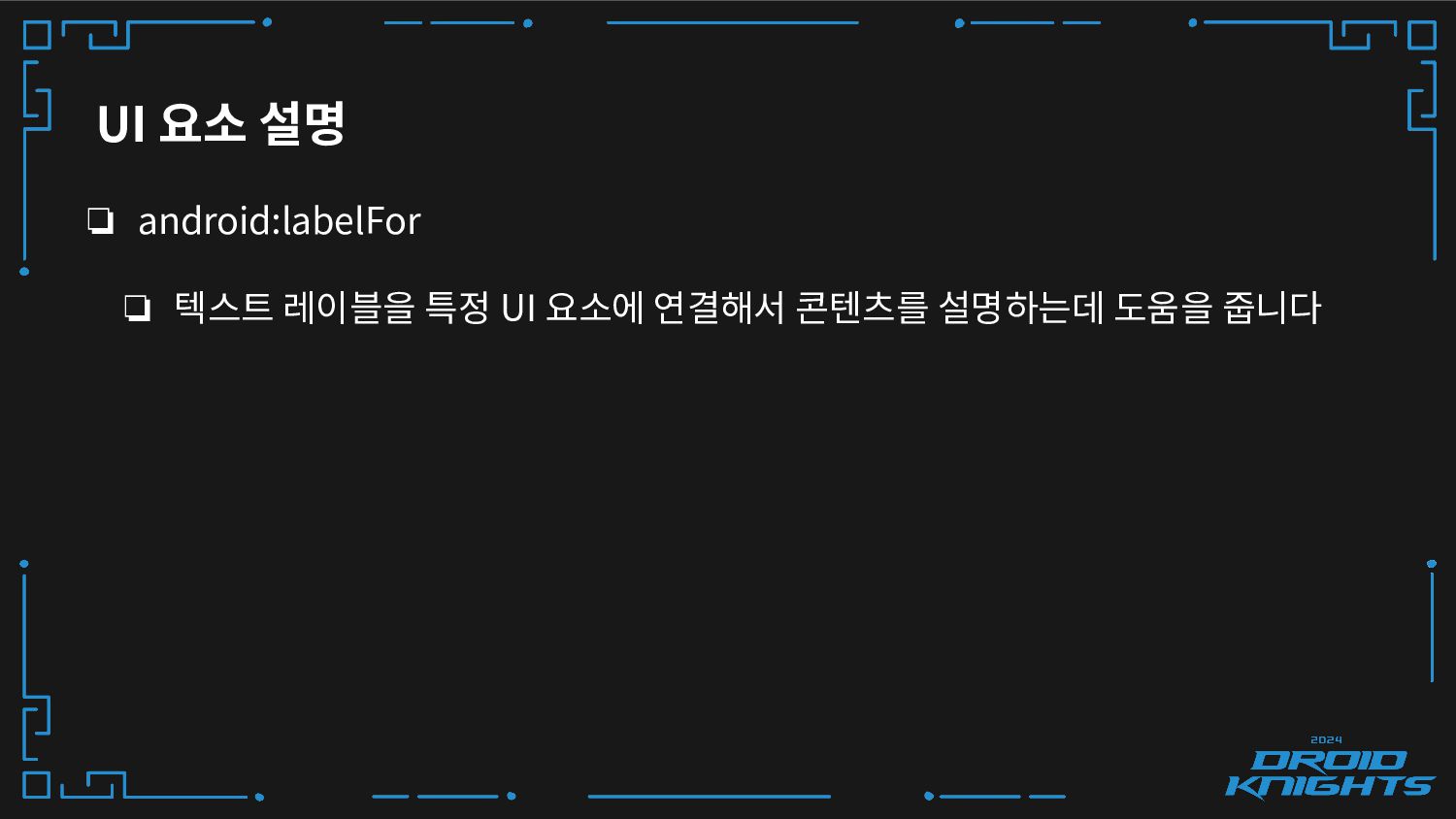
UI 요소 설명 ❏ android:labelFor ❏ 텍스트 레이블을 특정 UI
요소에 연결해서 콘텐츠를 설명하는데 도움을 줍니다 -
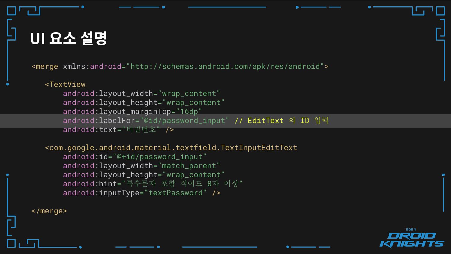
UI 요소 설명 <merge xmlns:android="http://schemas.android.com/apk/res/android"> <TextView android:layout_width="wrap_content" android:layout_height="wrap_content" android:layout_marginTop="16dp" android:labelFor="@id/password_input"
// EditText 의 ID 입력 android:text="비밀번호" /> <com.google.android.material.textfield.TextInputEditText android:id="@+id/password_input" android:layout_width="match_parent" android:layout_height="wrap_content" android:hint="특수문자 포함 적어도 8자 이상" android:inputType="textPassword" /> </merge> -
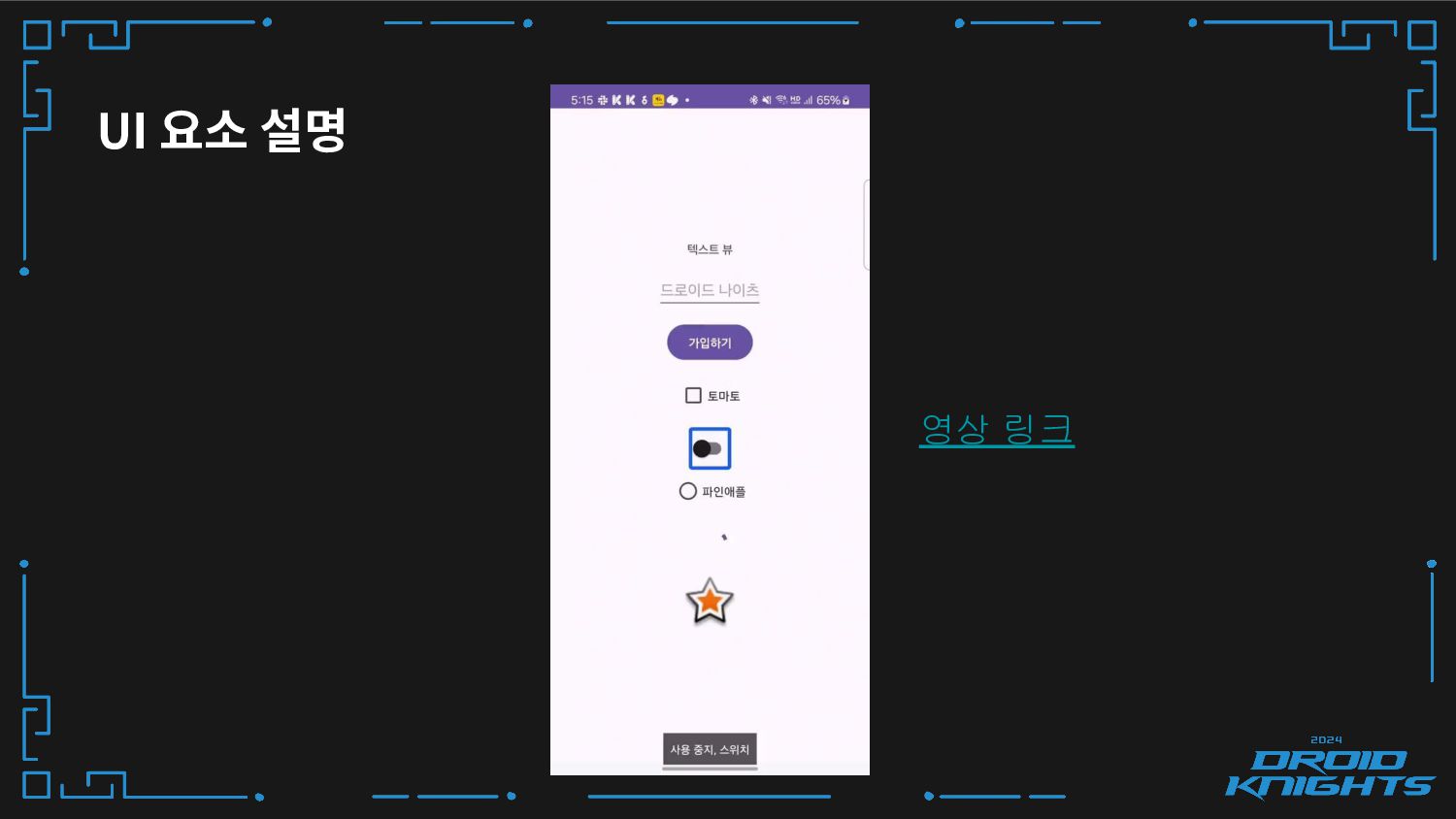
❏ 시스템 UI 컴포넌트에는 Role(Button, TextView, Image etc) 이 설정
되어 있기 때문에, 콘텐츠 설명에는 Role 을 포함할 필요가 없어요 ❏ 상태 변경를 지원하기 때문에, 접근성을 더욱 높여줘요 UI 요소 설명 -
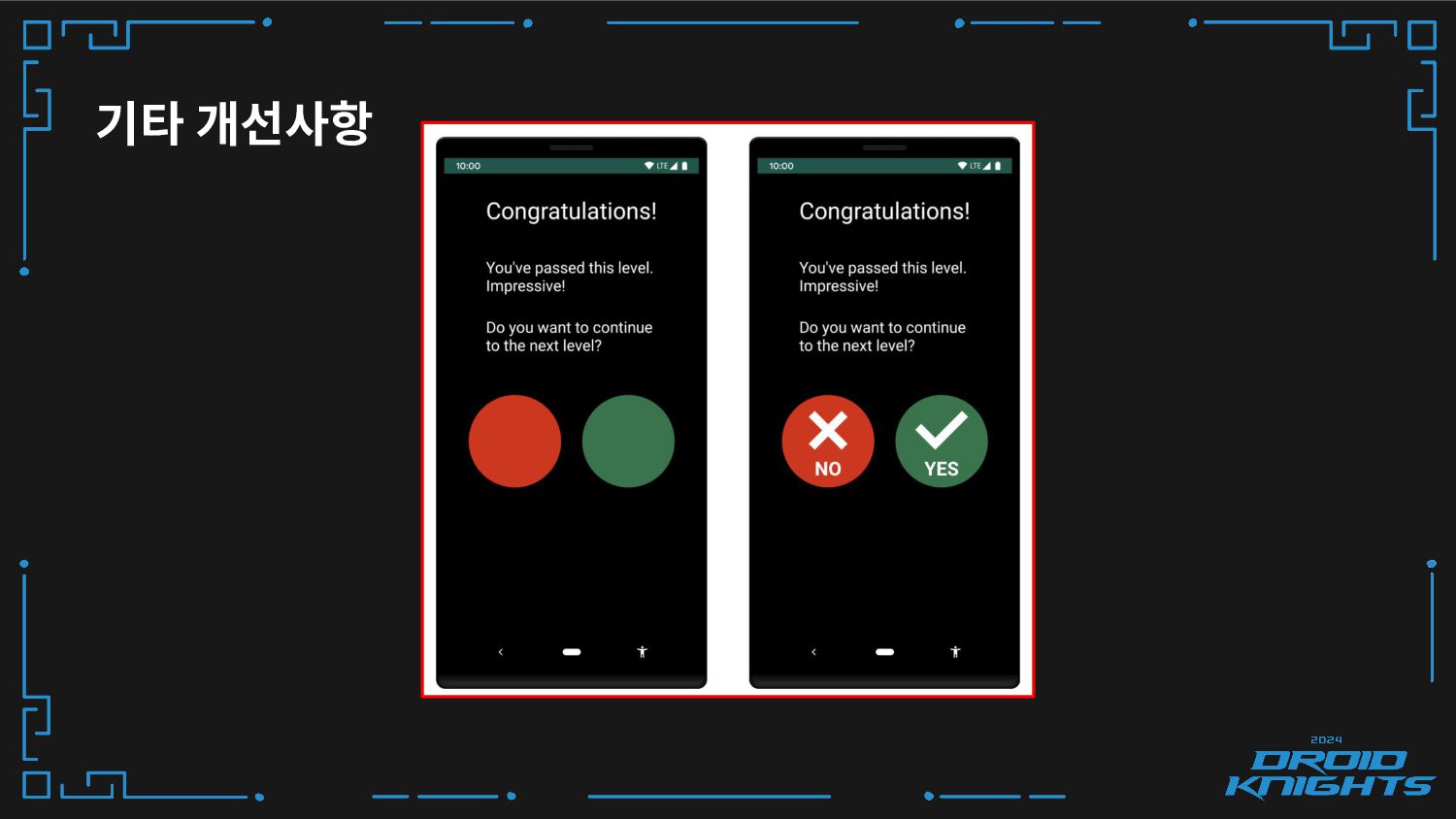
기타 개선사항 ❏ 색상 이외의 단서 활용하기 ❏ 빨간색을 부정적,
초록색을 긍정의 의미로 사용하면 시각적인 불편함(적록색맹)이 있는 분들은 이해하기 어려워요 -
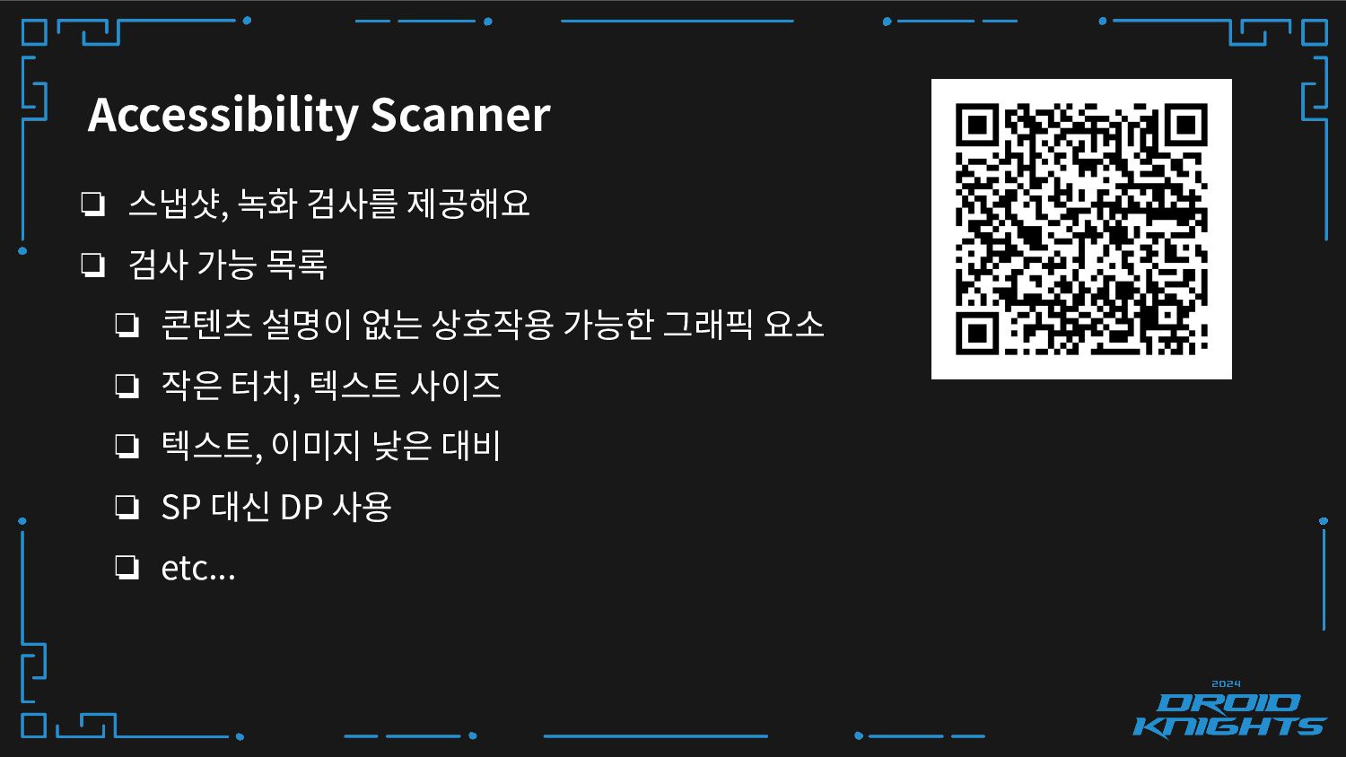
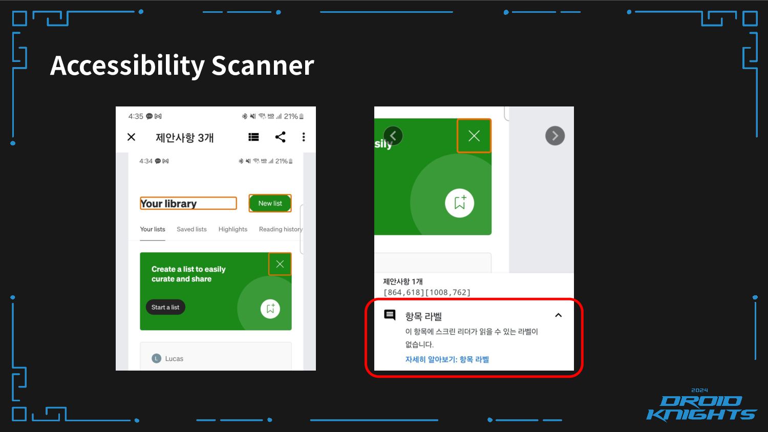
Accessibility Scanner ❏ 스냅샷, 녹화 검사를 제공해요 ❏ 검사 가능
목록 ❏ 콘텐츠 설명이 없는 상호작용 가능한 그래픽 요소 ❏ 작은 터치, 텍스트 사이즈 ❏ 텍스트, 이미지 낮은 대비 ❏ SP 대신 DP 사용 ❏ etc... -
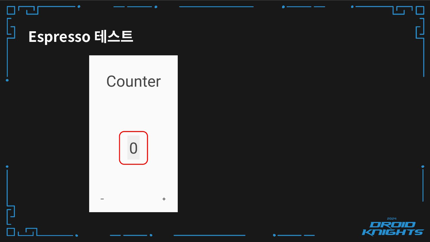
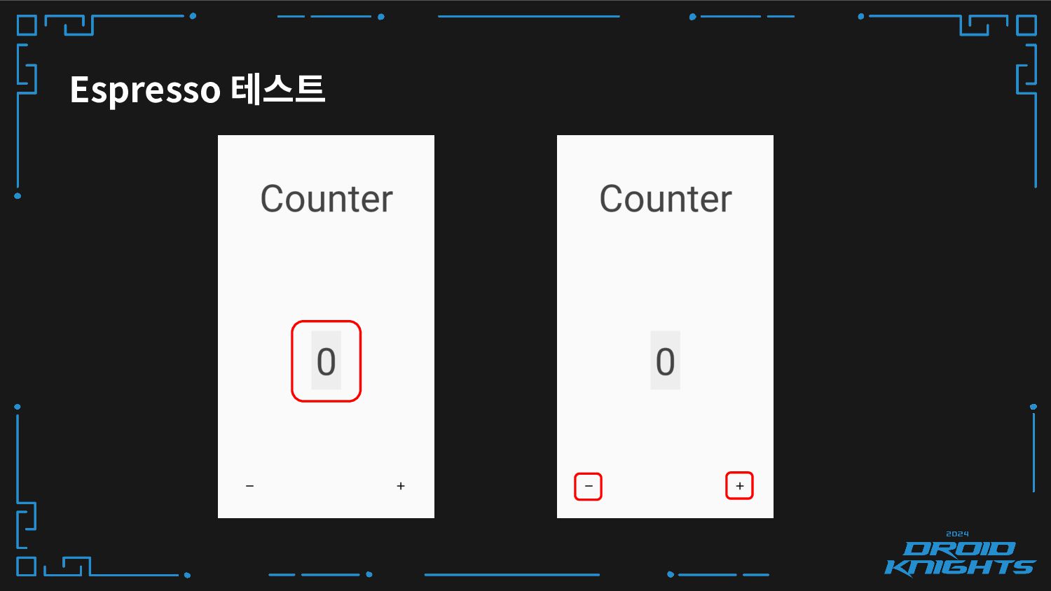
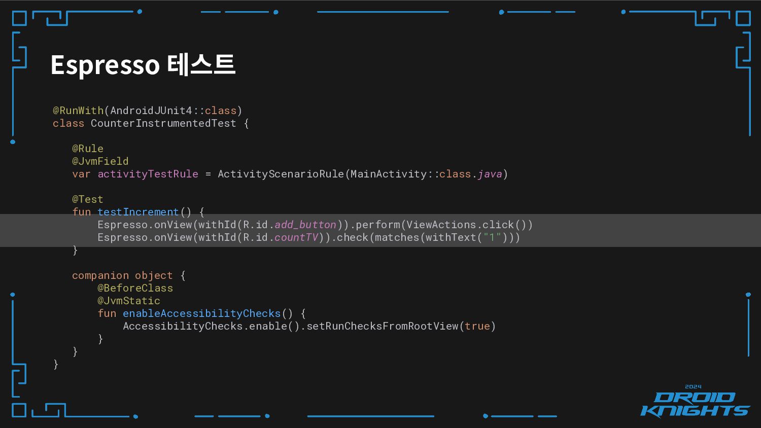
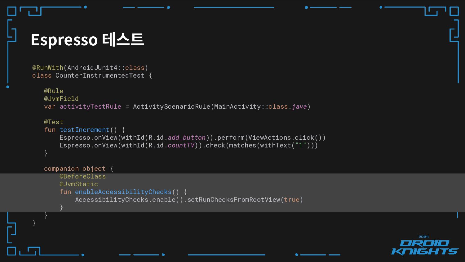
Espresso 테스트 @RunWith(AndroidJUnit4::class) class CounterInstrumentedTest { @Rule @JvmField var activityTestRule
= ActivityScenarioRule(MainActivity::class.java) @Test fun testIncrement() { Espresso.onView(withId(R.id.add_button)).perform(ViewActions.click()) Espresso.onView(withId(R.id.countTV)).check(matches(withText("1"))) } companion object { @BeforeClass @JvmStatic fun enableAccessibilityChecks() { AccessibilityChecks.enable().setRunChecksFromRootView(true) } } } -
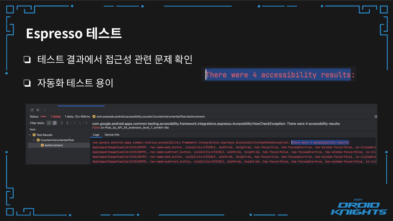
Espresso 테스트 ❏ 테스트 결과에서 접근성 관련 문제 확인 ❏
자동화 테스트 용이 -
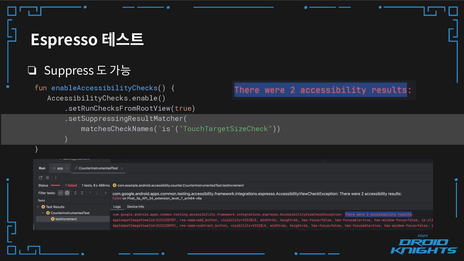
❏ Suppress 도 가능 Espresso 테스트 fun enableAccessibilityChecks() { AccessibilityChecks.enable()
.setRunChecksFromRootView(true) .setSuppressingResultMatcher( matchesCheckNames(`is`("TouchTargetSizeCheck")) ) } -
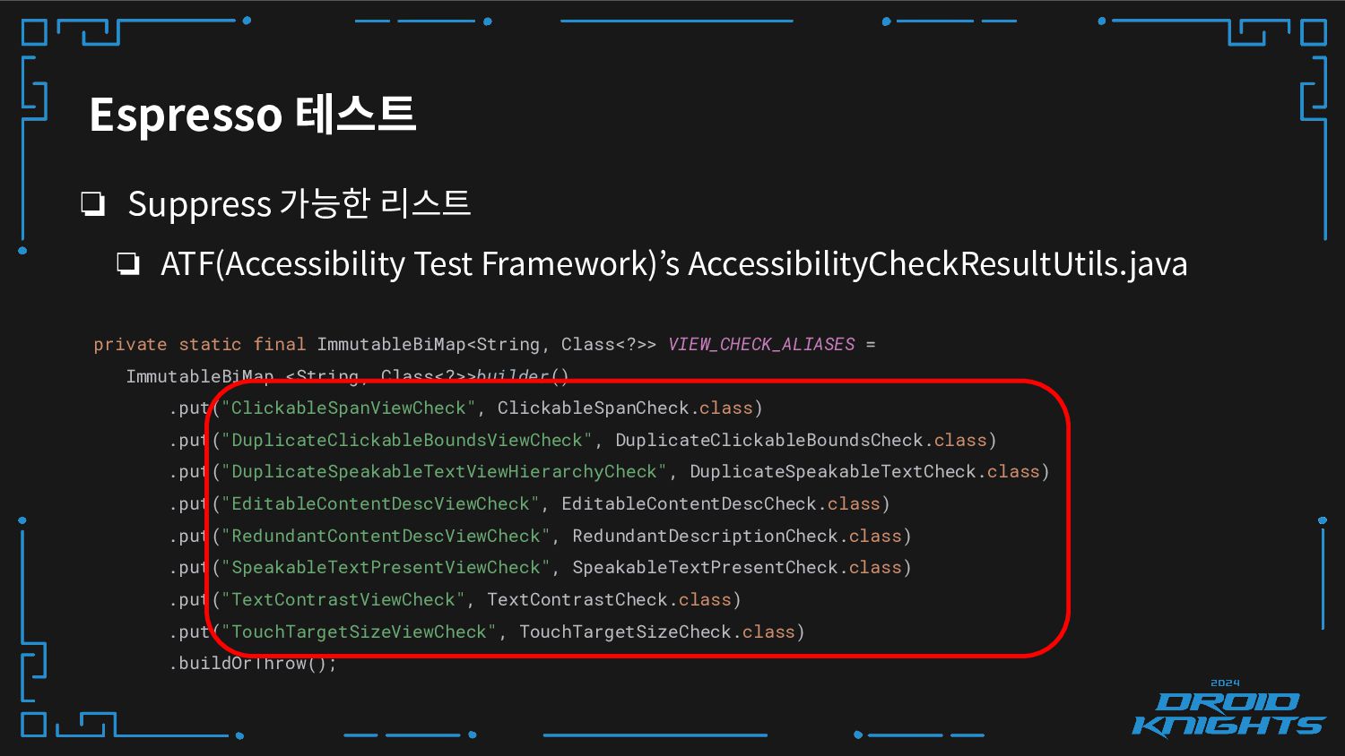
Espresso 테스트 ❏ Suppress 가능한 리스트 ❏ ATF(Accessibility Test Framework)’s
AccessibilityCheckResultUtils.java private static final ImmutableBiMap<String, Class<?>> VIEW_CHECK_ALIASES = ImmutableBiMap.<String, Class<?>>builder() .put("ClickableSpanViewCheck", ClickableSpanCheck.class) .put("DuplicateClickableBoundsViewCheck", DuplicateClickableBoundsCheck.class) .put("DuplicateSpeakableTextViewHierarchyCheck", DuplicateSpeakableTextCheck.class) .put("EditableContentDescViewCheck", EditableContentDescCheck.class) .put("RedundantContentDescViewCheck", RedundantDescriptionCheck.class) .put("SpeakableTextPresentViewCheck", SpeakableTextPresentCheck.class) .put("TextContrastViewCheck", TextContrastCheck.class) .put("TouchTargetSizeViewCheck", TouchTargetSizeCheck.class) .buildOrThrow(); -
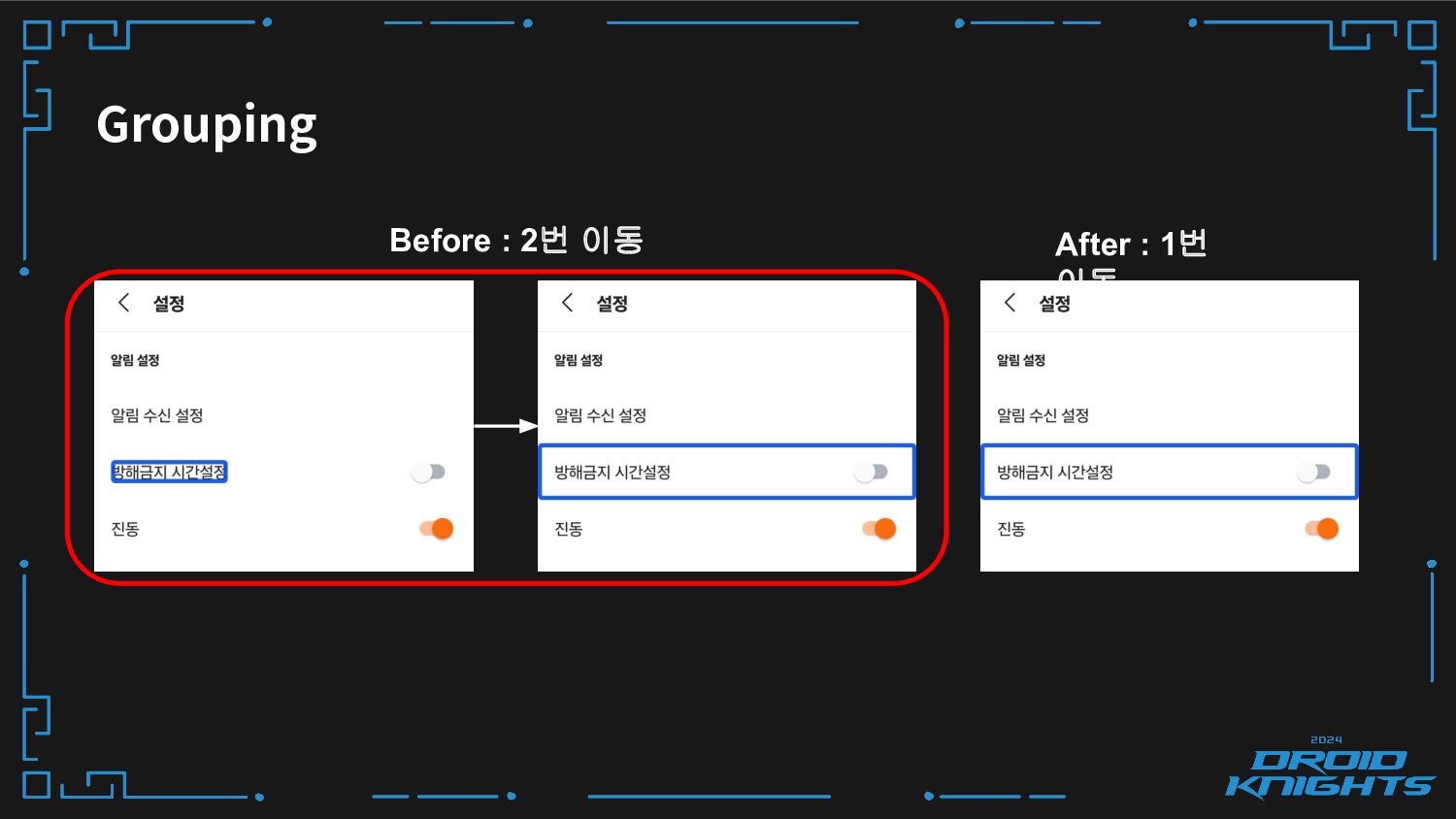
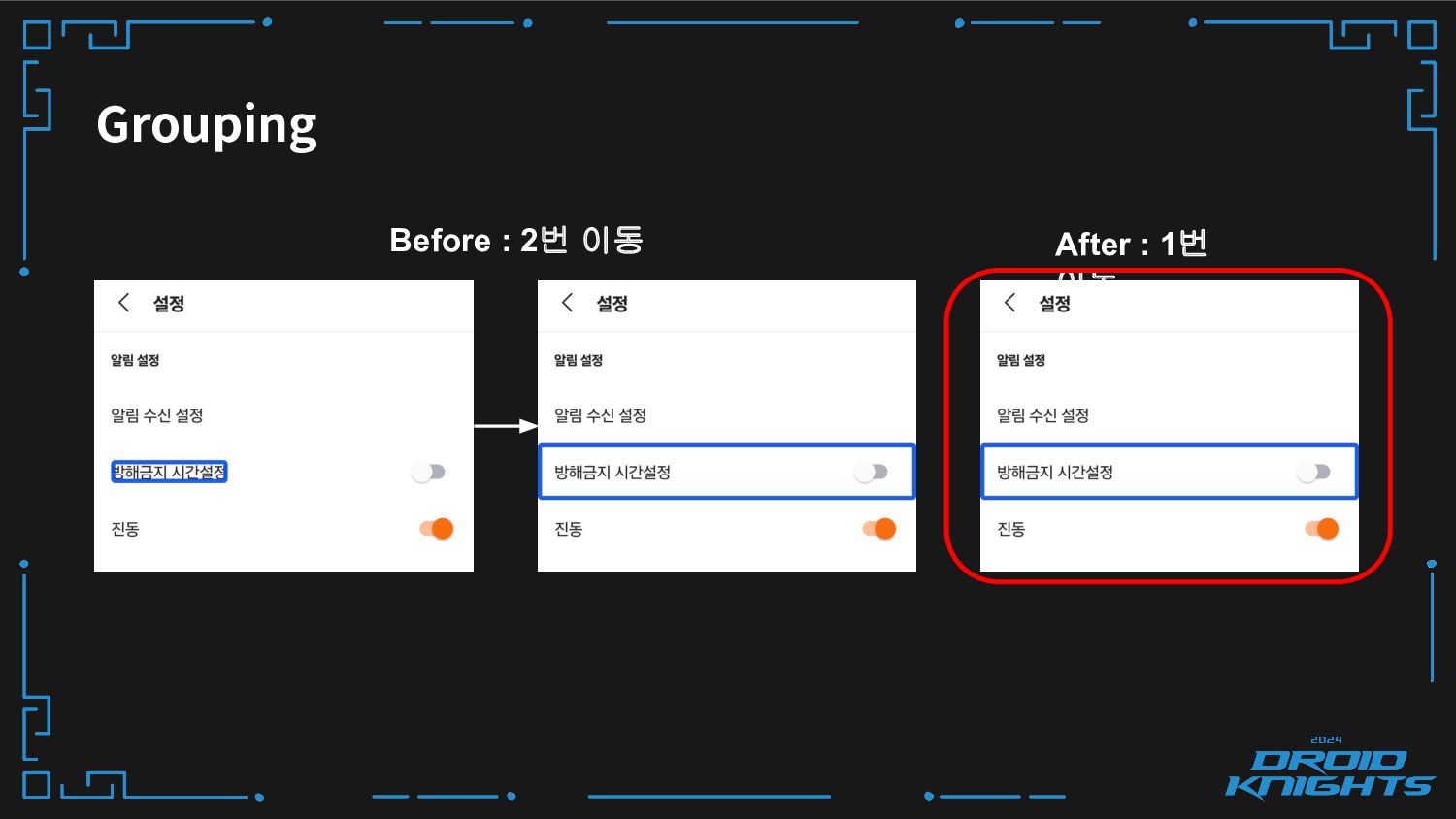
Grouping ❏ 연관된 콘텐츠를 그룹화하여 효율적으로 정보를 전달할 수 있어요
❏ 중요한 UI 요소까지 포커스를 여러 번 불필요하게 이동하는 경우 ❏ 동일한 콘텐츠가 여러 번 포커스 되어 내용이 반복되는 문제 해결 -
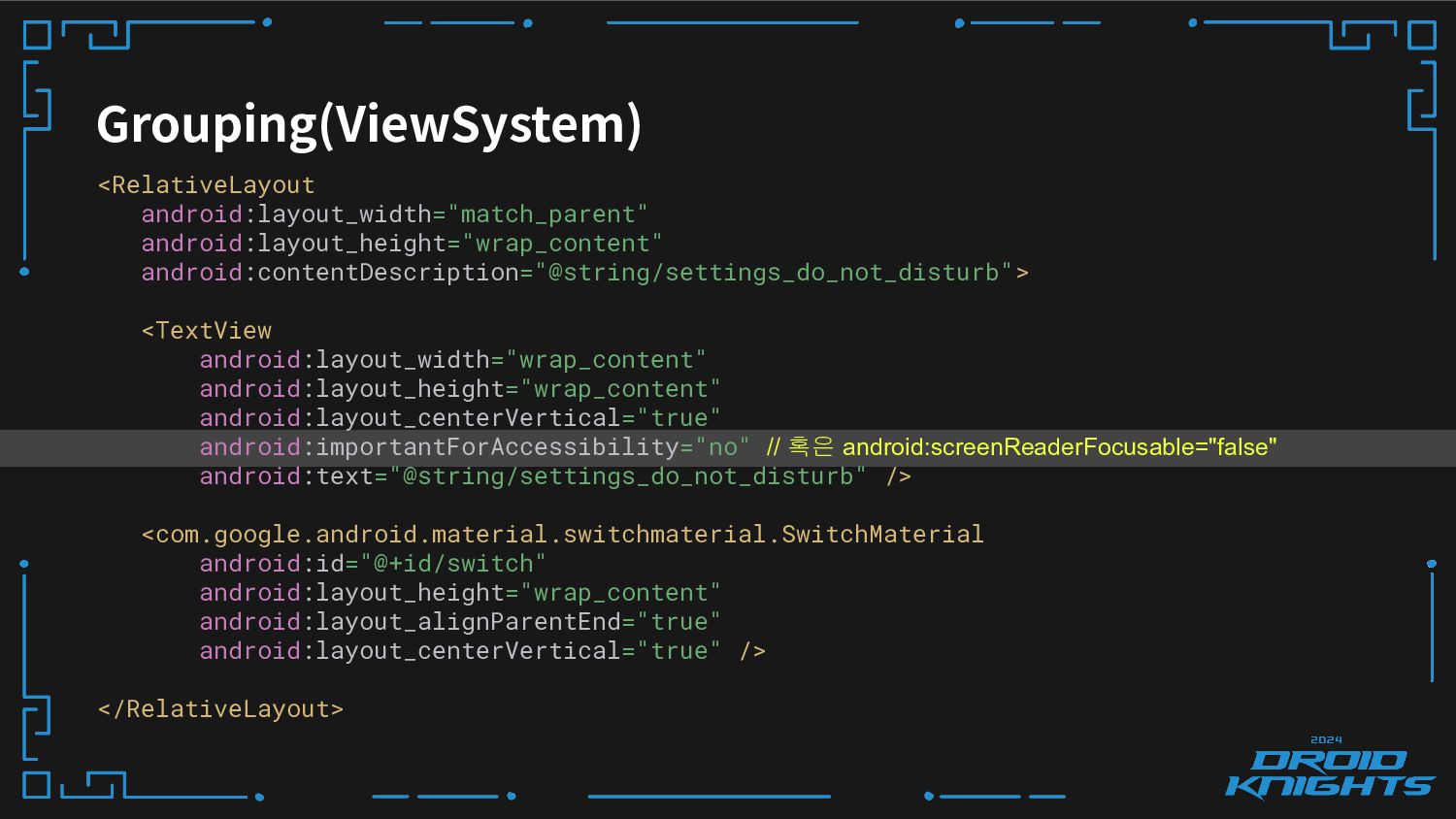
Grouping(ViewSystem) <RelativeLayout android:layout_width="match_parent" android:layout_height="wrap_content" android:contentDescription="@string/settings_do_not_disturb"> <TextView android:layout_width="wrap_content" android:layout_height="wrap_content" android:layout_centerVertical="true" android:importantForAccessibility="no"
// 혹은 android:screenReaderFocusable="false" android:text="@string/settings_do_not_disturb" /> <com.google.android.material.switchmaterial.SwitchMaterial android:id="@+id/switch" android:layout_height="wrap_content" android:layout_alignParentEnd="true" android:layout_centerVertical="true" /> </RelativeLayout> -
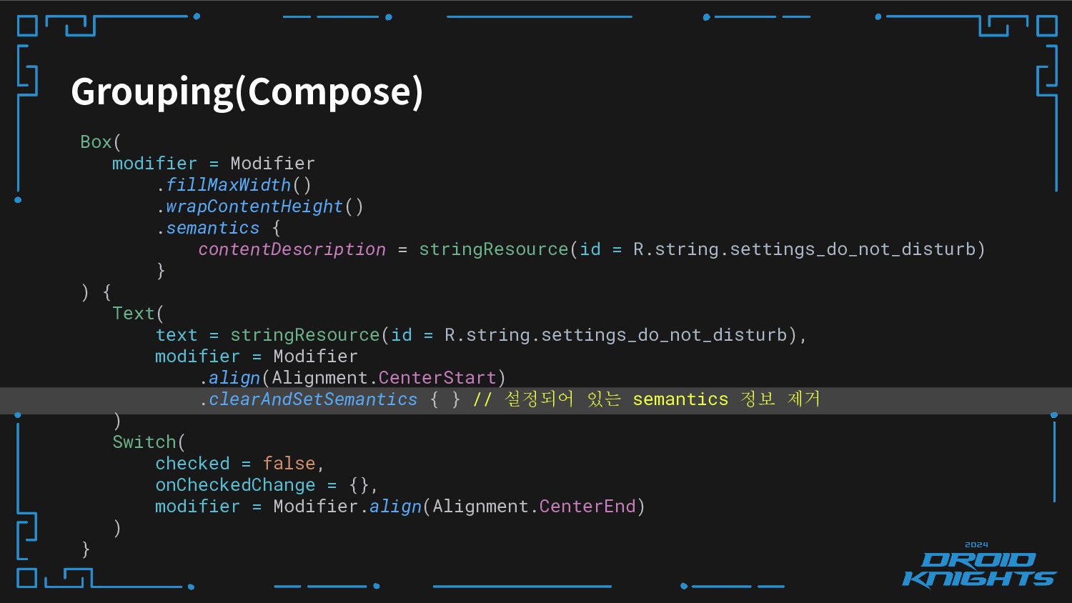
Grouping(Compose) Box( modifier = Modifier .fillMaxWidth() .wrapContentHeight() .semantics { contentDescription
= stringResource(id = R.string.settings_do_not_disturb) } ) { Text( text = stringResource(id = R.string.settings_do_not_disturb), modifier = Modifier .align(Alignment.CenterStart) .clearAndSetSemantics { } // 설정되어 있는 semantics 정보 제거 ) Switch( checked = false, onCheckedChange = {}, modifier = Modifier.align(Alignment.CenterEnd) ) } -
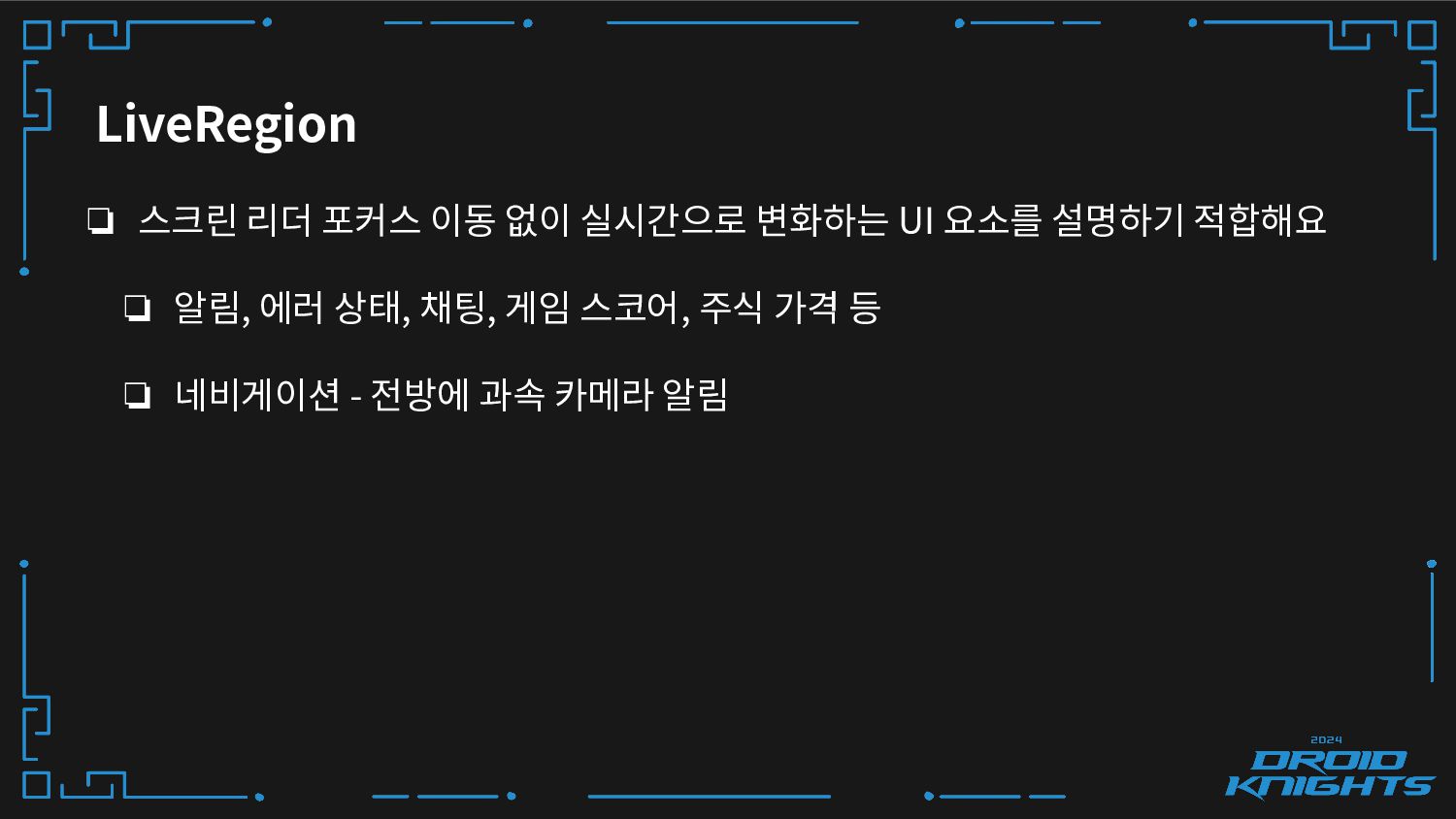
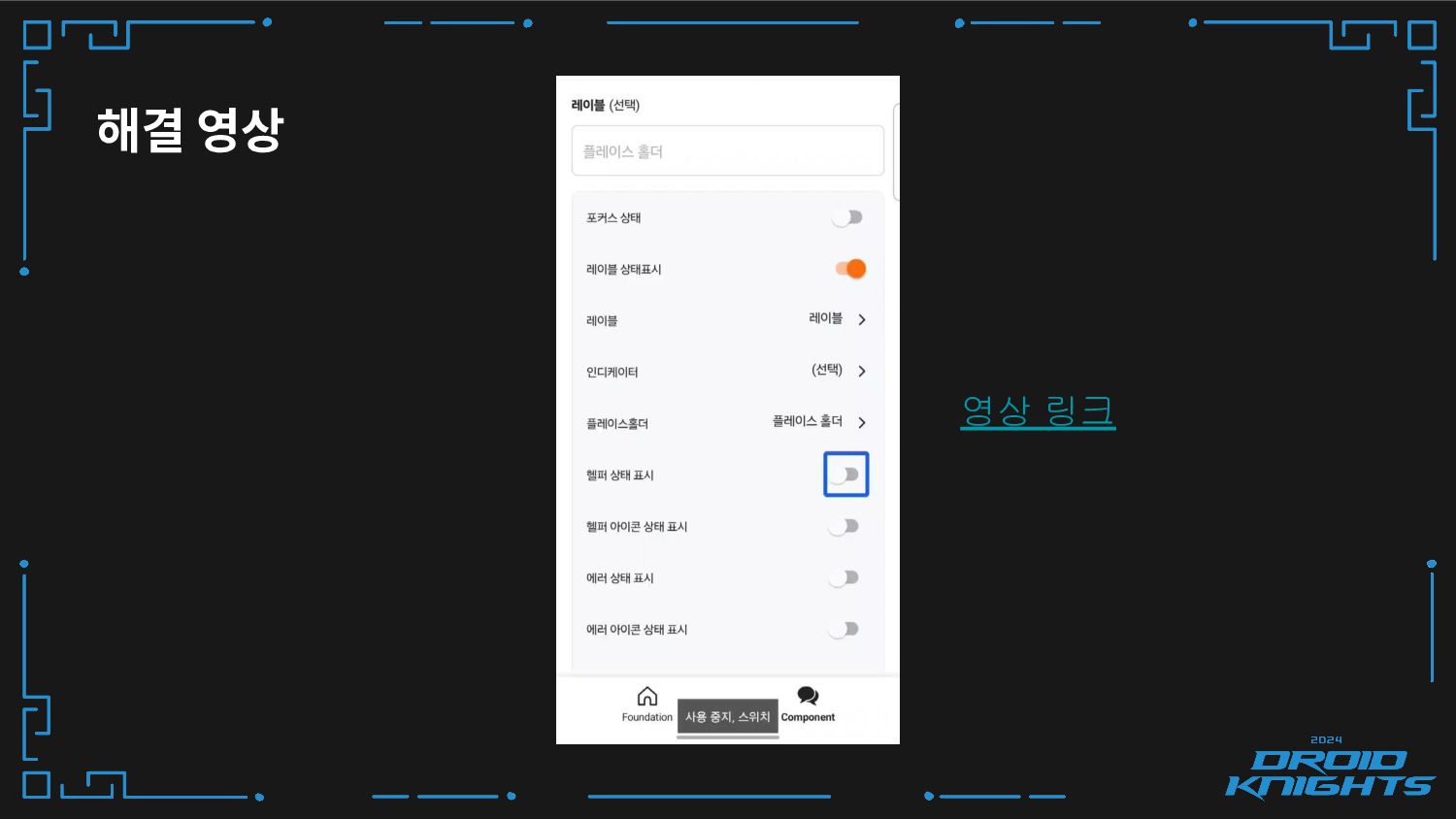
LiveRegion ❏ 스크린 리더 포커스 이동 없이 실시간으로 변화하는 UI
요소를 설명하기 적합해요 ❏ 알림, 에러 상태, 채팅, 게임 스코어, 주식 가격 등 ❏ 네비게이션 - 전방에 과속 카메라 알림 -
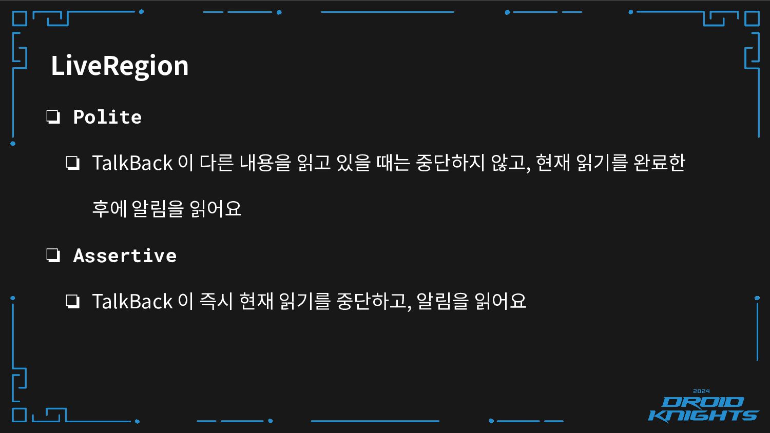
LiveRegion ❏ Polite ❏ TalkBack 이 다른 내용을 읽고 있을
때는 중단하지 않고, 현재 읽기를 완료한 후에 알림을 읽어요 ❏ Assertive ❏ TalkBack 이 즉시 현재 읽기를 중단하고, 알림을 읽어요 -
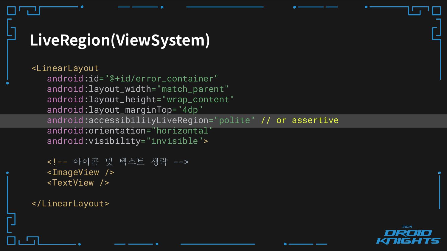
LiveRegion(ViewSystem) <LinearLayout android:id="@+id/error_container" android:layout_width="match_parent" android:layout_height="wrap_content" android:layout_marginTop="4dp" android:accessibilityLiveRegion="polite" // or assertive
android:orientation="horizontal" android:visibility="invisible"> <!-- 아이콘 및 텍스트 생략 --> <ImageView /> <TextView /> </LinearLayout> -
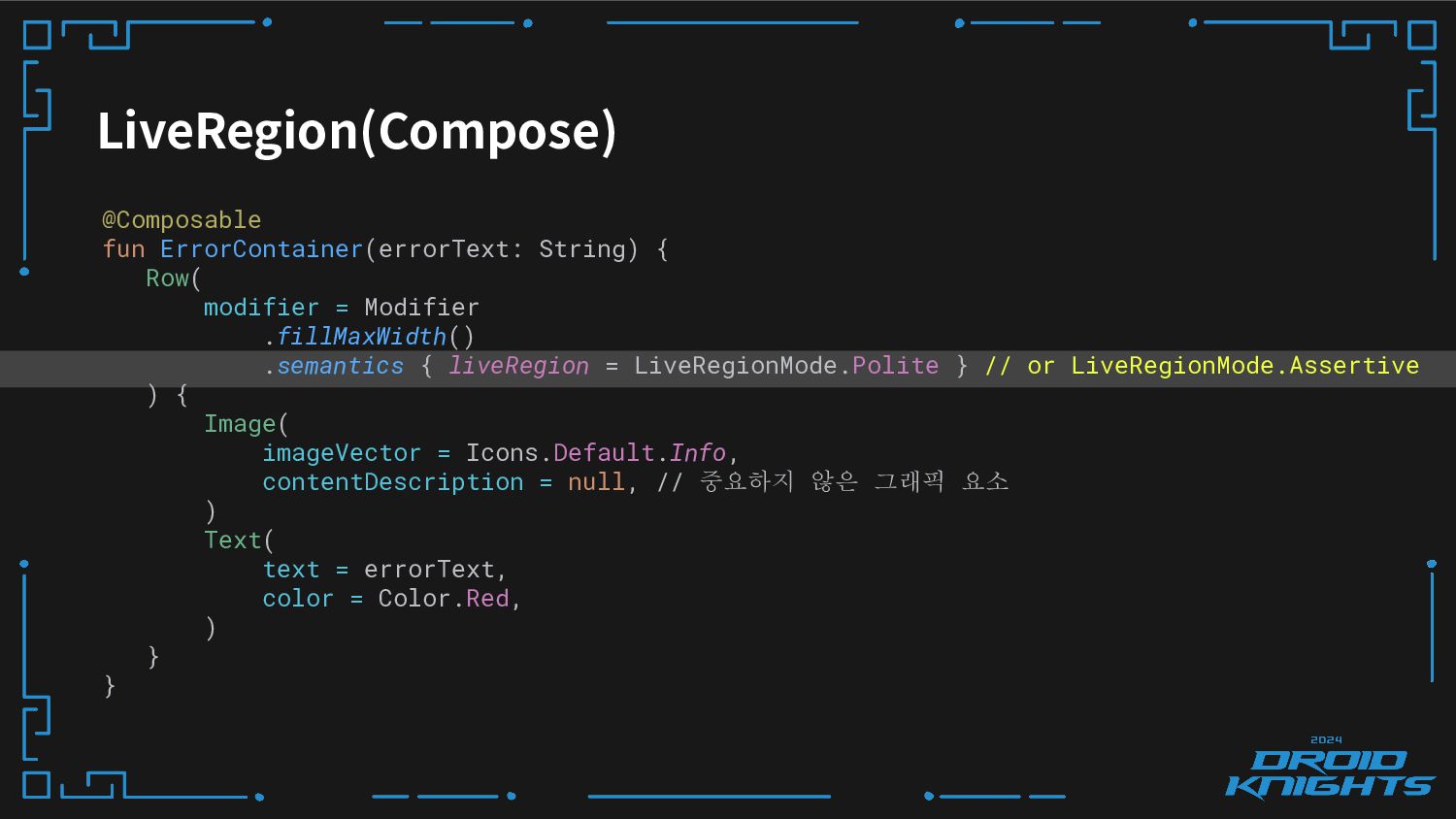
LiveRegion(Compose) @Composable fun ErrorContainer(errorText: String) { Row( modifier = Modifier
.fillMaxWidth() .semantics { liveRegion = LiveRegionMode.Polite } // or LiveRegionMode.Assertive ) { Image( imageVector = Icons.Default.Info, contentDescription = null, // 중요하지 않은 그래픽 요소 ) Text( text = errorText, color = Color.Red, ) } } -
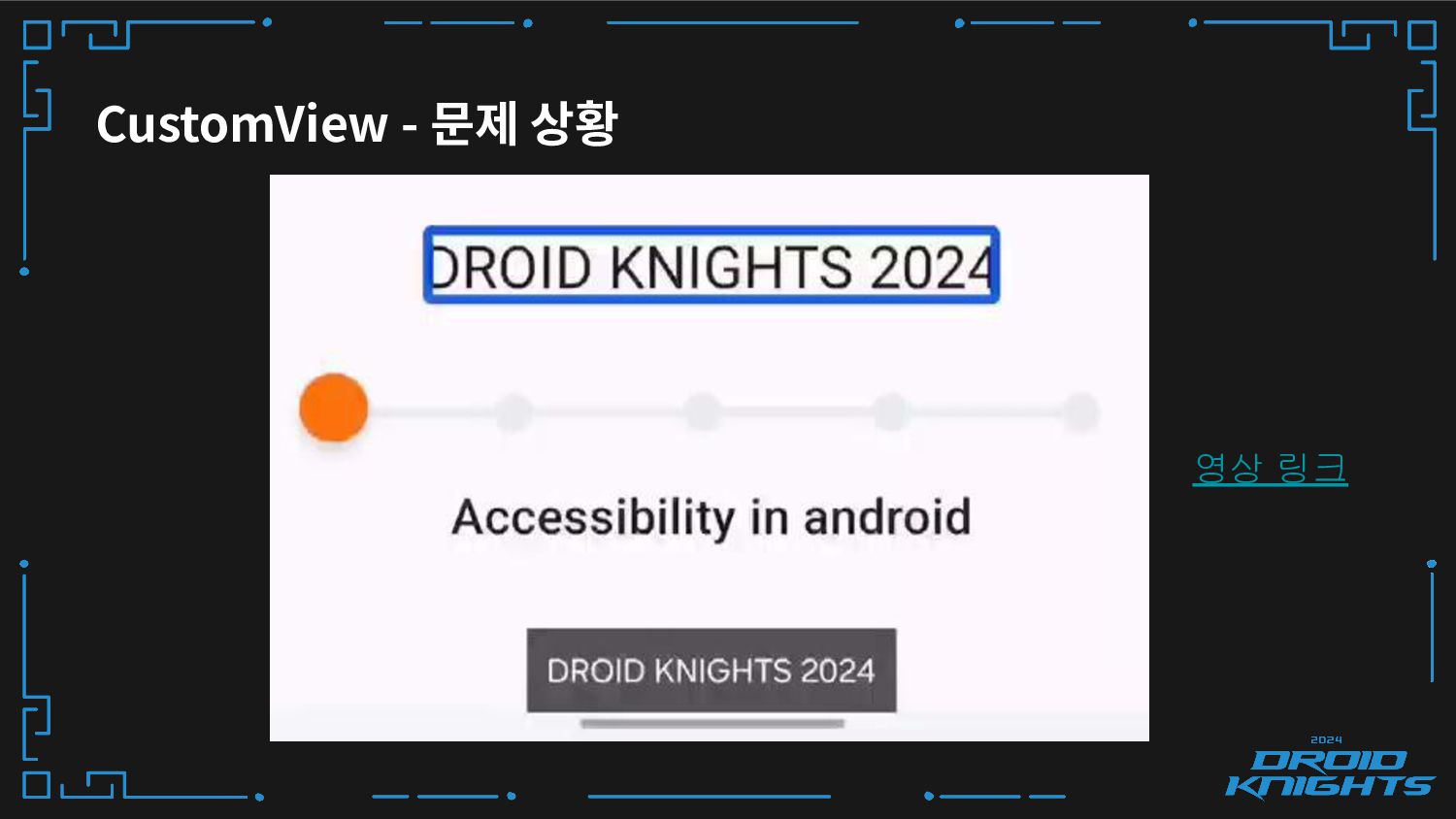
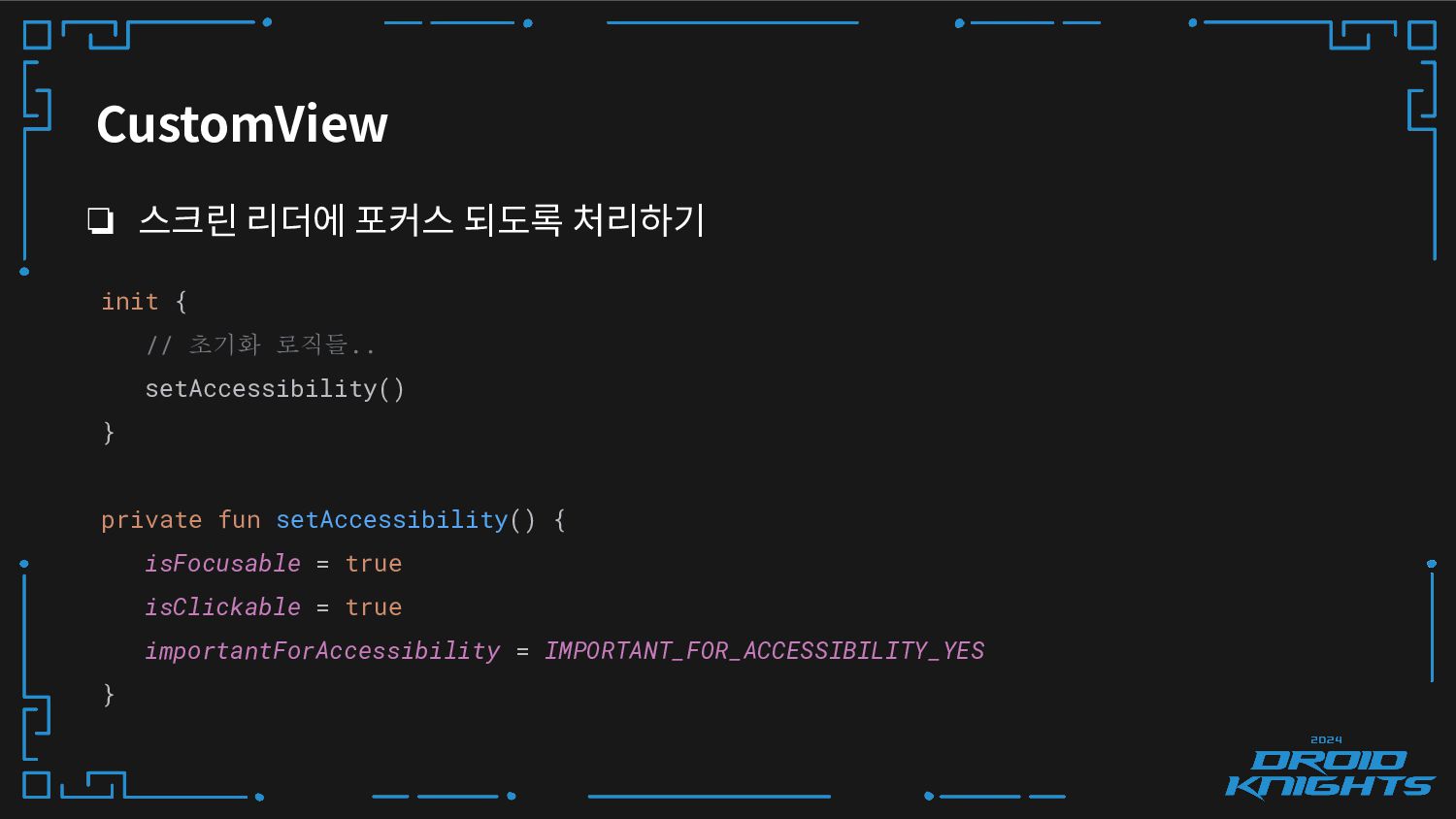
CustomView ❏ Canvas 에 직접 그리는 경우, 접근성 처리는 개발자
몫이에요. ❏ 오픈소스 사용시 주의해야해요. -
CustomView ❏ 스크린 리더에 포커스 되도록 처리하기 init { //
초기화 로직들.. setAccessibility() } private fun setAccessibility() { isFocusable = true isClickable = true importantForAccessibility = IMPORTANT_FOR_ACCESSIBILITY_YES } -
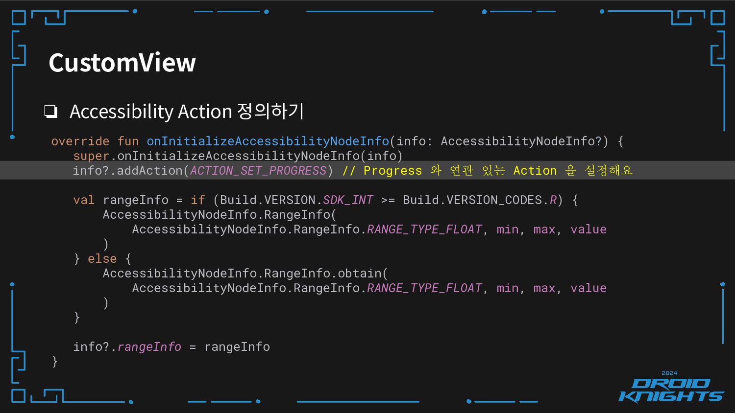
CustomView ❏ Accessibility Action 정의하기 override fun onInitializeAccessibilityNodeInfo(info: AccessibilityNodeInfo?) {
super.onInitializeAccessibilityNodeInfo(info) info?.addAction(ACTION_SET_PROGRESS) // Progress 와 연관 있는 Action 을 설정해요 val rangeInfo = if (Build.VERSION.SDK_INT >= Build.VERSION_CODES.R) { AccessibilityNodeInfo.RangeInfo( AccessibilityNodeInfo.RangeInfo.RANGE_TYPE_FLOAT, min, max, value ) } else { AccessibilityNodeInfo.RangeInfo.obtain( AccessibilityNodeInfo.RangeInfo.RANGE_TYPE_FLOAT, min, max, value ) } info?.rangeInfo = rangeInfo } -
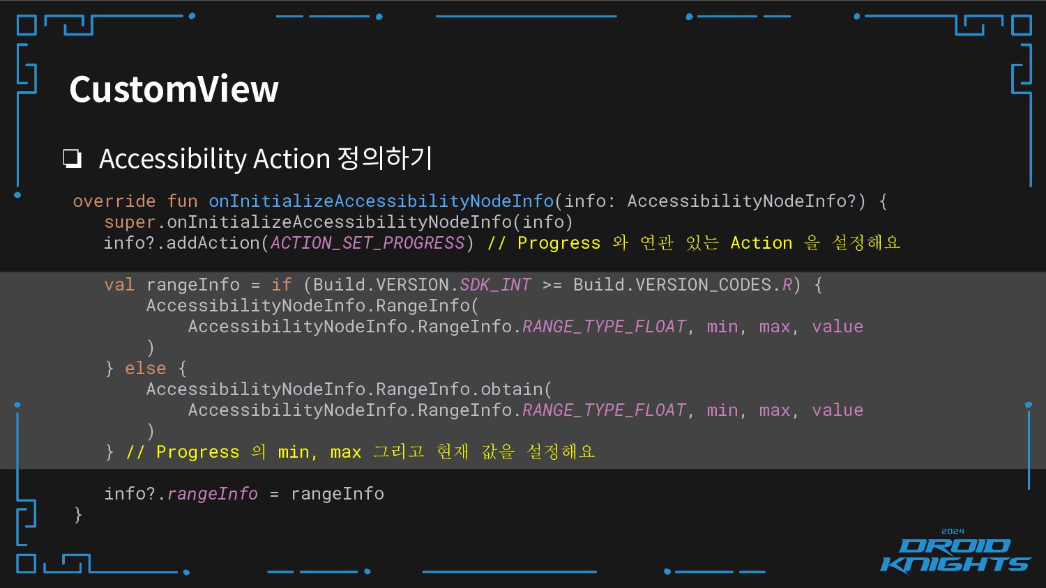
CustomView ❏ Accessibility Action 정의하기 override fun onInitializeAccessibilityNodeInfo(info: AccessibilityNodeInfo?) {
super.onInitializeAccessibilityNodeInfo(info) info?.addAction(ACTION_SET_PROGRESS) // Progress 와 연관 있는 Action 을 설정해요 val rangeInfo = if (Build.VERSION.SDK_INT >= Build.VERSION_CODES.R) { AccessibilityNodeInfo.RangeInfo( AccessibilityNodeInfo.RangeInfo.RANGE_TYPE_FLOAT, min, max, value ) } else { AccessibilityNodeInfo.RangeInfo.obtain( AccessibilityNodeInfo.RangeInfo.RANGE_TYPE_FLOAT, min, max, value ) } // Progress 의 min, max 그리고 현재 값을 설정해요 info?.rangeInfo = rangeInfo } -
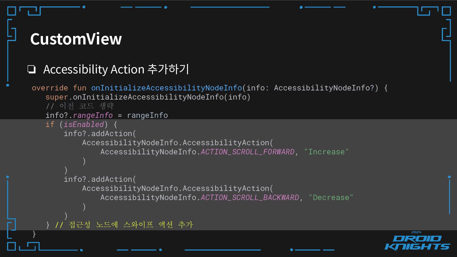
CustomView ❏ Accessibility Action 추가하기 override fun onInitializeAccessibilityNodeInfo(info: AccessibilityNodeInfo?) {
super.onInitializeAccessibilityNodeInfo(info) // 이전 코드 생략 info?.rangeInfo = rangeInfo if (isEnabled) { info?.addAction( AccessibilityNodeInfo.AccessibilityAction( AccessibilityNodeInfo.ACTION_SCROLL_FORWARD, "Increase" ) ) info?.addAction( AccessibilityNodeInfo.AccessibilityAction( AccessibilityNodeInfo.ACTION_SCROLL_BACKWARD, "Decrease" ) ) } // 접근성 노드에 스와이프 액션 추가 } -
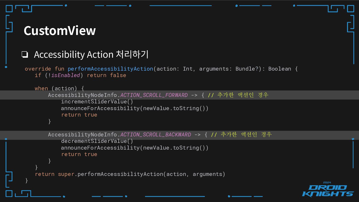
CustomView ❏ Accessibility Action 처리하기 override fun performAccessibilityAction(action: Int, arguments:
Bundle?): Boolean { if (!isEnabled) return false when (action) { AccessibilityNodeInfo.ACTION_SCROLL_FORWARD -> { // 추가한 액션인 경우 incrementSliderValue() announceForAccessibility(newValue.toString()) return true } AccessibilityNodeInfo.ACTION_SCROLL_BACKWARD -> { // 추가한 액션인 경우 decrementSliderValue() announceForAccessibility(newValue.toString()) return true } } return super.performAccessibilityAction(action, arguments) } -
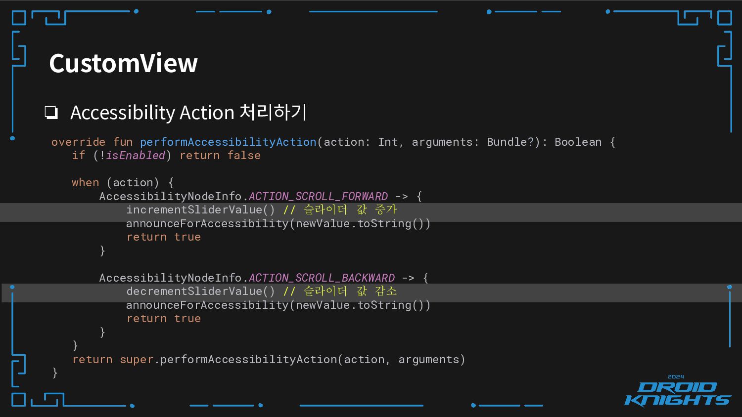
CustomView ❏ Accessibility Action 처리하기 override fun performAccessibilityAction(action: Int, arguments:
Bundle?): Boolean { if (!isEnabled) return false when (action) { AccessibilityNodeInfo.ACTION_SCROLL_FORWARD -> { incrementSliderValue() // 슬라이더 값 증가 announceForAccessibility(newValue.toString()) return true } AccessibilityNodeInfo.ACTION_SCROLL_BACKWARD -> { decrementSliderValue() // 슬라이더 값 감소 announceForAccessibility(newValue.toString()) return true } } return super.performAccessibilityAction(action, arguments) } -
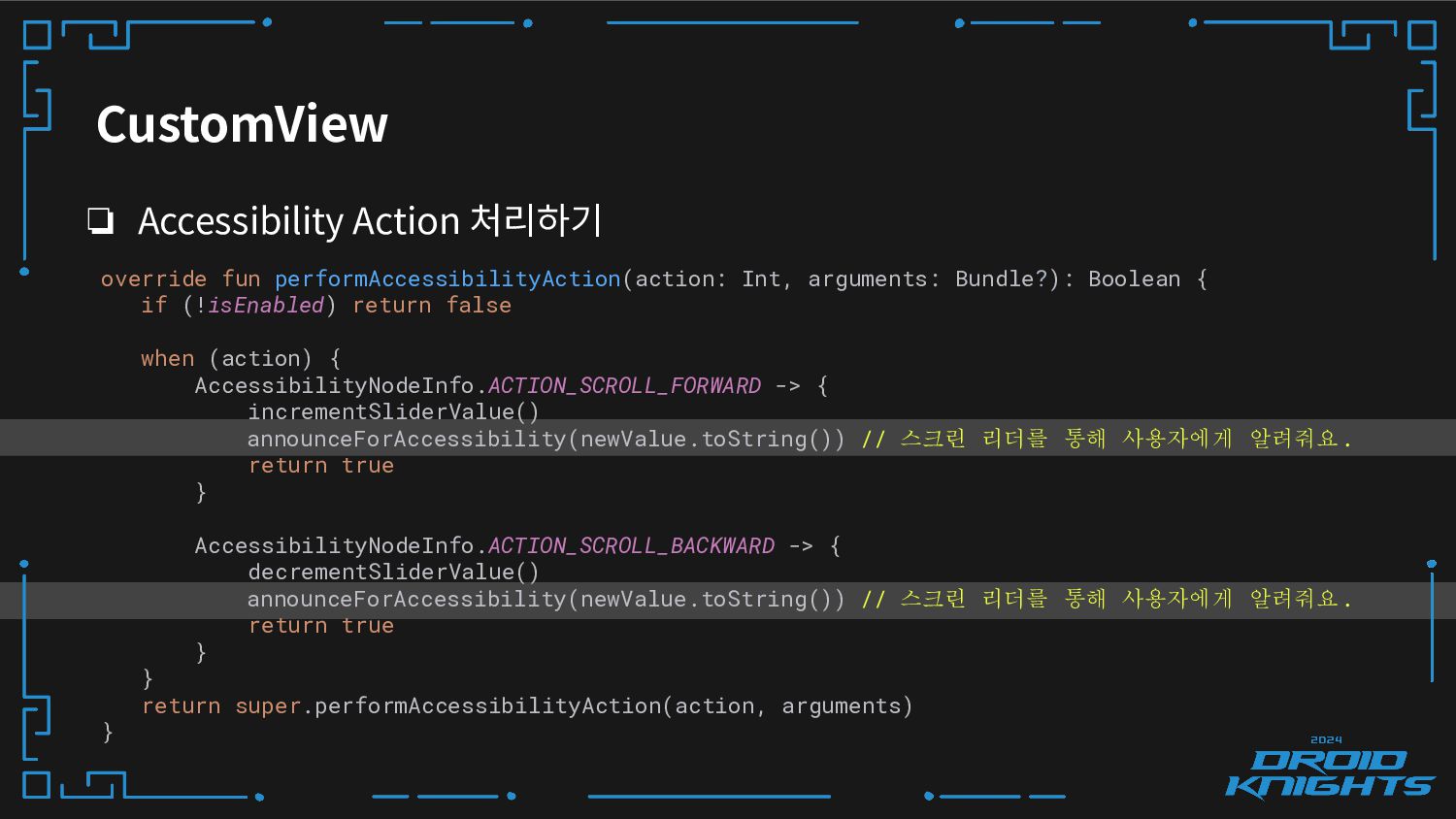
CustomView ❏ Accessibility Action 처리하기 override fun performAccessibilityAction(action: Int, arguments:
Bundle?): Boolean { if (!isEnabled) return false when (action) { AccessibilityNodeInfo.ACTION_SCROLL_FORWARD -> { incrementSliderValue() announceForAccessibility(newValue.toString()) // 스크린 리더를 통해 사용자에게 알려줘요. return true } AccessibilityNodeInfo.ACTION_SCROLL_BACKWARD -> { decrementSliderValue() announceForAccessibility(newValue.toString()) // 스크린 리더를 통해 사용자에게 알려줘요. return true } } return super.performAccessibilityAction(action, arguments) } -
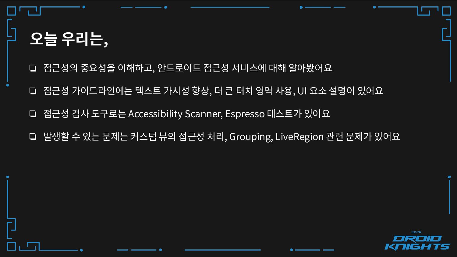
오늘 우리는, ❏ 접근성의 중요성을 이해하고, 안드로이드 접근성 서비스에 대해
알아봤어요 ❏ 접근성 가이드라인에는 텍스트 가시성 향상, 더 큰 터치 영역 사용, UI 요소 설명이 있어요 ❏ 접근성 검사 도구로는 Accessibility Scanner, Espresso 테스트가 있어요 ❏ 발생할 수 있는 문제는 커스텀 뷰의 접근성 처리, Grouping, LiveRegion 관련 문제가 있어요 -
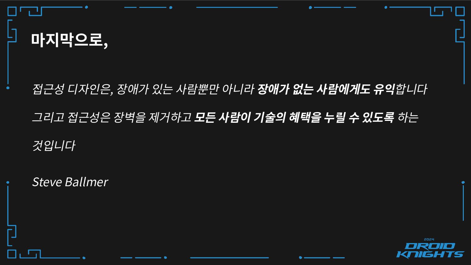
마지막으로, 접근성 디자인은, 장애가 있는 사람뿐만 아니라 장애가 없는 사람에게도
유익합니다 그리고 접근성은 장벽을 제거하고 모든 사람이 기술의 혜택을 누릴 수 있도록 하는 것입니다 Steve Ballmer