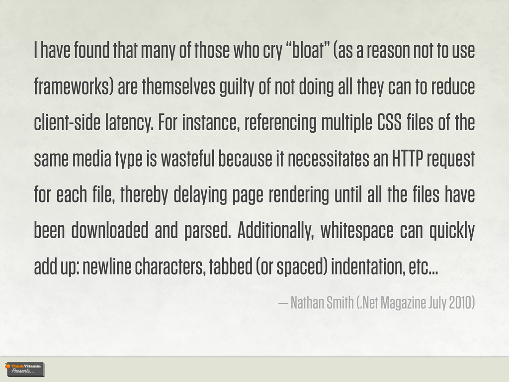
(as a reason not to use frameworks) are themselves guilty of not doing all they can to reduce client-side latency. For instance, referencing multiple CSS files of the same media type is wasteful because it necessitates an HTTP request for each file, thereby delaying page rendering until all the files have been downloaded and parsed. Additionally, whitespace can quickly add up: newline characters, tabbed (or spaced) indentation, etc... — Nathan Smith (.Net Magazine July 2010)
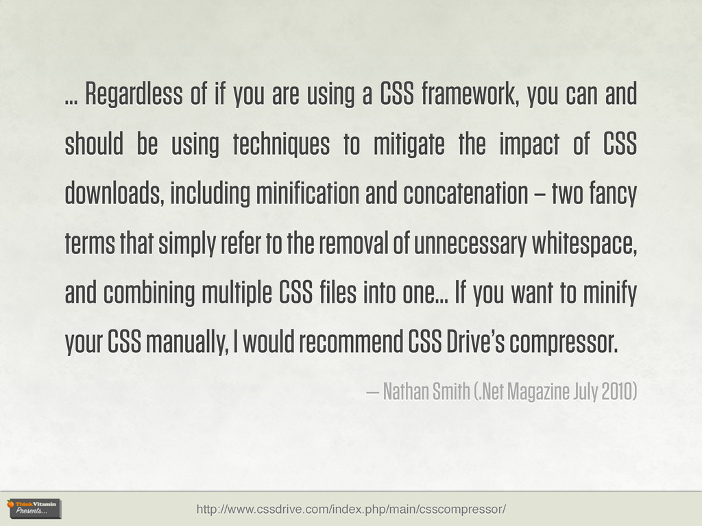
you can and should be using techniques to mitigate the impact of CSS downloads, including minification and concatenation – two fancy terms that simply refer to the removal of unnecessary whitespace, and combining multiple CSS files into one... If you want to minify your CSS manually, I would recommend CSS Drive’s compressor. — Nathan Smith (.Net Magazine July 2010) http://www.cssdrive.com/index.php/main/csscompressor/
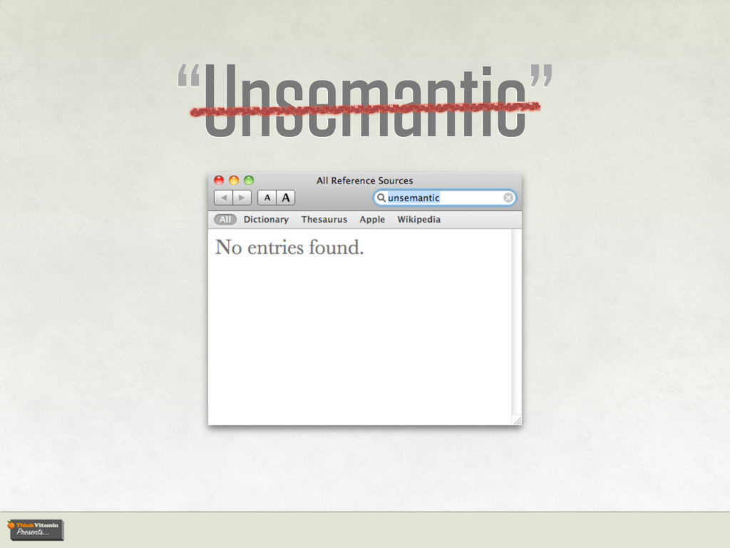
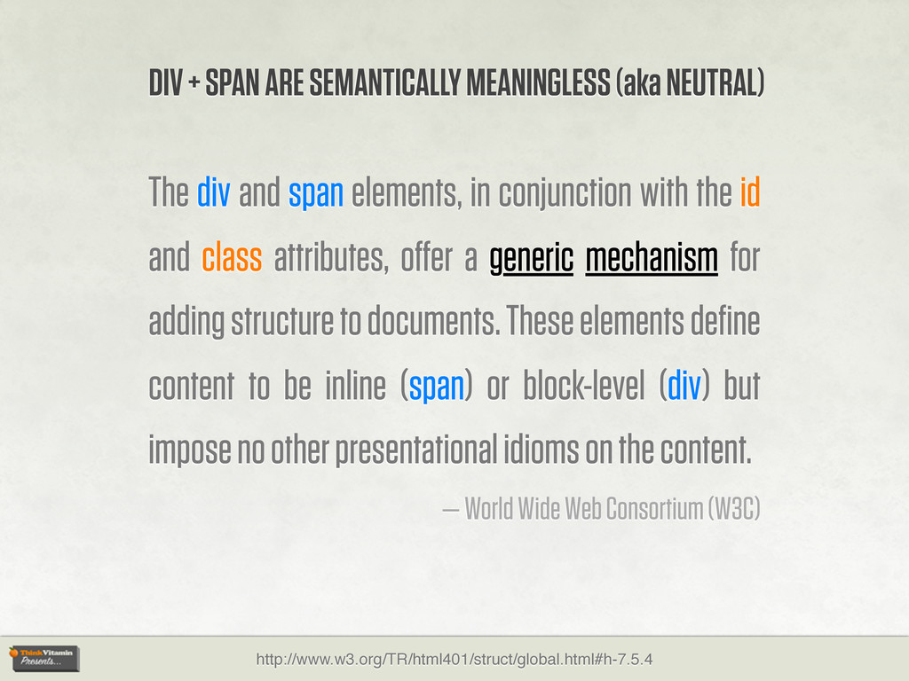
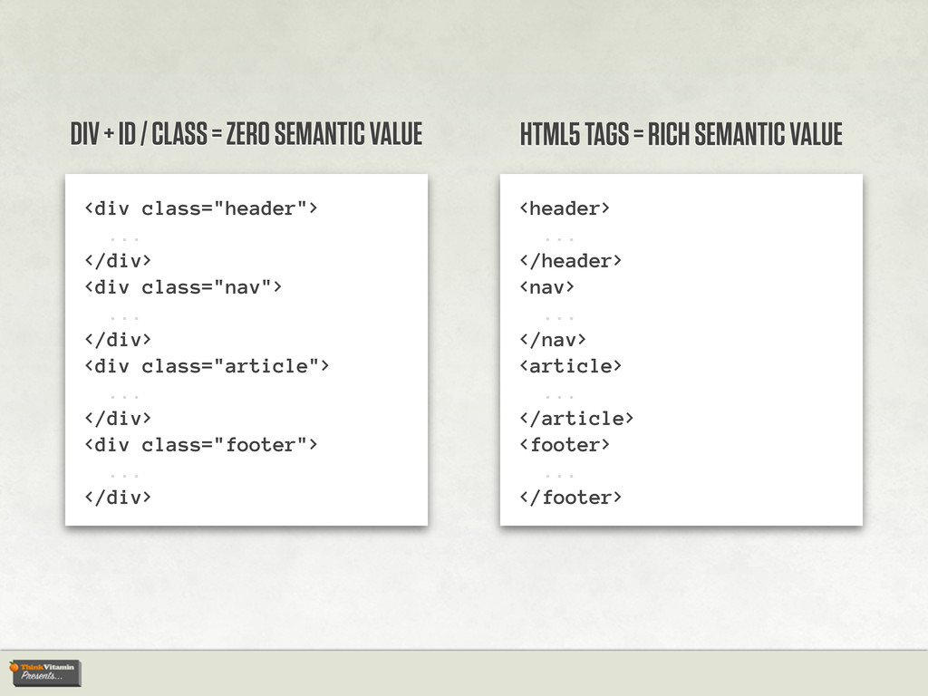
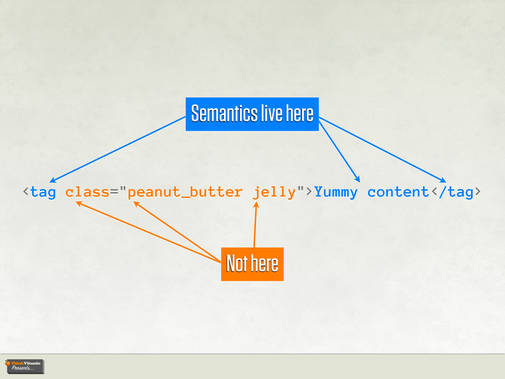
id and class attributes, offer a generic mechanism for adding structure to documents. These elements define content to be inline (span) or block-level (div) but impose no other presentational idioms on the content. — World Wide Web Consortium (W3C) DIV + SPAN ARE SEMANTICALLY MEANINGLESS (aka NEUTRAL)
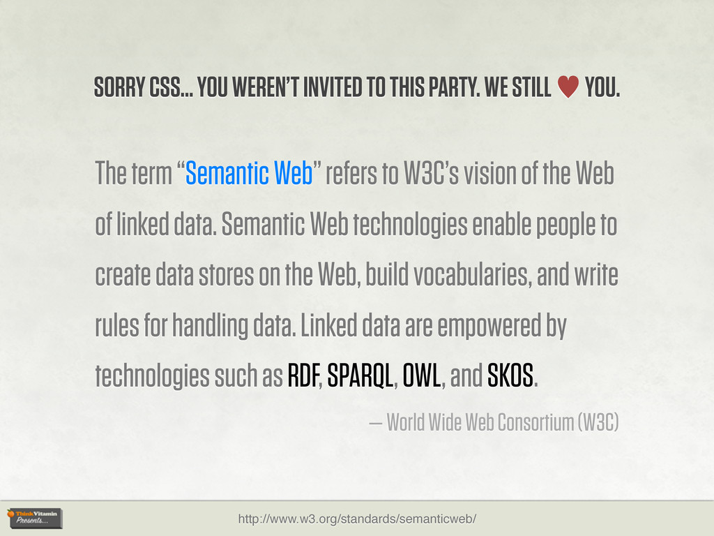
the Web of linked data. Semantic Web technologies enable people to create data stores on the Web, build vocabularies, and write rules for handling data. Linked data are empowered by technologies such as RDF, SPARQL, OWL, and SKOS. — World Wide Web Consortium (W3C) SORRY CSS... YOU WEREN’T INVITED TO THIS PARTY. WE STILL — YOU.
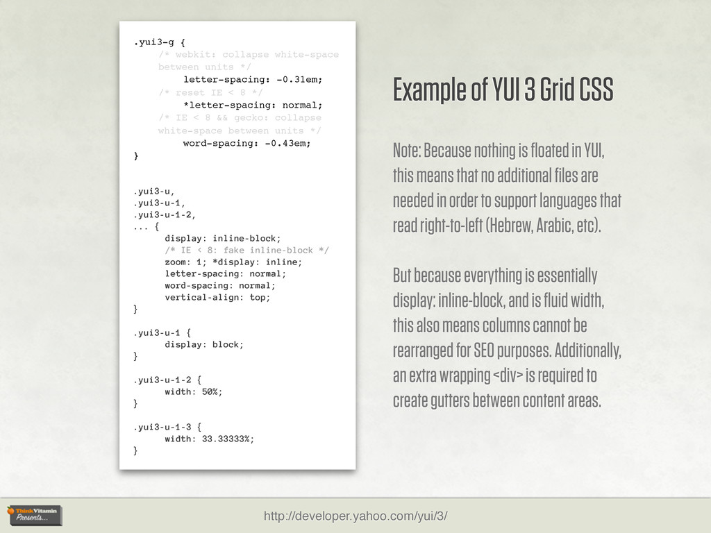
-0.31em; /* reset IE < 8 */ *letter-spacing: normal; /* IE < 8 && gecko: collapse white-space between units */ word-spacing: -0.43em; } .yui3-u, .yui3-u-1, .yui3-u-1-2, ... { display: inline-block; /* IE < 8: fake inline-block */ zoom: 1; *display: inline; letter-spacing: normal; word-spacing: normal; vertical-align: top; } .yui3-u-1 { display: block; } .yui3-u-1-2 { width: 50%; } .yui3-u-1-3 { width: 33.33333%; } Example of YUI 3 Grid CSS Note: Because nothing is floated in YUI, this means that no additional files are needed in order to support languages that read right-to-left (Hebrew, Arabic, etc). But because everything is essentially display: inline-block, and is fluid width, this also means columns cannot be rearranged for SEO purposes. Additionally, an extra wrapping <div> is required to create gutters between content areas. http://developer.yahoo.com/yui/3/
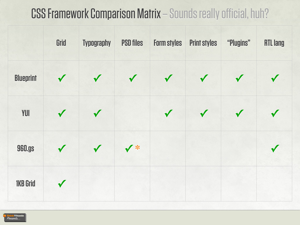
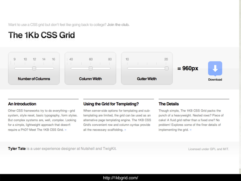
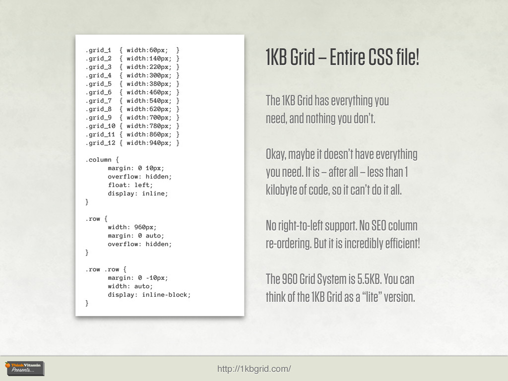
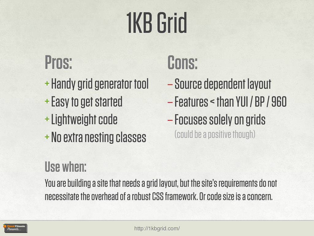
{ width:220px; } .grid_4 { width:300px; } .grid_5 { width:380px; } .grid_6 { width:460px; } .grid_7 { width:540px; } .grid_8 { width:620px; } .grid_9 { width:700px; } .grid_10 { width:780px; } .grid_11 { width:860px; } .grid_12 { width:940px; } .column { margin: 0 10px; overflow: hidden; float: left; display: inline; } .row { width: 960px; margin: 0 auto; overflow: hidden; } .row .row { margin: 0 -10px; width: auto; display: inline-block; } 1KB Grid – Entire CSS file! The 1KB Grid has everything you need, and nothing you don’t. Okay, maybe it doesn’t have everything you need. It is – after all – less than 1 kilobyte of code, so it can’t do it all. No right-to-left support. No SEO column re-ordering. But it is incredibly efficient! The 960 Grid System is 5.5KB. You can think of the 1KB Grid as a “lite” version.
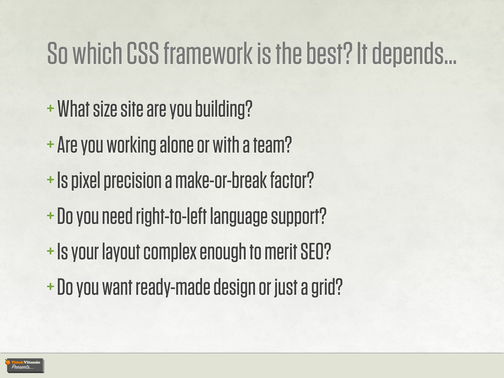
What size site are you building? + Are you working alone or with a team? + Is pixel precision a make-or-break factor? + Do you need right-to-left language support? + Is your layout complex enough to merit SEO? + Do you want ready-made design or just a grid?
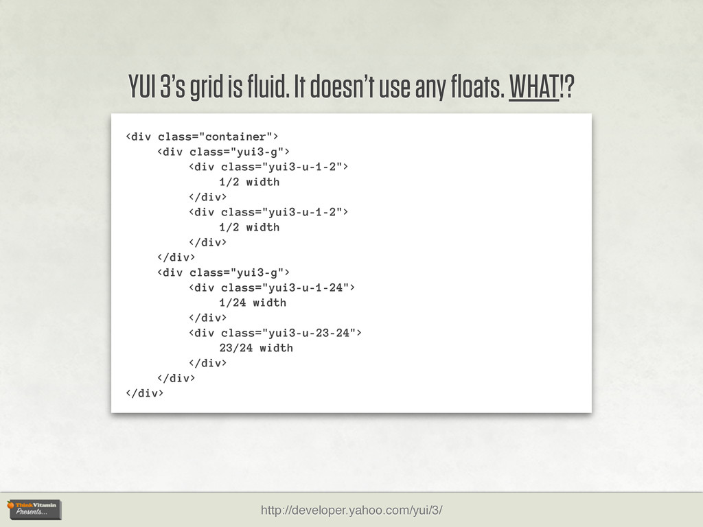
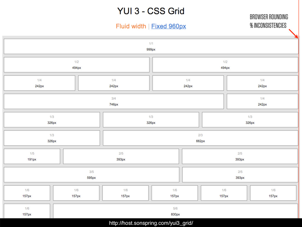
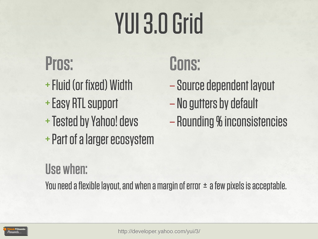
+ Tested by Yahoo! devs + Part of a larger ecosystem YUI 3.0 Grid Cons: – Source dependent layout – No gutters by default – Rounding % inconsistencies Use when: You need a flexible layout, and when a margin of error ± a few pixels is acceptable. http://developer.yahoo.com/yui/3/
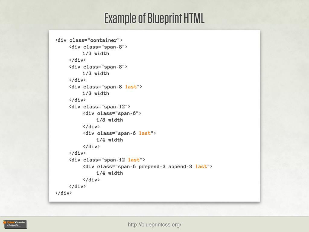
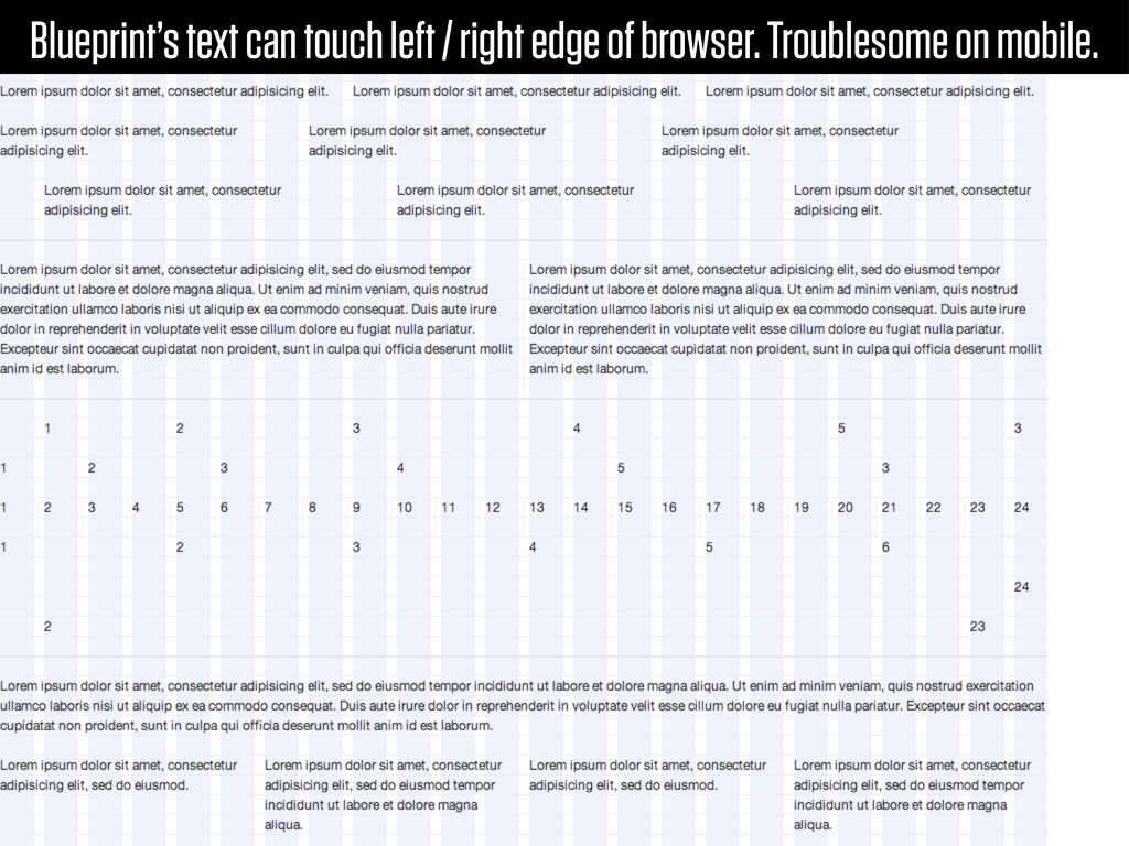
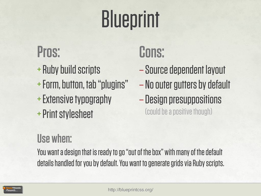
+ Extensive typography + Print stylesheet Blueprint Cons: – Source dependent layout – No outer gutters by default – Design presuppositions (could be a positive though) Use when: You want a design that is ready to go “out of the box” with many of the default details handled for you by default. You want to generate grids via Ruby scripts. http://blueprintcss.org/
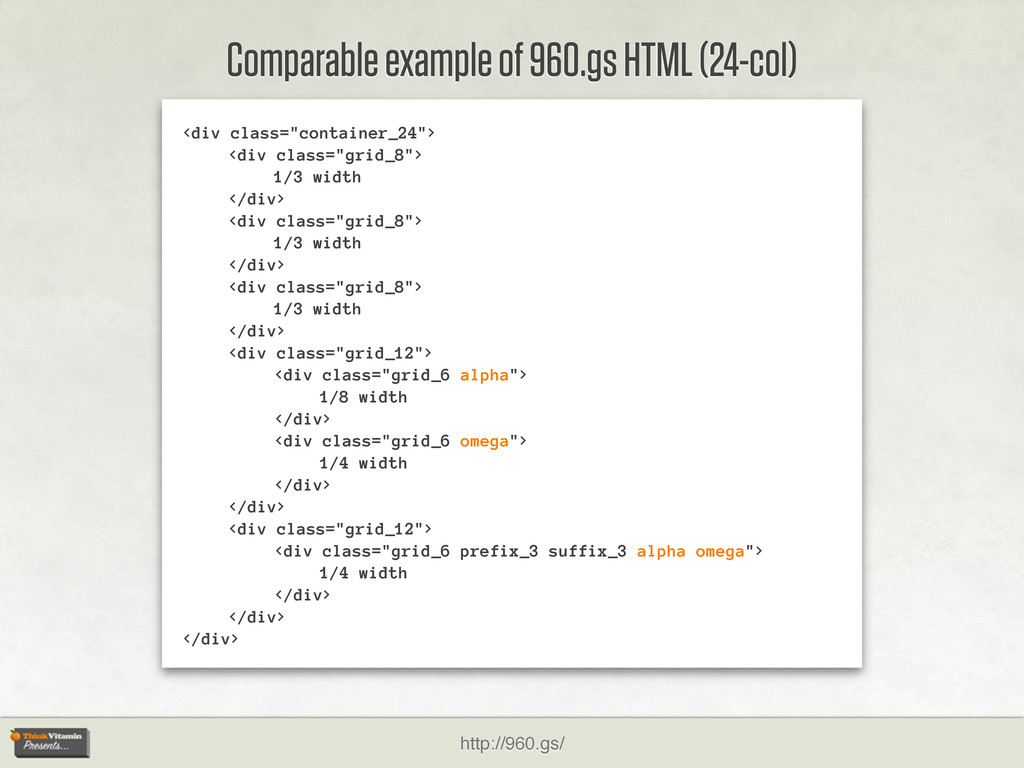
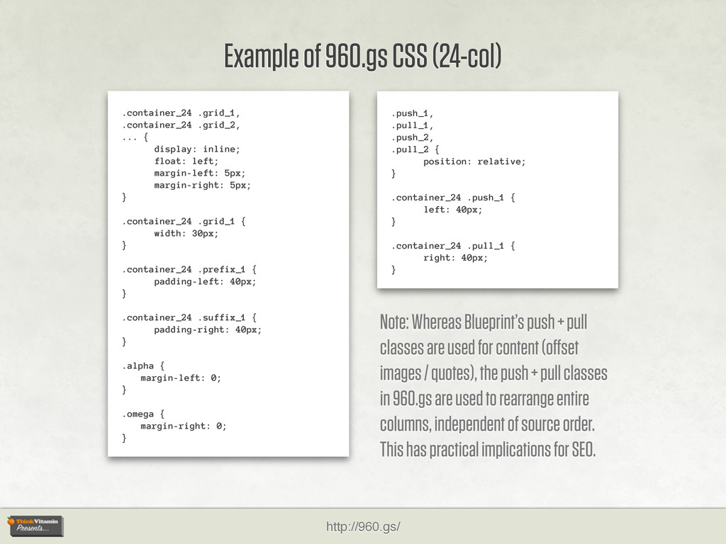
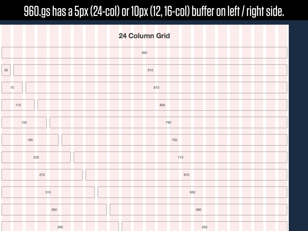
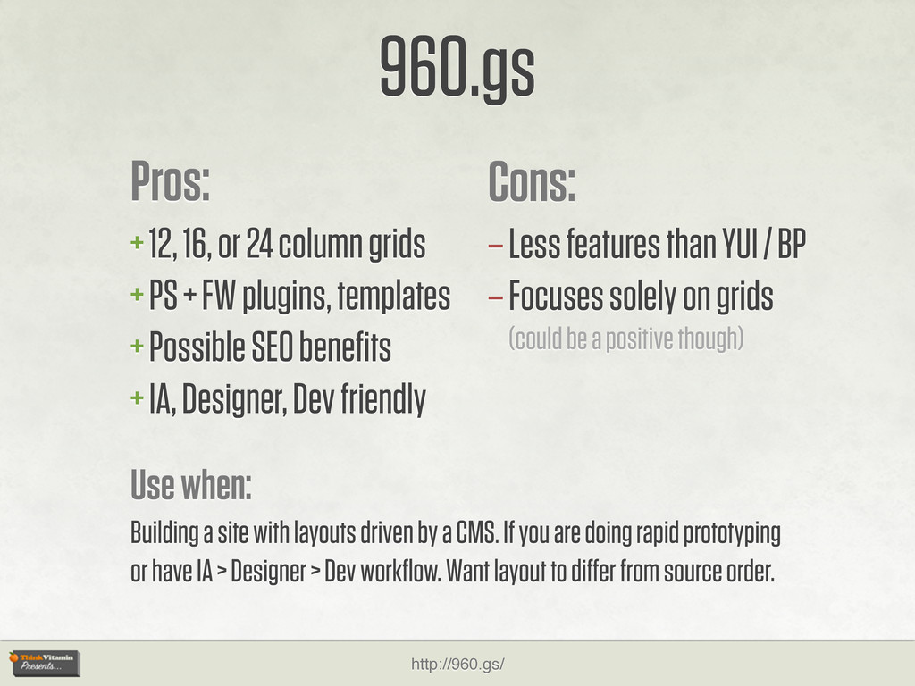
+ FW plugins, templates + Possible SEO benefits + IA, Designer, Dev friendly 960.gs Cons: – Less features than YUI / BP – Focuses solely on grids (could be a positive though) Use when: Building a site with layouts driven by a CMS. If you are doing rapid prototyping or have IA > Designer > Dev workflow. Want layout to differ from source order. http://960.gs/
started + Lightweight code + No extra nesting classes 1KB Grid Cons: – Source dependent layout – Features < than YUI / BP / 960 – Focuses solely on grids (could be a positive though) Use when: You are building a site that needs a grid layout, but the site’s requirements do not necessitate the overhead of a robust CSS framework. Or code size is a concern. http://1kbgrid.com/
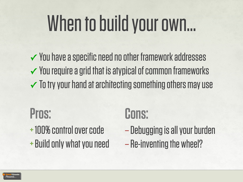
need no other framework addresses ✓ You require a grid that is atypical of common frameworks ✓ To try your hand at architecting something others may use Pros: + 100% control over code + Build only what you need Cons: – Debugging is all your burden – Re-inventing the wheel?
 nathansmith
 shosira
 tararira
 hypebeans
 kaikou
 dmattsun
 klemens
 calpin
 mottox2
 a2k
a2k
 ajstarks
 lynteo
 bebe
bebe
 portentint
 deanohume
 denniskardys
 madoxten
 skipperchong
 mfonobong
 mojombo
 jnunemaker
 jcasabona
 nmsamuel
 sachag
 rkendrick25