Swapnil and Ankur talked about the principles of interaction design including basics and significance of design and designing keeping end-users in mind during Ncell App Camp 2015.
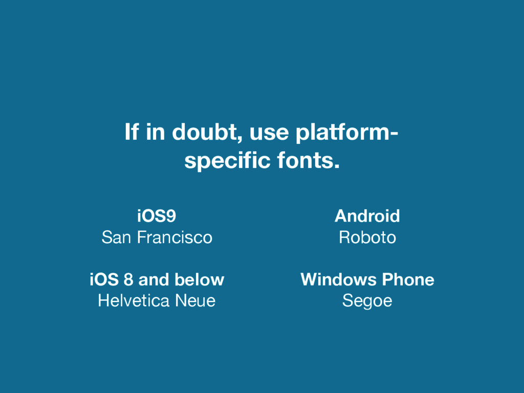
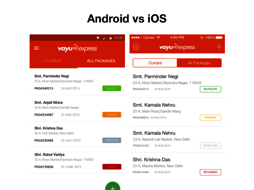
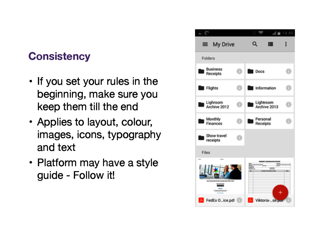
sure you keep them till the end • Applies to layout, colour, images, icons, typography and text • Platform may have a style guide - Follow it! Consistency
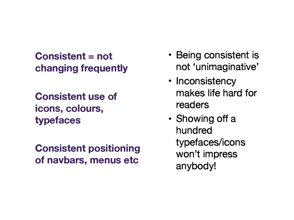
hard for readers • Showing off a hundred typefaces/icons won’t impress anybody! Consistent = not changing frequently Consistent use of icons, colours, typefaces Consistent positioning of navbars, menus etc
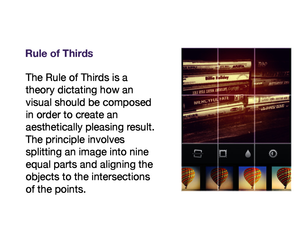
visual should be composed in order to create an aesthetically pleasing result. The principle involves splitting an image into nine equal parts and aligning the objects to the intersections of the points. Rule of Thirds
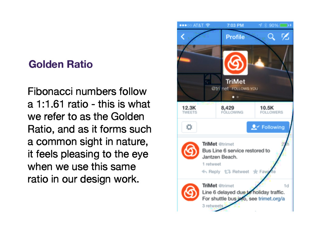
we refer to as the Golden Ratio, and as it forms such a common sight in nature, it feels pleasing to the eye when we use this same ratio in our design work. Golden Ratio