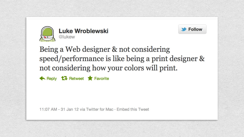
Speed has always mattered, and it matters even more in mobile, where connection speed and reliability can vary wildly. A common bottleneck? Images.
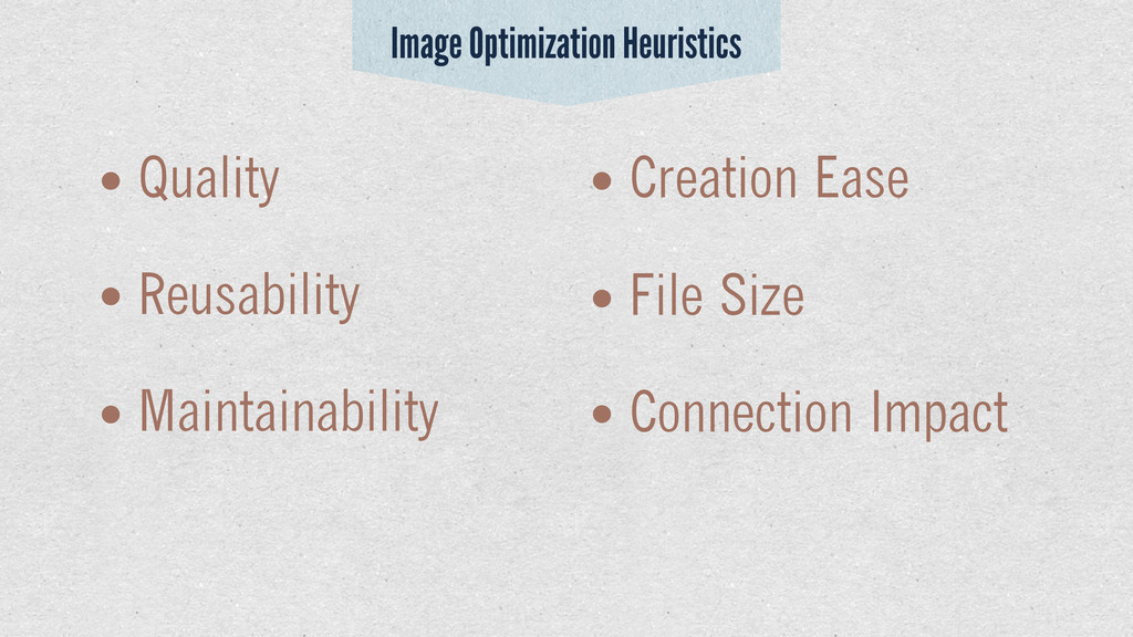
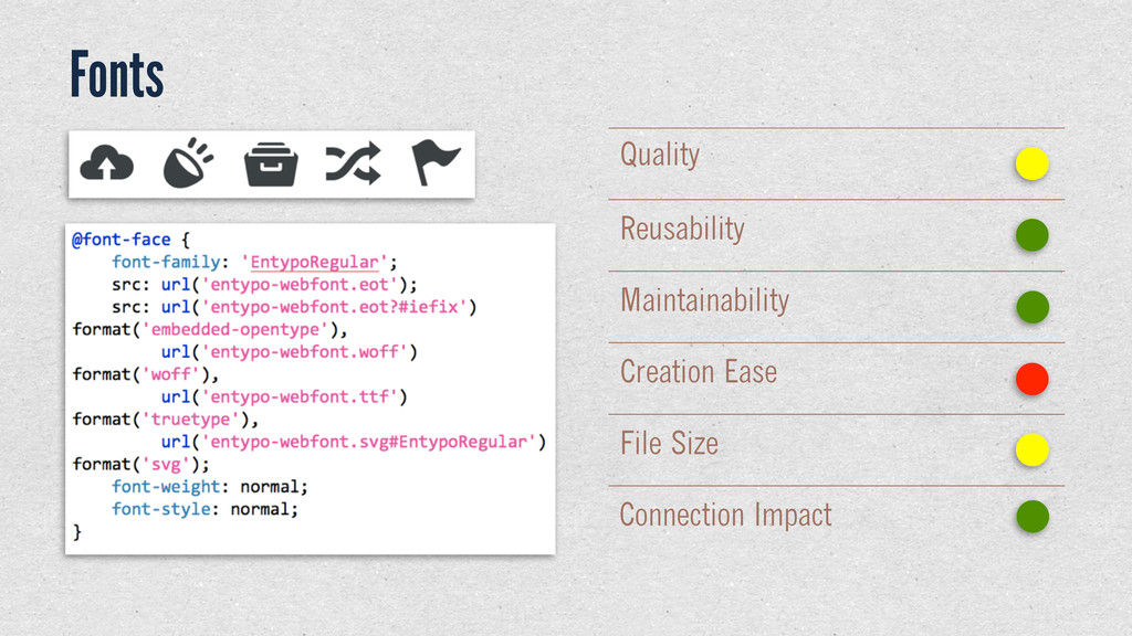
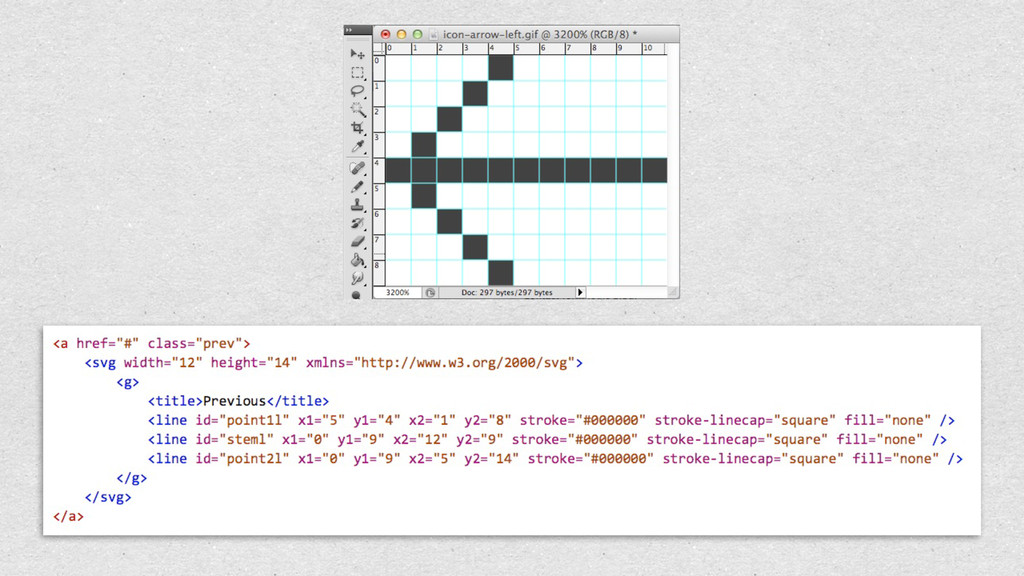
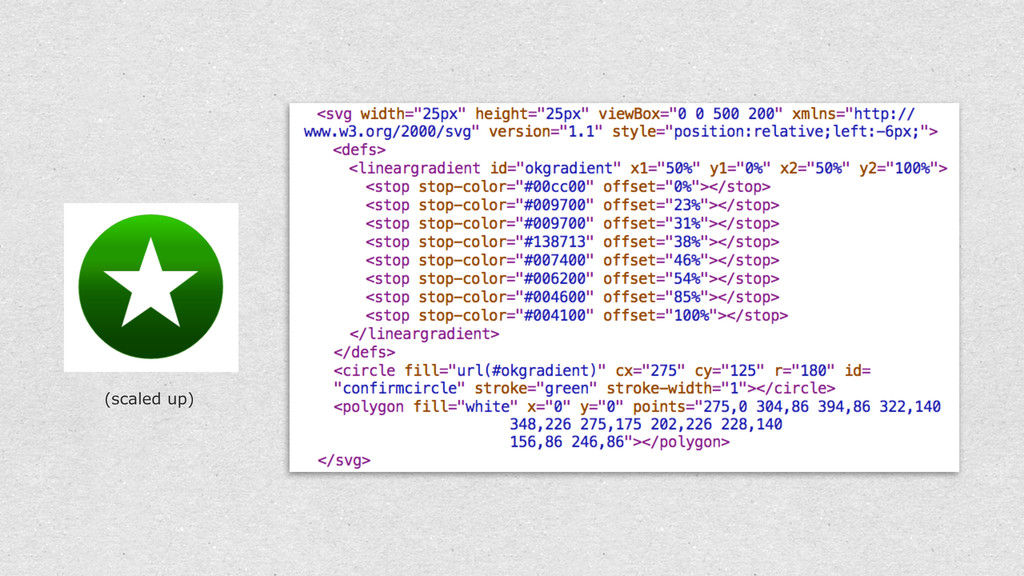
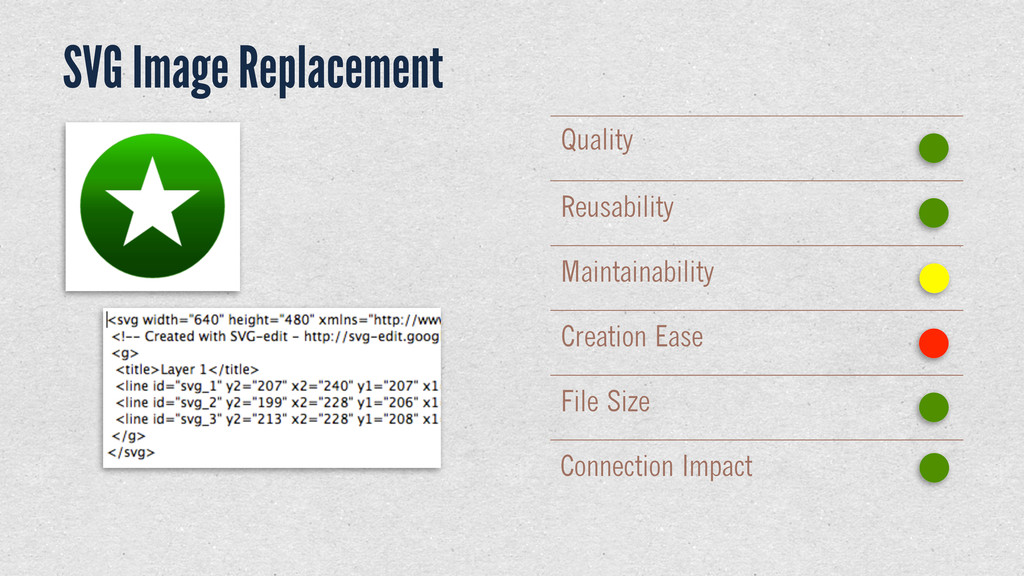
How to serve up images lies squarely at the intersection of design and code, as we work to tune our sites for performance while maintaining maximum visual UI polish, especially for newer, pixel-dense displays. This presentation gives an overview of common (and less common) techniques, along with heuristics we can use to evaluate the suitability of each for differing applications.
 nstop
nstop
 sevendex
 shoko_seven11
 securecat
 mhand01
 ajstarks
 shotamatsuo
 mottox2
 bebe
bebe
 lynteo
 a2k
a2k
 kgsi
kgsi
 reverentgeek
 garrettdimon
 lauravandoore
 speakerdeck
 lindahogenes
 axbom
axbom
 maltzj
 twada
twada
 mfonobong
 techseoconnect
 jnunemaker
 bcantrill