Upgrade to Pro — share decks privately, control downloads, hide ads and more …

VisMatch: A Web Tool for Selecting Effective Space-Time Visualization Techniques, Tool Design, and (Preliminary) User Study Results

VisMatch: A Web Tool for Selecting Effective Space-Time Visualization Techniques, Tool Design, and (Preliminary) User Study Results

Joanna Merson
Arizona State University
School of Geographical Sciences and Urban Planning

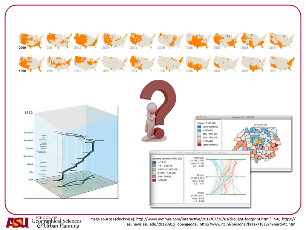
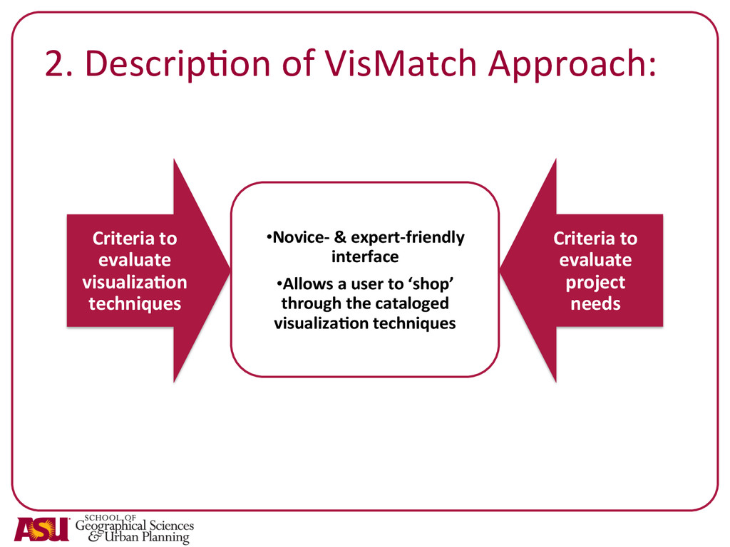
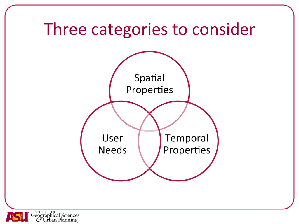
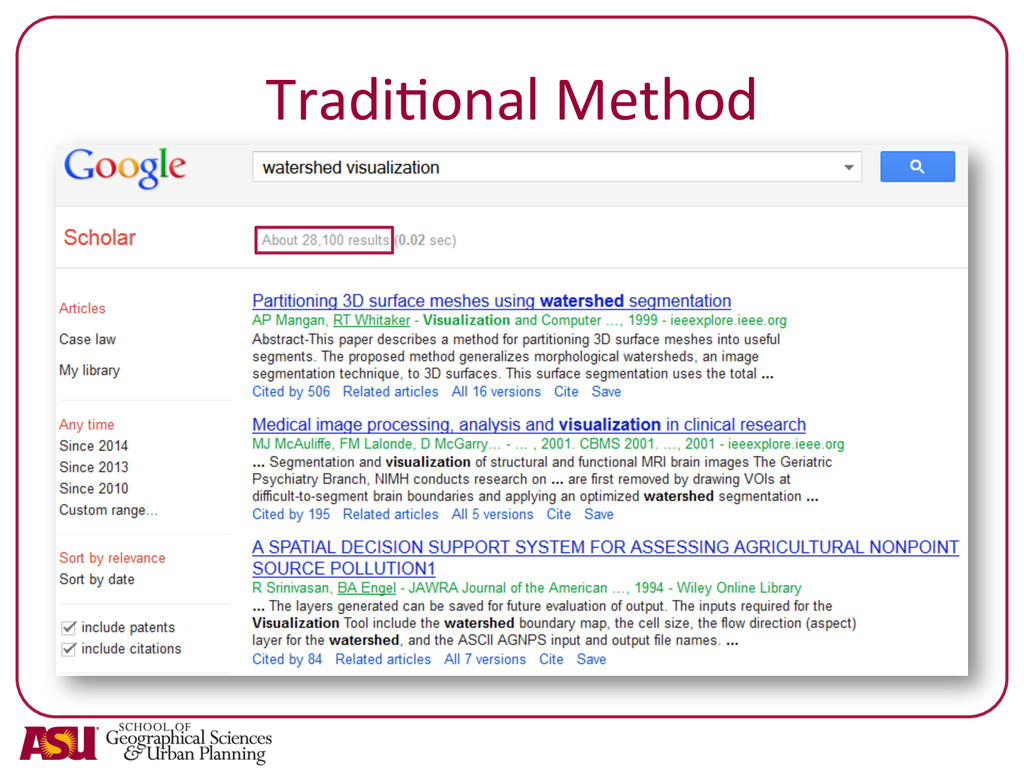
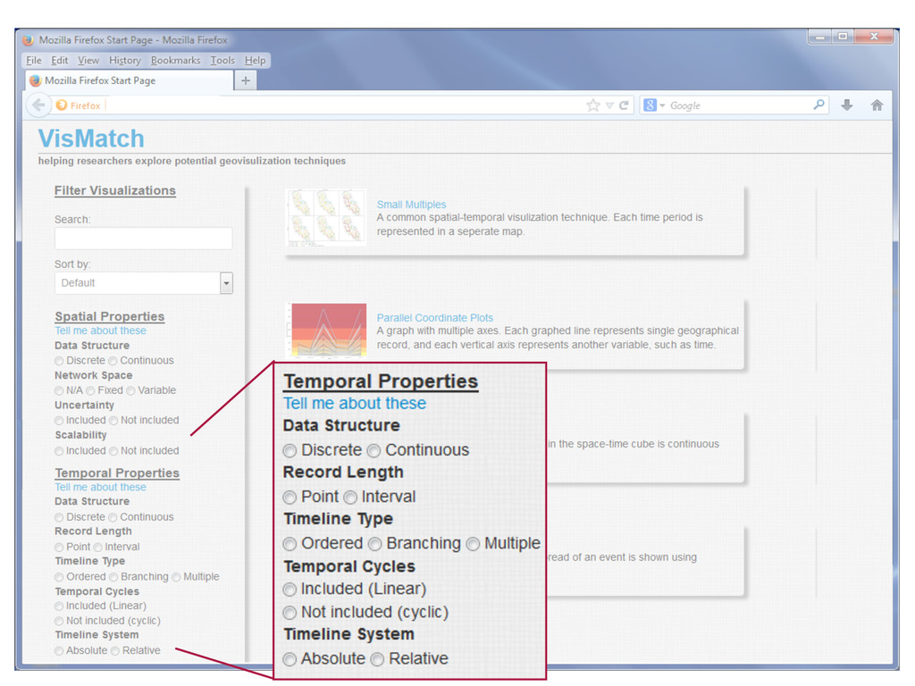
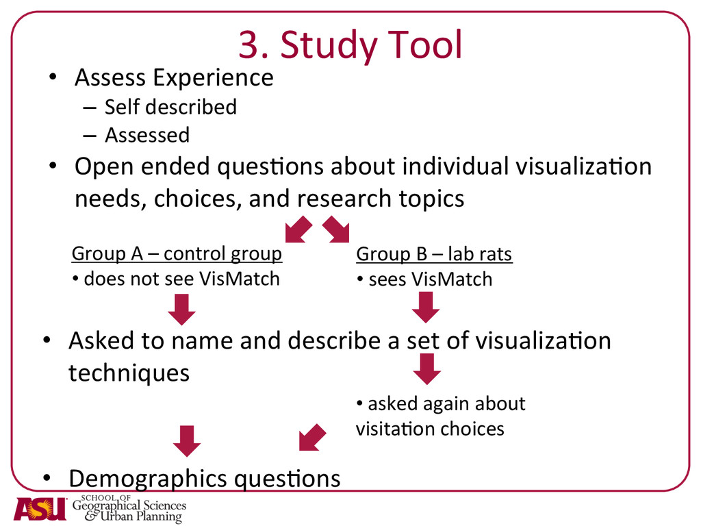
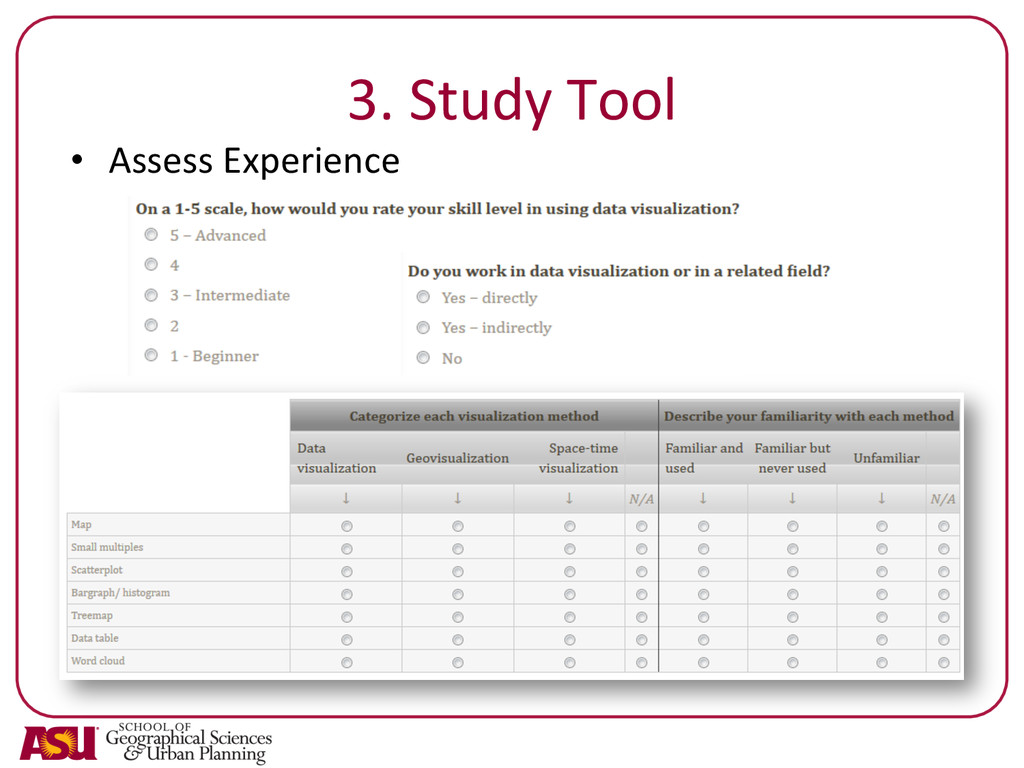
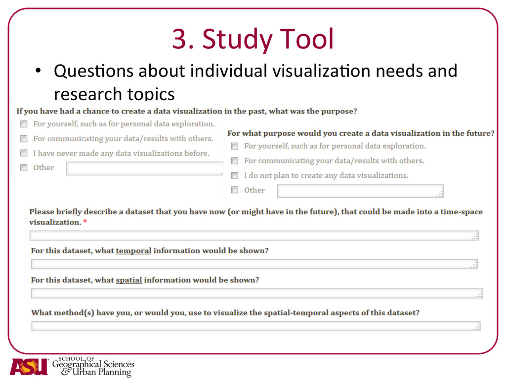
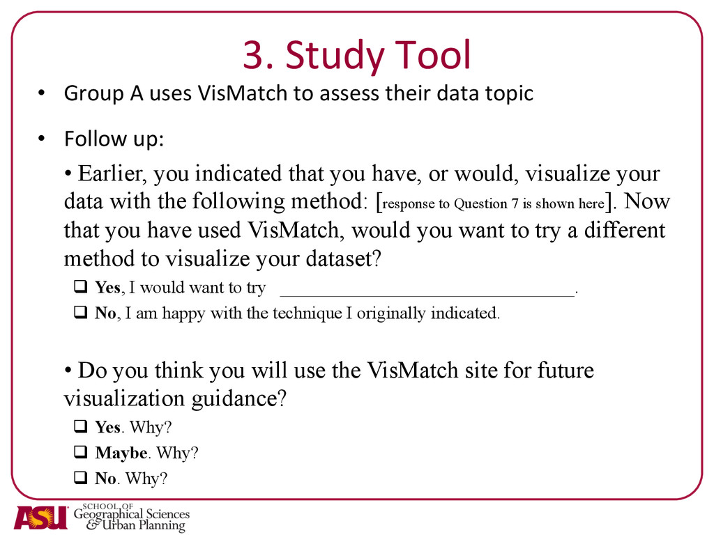
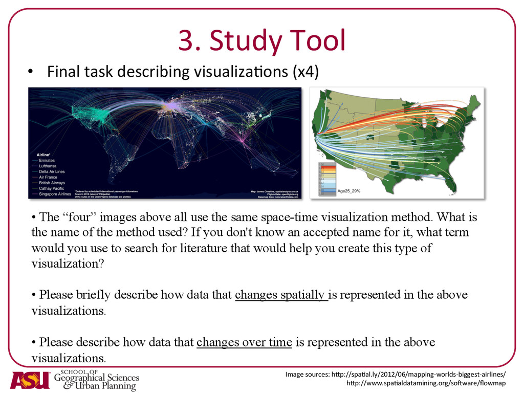
Successful visualizations can reveal patterns and relationships that would be concealed in traditional maps. However, researchers often choose a visualization technique just because they are familiar with it, regardless of what other visualization techniques might better communicate their data. A researcher that decides search out the best technique from the vast body of visualization literature will be faced with the slow and difficult task of wading through the nuances of very specific implementations. Therefore, I have developed VisMatch, a streamlined, web-based tool designed to help researchers choose which visualization techniques are best suited to the spatial-temporal data they want to communicate. In this presentation, I will present 1) the design behind the tool, which suggests optimal visualization techniques by considering data composition and audience needs; and 2) the results from a user-survey evaluating researcher interaction with VisMatch.

NACIS 2014

Nathaniel V. KELSO

October 09, 2014
Tweet

More Decks by Nathaniel V. KELSO

Other Decks in Design

Transcript

  1. VisMatch:  A  Web  Tool  for  Selec-ng   Effec-ve  Space-­‐Time  Visualiza-on

      Techniques     Tool  Design  and  (Preliminary)  User   Study  Results         Joanna  Merson   Arizona  State  University   School  of  Geographical  Sciences  and  Urban  Planning     NACIS  2014  
  2. Goals   •  Understand  which  techniques  are  used  by  

    visualizaQon-­‐novices   •  Understand  what  keywords  they  use  to   describe  visualizaQons   •  Help  visualizaQon  designers  to  idenQfy  which   techniques  may  best  express  a  dataset  
  3. 1.  SupporQng  visualizaQon   guideline  literature   Overarching  Principles  

      • Data  Structure   -­‐conQnuous  or  discrete  data  representaQons   -­‐structure  of  underlying  data  and  visualizaQon   • VisualizaQon  Elements   -­‐color,  content,  style,  data  type   SelecQon  Guidelines     OpQmizaQon  Guidelines     •   For  specific  visualizaQons   -­‐ ScagnosQcs   Wilkinson  et  al.  2005   -­‐ PargnosQcs     Dasgupta,  A.,  and  Kosara,  R.  2013   •   ApplicaQon  based   -­‐  TransportaQon  -­‐>  SchemaQc   •   Approach  based   -­‐ User  driven   -­‐ Data  driven  
  4. 2.  DescripQon  of  VisMatch  Approach:   Criteria  to   evaluate

      visualiza-on   techniques   Criteria  to   evaluate   project   needs   • Novice-­‐  &  expert-­‐friendly   interface   • Allows  a  user  to  ‘shop’   through  the  cataloged   visualiza-on  techniques  
  5. 3.  Study  Target   Target  users  of  the  study  are

     researchers  in   subfields  of  geography  that  work  with  spa-ally   and  temporally  varying  data.       The  objecQve  of  the  study  will  be  to  determine   if  access  to  VisMatch  impacts  how  researchers   understand  poten-al  visualiza-on  techniques   and  how  they  plan  to  visualize  their  own  data.    
  6. 3.  Study  ExpectaQons   I  expect  (hope)  that  ager  using

     the  tool,  the   researchers  involved  will:     •  have  a  greater  understanding  of  data   consideraQons  for  visualizaQon  selecQon,   •  demonstrate  an  awareness  of  more  visualizaQon   techniques,   •  be  interested  in  pursuing  new,  potenQally  more   effecQve,  visualizaQon  techniques,  and   •  indicate  an  intenQon  to  use  the  tool  for  future   visualizaQon  guidance.  
  7. 3.  Study  Tool   •  Assess  Experience   –  Self

     described     –  Assessed   •  Open  ended  quesQons  about  individual  visualizaQon   needs,  choices,  and  research  topics   Group  A  –  control  group   •   does  not  see  VisMatch   Group  B  –  lab  rats   •   sees  VisMatch   •  Asked  to  name  and  describe  a  set  of  visualizaQon   techniques   •   asked  again  about   visitaQon  choices   •  Demographics  quesQons  
  8. 3.  Study  Tool   •  Group  A  uses  VisMatch  to

     assess  their  data  topic   •  Follow  up:   •  Earlier, you indicated that you have, or would, visualize your data with the following method: [response to Question 7 is shown here]. Now that you have used VisMatch, would you want to try a different method to visualize your dataset? q  Yes, I would want to try _________________________________. q  No, I am happy with the technique I originally indicated. •  Do you think you will use the VisMatch site for future visualization guidance? q  Yes. Why? q  Maybe. Why? q  No. Why?
  9. 3.  Study  Tool   •  Final  task  describing  visualizaQons  (x4)

      •  The “four” images above all use the same space-time visualization method. What is the name of the method used? If you don't know an accepted name for it, what term would you use to search for literature that would help you create this type of visualization? •  Please briefly describe how data that changes spatially is represented in the above visualizations. •  Please describe how data that changes over time is represented in the above visualizations. Image  sources:  hNp://spaQal.ly/2012/06/mapping-­‐worlds-­‐biggest-­‐airlines/   hNp://www.spaQaldatamining.org/sogware/flowmap  
  10. 4.  Preliminary  Results   •  Group  A   –  Coming

     soon  to  a  journal  near  you   •  Group  B  Pilot  (8  responses)   –  1  Assistant  Prof,  6  Grad  Students,  1  Post-­‐Doc   –  6:  25-­‐34,  2:  35-­‐44     –  50%  male,  50%  female   –  Geography,  GIS,  Sustainability,  GeneQcs,  Ecology,   Environmental  Sciences   –  Human-­‐Environment,  Energy  and  transportaQon,   Pathogen  SpaQal  Ecology,    Plant  community,  SDSS  
  11. 4.  Preliminary  Results   Yes  –   directly   20%

      Yes  –   indirectly   60%   No   20%   Do  you  work  in  data   visualiza-on  or  in  a  related   field?   2   0   6   2   0   0   1   2   3   4   5   6   7   1  -­‐  Beginner   2   3  –   Intermediate   4   5  –  Advanced   On  a  1-­‐5  scale,  how  would  you  rate   your  skill  level  in  using  data   visualiza-on?  
  12. 4.  Preliminary  Results   Type  of  visualiza-on  methods   Familiarity

      Data   visualizaQon   GeovisualizaQon   Space-­‐Qme   visualizaQon   Not  a   visualizaQon   (N/A)   Familiar   and  used     Familiar   but  never   used   Unfamiliar     Data  table   5   -­‐   -­‐   1(+2)   5   -­‐   3   Bar  graph/   histogram   8   1   -­‐   -­‐   8   -­‐   -­‐   Sca[erplot   5   1   1   (1)   5   1   2   Word   could   5   -­‐   -­‐   2(+1)   4   2   2   Map   1   4   2   1   8   -­‐   -­‐   Treemap   7   -­‐   1   5   1   2   Small   mul-ples   1   3   1   3   3   1   4  
  13. 4.  Preliminary  Results   •   I  don’t  know  the  name.

     I  would  call  this   a  Qme  series  map.     •   unsure  of  a  specific  technical  term:   "staQc  maps",  "temporal  cross-­‐secQon,"   or  "panel"  come  to  mind   •   incidence  over  Qme  map   •   Qme  series  map   •   space  Qme  maps   •   small  mulQples   •   No  idea   The “four” images above all use the same space-time visualization method. What is the name of the method used? If you don't know an accepted name for it, what term would you use to search for literature that would help you create this type of visualization?   3  of  the  eight   were  familiar   with  these   Image  sources:  hNp://www.nyQmes.com/interacQve/2012/07/20/us/drought-­‐footprint.html?_r=0       MacEachren,  A.M.,  1995.  How  Maps  Work,  RepresentaQon,  VisualizaQon,  and  Design.  The  Guilford  Press,  New  York,   USA.,hNp://www.spaQaldatamining.org/sogware/flowmap  
  14. 4.  Preliminary  Results   Please  briefly  describe  how  data  that

      changes  spaQally  is  represented  in  the   above  visualizaQons.     •  colors     •  It  is  represented  by  shading  or  symbol  size.     •  changes  in  coverage  of  the  subject,   indicated  by  clear  color  or  symbol.   "Background"  data  held  constant  across  all   •  SpaQal  changes  are  represented  with   shading.     •  spaQal  data  are  shown  with  either   presence/absence  (1  &  2)  or  quanQtaQve   differences  (3).     •  changes  over  space  are  due  to  different   coloring  or  bubbles  on  the  map   •  SpaQal  paNerns  differ  across  each  small   image.   •  Maps  with  same  scale  
  15. 4.  Preliminary  Results   Please  describe  how  data  that  changes

      over  Qme  is  represented  in  the  above   visualizaQons.     •  Qme  is  represented  using  different  Qles.     •  visual/qualitaQve  comparison  of  paNern   across  all  years  of  interest   •  IdenQcal  and  consecuQve  maps,  one  for   each  Qme  increment.     •  snapshots  of  spaQal  data  are  portrayed  at   even  intervals  (1  &  3)     •  different  maps  through  each  year,  labeled   at  the  boNom  of  the  map     •  A  different  Qme  frame  is  shown  in  each   small  image.   •  MulQple  maps  
  16. Main  conclusion   Space  Qme  visualizaQons:   They  can’t  name

     it,  but  know  it  when  they  see  it    
  17. Future  Work   •  Redesign  of  tool  with  icons  to

     replace  words   •  Add  more  techniques  to  collecQon   •  Create  visualizaQon  submission  portal   •  Hold  focus  group  evaluaQons  of  VisMatch   •  Host  site  with  analyQcs  
  18. Reverse   QuesQons!!   [email protected]   @JoannaMerson   •  Any

     Angular  Experts   out  there?   •  Study  design  feedback?   •  Do  you  have  methods   to  contribute?