$30 off During Our Annual Pro Sale. View Details »

Visualizing Ten Years of Quantitative Color Schemes

Visualizing Ten Years of Quantitative Color Schemes

Travis White
University of Kansas
#nacis2015

Nathaniel V. KELSO

October 15, 2015
Tweet

More Decks by Nathaniel V. KELSO

Other Decks in Education

Transcript

  1. View Slide

  2. (color that represents quantitative data)
    Qc = Quantitative color schemes

    View Slide

  3. Existing research & resources
    indicate how Qc should be used…

    View Slide

  4. Existing research & resources
    indicate how Qc should be used…
    How are mapmakers using Qc?

    View Slide

  5. Qc Map Review & Evaluation
    Key parameters
    ∙2004-2013
    ∙geographic journals from multiple fields
    ∙no cartographic articles

    View Slide

  6. Qc Map Review & Evaluation
    Key parameters
    ∙2004-2013
    ∙geographic journals from multiple fields
    ∙no cartographic articles
    ∙at least one map selected per article
    ∙univariate maps only
    ∙no elevation maps

    View Slide

  7. Qc Map Review & Evaluation
    Key parameters
    ∙2004-2013
    ∙geographic journals from multiple fields
    ∙no cartographic articles
    ∙at least one map selected per article
    ∙univariate maps only
    ∙no elevation maps
    440 Qc maps from 315 articles

    View Slide

  8. Human
    Human
    & Physical
    Physical

    View Slide

  9. 100%
    80%
    60%
    40%
    20%
    0%
    2004 2005 2006 2007 2008 2009 2010 2011 2012 2013
    Qualitative color scheme rates
    11%
    29%
    42%
    71%

    View Slide

  10. Question 1
    Which Qc schemes were used?
    How appropriately? By whom?

    View Slide

  11. Question 1
    Which Qc schemes were used?
    How appropriately? By whom?
    Question 2
    Which colors were used?
    How appropriately? By whom?

    View Slide

  12. Question 1
    Which Qc schemes were used?
    How appropriately? By whom?
    Question 2
    Which colors were used?
    How appropriately? By whom?

    View Slide

  13. 2 Qc mapper personas:

    View Slide

  14. Persona 1
    ∙maps human data
    ∙works w/ unipolar data
    ∙prefers choropleth
    (enum. units)
    ∙uses fewer data classes
    2 Qc mapper personas:

    View Slide

  15. Persona 1
    ∙maps human data
    ∙works w/ unipolar data
    ∙prefers choropleth
    (enum. units)
    ∙uses fewer data classes
    2 Qc mapper personas:
    Persona 2
    ∙maps physical data
    ∙works equally between
    polarities
    ∙prefers surface data
    ∙uses more data classes

    View Slide

  16. Useful color assessment requires
    accurate color identification, but…
    consistent accurate sampling
    not possible with unclassed schemes:
    Cloetingh 2007
    , Koch 2009, Fischer 2001, Salvati 2013

    View Slide

  17. Gimpel 2004, Combes 2005, Wahl 2012, Holand 2013
    However…
    consistent, accurate sampling
    is possible with classed Qc

    View Slide

  18. Classed Qc sampling process
    Photoshop CC 2015
    sRGB IEC61966-2.1 color profile
    RGB color image mode
    example: Escutia 2005
    Confirm the color
    profile, copy legend
    to a new layer
    Edit out
    pixel noise

    View Slide

  19. Classed Qc sampling process
    Photoshop CC 2015
    sRGB IEC61966-2.1 color profile
    RGB color image mode
    example: Escutia 2005
    Average
    the edited
    color pixel
    values
    Point sample
    the averaged
    color values
    [eyedropper]

    View Slide

  20. DISCLAIMER
    Sampling & evaluations based
    on digital versions of maps,
    not original map files.
    Qc scheme appearances are
    inconsistent across display devices.

    View Slide

  21. Sequential
    Diverging non-spectral
    Spectral
    Traffic
    Other
    Qc Overview
    5 primary schemes

    View Slide

  22. Sequential Red/Orange/Yellow
    ∙n = 99 (31% of all Qc maps)
    ∙primary scheme for choropleths
    ∙preferred scheme for human data

    View Slide

  23. Sequential Green/Blue/Purple
    ∙n = 99 (31% of all Qc maps)
    ∙primary scheme for choropleths
    ∙preferred scheme for human data

    View Slide

  24. Sequential Yellow/Orange/Brown
    ∙n = 99 (31% of all Qc maps)
    ∙primary scheme for choropleths
    ∙preferred scheme for human data

    View Slide

  25. Sequential Examples

    View Slide

  26. Sequential Examples

    View Slide

  27. Sequential Examples

    View Slide

  28. Diverging non-spectral (critical class)
    ∙n = 86 (27% of all Qc maps)
    ∙common on both choro & surface maps
    ∙more frequently used for physical data

    View Slide

  29. Diverging non-spectral (critical break)
    ∙n = 86 (27% of all Qc maps)
    ∙common on both choro & surface maps
    ∙more frequently used for physical data

    View Slide

  30. Diverging non-spectral Examples

    View Slide

  31. Diverging non-spectral Examples

    View Slide

  32. Spectral (non-diverging)
    ∙n = 76 (24% of all Qc maps)
    ∙overwhelmingly used on surface maps
    ∙overwhelmingly used for physical data

    View Slide

  33. Spectral (diverging)
    ∙n = 76 (24% of all Qc maps)
    ∙overwhelmingly used on surface maps
    ∙overwhelmingly used for physical data

    View Slide

  34. Spectral Example

    View Slide

  35. Spectral Example

    View Slide

  36. Spectral Example

    View Slide

  37. Traffic (diverging & non-diverging)
    ∙n = 26 (8% of all Qc maps)
    ∙more common on surface maps
    ∙used for half of all human + physical data

    View Slide

  38. Traffic Example

    View Slide

  39. Other (hypso, thermal, undefined…)
    ∙n = 35 (11% of all Qc maps)
    ∙no noteworthy patterns

    View Slide

  40. Other Example

    View Slide

  41. Other Example

    View Slide

  42. Accentuating the positive
    ∙Sequential & Diverging schemes used
    appropriately
    ∙Qc schemes rarely lost in visual hierarchy
    ∙Color deficiency not too problematic
    (ignoring Spectral & Traffic schemes)

    View Slide

  43. Accentuating the negative
    ∙Too many classes!
    ∙Poor color grading
    (cannot distinguish colors within a scheme)
    ∙Poor matching btwn data type & Qc
    (e.g., unipolar data + diverging scheme)
    ∙Illogical sequencing of colors
    ∙Image quality matters!

    View Slide

  44. Recommendations
    ∙Educate & Inform!
    mappers need instruction and guidance
    ∙Improve graphics publication guidelines
    ∙Improve or limit software/package offerings
    ∙A Brewer for non-choro mapping (?)

    View Slide

  45. “GOOD ENOUGH”
    is not good enough!

    View Slide

  46. Appropriate Qc usage

    GOOD DESIGN

    View Slide

  47. Thank You!
    Expanded slides & RGB profiles available at:
    References
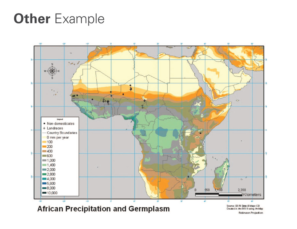
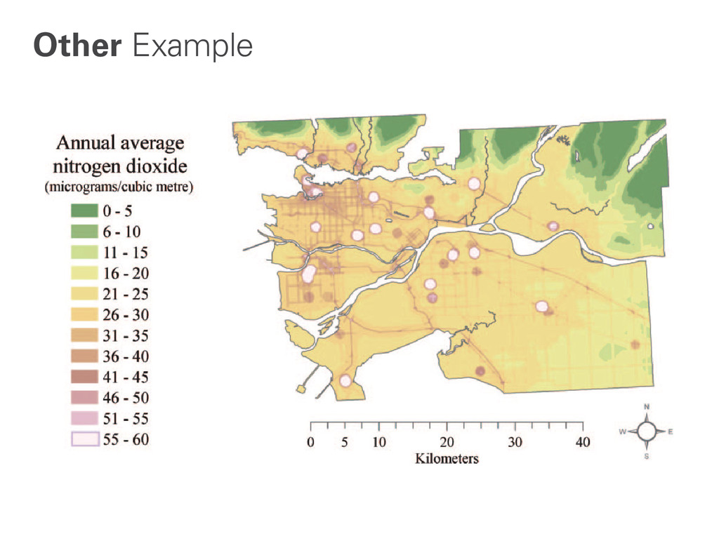
    Bordi, I. and A. Sutera. 2004. Drought variability and its climatic implications, Global and Planetary Change 40, 115–127
    .
    Brewer, Cynthia A., 2013. http://www.colorbrewer2.org, accessed October 4, 2015
    Gillespie, T, Foody, G., Saatchi, S. 2008. Measuring and modelling biodiversity from space, Progress in Physical Geography 32, 203.
    Groisman, P
    . Y. 2007
    . Potential forest fire danger over Northern Eurasia: Changes during the 20th century, Global and Planetary Change, 56, 371–386.
    Kaplan, D. and G. Sommers. 2009. An Analysis of the Relationship Between Housing Foreclosures, Lending Practices, and Neighborhood Ecology: Evidence from a Distressed
    County, The Professional Geographer, 61:1, 101-120.
    Lewis, L. 2010. Biogeography and Genetic Diversity of Pearl Millet (Pennisetum glaucum) from Sahelian Africa , The Professional Geographer, 62:3, 377-394.
    Lombard, A. 2005. Contribution of thermal expansion to present-day sea-level change revisited, Global and Planetary Change 47
    , 1–16.
    Maliszewski, P
    . and M. Horner. 2010. A Spatial Modeling Framework for Siting Critical Supply Infrastructures , The Professional Geographer, 62:3, 426-441.
    Morehouse, B and S. O’Brien. 2008. Facilitating Public Involvement in Strategic Planning for Wildland Fire Management , The Professional Geographer, 60:4, 495-507
    .
    Setton, E. 2010. Gender Differences in Chronic Exposure to Traffic-Related Air Pollution—A Simulation Study of Working Females and Males, The Professional Geographer, 62:1, 66-
    83.
    Taus, A. 2013. Conversion to Organic Farming in the Continental United States: A Geographically Weighted Regression Analysis, The Professional Geographer, 65:1, 87-102.
    Wen, T., Lin, M., Fang, C. 2012. Population Movement and Vector-Borne Disease Transmission: Differentiating Spatial–Temporal Diffusion Patterns of Commuting and Noncommuting
    Dengue Cases, Annals of the Association of American Geographers, 102:5, 1026-1037
    .

    View Slide