under a time limit because it'll help you focus on sketching for your goal, and it'll put a little pressure on you to just throw out those ideas, • So the thing you need to do is just be as detailed as you can, but just quickly point out some certain reasoning or proposed interactions like over here I have some titles, I have some just some text explaining what the interaction is.
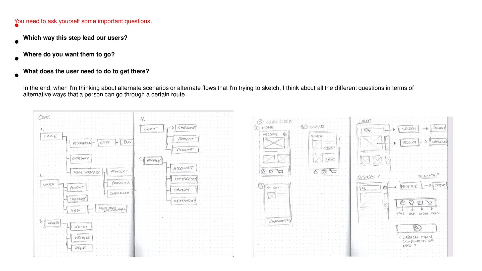
way this step lead our users? • Where do you want them to go? • What does the user need to do to get there? • In the end, when I'm thinking about alternate scenarios or alternate flows that I'm trying to sketch, I think about all the different questions in terms of alternative ways that a person can go through a certain route.
this, but I mean, talk to the people, you know, your peers. I mean, having engaging in conversations with the super smart people you work with is going to be amazing Next is study others. This is another big one. So I kind of lied a bit when I said that you should be studying your peers and what your peers are doing at all times. I mean, it could be on dribble or something like that, but it's important to study their work and break down their solution to discover how they thought about it. It's not just about looking at what the solution is, but it's also about dissecting it, understanding what their solution was for what the problem was The next one is you should surround yourself with great design. Try thinking about how you can surround yourself with that inspiration. You know, it could be your home, it could be a desk like this, you know, it could be digitally if you have like a dribble collection or something like that.
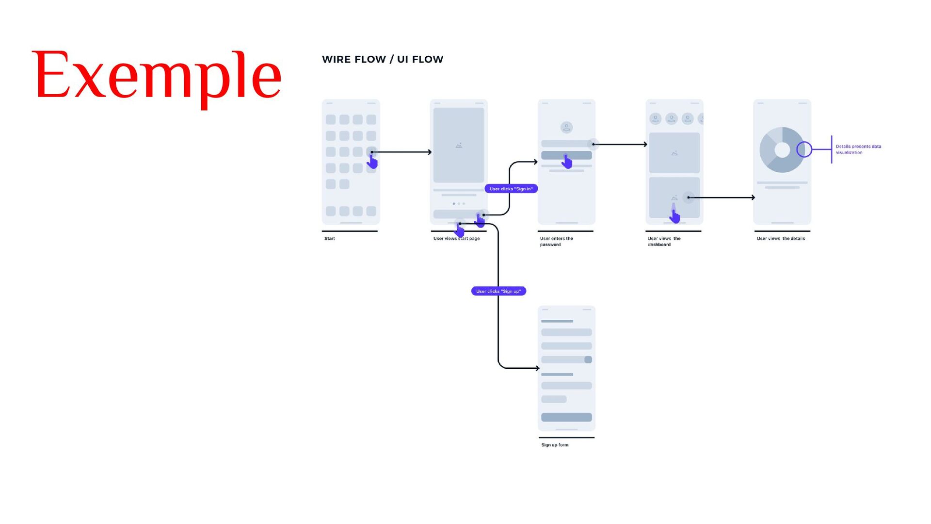
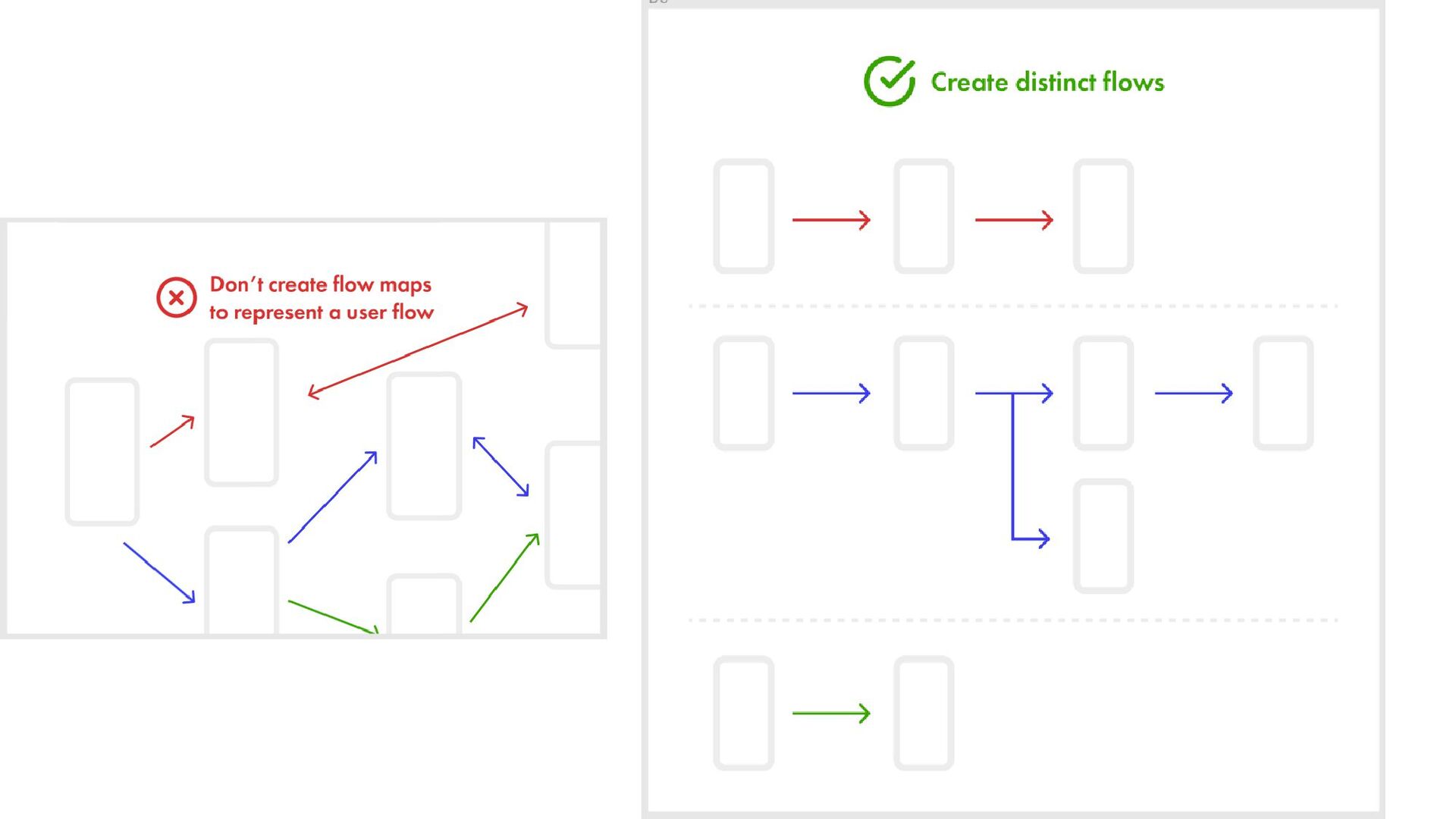
a user takes to achieve a meaningful goal. They're used to communicate the intended flow of a user through various pages and actions in an app or website. It's basically what the user sees and then what they do. And then the next step is what the user sees next and what they are going to do next. The most important thing about user flows is that the outline, the goal your user achieves by completing the flow.
or an application that shows how pages are prioritized. So when do we use sight maps? Well, site maps are generally used in the beginning or really early on in the design process, like right after discovery or kick offs, right after you get all that information from your clients or from your product team, kind of like what we're doing right now with application that we're trying to build. They'll really help us when we need to start working on our wireframes.
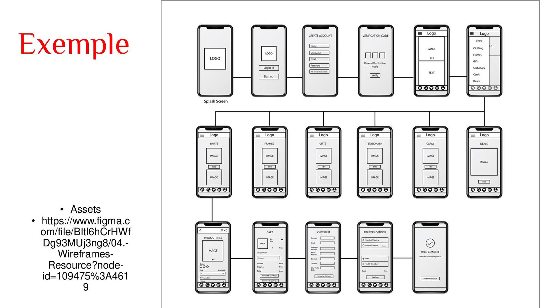
on the page in a little bit more detail than our sketches and our user flows. • It gives an outline of structure and layout of the page, and it conveys the overall direction and description of your user interface. • It's basically, as you can see here, it's just like a blueprint of a building, but instead of a building, it describes the details clearly and specifically, while giving everyone involved a good overview of the product. So why do we use them? Two big reasons. • They really help to test your concepts and your structure, so they really help you to understand how users will navigate your product. • Sometimes you can use your wireframes to highlight certain areas that you think need to have prominence on a page to test if that piece of content is actually working and if the user flow makes sense. • So this is one of the big reasons I use that so that it could be like user flows again, but in much more detail.
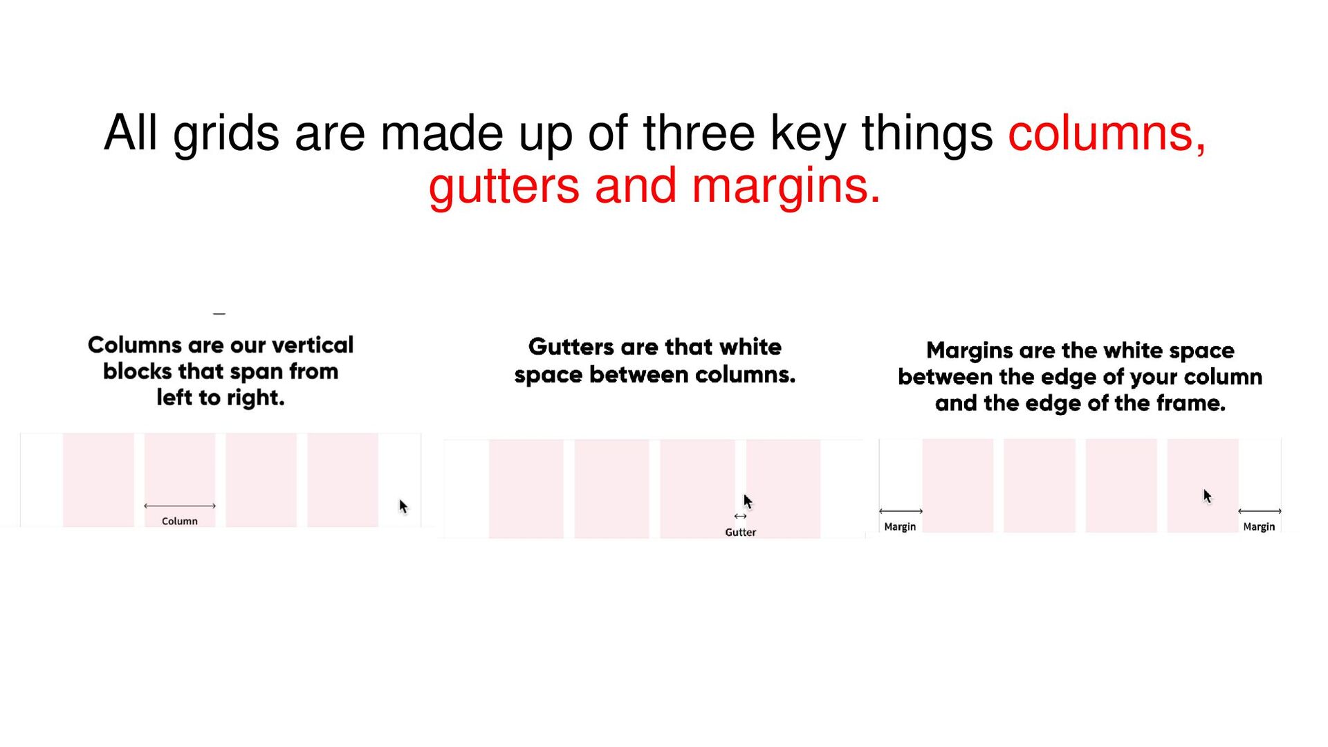
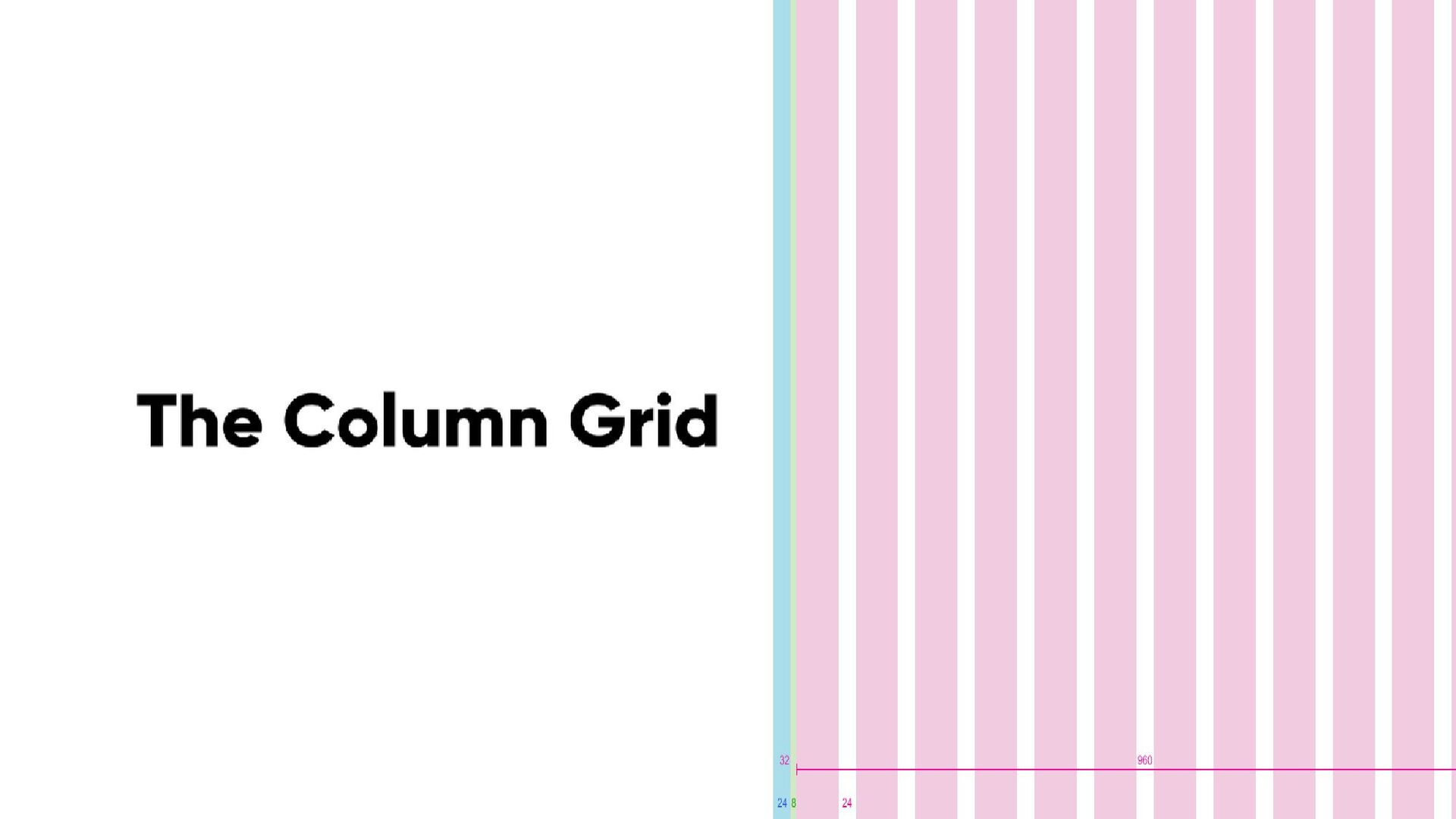
series of lines that divide the page into columns. • We have vertical and horizontal, and this structure helps designers arrange content on a page. • Best to use an eight pixel base unit because it makes scaling for a variety of devices really easy. • Most screen sizes are divisible by eight. • It's also divisible by itself. • Eight divided by two equals four.
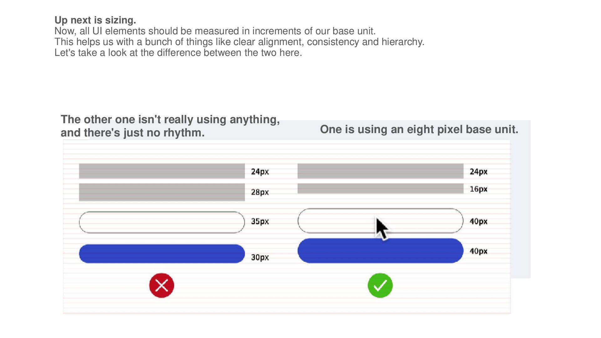
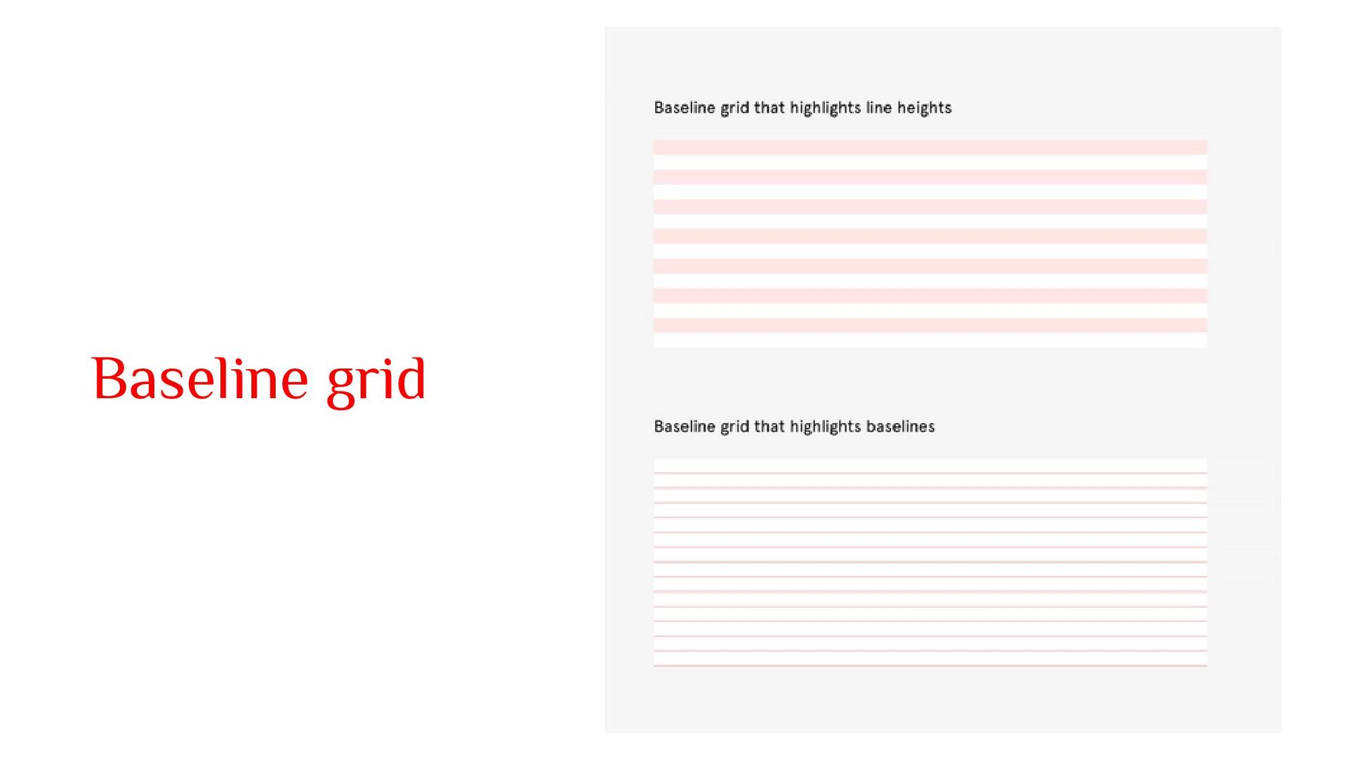
measured in increments of our base unit. This helps us with a bunch of things like clear alignment, consistency and hierarchy. Let's take a look at the difference between the two here. The other one isn't really using anything, and there's just no rhythm. One is using an eight pixel base unit.
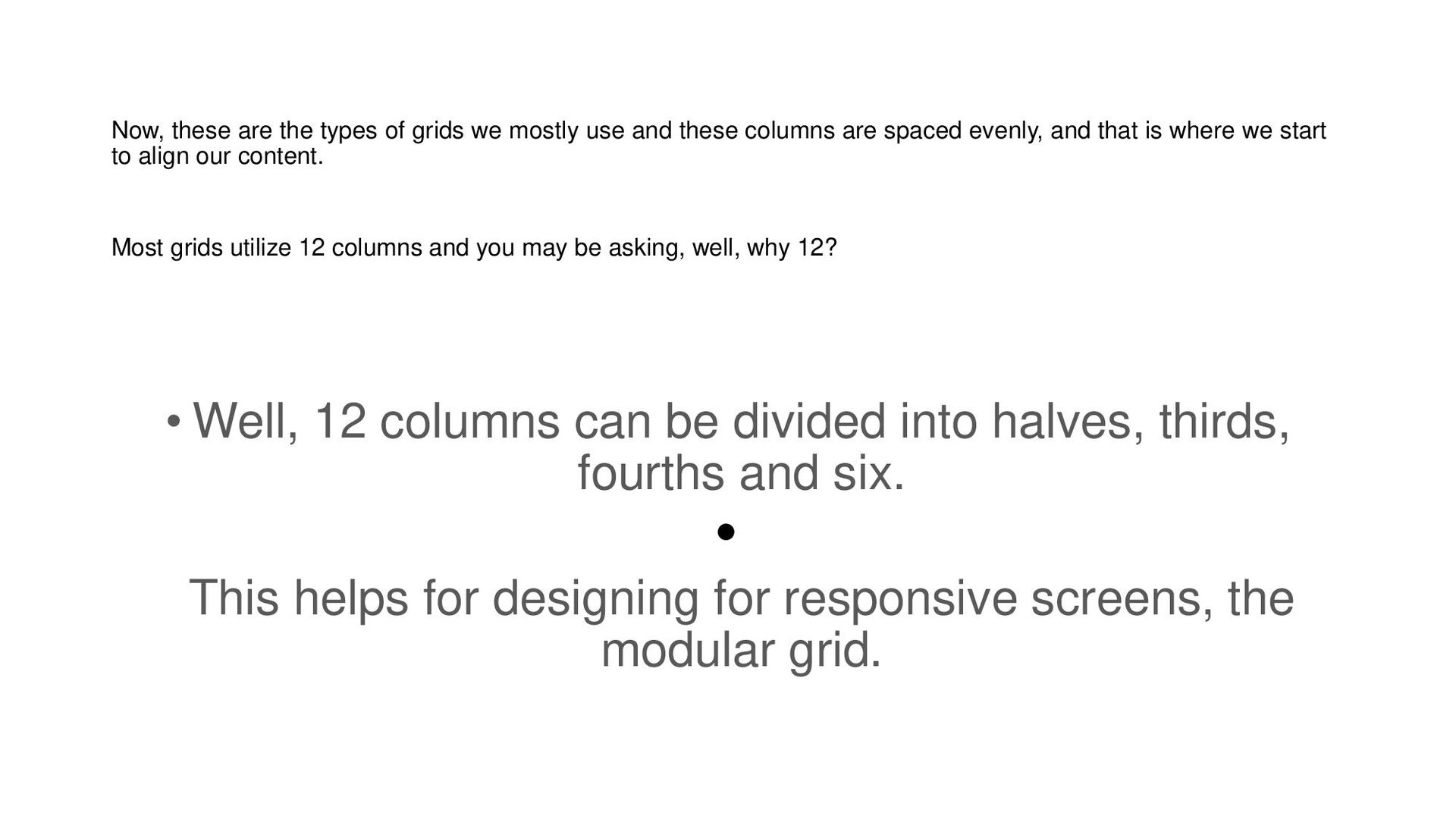
and these columns are spaced evenly, and that is where we start to align our content. Most grids utilize 12 columns and you may be asking, well, why 12? • Well, 12 columns can be divided into halves, thirds, fourths and six. • This helps for designing for responsive screens, the modular grid.
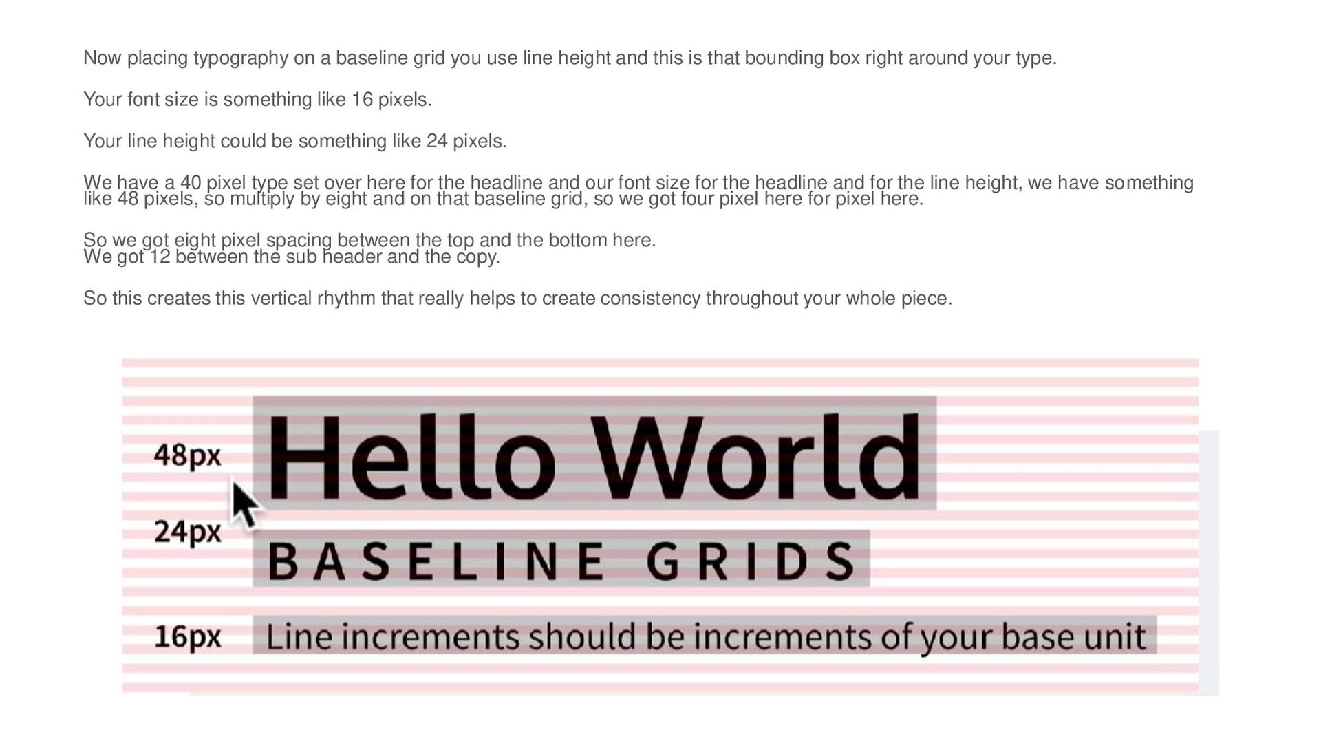
height and this is that bounding box right around your type. Your font size is something like 16 pixels. Your line height could be something like 24 pixels. We have a 40 pixel type set over here for the headline and our font size for the headline and for the line height, we have something like 48 pixels, so multiply by eight and on that baseline grid, so we got four pixel here for pixel here. So we got eight pixel spacing between the top and the bottom here. We got 12 between the sub header and the copy. So this creates this vertical rhythm that really helps to create consistency throughout your whole piece.
columns of the grid or your entire grid will shrink or grow depending on the size of your screen Fluid grids So what is a fixed grid? Basically, the fixed grid has a fixed container width and position. So if we take this griFluid grids are measured in percentages, so the columns of the grid or your entire grid will shrink or grow depending on the size of your screen.d, this frame and we start, you know, expanding it a bit, we notice that the actual main container that contains the grid, it doesn't budge at all. So we have all these little grid containers They're staying fixed based off of the columns here. It actually maintains its exact measurements, while the margin, which are these spaces on either side,nincreases or decreases. Exemple https://www.figma.com/file/CKwxbgT09NkdbpKhvlIEr6/06.-Spacing-and-Grids-Resource-(Copy)?node-id=29574%3A6327
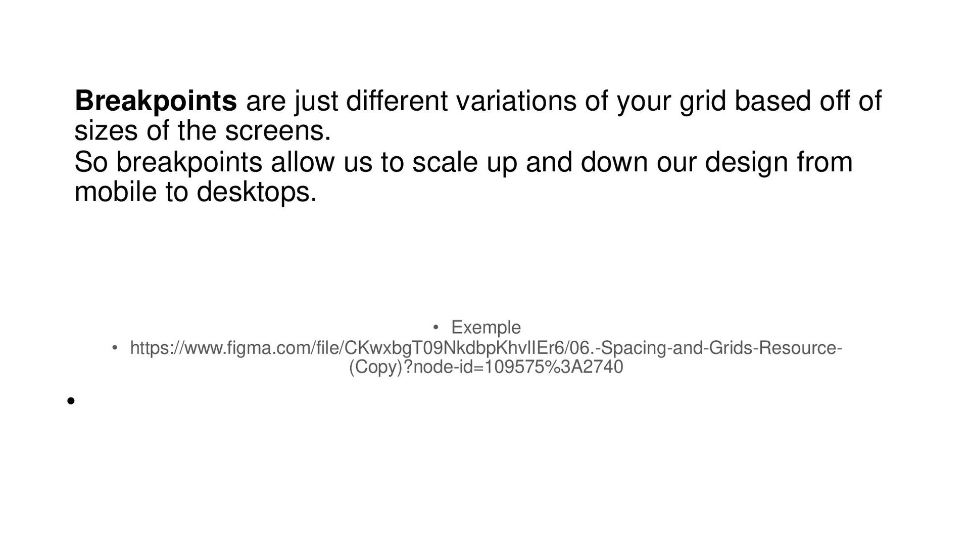
of sizes of the screens. So breakpoints allow us to scale up and down our design from mobile to desktops. • Exemple • https://www.figma.com/file/CKwxbgT09NkdbpKhvlIEr6/06.-Spacing-and-Grids-Resource- (Copy)?node-id=109575%3A2740 •
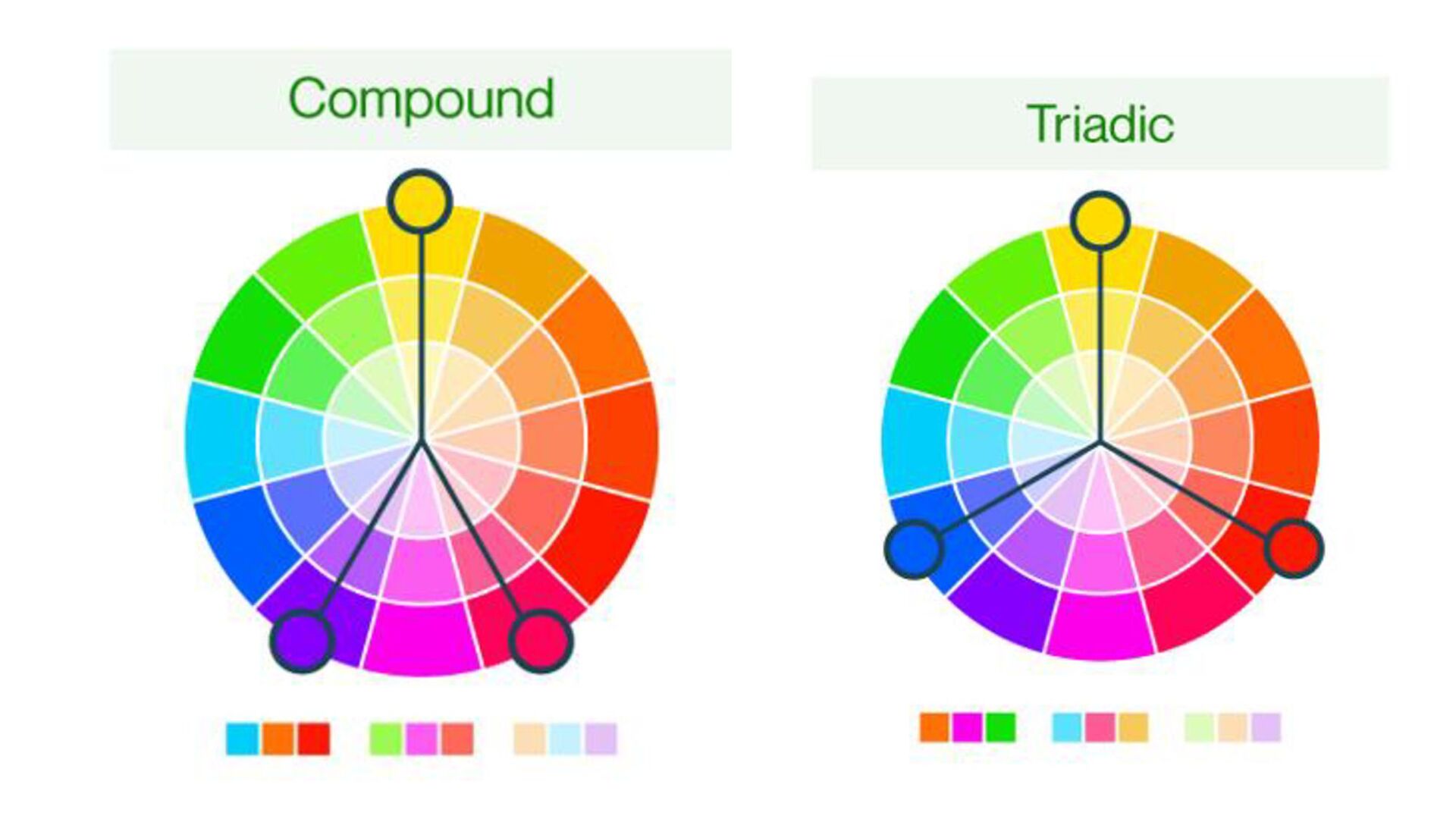
of one primary color. In theory, it's the simplest of all color schemes, and these are mostly used in minimal designs because one hue generally results in a less distracting layout. This is based off of three colors located next to each other on the color wheel. This scheme uses colors that are on the opposite sides of the color wheel.
to understand the type of problem we're trying to solve. I want to know, do I understand this product? What type of problem is the product trying to solve? What does it want to communicate? If we had a session where we were mapping these things earlier in like a kickoff and using our stakeholders kind of research to really understand what the big business problem was, these types of things could really help influence your color palette choice. You know, remember when we briefly talked about brand personality, you know, this applies here to understanding what the brand is trying to say, helps us pick colors and understanding the problem the product is trying to solve is integral. Some clothes are better suited or associated with different types of products. You know, maybe blues with fintech, nothing is set in stone. It's a good to understand the landscape when approaching a color palette, so just keep that in mind. When you're starting to create your own color palette, the next thing is we want to understand who our users are. Do I understand the user as well? Who are the users we are targeting? What region do they belong to? • . •
we perceive the world, and that couldn't be more true within the interfaces. Colors guide us to predict, understand and make decisions. Think about what colors mean to you. So I want you to take a second and just think about this while I'm going through it. Ever since you were a child, you've been trained to pause at words colored in red. You know, think about error text, or if you see a negative balance in your account or a stop sign or a red light. Or a bad mark on your essay and you relax relaxant maybe numbers in green or text in green. You naturally want to read text in black before you do texting gray. You want to click on things that are blue. It's embedded into how we experience products that we never give it really any extra thought. Now let's go one step further. And certain colors have a different connotation when it comes to things like culture. Think about who you're designing for. Even age and gender. Site with color palette Blue Color Palettes - Coolors
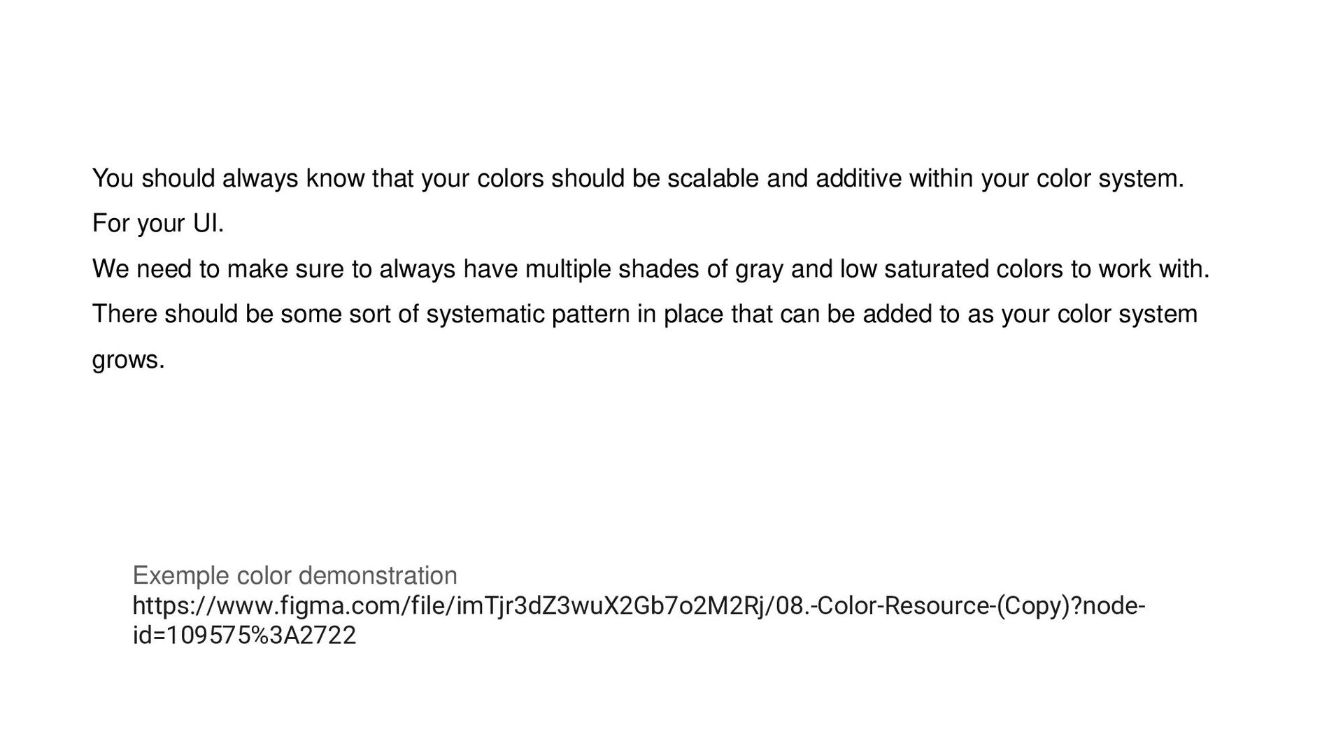
and additive within your color system. For your UI. We need to make sure to always have multiple shades of gray and low saturated colors to work with. There should be some sort of systematic pattern in place that can be added to as your color system grows. Exemple color demonstration https://www.figma.com/file/imTjr3dZ3wuX2Gb7o2M2Rj/08.-Color-Resource-(Copy)?node- id=109575%3A2722
just elements within your user interface. We have a cards, we have some icons, we have a navigation, we have a badge on an icon right there. We also have like a little picker over here. And these are all considered UI elements, but forms are probably the most common UI elements that we actually experience and probably if not the most important.
to use our products, those that have disabilities are typically using what's called an assistive technology, whether that's a device or software. And there's a wide range of them that are important to understand because it's going to open your mind to some of the ways that people are interacting with your content and the user experience you're creating online. Now, this is probably a more common one that we've all heard about, but it's a program that helps the visually impaired understand the content displayed on the page. So it basically converts digital text and labels and images and descriptions to something that is more readable by this piece of software. So you could imagine that they would all they would need to do is press play. And they could read like an entire block of text. They could read entire Web pages.
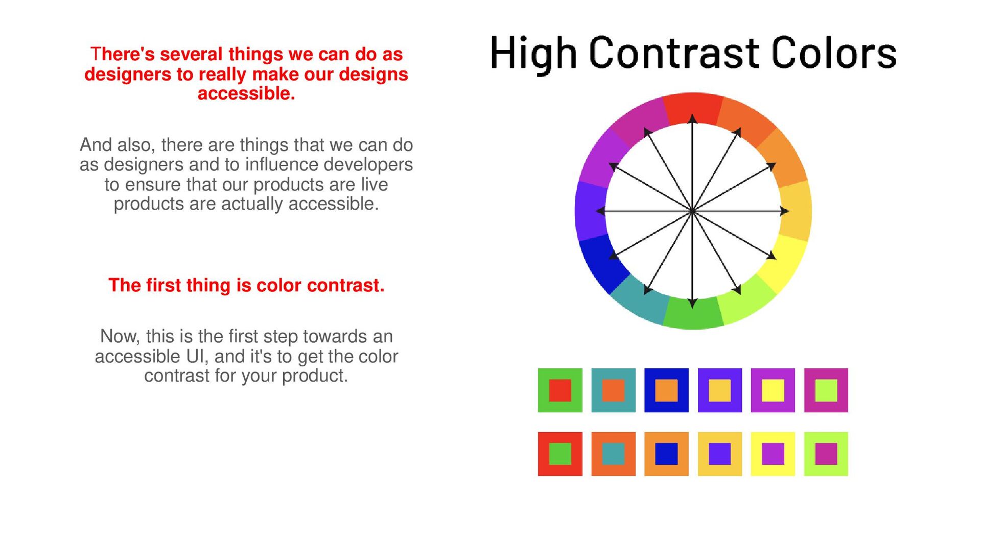
make our designs accessible. And also, there are things that we can do as designers and to influence developers to ensure that our products are live products are actually accessible. The first thing is color contrast. Now, this is the first step towards an accessible UI, and it's to get the color contrast for your product.
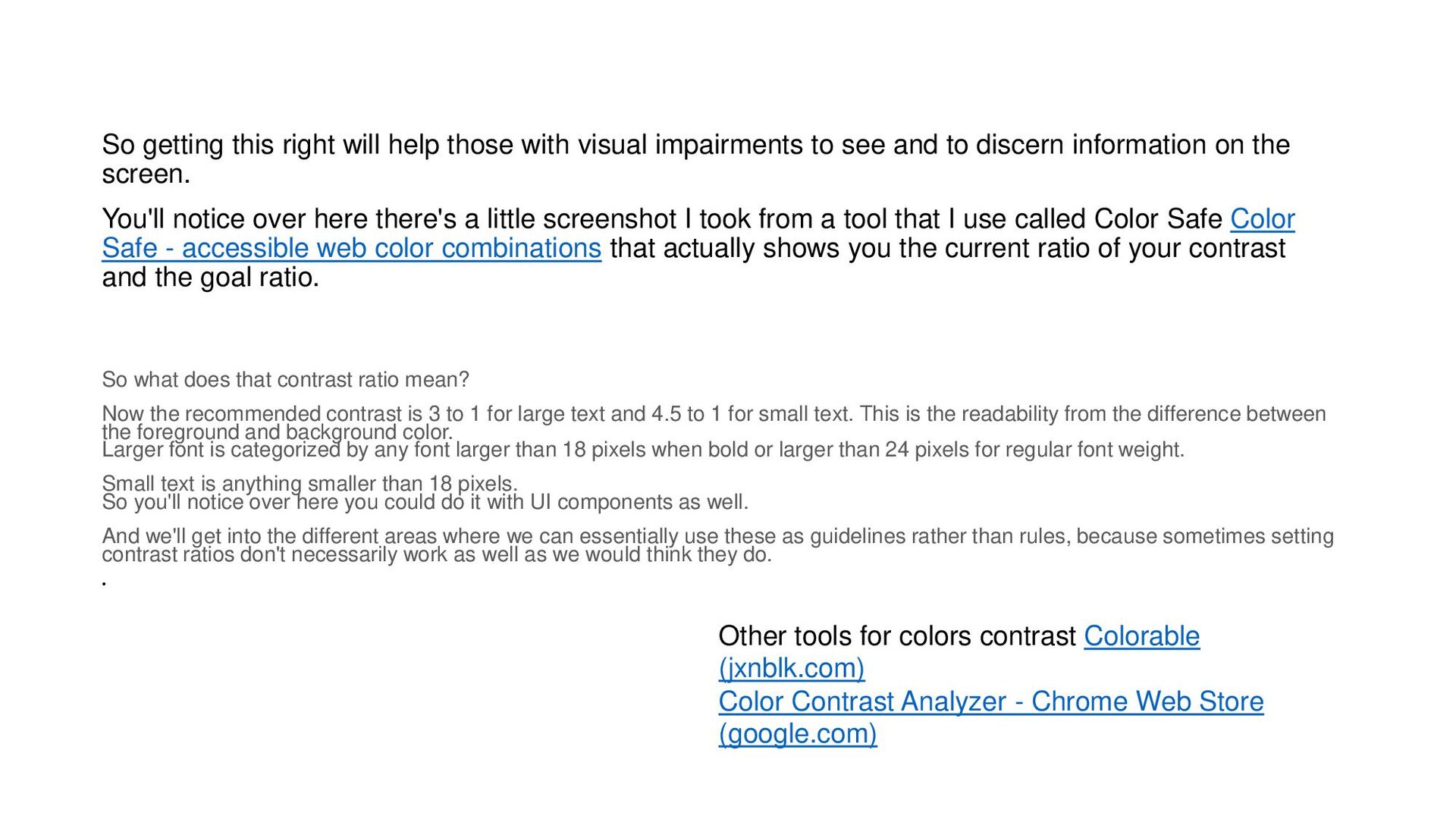
to see and to discern information on the screen. You'll notice over here there's a little screenshot I took from a tool that I use called Color Safe Color Safe - accessible web color combinations that actually shows you the current ratio of your contrast and the goal ratio. So what does that contrast ratio mean? Now the recommended contrast is 3 to 1 for large text and 4.5 to 1 for small text. This is the readability from the difference between the foreground and background color. Larger font is categorized by any font larger than 18 pixels when bold or larger than 24 pixels for regular font weight. Small text is anything smaller than 18 pixels. So you'll notice over here you could do it with UI components as well. And we'll get into the different areas where we can essentially use these as guidelines rather than rules, because sometimes setting contrast ratios don't necessarily work as well as we would think they do. • Other tools for colors contrast Colorable (jxnblk.com) Color Contrast Analyzer - Chrome Web Store (google.com)
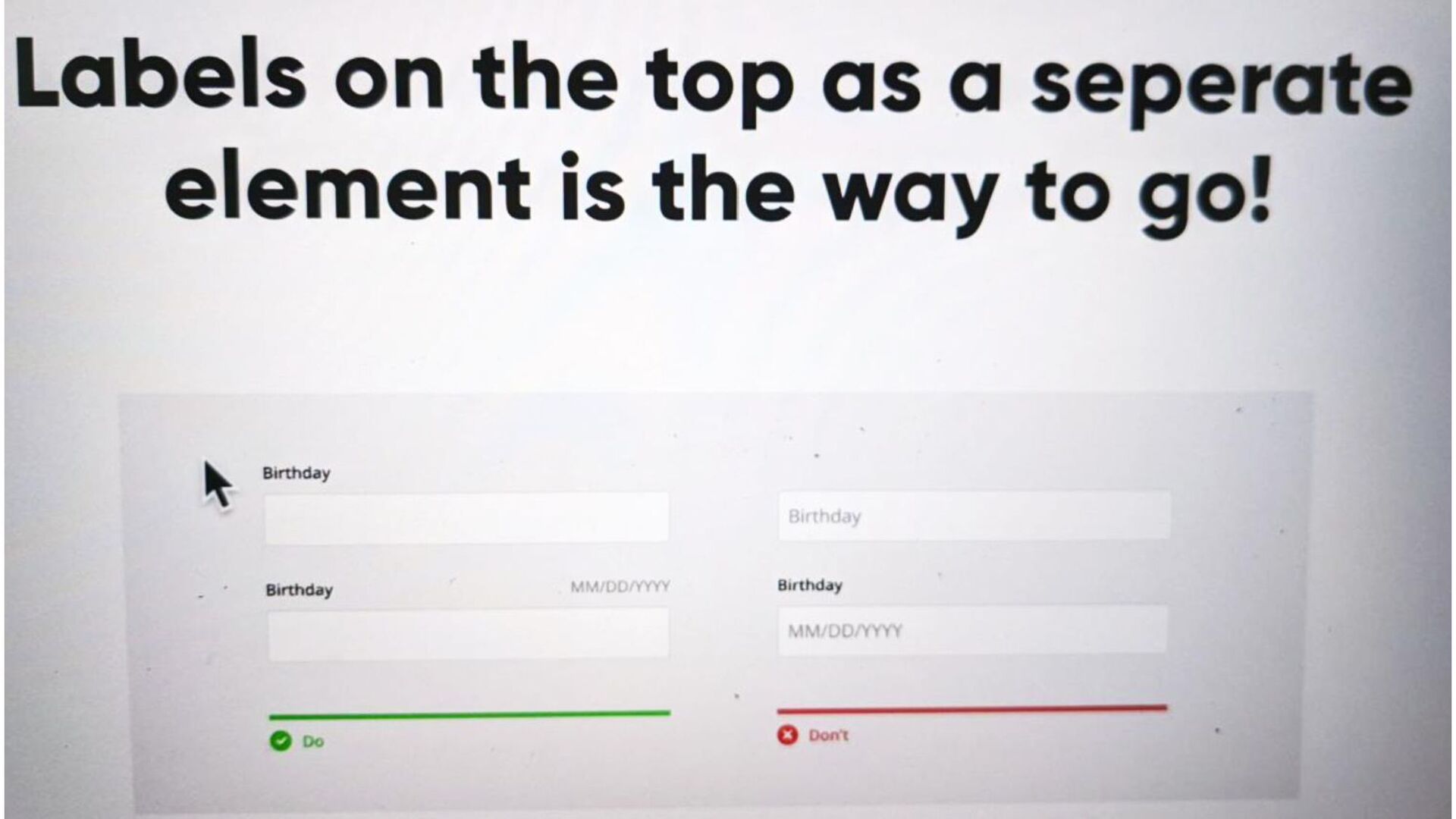
what I mean by that is that when you're designing a form, rather than having a placeholder inside the input and which possibly acts as the inputs label, just have your label be a label. You could have a placeholder that then on Focus acts as a label, but a placeholder that goes away upon Focus is a huge no no, not only for user experience, but for accessibility.
 bitkey
 lynteo
 kenichiota0711
 kazukiikeda
 spacemarket
 nbkouhou
 designer_no_pon
 hiro93n
 poteboy
 design_dolphins
 solmetts
 uxman
uxman
 inesmontani
 tammyeverts
 chriscoyier
 sugarenia
 katarinadahlin
 ryanjones
 codingconduct
 hatefulcrawdad
 axbom
axbom
 signer
 erikaheidi
 soysaucechin