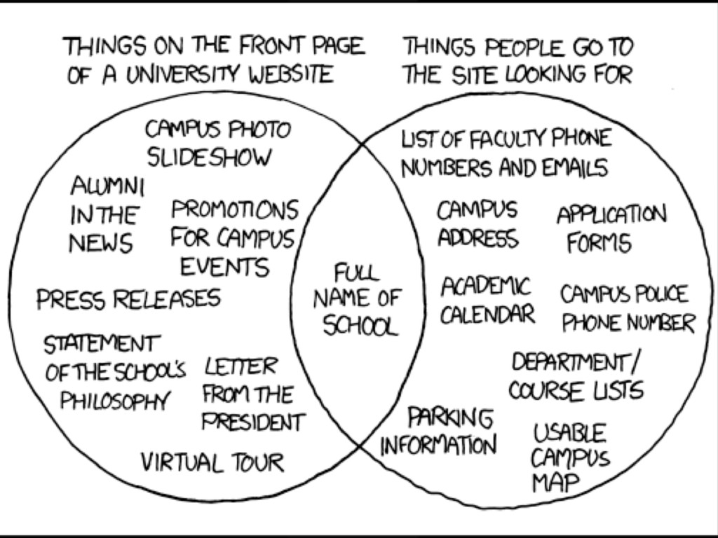
eBay global mobile sales generated nearly $2 billion in 2010 The average smartphone user visits up to 24 websites a day and the top 50% of websites only account for 40% of all mobile visits Mobile phones will overtake PCs as the most common web access devices worldwide by 2013 PayPal is seeing up to $10 million in mobile payment volume per day
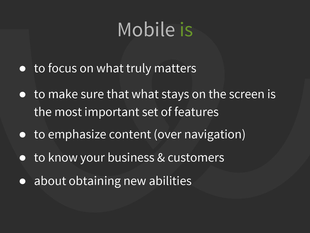
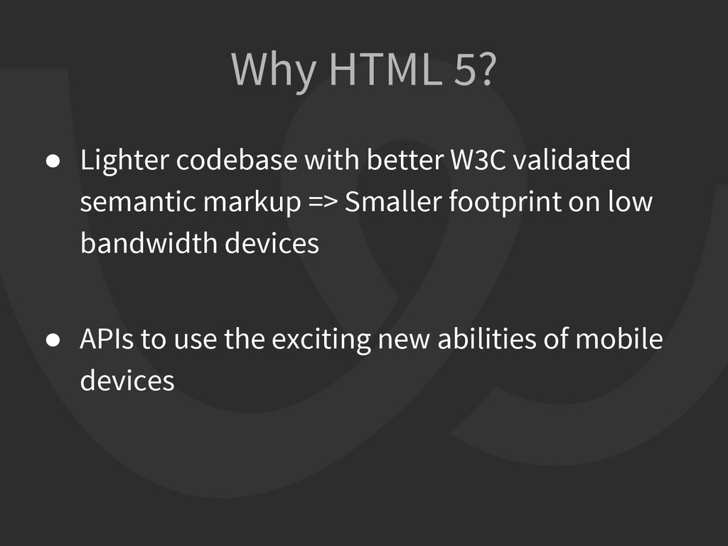
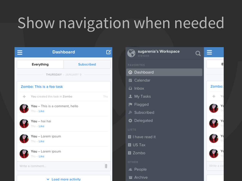
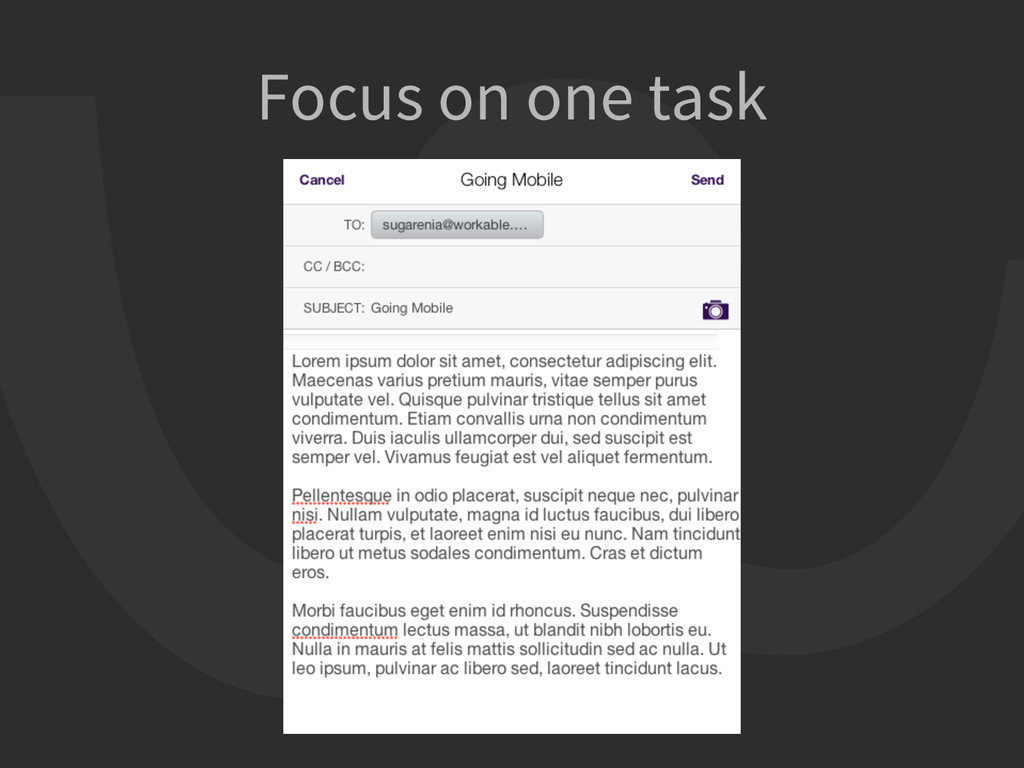
sure that what stays on the screen is the most important set of features • to emphasize content (over navigation) • to know your business & customers • about obtaining new abilities Mobile is
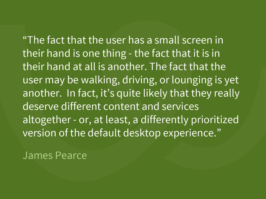
screen in their hand is one thing - the fact that it is in their hand at all is another. The fact that the user may be walking, driving, or lounging is yet another. In fact, it’s quite likely that they really deserve different content and services altogether - or, at least, a differently prioritized version of the default desktop experience.”
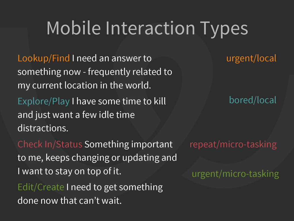
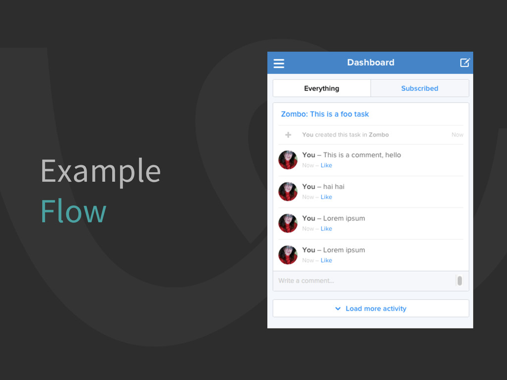
now - frequently related to my current location in the world. Explore/Play I have some time to kill and just want a few idle time distractions. Check In/Status Something important to me, keeps changing or updating and I want to stay on top of it. Edit/Create I need to get something done now that can’t wait. urgent/local bored/local repeat/micro-tasking urgent/micro-tasking
browser engine [WebView] but not the browser • has access to device capabilities that are not accessible in Mobile Web applications through a web-to-native abstraction layer A Hybrid App
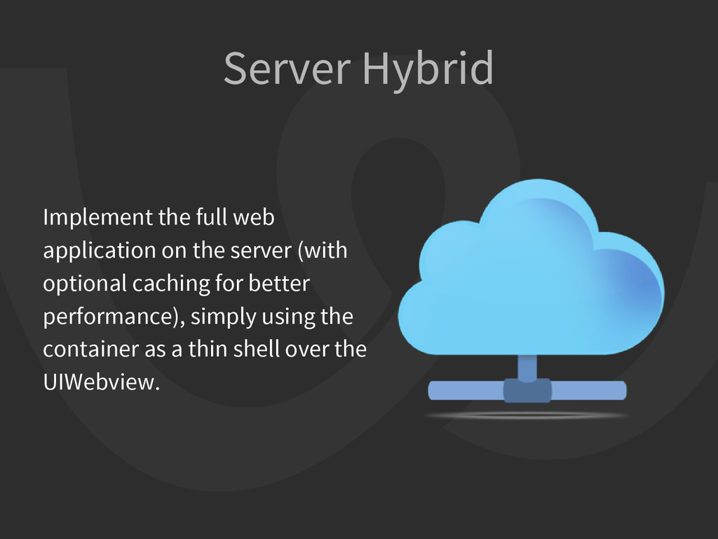
application binary, in a manner similar to the structure of a native application. In this scenario you use REST APIs to move data back and forth between the device and the cloud.
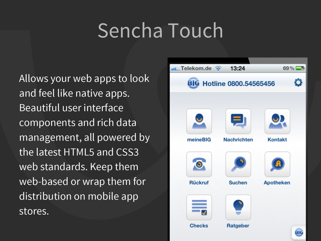
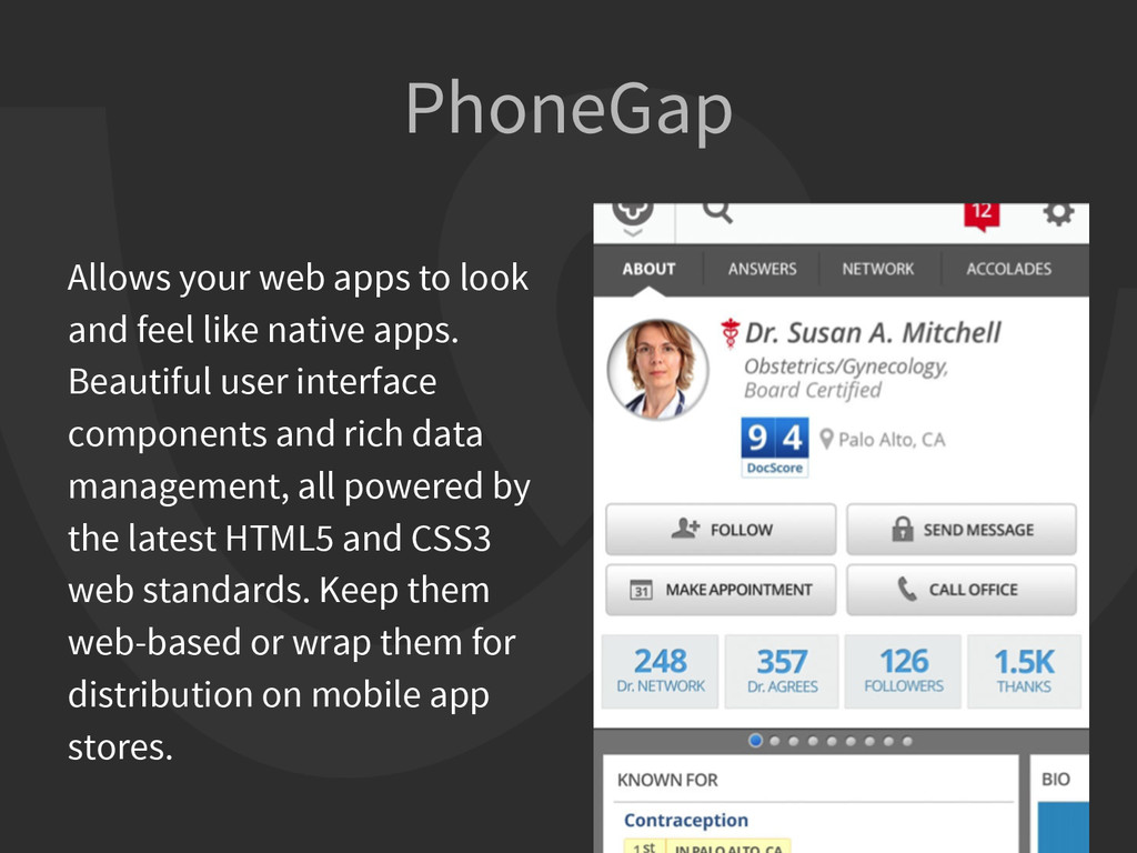
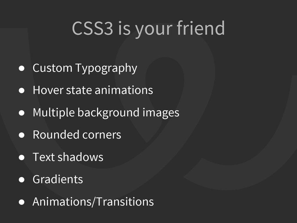
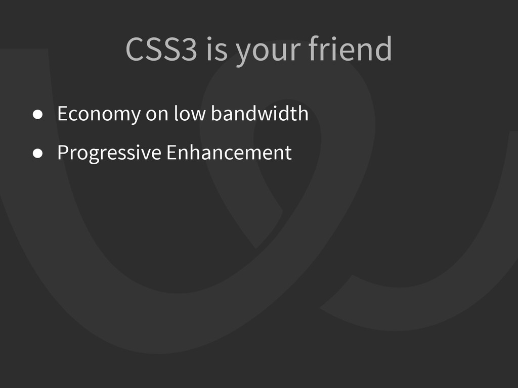
like native apps. Beautiful user interface components and rich data management, all powered by the latest HTML5 and CSS3 web standards. Keep them web-based or wrap them for distribution on mobile app stores.
native apps. Beautiful user interface components and rich data management, all powered by the latest HTML5 and CSS3 web standards. Keep them web-based or wrap them for distribution on mobile app stores.
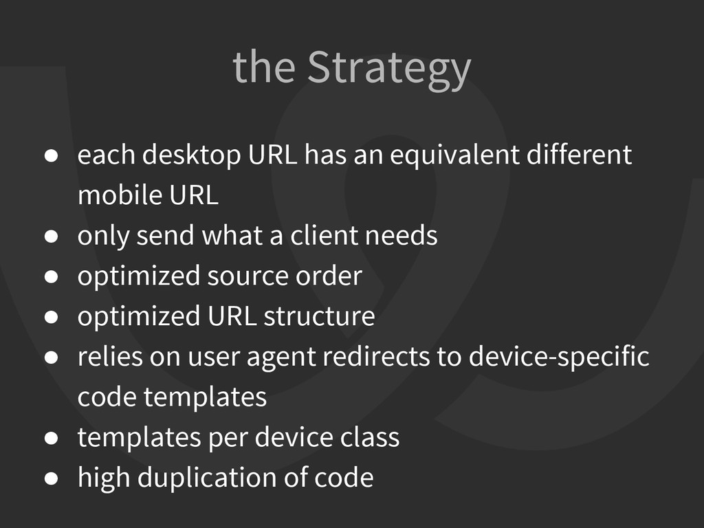
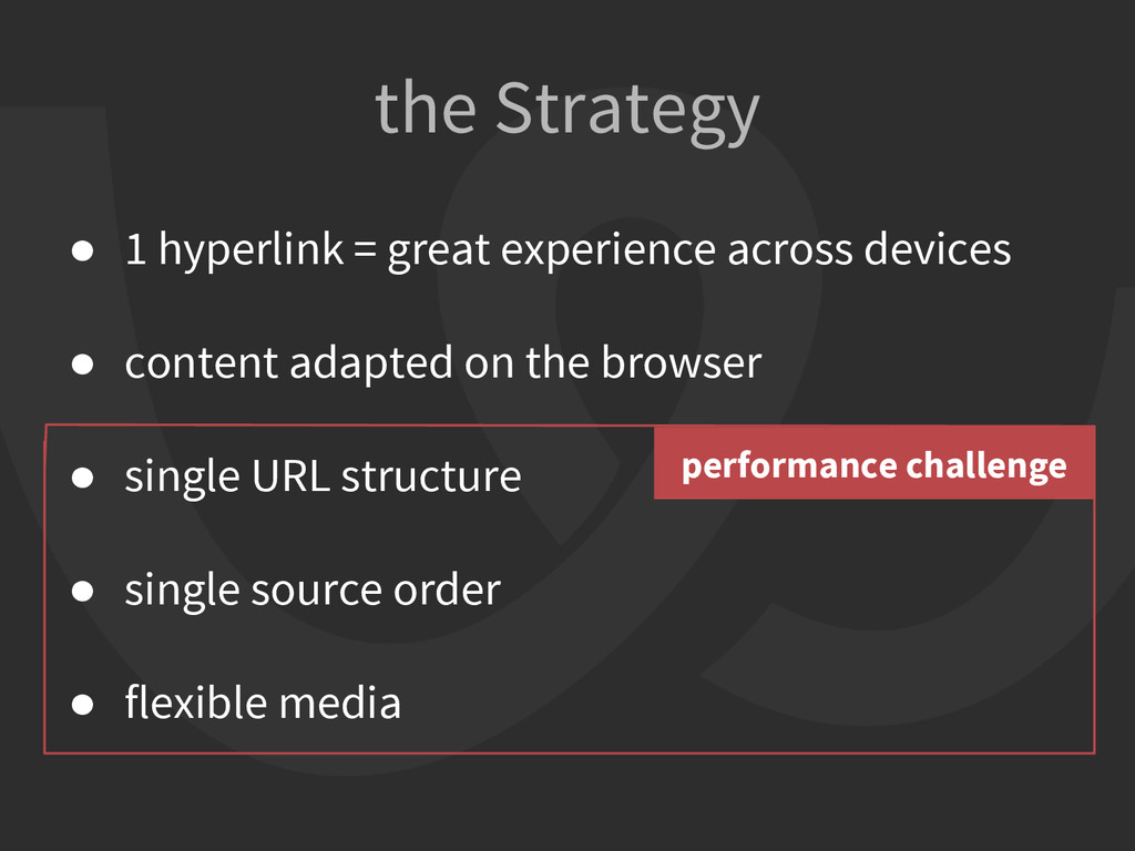
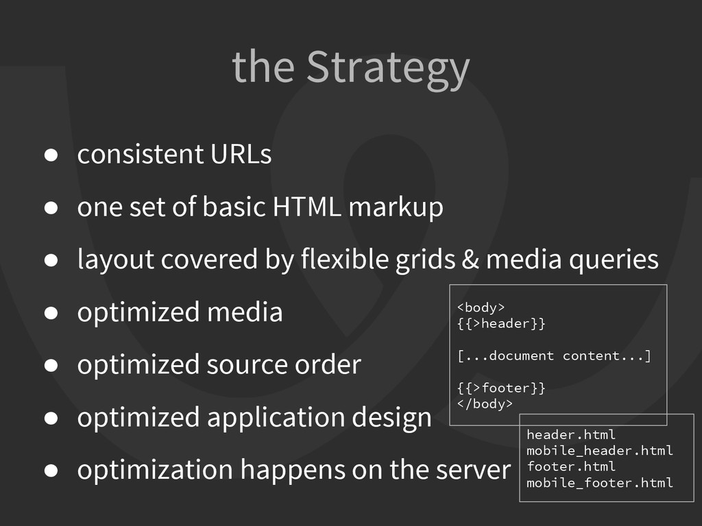
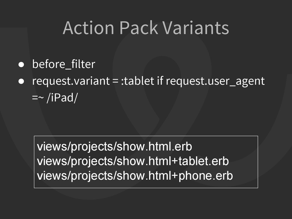
• only send what a client needs • optimized source order • optimized URL structure • relies on user agent redirects to device-specific code templates • templates per device class • high duplication of code the Strategy
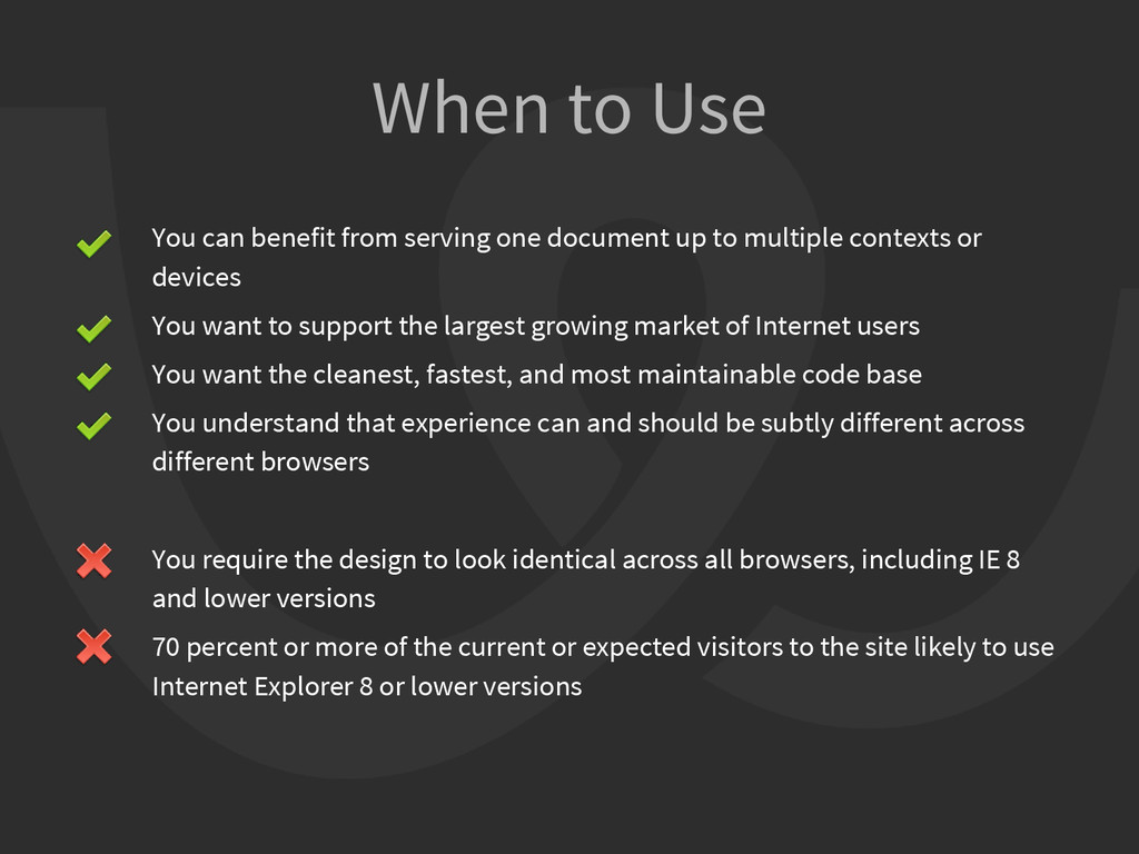
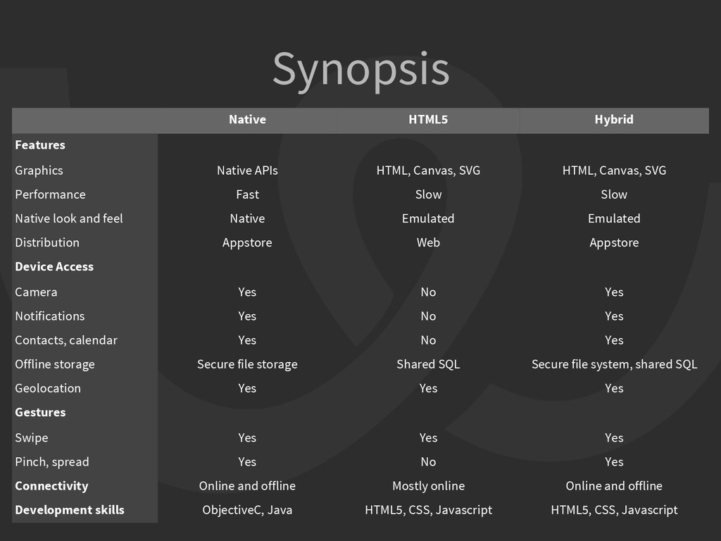
contexts or devices You want to support the largest growing market of Internet users You want the cleanest, fastest, and most maintainable code base You understand that experience can and should be subtly different across different browsers You require the design to look identical across all browsers, including IE 8 and lower versions 70 percent or more of the current or expected visitors to the site likely to use Internet Explorer 8 or lower versions When to Use
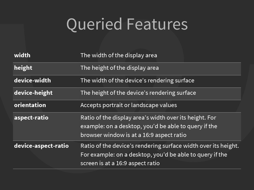
The height of the display area device-width The width of the device’s rendering surface device-height The height of the device’s rendering surface orientation Accepts portrait or landscape values aspect-ratio Ratio of the display area’s width over its height. For example: on a desktop, you’d be able to query if the browser window is at a 16:9 aspect ratio device-aspect-ratio Ratio of the device’s rendering surface width over its height. For example: on a desktop, you’d be able to query if the screen is at a 16:9 aspect ratio
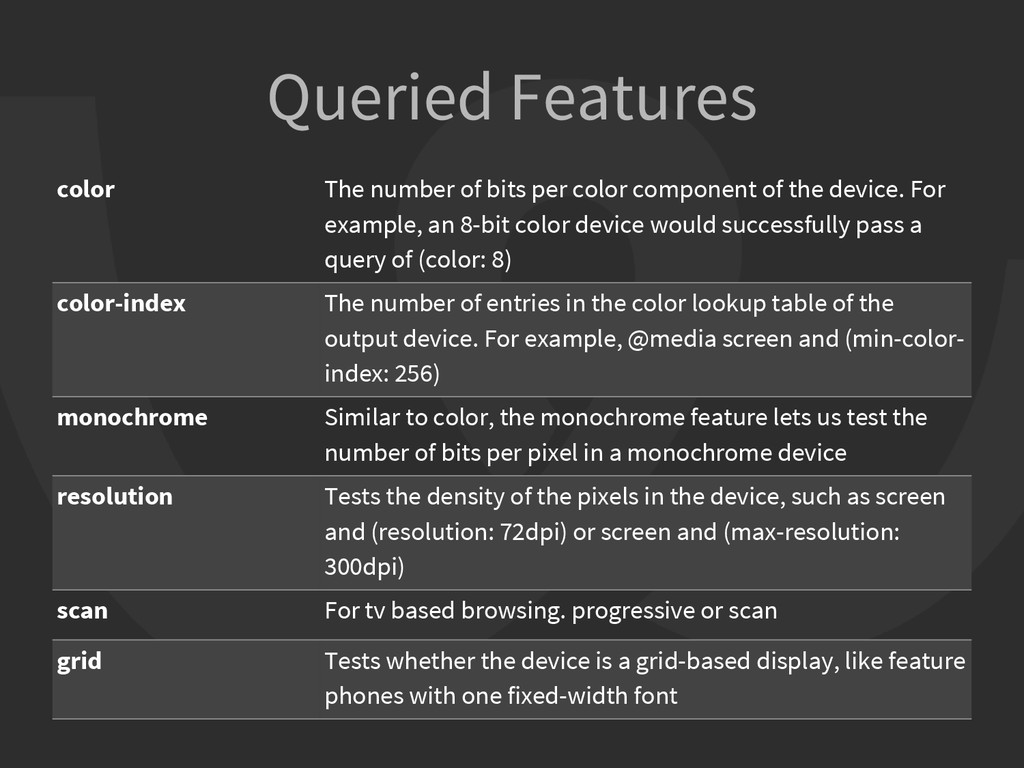
of the device. For example, an 8-bit color device would successfully pass a query of (color: 8) color-index The number of entries in the color lookup table of the output device. For example, @media screen and (min-color- index: 256) monochrome Similar to color, the monochrome feature lets us test the number of bits per pixel in a monochrome device resolution Tests the density of the pixels in the device, such as screen and (resolution: 72dpi) or screen and (max-resolution: 300dpi) scan For tv based browsing. progressive or scan grid Tests whether the device is a grid-based display, like feature phones with one fixed-width font
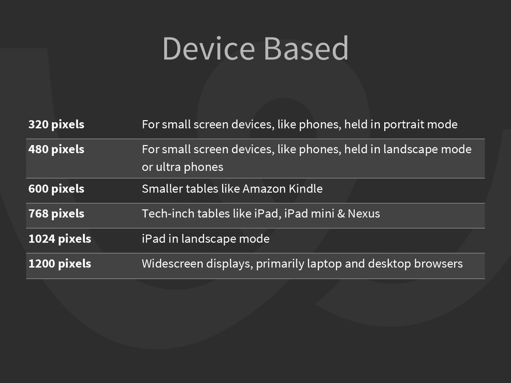
held in portrait mode 480 pixels For small screen devices, like phones, held in landscape mode or ultra phones 600 pixels Smaller tables like Amazon Kindle 768 pixels Tech-inch tables like iPad, iPad mini & Nexus 1024 pixels iPad in landscape mode 1200 pixels Widescreen displays, primarily laptop and desktop browsers
HTML markup • layout covered by flexible grids & media queries • optimized media • optimized source order • optimized application design • optimization happens on the server <body> {{>header}} [...document content...] {{>footer}} </body> header.html mobile_header.html footer.html mobile_footer.html
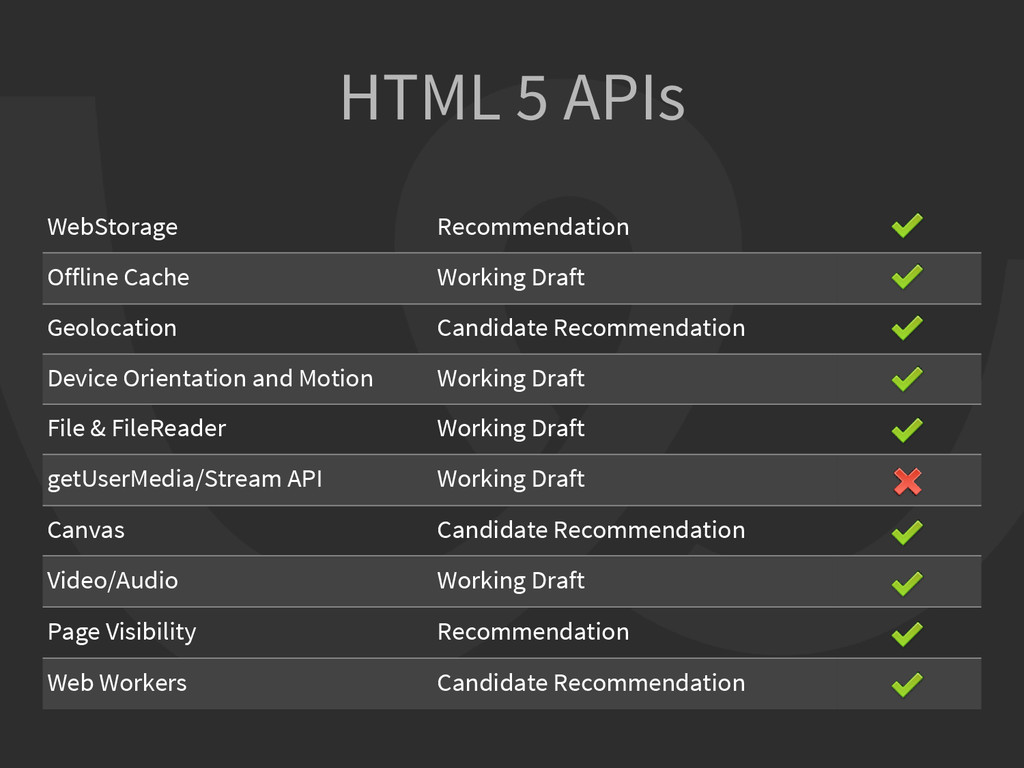
Candidate Recommendation Device Orientation and Motion Working Draft File & FileReader Working Draft getUserMedia/Stream API Working Draft Canvas Candidate Recommendation Video/Audio Working Draft Page Visibility Recommendation Web Workers Candidate Recommendation
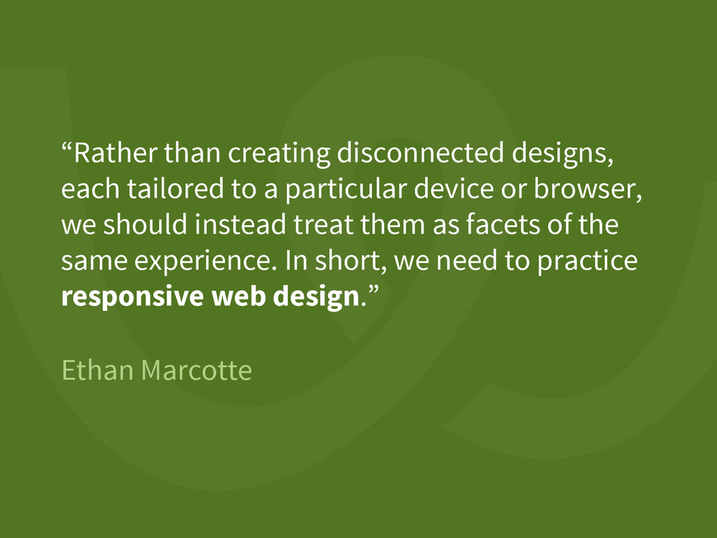
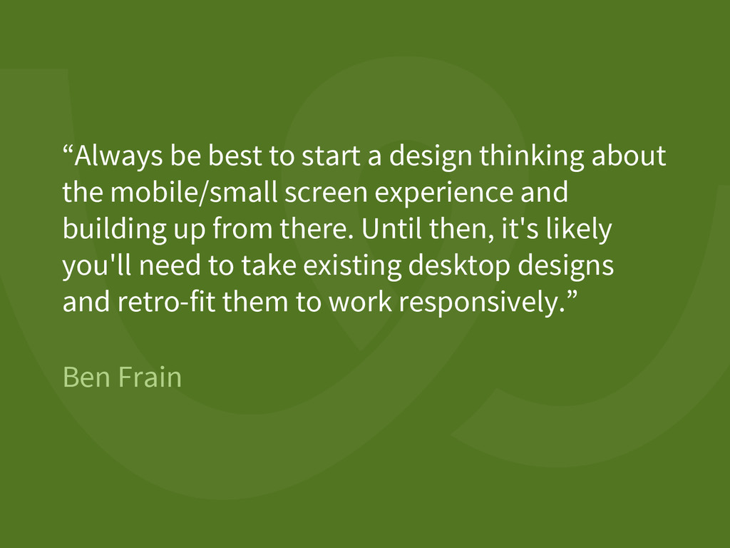
about the mobile/small screen experience and building up from there. Until then, it's likely you'll need to take existing desktop designs and retro-fit them to work responsively.”
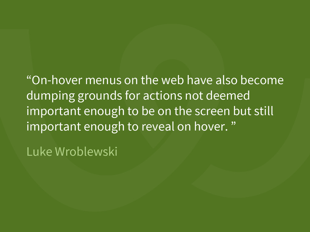
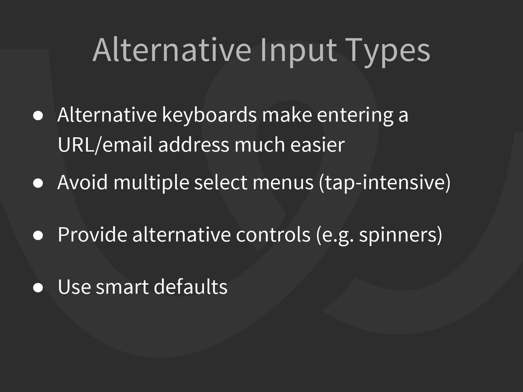
Show info on tap/swipe if it doesn’t introduce an extra step • Show info on a separate screen if content is excessive • Kill it with fire to simplify, you know? How to deal with hovers
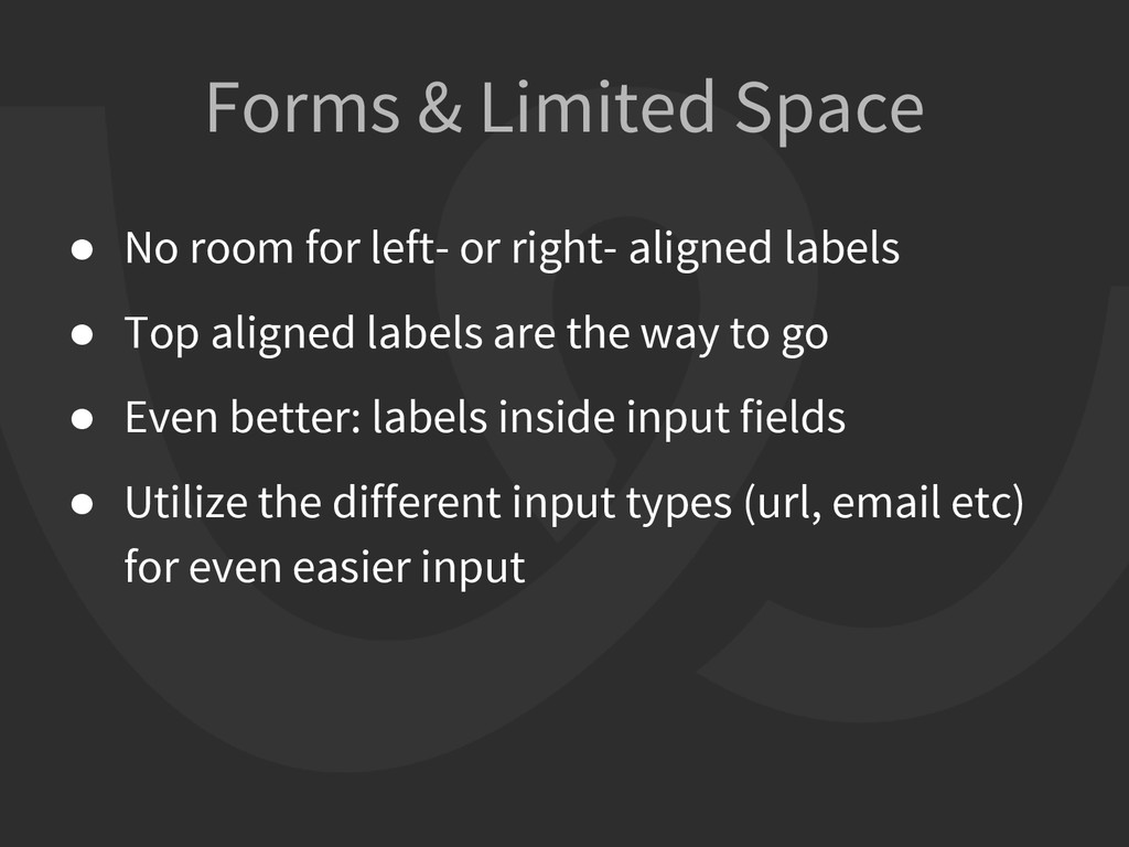
right- aligned labels • Top aligned labels are the way to go • Even better: labels inside input fields • Utilize the different input types (url, email etc) for even easier input
provides the ability to conditionally load further polyfills, CSS files, and additional JavaScript files based on a number of feature tests. • Makes it easy for you to write conditional JavaScript and CSS to handle each situation, whether a browser supports a feature or not Modernizr
 pavlakis
 mizchi
 minodriven
 hananouchi
 tatsuhiro
 kajitack
 yukikurage
 16bitidol
 slashnephy
 handlename
 tomoyk
 nakahara
 jsoizo
 sferik
 katarinadahlin
 auna
auna
 rakko
rakko
 szymonslowik
 addyosmani
 keavy
keavy
 lara
lara
 techseoconnect
 eileencodes
 jonoalderson
 quramy