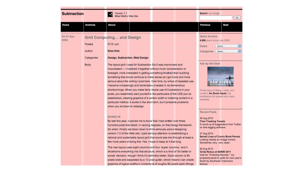
position • Can adjust position using top, right, bottom, left properties (px, em, rem, %) • Surrounding content does not adjust based on positioning of relative elements • Also used to set position context for absolutely positioned child elements
• Stays in the same place even as the viewport is scrolled • Can adjust position using top, right, bottom, left properties • Does not leave a gap where it would have normally been located on the page (“Removed from the flow”) • Set sufficient margin/padding on content to accommodate fixed elements
(not static) ancestor • If no positioned ancestors exist, uses the body element • Scrolls with surrounding content • Can adjust position using top, right, bottom, left properties • Does not leave a gap where it would have normally been located on the page
of their parent • Applying a width will prevent this (px/em/rem/%) • Setting left and right margins to auto will center horizontally • Using max-width instead of width will make the box flexible up to the max-width value
z-index: X; * relative to closest positioned ancestor Centering with margin: auto margin: X auto; X = top/bottom margin Float Property float: none|left|right; clear: left; /* clears proceeding element */ overflow: hidden; /* self-clears parent of floated elements */
Learn Layout (http://learnlayout.com/) • Responsive Grid System (http://www.responsivegridsystem.com/) • Can I Use? (http://caniuse.com/) • CSS-Tricks (https://css-tricks.com/) • A Book Apart (https://abookapart.com/)
 peruvianidol
 nari_ex
 sansantech
 takkuhiro
 tatsuya1970
 ming_ayami
 sugitak
 lycorptech_jp
 rakus_dev
 alchemy1115
 glaforge
 prgckwb
 dmmsre
 akihiro_kokubo
 katiecoart
 matthewcrist
 stephenakadiri
 portentint
 tammyeverts
 chriscoyier
 soudai
 davidcarrasco
 tanoku
 addyosmani
 reverentgeek
![Layout Cheatsheet Position Properties position: static|absolute*|fixed|relative; top|right|bottom|left: [value in px/ems/rems/%];](https://files.speakerdeck.com/presentations/32621680913d4faca0e01aeb3873b8d5/slide_46.jpg)
![Questions? Mike Aparicio [email protected]](https://files.speakerdeck.com/presentations/32621680913d4faca0e01aeb3873b8d5/slide_73.jpg)