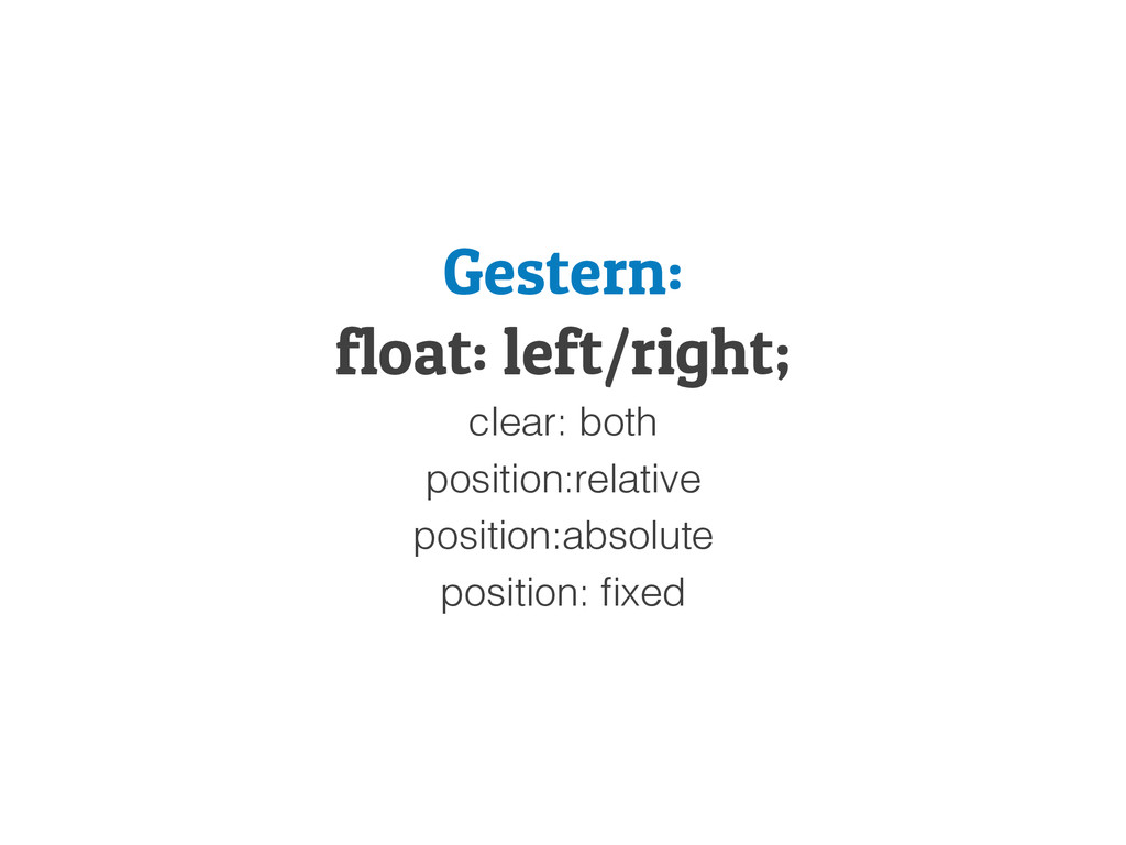
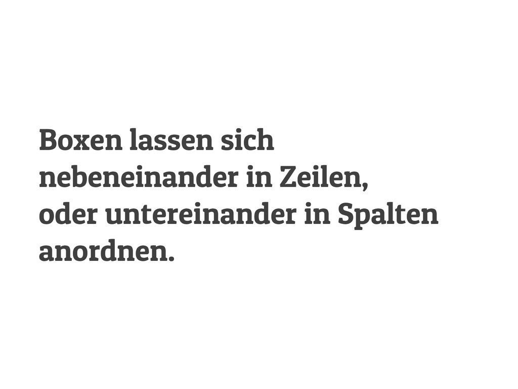
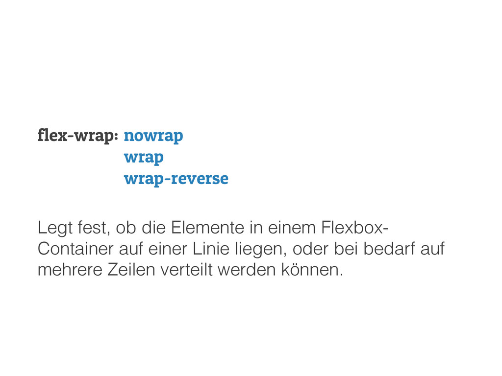
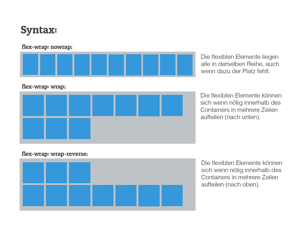
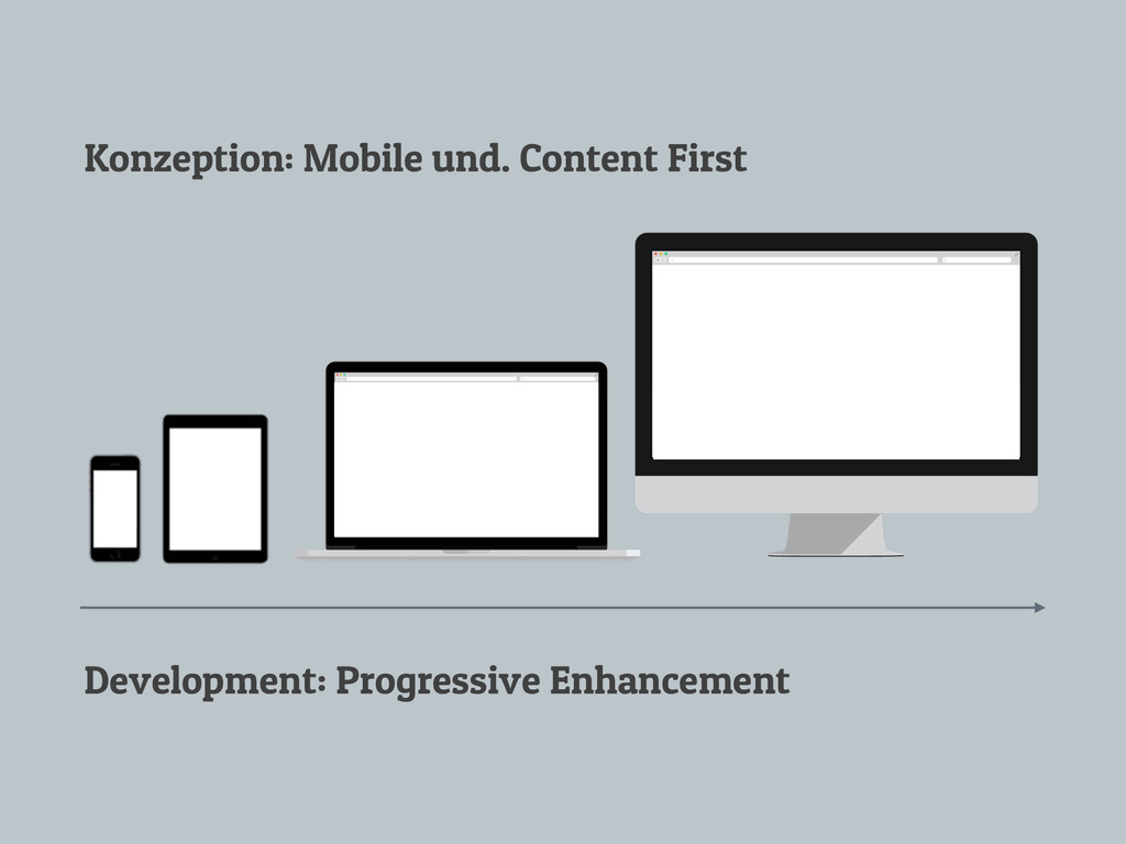
liegen alle in derselben Reihe, auch wenn dazu der Platz fehlt. Die flexiblen Elemente können sich wenn nötig innerhalb des Containers in mehrere Zeilen aufteilen (nach unten). Die flexiblen Elemente können sich wenn nötig innerhalb des Containers in mehrere Zeilen aufteilen (nach oben).
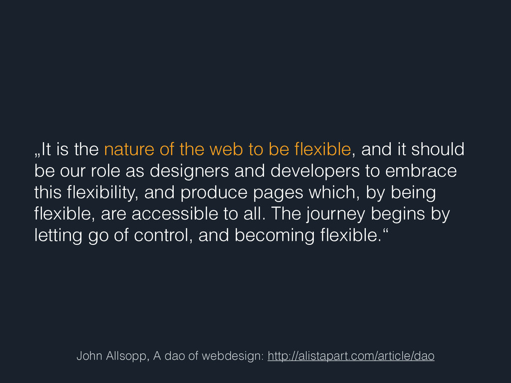
nature of the web to be flexible, and it should be our role as designers and developers to embrace this flexibility, and produce pages which, by being flexible, are accessible to all. The journey begins by letting go of control, and becoming flexible.“
 peterrozek
 k1mu21
 oniak3ibm
 simas
simas
 licux
licux
 rkaga
rkaga
 chobishiba
 handlename
 chiroruxx
 kn_to_maxpno
 mom0tomo
 snhryt
 jinwatanabe
 emna__ayadi
 rocio
rocio
 chriscoyier
 reverentgeek
 andyhume
 bkeepers
 nwiizo
 samanthasiow
 ianozsvald
 vanstee
 aki_iinuma
 thoeni
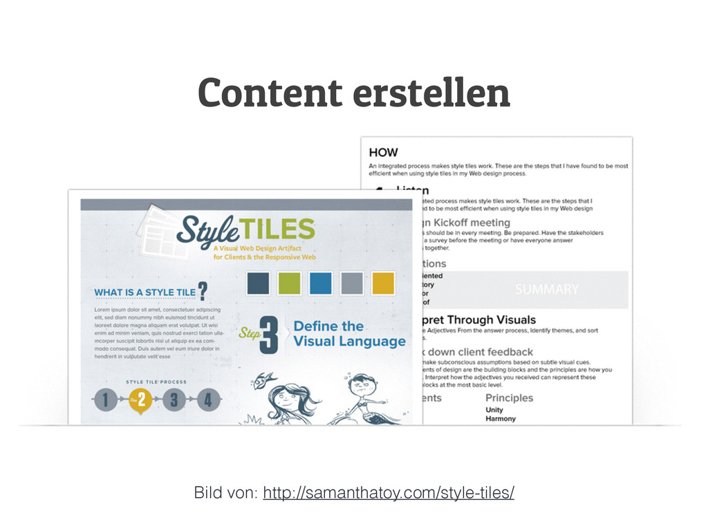
![Fragen ? twitter: @webinterface E-Mail: [email protected] E-Mail: [email protected] Demos: https://github.com/webinterface/Flexbox](https://files.speakerdeck.com/presentations/d9721950cdf601316bf61e853270e897/slide_111.jpg)