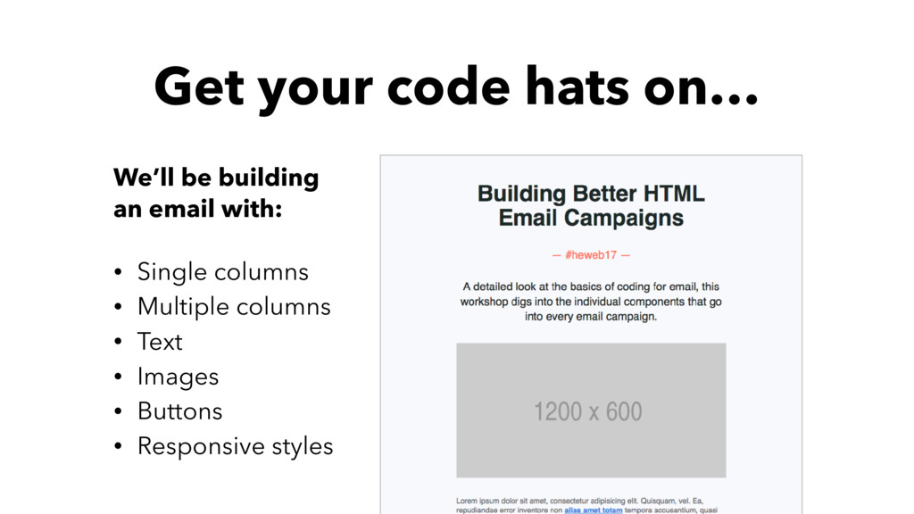
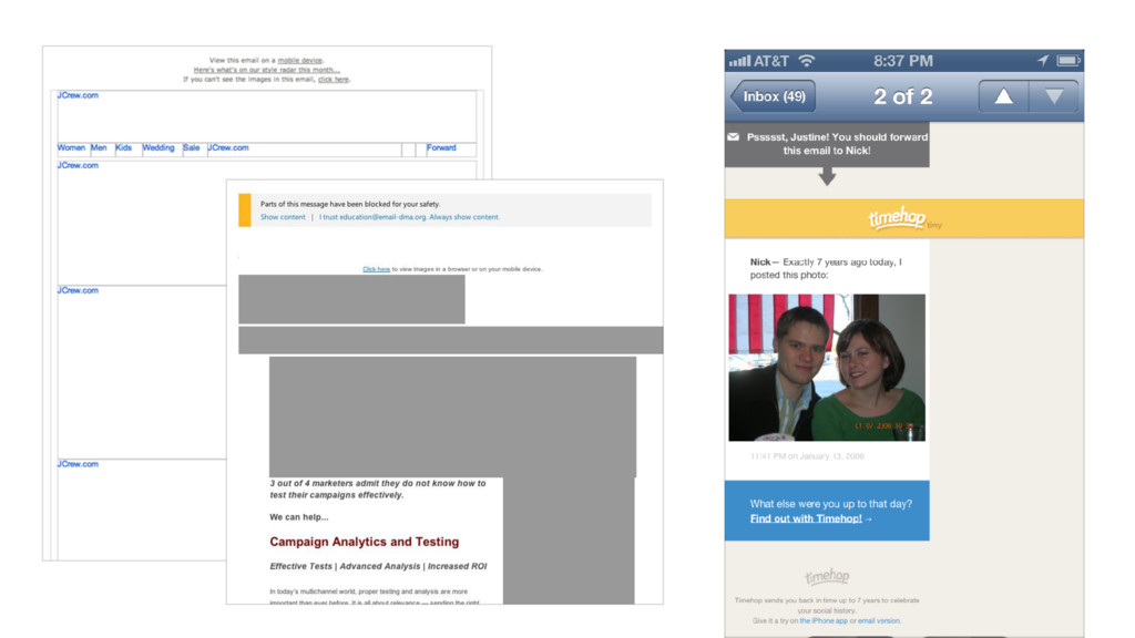
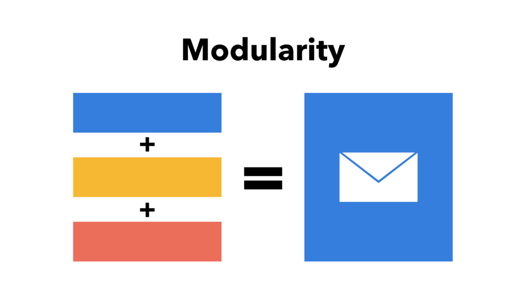
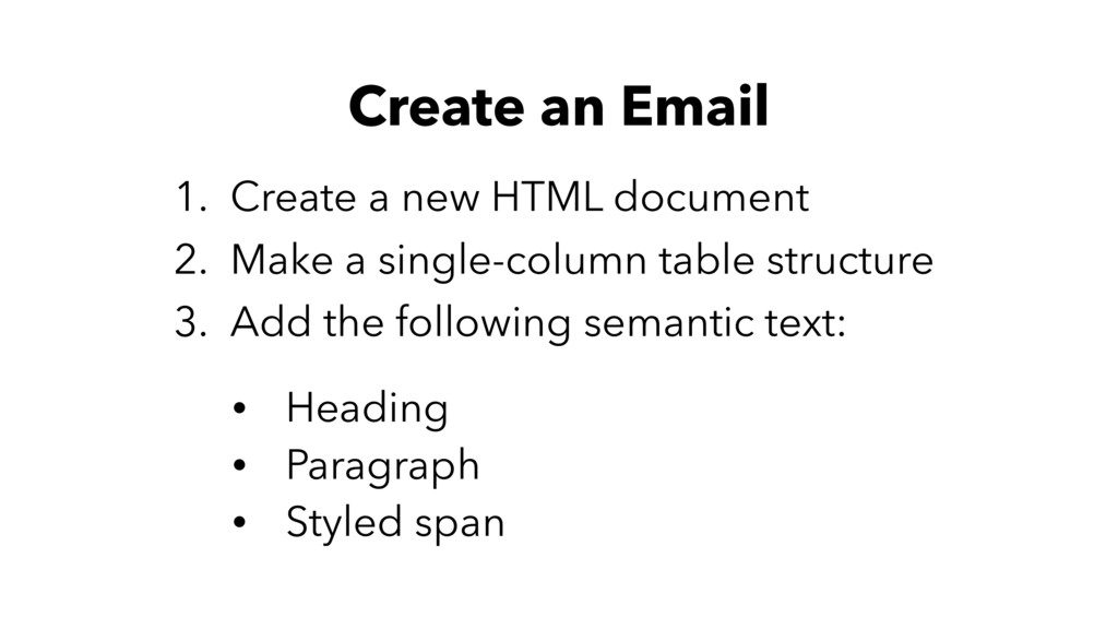
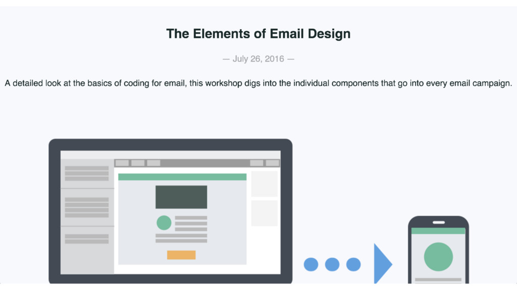
In this workshop, we’ll dig into the components used in every HTML email campaign. You’ll learn how to combine things like typography, images, links and buttons to create well-crafted emails that work across most email clients. We will also look at different approaches for making those emails work on screens of all sizes and code a responsive email campaign from scratch.
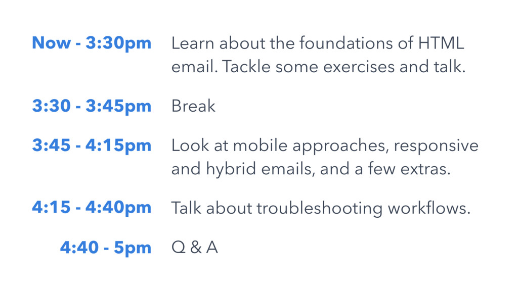
During the workshop, we’ll discuss:
The unique benefits of email marketing
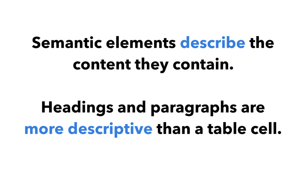
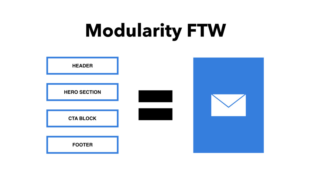
The basic elements of every email campaign
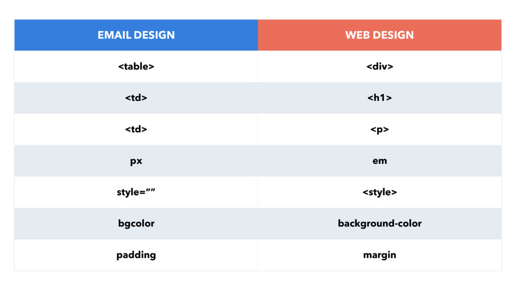
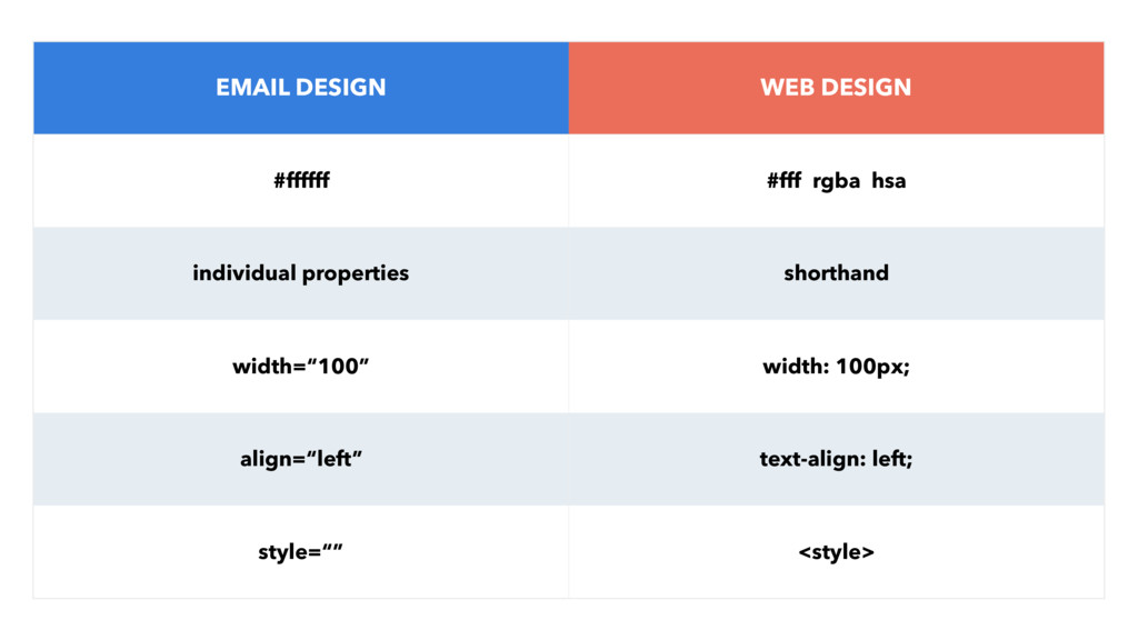
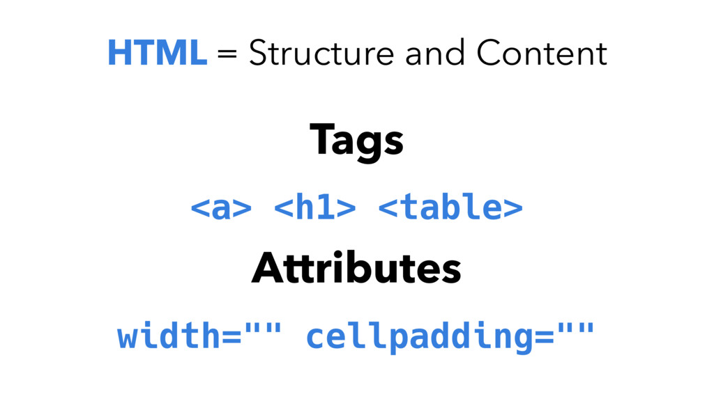
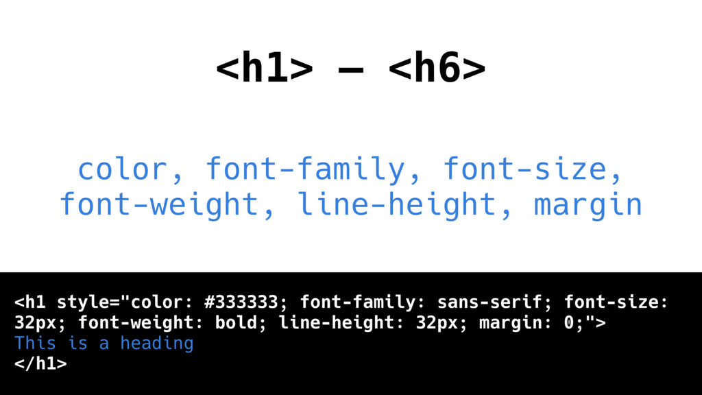
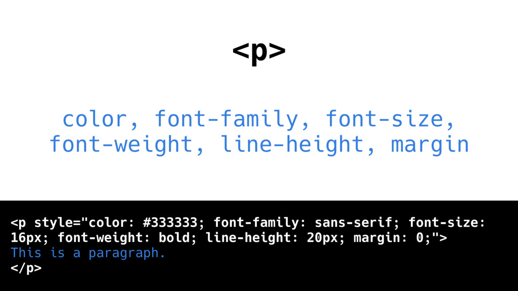
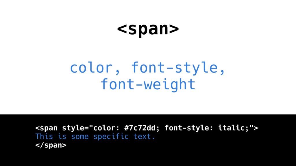
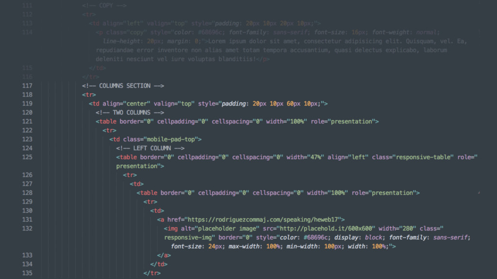
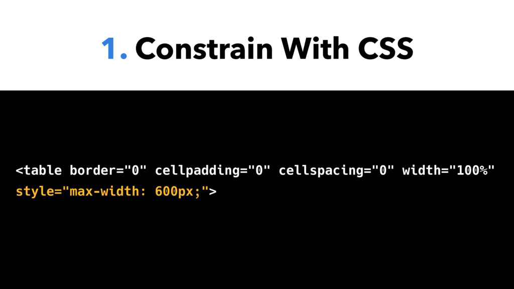
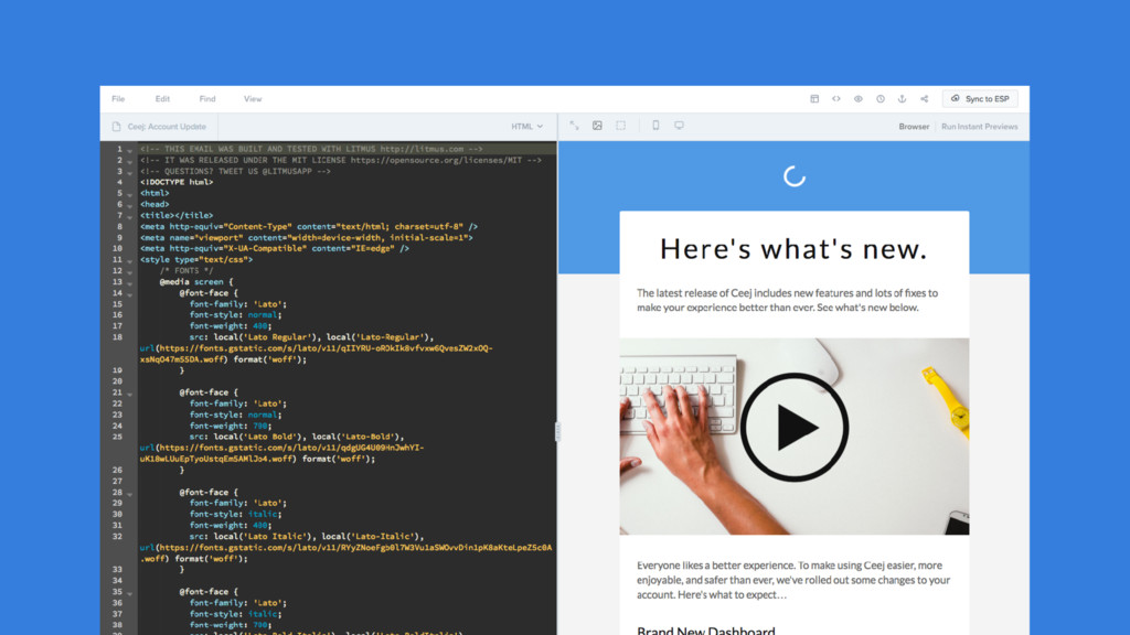
The best ways for coding those elements
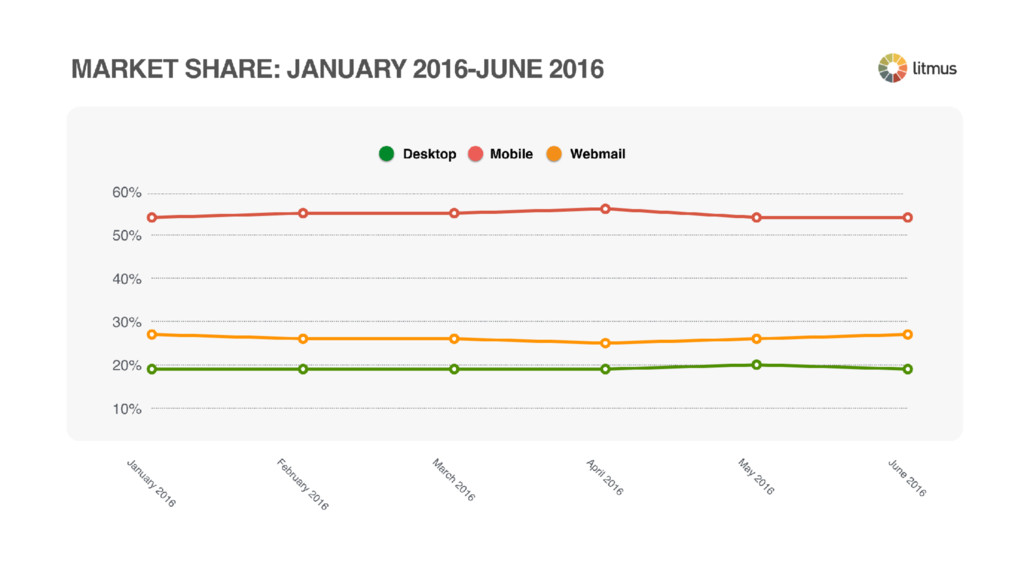
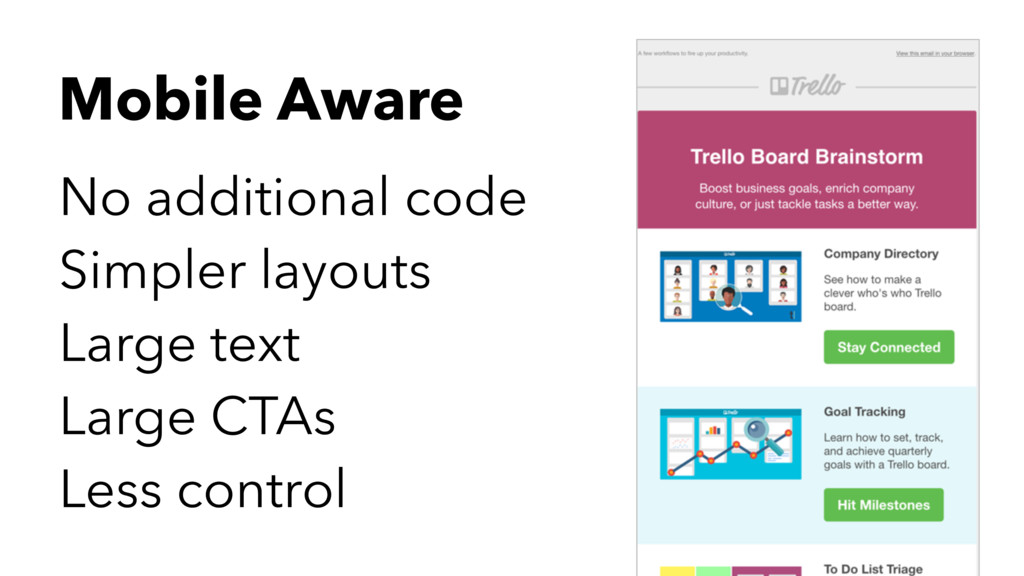
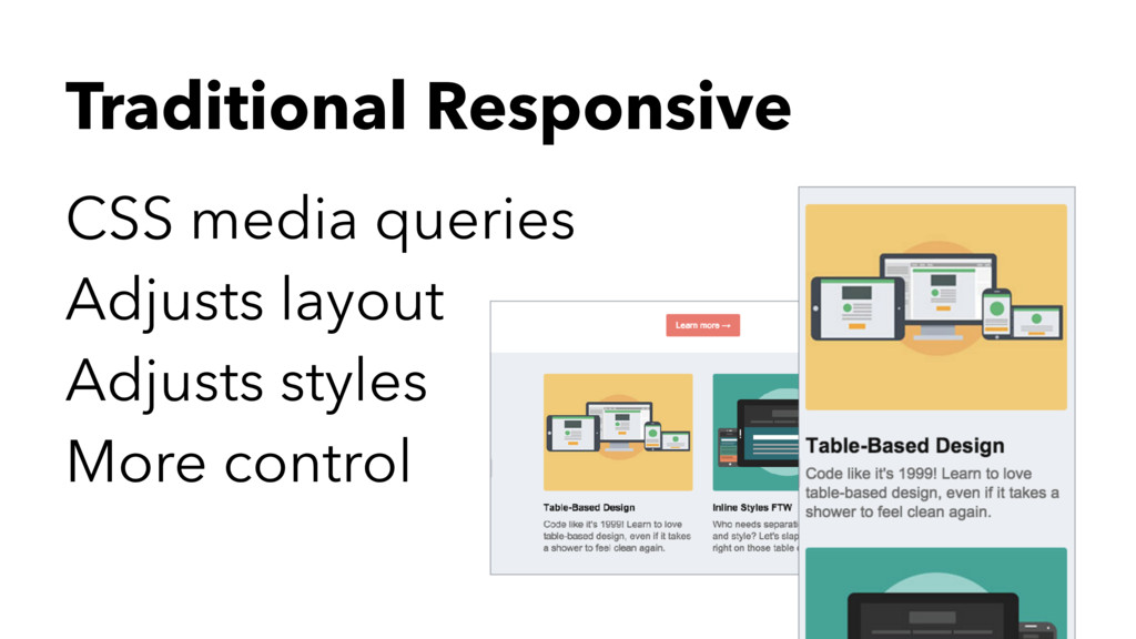
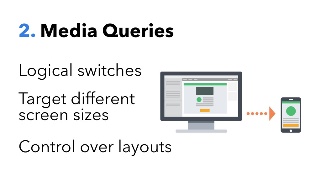
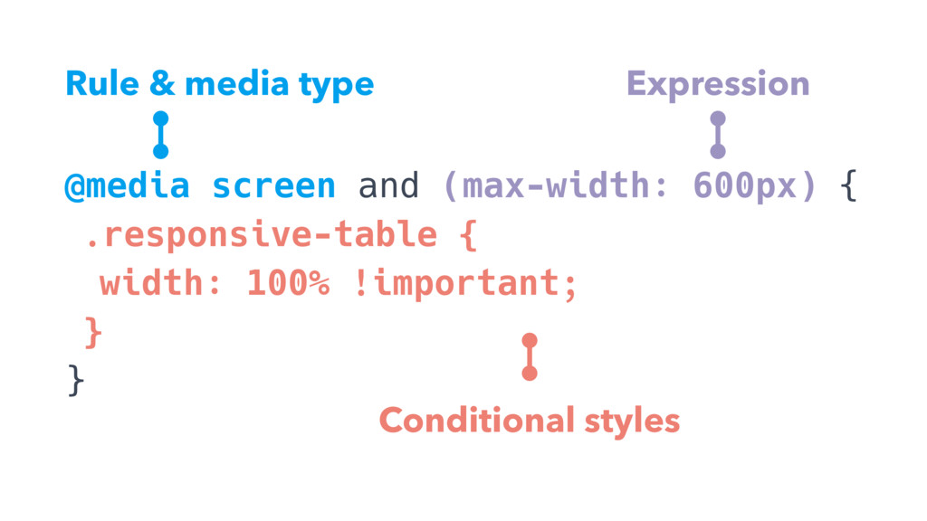
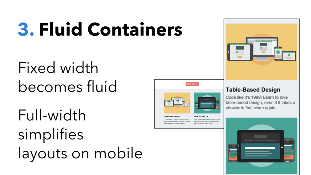
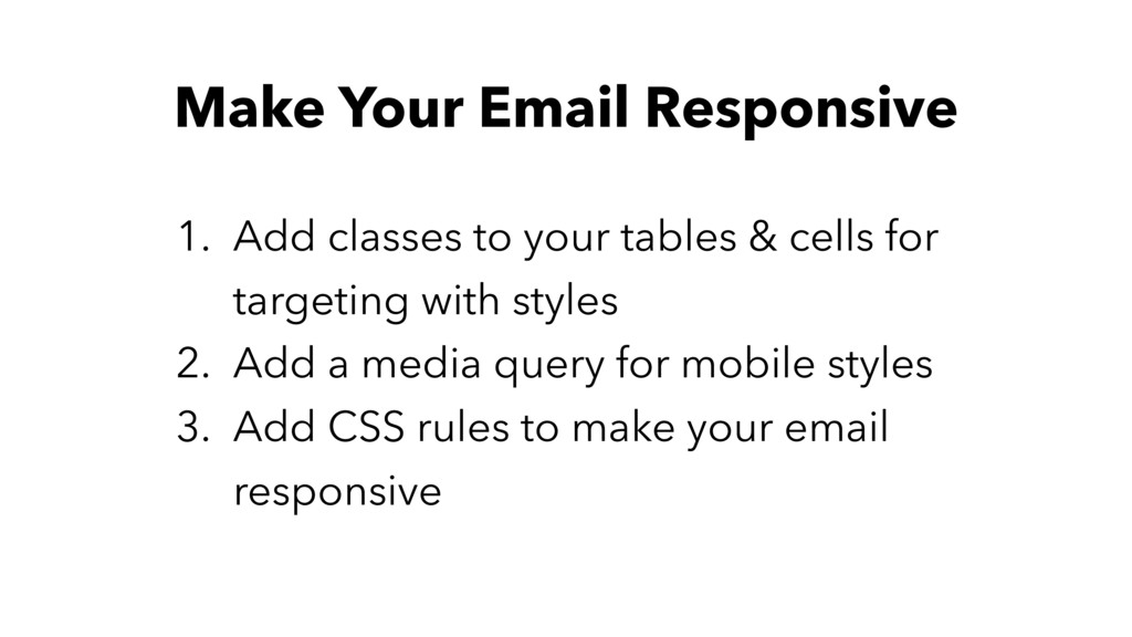
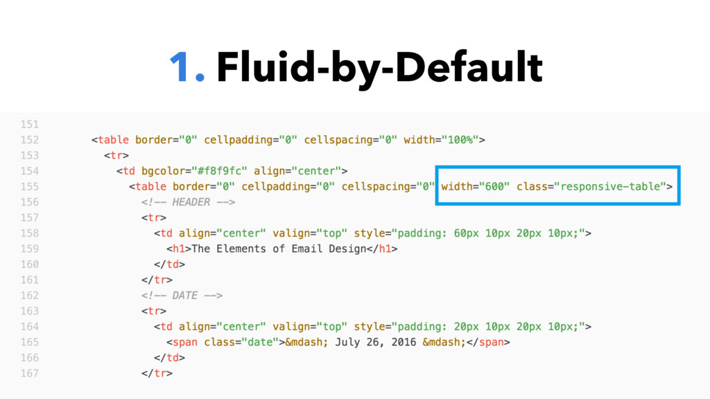
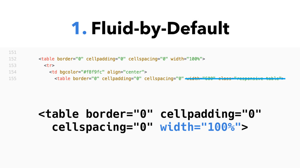
Different approaches to mobile and responsive emails
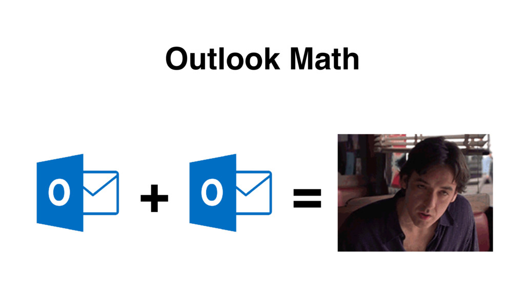
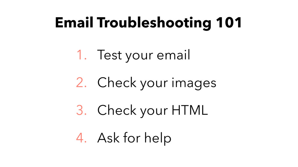
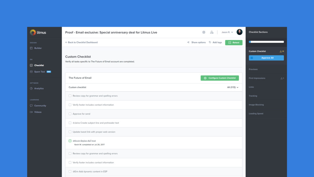
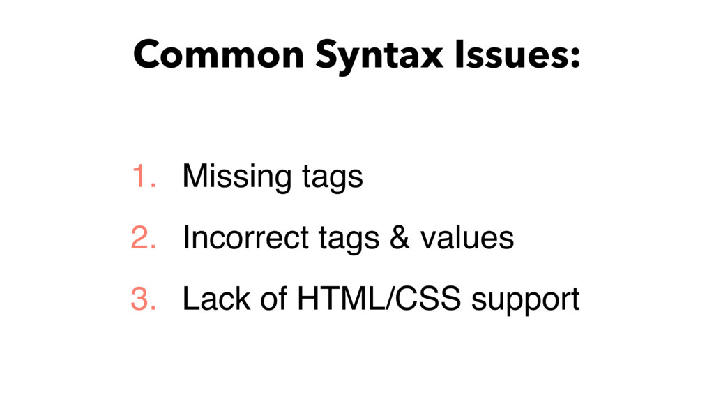
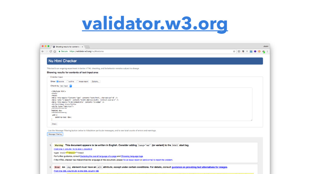
Tips on troubleshooting, workflows and where to learn more
You will leave with a better understanding of what goes into coding amazing email campaigns, along with plenty of resources and code samples to use in your own emails. While this workshop assumes some familiarity with HTML and CSS, it is great for both beginner and intermediate email marketers, designers and developers.
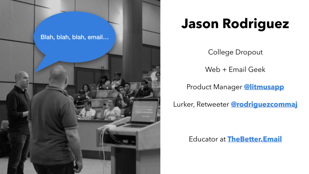
 rodriguezcommaj
 databricksjapan
 ks91
ks91
 rakus_dev
 nttcom
 fossamagna
 genda
genda
 quiver
 kaminashi
 torumakabe
 lycorptech_jp
 kaym
kaym
.jpg) cargoodrich
cargoodrich
 stephaniewalter
 keathley
 jnunemaker
 gr2m
gr2m
 marcelosomers
 addyosmani
 tessaabrams
 honzajavorek
 garrettdimon
 cromwellryan
 jonoalderson
![#heweb17 <div><!--[if mso]> <v:roundrect xmlns:v="urn:schemas-microsoft-com:vml" xmlns:w="urn:schemas-microsoft-com:office:word" href="https://" style="height:40px;v-text-anchor:middle;width:200px;" arcsize="10%" strokecolor="#1e3650"](https://files.speakerdeck.com/presentations/a39f0007096340a28cda634d6ef61621/slide_67.jpg)
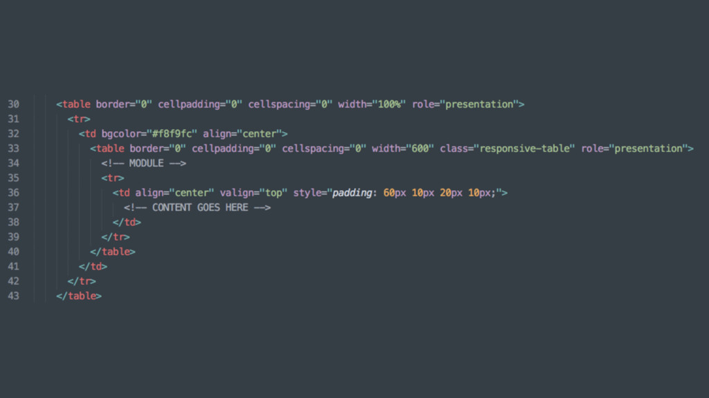
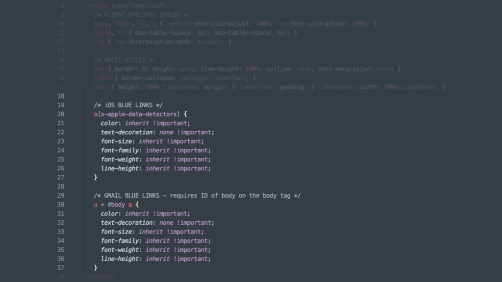
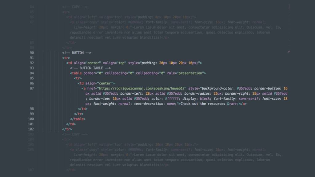
![<!--[if (gte mso 9)|(IE)]> <![endif]--> 3. Microsoft Conditionals](https://files.speakerdeck.com/presentations/a39f0007096340a28cda634d6ef61621/slide_127.jpg)
![3. Microsoft Conditionals <!--[if (gte mso 9)|(IE)]> <table align="center" border="0"](https://files.speakerdeck.com/presentations/a39f0007096340a28cda634d6ef61621/slide_128.jpg)