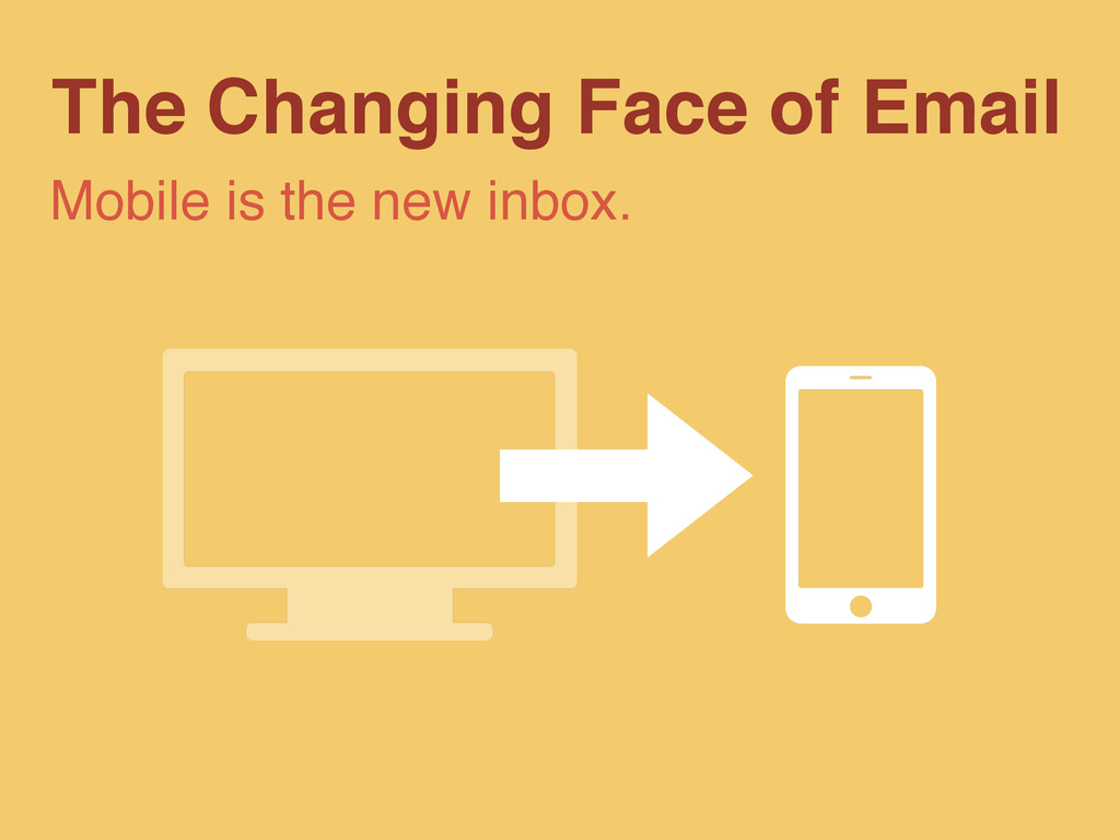
A look at how mobile opens are affecting email designers and marketers and some strategies and quick wins for optimizing campaigns for an increasingly mobile audience.
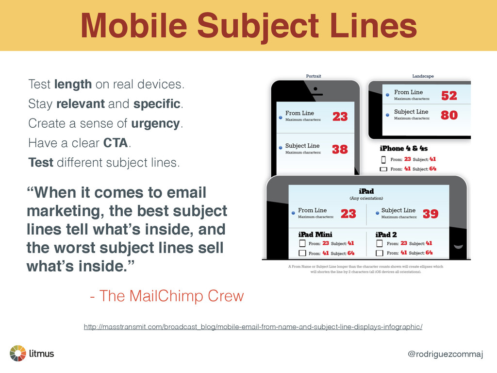
Stay relevant and specific. Create a sense of urgency. Have a clear CTA. Test different subject lines. “When it comes to email marketing, the best subject lines tell what’s inside, and the worst subject lines sell what’s inside.” - The MailChimp Crew
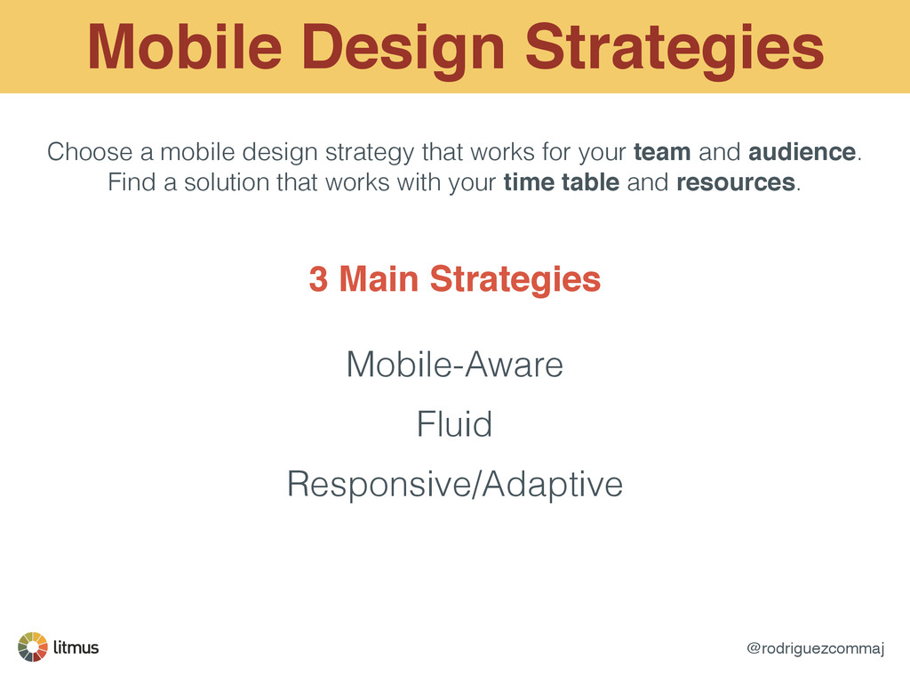
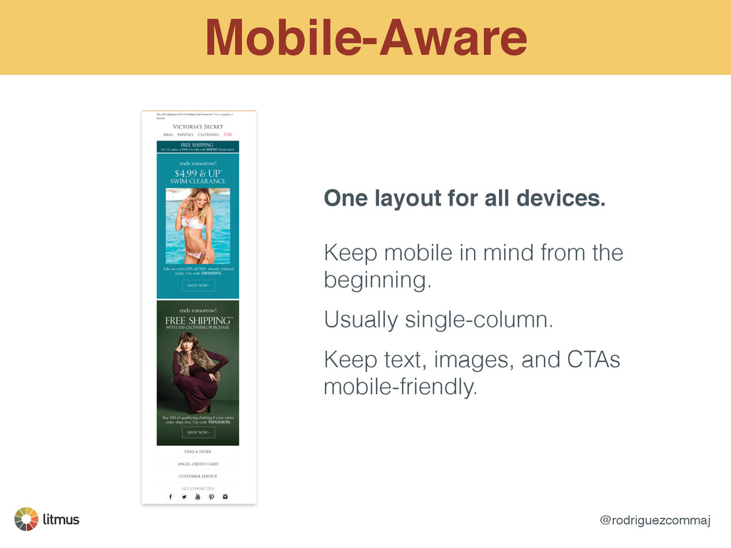
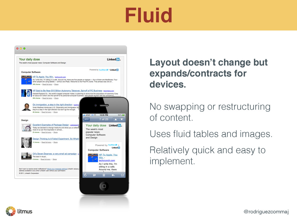
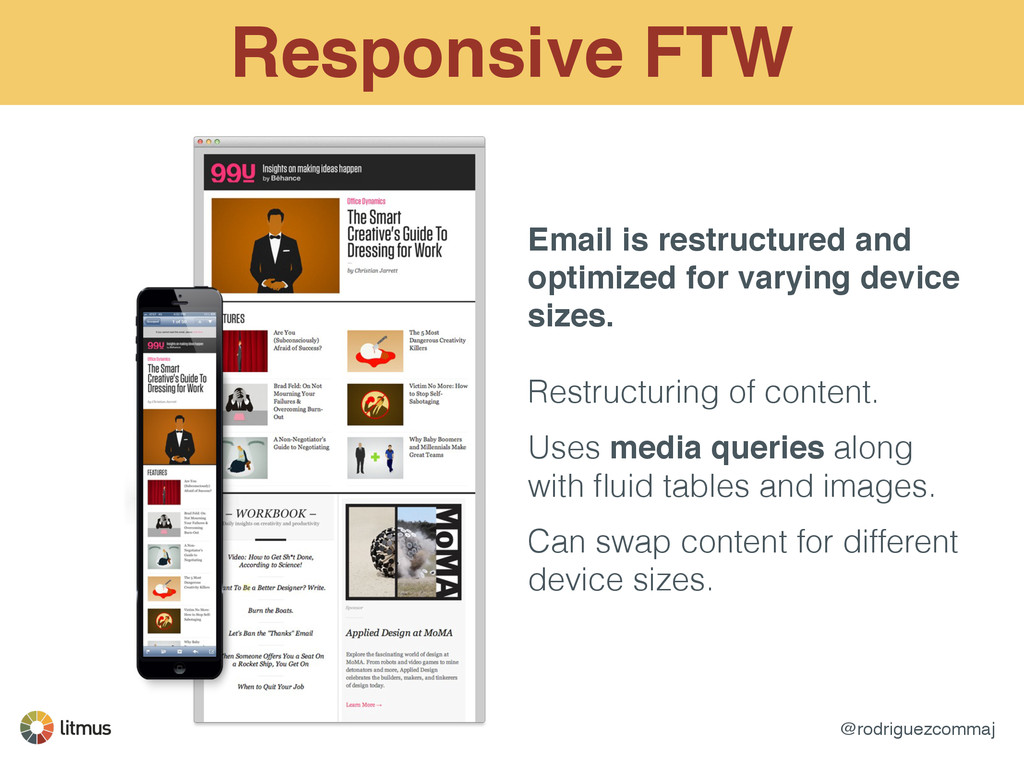
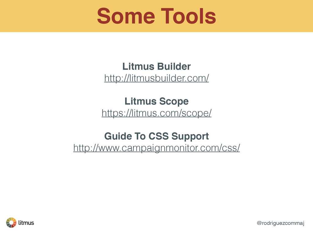
works for your team and audience. Find a solution that works with your time table and resources. ! ! 3 Main Strategies! ! Mobile-Aware Fluid Responsive/Adaptive
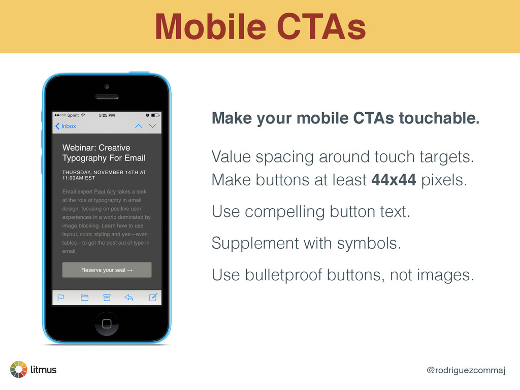
spacing around touch targets. Make buttons at least 44x44 pixels. ! Use compelling button text. ! Supplement with symbols. ! Use bulletproof buttons, not images.
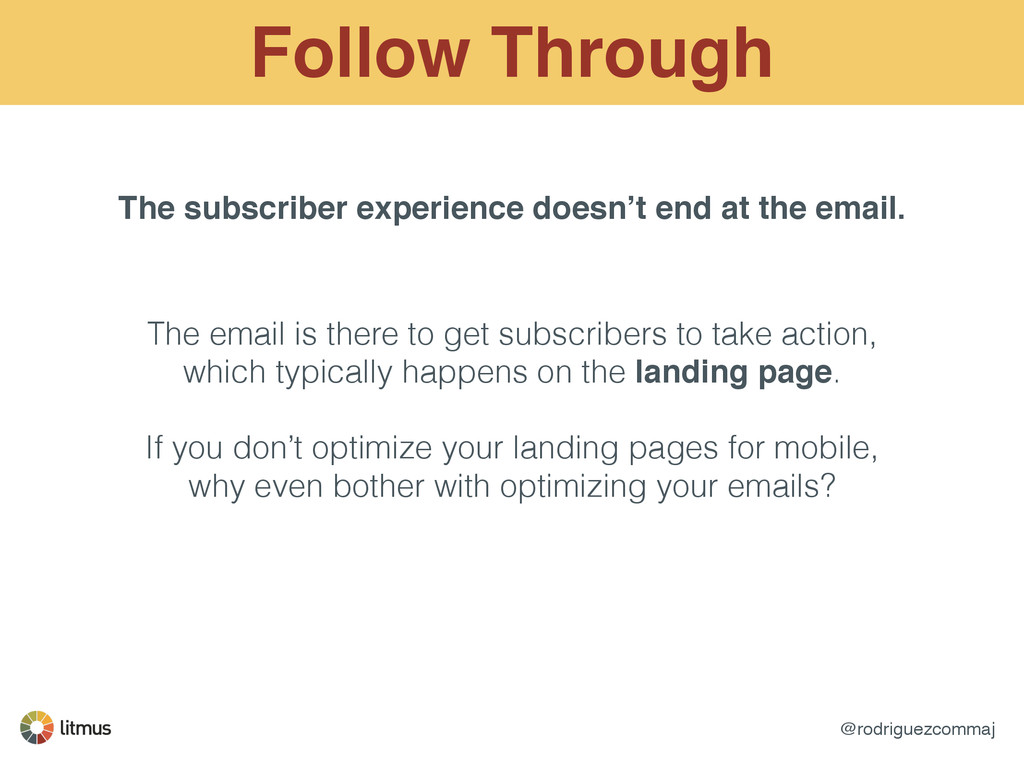
email. The email is there to get subscribers to take action, which typically happens on the landing page. ! If you don’t optimize your landing pages for mobile, why even bother with optimizing your emails?
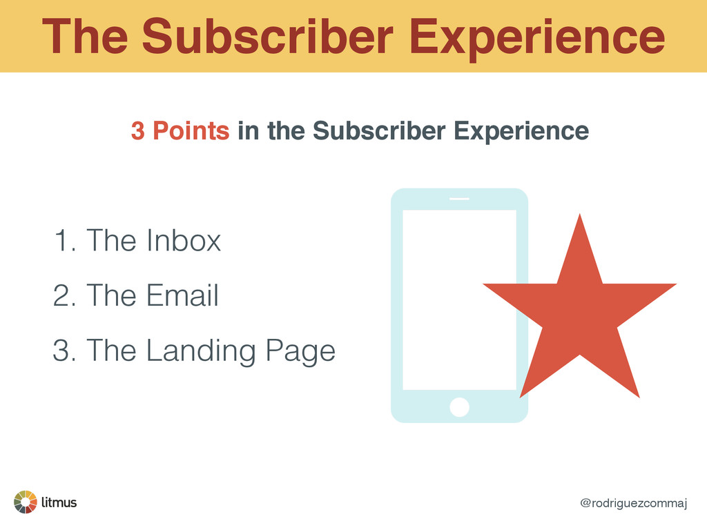
subscriber experience! - from inbox to email to landing page. ! ! Optimize all three for mobile, it is increasingly the most important platform. ! ! Your job doesn’t end with the email - coordinate with web teams to optimize landing pages for mobile, too.
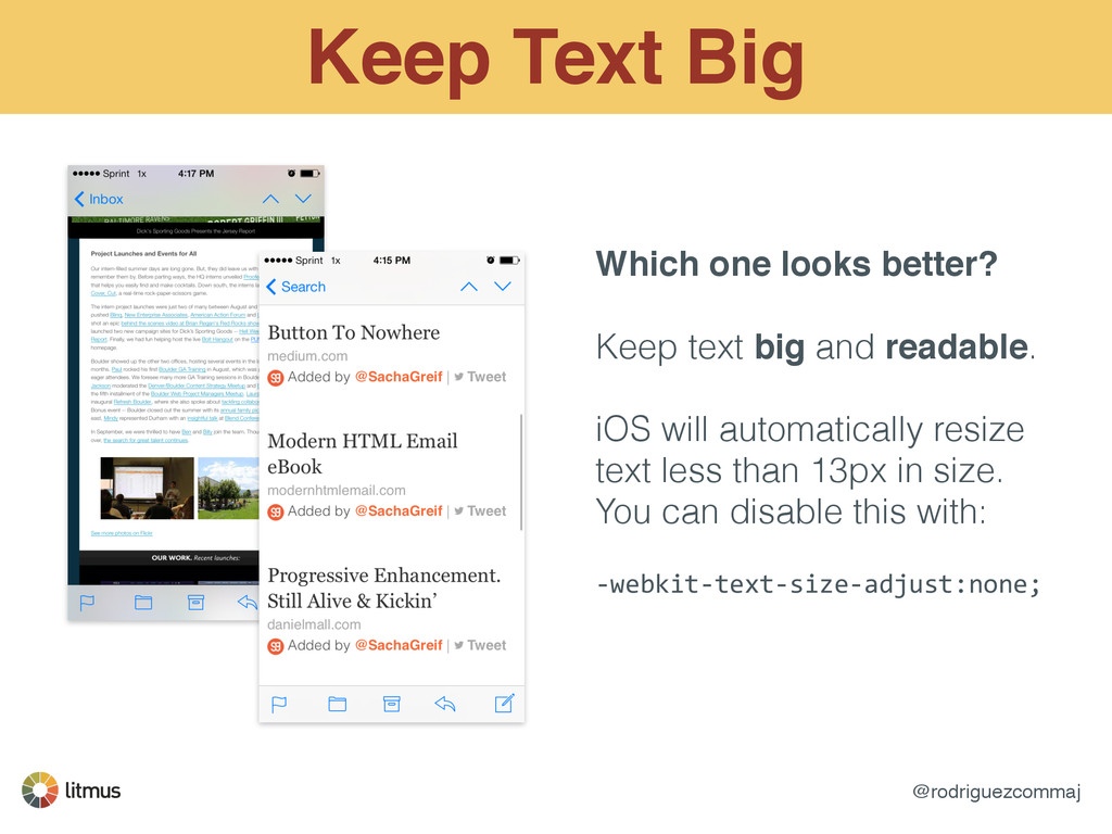
text big and readable. ! iOS will automatically resize text less than 13px in size. You can disable this with: ! -‐webkit-‐text-‐size-‐adjust:none;
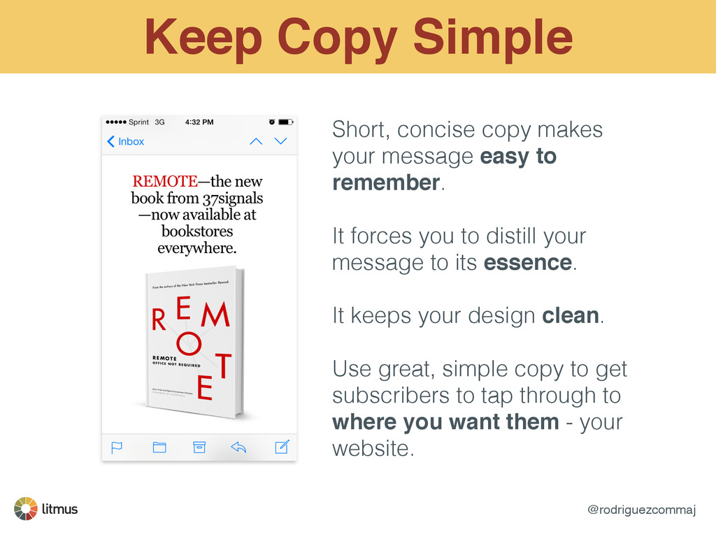
easy to remember. ! It forces you to distill your message to its essence. ! It keeps your design clean. ! Use great, simple copy to get subscribers to tap through to where you want them - your website.
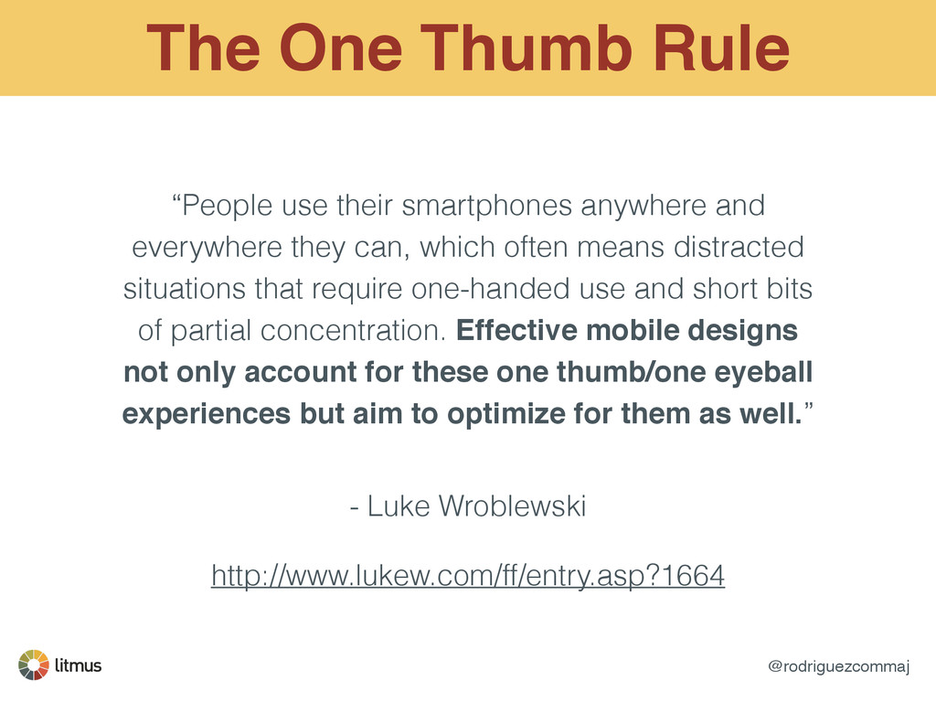
and everywhere they can, which often means distracted situations that require one-handed use and short bits of partial concentration. Effective mobile designs not only account for these one thumb/one eyeball experiences but aim to optimize for them as well.” - Luke Wroblewski ! http://www.lukew.com/ff/entry.asp?1664
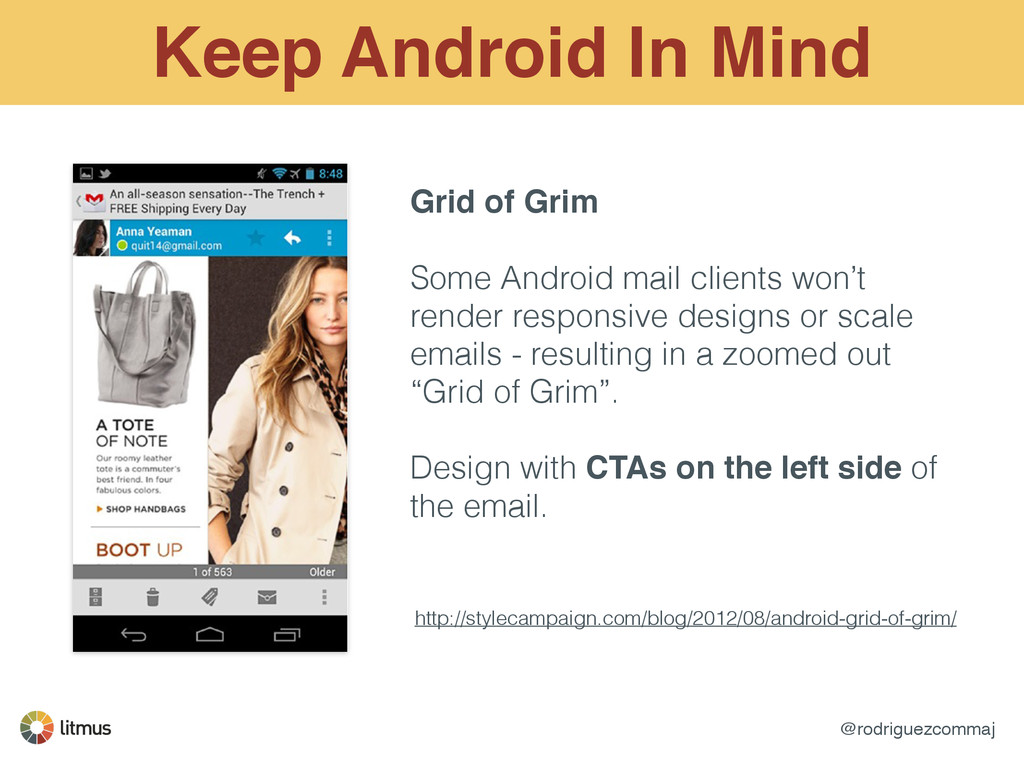
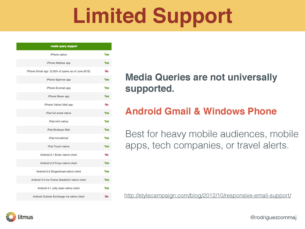
Android mail clients won’t render responsive designs or scale emails - resulting in a zoomed out “Grid of Grim”. ! Design with CTAs on the left side of the email. http://stylecampaign.com/blog/2012/08/android-grid-of-grim/
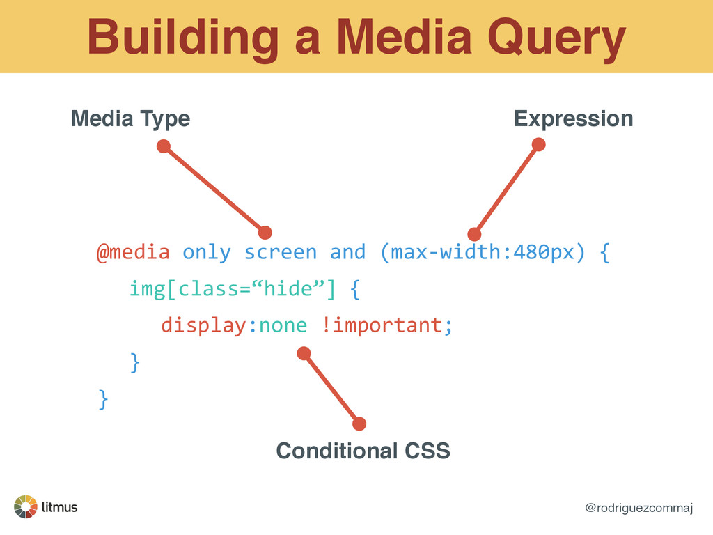
set conditions for altering styles. ! Not a one-line solution, you need to think about what you’re doing. ! Allows you to toggle and swap content based on screen size, orientation, aspect- ratio, resolution, etc.
Android Gmail & Windows Phone ! ! Best for heavy mobile audiences, mobile apps, tech companies, or travel alerts. http://stylecampaign.com/blog/2012/10/responsive-email-support/
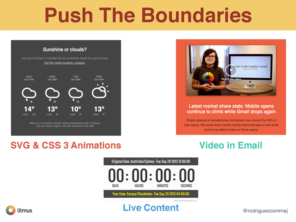
your emails with CSS 3. Text shadows! ! <span style=“text-‐shadow:2px 2px 2px #000;”> Text Shadows! </span> Border Radius! ! <span style=“border-‐radius:8px;”> Text Shadows! </span>
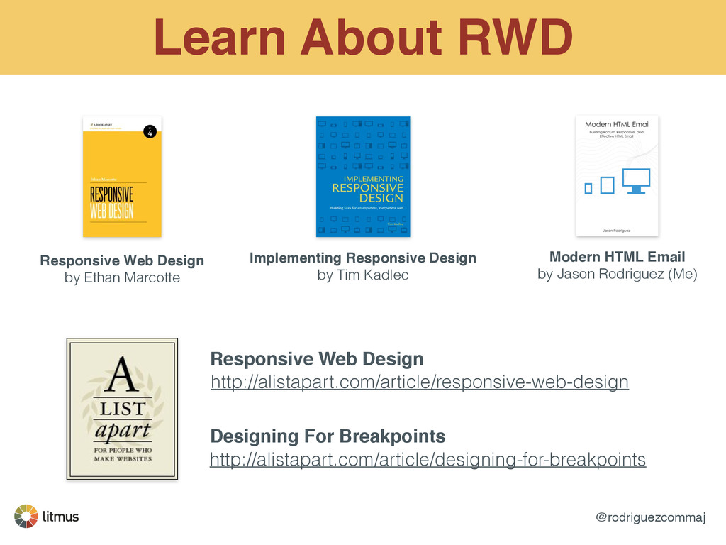
Implementing Responsive Design! by Tim Kadlec Modern HTML Email! by Jason Rodriguez (Me) http://alistapart.com/article/responsive-web-design http://alistapart.com/article/designing-for-breakpoints Responsive Web Design Designing For Breakpoints
 rodriguezcommaj
 chiemitaki
 toshihidemurata
 deadlinepoet
 littlebusters
 seto
seto
 securecat
 ajstarks
 signull
 ukaoli
 mukai_takeru
 mhand01
 nagata03
 rasmusluckow
 cassininazir
 skipperchong
 lcolladotor
 bermonpainter
 leimatthew05
 aleyda
 stephaniewalter
 rkendrick25
 addyosmani
 inesmontani