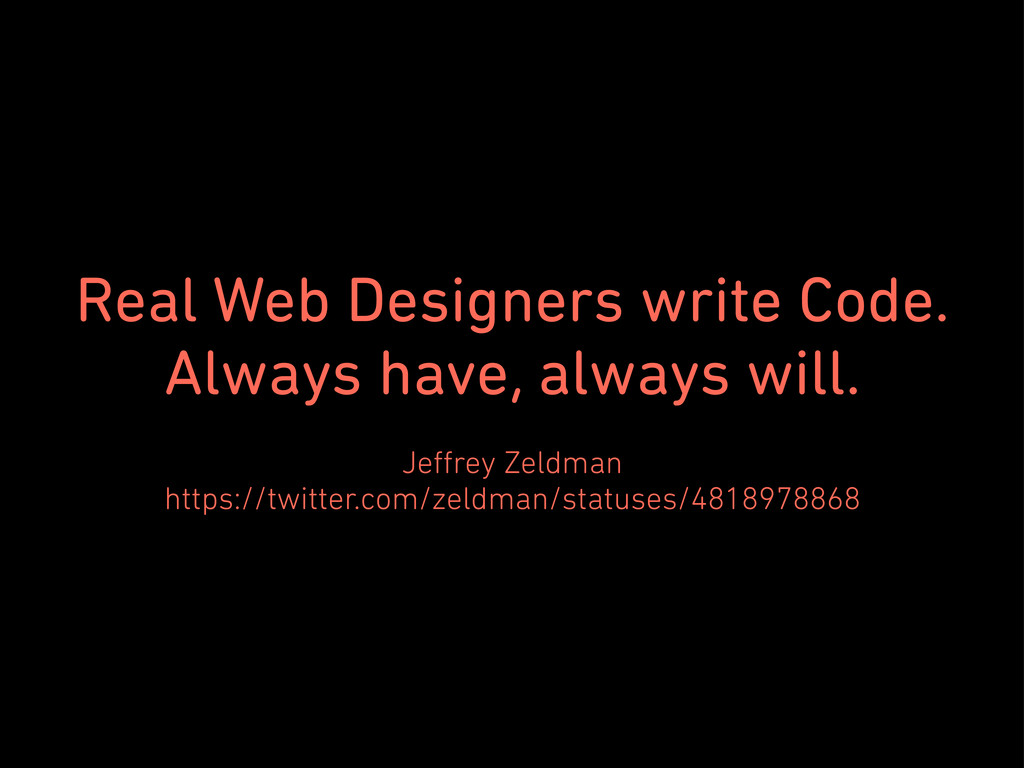
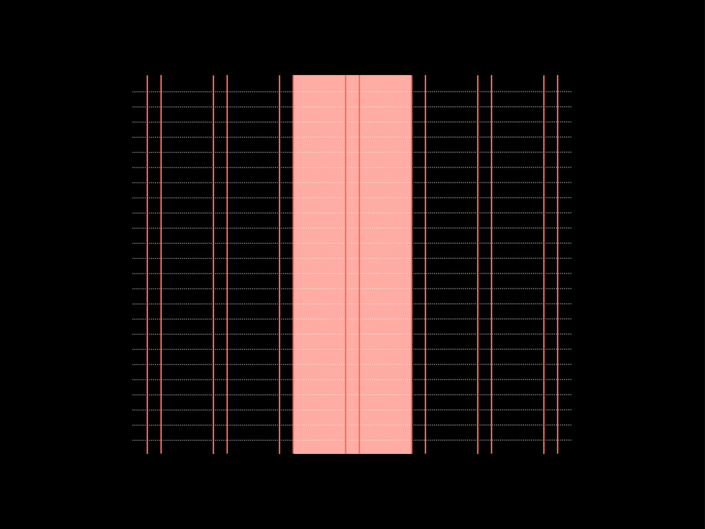
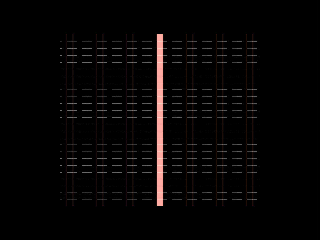
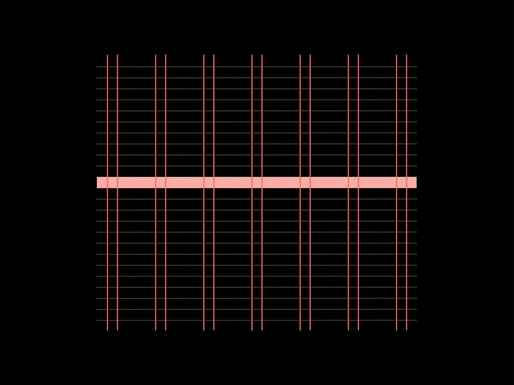
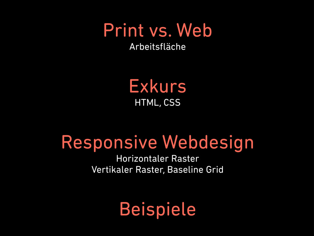
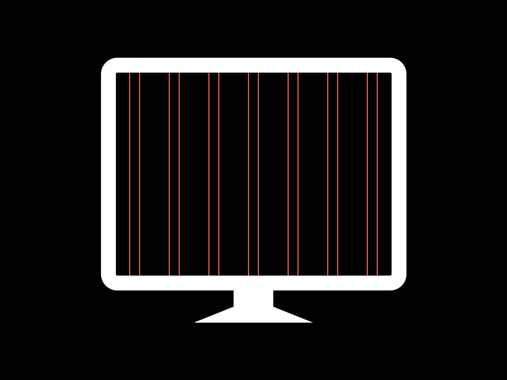
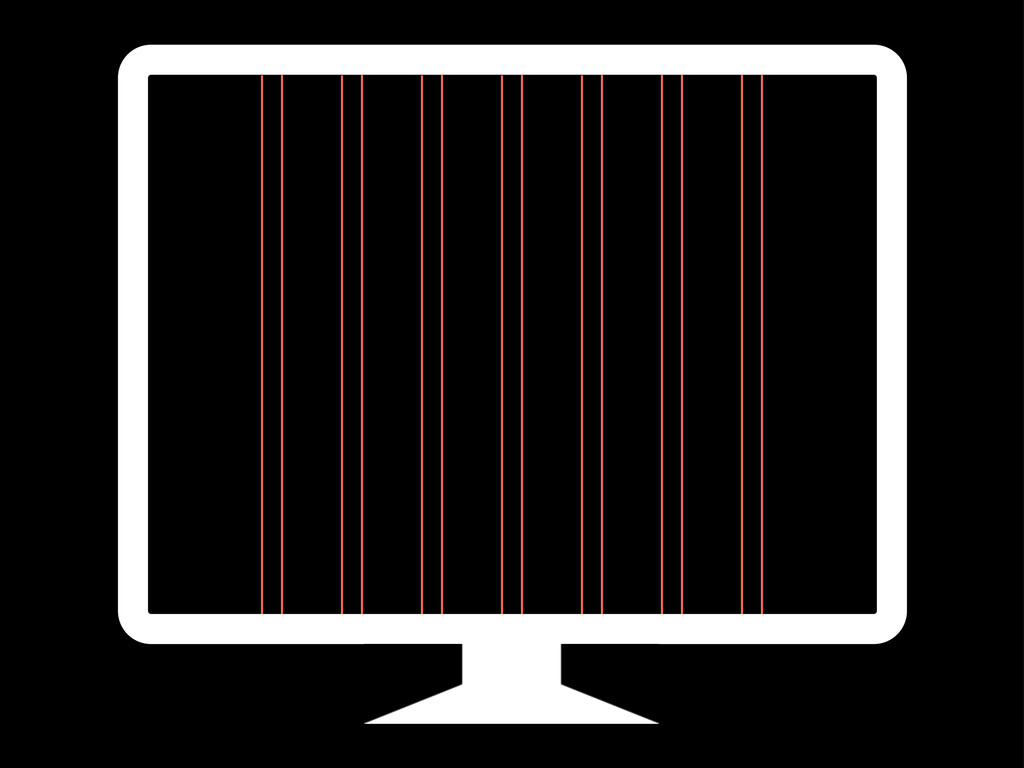
permits a number of possible uses and each designer can look for a solution appropiate to his personal style. But one must learn how to use the grid; it is an art that requires practice. Josef Müller Brockmann artofthegrid.com/quotes.html
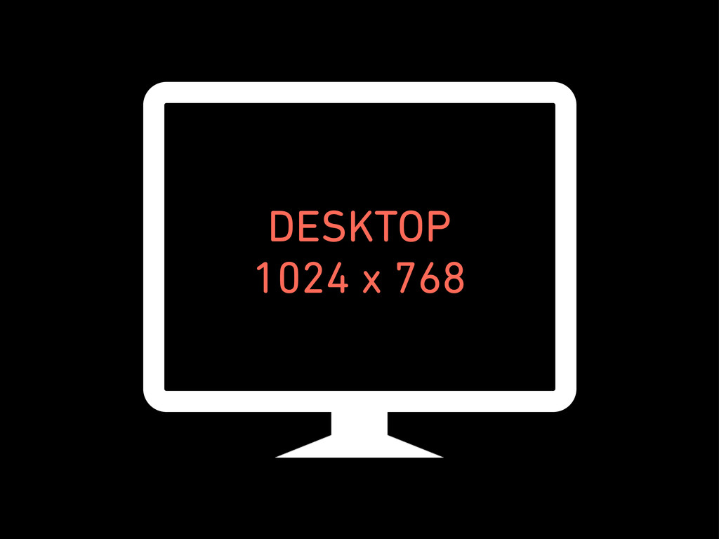
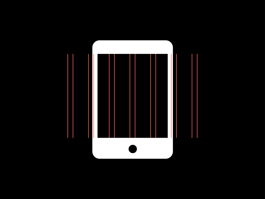
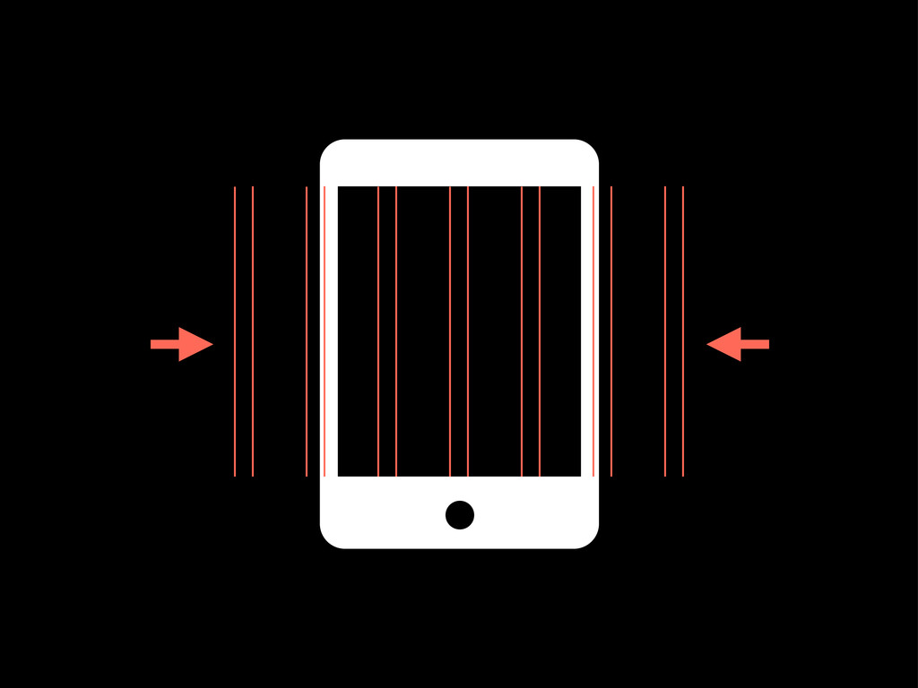
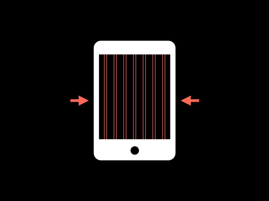
@media only screen and (min-width: 480px) and (max-width: 767px) {} Tablet Portrait @media only screen and (min-width: 768px) and (max-width: 980px) {}
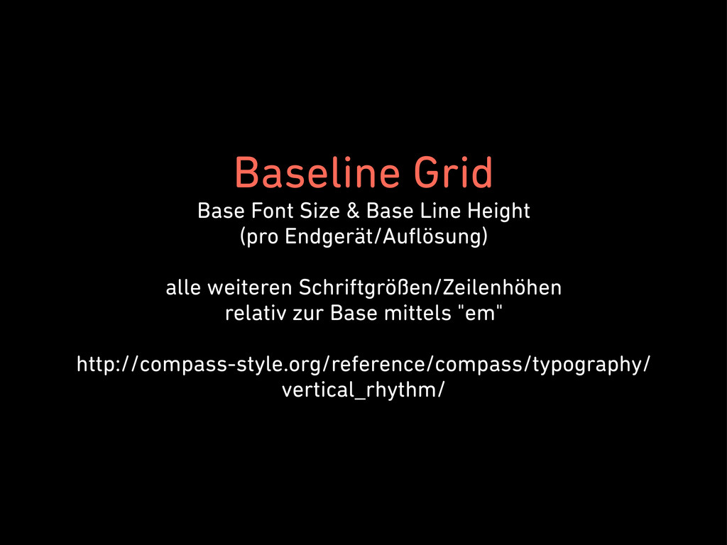
Endgerät/Auflösung) alle weiteren Schriftgrößen/Zeilenhöhen relativ zur Base mittels "em" http://compass-style.org/reference/compass/typography/ vertical_rhythm/
 civitaspo
 lycorptech_jp
 sheharyar
 line_developers_tw
 cdataj
 sato4
sato4
 ezaki
ezaki
 yuyatakeyama
 iwamot
 sonoda_mj
 miyatakoji
 jnunemaker
 codingconduct
 tenderlove
 zakiyama
 techseoconnect
 skipperchong
 lfama
lfama
 62gerente
 palkan
 smashingmag
 inesmontani