Upgrade to Pro
— share decks privately, control downloads, hide ads and more …
Speaker Deck
Features
Speaker Deck
PRO
Sign in
Sign up for free
Search
Search
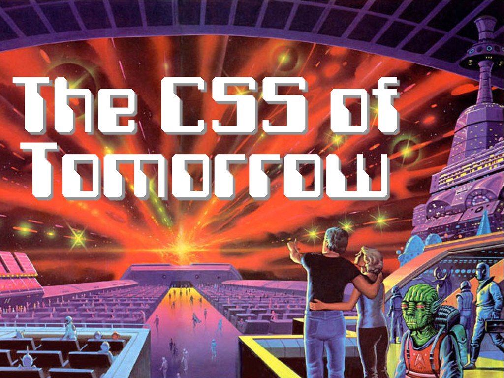
The CSS of Tomorrow (revised)
Search
Peter Gasston
October 22, 2012
Programming
31k
116
Share
Embed
Copy iframe code
Copy JS code
Copy link
Start on current slide
The CSS of Tomorrow (revised)
London Web Standards, October 2012
Peter Gasston
October 22, 2012
More Decks by Peter Gasston
See All by Peter Gasston
People Don’t Change
stopsatgreen
0
230
Your Reality Here
stopsatgreen
0
140
Growing Up, Getting Serious - #SotB6
stopsatgreen
1
390
Growing Up, Getting Serious
stopsatgreen
0
130
Surveying the Landscape — November 2016
stopsatgreen
1
210
Surveying the Landscape - Fronteers
stopsatgreen
2
530
The Web vs. The Browser
stopsatgreen
0
240
Surveying the Landscape Sept. 2016
stopsatgreen
1
470
Surveying the Landscape
stopsatgreen
4
920
Other Decks in Programming
See All in Programming
初めてのKubernetes 本番運用でハマった話
oku053
0
120
ローカルLLMでどこまでコードが書けるか -拡張版 / How much code can be written on a local LLM Extended
kishida
12
4.7k
これからAgentCoreを触る方へ トレンドはGatewayです
har1101
6
480
20260623_Loop Engineeringで自分の分身の問い合わせBotを作る
ryugen04
0
190
気圧・高度・GPSを記録&可視化するアプリ「Koudo」を作った話
hjmkth
1
350
「正の参照」と 「負の導出」で組む ハーネスエンジニアリング
cottpan
1
130
コンテキストの使い捨てをやめる — ビジネスルール駆動開発と miko —
ioki
0
270
Semantic Version 単位で戦略を柔軟に変えて、パッケージアップデートを自動化する
daitasu
1
350
トークンをケチるな、設計しろ:GitHub Copilotを賢く使うコンテキスト戦略
ochtum
0
300
例外の正しい扱い方 そのエラー try-catchして大丈夫?
jinwatanabe
0
350
Vite+ Unified Toolchain for the Web
naokihaba
0
720
そのテスト、説明できますか?~LWテスト戦略FW~のご紹介
nakahara
0
200
Featured
See All Featured
GraphQLの誤解/rethinking-graphql
sonatard
75
12k
Navigating Weather and Climate Data
rabernat
0
280
Avoiding the “Bad Training, Faster” Trap in the Age of AI
tmiket
0
190
Reality Check: Gamification 10 Years Later
codingconduct
0
2.2k
The AI Revolution Will Not Be Monopolized: How open-source beats economies of scale, even for LLMs
inesmontani
PRO
3
3.6k
Being A Developer After 40
akosma
91
590k
A better future with KSS
kneath
240
18k
End of SEO as We Know It (SMX Advanced Version)
ipullrank
3
4.3k
GraphQLとの向き合い方2022年版
quramy
50
15k
Introduction to Domain-Driven Design and Collaborative software design
baasie
1
890
Breaking role norms: Why Content Design is so much more than writing copy - Taylor Woolridge
uxyall
0
340
Exploring the relationship between traditional SERPs and Gen AI search
raygrieselhuber
PRO
2
4.1k
Transcript
Peter Gasston @stopsatgreen http://broken-links.com
The CSS of Tomorrow
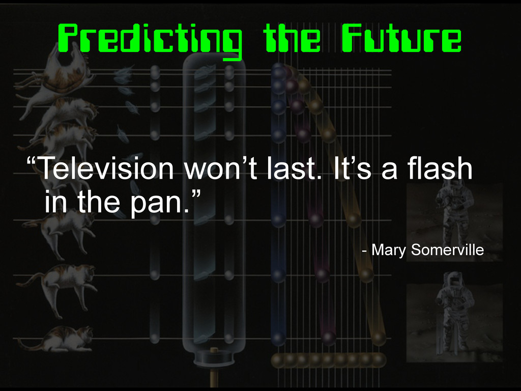
Predicting the Future “Television won’t last. It’s a flash in
the pan.” - Mary Somerville
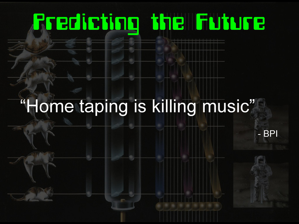
Predicting the Future “Home taping is killing music” - BPI
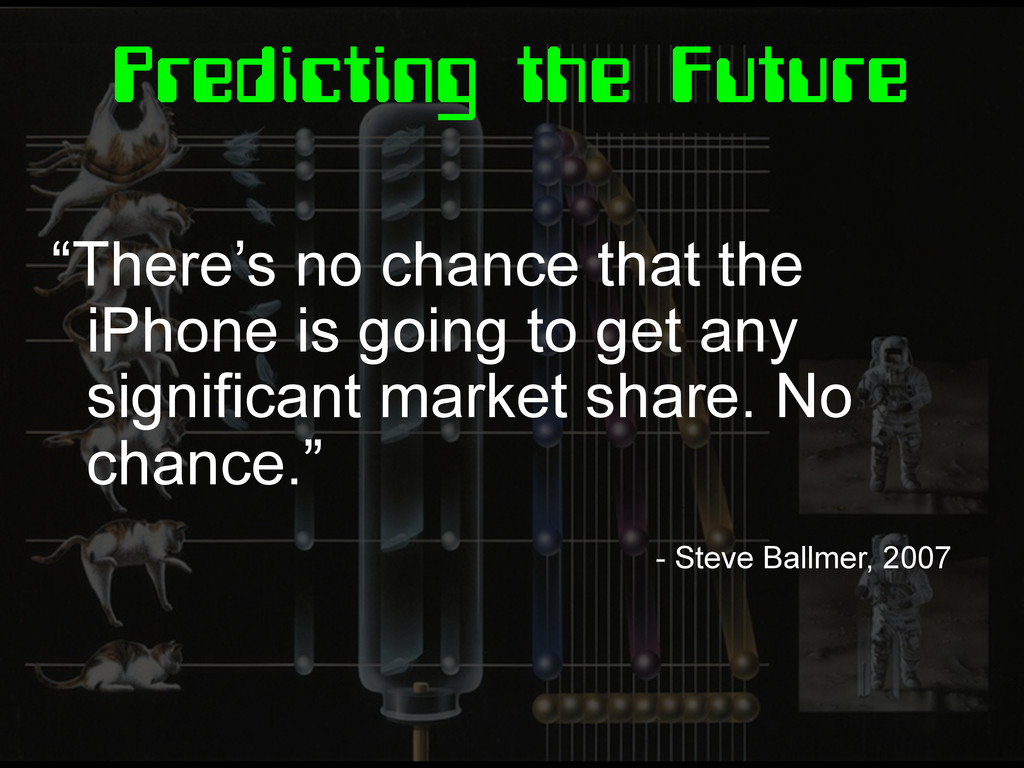
Predicting the Future “There’s no chance that the iPhone is
going to get any significant market share. No chance.” - Steve Ballmer, 2007
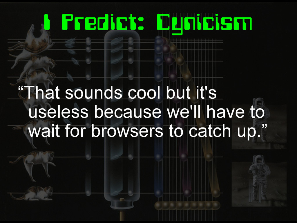
I Predict: Cynicism “That sounds cool but it's useless because
we'll have to wait for browsers to catch up.”
The CSS of Tomorrow
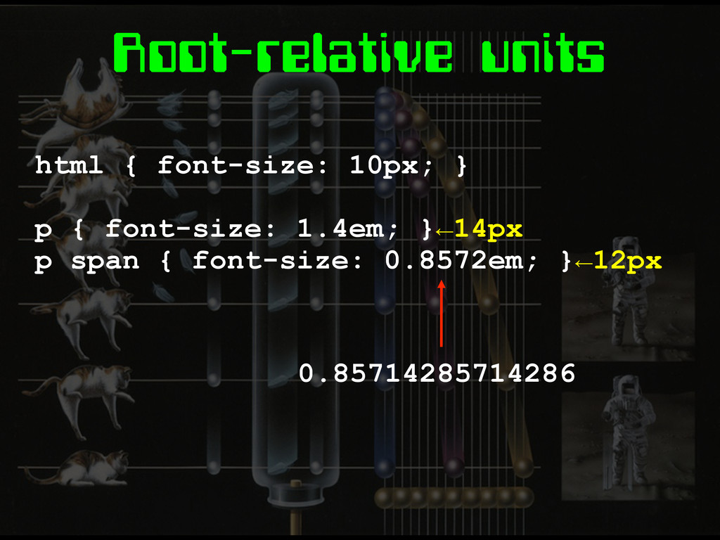
Root-relative units html { font-size: 10px; } p { font-size:
1.4em; }←14px p span { font-size: 0.8572em; }←12px 0.85714285714286
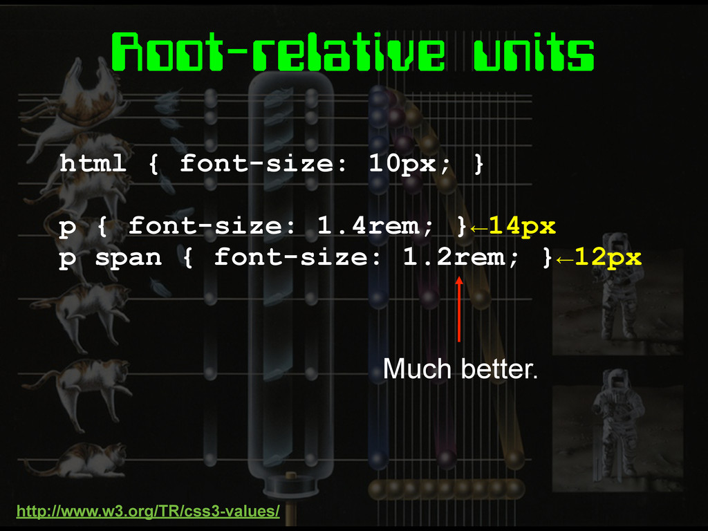
Root-relative units html { font-size: 10px; } p { font-size:
1.4rem; }←14px p span { font-size: 1.2rem; }←12px Much better. http://www.w3.org/TR/css3-values/
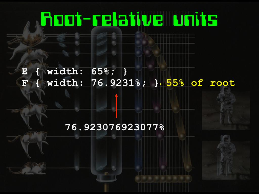
Root-relative units E { width: 65%; } F { width:
76.9231%; }←55% of root 76.923076923077%
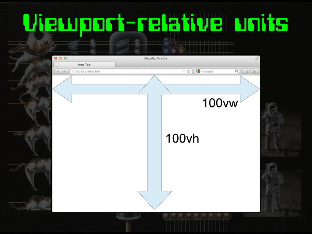
Viewport-relative units 100vw 100vh
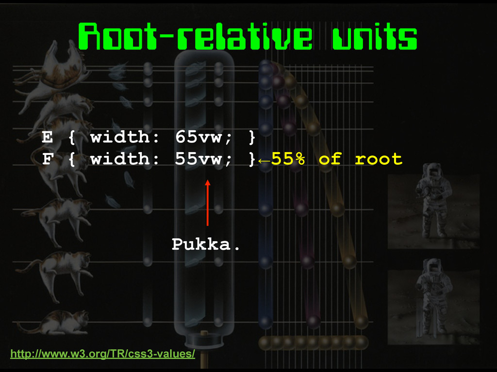
Root-relative units E { width: 65vw; } F { width:
55vw; }←55% of root Pukka. http://www.w3.org/TR/css3-values/
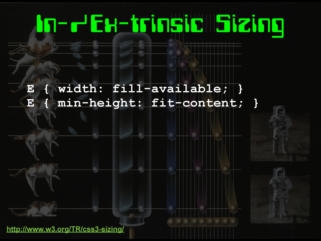
In-/Ex-trinsic Sizing E { width: fill-available; } E { min-height:
fit-content; } http://www.w3.org/TR/css3-sizing/
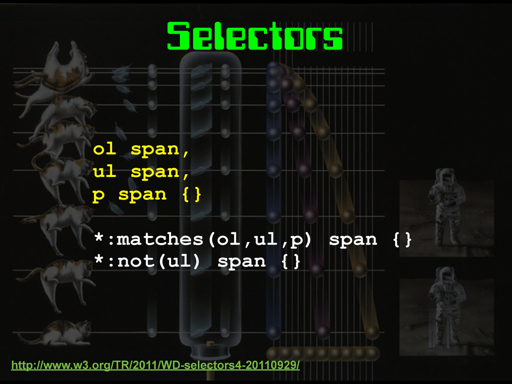
Selectors ol span, ul span, p span {} *:matches(ol,ul,p) span
{} *:not(ul) span {} http://www.w3.org/TR/2011/WD-selectors4-20110929/
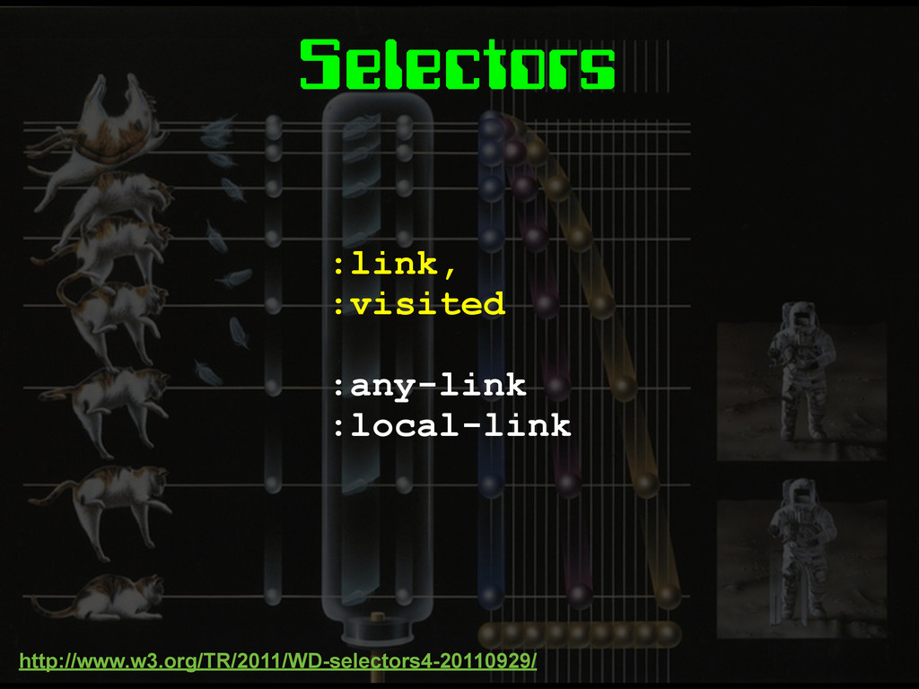
Selectors :link, :visited :any-link :local-link http://www.w3.org/TR/2011/WD-selectors4-20110929/
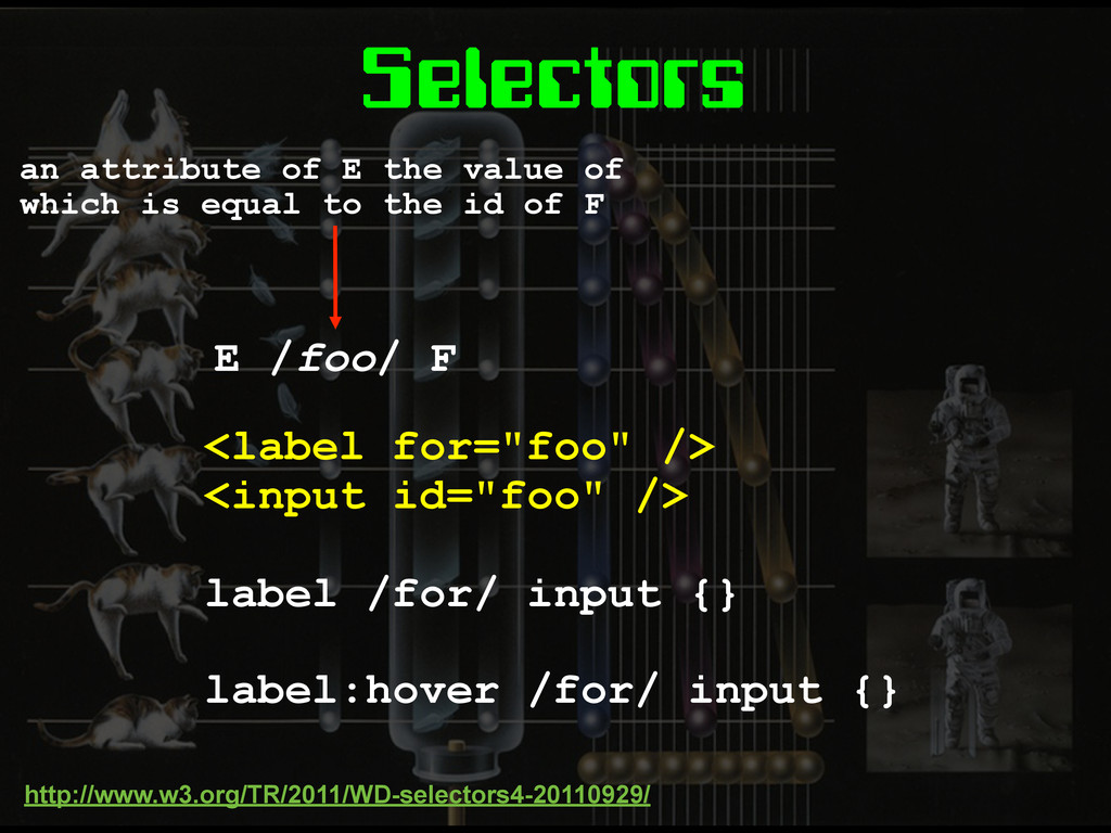
Selectors <label for="foo" /> <input id="foo" /> label /for/ input
{} label:hover /for/ input {} http://www.w3.org/TR/2011/WD-selectors4-20110929/ an attribute of E the value of which is equal to the id of F E /foo/ F
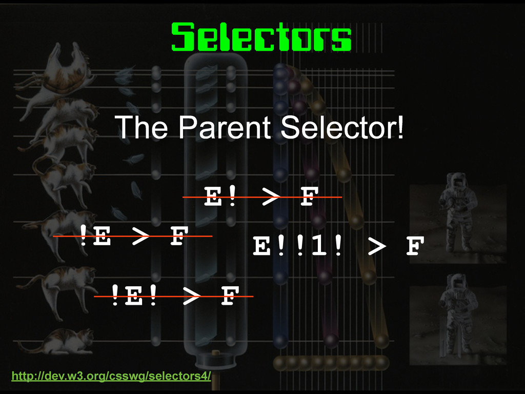
Selectors E! > F !E > F !E! > F
E!!1! > F The Parent Selector! http://dev.w3.org/csswg/selectors4/
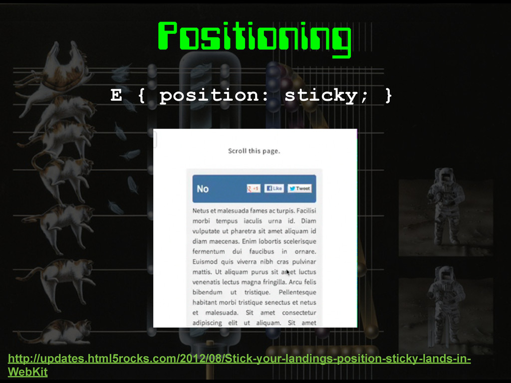
Positioning E { position: sticky; } http://updates.html5rocks.com/2012/08/Stick-your-landings-position-sticky-lands-in- WebKit
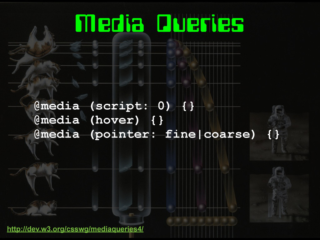
Media Queries
Media Queries @media (script: 0) {} @media (hover) {} @media
(pointer: fine|coarse) {} http://dev.w3.org/csswg/mediaqueries4/
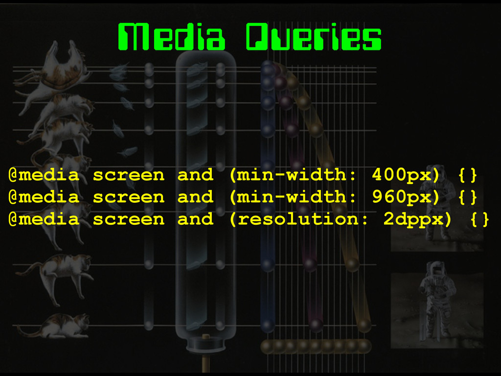
Media Queries @media screen and (min-width: 400px) {} @media screen
and (min-width: 960px) {} @media screen and (resolution: 2dppx) {}
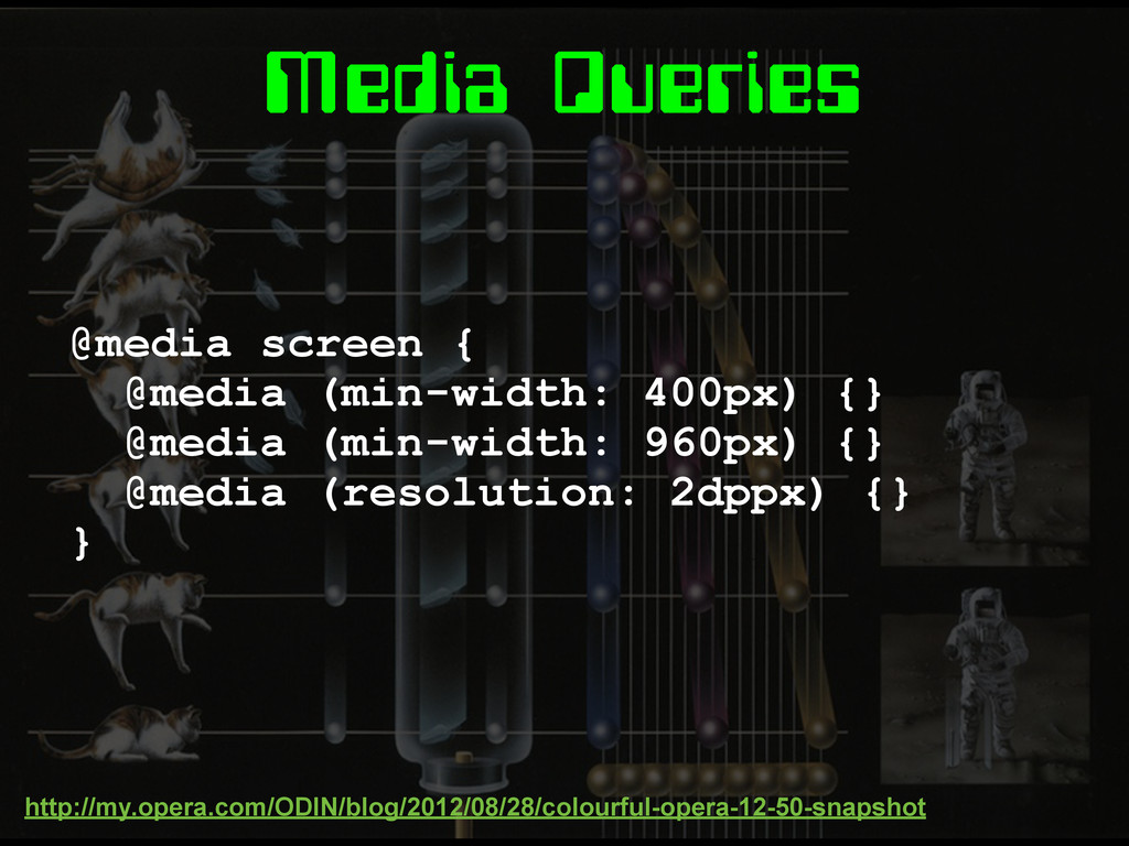
Media Queries @media screen { @media (min-width: 400px) {} @media
(min-width: 960px) {} @media (resolution: 2dppx) {} } http://my.opera.com/ODIN/blog/2012/08/28/colourful-opera-12-50-snapshot
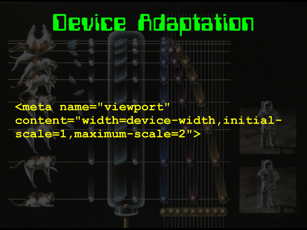
Device Adaptation <meta name="viewport" content="width=device-width,initial- scale=1,maximum-scale=2">
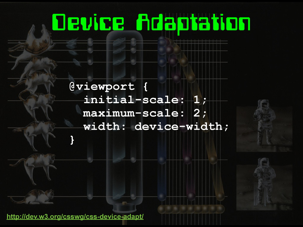
Device Adaptation @viewport { initial-scale: 1; maximum-scale: 2; width: device-width;
} http://dev.w3.org/csswg/css-device-adapt/
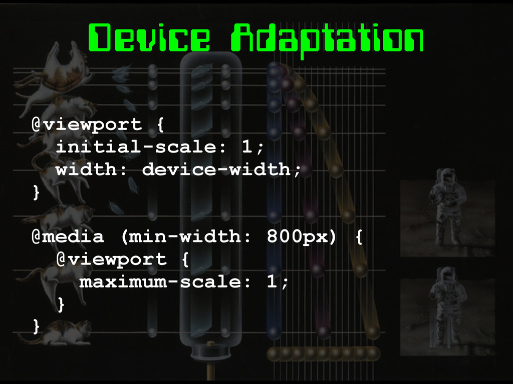
Device Adaptation @viewport { initial-scale: 1; width: device-width; } @media
(min-width: 800px) { @viewport { maximum-scale: 1; } }
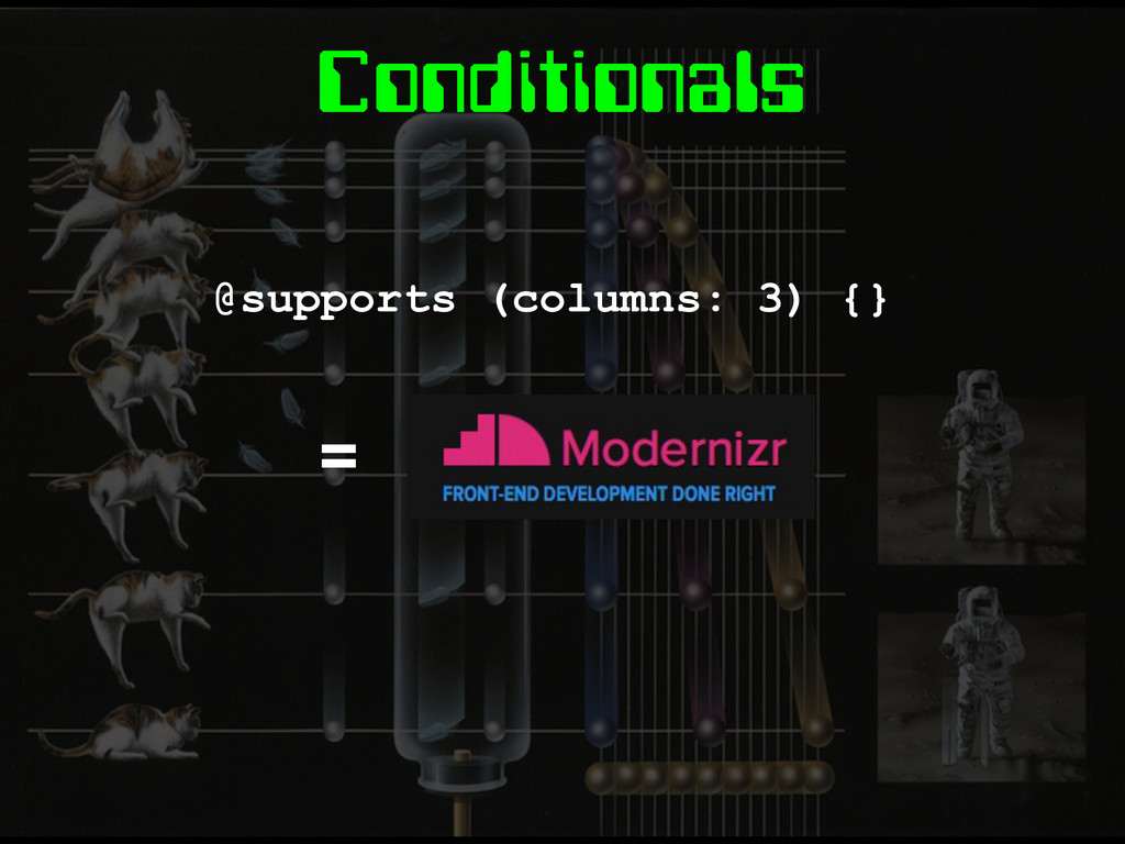
Conditionals @supports (columns: 3) {} =
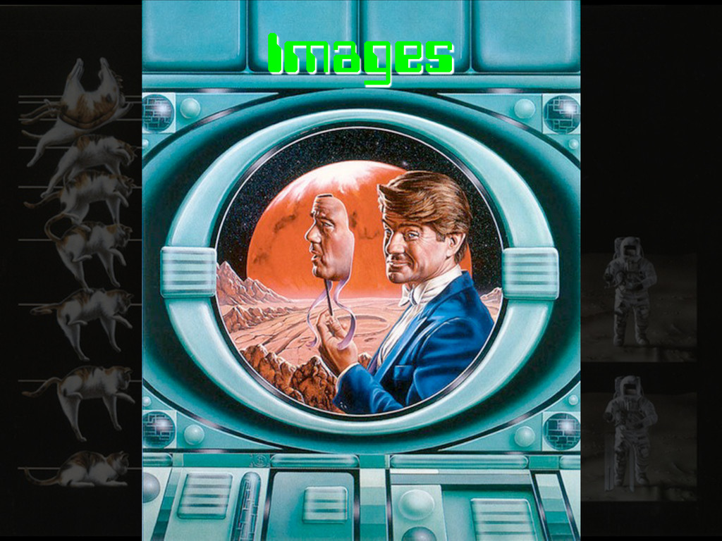
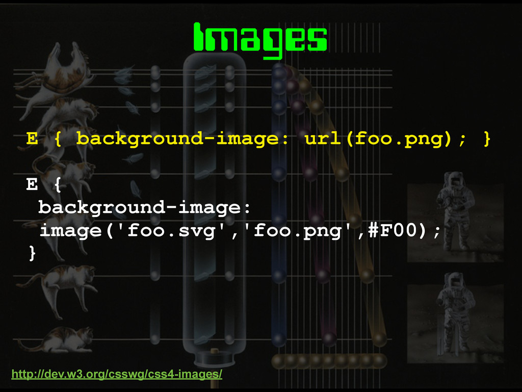
Images
Images E { background-image: image('foo.svg','foo.png',#F00); } E { background-image: url(foo.png);
} http://dev.w3.org/csswg/css4-images/
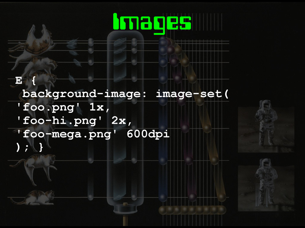
Images E { background-image: image-set( 'foo.png' 1x, 'foo-hi.png' 2x, 'foo-mega.png'
600dpi ); }
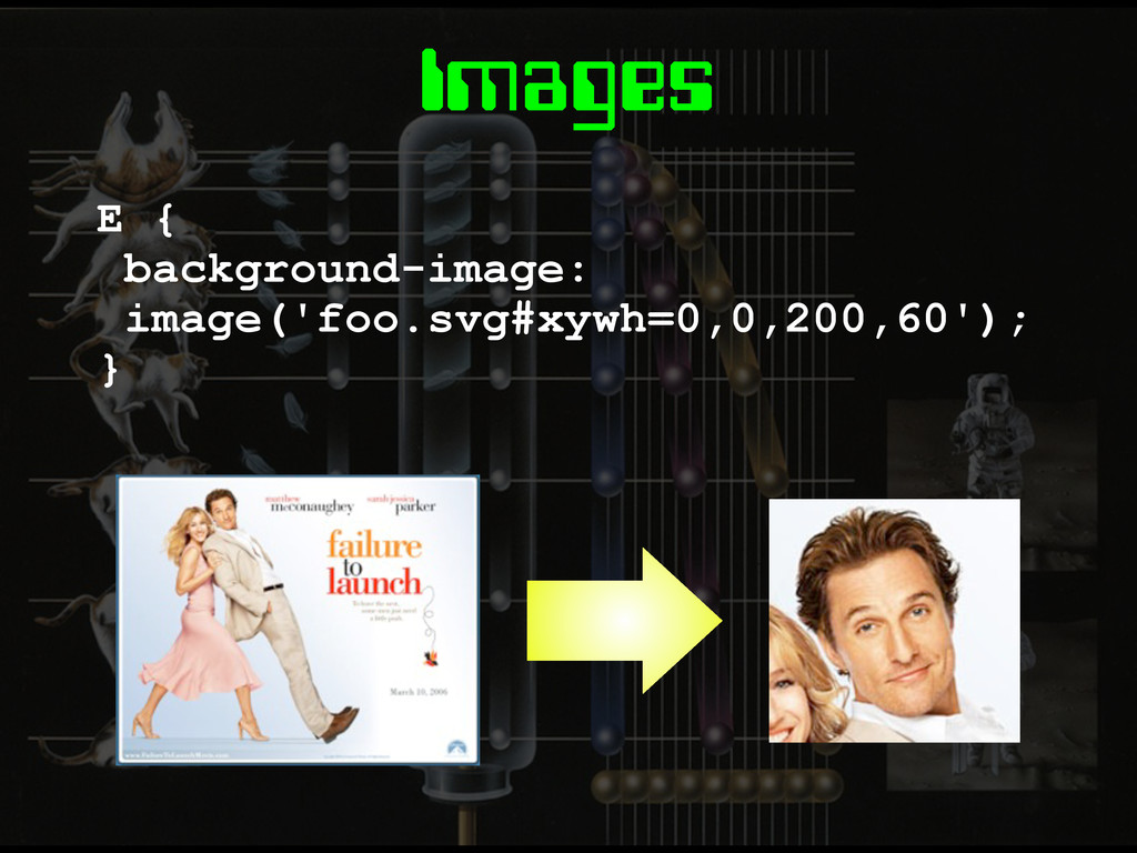
Images E { background-image: image('foo.svg#xywh=0,0,200,60'); }
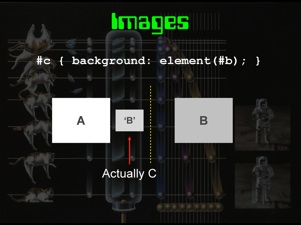
Images #c { background: element(#b); } ‘B’ Actually C A
B
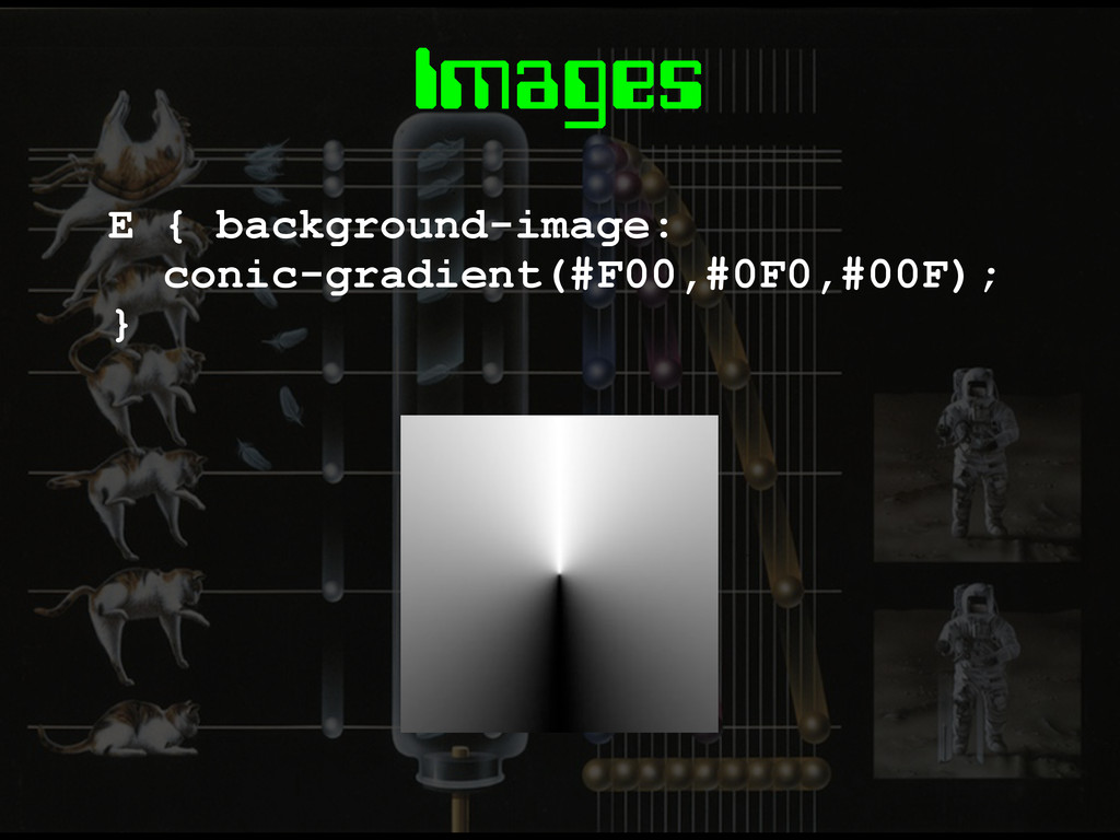
Images E { background-image: conic-gradient(#F00,#0F0,#00F); }
Layout
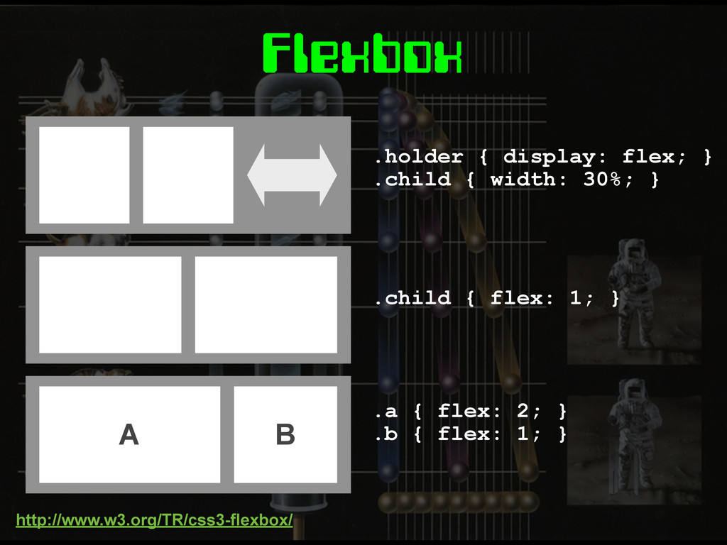
Flexbox
.holder { display: flex; } .child { width: 30%; }
.child { flex: 1; } A B .a { flex: 2; } .b { flex: 1; } Flexbox http://www.w3.org/TR/css3-flexbox/
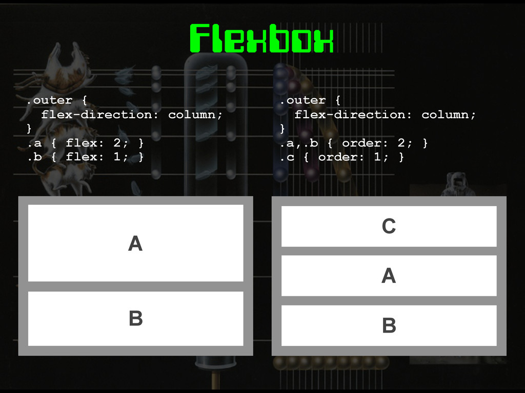
Flexbox C A B .outer { flex-direction: column; } .a,.b
{ order: 2; } .c { order: 1; } A B .outer { flex-direction: column; } .a { flex: 2; } .b { flex: 1; }
Grid Layout
Grid Layout E { display: grid; grid-definition-columns: 1fr 1fr 2fr;
} E { grid-definition-columns: 1fr 1fr 2fr; grid-definition-rows: 10em auto 40px; } http://dev.w3.org/csswg/css3-grid-layout/
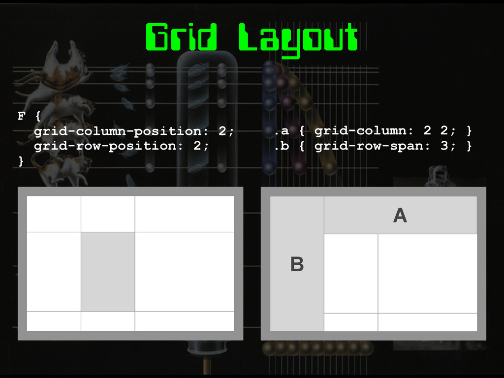
Grid Layout F { grid-column-position: 2; grid-row-position: 2; } A
B .a { grid-column: 2 2; } .b { grid-row-span: 3; }
Grid Templates E { grid-template: 'head head head' 'nav main
main' 'foot foot foot'; } .a { grid-area: 'head'; } .b { grid-area: 'main'; } A B
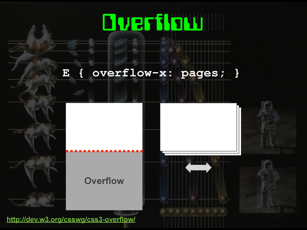
Overflow E { overflow-x: pages; } Overflow http://dev.w3.org/csswg/css3-overflow/
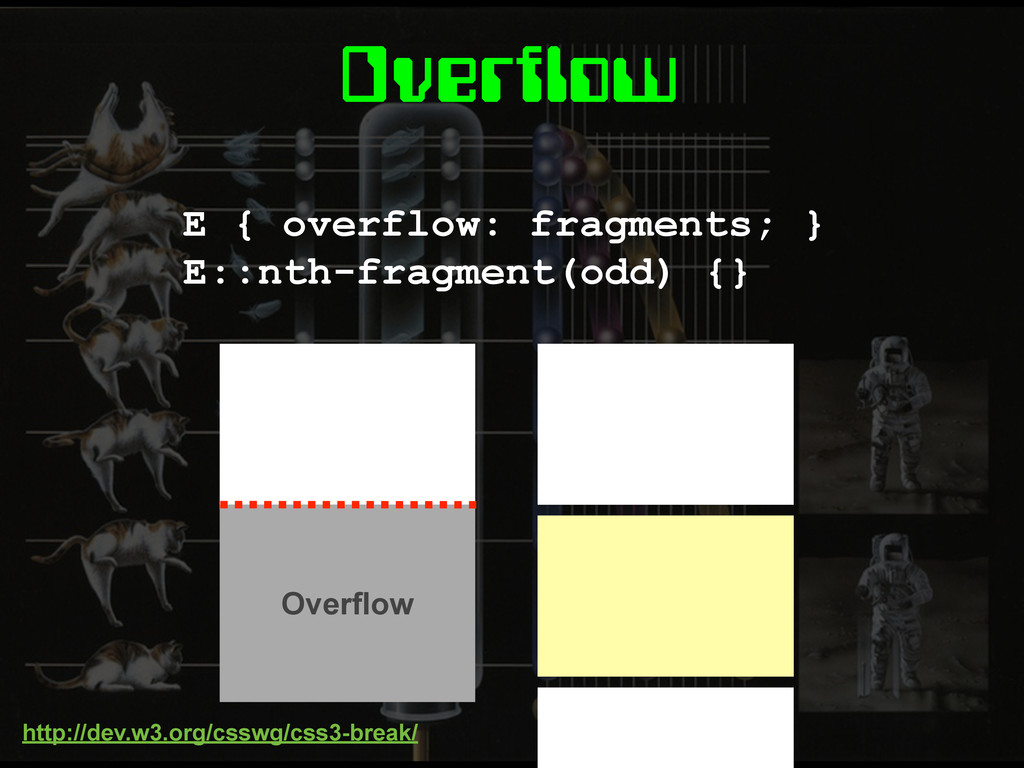
Overflow E { overflow: fragments; } E::nth-fragment(odd) {} http://dev.w3.org/csswg/css3-break/ Overflow
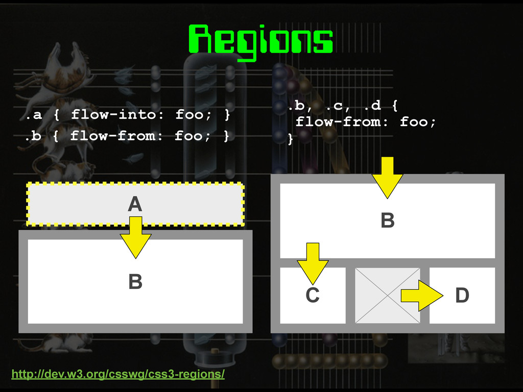
Regions A .a { flow-into: foo; } B C D
.b, .c, .d { flow-from: foo; } B .b { flow-from: foo; } http://dev.w3.org/csswg/css3-regions/
None
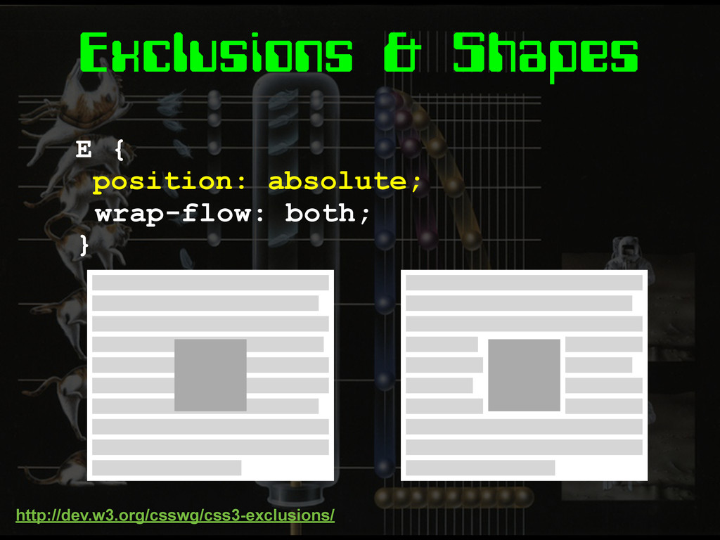
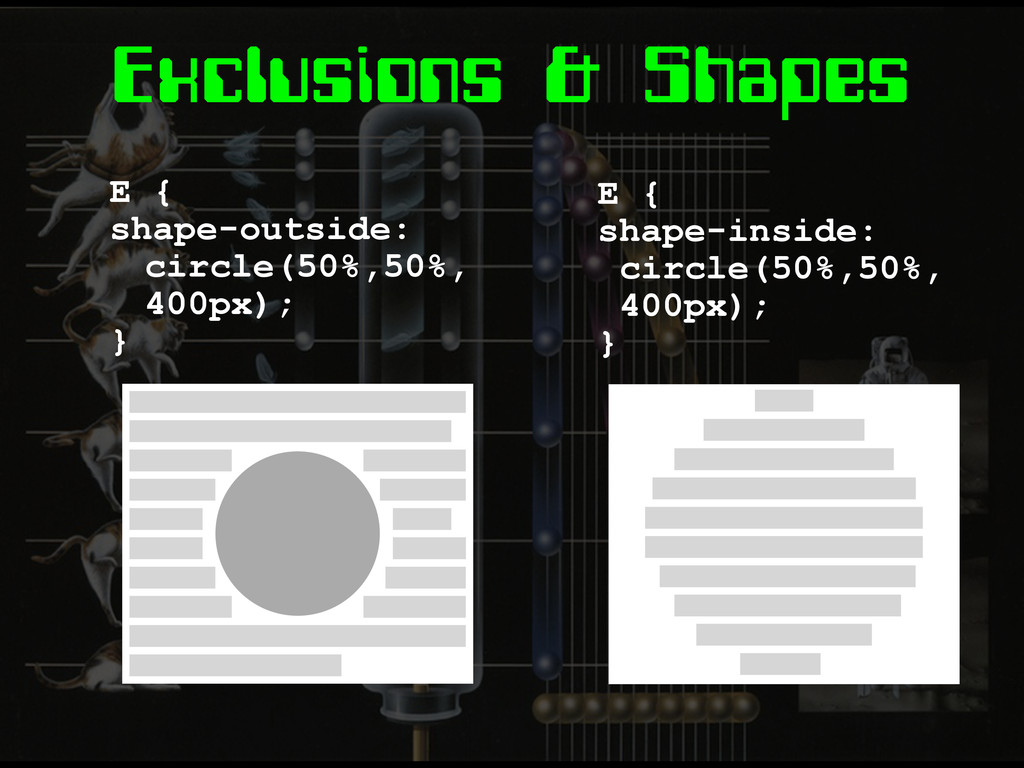
Exclusions & Shapes E { position: absolute; } wrap-flow: both;
http://dev.w3.org/csswg/css3-exclusions/
Exclusions & Shapes E { shape-outside: circle(50%,50%, 400px); } E
{ shape-inside: circle(50%,50%, 400px); }
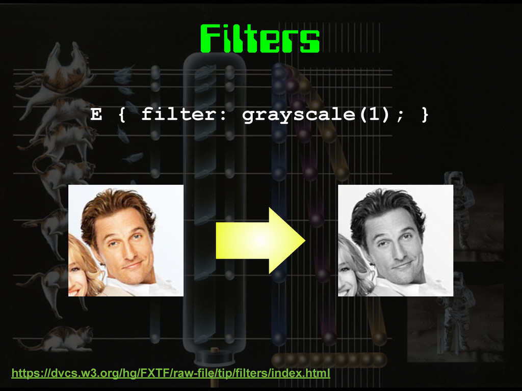
Filters E { filter: grayscale(1); } https://dvcs.w3.org/hg/FXTF/raw-file/tip/filters/index.html
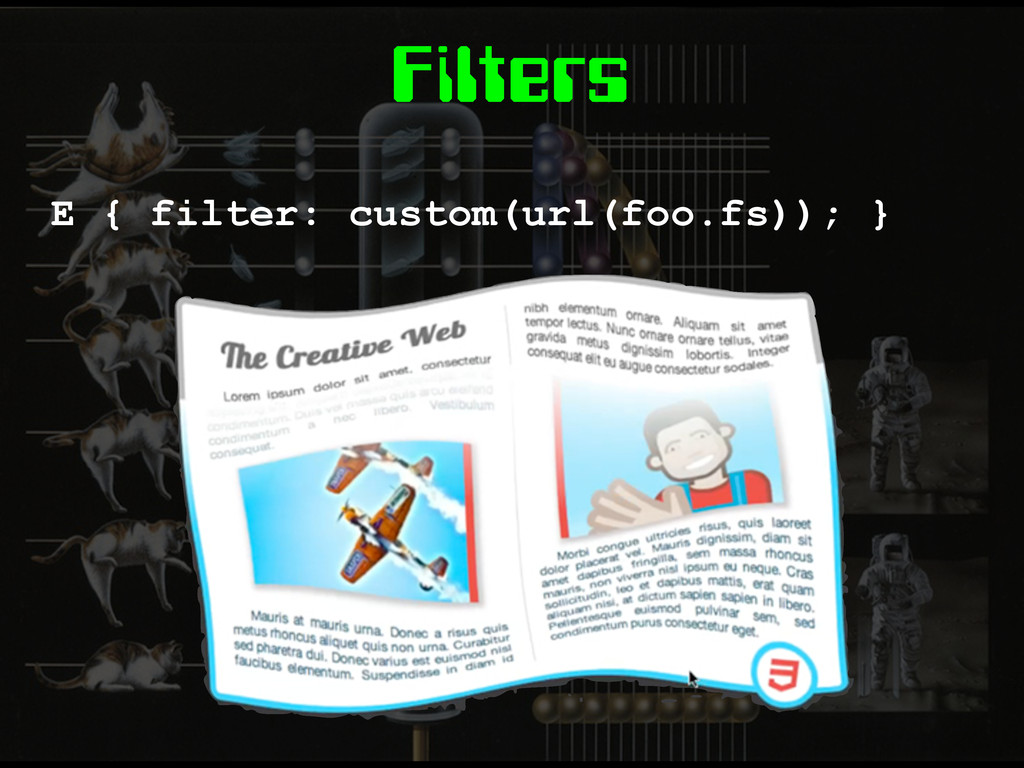
Filters E { filter: custom(url(foo.fs)); }
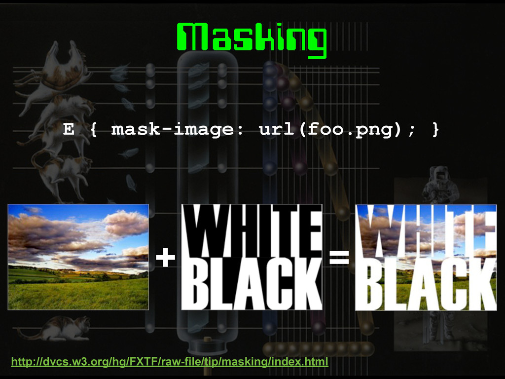
Masking E { mask-image: url(foo.png); } http://dvcs.w3.org/hg/FXTF/raw-file/tip/masking/index.html + =
Masking E { clip-path: circle(50%,50%,200px); }
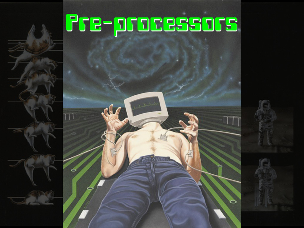
Pre-processors
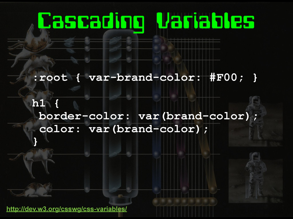
Cascading Variables :root { var-brand-color: #F00; } h1 { border-color:
var(brand-color); color: var(brand-color); } http://dev.w3.org/csswg/css-variables/
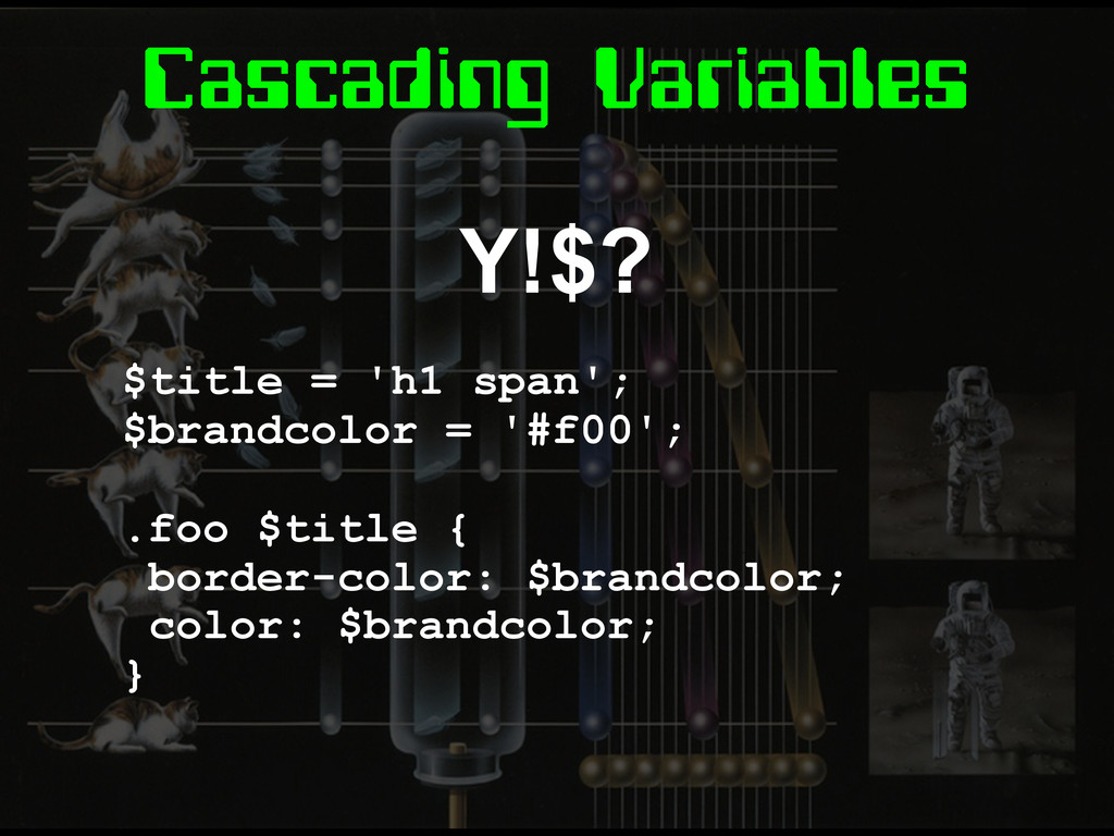
Cascading Variables Y!$? $title = 'h1 span'; $brandcolor = '#f00';
.foo $title { border-color: $brandcolor; color: $brandcolor; }
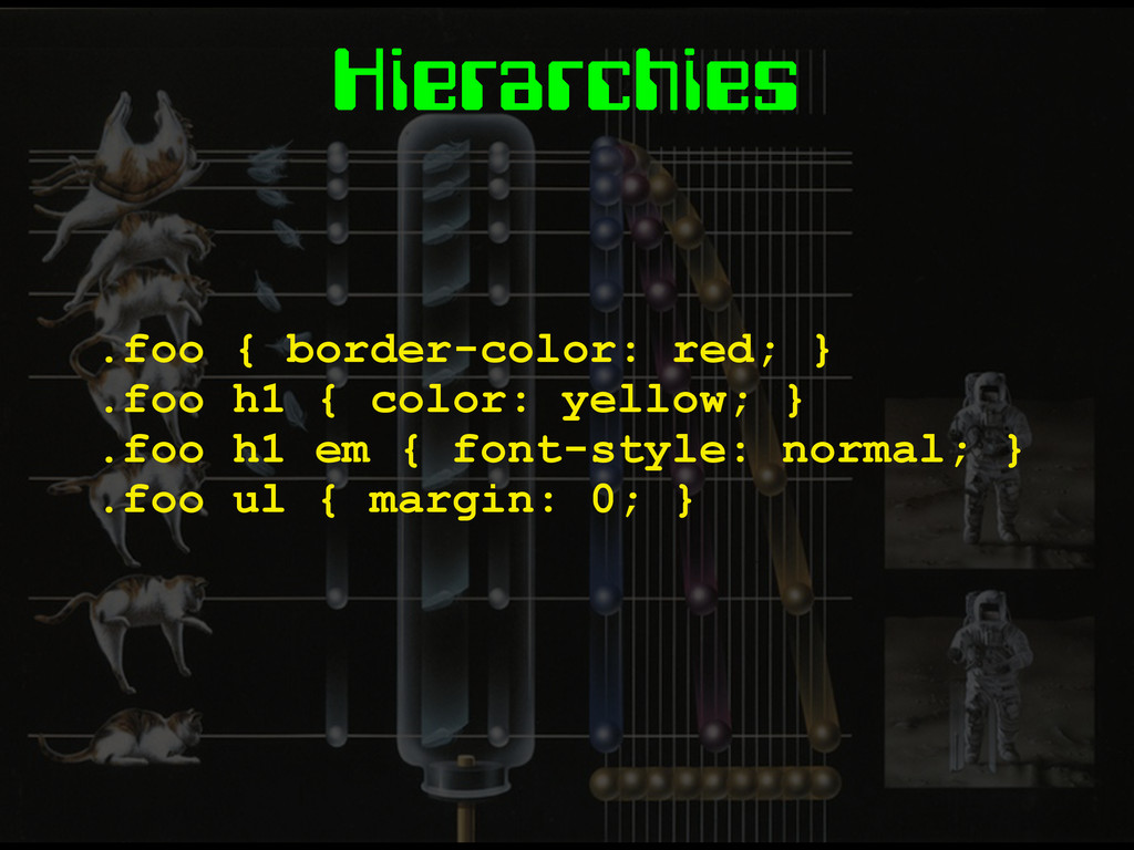
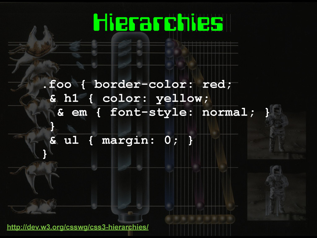
Hierarchies .foo { border-color: red; } .foo h1 { color:
yellow; } .foo h1 em { font-style: normal; } .foo ul { margin: 0; }
Hierarchies .foo { border-color: red; & h1 { color: yellow;
& em { font-style: normal; } } & ul { margin: 0; } } http://dev.w3.org/csswg/css3-hierarchies/
Mixins TBC
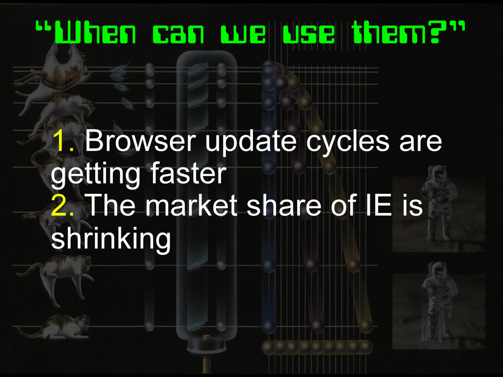
“When can we use them?” 1. Browser update cycles are
getting faster 2. The market share of IE is shrinking
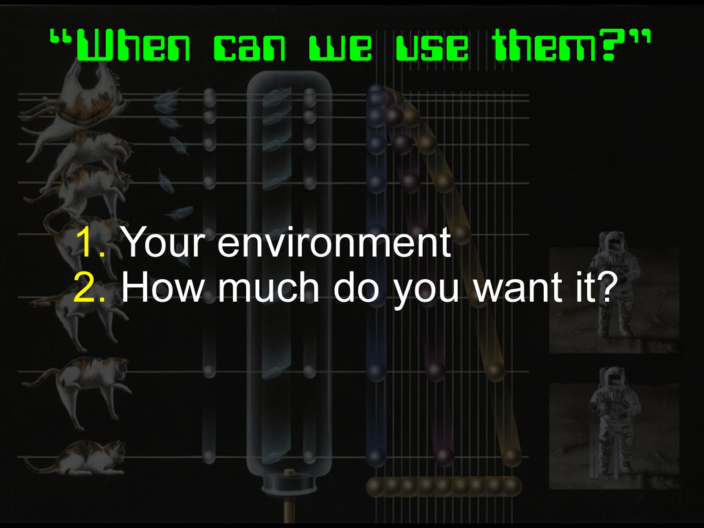
“When can we use them?” 1. Your environment 2. How
much do you want it?
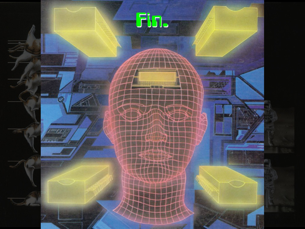
Fin.
None
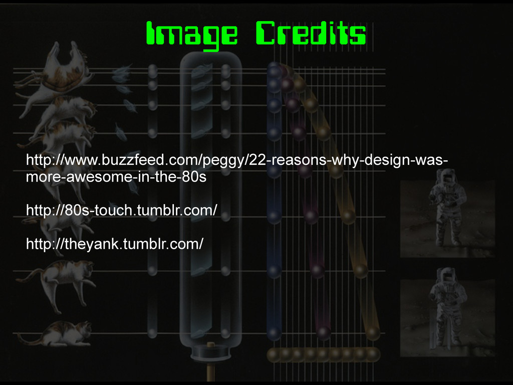
Image Credits http://www.buzzfeed.com/peggy/22-reasons-why-design-was- more-awesome-in-the-80s http://80s-touch.tumblr.com/ http://theyank.tumblr.com/
 stopsatgreen
 oku053
 kishida
 har1101
 ryugen04
 hjmkth
 cottpan
 ioki
ioki
 daitasu
 ochtum
 jinwatanabe
 naokihaba
 nakahara
 sonatard
 rabernat
 tmiket
 codingconduct
 inesmontani
 akosma
 kneath
 ipullrank
 quramy
 baasie
 uxyall
 raygrieselhuber