Upgrade to Pro — share decks privately, control downloads, hide ads and more …

Design beyond your monitor

Eric Haidara
November 18, 2011

Design beyond your monitor

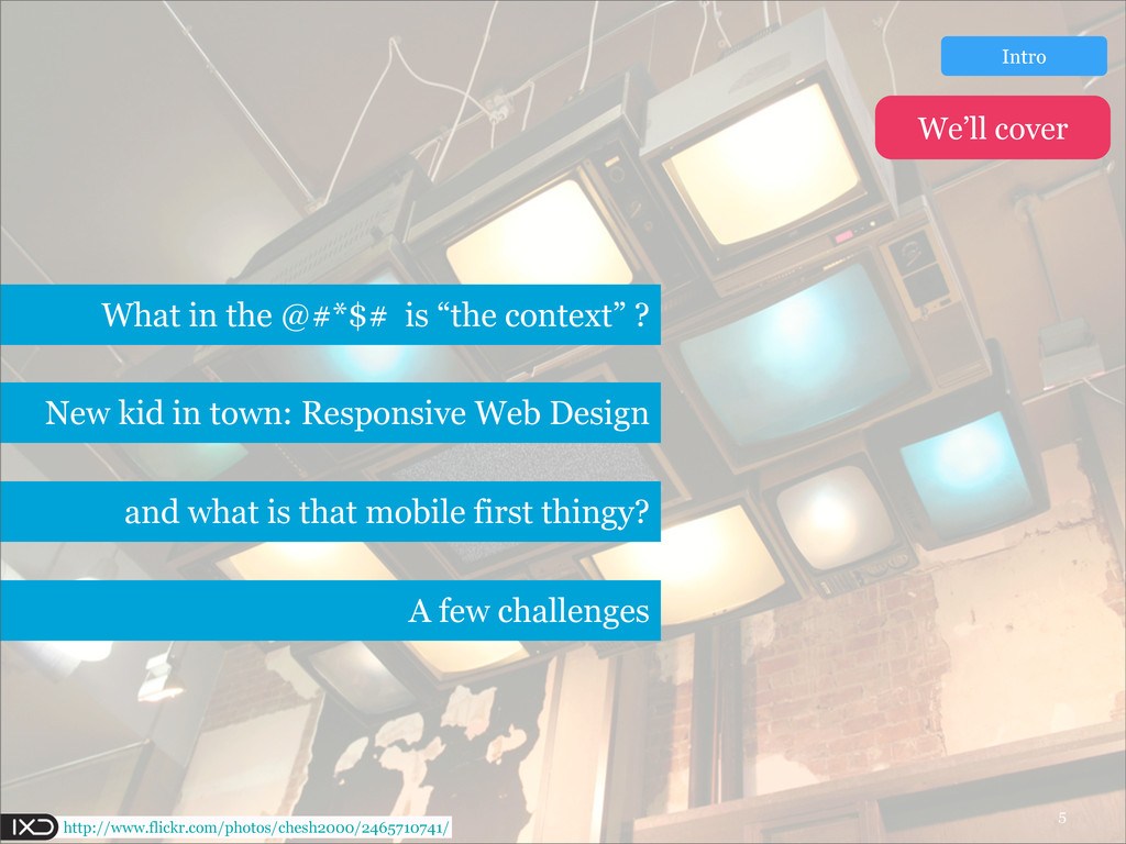
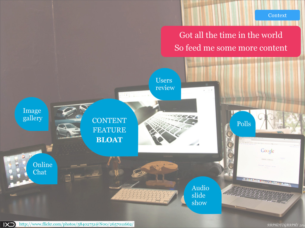
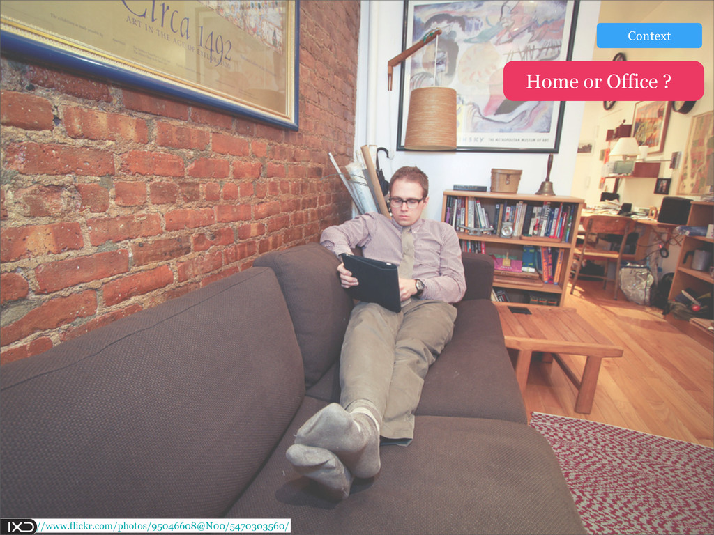
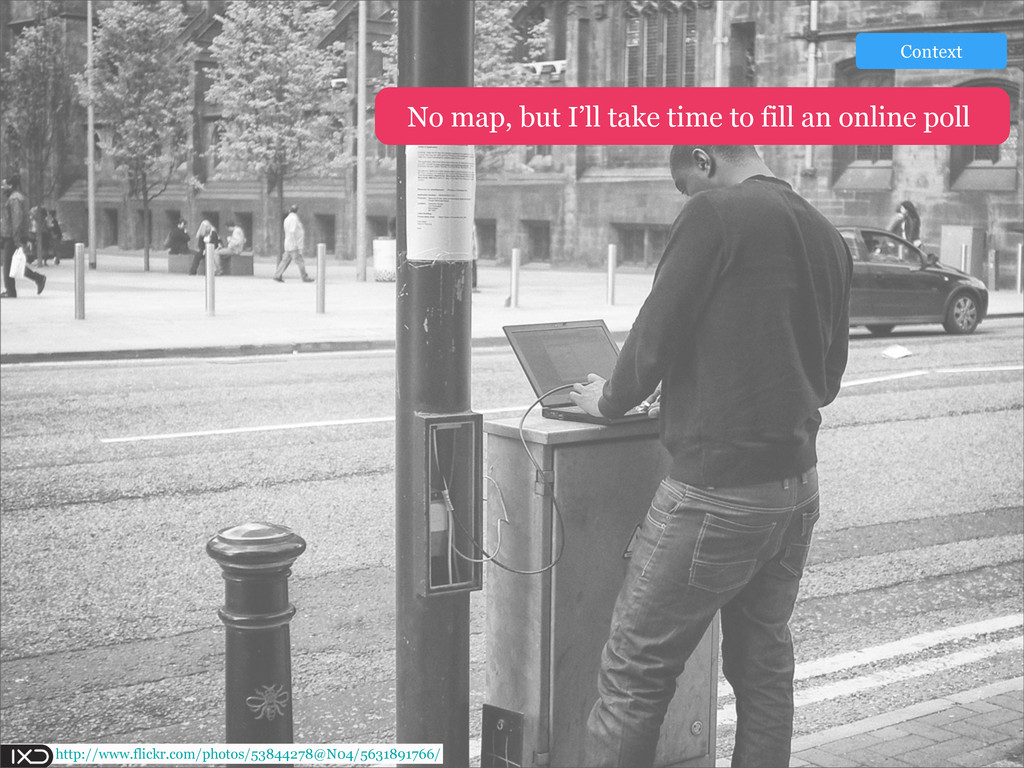
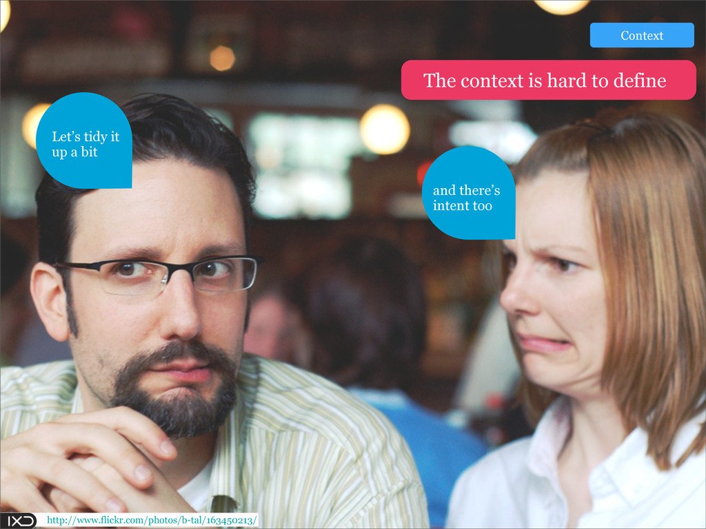
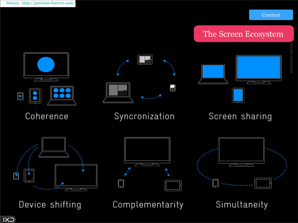
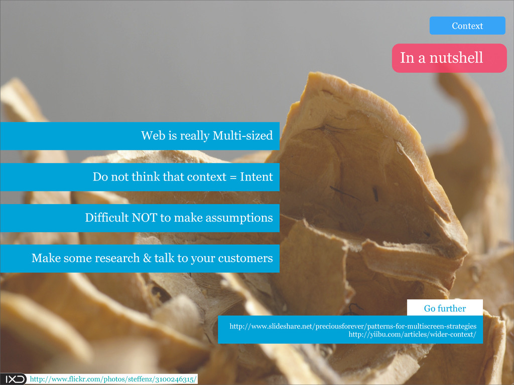
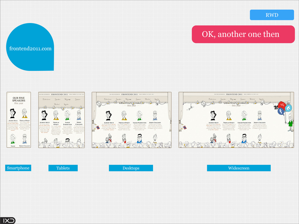
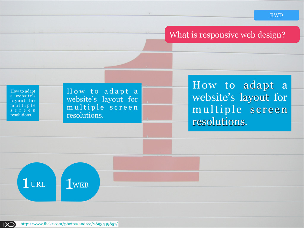
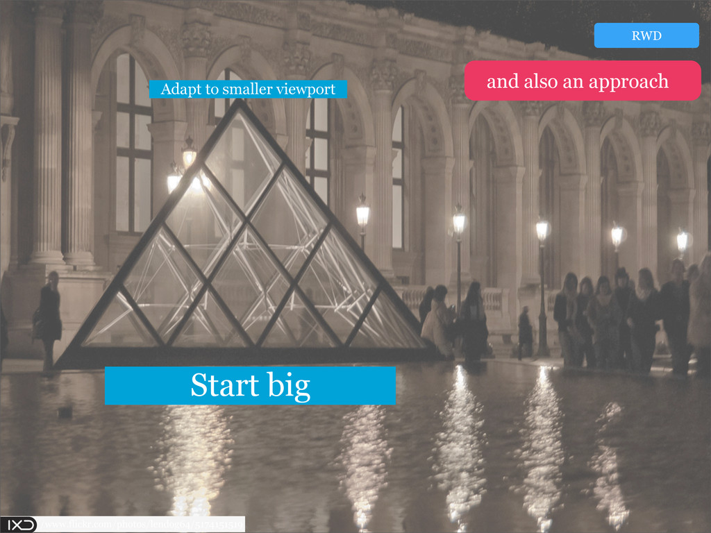
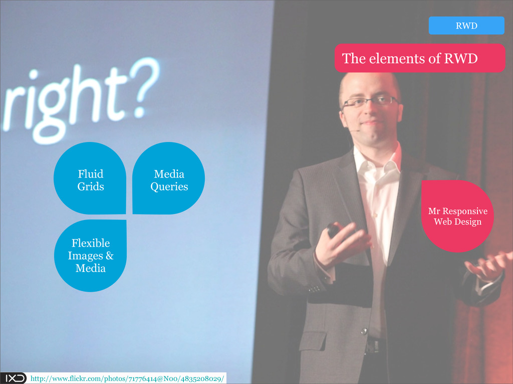
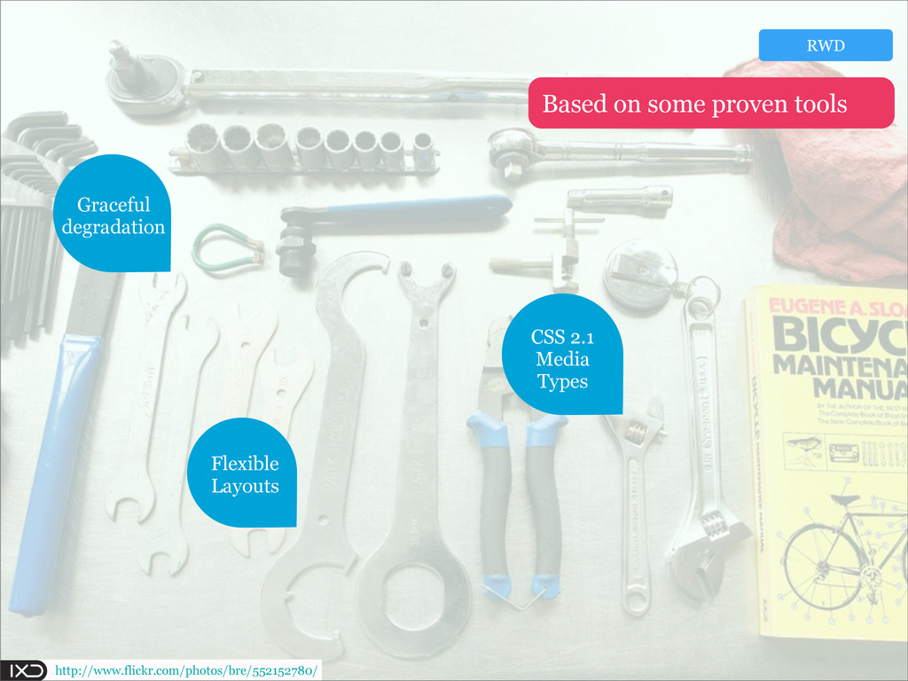
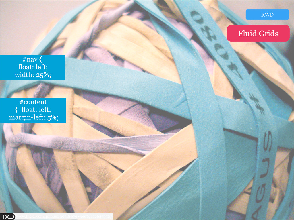
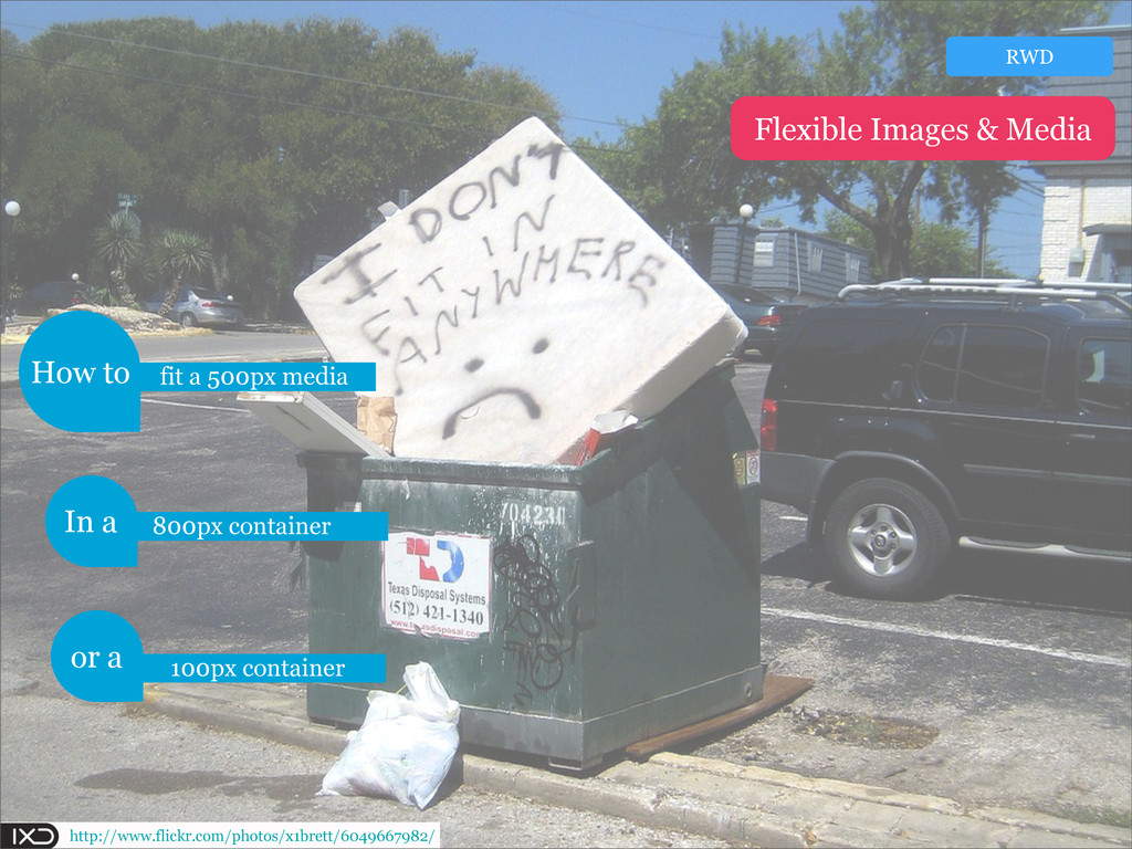
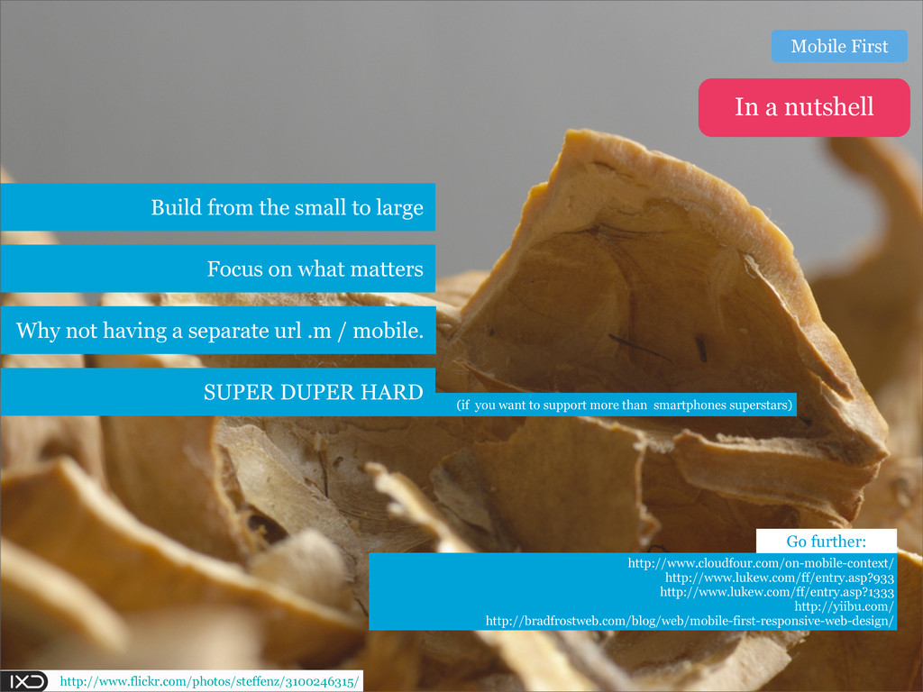
In this talk I'm giving an introduction the concepts of Mobile First and Responsive web design. We take a look at the techniques, benefits and caveats.
I take both those approaches and showcase how they affect our daily work as UX professionals and how they relate to the concept of content.

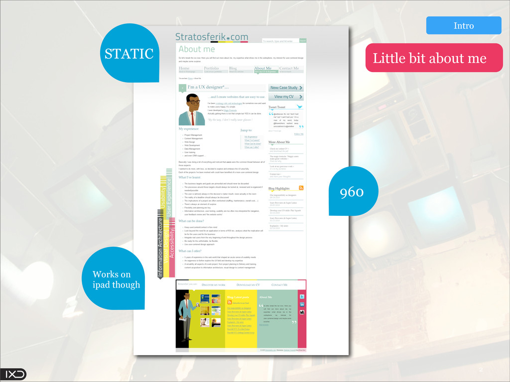
This talk was held at our local meetup organised by IXDA Oslo on Nov.16 2011.

Eric Haidara

November 18, 2011
Tweet

Other Decks in Design

Transcript

  1. 3 1024x768 640x480 800x600 1440x900 320 x 480 1024x768 640

    x 960 480 x 272 1024 x 600 480 x 800 Intro A matter of size
  2. 4 We’ve got the coolest job in the world. We

    have to figure out how to use these platforms. It’s one of the most exciting times in the history of our culture.” Josh Clarke FWOD NYC Intro Some say http://www.flickr.com/photos/chesh2000/2465710741/
  3. 5 What in the @#*$# is “the context” ? New

    kid in town: Responsive Web Design and what is that mobile first thingy? A few challenges Intro We’ll cover http://www.flickr.com/photos/chesh2000/2465710741/
  4. http://www.flickr.com/photos/58402751@N00/2657011662/ Got all the time in the world So feed

    me some more content Users review Image gallery Online Chat Polls Audio slide show CONTENT FEATURE BLOAT Context
  5. http://www.flickr.com/photos/houghtonregis/4371208302/ Source: www.regjeringen.no In Norway has internet connection 84% uses

    internet daily 76% uses online banking 77% connect wirelessly outside of home or work 1 2 / Context
  6. http://www.flickr.com/photos/steffenz/3100246315/ Web is really Multi-sized Do not think that context

    = Intent Difficult NOT to make assumptions Make some research & talk to your customers Go further http://www.slideshare.net/preciousforever/patterns-for-multiscreen-strategies http://yiibu.com/articles/wider-context/ In a nutshell Context
  7. http://www.flickr.com/photos/andrec/2893549851/ How to adapt a website’s layout for multiple screen

    resolutions. H o w t o a d a p t a website’s layout for m u l t i p l e s c r e e n resolutions. How to adapt a website’s l a y o u t f o r m u l t i p l e s c r e e n resolutions. What is responsive web design? URL 1 WEB 1 RWD
  8. http://www.flickr.com/photos/30145139@N07/5299081893/ @media screen and (max-width: 1160px) { #drapeRight, #drapeLeft, #award

    { display: none; } } /* Horizontal limits */ @media screen and (max-width: 1540px) { #teo, #balloons { display: none; } } Media Queries RWD
  9. http://www.flickr.com/photos/steve0_f/416266654/ Media Queries: Fool’s Gold I pity the FOOL!!! All

    you need to do to transform your desktop web design into something optimized for devices with smaller screens, less powerful CPUs, and slower network connections is to add more code. * Jason Grigsby RWD
  10. http://www.flickr.com/photos/steffenz/3101130384/ Build from the top-down Doesn’t solve the “context” Give

    flexibility over the viewport Hot right now http://pinchzoom.com/posts/a-mobile-magazine-prototype/ http://www.cloudfour.com/css-media-query-for-mobile-is-fools-gold/ Only one content/URL In a nutshell RWD Go further:
  11. http://www.flickr.com/photos/imaphotog/205492402/ Mobile First “they create a truly Personalized and Responsive

    user experience regardless of the situation.” Tim Kadlec Unique User Experience Mobile First
  12. http://www.flickr.com/photos/boston_public_library/6303112003 (Many web users are mobile-only) mobile subscribers = To

    reach more people Mobile First 5,3 Billion Of world population 77% Source: www.internetworldstats.com/ www.lukew.com/ff/entry.asp?1426
  13. http://www.flickr.com/photos/boston_public_library/6303112003 (Many web users are mobile-only) mobile subscribers = To

    reach more people Mobile First 5,3 Billion Of world population 77% Source: www.internetworldstats.com/ www.lukew.com/ff/entry.asp?1426 Need more data? 2015 $4 Billion 3 x 20 %
  14. (if you want to support more than smartphones superstars) http://www.flickr.com/photos/steffenz/3100246315/

    Build from the small to large Focus on what matters Why not having a separate url .m / mobile. http://www.cloudfour.com/on-mobile-context/ http://www.lukew.com/ff/entry.asp?933 http://www.lukew.com/ff/entry.asp?1333 http://yiibu.com/ http://bradfrostweb.com/blog/web/mobile-first-responsive-web-design/ SUPER DUPER HARD In a nutshell Mobile First Go further:
  15. http://www.flickr.com/photos/glsims99/1404828286/ Breaking point is a defined size at which the

    design changes How many breaking points 1 2 More ? Challenges
  16. We removed […] the sidebar because […] posting a job

    from a tablet or mobile is pretty unlikely given how much input is involved Localization: Only Mobile …Filtering bar changes substantially on desktop vs. tablet A matter of choices What about UX? Cameron Moll Authentic Jobs Challenges
  17. http://www.flickr.com/photos/26121794@N07/4049957908/ Advertising money What of the real-estate on smaller screens?

    Is smaller ads = less revenue? Maybe smart to keep a separate mobile site Challenges
  18. http://www.flickr.com/photos/26121794@N07/4049957908/ Advertising money Challenges The main challenge associated to a

    new responsive design was the advertising. (...) we didn't work on a new revenue model, we are basically just resizing the images as we go down to mobile Vitaly Friedman
  19. 4 Where to now? Content First Clever Web One web

    Future Friendly Multisize Web Responsive Enhancement We have to make content that endures – that lives through those shifts, not loses its meaning.* http://endlesslycontent.com/2011/08/04/structured-content-shifting-context-responsive-design/
  20. 4 And here we are Where to now? There's a

    digital evolution taking place - one with exciting implications for Web designers. Heard that before ? http://www.flickr.com/photos/vox_efx/3501000840/
  21. 4 And here we are Where to now? 12 years

    ago http://www.flickr.com/photos/vox_efx/3501000840/
  22. http://www.flickr.com/photos/jonworth/105842934/ Stephanie & Bryan Rieger Luke Wroblewski Ethan Marcotte Jason

    Grigsby Brad Frost Precious-Forever And many more... Based on the work of The Multisize web
  23. http://www.flickr.com/photos/chesh2000/2465710741/ http://www.flickr.com/photos/31525431@N00/4328160674/ http://www.flickr.com/photos/58402751@N00/2657011662/ http://www.flickr.com/photos/tambako/3593686294/ http://www.flickr.com/photos/laurenmanning/2979574719/ http://www.flickr.com/photos/houghtonregis/4371208302/ http://www.flickr.com/photos/38305415@N00/5873954634/ http://www.flickr.com/photos/joebustillos/5413847585/ http://www.flickr.com/photos/15734079@N00/397345394/ http://www.flickr.com/photos/95046608@N00/5470303560/

    http://www.flickr.com/photos/47610090@N07/4389698869/ http://www.flickr.com/photos/53844278@N04/5631891766/ http://www.flickr.com/photos/b-tal/163450213/ http://www.flickr.com/photos/b-tal/163450213/ http://www.flickr.com/photos/steffenz/3100246315/ http://www.flickr.com/photos/wasabicube/5864797151/ http://www.flickr.com/photos/andrec/2893549851/ http://www.flickr.com/photos/81445502@N00/4365152223/ http://www.flickr.com/photos/99983307@N00/4299377933/ http://www.flickr.com/photos/58944004@N00/2542795166/ http://www.flickr.com/photos/71776414@N00/4835208029/ http://www.flickr.com/photos/roland/4305223929/ http://www.flickr.com/photos/glsims99/1404828286/ http://www.flickr.com/photos/mondayne/3410286069/ http://www.flickr.com/photos/45940879@N04/5421517469/ http://www.flickr.com/photos/26121794@N07/4049957908/ http://www.flickr.com/photos/steve0_f/416266654/ http://www.flickr.com/photos/steffenz/3101130384/ http://www.flickr.com/photos/17927408@N07/2322337810/ http://www.flickr.com/photos/83346641@N00/3383629917/ http://www.flickr.com/photos/localcelebrity/4831362933 http://www.flickr.com/photos/imaphotog/205492402/ http://www.flickr.com/photos/86009833@N00/2771273050/ http://www.flickr.com/photos/90963248@N00/299066758/ http://www.flickr.com/photos/boston_public_library/5712631379/ http://www.flickr.com/photos/arselectronica/4959753845/ http://www.flickr.com/photos/laurenmanning/2979574719/ http://www.flickr.com/photos/paulr/2978291797 http://www.flickr.com/photos/fritish/3423037412/ http://www.flickr.com/photos/fritish/3423037412/ http://www.flickr.com/photos/crazyeddie/2888389000/ http://www.flickr.com/photos/lazzeresky/5200654959 http://www.flickr.com/photos/41185766@N03/4760692715/ http://www.flickr.com/photos/huasonic/1443767744/ http://www.flickr.com/photos/evalottchen/4666617453 http://www.flickr.com/photos/evalottchen/4666617453 http://www.flickr.com/photos/scatterbrein/5533360139 http://www.flickr.com/photos/chris-fritz/2409491374 http://www.flickr.com/photos/jonworth/105842934/ http://www.flickr.com/photos/16865477@N07/5492830078/ http://www.flickr.com/photos/39718079@N00/172647550/ http://www.flickr.com/photos/x1brett/6049667982/ http://www.flickr.com/photos/30145139@N07/5299081893/ http://www.flickr.com/photos/11777427@N05/1184491822/ http://www.flickr.com/photos/chris-fritz/2409491374 Links ;-) The Multisize web http://bagcheck.com/bag/4986-the-multi-size-web