Upgrade to Pro
— share decks privately, control downloads, hide ads and more …
Speaker Deck
Features
Speaker Deck
PRO
Sign in
Sign up for free
Search
Search
Responsive Web Design: Everything has Changed
Search
Swwweet
June 17, 2012
Technology
760
6
Share
Embed
Copy iframe code
Copy JS code
Copy link
Start on current slide
Responsive Web Design: Everything has Changed
Presentation by @htmlboy at Drupal Developers Day Barcelona 2012.
Swwweet
June 17, 2012
More Decks by Swwweet
See All by Swwweet
Wonders from the Full Stack Fest website
swwweet
1
400
How to be the best web designer in the world.
swwweet
6
1.3k
Design for loading
swwweet
5
590
Mobile First: as difficult as doing things right
swwweet
225
10k
One Size Fits None
swwweet
12
920
One Size Fits None - From the Front 2013
swwweet
2
770
Responsively Responsive
swwweet
23
1.7k
La letra con píxel entra
swwweet
0
1.2k
The future of code
swwweet
4
670
Other Decks in Technology
See All in Technology
Claude Mythos、Fable...フロンティアAIの最新動向と企業のセキュリティ対策
flatt_security
0
140
AIとハーネスで育てるトランスコンパイラ / 20260722 Yasushi Katayama
shift_evolve
PRO
3
930
変更し続けられるシステムをどう保つか — AI時代のSSoTという設計原則
kawauso
1
1.2k
Webアプリ認証の全体像 / The Big Picture of Web App Authentication
kitano_yuichi
1
450
SRENEXT_2026_Chairs__Talks_in_Tamachi.sre.pdf
srenext
1
160
仕様駆動開発、導入半年。「本当に速くなってるの?」にデータで答える / AICon2026_hirakawa
rakus_dev
0
340
MCPをつなげて作る組織横断のAIエージェント基盤
tsubakimoto_s
0
150
AWS環境のセキュリティ不安を解消した企業事例 ~よくある課題と対策を一挙公開~
asanoharuki
0
170
データ活用研修 問いの発見と仮説構築【MIXI 26新卒技術研修】
mixi_engineers
PRO
1
150
AIが当たり前の組織で エンジニアはどう育つか
nishihira
1
1.3k
探索・可視化・自動化を一本化 Amazon Quickでデータ活用スピードを上げる方法
koheiyoshikawa
0
200
なぜ、あなたのエージェントは言うことを聞かないのか
segavvy
1
490
Featured
See All Featured
GraphQLの誤解/rethinking-graphql
sonatard
75
12k
Public Speaking Without Barfing On Your Shoes - THAT 2023
reverentgeek
1
460
Deep Space Network (abreviated)
tonyrice
0
230
Tips & Tricks on How to Get Your First Job In Tech
honzajavorek
1
620
The Spectacular Lies of Maps
axbom
PRO
1
870
16th Malabo Montpellier Forum Presentation
akademiya2063
PRO
0
280
Agile that works and the tools we love
rasmusluckow
331
22k
The Organizational Zoo: Understanding Human Behavior Agility Through Metaphoric Constructive Conversations (based on the works of Arthur Shelley, Ph.D)
kimpetersen
PRO
0
390
What's in a price? How to price your products and services
michaelherold
247
13k
Exploring the Power of Turbo Streams & Action Cable | RailsConf2023
kevinliebholz
37
6.5k
Intergalactic Javascript Robots from Outer Space
tanoku
273
27k
Reflections from 52 weeks, 52 projects
jeffersonlam
356
21k
Transcript
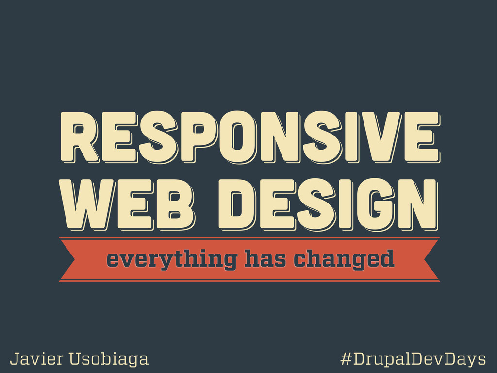
RESPoNSIVE WEB DESIGN RESPoNSIVE WEB DESIGN RESPoNSIVE WEB DESIGN everything
has changed Javier Usobiaga #DrupalDevDays
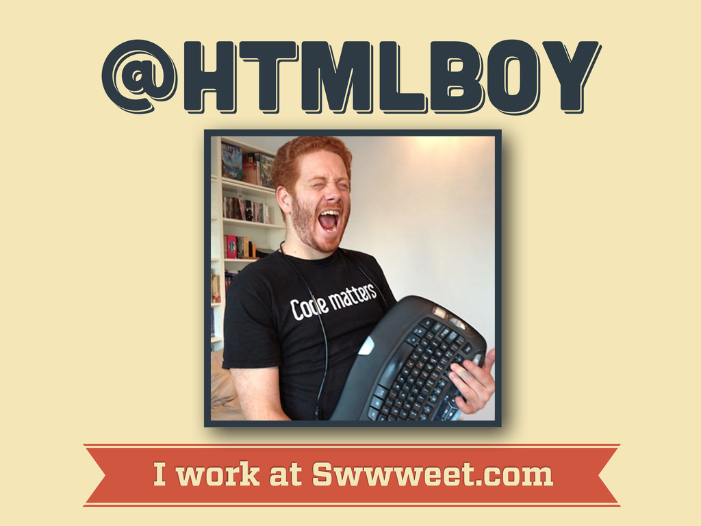
@htmlboy @htmlboy @htmlboy I work at Swwweet.com
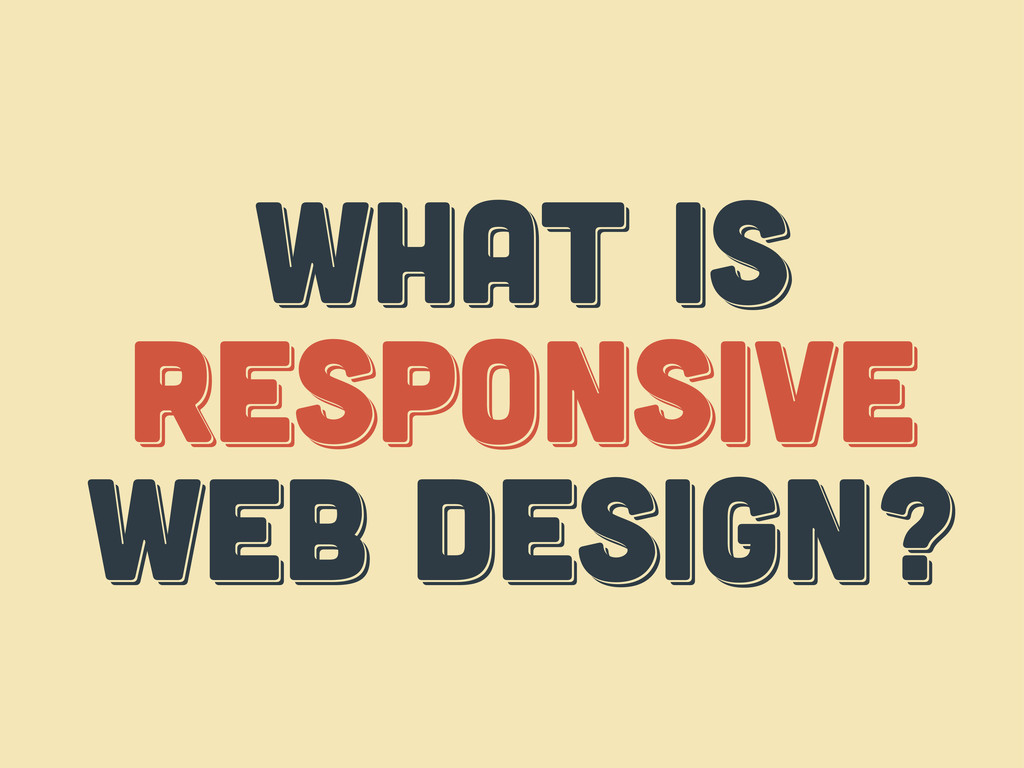
WHAT IS responsive web design? WHAT IS responsive web design?
WHAT IS respoNsive web design?
WHAT IS THE web? WHAT IS THE web? WHAT IS
THE web?
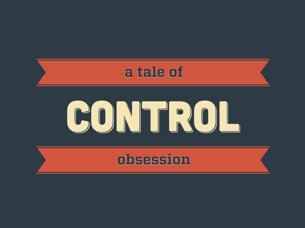
CONTROL CONTROL CONTROL a tale of obsession
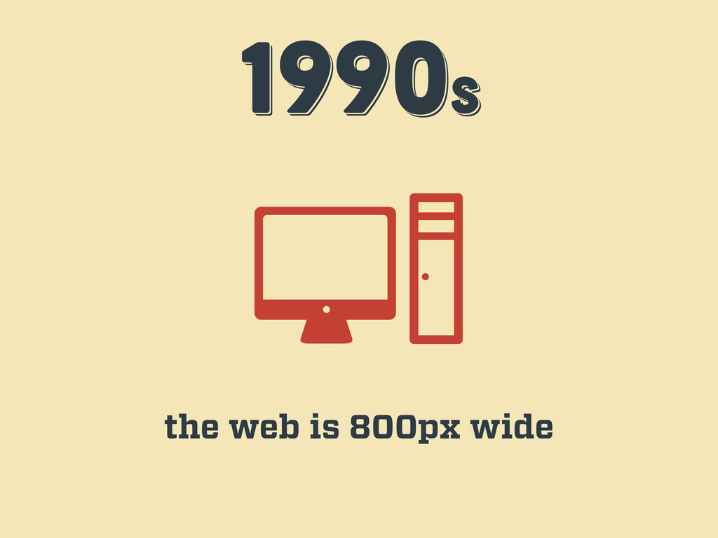
1990s 1990s 1990s the web is 800px wide
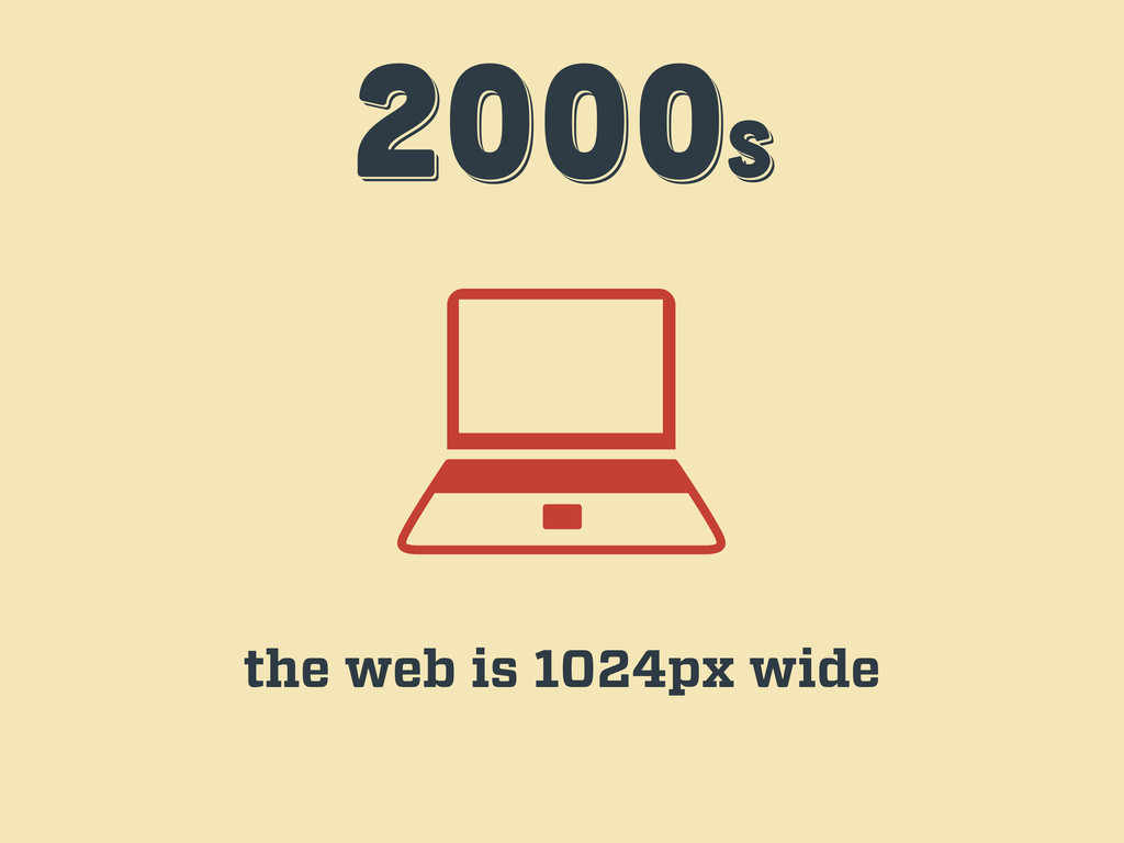
2000s 2000s 2000s the web is 1024px wide
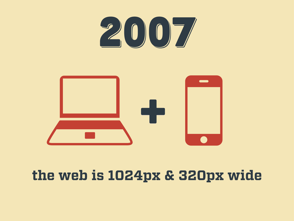
2007 2007 2007 + the web is 1024px & 320px
wide
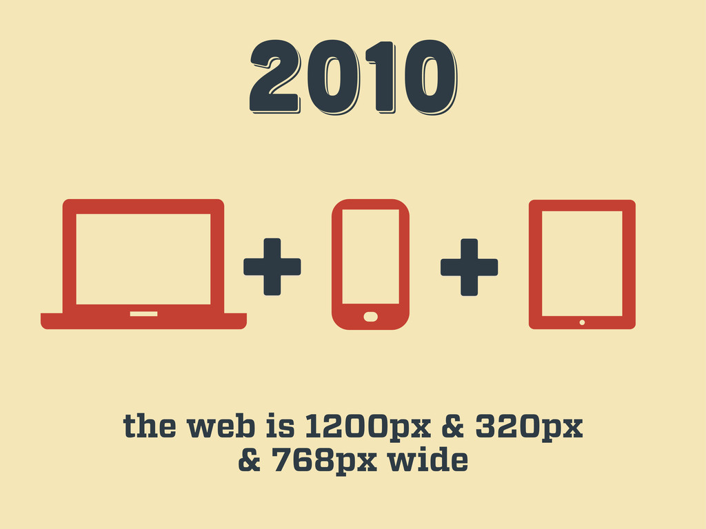
2010 2010 2010 + + the web is 1200px &
320px & 768px wide
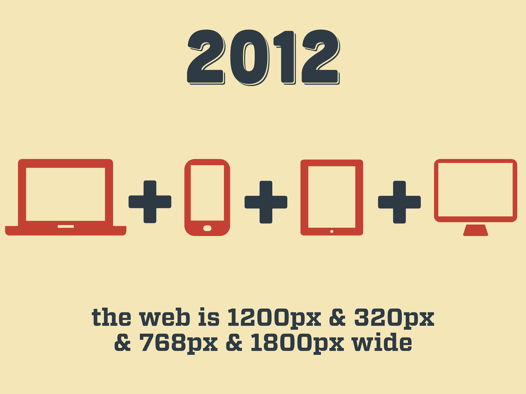
2012 2012 2012 + + the web is 1200px &
320px & 768px & 1800px wide +
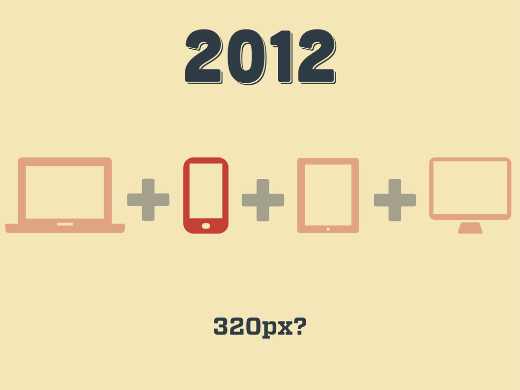
2012 2012 2012 + + 320px? +
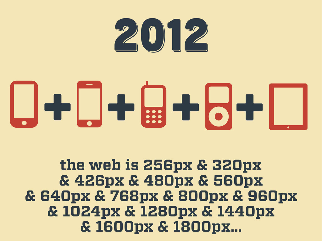
2012 2012 2012 the web is 256px & 320px &
426px & 480px & 560px & 640px & 768px & 800px & 960px & 1024px & 1280px & 1440px & 1600px & 1800px… + + + +
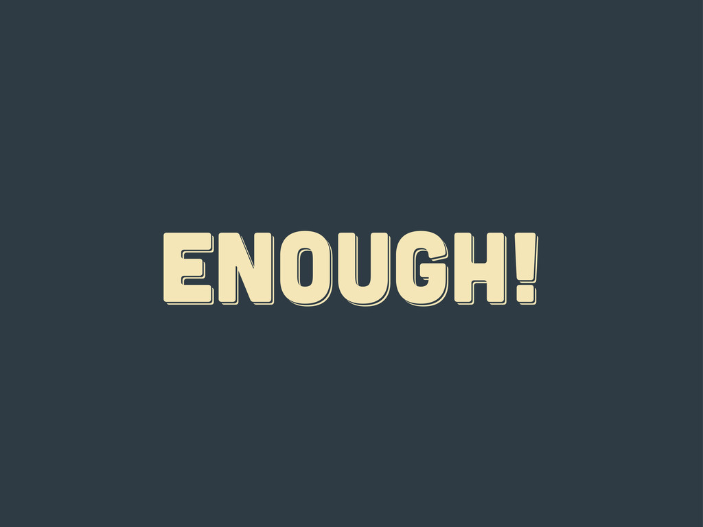
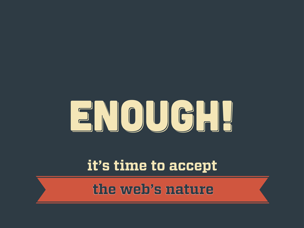
ENOUGH! ENOUGH! ENOUGH!
ENOUGH! ENOUGH! ENOUGH! it’s time to accept the web’s nature
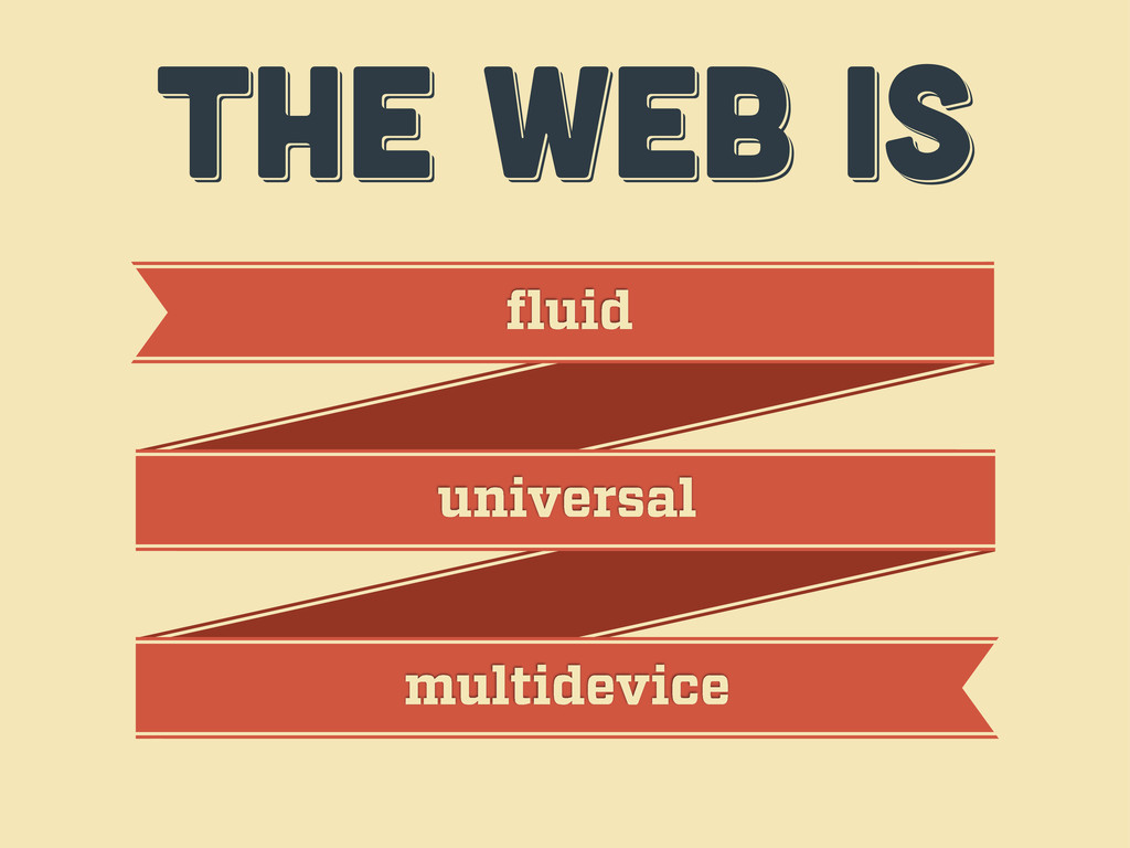
THE WEB IS THE WEB IS THE WEB IS fluid
universal multidevice
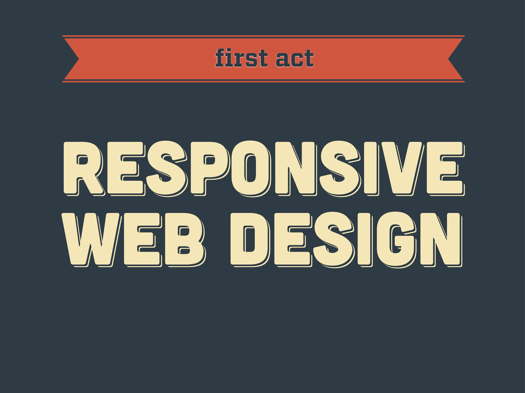
first act RESPoNSIVE WEB DESIGN RESPoNSIVE WEB DESIGN RESPoNSIVE WEB
DESIGN
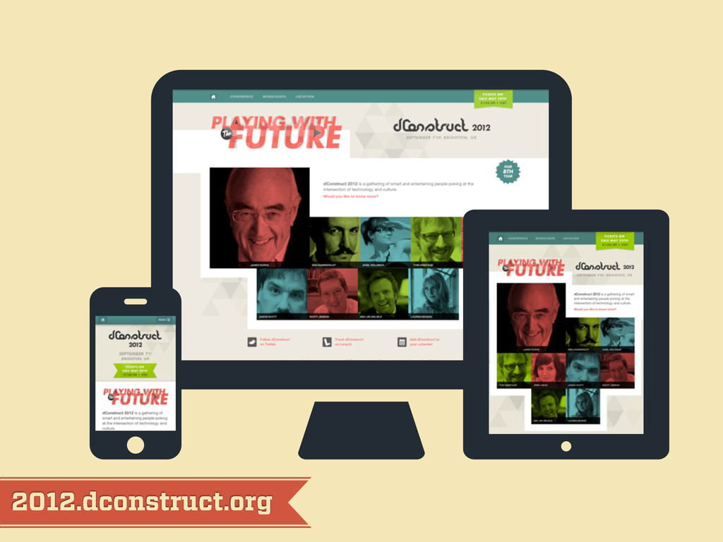
2012.dconstruct.org
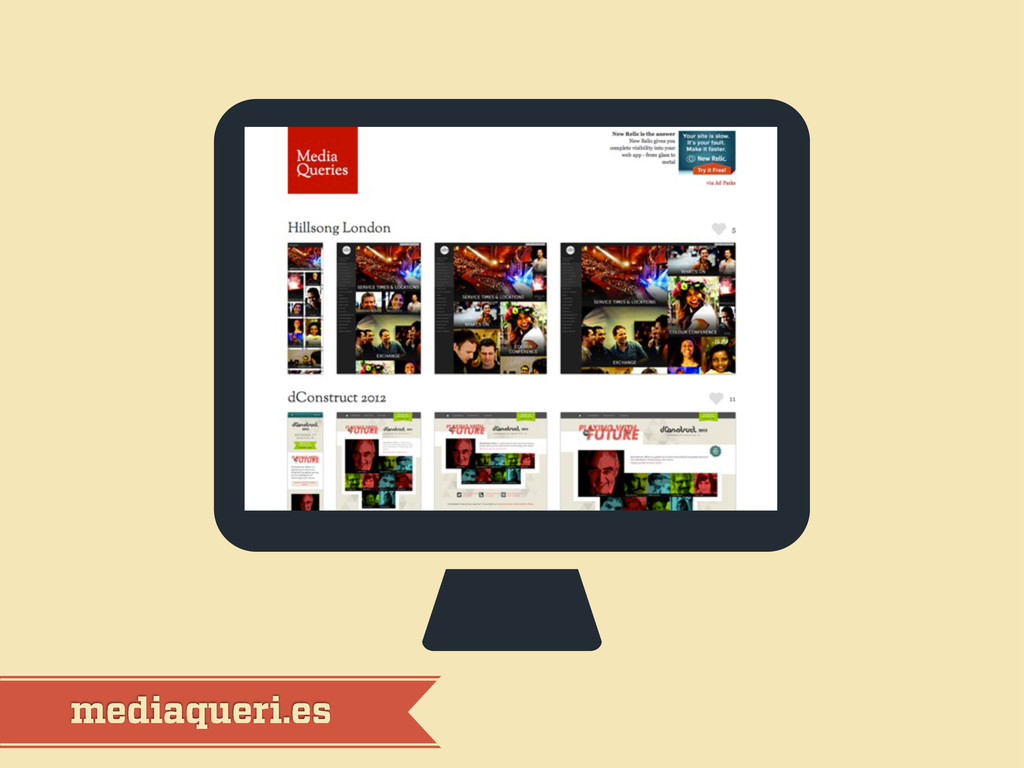
mediaqueri.es
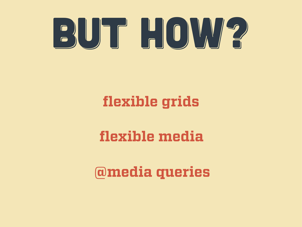
BUT HOW? BUT HOW? BUT HOW? flexible grids flexible media
@media queries
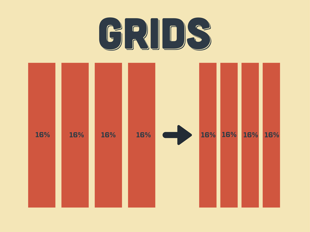
GRIDS GRIDS GRIDS 16% 16% 16% 16% 16% 16% 16%
16%
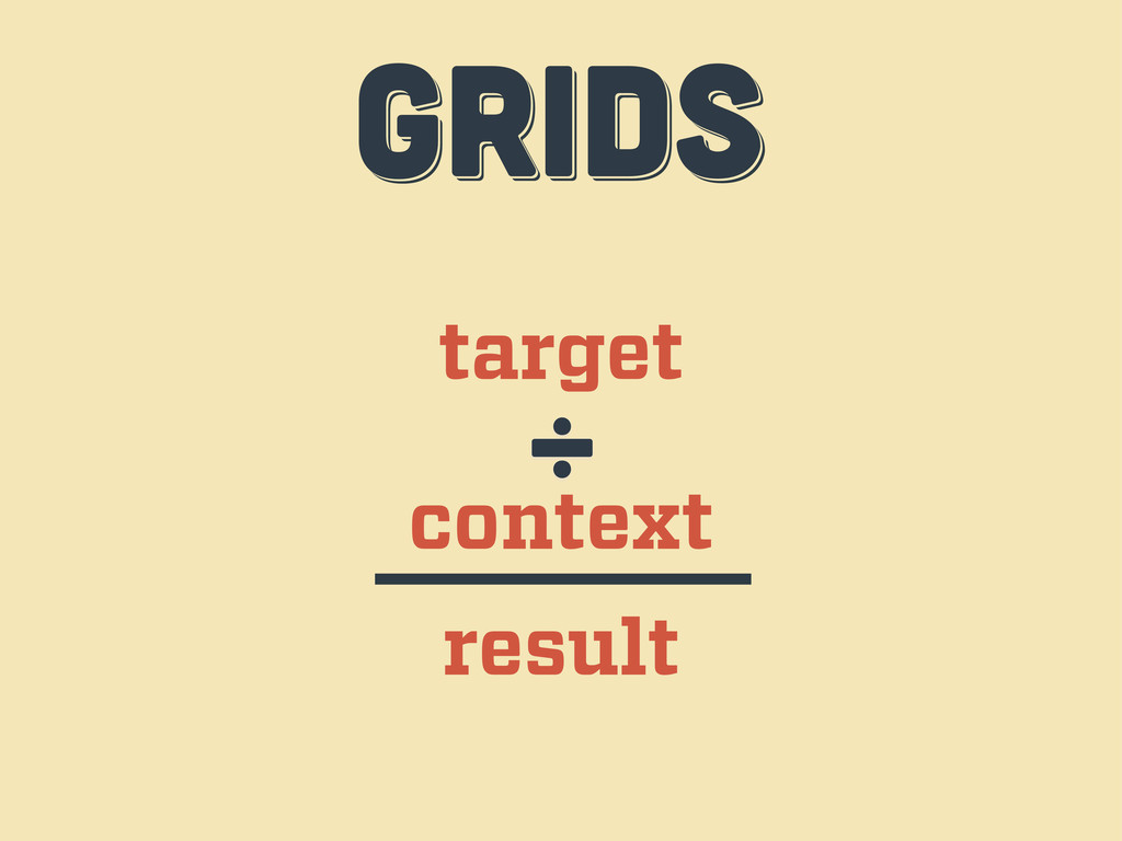
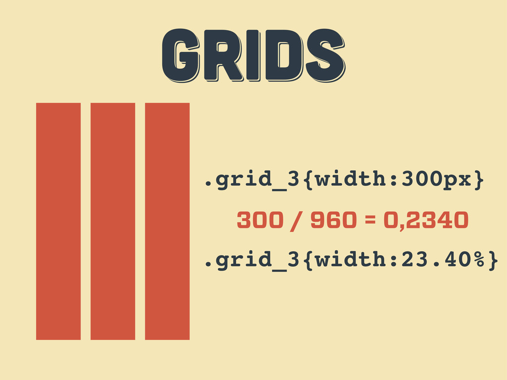
target context ÷ result GRIDS GRIDS GRIDS
.grid_3{width:300px} 300 / 960 = 0,2340 .grid_3{width:23.40%} GRIDS GRIDS GRIDS
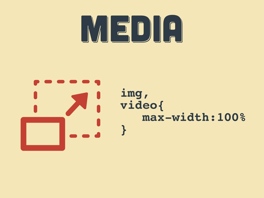
MEDIA MEDIA MEDIA img, video{ max-width:100% }
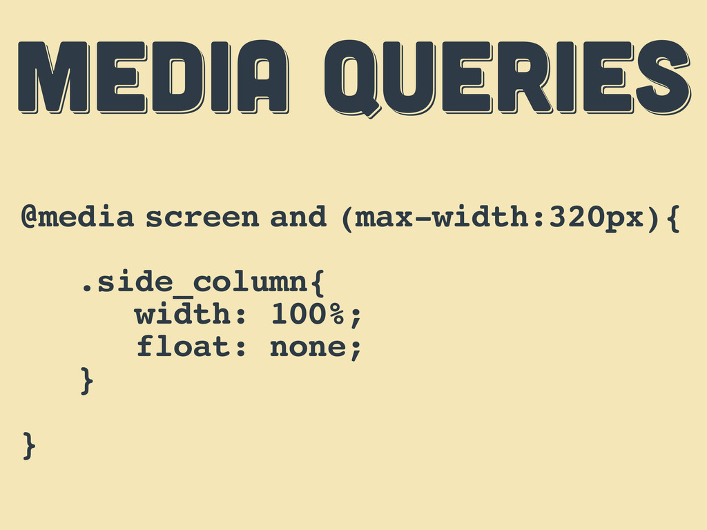
MEDIA QUERIES MEDIA QUERIES MEDIA QUERIES @media screen and (max-width:320px){
.side_column{ width: 100%; float: none; } }
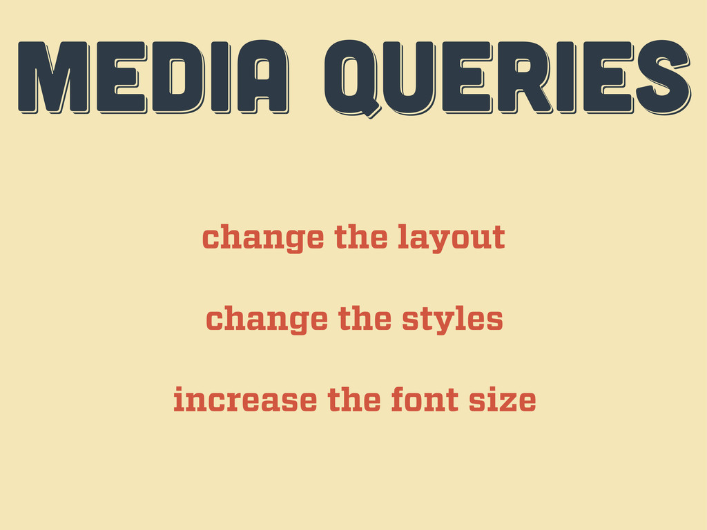
MEDIA QUERIES MEDIA QUERIES MEDIA QUERIES change the layout change
the styles increase the font size
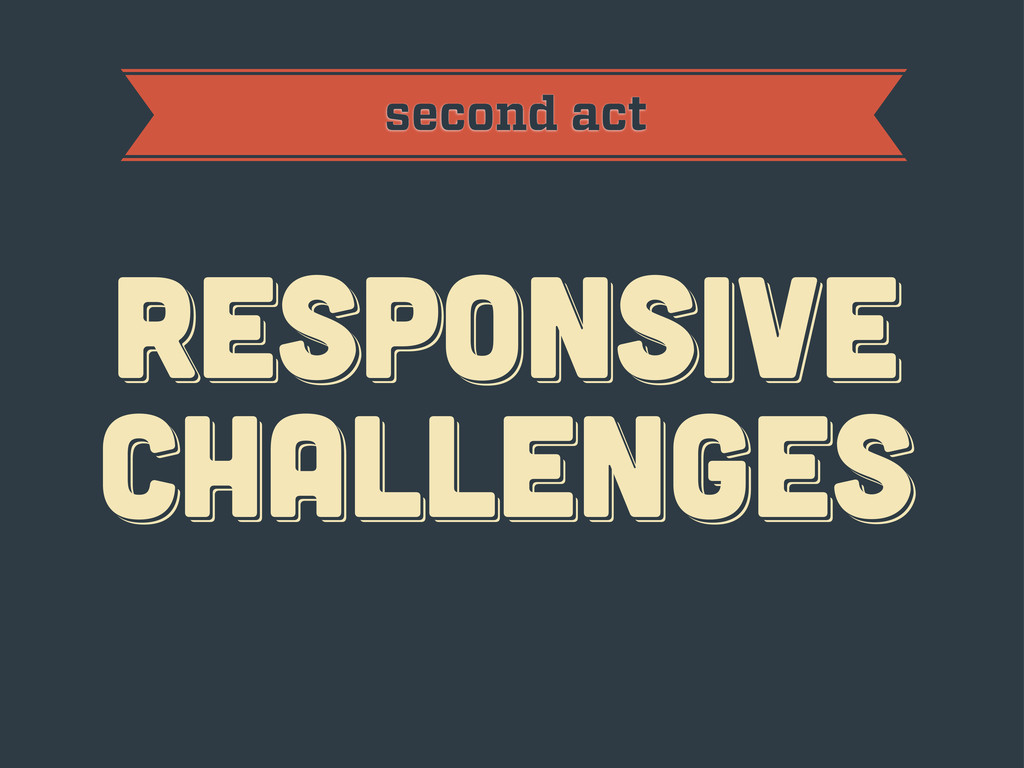
RESPoNSIVE challenges RESPoNSIVE challenges Responsive challenges second act
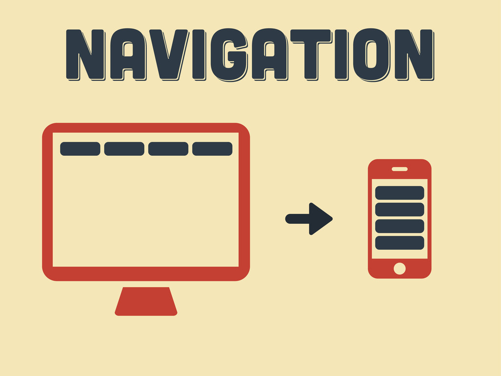
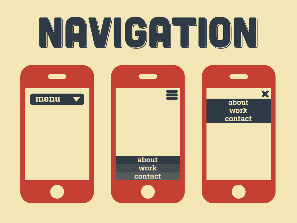
Navigation Navigation Navigation
Navigation Navigation Navigation menu contact work about contact work about
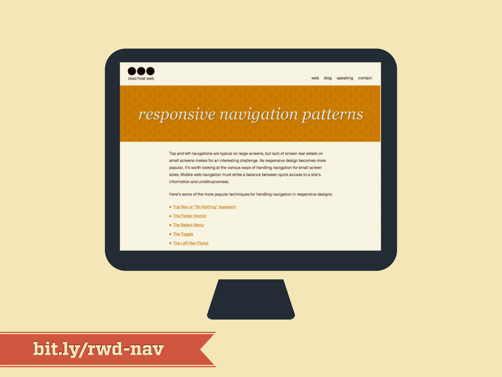
bit.ly/rwd-nav
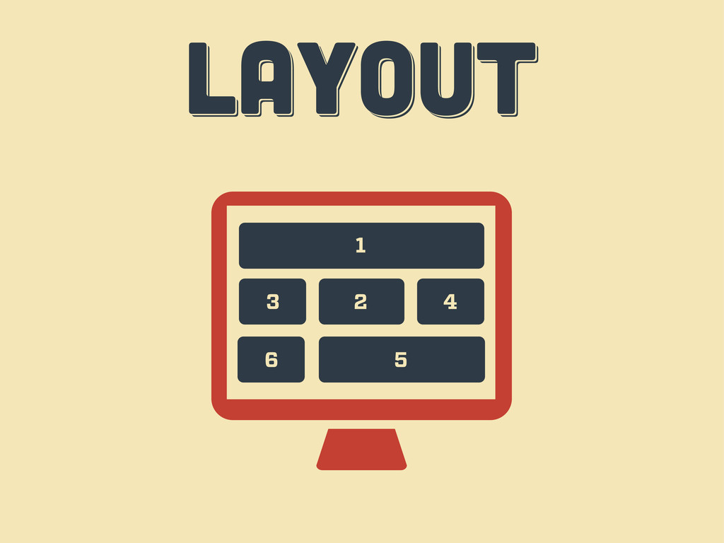
LAYOUT LAYOUT layout 1 2 3 4 6 5
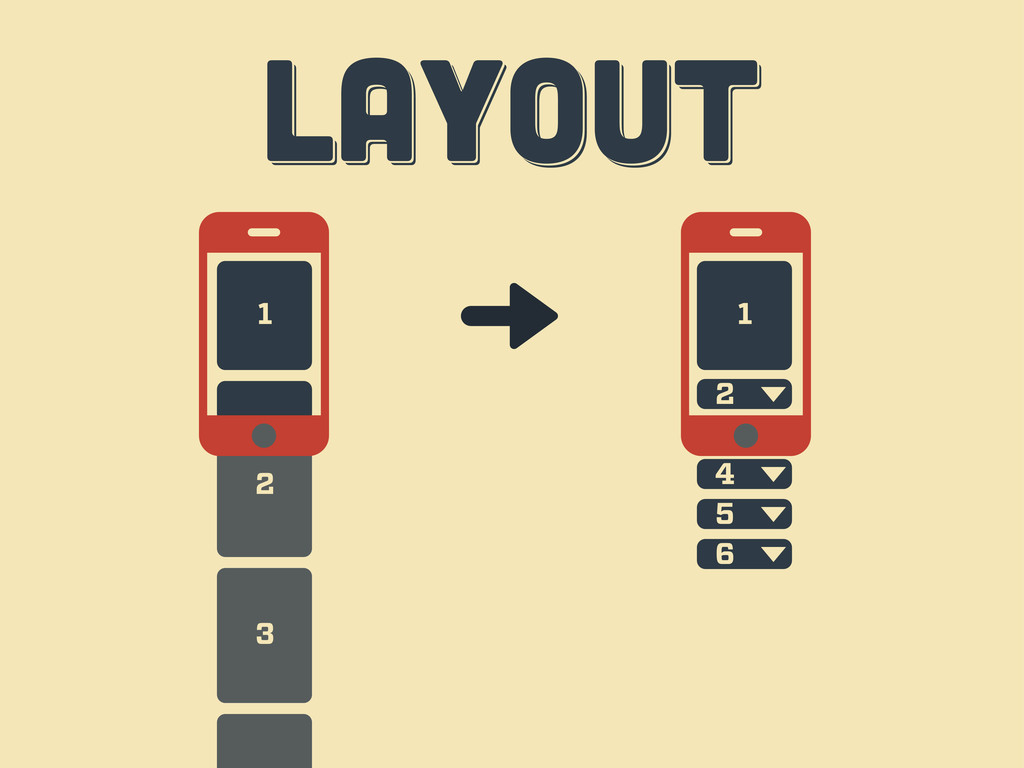
3 2 LAYOUT LAYOUT layout 1 3 1 2 4
5 6
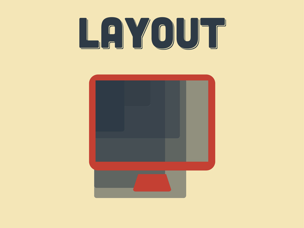
LAYOUT LAYOUT layout
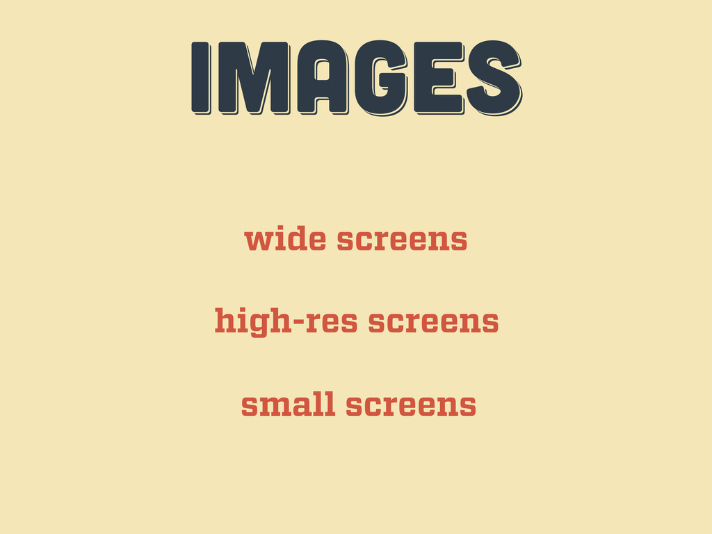
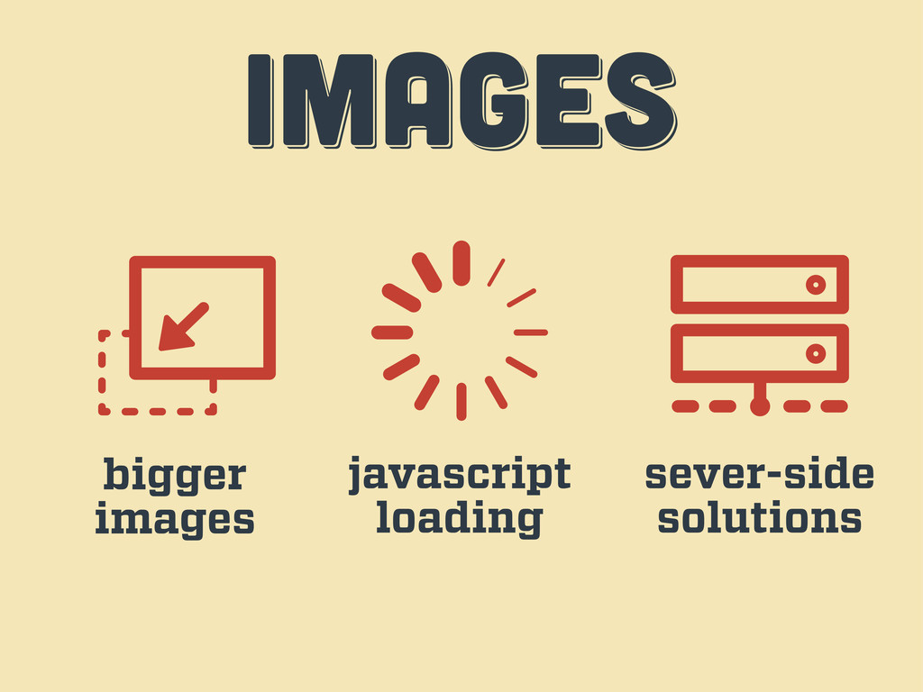
IMAGES IMAGES images wide screens high-res screens small screens
IMAGES IMAGES images bigger images javascript loading sever-side solutions
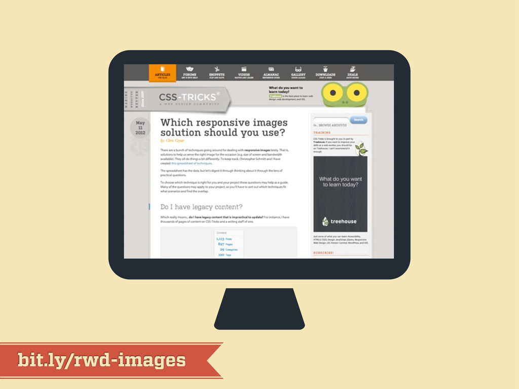
bit.ly/rwd-images
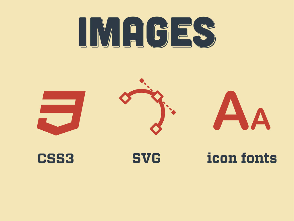
IMAGES IMAGES images CSS3 SVG icon fonts
workflow workflow workflow third act
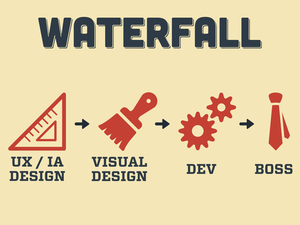
WATERFALL WATERFALL WATERFALL UX / IA DESIGN VISUAL DESIGN DEV
BOSS
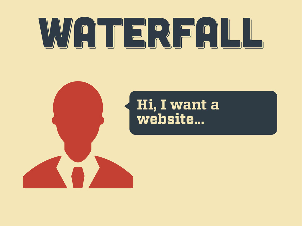
Hi, I want a website… WATERFALL WATERFALL WATERFALL
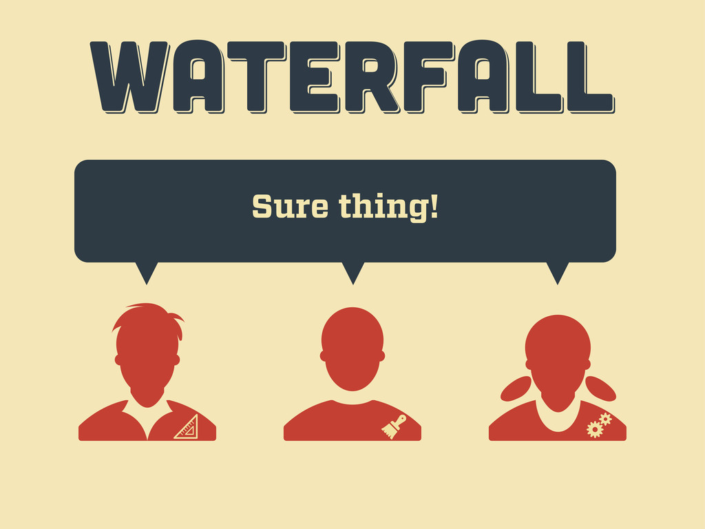
Sure thing! WATERFALL WATERFALL WATERFALL
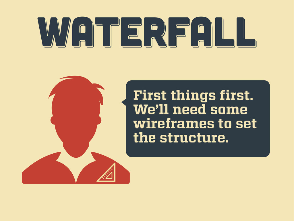
First things first. We’ll need some wireframes to set the
structure. WATERFALL WATERFALL WATERFALL
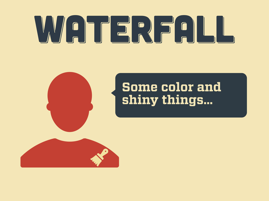
Some color and shiny things… WATERFALL WATERFALL WATERFALL
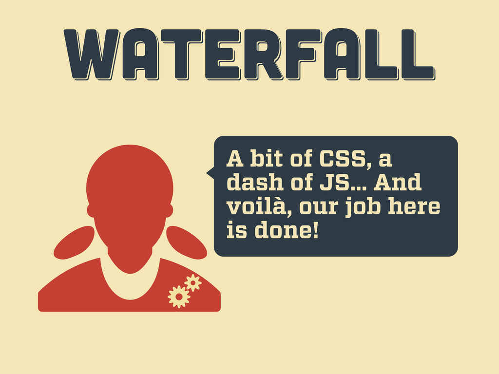
A bit of CSS, a dash of JS... And voilà,
our job here is done! WATERFALL WATERFALL WATERFALL
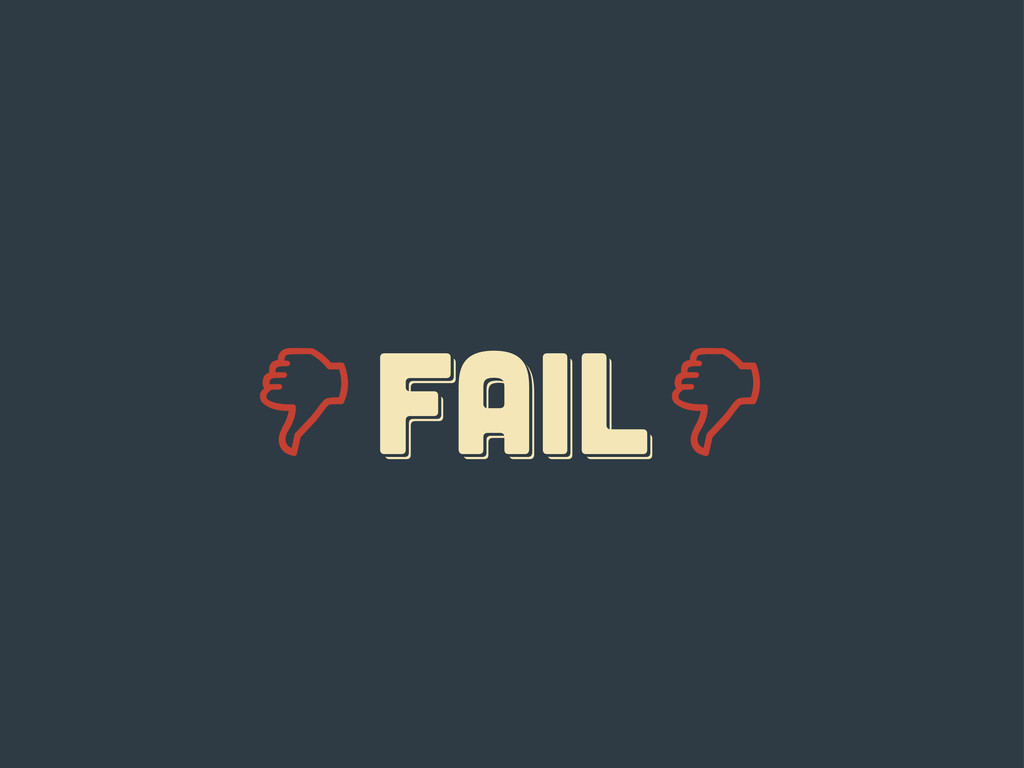
Er... guys... WATERFALL WATERFALL WATERFALL
FAIL fail Fail
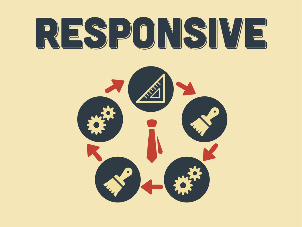
responsive responsive Responsive
ten tips ten tips ten tips fourth act
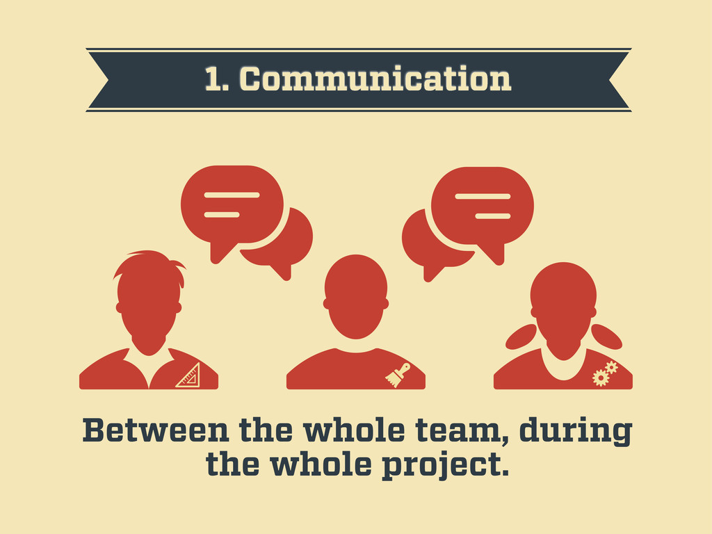
1. Communication Between the whole team, during the whole project.
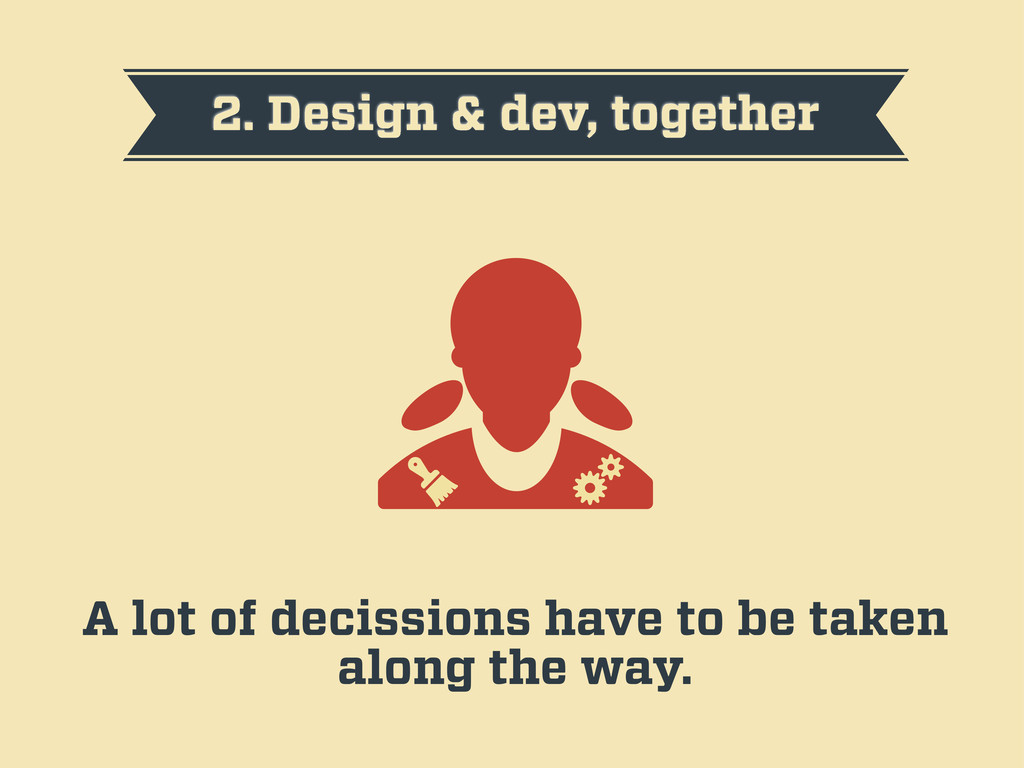
2. Design & dev, together A lot of decissions have
to be taken along the way.
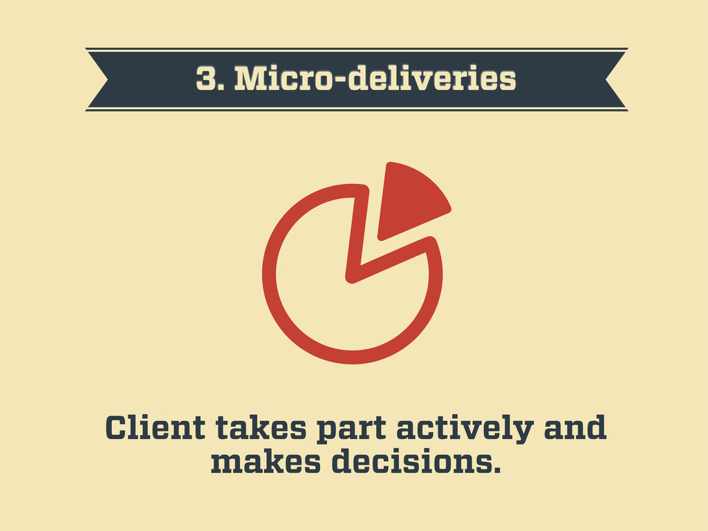
3. Micro-deliveries Client takes part actively and makes decisions.
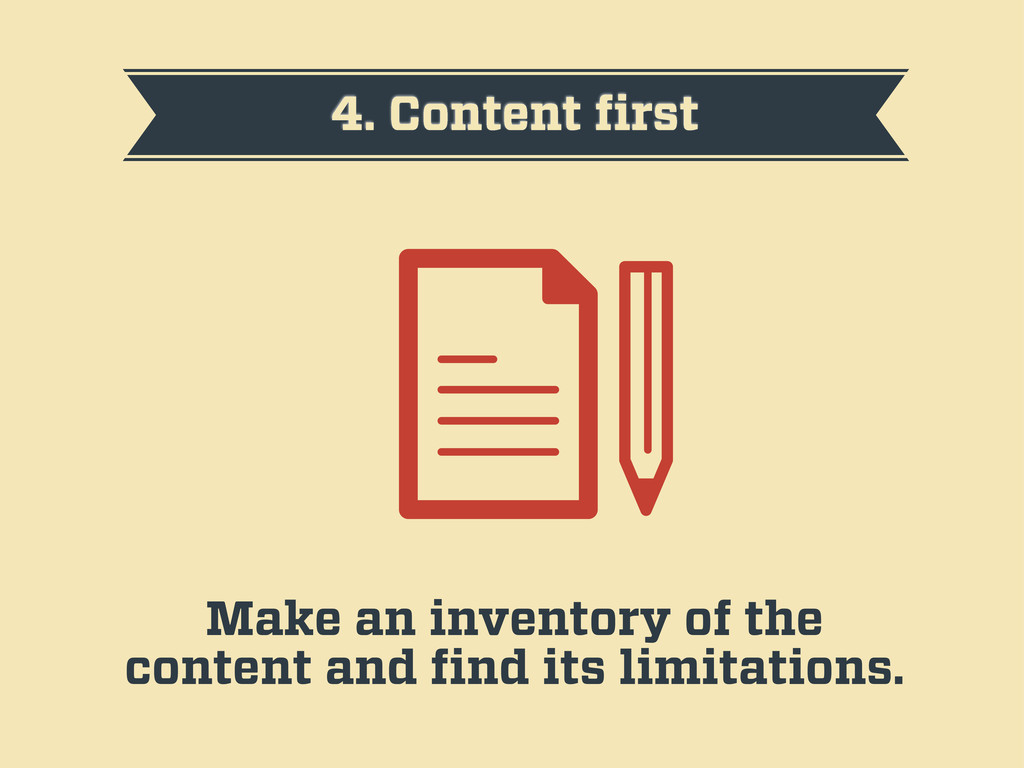
4. Content first Make an inventory of the content and
find its limitations.
5. Find the critical points Navigation, images, ads, information hierarchy…
6. Mobile first The small screen is the first limit.
7. Reference sketches Make basic sketches to help with the
hierarchy of the content.
8. Prototype fast The sooner you start coding your HTML,
the better.
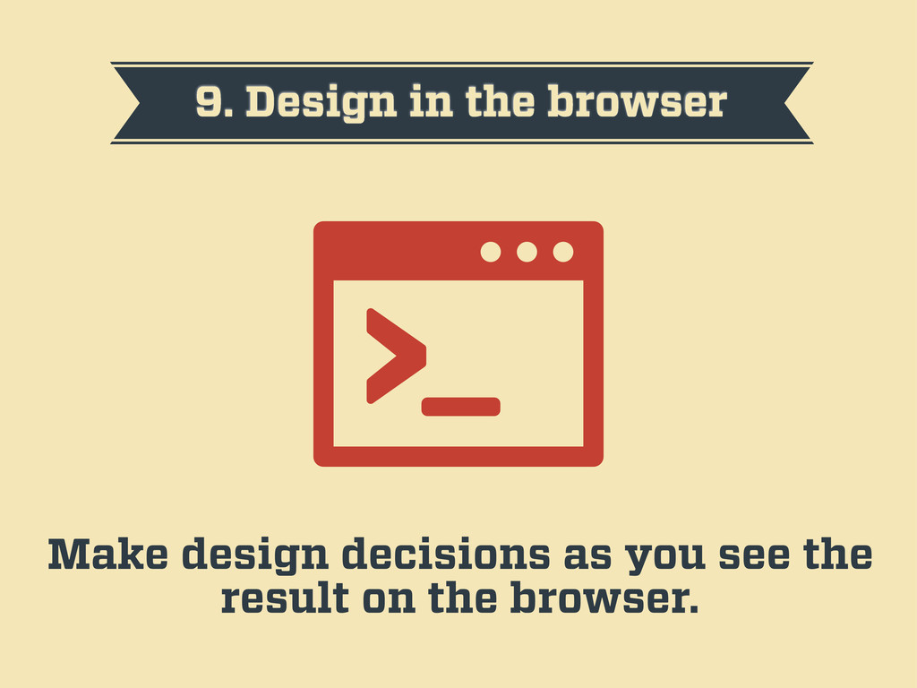
9. Design in the browser Make design decisions as you
see the result on the browser.
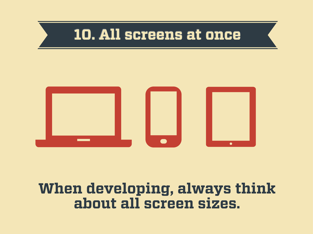
10. All screens at once When developing, always think about
all screen sizes.
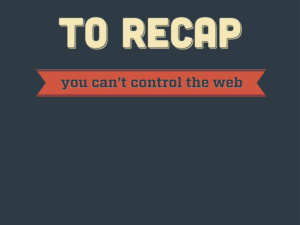
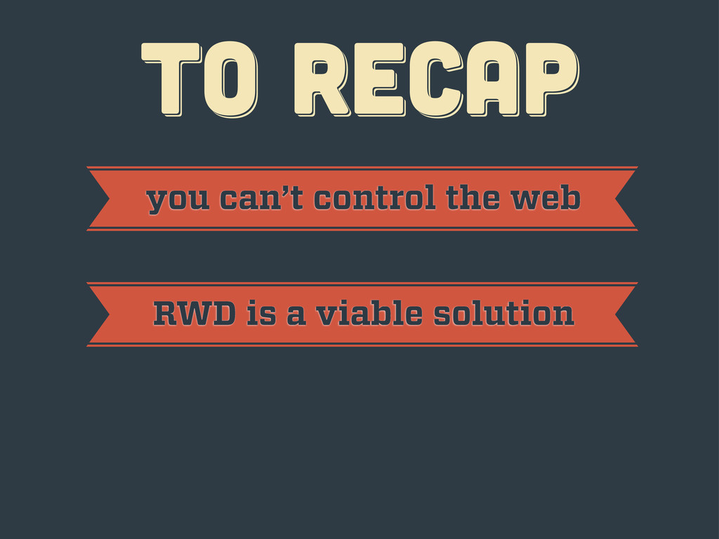
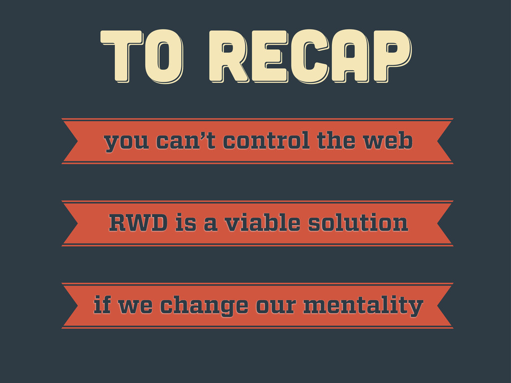
TO RECAP TO RECAP TO RECAP
TO RECAP TO RECAP TO RECAP you can’t control the
web
TO RECAP TO RECAP TO RECAP you can’t control the
web RWD is a viable solution
TO RECAP TO RECAP TO RECAP you can’t control the
web RWD is a viable solution if we change our mentality
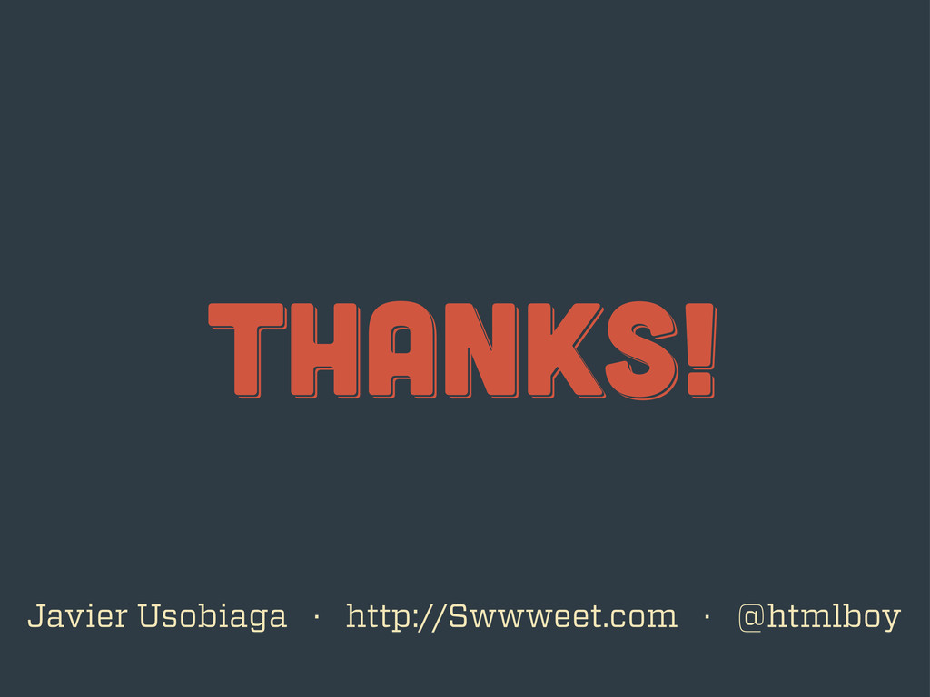
thanks! thanks! thanks! Javier Usobiaga · http://Swwweet.com · @htmlboy
 swwweet
 flatt_security
 shift_evolve
 kawauso
 kitano_yuichi
 srenext
 rakus_dev
 tsubakimoto_s
 asanoharuki
 mixi_engineers
 nishihira
 koheiyoshikawa
 segavvy
 sonatard
 reverentgeek
 tonyrice
 honzajavorek
 axbom
axbom
 akademiya2063
 rasmusluckow
 kimpetersen
 michaelherold
 kevinliebholz
 tanoku
 jeffersonlam