Upgrade to Pro
— share decks privately, control downloads, hide ads and more …
Speaker Deck
Features
Speaker Deck
PRO
Sign in
Sign up for free
Search
Search
Visual Inventory
Search
Sydney
April 06, 2014
Design
100
0
Share
Visual Inventory
Sydney
April 06, 2014
Other Decks in Design
See All in Design
decksh object reference
ajstarks
2
1.6k
体験負債を資産に変える組織的アプローチ
hikarutakase
0
1.1k
Diverse Design Team Deck
diverse
0
1.5k
なぜ、インサイトを貯めるのか?
tajima_kaho
1
540
Figma MCPを活用するためのデザインハンドブック
vivion
7
17k
デザインとフロントエンドの境界が融ける Claude Code × Figma
littlebusters
1
2.6k
Drawing for Animation
lynteo
2
290
速く作れるかではなく、速く学べるか ― 学習ループを回すパイロットの途中報告
nagata03
0
270
AI時代、デザイナーの価値はどこに?
tararira
2
1.1k
デザイナーが主導権を握る、AI協業の本音と実践
satosio
7
3.2k
The Art of Caring
klemens
0
310
プロダクトデザイナーに学ぶ、『見る気が起きる』ダッシュボードの作り方 / Creating Engaging Dashboards: Lessons from Product Designers
yamamotoyuta
2
780
Featured
See All Featured
Evolution of real-time – Irina Nazarova, EuRuKo, 2024
irinanazarova
9
1.3k
Stewardship and Sustainability of Urban and Community Forests
pwiseman
0
190
Hiding What from Whom? A Critical Review of the History of Programming languages for Music
tomoyanonymous
2
800
Primal Persuasion: How to Engage the Brain for Learning That Lasts
tmiket
0
330
Digital Projects Gone Horribly Wrong (And the UX Pros Who Still Save the Day) - Dean Schuster
uxyall
0
1.3k
GraphQLの誤解/rethinking-graphql
sonatard
75
12k
30 Presentation Tips
portentint
PRO
1
290
Site-Speed That Sticks
csswizardry
13
1.2k
Unlocking the hidden potential of vector embeddings in international SEO
frankvandijk
0
780
Pawsitive SEO: Lessons from My Dog (and Many Mistakes) on Thriving as a Consultant in the Age of AI
davidcarrasco
0
130
Into the Great Unknown - MozCon
thekraken
41
2.4k
The Cost Of JavaScript in 2023
addyosmani
55
9.9k
Transcript
VISUAL INVENTORY Wikipedia Prepared by Sydney Yeremy April 3rd, 2014
Summary I have put together an assortment of ideas that
I thought would be beneficial to your Wikipedia website. I generalized each example into three categories, concept, color and tone.
Concept With a general concept, we can create a design
that ties the entire site together in an organized and unified way.
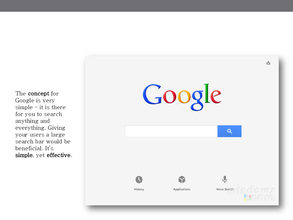
The concept for Google is very simple – it is
there for you to search anything and everything. Giving your users a large search bar would be beneficial. It’s simple, yet effective.
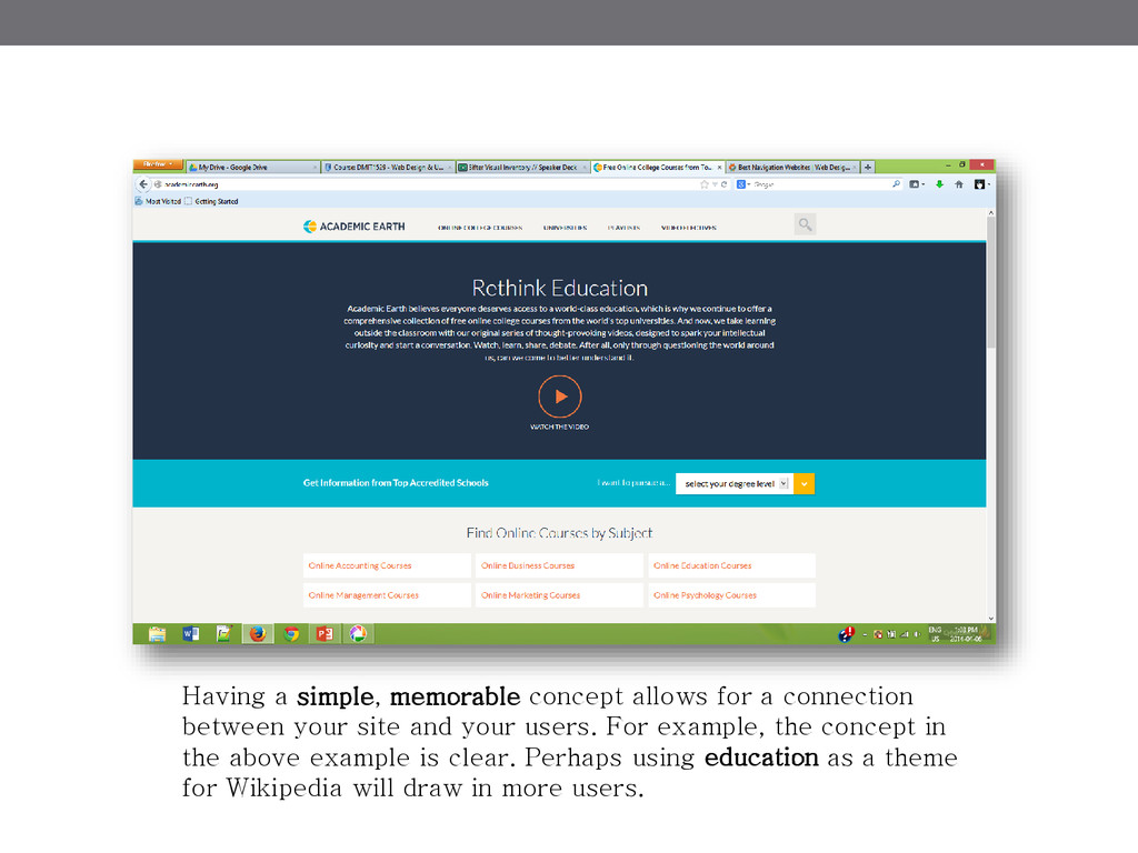
Having a simple, memorable concept allows for a connection between
your site and your users. For example, the concept in the above example is clear. Perhaps using education as a theme for Wikipedia will draw in more users.
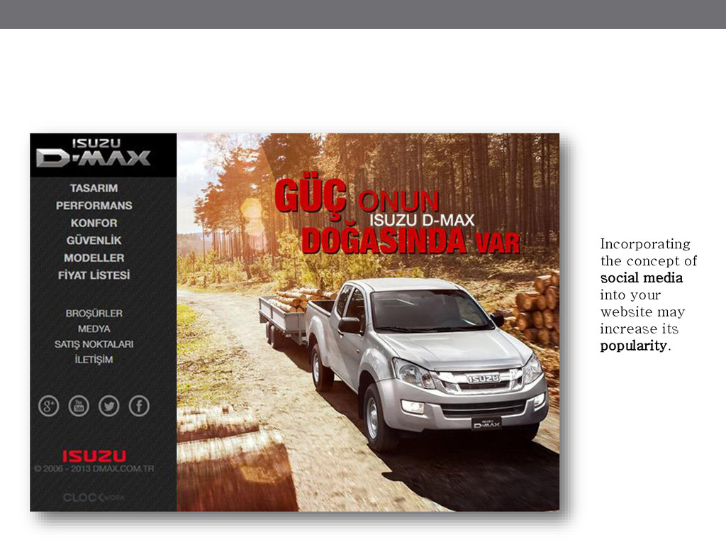
Incorporating the concept of social media into your website may
increase its popularity.
Color You can do so much with color schemes and
white space. With the right schemes, your website can be taken to a whole other level.
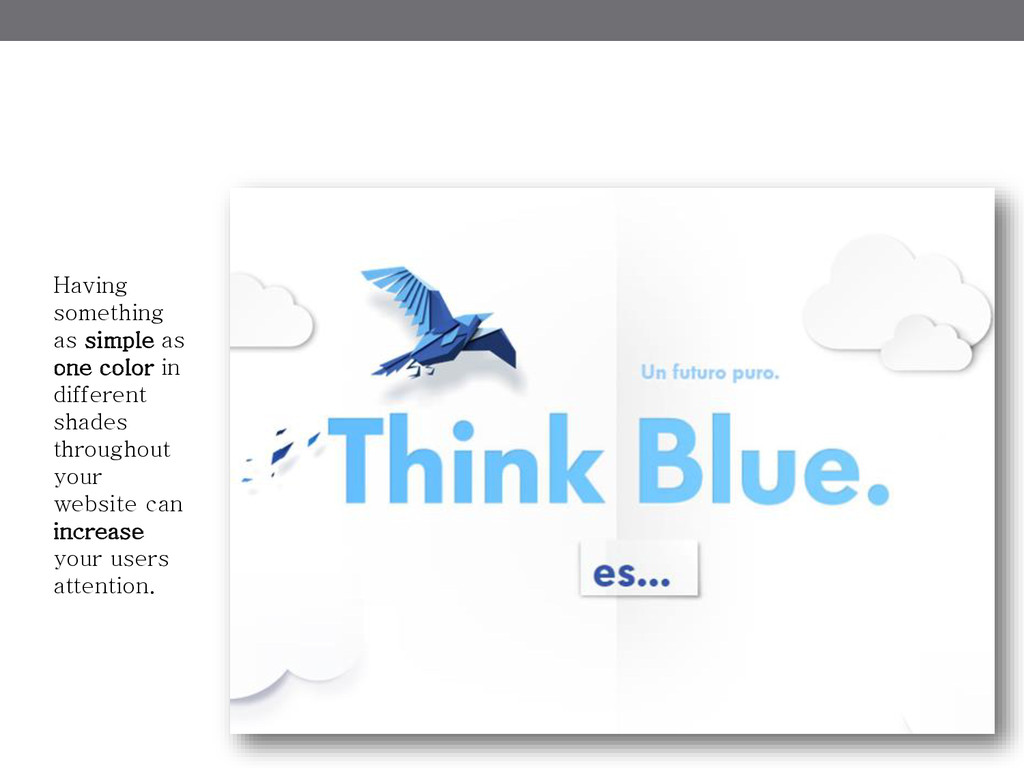
Having something as simple as one color in different shades
throughout your website can increase your users attention.
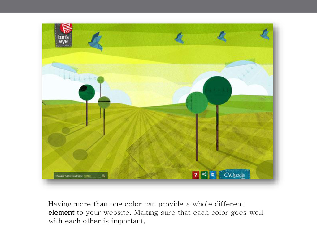
Having more than one color can provide a whole different
element to your website. Making sure that each color goes well with each other is important.
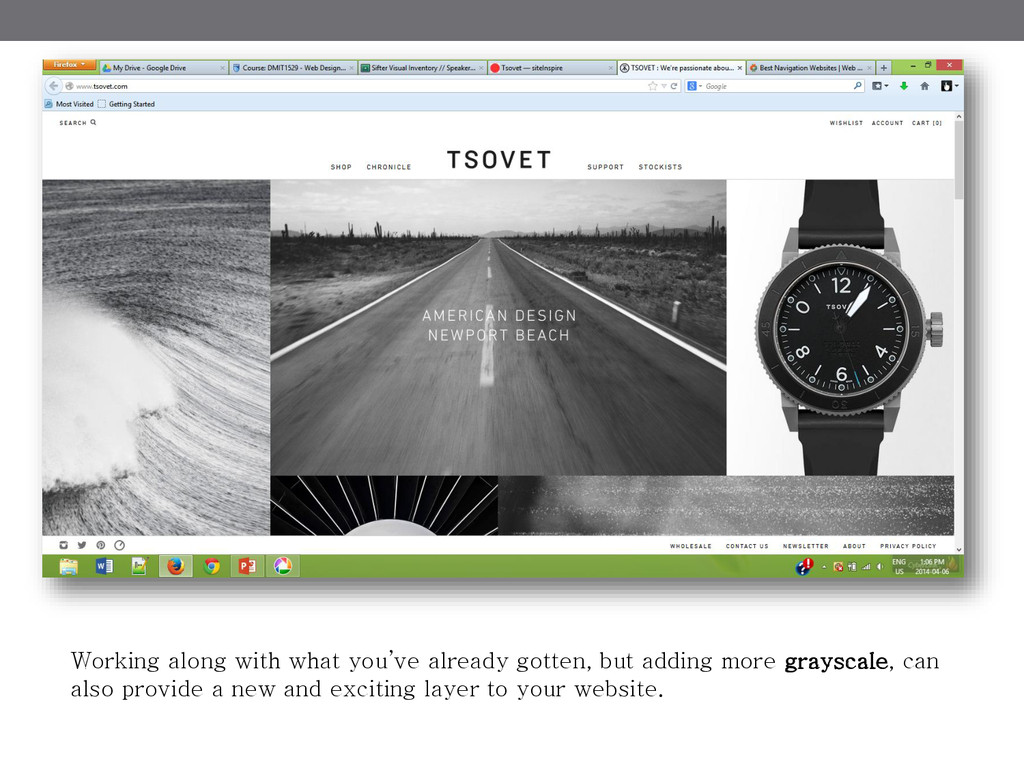
Working along with what you’ve already gotten, but adding more
grayscale, can also provide a new and exciting layer to your website.
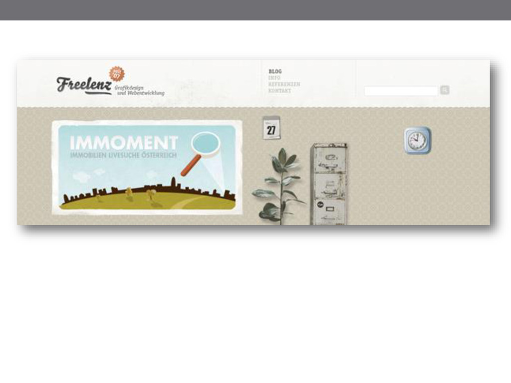
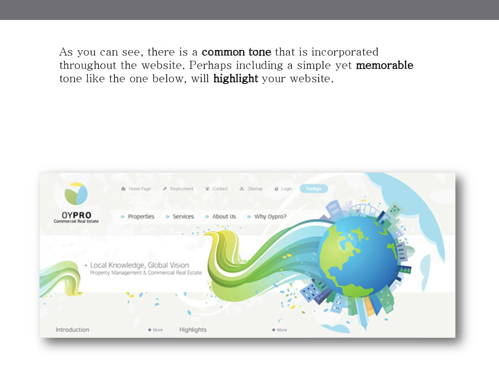
Tone Tone is what really connects your users to your
site; it is such a versatile thing!
None
None
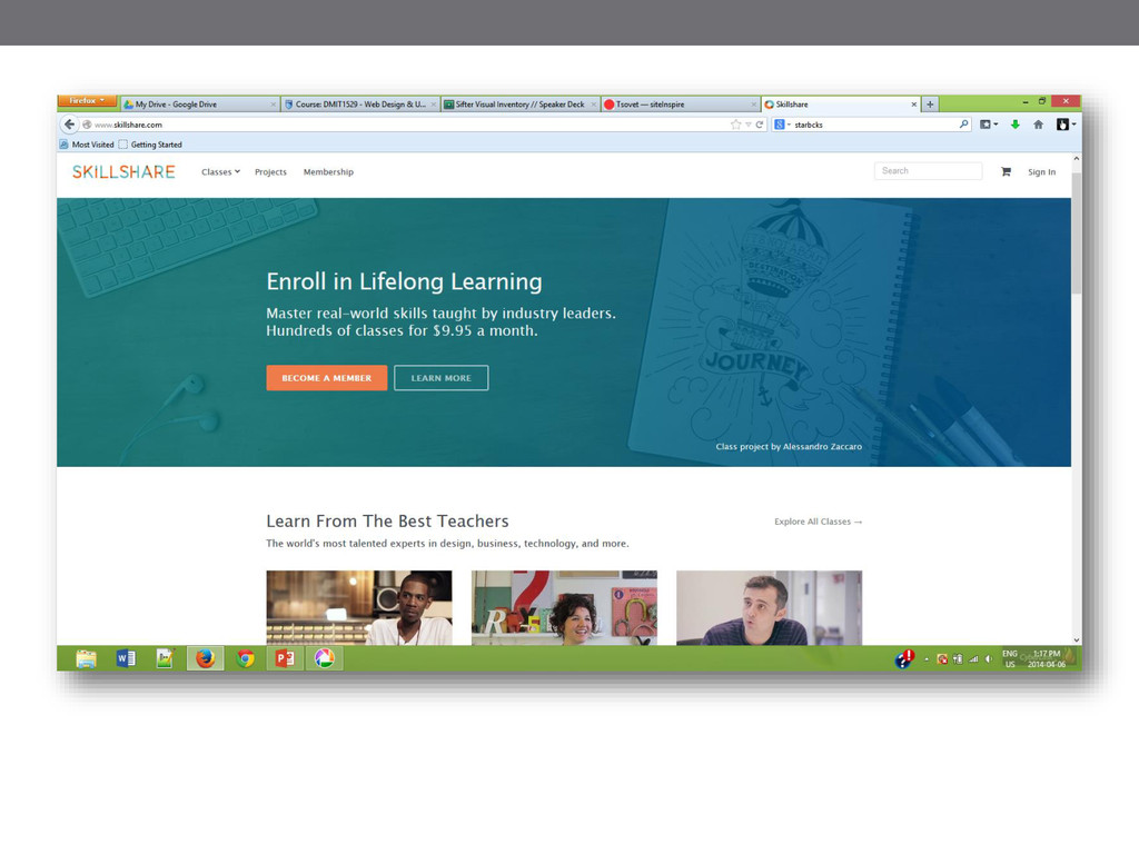
As you can see, there is a common tone that
is incorporated throughout the website. Perhaps including a simple yet memorable tone like the one below, will highlight your website.
I am enthusiastic to be working with you! I can’t
wait to hear your thoughts and ideas on the document. Thank you!